First Template - AppDaddy-Software-Solutions-Inc/framework-markup-language GitHub Wiki
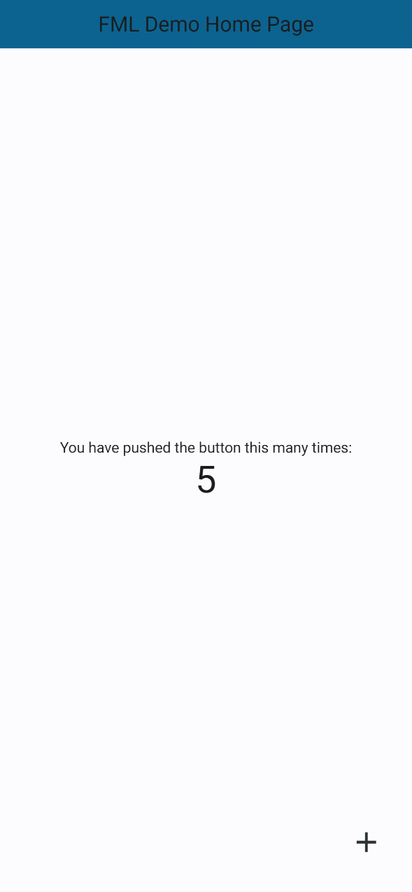
To start, we are going to build a reproduction of the Flutter Counter App. This is a simple application, but it satisfies the criteria for databinding, layout, and responsiveness. This sample template will connect all of the basics from Databinding Basics and Layout Basics to form a simple functioning template.
First, we start by creating the TEMPLATE. As best practice, we give it a version number and title.
<FML version="1.0" title="Counter-Page">
</FML>
Next, we will look at the layout requirements. There is a HEADER with a title at the top, an elevated BUTTON in the bottom right with an ICON, and TEXT with the counter below it in a COLUMN in the center. Lets start with the outer body. We need a column, and a POSITIONed BUTTON.
<FML version="1.0" title="Counter-Page" center="true">
          <COL>
          </COL>
     <POS bottom="10" right="10">
     </POS>
</FML>
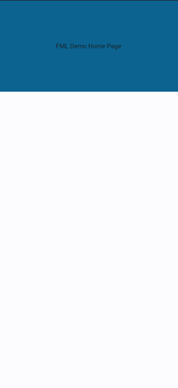
Lets then add the HEADER with centered TEXT.
<FML version="1.0" title="Counter-Page">
     <HEADER>
          <CENTER>
                <TEXT value="FML Demo Home Page"/>
          </CENTER>
     </HEADER>
     <CENTER>
          <COL>
          </COL>
     </CENTER>
     <POS bottom="10" right="10">
     </POS>
</FML>
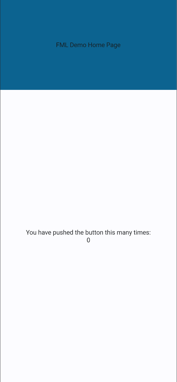
And now the remaining TEXT for the COLUMN, the BUTTON, and add our alignment attributes to position the children within the COLUMN.
<FML version="1.0" title="Counter-Page">
     <HEADER>
          <CENTER>
                <TEXT value="FML Demo Home Page"/>
          </CENTER>
     </HEADER>
     <CENTER>
          <COL center="true">
               <TEXT value="You have pushed the button this many times:"/>
               <TEXT value="0"/>
          </COL>
     </CENTER>
     <POS bottom="10" right="10">
          <BTN>
          </BTN>
     </POS>
</FML>
Now, we need to note that we require an id for the TEXT, as it is the only item that we will be manipulating with events and databinding, as well as an onclick="" event for the BUTTON in order to preform an action when it is pressed.
<FML version="1.0" title="Counter-Page">
     <HEADER>
          <CENTER>
                <TEXT value="FML Demo Home Page"/>
          </CENTER>
     </HEADER>
     <CENTER>
          <COL center="true">
               <TEXT value="You have pushed the button this many times:"/>
               <TEXT id="clicknumber" value="0"/>
          </COL>
     </CENTER>
     <POS bottom="10" right="10">
          <BTN onclick="">
          </BTN>
     </POS>
</FML>
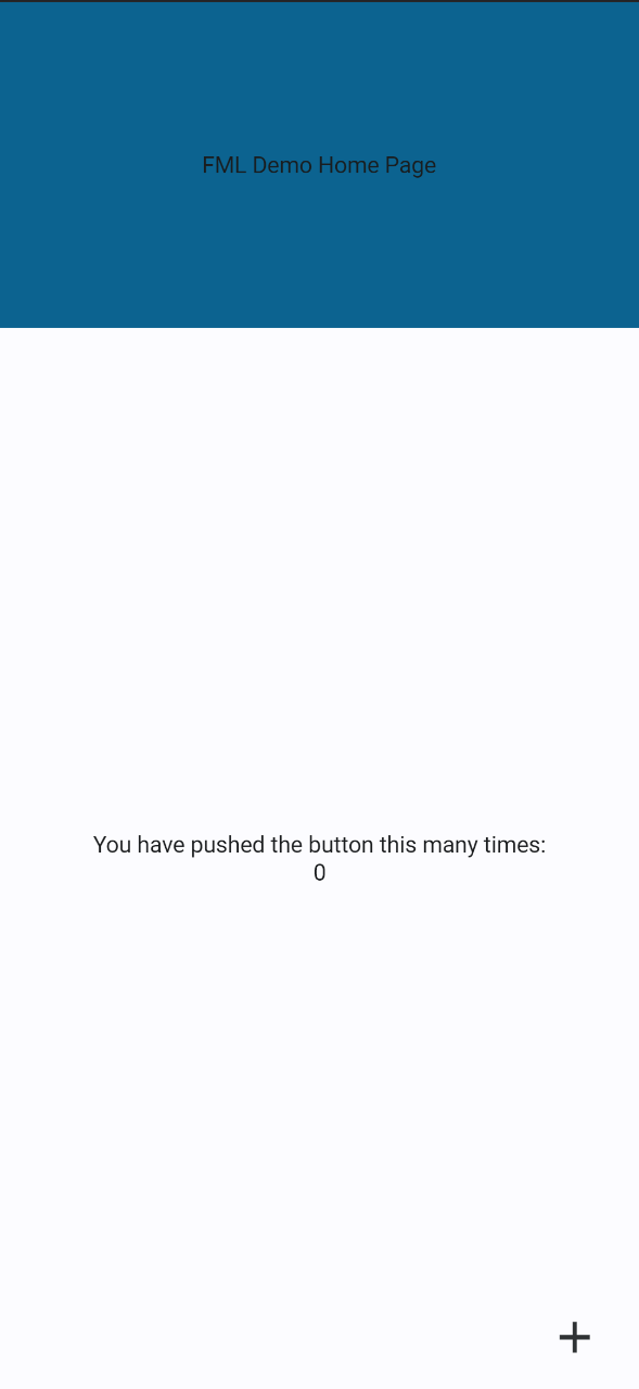
Next, we add the ICON to our BUTTON from the Flutter Icons Library.
<FML version="1.0" title="Counter-Page">
     <HEADER>
          <CENTER>
                <TEXT value="FML Demo Home Page"/>
          </CENTER>
     </HEADER>
     <CENTER>
          <COL center="true">
               <TEXT value="You have pushed the button this many times:"/>
               <TEXT id="clicknumber" value="0"/>
          </COL>
     </CENTER>
     <POS bottom="10" right="10">
          <BTN onclick="">
               <ICON icon="add">
          </BTN>
     </POS>
</FML>
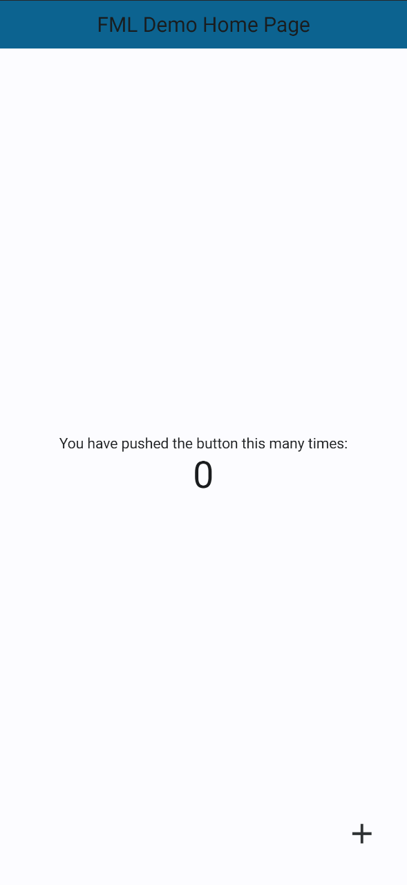
Before we implement our functional component, lets get the sizing correct by adjusting the HEADER height, the TEXT size or style, and the BUTTON width and height.
<FML version="1.0" title="Counter-Page">
     <HEADER height="46">
          <CENTER>
                <TEXT value="FML Demo Home Page" size="20"/>
          </CENTER>
     </HEADER>
     <CENTER>
          <COL center="true">
               <TEXT value="You have pushed the button this many times:"/>
               <TEXT id="clicknumber" value="0" style="h3"/>
          </COL>
     </CENTER>
     <POS bottom="10" right="10">
          <BTN onclick="" width="40" height="50" radius="50">
               <ICON icon="add"/>
          </BTN>
     </POS>
</FML>Now to create the increments! We will use the <id>.set() event to set the value of clicknumber clicknumber.set, and in that event we will evaluate the current value of clicknumber and add 1 using {clicknumber} + 1.
<FML version="1.0" title="Counter-Page">
     <HEADER height="46">
          <CENTER>
                <TEXT value="FML Demo Home Page" size="20"/>
          </CENTER>
     </HEADER>
     <CENTER>
          <COL center="true">
               <TEXT value="You have pushed the button this many times:"/>
               <TEXT id="clicknumber" value="0" style="h3"/>
          </COL>
     </CENTER>
     <POS bottom="10" right="10">
          <BTN onclick="clicknumber.set({clicknumber} + 1);" width="40" height="50" radius="50">
               <ICON icon="add"/>
          </BTN>
     </POS>
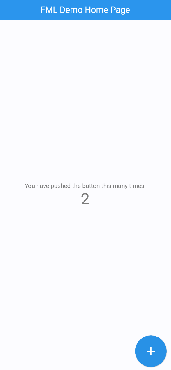
</FML>And now for some final styling to match the colors. In a full app we would use the THEME, but in this case we can simply set attributes, including the BUTTON type to allow the style to match.
<FML version="1.0" title="Counter-Page">
     <HEADER height="46" color="blue">
          <CENTER>
                <TEXT value="FML Demo Home Page" size="20" color="white"/>
          </CENTER>
     </HEADER>
     <CENTER>
          <COL center="true">
               <TEXT value="You have pushed the button this many times:" color="#7c7c7c"/>
               <TEXT id="clicknumber" value="0" style="h3" color="#7c7c7c"/>
          </COL>
     </CENTER>
     <POS bottom="10" right="10">
          <BTN onclick="clicknumber.set({clicknumber} + 1);" width="40" height="40" radius="50" color="blue" type="elevated">
               <ICON icon="add" color="white"/>
          </BTN>
     </POS>
</FML>
There we have it! There is some fine tuning that can be done to get the layout pixel perfect in comparison to the flutter version, yet we see the quick and simple ability to estimate and choose everything on the fly using FML.
