Modifiers - wildware-uk/composegl GitHub Wiki
Modifier is the same idea as Compose's: a chain of things said about a widget,
folded left to right, read by layout and by drawing.
Panel(Modifier.align(Alignment.BottomStart).padding(20f).width(280f)) { … }If you know Modifier.padding(8f).background(Color.Blue), you know this. What
follows is the list, and the three rules that are ours.
Size
Modifier.size(64f)                 // square
Modifier.size(width = 200f, height = 40f)
Modifier.width(280f)
Modifier.height(40f)
Modifier.fillMaxWidth()            // all of what the parent offers
Modifier.fillMaxHeight(0.5f)       // half of it
Modifier.fillMaxSize()
Modifier.fillMaxWidth().aspectRatio(3f / 4f)  // as wide as the slot, height follows at 3:4
Modifier.widthIn(min = 200f, max = 400f)   // as wide as the contents, inside that range
Modifier.heightIn(min = 40f)
Modifier.sizeIn(minWidth = 64f, minHeight = 64f)
Modifier.defaultMinSize(minWidth = 48f)    // only when nothing else says a width
Modifier.width(IntrinsicSize.Max)  // as wide as the contents would like, asked first
Modifier.height(IntrinsicSize.Min) // as short as they can be squeezed to
Modifier.animateContentSize()      // grows to new contents rather than jumping
A range is a rule rather than a wish, so it holds wherever it sits in the chain:
width and fillMaxWidth are measured inside it. See Layout for the details.
Growing with its contents. animateContentSize moved to
Animation.
Space
Modifier.padding(12f)
Modifier.padding(horizontal = 16f, vertical = 8f)
Modifier.padding(left = 28f, bottom = 28f)
Modifier.paddingFrom(Baseline.First, before = 24f)  // measured to the text's line, not its box
Modifier.paddingFromBaseline(top = 28f, bottom = 12f)
Modifier.offset(x = 0f, y = 2f)    // move it, without moving anything else
Modifier.parallax(pointer, factor = -0.02f) // …by how far the pointer is from the middle
Parallax is cheap depth. Moved to Animation.
Where it goes
Modifier.align(Alignment.TopEnd)   // inside a Box
Modifier.weight(1f)                // inside a Row or Column
Modifier.zIndex(1f)                // drawn over its siblings, and clicked first
Modifier.layoutId("icon")          // inside a layout of your own; see [[Custom layouts]]
Modifier.worldPosition(120f, 80f)  // inside a PanZoomCanvas; see [[Widgets]]
Modifier.wrapContentSize()         // its own size, centred in a slot bigger than it
Modifier.wrapContentWidth(HorizontalAlignment.End)
Modifier.animatePlacement()        // slides to a new slot instead of jumping there
zIndex is for lifting one thing out of a pile. Siblings paint in the order they are written. A selected card, a dragged tile, a hovered item can come forward without being moved in the code — which would also move it in focus order and change what recomposition matches it by:
Card(Modifier.zIndex(if (selected) 1f else 0f))Higher is drawn later, so on top. Equal values keep source order, so the default of
zero changes nothing, and a negative value sinks a node under its siblings. Clicks
and hover follow the picture: where two cards overlap, the one on top gets the
press. Layout and focus do not — a row still lays out left to right as written, and
Tab still walks in source order. It orders siblings only: a child with a huge
zIndex inside a low parent stays under that parent's higher siblings. Two on one
node add, like offset.
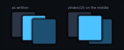
animatePlacement is for lists that change. Moved to Animation.
How it looks
Modifier.background(Colour.rgb(0x1A1F28), corner = 6f)
Modifier.background(Brush.vertical(top, bottom), corner = 6f)   // a gradient
Modifier.border(Colour.rgb(0x2C3545), width = 1f, corner = 6f)
Modifier.border(accent, width = 2f, style = BorderStyle.Dashed(on = 6f, off = 4f))
Modifier.border(accent, width = 2f, corner = 8f, style = BorderStyle.Dotted)
Modifier.border(bottom = BorderSide(1f, divider))   // one edge: a divider, a tab's underline
Modifier.shadow(Colour.argb(0x80000000), spread = 12f, corner = 6f)
Modifier.borderOutside(almostBlack, width = 3f, corner = 12f)   // an outline outside the box
Modifier.innerShade(black, depth = 6f, corner = 12f)            // shade falling in from the edge
Modifier.bevel(depth = 6f, corner = 12f)                        // light on top, dark below
Modifier.gloss(fraction = 0.45f, corner = 12f)                  // a shine across the top
Modifier.ninePatch(frame)          // skin art, stretched properly
Modifier.background(Accent, Corners.top(8f))  // …with a radius per corner
Modifier.clip()                    // children cannot draw outside
Modifier.clip(corner = 6f)         // …with rounded corners
Modifier.clipShape(Shapes.Circle)  // …or any convex shape: a round portrait
Modifier.alpha(0.4f)               // the subtree fades as one thing
Modifier.tint(Colour.Red)          // …every colour in it multiplied by red
Modifier.scale(1.2f)               // …drawn bigger, without re-laying it out
Modifier.mirror()                  // …flipped to face the other way
Modifier.rotate(8f)                // …turned clockwise
Modifier.skew(x = -12f)            // …slanted, top leaning forward
Modifier.rotate3d(y = 180f)        // …turned over in depth, like a card
Modifier.blur(radius = 8f)         // …through a shader, from composegl-effects
Clipping to a shape. clip() is a rectangle, and free. clipShape cuts to any
convex shape instead — a round portrait, a diamond minimap, a hexagon tile — from
square art, at draw time:
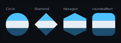
Image(portrait, Modifier.size(64f).clipShape(Shapes.Circle))
Box(Modifier.size(96f).clipShape(Shapes.Diamond)) { Minimap() }
Box(Modifier.clipShape(Shapes.polygon(0.5f, 0f, 1f, 1f, 0f, 1f))) { … }  // fractions of the box
The shapes are Shapes.Rectangle, Circle, Ellipse, Diamond, Hexagon,
roundedRect(corner) and polygon(…). A polygon's points are fractions of the
widget's box, so one shape fits every size; a concave one throws, because only a
convex outline can be drawn in one piece.
Chain order decides what is cut. What the chain paints after clipShape is cut
with the content and children; what it paints before stays whole:
Modifier.border(ring, 2f).clipShape(Shapes.Circle).background(grey) // square ring, round discWhat the shape cuts away cannot be clicked either — the click goes to whatever is
drawn there instead. The same shape goes to hitShape to make the widget itself
round to the pointer without cutting anything:
Modifier.hitShape(Shapes.Circle)A rounded clip — clip(corner = …), clip(Corners.top(…)), Shapes.roundedRect or
Shapes.Circle — is drawn in place: the shader that draws every box trims what lands
to the rounded edge, softened over one screen pixel. No picture is taken, on a still
frame or a moving one, so a rounded card costs what clip() costs:
Box(Modifier.size(220f, 140f).clip(corner = 16f).background(panel)) { Artwork() }
Image(portrait, Modifier.size(64f).clipShape(Shapes.Circle))
A shader effect that reaches a rounded corner goes into a picture the size of what it draws and is trimmed as it lands, so its corners are cut too; one clear of the corners is drawn straight.
Your own raw drawing can land anywhere, even past the place raw(rect) gives it, and
only a picture can trim it. So a rounded clip that holds one is drawn as a cut picture,
as before, from the frame after the first one it is seen in, and goes back to being
drawn in place the frame after it is gone. On that first frame the first raw opens
one picture of the whole clip and the rest of the clip is drawn into it: the corners
are cut all the same, and an additive child drawn after it lights the card under the
picture as well as what is in it, but see-through pixels from a SpriteBatch at its
default blend land a little light, for that one frame.
One thing differs from a cut picture, and only on the curve. A pixel the edge passes through is partly inside, and drawn in place each thing stacked there is trimmed on its own, so the things underneath show through a little where the picture would show what is outside the card. With two things stacked — a background and art over it — that is at most a quarter of the lower one, in the one pixel the edge cuts in half; with three it is up to about two fifths, and more with more. Straight edges come out as before. It is the same trade clipping makes in Compose and Flutter: worth it for a card that costs no picture.
It goes back to a picture in four cases: inside another rounded clip, when it or
something above it is faded with alpha (so the subtree still fades as one piece), when
it holds your own raw drawing (above), and on a canvas that cannot round a clip in
place (canvas.roundsClips).
Under blend it stays in place. A glow cut to a card's corners is trimmed and added part
by part, exactly as the same glow is with no clip:
Box(Modifier.fillMaxSize().clip(corner = 12f).blend(BlendMode.Additive).drawBehind { area ->
    rect(area, shine)    // added onto the card, cut to its corners, no picture
})
Only where two of its own parts overlap does that differ from the cut picture it used to be, which stacked them first and then added the whole: in place each one adds.
Every other shape draws the widget into an offscreen picture and puts it back through the shape, with the same soft edge. That is one picture per clipped widget per frame: fine for portraits and a row of tiles, not for a thousand. A canvas that cannot make or cut pictures clips to the rectangle instead.
Skew is for leaning. A banner with speed in it, an italic-style title card, the slanted bars of a fighting-game HUD:
Banner(Modifier.skew(x = -12f))                                   // top leans forward
HealthBar(Modifier.skew(x = -20f, origin = Alignment.BottomStart)) // bottom edge stays put
Ribbon(Modifier.skew(y = 8f))                                     // sides upright, sliding down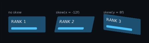
The angles are degrees, with the sign CSS uses: negative x puts the top to the
right. It is built like scale and rotate — the widget is drawn upright into a
picture and the picture is put down on four corners — so text inside is not asked
for an oblique font and layout does not move. A skew and a rotate on the same widget
share one picture. Clicks do not follow it: a slanted widget is hit inside its
upright box, exactly as a turned one is. Two skews on one axis add their slopes, and
an angle of ±90 or beyond throws. On a canvas that cannot put a picture on four
corners (canvas.drawsLayersOnto) the widget is drawn without the slant.
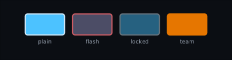
Tint multiplies a whole subtree by a colour. A damage flash, a locked item dimmed, one piece of art in every team's colour — with no shader and no offscreen picture, just the multiply a tinted image already gets:
Hotbar(slots, Modifier.tint(Colour.Red.scaleAlpha(flash)))   // flash runs 1 → 0
Image("sword", Modifier.tint(Colour.Grey))                   // locked
Image("banner", Modifier.tint(team.colour))                  // one banner, four teams
Hotbar is a game widget from composegl-game (import dev.wildware.composegl.game);
see Game widgets.
The colour's alpha is how strong the tint is, not an opacity: at 0 nothing changes,
at 1 the colour applies in full. So a flash is one number animating back to zero. Fade
with alpha, not with this.
Two tints multiply, on one widget or nested, so a team colour on a locked slot is both.
White changes nothing and nothing gets brighter, so a flash towards white wants an
additive overlay instead; turning something truly grey wants colourGrade. What a
raw block draws is not tinted. A canvas says whether it can with canvas.tints; every
backend here can.
Rotate3d is for depth. A card flipping over, a panel swinging in on its hinge, a menu tipping towards the pointer:
Card(Modifier.rotate3d(y = flip * 180f))                                   // turns over
Panel(Modifier.rotate3d(y = -70f * (1f - arrival), origin = Alignment.CentreStart)) // swings in
Menu(Modifier.rotate3d(x = -tilt.y * 8f, y = tilt.x * 8f))                 // leans at the pointer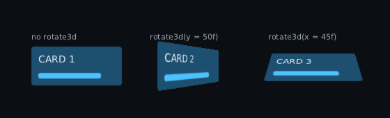
Angles are degrees with CSS's signs: positive y sends the right edge away, positive
x sends the top edge away, positive z turns clockwise like rotate. They are
applied z, then y, then x, about origin, and a camera straight in front of that
point looks at the result. cameraDistance is in 72-pixel inches, as on Android, so
the default 8 puts it 576 pixels away; smaller is more dramatic.
It is built like rotate and skew: the widget is drawn flat into a picture, and the
picture is put down through the camera. The GPU divides by depth for every pixel, so
the picture does not bend along the diagonal. A skew and a rotate on the same
widget share the picture. Past 90 degrees you see the back of the picture, mirrored —
a two-sided card swaps what it composes at the halfway point:
val angle = flip * 180f
Card(Modifier.rotate3d(y = angle)) {
    if (angle < 90f) Front() else Back(Modifier.mirror())  // mirrored again, so it reads
}
Clicks do not follow it: a tilted widget is hit inside its flat box, like a turned one
(hitShape is the escape hatch). Two rotate3ds add angle by angle. On a canvas that
cannot tilt a picture (canvas.tiltsLayers) the widget is drawn without the depth.
Perspective gives a group one camera. On its own each tilted widget has a camera
straight in front of its own middle, so five cards turned the same way are five
identical shapes. Put perspective on their parent and they share one vanishing
point, like cards on a table:
Row(Modifier.perspective(distance = 800f, origin = Alignment.Centre)) {
    cards.forEach { Card(Modifier.rotate3d(y = tilt)) }
}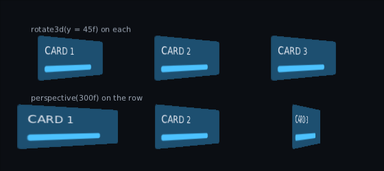
The card left of the camera shows more of its face than the one to the right. The
distance is in pixels, as in CSS's perspective, and origin is where on the parent
the camera sits. Every rotate3d anywhere inside uses it, not only direct children,
and it replaces their own cameraDistance; each card still turns about its own
origin. A nearer perspective wins. A tilted widget flattens what is inside it, so
a tilt inside a tilted card goes back to its own camera, unless that card has a
perspective of its own. The parent itself is not tilted by it, and it costs no
picture.
Scale is for arriving and for fitting. The widget and everything under it are drawn bigger or smaller, about the point you name, without being laid out again:
Panel(Modifier.scale(spring.value)) { … }                  // a panel springing in
Panel(Modifier.scale(min(1f, budget / measured))) { … }     // one squeezed to fit
Panel(Modifier.scale(1.4f, Alignment.TopStart)) { … }       // grown from a corner
Layout does not move, so a panel arriving does not shove its neighbours and a fit
correction does not re-flow what is inside it. Clicks and pad focus do move:
boundsInRoot reports where the widget is drawn, so a button drawn at twice the
size is clickable at twice the size. layoutBoundsInRoot is the rectangle before
any scaling, for the code that wants the slot rather than the pixels. And
paintedInRoot is a third question again — what the subtree actually painted,
scaling folded in, which for text is the glyphs rather than the line box and for a
bare Box used only for layout is nothing at all:
val ink = node.paintedInRoot // null: it drew nothing, or has not been laid outReach for it when something has to frame composed content — a debug overlay, a focus ring that should hug the letters, a screenshot cropper, a containment assertion in a test. Using the node box for any of those over-reports by roughly the leading plus the descent: small enough to look like a rounding bug, big enough to fail a strict check.
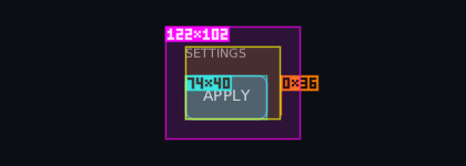
To see all three on a running screen, turn on LayoutOverlay: blue for the laid-out
box, yellow for where a scale draws it, pink for the ink. See
Debugging.
A few things to know. Once the factor has held still for a few frames (ten — a sixth
of a second at 60 frames a second) the widget is drawn straight onto the screen
through one transform, so a panel shrunk to fit costs only a clip at its edge (two
batch breaks), and boxes and borders stay sharp at any size. While the factor is
moving — a panel springing in, a pulse — it is drawn into an offscreen picture each
frame and the picture is grown or shrunk, so its letters slide together instead of
each one snapping to the pixel grid on its own. The letters can sit up to about a
pixel apart between the two, so words shift that much, once, as a scale starts or
stops moving. Text is its ordinary letters grown or shrunk either way, so past about
1.15 the words are visibly soft — a world that wants to be crisp at three times the
size wants to be laid out three times the size, or to sit under a camera (see
PanZoomCanvas). The widget's own rectangle is a clip, so anything a child draws
outside it is cut off while the scale is on — and clicks agree, so what you cannot see
you cannot press. The other direction is not true: the widget is drawn filling the
scaled rectangle, so clip() on the same widget does not hold it in. A viewport
that must not spill wants the clip on the parent and the scale on the child inside
it.
Some scales are always drawn into an offscreen picture: one that is faded or blends in
a mode of its own (alpha or blend on it or on anything above it), so it fades and
glows as one object rather than part through part; one sharing the widget with a
mirror or an effect; one with no width or height; and any scale on a canvas that
cannot transform (canvas.transforms). A picture is taken again every frame. A canvas
can refuse to make the picture, and every backend here refuses one bigger than 4096
screen pixels a side. Then a scale that could be drawn through a transform is, moving
or not, so it keeps its size. Any other is drawn plainly, at its ordinary size, and hit
testing goes back with it. Ask canvas.drawsLayers first if a screen would rather pick
a different animation.
What is inside a still scale does not make it a picture. A glow inside — a blend
on a child, or pushBlend in a drawBehind — adds onto whatever it lands on, exactly
as it does on the same panel unscaled. A scale whose factor is moving still takes a
picture, and so does a rotate at any angle but nought, still or not; a glow looks the
same in one. Light adds colour to a picture and no opacity, so when the picture is laid
over the screen the glow adds onto what is behind it, over the panel's own paint and
over a part that lets the screen through alike. A card landing, a flip ending or a
tilt settling does not change how its glow looks. The one exception is a KorGE texture
such as a KorgeRenderTarget, where light keeps its opacity (see KorGE), so there
the glow still steps between the two looks. An effect inside — a blur, an
outline — takes its own picture as always, and shrinks or grows with the panel:
// A card in a row shrunk to fit: drawn through one transform, no picture of the card.
Box(Modifier.scale(fit, Alignment.TopStart)) {
    Box(Modifier.size(120f, 180f).clip(corner = 12f).background(face)) {
        // Adds onto the card face, as it would unscaled.
        Box(Modifier.size(120f, 40f).blend(BlendMode.Additive).background(shine))
        // A 4-unit blur: 2 pixels across when fit is 0.5. Modifier.blur is in composegl-effects.
        Box(Modifier.size(32f).blur(4f).background(gold))
    }
}
The effect's own picture is taken at the size the widget had in the scale's picture
and shrunk on the way down, so a shader sees the same picture as before whether it
measures its steps in u_size or in the picture's own pixels.
Two scales on one widget multiply, so an arrival animation and a fit correction
compose. A scale of one costs nothing at all. Zero draws nothing and cannot be
clicked or focused, which is what lets a panel arrive from nothing. A negative factor
throws rather than mirroring — flipping is mirror(), below — so hand an anticipate
easing over as scale(t.coerceAtLeast(0f)).
Mirror is for one piece of art facing either way. The same offscreen picture, put down read from the other side, flipped in place about the widget's middle:
Portrait(Modifier.mirror(horizontal = speaker.isOnRight))   // a speaker on either side
Arrow(Modifier.mirror(vertical = pointsDown))               // one arrow, up or down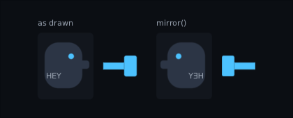
Text inside flips too, and reads backwards — nothing inside knows it is being mirrored. Mirror the art, and put the name label beside it rather than inside it.
Layout does not move. What is inside does, and clicks, pad focus and boundsInRoot
move with it: in a mirrored row the first child is drawn on the right, clicked on the
right, and is where focus goes when the player presses right. A pointer handler
inside gets its own coordinates mirrored too, so a drag to the right on screen is a
drag to the left to it — which is what keeps a mirrored slider under the finger. The
same goes for the arrows and the pad a focused widget claims: pressing right on a
mirrored slider moves its knob right on screen, which is towards its own minimum.
Two mirrors cancel, so a flipped portrait inside a flipped panel faces the way it was
drawn. mirror(horizontal = false) takes no picture, so the flag can come straight
from game state. It shares a picture with a scale on the same widget, and is
flipped first and then turned under a rotate. The rest is scale's bargain: the
capture is a clip, and a canvas that cannot flip a picture (canvas.mirrorsLayers)
draws the widget the right way round and is clicked the right way round.
Shake
Moved to Animation.
Marquee
Moved to Animation.
Your own drawing
Modifier.drawBehind { bounds -> rect(bounds, Colour.rgb(0xE5484D)) }
Modifier.drawInFront { bounds -> border(bounds, Colour.White, 1f) }
The receiver is a UiCanvas
and the argument is the widget's rectangle in screen coordinates.
Turning a picture, and making it glow. Two things the canvas can do that a plain rectangle cannot:
Modifier.drawBehind { bounds ->
    // A sunburst: one picture per ray, each turned about the hub on the left edge.
    pushBlend(BlendMode.Additive)        // light adds; paint covers
    repeat(14) { ray ->
        image(spark, bounds, degrees = ray * 360f / 14f, pivotX = 0f)
    }
    popBlend()
}.drawsOutside()                         // the rays turn out of the box: see below
degrees turns clockwise, because y grows downwards here. destination is the box
before turning, so the pixels can land outside it. The rays batch together — no
draw call per ray. Changing the blend mode is a batch boundary, but only where something
is drawn in the new mode after something drawn in the old one: a push and a pop with
nothing drawn in between cost nothing, so a dozen rays cost the same whether you push
once round the group or once per ray. To find the nodes that do cut a batch on a running
screen, see where the draw calls go.
Both degrade honestly on a backend that cannot do them: the picture is drawn upright
and the glow is drawn as ordinary paint. Ask canvas.rotatesImages and
canvas.supports(BlendMode.Additive) first if you would rather draw something else.
Drawing outside the box. A widget that cannot be seen is not drawn at all, and
nor is anything inside it: the rows of a long page below the fold, a card scrolled out
of its window. Layout works out how far each widget's drawing reaches — its box, grown
by its shadow, borderOutside, an effect's bleed, a turn, a slant or a scale, and by
its children unless it clips — and the draw pass skips one whose reach misses the
screen or a clip it is inside. A still screen keeps what layout worked out, so the
check is four comparisons a widget. The screen counts when the draw pass is handed the
viewport, as UiRenderer does (see Your first screen).
What drawBehind, drawInFront or a widget's own drawing paints is taken to stay
inside the rectangle it is handed. A drawing that reaches past it — a halo, a badge
hanging off a corner, the sunburst above, whose rays turn out of the box — says so:
Box(Modifier.size(40f).drawBehind { box -> circle(box.centre, 60f, halo) }.drawsOutside())drawsOutside() draws that widget, and the ones it sits in, wherever they are. A clip
above it still cuts its drawing off at the clip's edge, as it always did.
Seeing where a widget went
Panel(Modifier.debugBounds())                           // a magenta box round it
Panel(Modifier.debugBounds(Colour.Red, label = true))   // …with its size, 120x40, in the corner
What to write instead of a temporary border you then have to remember to take
off. It draws an outline and a faint wash over the widget and its children, and
changes nothing else: not the size, not the padding, not the clicks — a click goes
straight through it. It is a data class, so a screen that recomposes with the same
box on it stays still.
It paints where it sits in the chain, like a border. First, which is where a
widget's own modifier puts it, boxes the whole widget; after a padding it boxes
what the padding left. A widget laid out with no width shows as a line, which is
often the answer. The label's digits are drawn with rectangles, so they need no
font and look the same on every backend.
For every widget on the screen at once — boxes, padding and the gaps between
children — use LayoutOverlay instead (Debugging).
To point at one widget and read its size, the room it was given and its modifier
chain, wrap the screen in Inspector (Debugging).
To see which parts of the screen are painted over and over — stacked translucent panels,
a scrim over everything — use OverdrawOverlay
(Debugging).
A note on colours. Colour.rgb(0x…) and Colour.argb(0x…) are how you write
one. There are also about a dozen named ones — Colour.Red, Colour.Grey,
Colour.Orange — for a debug box, an example, or a prototype nobody has skinned
yet. They are deliberately plain and deliberately few: your game's actual colours
belong in its skin, where one edit changes every panel at once.
Input
Modifier.clickable { fire() }
Modifier.clickable(enabled = false) { }   // still swallows the click
Modifier.clickable(onDoubleClick = { equip() }, onLongPress = { actions() }) { select() }
Modifier.repeatingClickable { count++ }   // the + on a quantity picker
Modifier.interaction(state)               // hover and press, for drawing
Modifier.draggable { delta -> at += delta } // slop, capture and cancel done for you
Modifier.dragSource(payload = item) { ItemIcon(item) } // inside a DragAndDropHost
Modifier.dropTarget<Item>(accepts = { it.fits(slot) }, onDrop = { move(it, slot) })
Modifier.onActivate { pickUp(); true }    // South or Enter, before the click
Modifier.onPointer(handler)               // raw pointer events
Modifier.watchPointer(watcher)            // the same events, in front of nothing
Modifier.onKeyEvent(handler)
Modifier.onTextEvent(handler)
Modifier.hitShape { it.x >= 20f }         // which points inside the box are really yours
Modifier.pointerHoverIcon(PointerIcon.Hand) // the mouse cursor's shape over it
A note on watchPointer. A full-screen layer with onPointer on it is the topmost
thing the pointer finds, so everything under it stops being hovered — even when the
handler consumes nothing. That is right for a scrim over a dialogue and wrong for a
layer that only wants to know where the mouse is: an item card hanging beside the
cursor, a cursor a game draws itself. watchPointer is the other half of the pair. The
node is found and told exactly what a handler would be told, but it is never hovered,
never pressed and cannot consume, so the bag slot underneath lights up as if the layer
were not there. Capture does not apply either: a press the slot takes, the moves while
it is dragging and the release that ends it are all still reported, and so is the Exit
when the mouse leaves the window.
A note on hitShape. Hit testing is rectangles, because nearly everything is a
rectangle and rectangles are cheap. A round button, a diamond or a honeycomb cell is
not, and its rectangle overlaps its neighbours' — so the empty corner of one sits over
the middle of another and the click goes to whichever was drawn later. hitShape is
how a widget says those corners are not its own; saying no lets the click carry on to
whatever is underneath.
The question is asked in the widget's own coordinates, the ones onPointer delivers,
with any scale already divided back out — so the shape is written once against the
widget's own width and height and keeps working while it grows. Unlike clip it gates
that one widget and says nothing about its children: it does not change what is drawn,
so it must not change what is reachable. A child that wants the same shape asks for it
itself. Two on one widget is a choice rather than a quantity, so the later one wins.
Focus
Modifier.focusable()
Modifier.focusRequester(requester)        // send focus straight here
Modifier.focusOrder(down = inventoryTab)  // override the geometry
Modifier.focusTrap()                      // a dialogue keeps focus inside itself
Modifier.onFocusWithin { inside -> … }
Modifier.onReveal { child -> scrollTo(child) }
Focus has its own page: Input.
Testing
Modifier.testTag("play") // host.root.find("play") from a testChanges nothing about how the node looks or behaves. See Testing.
Being told where it ended up
Modifier.onPlaced { node -> anchor = node.boundsInRoot }   // it moved on screen
Modifier.onSizeChanged { size -> emitter.resize(size) }    // it got bigger or smaller
A popup under a button, a particle emitter the size of a panel, a tutorial arrow pointing at something: all of them need to know where a widget is, and none of them should ask every frame.
Both are called after layout has finished, so every rectangle in the tree is this
frame's, parents first. Both are called only when the answer changed — the first
layout counts — so a still screen calls nothing. onPlaced is about where the
widget is drawn: a parent moving it or scaling it counts, even though the widget
itself did not change. onSizeChanged is only its size, so moving is not resizing.
onPlaced hands you the node rather than a rectangle, because you usually want one
of three: boundsInRoot for the pixels, layoutBoundsInRoot for the slot, or
paintedInRoot for the ink. Keep what you asked it, or keep the node and ask it
again later.
State written in either lands on the next frame, the same as in Compose. A copy kept in a plain field works too, even one your own layout reads while it measures: after a handler is told anything, the next layout pass measures every node, so that layout catches up. That costs a whole pass each time the handler hears something. A handler that only writes state, or keeps what it hears for input or drawing, can say no layout reads it, and the passes after it measure only what changed:
val follow = remember {
    object : PlacedHandler {
        override val readByLayout get() = false            // nothing measures from this
        override fun onPlaced(node: UiNode) { spark.moveTo(node.boundsInRoot.centre) }
    }
}
Box(Modifier.onPlaced(follow)) { … }
SizeChangedHandler has the same readByLayout. It matters most on rows of a
long list: every row that scrolls into view is a handler hearing something new.
The library's own handlers — tooltips, tree rows, inventory slots, drag and drop —
already say it.
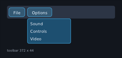
Rule 2 below applies: remember the handler on a widget that recomposes often.
The decoration ones, on the same box:
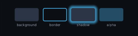
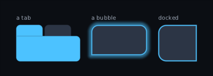
One radius, or one per corner. background (a colour or a gradient), border and shadow take a single
corner, or a Corners with a radius for each — clockwise from the top-left, like
CSS. That is how a tab rounds only along its top, a speech bubble keeps one sharp
corner, and a panel docked to the edge of the screen stays square against it:
val speech = Corners(topLeft = 14f, topRight = 14f, bottomRight = 14f, bottomLeft = 0f)

Modifier.background(Accent, Corners.top(8f))                       // a tab
Modifier.shadow(Glow, spread = 10f, corners = speech)
    .background(Steel, speech)
    .border(Accent, width = 2f, corners = speech)                  // a bubble
Modifier.background(Steel, Corners.left(16f))                      // docked to the right edge
Give the border and the shadow the same Corners as the background, or they show
at the corner that differs. Corners.top, bottom, left and right round two;
Corners.all(r) is exactly corner = r. A backend that cannot round corners one by
one draws every corner at the smallest of the four and says so through
canvas.roundsCornersSeparately; every backend here can. clip(corners) rounds
a clip the same way, through clipShape (see Clipping to a shape above).
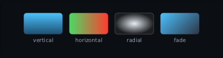
Gradients: a Brush in place of a colour.
Brush.vertical(top, bottom)
Brush.horizontal(left, right)
Brush.linear(start, end, degrees = 45f)      // clockwise from pointing right
Brush.radial(centre, edge)                   // an ellipse that fits the box
Two colours each. The gradient runs edge to edge across the node, whatever its size, and
a corner cuts it like any other fill — Modifier.background(brush, Corners.top(8f)) gives
each corner its own radius. Fading to Colour.Transparent keeps the colour
rather than darkening on the way. A backend without gradients draws the first colour
flat; canvas.drawsGradients says which you have.
More than two colours. Brush.Ramp runs through as many as you like:
Brush.evenly(listOf(gold, amber, bronze))                 // spaced out, top to bottom
Brush.evenly(listOf(gold, amber, bronze), degrees = 45f)
Brush.ramp(Brush.Stop(0f, white), Brush.Stop(0.2f, sky), Brush.Stop(1f, navy), degrees = 90f)
Brush.radialRamp(Brush.Stop(0f, clear), Brush.Stop(0.6f, clear), Brush.Stop(1f, black))
evenly spaces the colours out — three colours put the middle one halfway. ramp
puts each colour where you say, as a fraction of the run from 0 at the start to 1 at
the end, and radialRamp runs outwards from the middle instead. The ends are held:
anything before the first stop is the first colour, anything after the last is the
last. A run is drawn from the same atlas as a flat colour, but through the renderer's
heavier program — see What they cost below.
Borders can be one-sided, dashed or dotted. BorderSide(width, colour, style) is
one edge, and Modifier.border(left =, top =, right =, bottom =) takes any of the four;
a side left out is not drawn. The edges meet in square corners, top and bottom running
the full width. A rounded outline is the all-sides border, where one line follows the
curve.
BorderStyle.Dashed(on, off) stretches its lengths a touch so a whole number of dashes
fits, which is why an edge always starts and ends on a dash. BorderStyle.Dotted is
square dots as long as the line is thick, the same distance apart. Both are drawn as
plain rectangles and flat shapes, so every backend gets them without doing anything.
However thick the line, a rounded box's outside corners stay round, as a solid border's do. Round a curve each dash runs from the box's own rounded edge inwards. A line at least twice as thick as every corner is round has no curve left along its middle, so it is four straight edges, and the dashes that reach a corner are cut to its curve. Where it is that thick against only some corners, it turns square at those, and the outside of the turn is cut the same way. All of it is plain shapes, so the corners stay round on every canvas, fading or not:
// 40 thick on corners of 20: the corner dashes are cut round, never square.
Box(Modifier.size(60f, 60f).border(accent, width = 40f, corner = 20f, style = BorderStyle.Dashed(on = 6f, off = 4f)))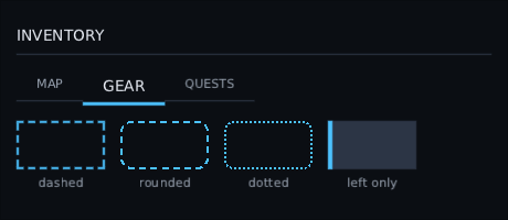
A line as thick as its box is short, or thicker, fills the box the way a solid one does, still broken: the box is dashed along its longer side, and dots are as big as the box is thin. Rounded corners stay round here too, the dashes that reach them cut to the curve.
// 4 wide on a box only 3 tall: a 3-tall strip of dashes, never a crash.
Box(Modifier.size(120f, 3f).border(accent, width = 4f, style = BorderStyle.Dashed(on = 6f, off = 4f)))
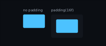
And what padding does to what is inside it:
Four modifiers that turn a flat box into a moulded one. They are meant to be used together, and each one is a thin layer painted over what came before it:
Modifier
    .background(Brush.evenly(listOf(leafLight, leaf, leafDark)), corner = 12f)
    .bevel(depth = 6f, corner = 12f)
    .gloss(fraction = 0.45f, corner = 12f, inset = 3f)
    .borderOutside(almostBlack, width = 3f, corner = 12f)
    .padding(horizontal = 24f, vertical = 12f)
borderOutside draws outside the box. A border is drawn inside the node's
bounds, so a 3px dark line eats 3px off the fill it frames. borderOutside sits
outside it instead and the node keeps every pixel it was given — so leave room for
it, or it paints over its neighbours. A click still only counts inside the node, as
it does with a shadow.
innerShade is shade falling inwards from the edge. depth is how far in it
reaches, and offset is which way it gathers: an offset downwards gathers the shade
along the top inside edge, as though the light came from below. With no offset it
rings the whole edge, which is what a socket looks like.
Modifier.background(steel, corner = 12f)
    .innerShade(black.scaleAlpha(0.35f), depth = 6f, corner = 12f, offset = Offset(0f, -4f))
bevel is two of those, written once: light along the top inside edge, dark
along the bottom, lit from above, which is where light comes from in nearly every
interface. The defaults are Colour.White.scaleAlpha(0.35f) and
Colour.Black.scaleAlpha(0.35f); pass light and dark when the button's own
colour wants something warmer.
gloss is the shine across the top. It covers the top fraction of the node,
0.45 by default, and fades downwards — rounded by the top corners and square along
the bottom, where it has faded out anyway. inset pulls it in from the sides, which
is what makes it read as a reflection rather than a stripe.
All four take a single corner or a Corners with a radius per corner. Give them
the same corners as the background or they show at the corner that differs; gloss
uses only the top two.
They paint in the order they are written (Rule 1 below). Background, then the
shades, then the shine, then the outline. A gloss written before the background is
painted underneath it and never seen.
Written one at a time, those four are four chances to disagree — a shine from the top
over a bevel lit from the left reads as a mistake before anybody can say why.
Modifier.moulded takes the direction the light falls and works the rest out:
Modifier.background(face, corner = 26f)
    .moulded(corner = 26f, outline = almostBlack, shadow = 0.12f)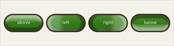
One button, one modifier, four angles. light is degrees clockwise from pointing
right, so 90 is from above, which is where interfaces are lit from. The edge facing the
light is lifted, the far edge is shaded, the shine lies along the lit side and the
shadow falls away from it.
depth, shine, shadow and outlineWidth are fractions of the box's shorter side,
so the same call dresses a 200-wide button and a 24-wide checkbox. strength is how
hard the light is; at 0f nothing is drawn but the outline.
moulded stacks bands and keeps them agreeing. Modifier.relief does the thing itself:
the edge is given a height, the renderer works out which way the surface faces at every
pixel — a normal map, made from the shape rather than loaded from a file — and shines one
light on it.
Modifier.background(face, corner = 30f).relief(corner = 30f, shape = Relief.Chamfer)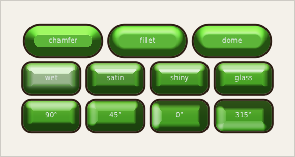
The Relief is what the edge does, in a joiner's words: a chamfer is a flat cut with
a crease along the top of it, a fillet is rolled over, and a dome keeps curving
across the whole face. depth is how far the climb reaches in, as a fraction of the
shorter side — a dome wants about 0.5f, an edge about 0.2f.
light and elevation place the light: degrees clockwise from pointing right, and
degrees above the surface. gloss is how bright the shine is, and polish is how tight
it is — the middle row above is one shape at four polishes. Low spreads the shine across
the whole lit side, which reads as wet plastic; high draws it to a point, which reads as
glass. Drawn game art is usually low, around 0.2f to 0.5f.
The corners are the part worth looking at. They are lit by how far they have actually turned away from the light, which is what no stack of bands gets right, and it is why a lit box reads as a shape rather than as a box with a stripe on it.
Give it the face colour. With face, the light is put on that colour rather than over
it, and that is the difference between a painted button and a plastic one: a highlight is
the same green made brighter, not green with white on top. Over somebody else's fill all
a light can add is white, and white takes the colour out of the bright parts.
// The button, in one modifier. No background underneath it.
Modifier.relief(corner = 30f, face = leaf, gloss = 0.5f, polish = 0.45f)
Left out, it lies over whatever fill is underneath — useful over a gradient or a picture, at the cost of that washing. Either way nothing is sampled: the normal is worked out from the same distance field that rounds the corners.
hardness says what kind of edge the light makes. At 0f the shade fades the
whole way in: a fillet, a moulded plastic button. Near 1f it holds its strength and
then drops: a chamfer, a cut edge with a line you can see. Drawn game art is usually a
chamfer, so a sheet like the one below wants hardness up around 0.8f.
faceRun lights a run of colours instead of one. This is the difference between a
painted button and a moulded one, and it took a while to see. Drawn art almost always
grades the body — light at the top, deep at the bottom — and that grade is a change of
colour, not a change of brightness: the light end is a warmer, yellower green than the
dark end. No light can invent a colour that is not in what it is lighting, so one flat
colour lit will always read as plastic beside real art.
Modifier.relief(
    corner = 24f,
    faceRun = Brush.ramp(brightGreen to 0.18f, midGreen to 0.5f, deepGreen to 0.8f),
    gloss = 0.3f, polish = 0.6f,
)
The run goes the way the light falls, so turning the light turns the body grade with it. A face is a colour or a run, and where the atlas is full it falls back to the colour — the same fallback a many-stop gradient already has.
Here is that art sheet's own row of buttons, drawn with nothing but three colours off each one and this modifier — two lines a button:
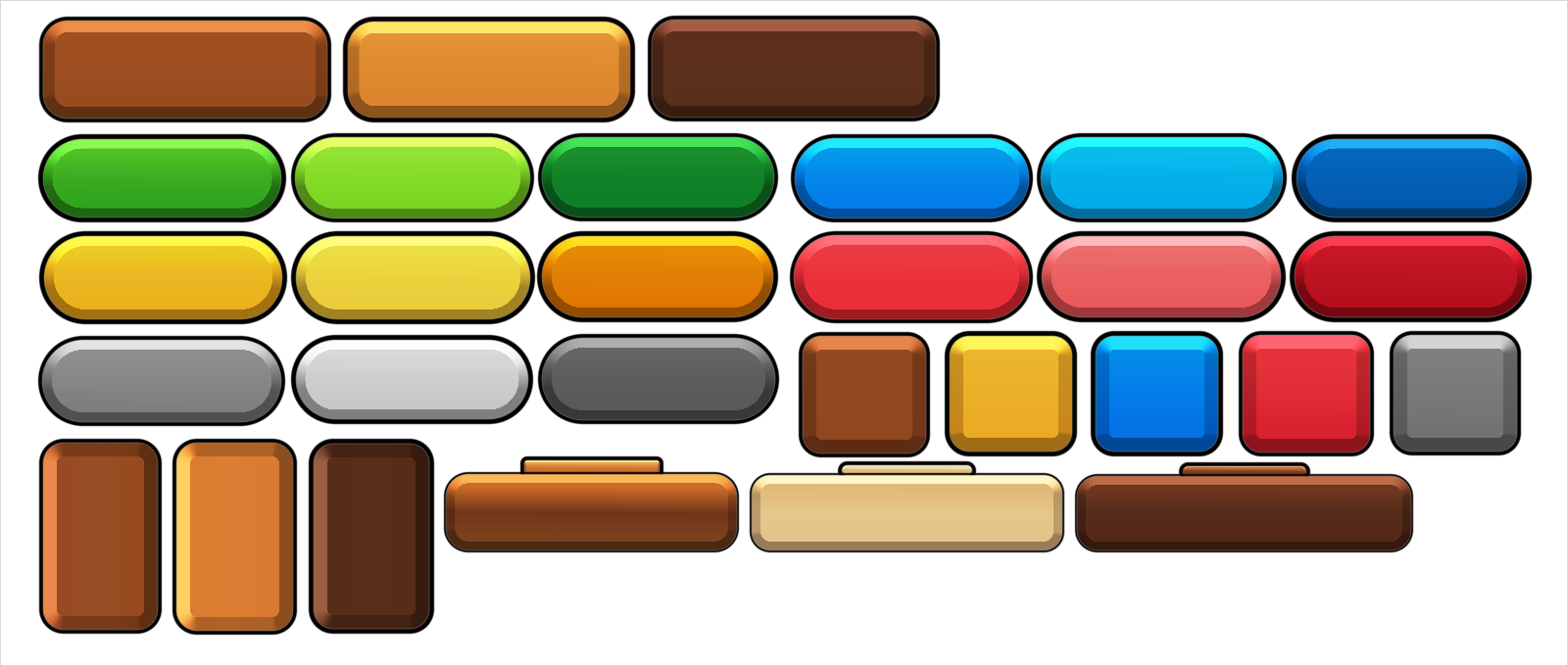
Those are lit by relief — a chamfered edge, one light, and a fairly wet polish — over
three colours taken off each original. Down the middle of three of them, the typical
pixel is out by 2 of 255. The measured version above gets closer still, because it
carries fourteen stops a piece and a measured band for the shine. Three colours gets the
family; a measurement gets the twin.
material lays a picture across the face, multiplied into face and lit exactly as a
colour is. So one grey grain makes oak, walnut or mahogany depending only on what tints
it:
Modifier.relief(corner = 20f, face = oak, material = woodGrain, gloss = 0.25f)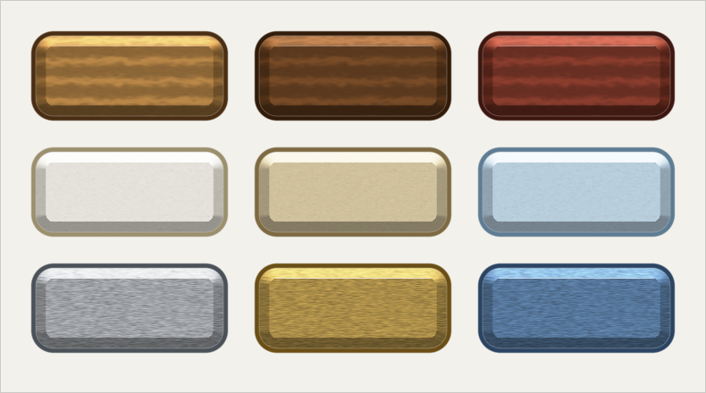
Three grains, three tints each, one modifier. The rows differ only in how they take a light: wood and paper want the shine turned right down, and brushed metal wants it tight, because that is what a scratched surface does to a highlight.
tiles is how many times the grain is laid across the face; 1f stretches it to fit.
A material takes the one texture a lit quad has, so a face is a material or a run of
colours, never both, and a material has to be a texture of its own rather than a region
of an atlas — tiling a region samples whatever was packed beside it at every repeat. A
picture from canvas.layer is not one either: it is refused.
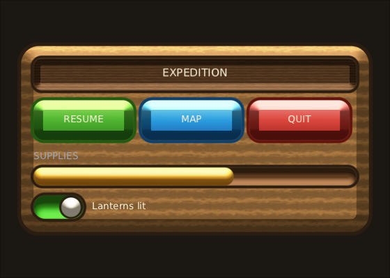
A piece at a time proves the modifier; a panel is where a light has to agree across eight things at once. Everything here is a box with an edge and a light on it — the plank, the name plate cut into it, the three buttons, the groove the supply bar runs in, the bar itself, the switch and its knob. The only picture on it is one grey wood grain, tinted two browns.
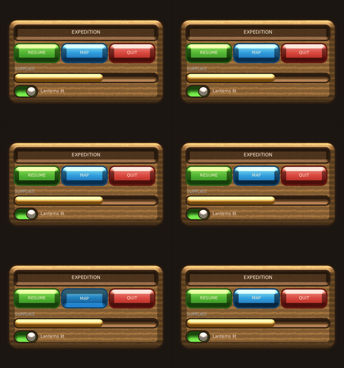
Turning the light over is a press. A pressed button is lit from underneath, and that one number takes every edge with it: the top edge that was catching the light goes into shadow, the bottom edge lights up, the graded face runs the other way, and the shine goes out because the face is no longer pointed at the light. The corners follow, which is the part a stack of bands never manages.
val interaction = remember { InteractionState() }
val down = interaction.isPressed

Box(
    Modifier
        .size(144f, 58f)
        .interaction(interaction)
        .clickable { resume() }
        .relief(
            corner = 16f,
            depth = 0.24f,
            light = if (down) 270f else 90f,   // from below while it is held
            gloss = if (down) 0.06f else 0.4f, // and the shine goes out
            faceRun = if (down) deepToBright else brightToDeep,
        )
        .borderOutside(line, width = 4f, corner = 16f),
    contentAlignment = Alignment.Centre,
) {
    Text("RESUME", Modifier.offset(y = if (down) 2f else 0f), style = "label")
}
Hovering turns the light up rather than changing a colour: the same surface catching more of the same light, which is what a mouse resting on a real one would do.
What they cost. A lit surface, an inner shade and a gradient of more than two
colours are the heaviest things the renderer draws, so they go through a program of
their own. Everything else goes through a lighter one that a phone's GPU runs much
faster: a letter in half the time on a mid-range Mali. Each switch between the two is
a draw call. A moulded button is three: the fill, both shades together, then the
outline. A multi-stop gradient is baked into a 64-pixel strip of the same atlas a flat
colour comes from, so it costs no texture switch, only the program one. Lit buttons in
a row share one heavy draw only when nothing else is drawn between them. The frame
budget overlay names these calls program — see Debugging.
How far this goes. The picture below is a bought art sheet of casual-game interface pieces, drawn again with these modifiers and no art at all — no texture, no nine-patch, no atlas. Every capsule, wooden bar, plate, progress bar, checkbox and switch on it is a box with a fill, some shade and an outline.
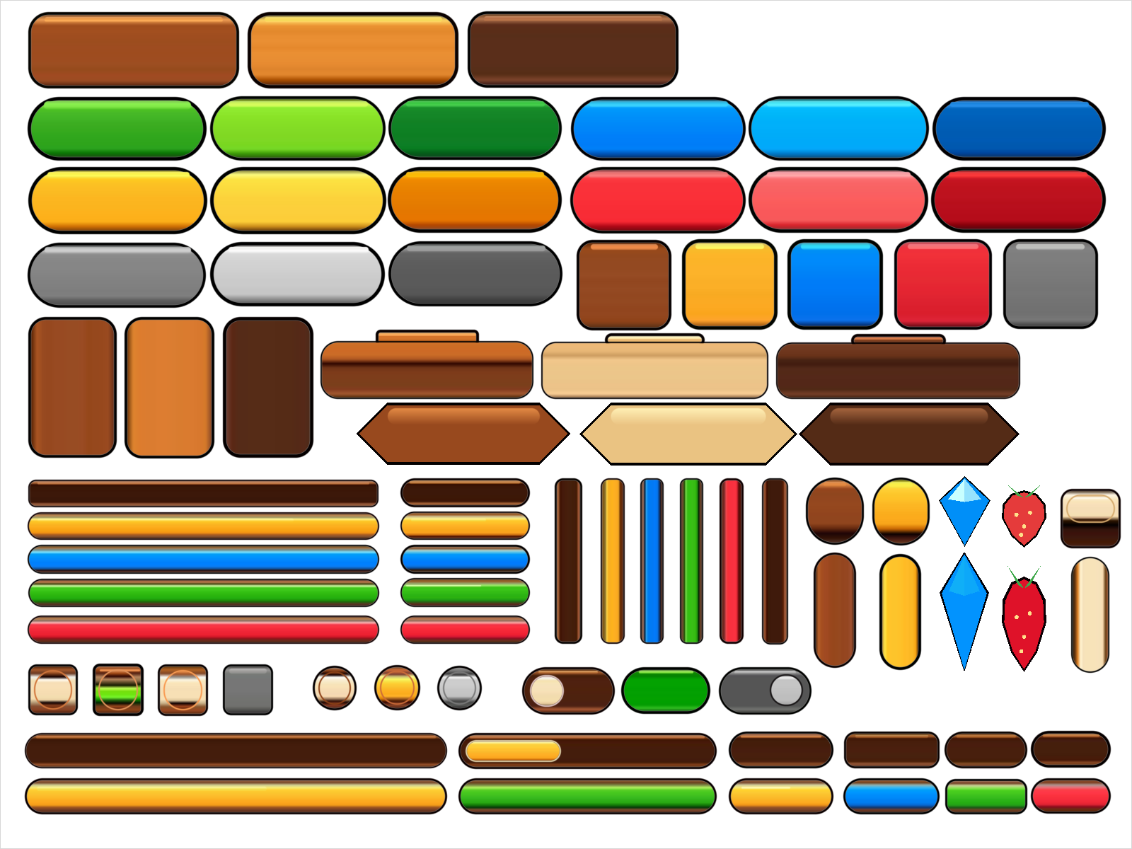
Every number in it was read out of the original sheet's pixels rather than typed by
eye: where each piece sits, how big it is, how round its corners are, how thick its
line is, and the colours down the middle of it. Each piece is then a background with
a Brush.Ramp of fourteen stops and a borderOutside, and the bright band across the
top is a second rounded box over it.
Three shapes on the page are not rounded boxes and are drawn onto the canvas instead: the banner with pointed ends, the cut gem and the berry, each a polygon with a larger dark one under it for its outline. Over the sheet's own pixels, half of what is drawn lands within 6 levels of 255 of the original, and two thirds within 24.
Modifier.padding(8f).background(blue)   // blue is painted inside the padding
Modifier.background(blue).padding(8f)   // blue is painted across the whole widget
Both are useful and the difference is on the screen, which is why the chain stays in order rather than being collected into a bag of properties.
The same applies to two backgrounds, a background and a border, or a nine-patch and padding — each one paints where it sits in the chain.
A node's modifier is compared on every recomposition to decide whether anything changed. Every element is a data class, so the chain compares by value, and a screen that has not changed costs nothing.
The one thing that defeats that is a lambda written inline:
Modifier.drawBehind { … } // ❌ a new object every recompositionSame trap as Compose, same fix:
val glow = remember { drawGlow() }
Modifier.drawBehind(glow)        // ✅ compares equal
It only matters on a widget that recomposes often. clickable { } on a menu
button is fine.
Box(Modifier.styled(style)) { … }One call, because the three parts have to happen in order: the background paints across the widget, the padding keeps its contents off the edge, and the content offset moves those contents without moving the background — which is how a pressed button's label shifts down a pixel while its frame stays put.
A widget that writes styled(style) and then draws its text in style.textColour
contains no colour, no corner radius and no texture name of its own. That is what
makes one skin file change the look of a whole game. See Skins.
A modifier is an element plus an extension function:
data class GlowElement(val amount: Float) : Modifier.Element

fun Modifier.glow(amount: Float) = then(GlowElement(amount))
A data class, so the chain still compares by value. Then read it wherever it is
meant to act — a measure policy, a draw pass, your own widget. The built-in ones
are read by ResolvedModifier, which folds the chain once per node per frame.