Hand Lettering - saraoswald/lettering-tutorials GitHub Wiki
Outline:
Hand Lettering Technique
When I hand-letter SFX for manga, I basically use the same technique every time, whether I'm using Photoshop or CSP.
For this example, I'm going to show how I'd subtitle this sound effect with the translation "GAAAH" in Photoshop:
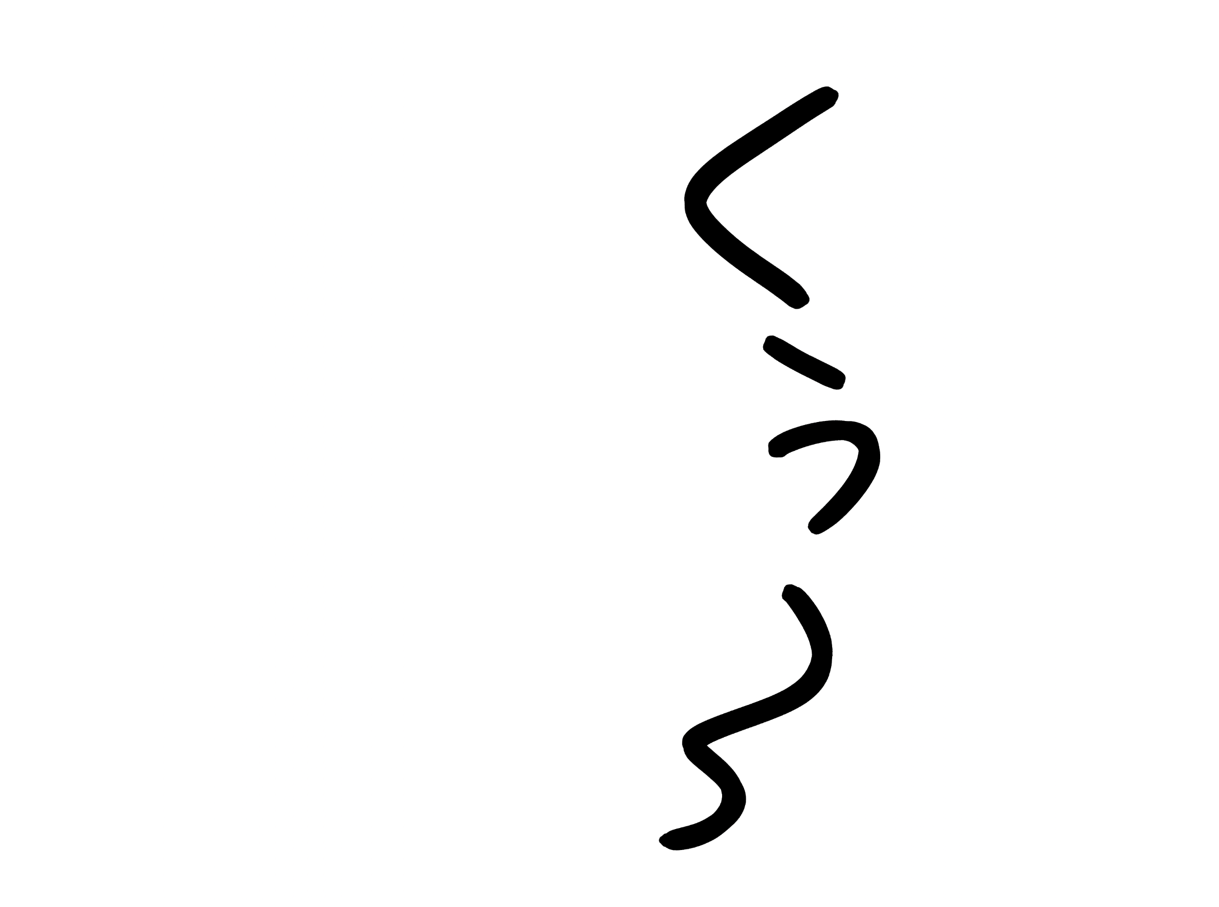
- Create a reference layer, with the opacity set to 50%. Choose a brush you're comfortable using. For this example, I'm using my "Hard Elliptical" brush.
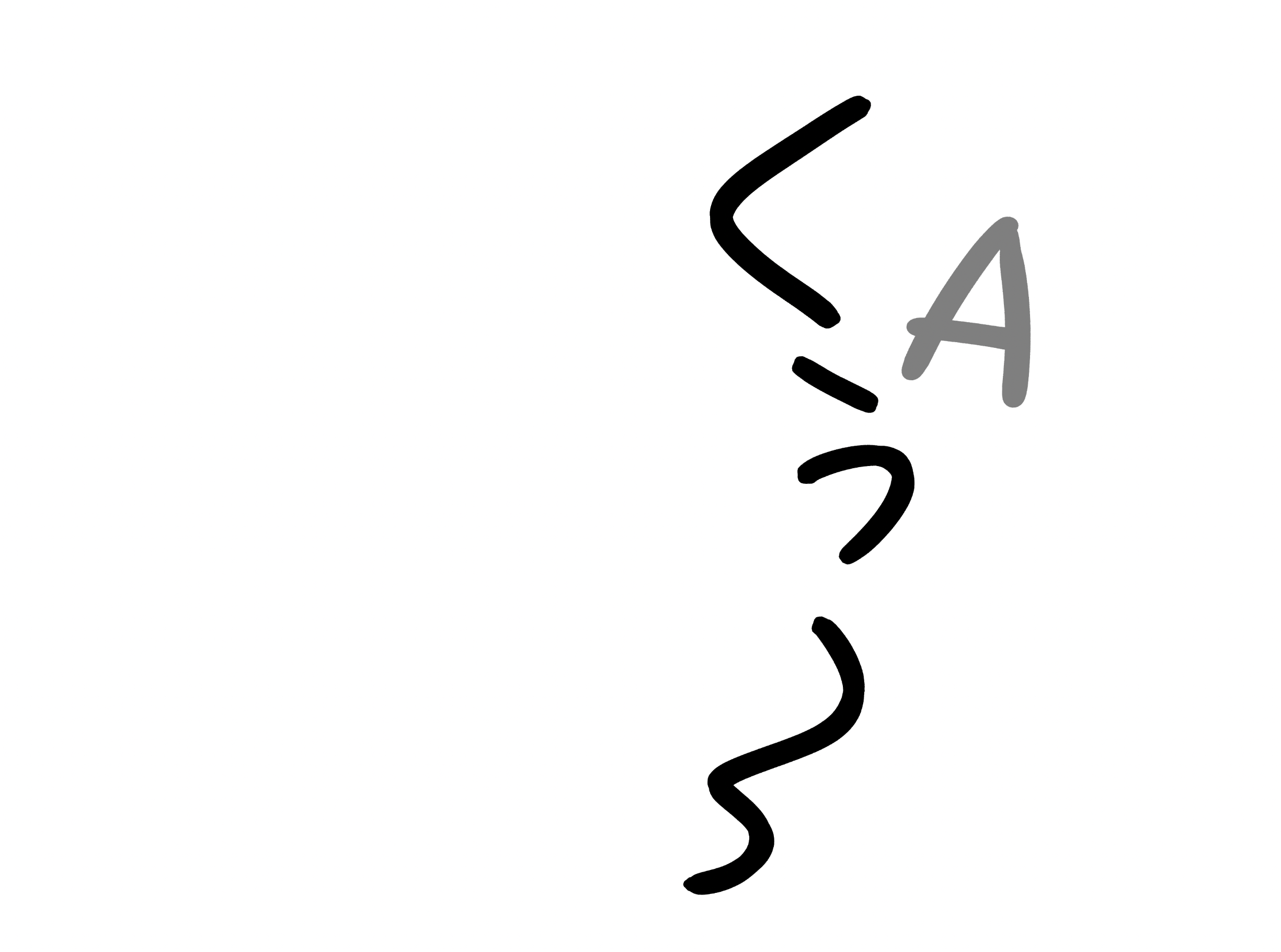
- Draw your biggest letter. For this SFX, I want the second letter "A" to be read the loudest, so I want it to be the biggest:
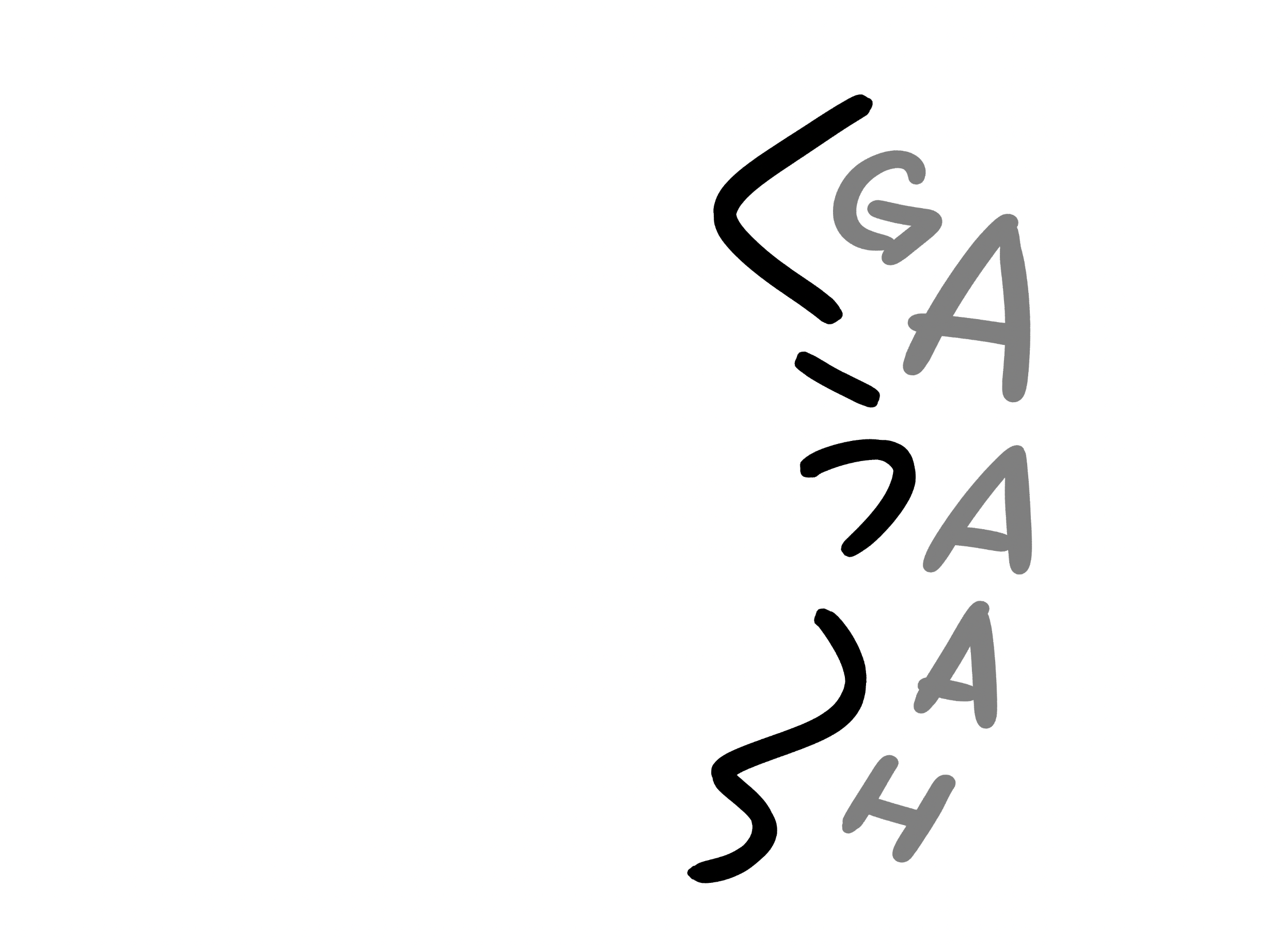
- Draw the rest of your letters. Don't be too precious about it.
- Adjust your reference layer with Free Transform (
Edit > Free TransformorCMD + T) until you're 100% happy with the placement. It's much easier to adjust the placement in this stage than when you're drawing your final lines, so repeat steps 1 - 4 as many times as needed.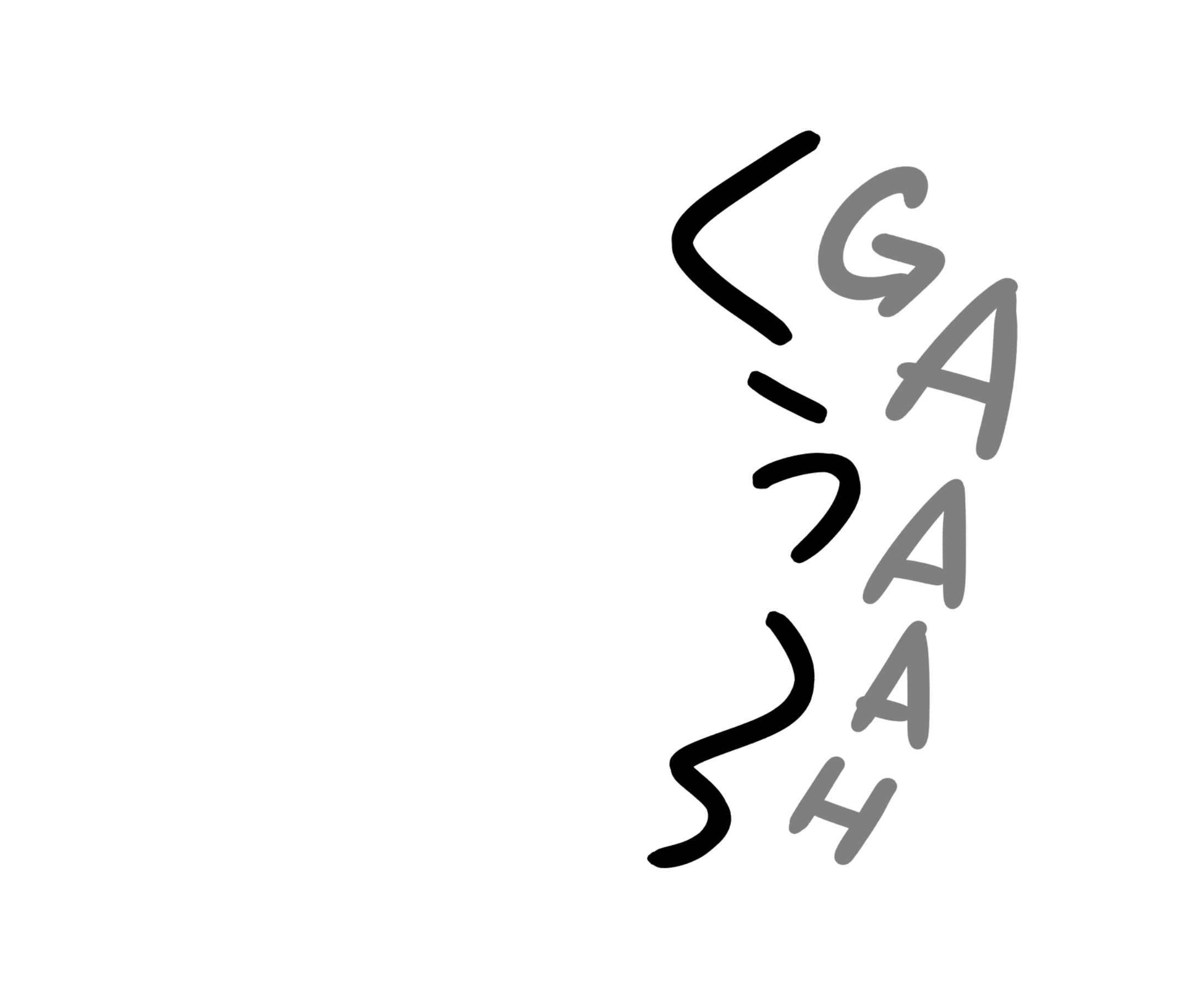
- On a new layer, play around with brushes until you find the brush that matches the source SFX the best. I like to just draw a couple lines next to the source, mimicking the shape of the artist's lines.
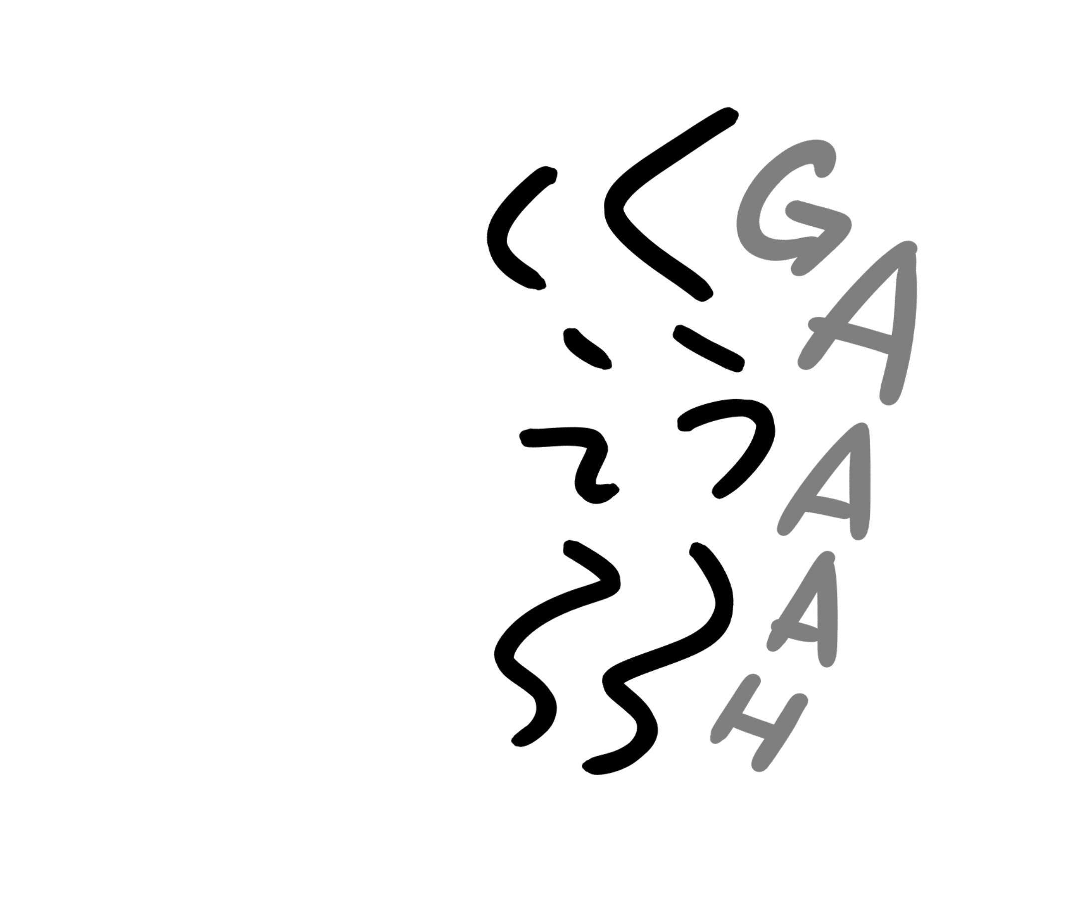
- Clear out your layer from step 5 or create a new one. Draw your final SFX over the reference. You can see I chose to change the shape of the A's at the last minute, because it matched the source better:
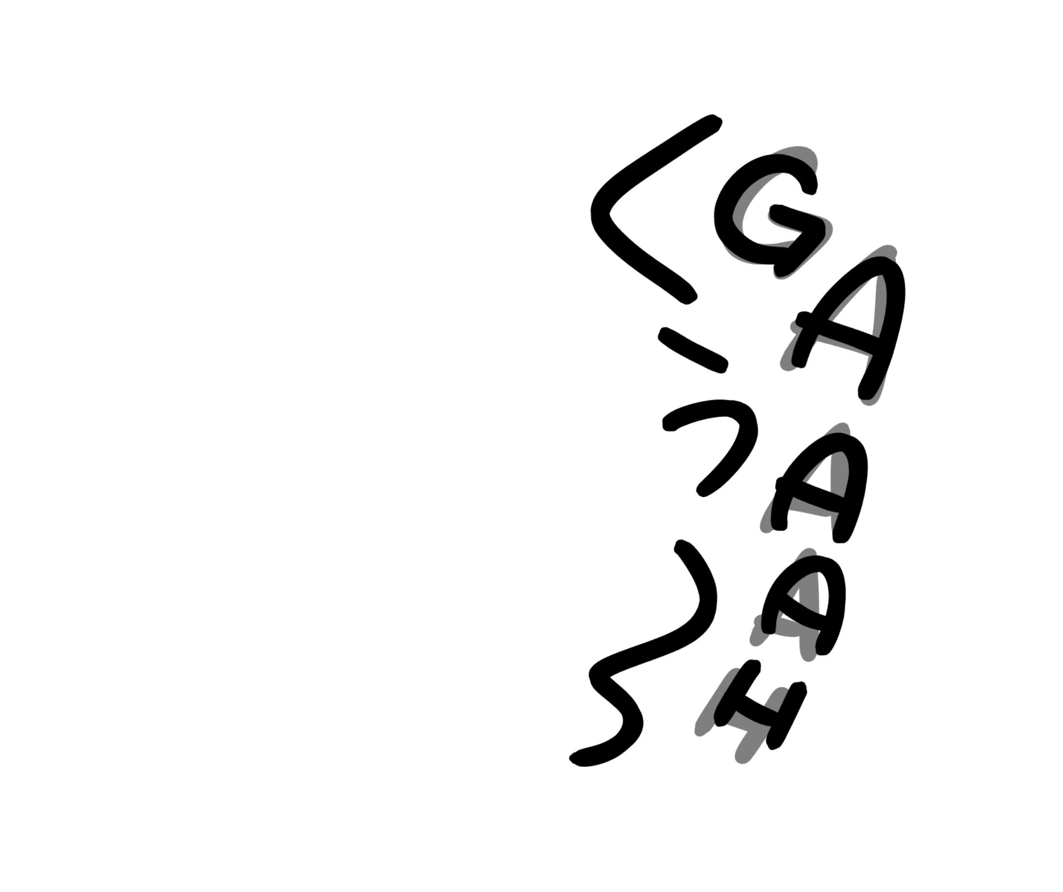
- Turn off or delete your reference layer, and you're done.
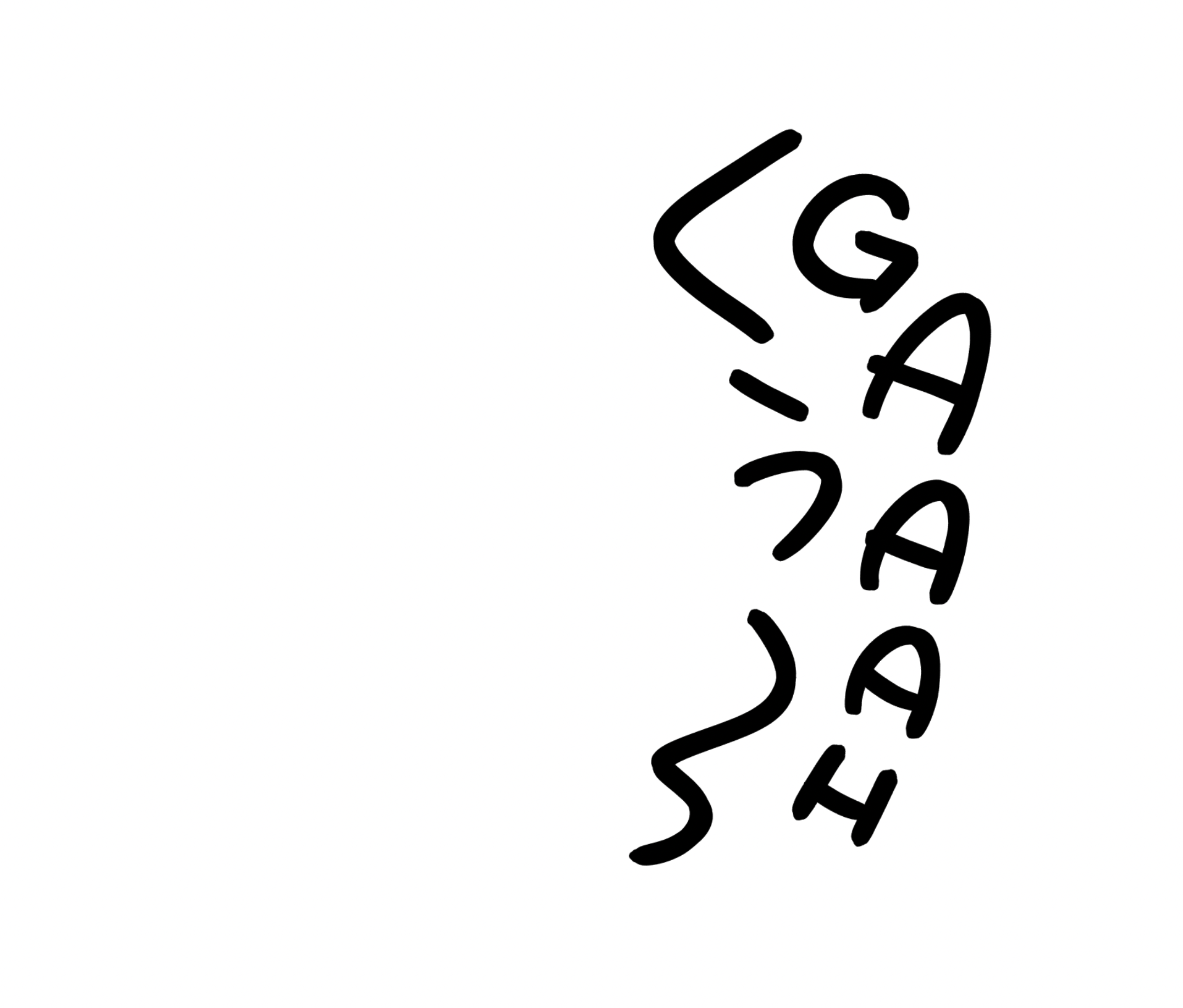
Some notes about this technique:
- Use fonts for your reference layer! Using fonts for reference is totally acceptable, and it's a great alternative if you're new to hand-lettering.
- You can re-use your reference layer as many times as you want. For example, if you have 5 "CHATTER"s on one page, you can re-use the reference layer you made, and just draw your final SFX over it. They'll all look similar but unique.
- Try to keep your brush size the same size as (or slightly smaller than) the brush used in the source SFX, even if the total size of your SFX is smaller. This isn't a hard rule, but it can make your SFX blend in better when zoomed out.
- If you're fully replacing the SFX, just make sure to whitewash the source before drawing your reference layer. See more of this technique here.
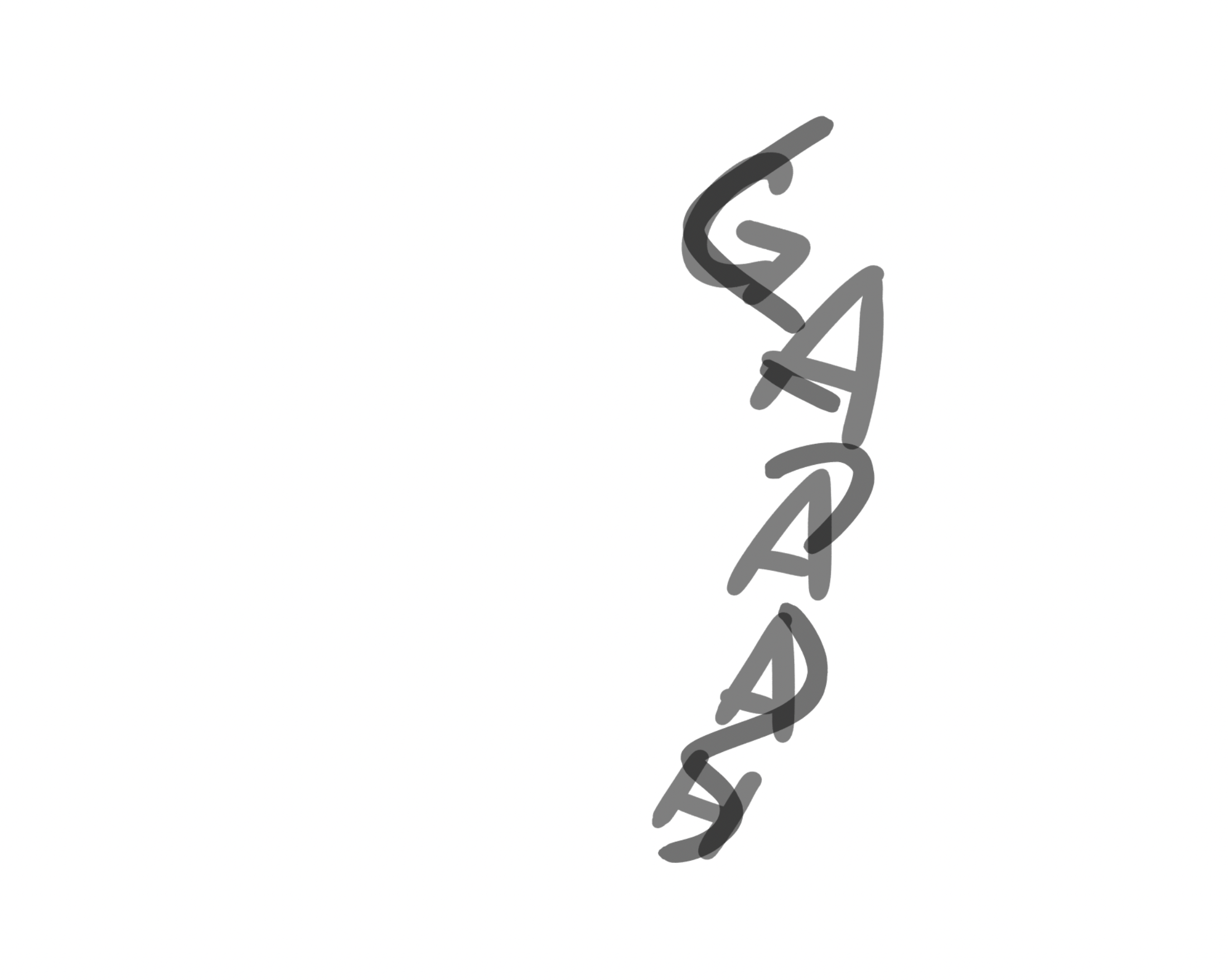
Sharp SFX
One tricky SFX shape that shows up a lot in manga are spikey/sharp sound effects. They actually come up so often that I made a font for them. If you decide to letter this kind of sound effect by hand, here's how I do it.
- Using whatever pen you feel most comfortable drawing with, draw the basic letter forms of the sound effect. Transform this layer until it fits the available space on the page.
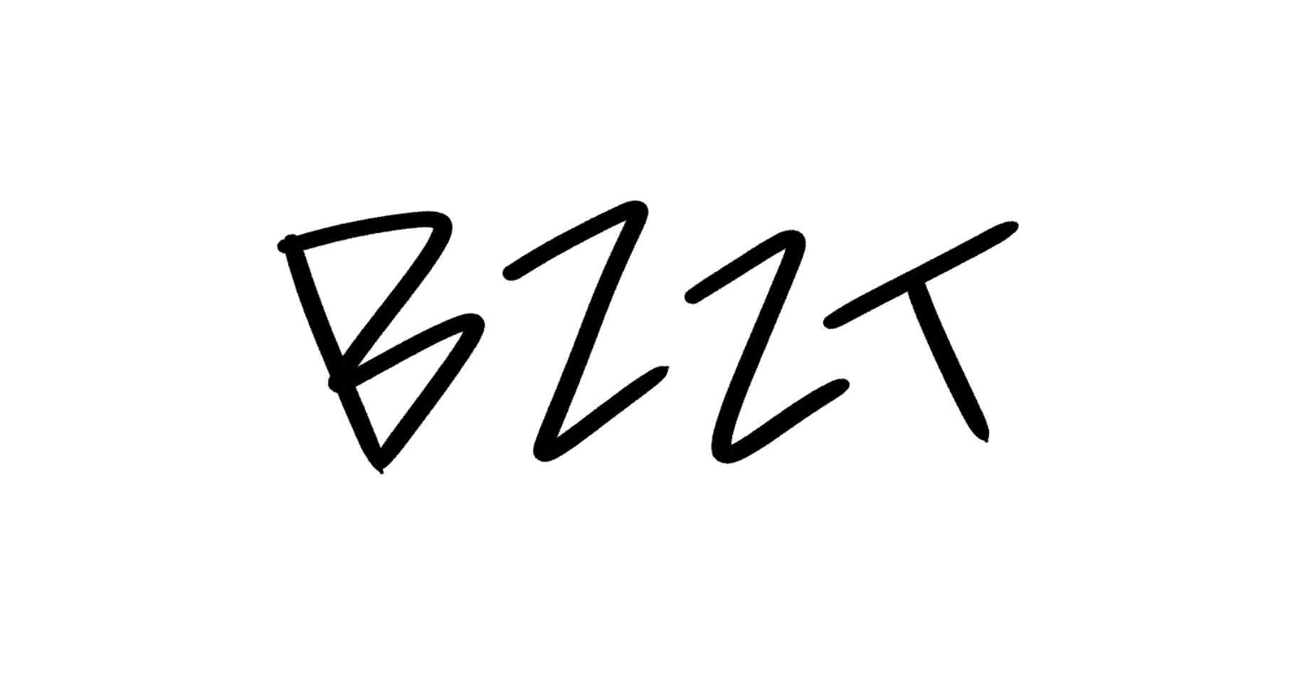
- Apply 50% opacity to the layer from Step 1. Create a new layer. Using the same brush from before, draw triangles along the edges of the letters
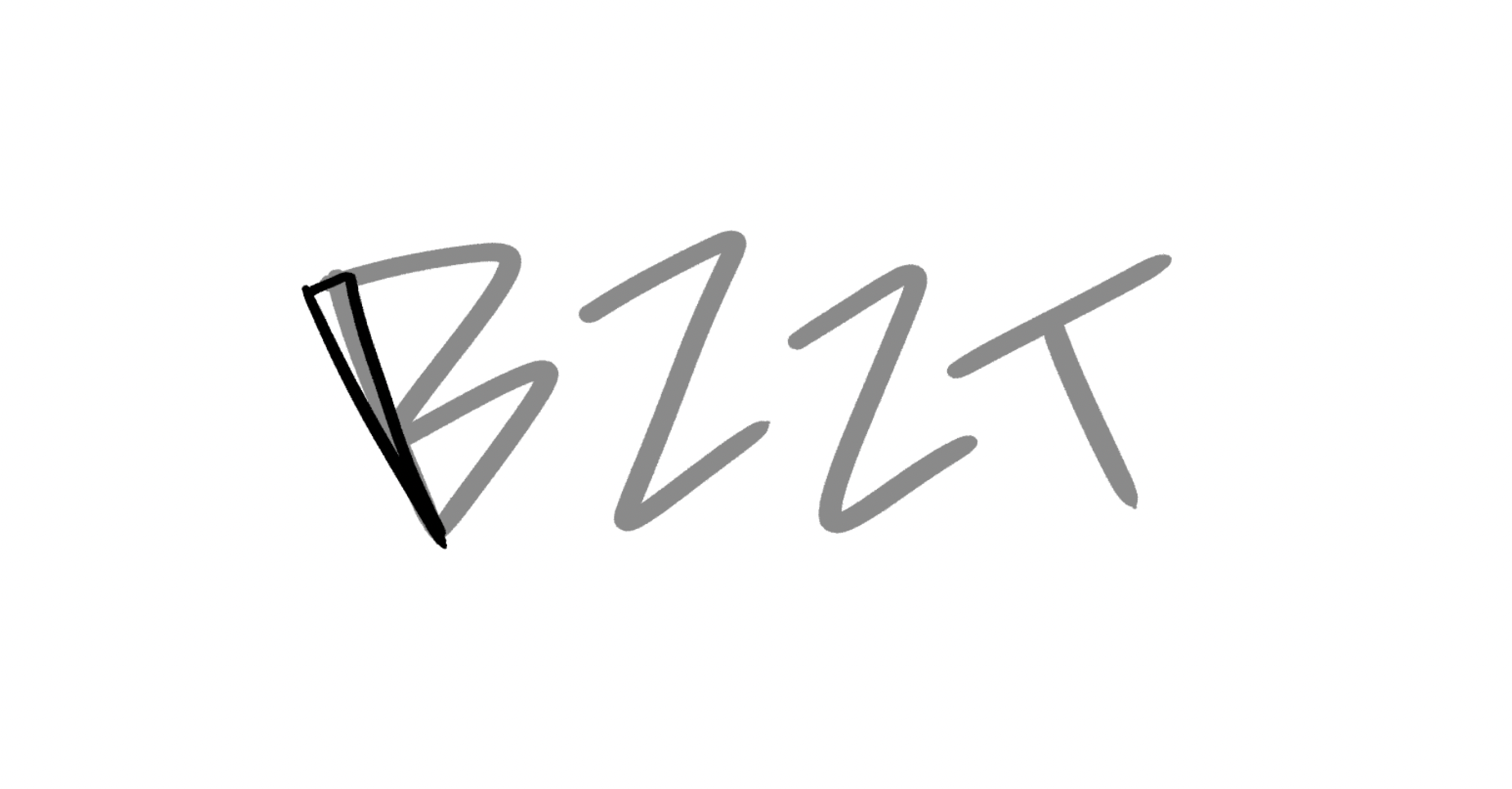
- You want all of the triangles to have about the same width. This will appear as the width of your final sound effect.
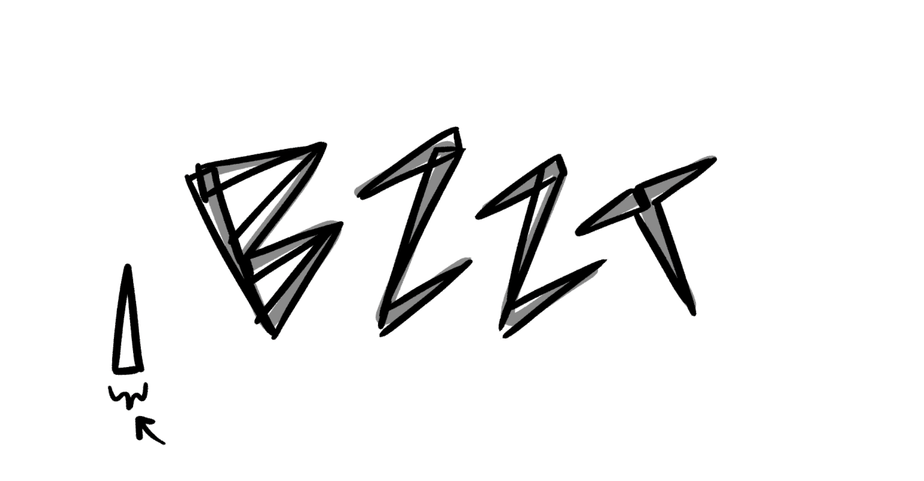
- Hide or delete the layer from step 1. Apply 50% opacity to the layer from Step 2-3. Create a new layer. This will be the final copy, so choose the brush that best matches the sound effect you're localizing.
- Draw the final lines of the sound effect, using the lines of the triangles as a guide.
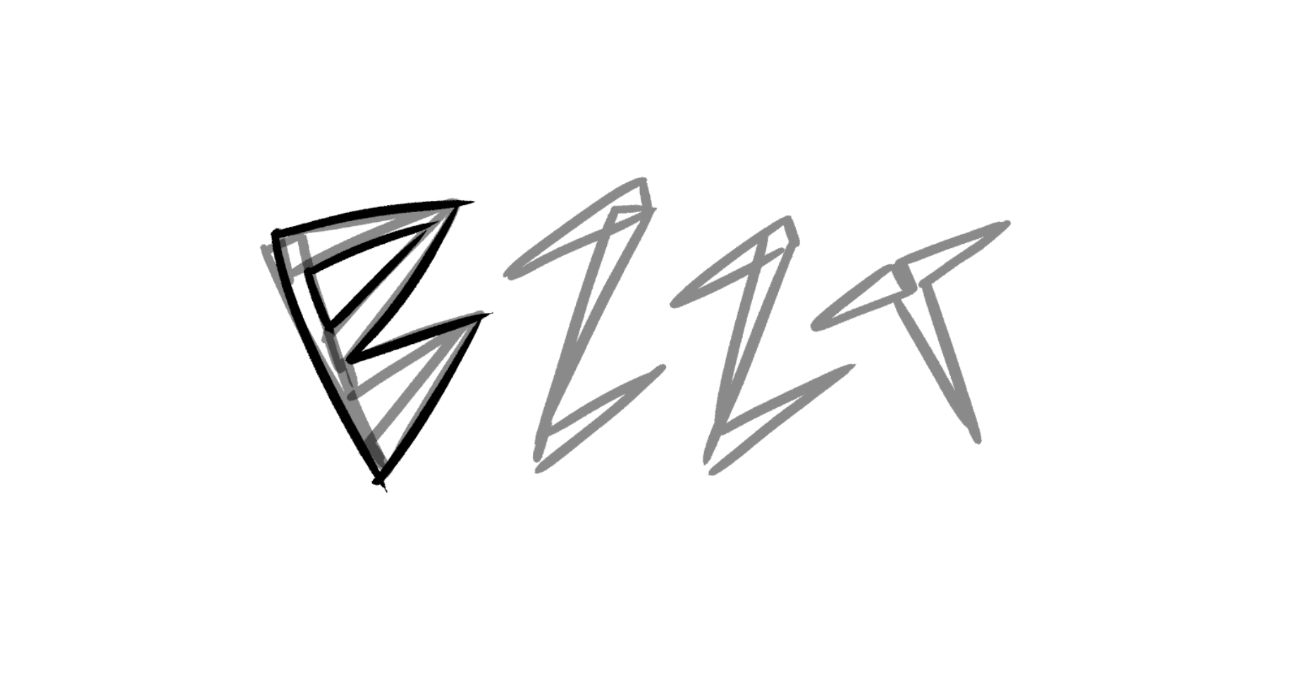
- Continue until you've traced the entire sound effect, focusing on consistent line weight and tapering.
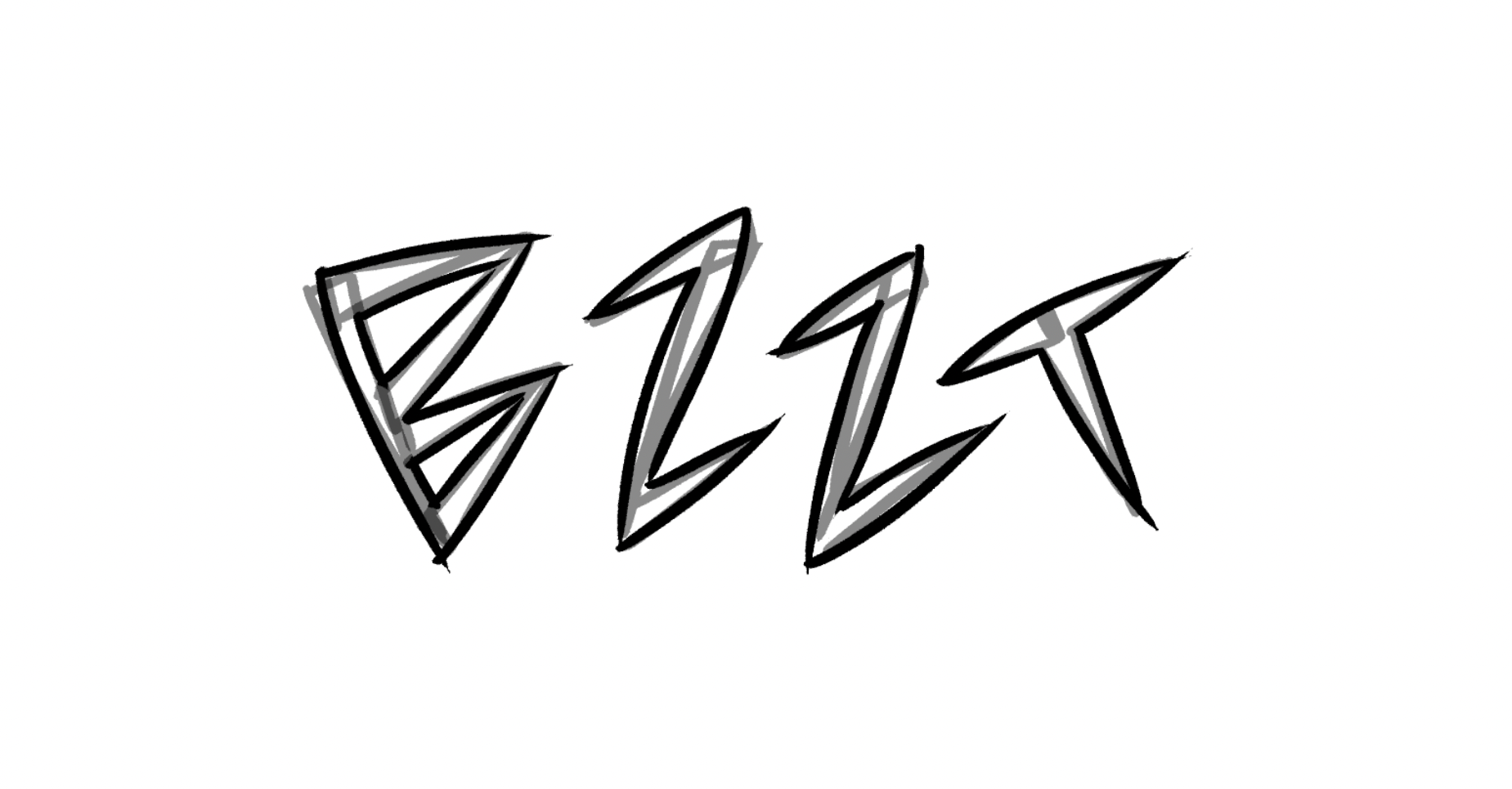
- Hide or delete the layer from steps 2-3. This is your final sound effect, so adjust it as needed.
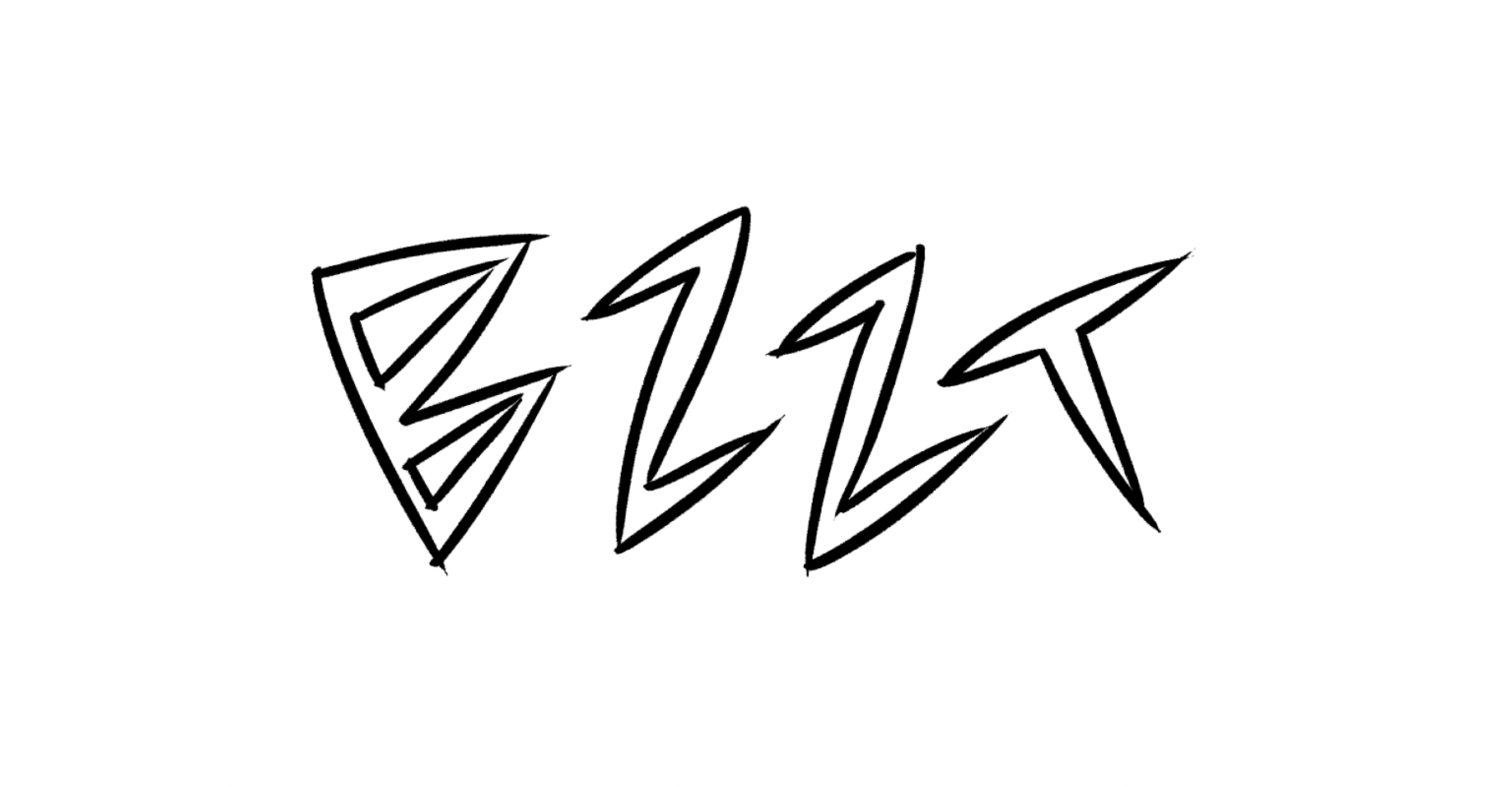
This is a lot of work, but it results in the most consistent shapes. Using two draft layers ensures that on your final layer, you're only focusing on the quality of the lines. The geometry and placement of the letter has already been figured out, so all that's left is brush strokes.
Letterforms
The way that you draw letters has an impact on how they sound in the reader's head. Please consider how different this BARK sounds based on the ways the letters are drawn with the same brush:

Every letter has several different ways to draw it. Please consider the different voice that each of these variants have:
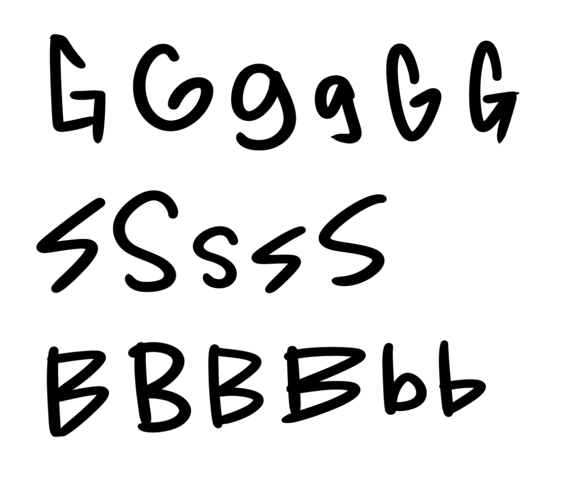
If you need more reference for letterforms, fonts are a great resource. For example, if you're trying to convey a certain voice, you can reference the letterforms in a font that has that same voice.