Card - nomadjimbob/mikioplugin GitHub Wiki
Creates a card element
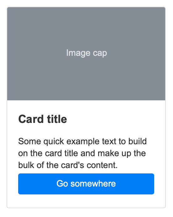
<card placeholder-text="Image cap" title="Card title" width=18em>
Some quick example text to build on the card title and make up the bulk of the card's content.

<button>Go somewhere</button>
</card>
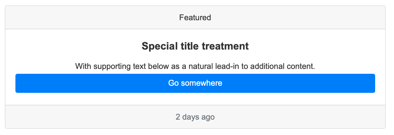
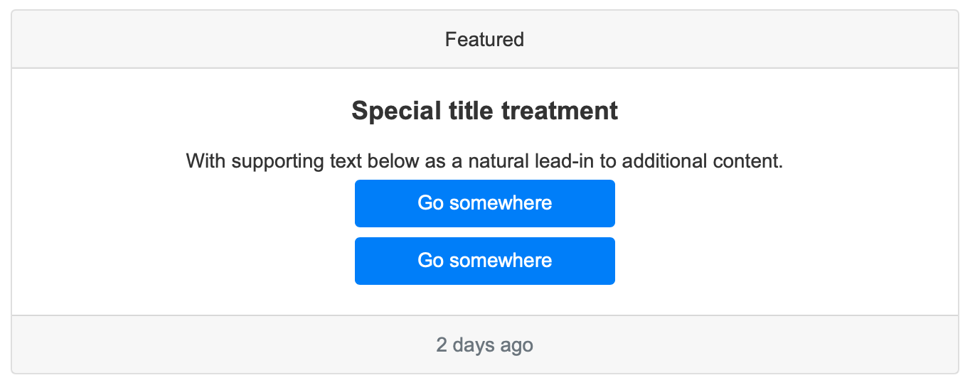
<card header="Featured" footer="2 days ago" title="Special title treatment" text-center>
With supporting text below as a natural lead-in to additional content.

<button>Go somewhere</button>
</card>
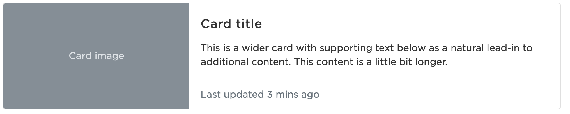
<card placeholder-text="Card image" title="Card title" footer="Last updated 3 mins ago" horizontal>This is a wider card with supporting text below as a natural lead-in to additional content. This content is a little bit longer.</card>
title: Inserts a title element into the cards body
title-text-align: Align the title text
title-text-color: Color the title text
subtitle: Inserts a subtitle element into the cards body
subtitle-text-align: Align the subtitle text
subtitle-text-color: Color the subtitle text
no-body: Removes any padding in the card body
horizontal: Displays the card horizontally
image: Displays an image at the top of the card (contained within the object)
image-cover: True or false to use the image to cover the space instead of contain the entire image
footer-image: Displays an image at the bottom of the card
placeholder-text: Displays a placeholder with the text at the top of the card
footer-placeholder-text: Displays a placeholder with the text at the bottom of the card
overlay: Displays either the image or placeholder-text underneath the card
header: Displays a card header with text
header-text-align: Align the header text
header-text-color: Color the header text
footer: Displays a card footer with text
footer-text-align: Align the footer text
footer-text-color: Color the footer text
footer-small: Displays a card footer with small text
Card elements also support seperate elements instead of using attribute values for advanced designs:
<card width=18em no-body>
<card-header>Fancy header</card-header>
<card-body>
<card-title>Special title treatment</card-title>
With supporting text below as a natural lead-in to additional content.

<button>Go somewhere</button>
</card-body>
<card-footer>Footer text</card-footer>
</card>
An example of a card using a listgroup in the body. As the cards body has its own padding, the flush attribute is used on the listgroup to remove its own margins.
<card width=18em no-body>
<card-header>Fancy header</card-header>
<card-body>
<card-title>Special title treatment</card-title>
This is my list group
</card-body>
<listgroup flush>
<listgroup-item>Item 1</listgroup-item>
<listgroup-item>Item 2</listgroup-item>
<listgroup-item>Item 3</listgroup-item>
</listgroup>
<card-footer>Footer text</card-footer>
</card>
All elements inside a card receive a width of 100% as part of the CSS flexbox styling. This means that items such as buttons will be treated as block elements and you will be required to explicitly set their width and alignment.
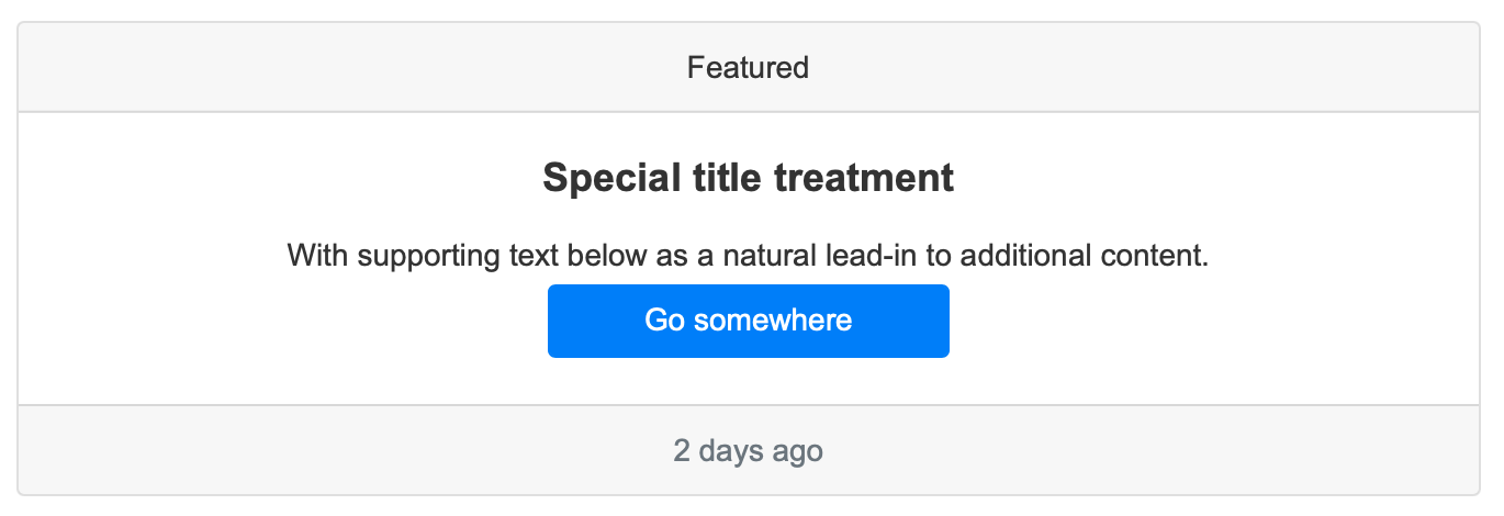
<card header="Featured" footer="2 days ago" title="Special title treatment" text-center>
With supporting text below as a natural lead-in to additional content.

<button align-enter width=10rem>Go somewhere</button>
</card>
Even setting the width of an object as above, the element will still block the entire row and force siblings onto the next line as per the image below:
This can be overcome using columns and rows such as:
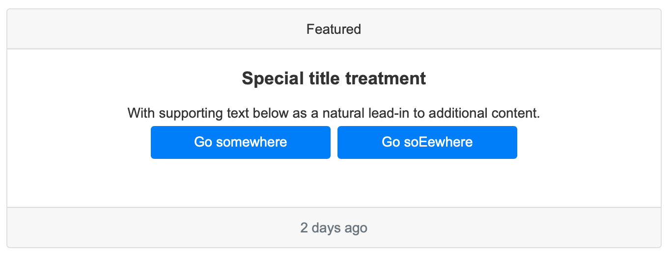
<card header="Featured" footer="2 days ago" title="Special title treatment" text-center>
With supporting text below as a natural lead-in to additional content.

<row>
<button align-right width=10rem>Go somewhere</button>
<button align-left width=10rem>Go somewhere</button>
</row>
</card>