Common Attributes - nomadjimbob/mikioplugin GitHub Wiki
Common Attributes are available on most elements across the Mikio Plugin range.

Aligns an element on the page
<alert dark align-left width=20em>This is a dark alert aligned left</alert>
<alert dark align-center width=20em>This is a dark alert aligned center</alert>
<alert dark align-right width=20em>This is a dark alert aligned right</alert>

Applies a border to the element.
border-color: sets the borders color. Supports CSS based values such as HEX and RGBA.
border-width: sets the borders width. Supports px, em, rem and %. Can also be formatted to support different widths for each side.
round: sets the border radius. Supports px, em, rem and %.
<box width=10em text-center border-color=#ffff00>This is some text</box>
<box width=10em text-center border-color=green border-width=10px>This is some text</box>
<box width=10em text-center border-color=green border-width="10px 0 10px 0">This is some text</box>
<box width=10em text-center border-color=rgba(0,0,0,.5) border-width=4px>This is some text</box>
</row>

Sets the height of the element. Sizes can be in %, px, rem or em.
<box width=10em height=10em border-color=pink>This is some text</box>
Adds rounded corners (or border radius) to an element. Supports px, em, rem and %.
<box width=10em round=.25em>{{:badgeduino_002b.jpg?nolink|}}</box>
<box width=10em round=.5em>{{:badgeduino_002b.jpg?nolink|}}</box>
<box width=10em round=40px>{{:badgeduino_002b.jpg?nolink|}}</box>
<box width=10em round=100%>{{:badgeduino_002b.jpg?nolink|}}</box>

Adds a shadow to an element.
<button>No shadow</button>
<button shadow>Normal shadow</button>
<button shadow-large>Large shadow</button>
<button shadow-small>Small shadow</button>
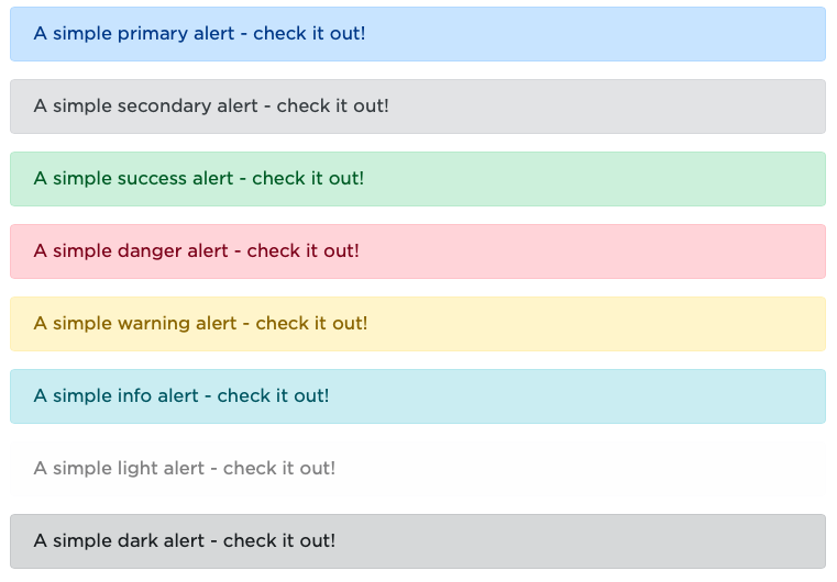
Styles elements using the standard Bootstrap colors. Supports the styles:
- primary
- secondary
- success
- danger
- warning
- info
- light
- dark
<alert>A simple primary alert - check it out!</alert>
<alert secondary>A simple secondary alert - check it out!</alert>
<alert success>A simple success alert - check it out!</alert>
<alert danger>A simple danger alert - check it out!</alert>
<alert warning>A simple warning alert - check it out!</alert>
<alert info>A simple info alert - check it out!</alert>
<alert light>A simple light alert - check it out!</alert>
<alert dark>A simple dark alert - check it out!</alert>

Aligns text within an element
<card title="Special title treatment" width=18em text-left>
With supporting text below as a natural lead-in to additional content.
<button>Go somewhere</button>
</card>

<card title="Special title treatment" width=18em text-center>
With supporting text below as a natural lead-in to additional content.
<button>Go somewhere</button>
</card>

<card title="Special title treatment" width=18em text-right>
With supporting text below as a natural lead-in to additional content.
<button>Go somewhere</button>
</card>
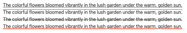
Applies text decorations within an element
<text text-decoration=underline>The colorful flowers bloomed vibrantly in the lush garden under the warm, golden sun.</text>
<text text-decoration=overline>The colorful flowers bloomed vibrantly in the lush garden under the warm, golden sun.</text>
<text text-decoration=line-through>The colorful flowers bloomed vibrantly in the lush garden under the warm, golden sun.</text>
<text text-decoration="underline red double 5px">The colorful flowers bloomed vibrantly in the lush garden under the warm, golden sun.</text>

Adds a tooltip that is displayed when the cursor hovers over
<button tooltip="This is not a good tip">Hover me</button>

Some elements support a URL attribute that opens a page when the user clicks.
- External web pages are required to begin with http:// or https://
- Wiki pages can be written as the direct namespace
- Anchors must begin with #
<button url="http://www.my_anchor.com/">Go to my_anchor</button>
You can also append newtab attribute into the element and the URL will open in a new tab within the browser.
<button url="http://www.my_anchor.com/" newtab>Go to my_anchor</button>

Sets the elements vertical alignment
<box width=10em height=10em border-color=black vertical-align=middle>My text</box>

Sets the width of the element. Sizes can be in %, px, rem or em.
<alert danger width=20em shadow>
  <mikio-icon fa exclamation-triangle>This is a danger alert with a set width and shadow
</alert>