Dropdown Widget v7 - nodeGame/nodegame GitHub Wiki
- status : complete
- version : 7.x DEV
The Dropdown widget creates a dropdown menu with specified options.
Dropdown creates a dropdown menu where one of the specified options can be selected from a list.
-
tag: The HTML tag that creates the dropdown menu: datalist or select. Default: "datalist".
-
choices: the array of available choices. It may contain elements of type: string, number.
-
requiredChoice: if TRUE, a choice is required.
-
correctChoice: the array|number|string of correct choice/s.
-
shuffleChoices: if TRUE, choices are shuffled before being added to the dropdown menu.
-
fixedChoice: if True, custom values that entered in menu do not validated.
-
mainText: a text to be displayed above the dropdown menu.
-
labelText: a label text to be displayed on left side of the input box.
-
placeholder: a placeholder text instead for the input box.
-
timeFrom: The timestamp as recorded by
node.timer.setTimestampor FALSE, to measure absolute time for current choice. Default: from the beginning of current step. -
onchange: a custom onchange listener function. Receives 2 input parameters: the value of the selected choice,
thisinstance. -
validation: a user defined validation function executed after the default validation function. Takes as input the value of current choice and an object. The value property of the object contains the value from the default validation function which can be modified accordingly. A custom error message can be added by adding a "err" property to the object.
-
validationSpeed: how quickly the current value of the input form is validated after a keystroke.
-
width: a shortcut to set the width of the HTML input form, applied as a CSS style property.
- listener: the main onchange listener, handling all the update operations and finally calling the custom onchange listener.
-
verifyChoice(): compares the current choice/s with the correct one/s, check if custom values should be validated or simply if a required choice was made. Finally, the method calls the user defined validation function. The return value is an object containing the following properties:
- value: TRUE/FALSE
-
err: if exist, a custom error message defined by the user on
validation.
-
getValues(opts): returns the values for current selection and other paradata. Parameter
optsoptionally configures the return value:- highlight: If TRUE, if current value is not the correct value, widget will be highlighted. Default: FALSE.
-
setChoices(choices, append): creates the choice menu and enables
listener. Notice: it updates the display.
The return value is an object containing the following properties:
- id: The id of the widget.
-
choice: The current choice/s, that is the input value if custom
values are allowed by
fixedChoice. If not, the position/s in the original choices array. - value: The current value/s, that is the display text or the value specified in the choices array.
- isCorrect: if a correct choice is specified, or simply any choice is required, this variable is TRUE if the requirement is satisfied.
- nChanges: the total number of changes before settling for a choice.
-
time: the time passed in milliseconds from the event specified
in property
timeFrom.
var root = W.getElementById('root');
var stateForm = node.widgets.append('Dropdown', root, {
id: 'state',
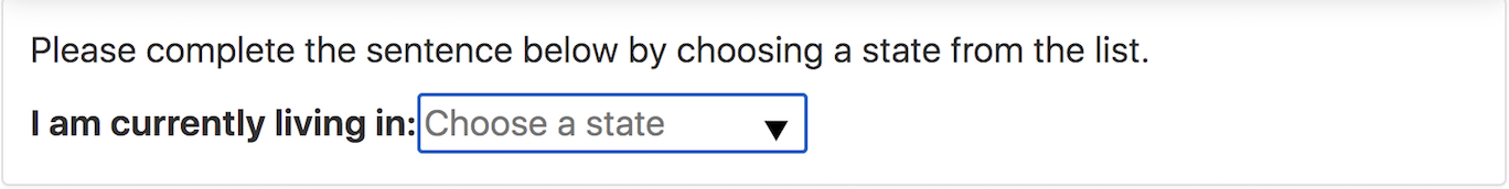
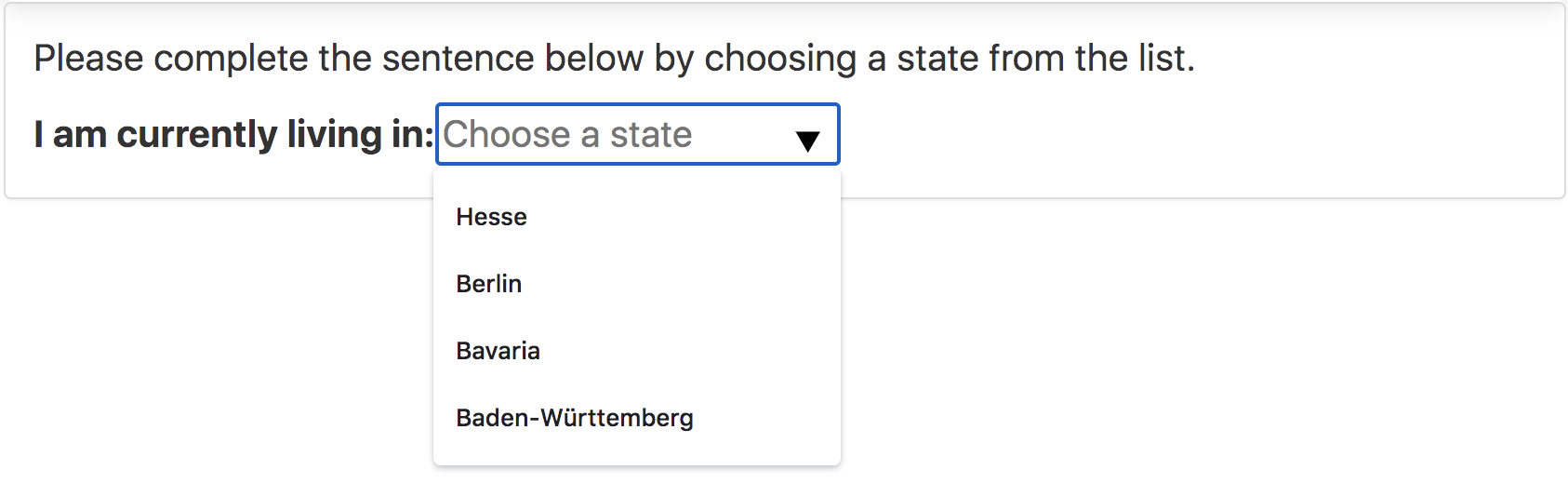
mainText: "Please complete the sentence below by choosing" +
"a state from the list.",
labelText: 'I am currently living in: ',
choices: [ "Baden-Württemberg", "Bavaria", "Berlin", "Hesse"],
placeHolder: "Choose a State",
requiredChoice: true,
fixedChoice: true
});
// After user made his or her selection, get current values.
stateForm.getValues();
// Object {
// id: "state",
// choice: "3"
// isCorrect: true,
// value: "Hesse",
// nChanges: 1,
// time: 2555
// };var root = W.getElementById('root');
var stateForm = node.widgets.append('Dropdown', root, {
id: 'stateForm',
mainText: "Please complete the sentence below by choosing" +
"a state from the list.",
labelText: 'I am currently living in: ',
choices: [ "Baden-Württemberg", "Bavaria", "Berlin", "Hesse"],
onchange: function(value, that) {
// Inputs:
// value: value of the input.
// that: `this` instance.
// Shows the additional form if the user chooses "Baden-Württemberg".
if (value === "Baden-Württemberg") {
cityForm.show();
}
else {
cityForm.hide();
}
// Make sure the height of the mainframe is right.
W.adjustFrameHeight();
}
});
var cityForm = node.widgets.append('Dropdown', root, {
id: 'stateForm',
mainText: "Please complete the sentence below by choosing" +
"a city from the list.",
labelText: 'I am currently living in: ',
choices: [ "Mannheim", "Ulm", "Karlsruhe", "Stuttgart", "Heidelberg"],
placeHolder: "Choose a State",
requiredChoice: false,
hidden: true
});