CustomInput Widget v7 - nodeGame/nodegame GitHub Wiki
- status : complete
- version : 7.x
CustomInput widgets formatting a date, a US city, state, and ZIP code, and a list of languages.
The CustomInput widget displays, formats and validate different types of open-ended inputs.
-
type: the type of input. Available:
number,int,float,text,date,list,us_city_state_zip,us_state,us_zip. -
validation: a validation function in place of the default ones. The function takes as input parameter the current value of the input, and must return an object of the type:
{
   value: value,
   err: 'An error string, if value does not validate.'
}
-
userValidation: an additional validation executed after the default validation function and only if no error was raised. Takes as input the return value from the default validation function which can be modified accordingly.
-
validationSpeed: how quickly the current value of the input form is validated after a keystroke.
-
postprocess: a postprocess function transforming the output of the validated form before returning it. The function takes as input parameters the output of the validation function, and boolean flag which is TRUE, if the outoput is valid.
-
preprocess: a preprocess function transforming the current value of the form before it is validated. The function takes as input the HTML input form.
-
placeholder: a placeholder text instead of the default one.
-
width: a shortcut to set the width of the HTML input form, applied as a CSS style property.
-
checkboxText: a text to be displayed next to a checkbox below the form.
-
checkboxCb: a callback function executed when the checkbox is clicked. The function is of the form:
    function(checked, widget) {
        if (checked) console.log('The checkbox was clicked');
        else console.log('The tick was removed from the checkbox');
        // widget is the current instance of CustomInput
    }
-
requiredChoice: If TRUE, input is required.
-
mainText: A text to be displayed above the form.
-
hint: A smaller text to be displayed after the main text.
-
number, int, float:
-
min: The minimum accepted value. -
max: The maximum accepted value. -
strictlyGreater: If TRUE, values must be stricly greater than min. -
strictlyLess: If TRUE, values must be strictly less than max.
-
-
text:
-
min: The minimum string length in characters. -
max: The maximum string length in characters. -
strictlyGreater: If TRUE, length must be stricly greater than min. -
strictlyLess: If TRUE, length must be strictly less than max.
-
-
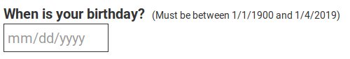
date:
-
format: A string from the set: 'mm-dd-yy', 'dd-mm-yy', 'mm-dd-yyyy', 'dd-mm-yyyy', 'mm.dd.yy', 'dd.mm.yy', 'mm.dd.yyyy', 'dd.mm.yyyy', 'mm/dd/yy', 'dd/mm/yy', 'mm/dd/yyyy', 'dd/mm/yyyy'. Default: 'mm/dd/yyyy'. -
minDate: If set, dates must be in the future respect to this date. -
maxDate: If set, dates must be in the past respect to this date.
-
-
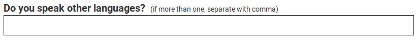
list:
-
listSeparator: A character or string that delimits the items. Default: ',' (comma). -
minItems: The minimum number of items. -
maxItems: The maximum number of items.
-
-
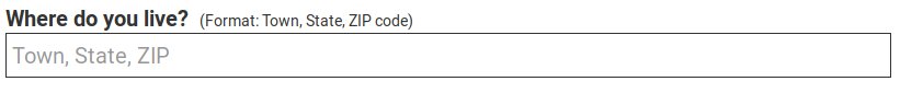
us_state_city_zip:
-
listSeparator: A character or string that delimits state, city and zip. Default: ',' (comma).
-
-
us_state:
-
abbreviation: If TRUE, US states must be typed with their two-letter code (e.g., NY instead of New York). Default: FALSE. -
territories: If TRUE, US territories are considered valid. Default: TRUE.
-
-
us_zip: (No special options. Note: It currently checks only if it is a 5-digit number.)
-
setError(err): Sets an error message and highlights the widget
-
setValues(opts) Sets the values of the form. Available options:
- value: The value to set.
- values: Alias for value.
- availableValues: An array of values from which a random value is chosen (or more than one if type is "list").
If not option is specified, a completely random value consistent with the type is chosen. If defined, the preprocess function is called after setting the value.
The return value is an object containing the following properties:
-
id: The id of the widget.
-
timeBegin: the time passed in milliseconds from the beginning of the step until first character was typed in the form.
-
timeEnd: the time passed in milliseconds from the beginning of the step until last character was typed in the form.
-
value: the validated and postprocessed value of the input.
-
isCorrect: TRUE, if there are no errors. This property is not added if getValues is called with property markAttempt = FALSE.
// Element with id "root" must exist.
var root = W.getElementById('root');

var ageForm = node.widgets.append('CustomInput', root, {
    id: 'age',
    mainText: 'What is your age?',
    type: 'int',
    min: 0,
    max: 120,
    requiredChoice: true
});


// After user made his or her selection, get current values.
ageForm.getValues();
// Object {
//     id: "age"
//     isCorrect: true,
//     value: 50,
//     timeBegin: 2555,
//     timeEnd: 2957
// };A custom validation that prevents some words to be used in the input.
// Element with id "root" must exist.
var root = W.getElementById('root');

var validation = function(value) {
    var res;
    res = { value: value };
    if (value.trim() === '' && this.requiredChoice) {
        res.err = this.getText('emptyErr');
        return res;
    }
    // Custom validation (only reports about last word).
    value.split(" ").forEach(function(t) {
        if (J.inArray(t, ["word1", "word2", "word3"])) {
            res.err = 'You have used a forbidden word: ' + t;
        }
    });
    return res;
};

// Notice! the validation function completely replaces
// the original validation for the input type, so it is often
// more convenient to use the userValidation option, a function
// executed only if the default validation for the type does not fail.

var userValidation = function(res) {
    res.value.split(" ").forEach(function(t) {
        if (J.inArray(t, ["word1", "word2", "word3"])) {
            res.err = 'You have used a forbidden word: ' + t;
        }
    });
};

var forbiddenWords = node.widgets.append('CustomInput', root, {
    id: 'secretWords',
    mainText: 'Tell me the secret words, but do not use the forbidden words!',
    type: 'text',
    requiredChoice: true,
    // validation: validation,
    userValidation: userValidation // development feature.
});