User Testing chooser GUI - UQdeco2800/2021-ext-studio-2 GitHub Wiki
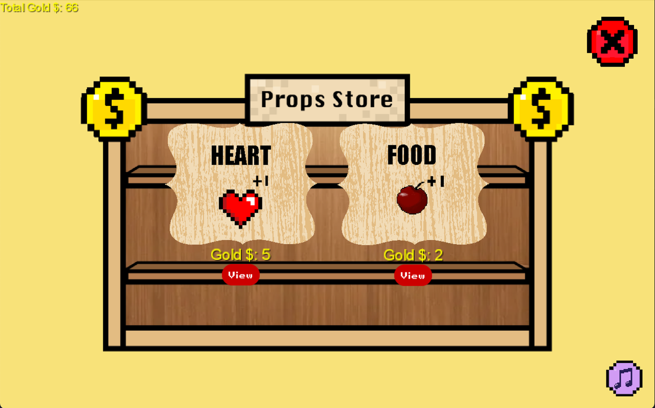
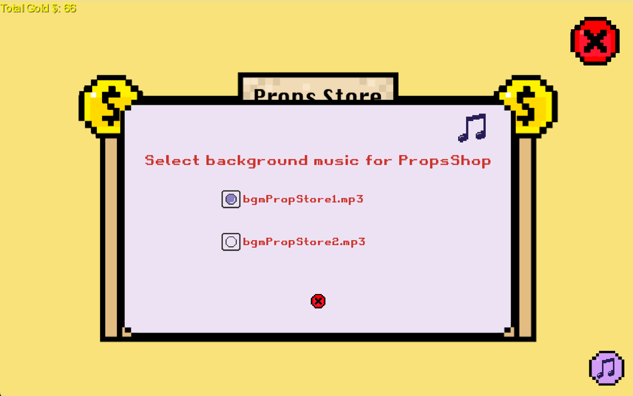
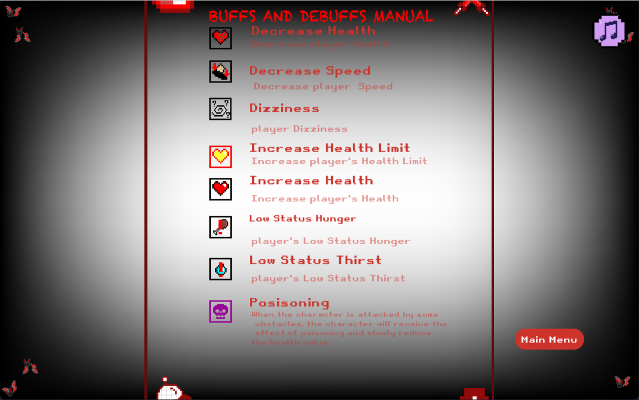
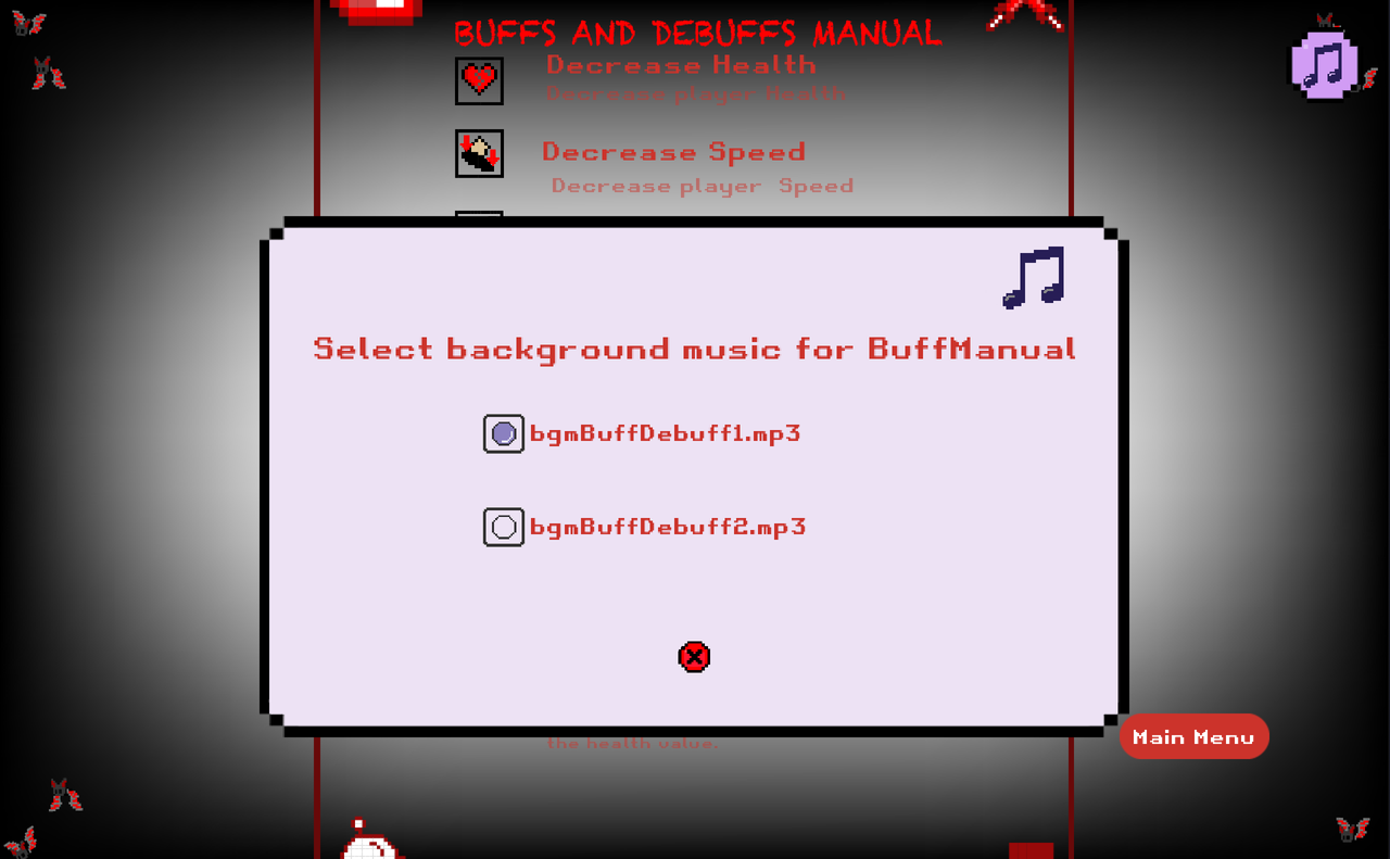
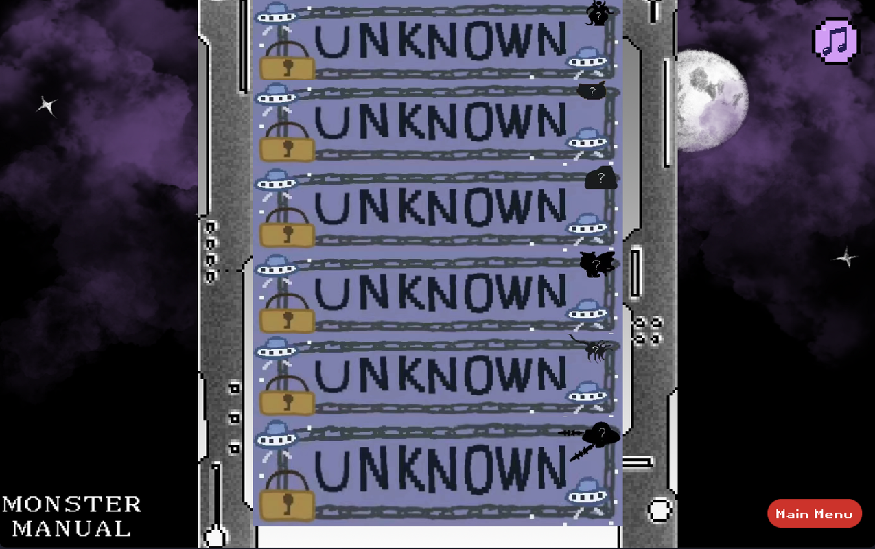
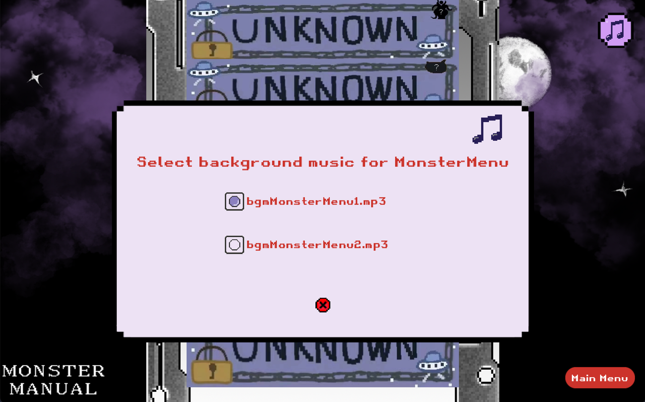
Show the user the current presentation of all interfaces containing the music part of the GUI and evaluate it. Based on the evaluation results determine and perform the next optimization step.
Show the user all the interfaces we are going to test and introduce the elements contained in them in turn.
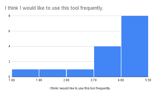
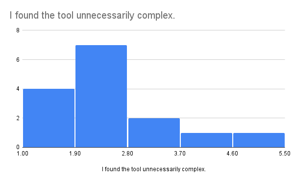
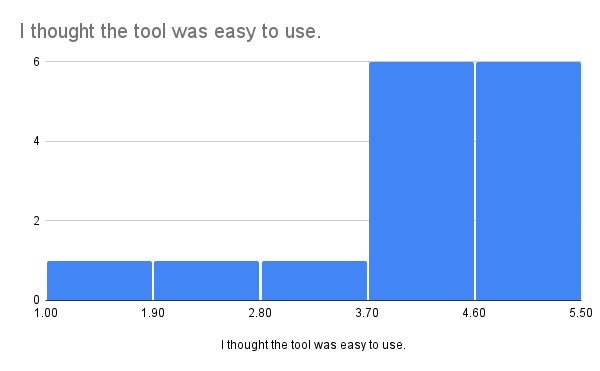
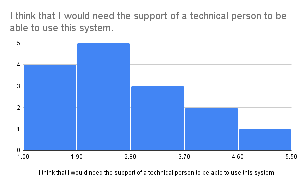
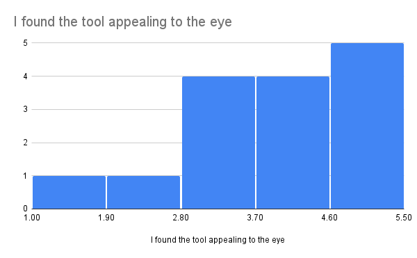
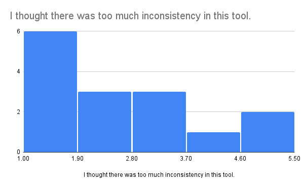
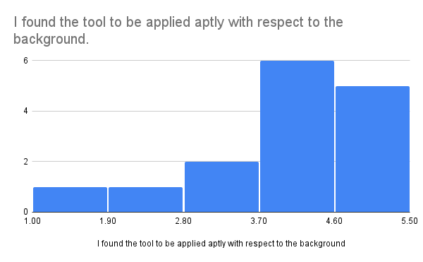
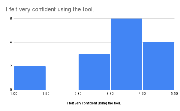
In order to make the test results more credible, we selected 5 users for SUS evaluation. And to further explore the issue, we selected three of the users for further interviews. All tests are done via zoom.
-
Carefully observe each interface.
-
Complete the SUS evaluation test.
-
Carefully and objectively respond to questions in the interview.
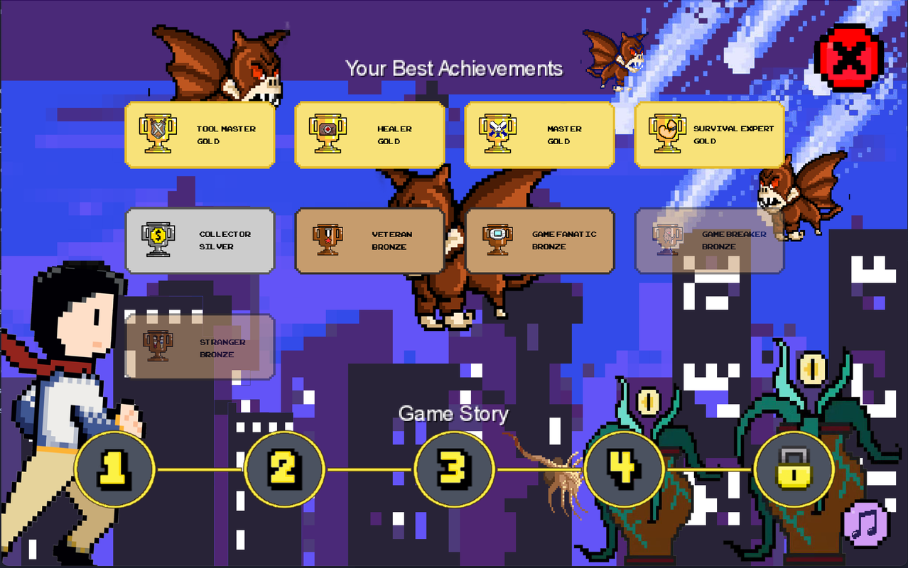
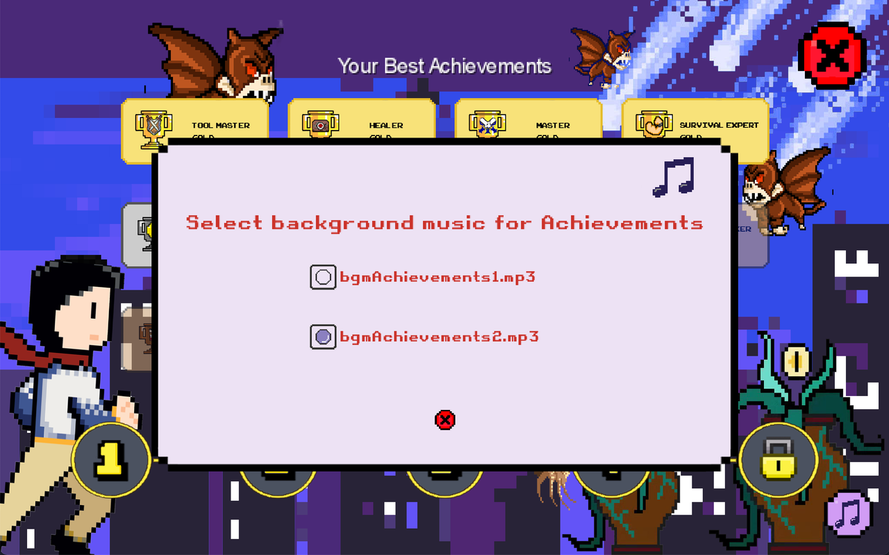
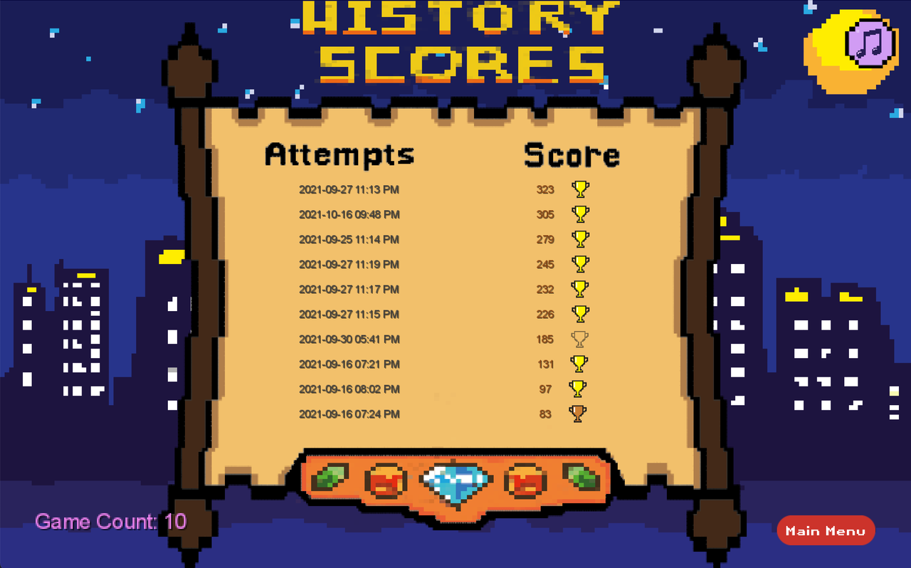
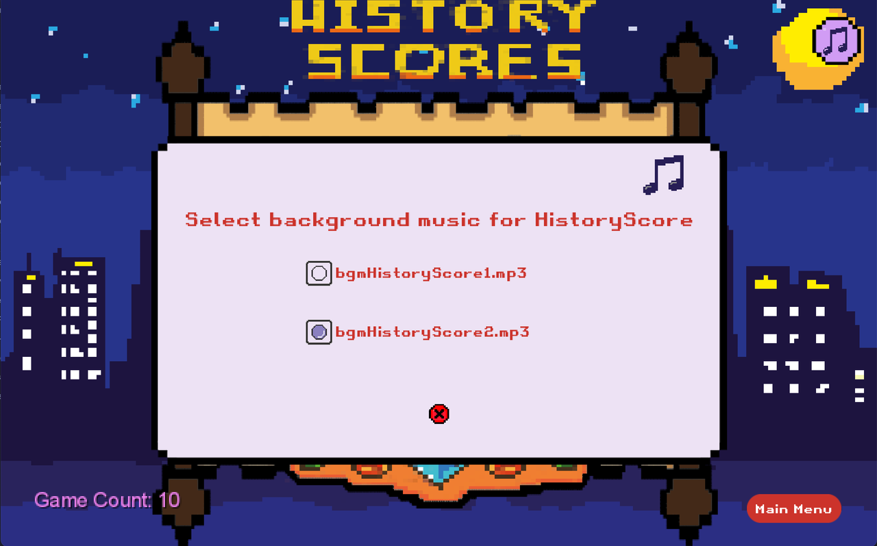
The following options show all the testing interface:
| System Overview | Click The Music Button |
|---|---|
|
|
|
|
|
|
|
|
|
|
|
|
|
|
|
-
What was your first impression of the music section GUI?
-
Do you think the design of the music section GUI fits the design style of the integrated game?
-
Where do you think the design of this section needs to be adjusted and upgraded?
User1:
First Impression:
I feel that the design is very careful. The details are very well handled. Good work.
Matching:
Yes, I feel that the overall look is very coherent.
Needs To Be Adjusted And Upgraded:
If I have to say what needs to be adjusted, I think the red cross at the bottom of the GUI can be enlarged to make it easier for users to click.
User2:
First Impression:
I think the design style is my favorite type, very eye-catching.
Matching:
Yes, I think the color scheme is perfect.
Needs To Be Adjusted And Upgraded:
I think there are too many blank pages in the GUI, maybe it would be better if the font is bigger.
User3:
First Impression:
It's very interesting and I want to play this game.
Matching:
Yes, overall there are no abrupt parts.
Needs To Be Adjusted And Upgraded:
The GUI font is a little small, I think I have to look closely to see it. Also the spacing between the last line and the red cross at the bottom is too big.The red cross seems to be too small.
According to the user's feedback, we can know that the overall design of the interface is very popular with users. The design is very nice and the details are well handled, but there are still some parts that need to be changed. Users generally feedback that the GUI font is a should be black, and the spacing between the last line and the bottom Red Cross is too large. The red cross should be larger.
