Score Screen UI enhancements - UQdeco2800/2021-ext-studio-2 GitHub Wiki
Determine the effects of the UI enhancements added to History Scoreboard achievements in sprint 3.
The aim was to ask open ended questions related to history scoreboard screen modifications, to future users of this game. User tests were performed in order to gauge what the ideal UI modifications would look like, and how the users want to assess their progress within the game.
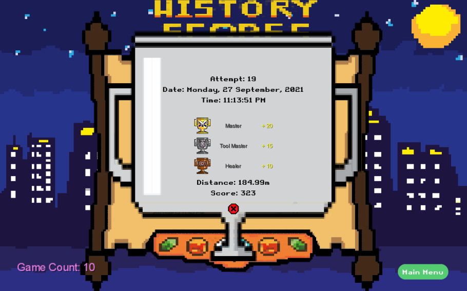
The follow up questions were based on the changes made to this screen and the score details dialog above.
| Before | After |
 |
 |
This questionnaire is based on the features added in sprint 3 to enhance the History Scoreboard achievements UI from sprint 2. Users were made to play the game via remote control on zoom. First they tested the game from sprint 2 and then they tested the game from sprint 3. The main objective being the enhancement of user interface of the history scoreboard.
-
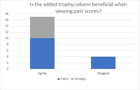
Is the added trophy column beneficial when viewing past scores?
-
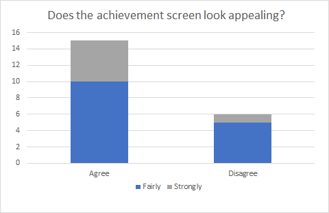
Does the achievement screen look appealing?
-
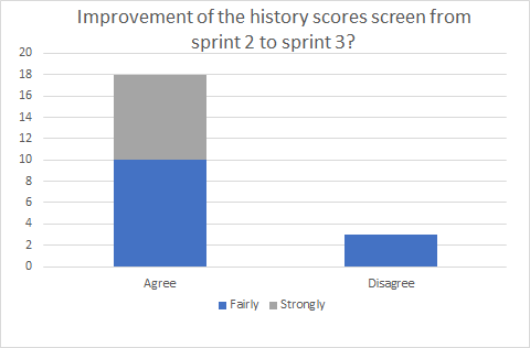
How would you evaluate the improvement of the history scores screen from sprint 2 to sprint 3?
-
Do you think the trophy design in the history scoreboard needs to be improved?
-
What are your views about the achievement list interface?
-
Does the new achievement list interface give you clarity on your accomplishments?


User1:
Trophy design in history scoreboard:
A column named achievements might be added on top of the trophies.
Views on the achievement list interface:
The large trophy design to display the contents is very innovative.
Clarity on accomplishments:
Yes, all the achievements in a particular run are all visible.
User2:
Trophy design in history scoreboard:
Trophies of bronze, silver, gold are very nice.
Views on the achievement list interface:
Design is very good and informative but a little pixelated.
Clarity on accomplishments:
Very easy to understand whether I received a bronze, silver or gold trophy for a specific achievement.
User3:
Trophy design in history scoreboard:
No, I don't think anything needs to be changed.
Views on the achievement list interface:
The pop up looks nice and goes well with the theme of displaying achievements.
Clarity on accomplishments:
Pretty straightforward and concise. Well designed and gives clarity.
The overall feedback gathered from sprint 3 enhancements have been promising. There were not as many people who felt like disagreeing as observed in user testing for sprint 2. This shows that enhancements made are according to users' choice. General feedback showed that the user interface for achievement list is easy to comprehend and appealing to the eye. Very few users felt that there was a need of improvement in the pixelated images.
In the future, we will look for volunteers to experience the game, interview them after they have tried the game, and investigate whether the functions of the history scoreboard and the styles of all elements of the history scoreboard and score details interface are well integrated with the game based on the user's real experience of the game, figure out whether it can meet the needs of users for such a game and play a positive role in users' game experience.
