Game achievements UI Testing - UQdeco2800/2021-ext-studio-2 GitHub Wiki
This user testing is to decide the version of achievement UI.
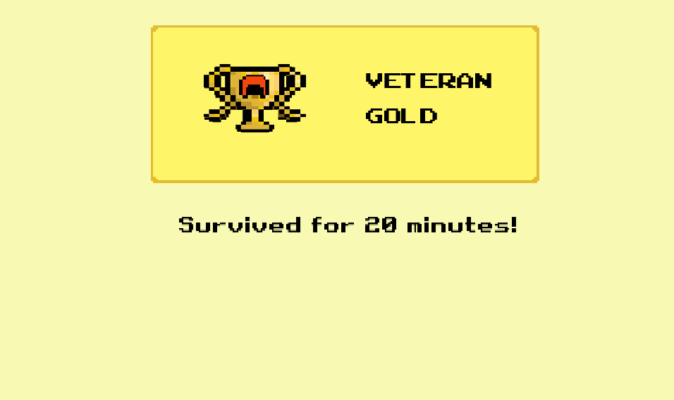
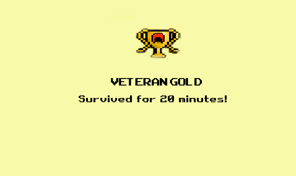
In version 1, we followed card UI design style. This is because the card design is more focused and easier to understand than large sections of text. The design is also more attractive. Version 2 is designed with the basic text information laid out to highlight key elements.
| Version 1 | Version 2 |
|---|---|
The questionnaire is tested on students who have chosen the same class, and the questions in the questionnaire are in a single-choice format. The target number of people for the questionnaire survey was 20.
Since the online interviews involved questions about views on design, the interviewees were selected from the same class who were responsible for the design section. The number of interviewees was 3, and the interview was done through Zoom. The interview format was to ask users about their opinions on our design and record their views.
-
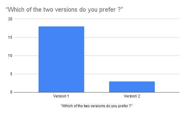
Which of the two versions do you prefer ?
-
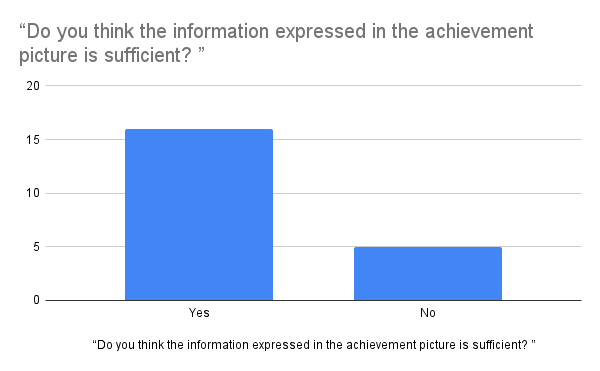
Do you think the information expressed in the achievement picture is sufficient?
-
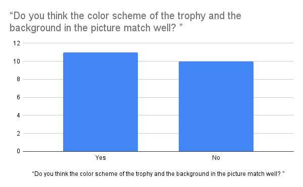
Do you think the color scheme of the trophy and the background in the picture match well?
-
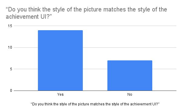
Do you think the style of the picture matches the style of the achievement UI?
-
Which version do you prefer and briefly explain why you prefer this version? (e.g., the content is easier to understand)
-
Do you think the information expressed in this achievement chart is adequate and what additional information do you think is needed?
-
How do you feel about the design of the achievement page? What parts do you appreciate? Which parts do you think are not perfect?
-
What other adjustments do you think need to be made to the design of the trophy?
-
What else do you think needs to be added to the background?
User1:
Version Preferences & Reasons:
- Version 1.
- Because version 1 is more design-oriented and visually distinctive.
Image information adequacy:
- Yes I think the information given in the image is sufficient.
Achievement interface design:
- Appreciated parts: The overall color palette is harmonious and the use of trophies as achievements is very apt.
- Less than perfect: The text design is a bit rigid.
Trophy design:
- The design of trophies can add some elements related to the game.
Background design:
- I hope to add some elements to the background design to make the picture more vivid.
User2:
Version preference & reason:
- Version 1.
- Because the color richness of version 1 is better.
Image information adequacy:
- I think the picture could also show the extra bonus points that the achievement adds to the player.
Achievement Interface Design:
- Appreciated parts: The content is prominent and clear, and the drawing style fits the game's setting.
- Less than perfect: The details of the trophies are not handled perfectly.
Trophy design:
- In order to distinguish different achievements, the trophy can add more design about the achievement. For example, the trophy for the veteran achievement can add a design similar to the beard.
Background design:
- The current background color is not prominent enough, and overlap with the color of the gold trophy, you can change or add a contrast color to increase the richness of the picture.
User3:
Version preference & reason:
- Version 1.
- The information in the Version 1 is easier to read.
Image information adequacy:
- Yes, because the name of achievement is very appropriate.
Achievement Interface Design:
- Appreciated parts: I think the design of the trophy is great.
- Less than perfect: I think you can try more color combinations in color design.
Trophy design:
- I think the design of the trophy is very good and doesn't need to be changed.
Background design:
- The monotonous background can make users pay more attention to the design and information of the trophy.
The questionnaire shows that most users think that version 1 has clearer and readable content. As for the design, most people like the current design. In terms of color, more than half of the survey users are satisfied with the current color matching, while nearly half of the users feel that the color matching can still be improved.
Through the online interviews we got a better idea of our design strengths and weaknesses. Based on the feedback, we think we need to add color to the background of the achievement interface to make the picture more distinct and vivid. In the design of trophies, we can add more achievement-related elements to better differentiate between achievements.
