Achievements Screen and Game Storyline UI Testing - UQdeco2800/2021-ext-studio-2 GitHub Wiki
We designed game story chapters implementation in the game with three different layout. We determined the design scheme of the final version through user test, we will follow up users and show them final results for a review. Interviews / questionnaires were used to determine the layout of game story chapters in the game.
| Version 1 | Version 2 | Version 3 |
|---|---|---|
The questionnaire is tested on students who have chosen the same class, and the questions in the questionnaire are in a single-choice format. The target number of people for the questionnaire survey was 15.
Since the online interviews involved questions about views on design, the interviewees were selected from the same class who were responsible for the design section. The number of interviewees was 3, and the interview was done through Zoom. The interview format was to ask users about their opinions on our design and record their views.
-
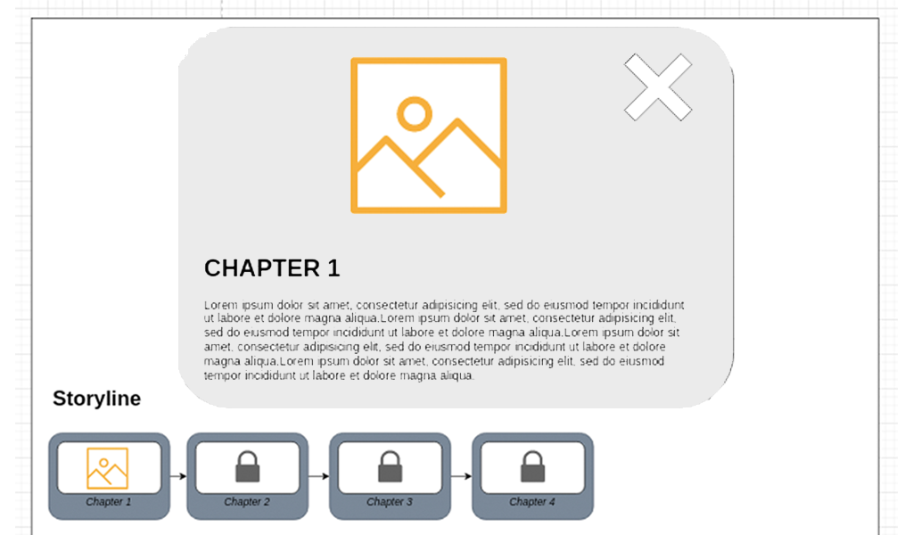
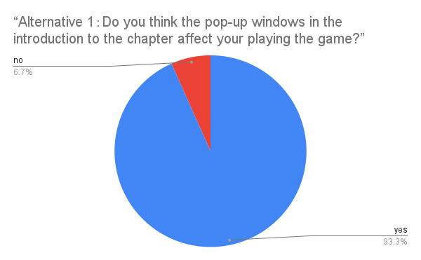
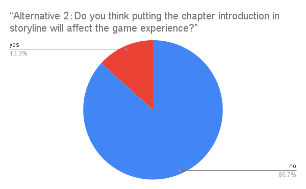
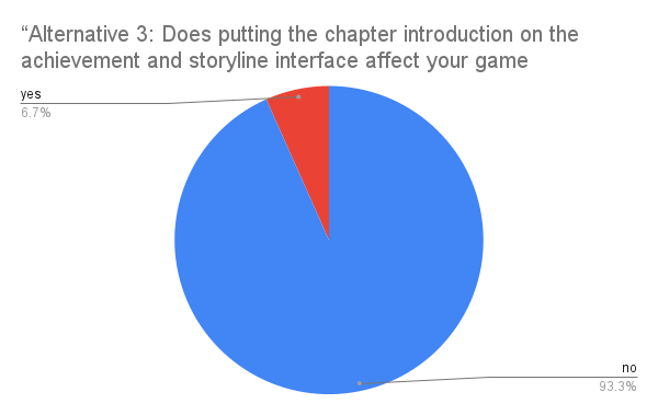
Alternative 1,2,3:Do you think the pop-up windows in the introduction to the chapter affect your playing the game?
-
Which alternative version you prefer?
-
Why you choose this version?
-
Which version of game story chapters do you prefer?
-
From the design angle, what do you think appeals to you in version 1 and what needs to be improved?
-
From the design perspective, what do you think appeals to you in version 2 and what needs to be improved?
-
From the design perspective, what do you think appeals to you in version 3 and what needs to be improved?
-
Assuming you were to design this section, how would you design it?
User1:
Version Preferences:
- Version 1.
For version 1:
- Appreciated parts: The game chapter interface in version 1 uses white background and black font, which seems to be harmonious in color throughout the interface.
- Needs to be improved: Since version 1 appears during the game and takes up most of the game interface. It is easy to obscure the player's view when playing
For version 2:
- Appreciated parts: The design of the lock in version two allows players to understand very clearly the progress of their game story unlocked, with interest.
- Needs to be improved: The utilization of the entire interface is not efficient, and the entire screen looks more empty.
For version 3:
- Appreciated parts: Version three in the interface utilization is higher than version two, players can get more information in version three.
- Needs to be improved: The color of the whole interface in version three is more rigid, using some bright colors will improve the colorfulness of the whole interface.
User design idea:
- First of all, the colors, I will use bright colors to highlight the point I want to express. The background uses dark colors to make the whole color match more harmonious. Secondly, the elements contained in the interface, I will fill the whole interface as much as possible, just like version 3, so that players can get more information.
User2:
Version preference:
- Version 3.
For version 1:
- Appreciated parts: The most attractive thing in version one for me is the fork because it is conspicuous and this design gives the player instructions very well.
- Needs to be improved: The biggest problem with version 1 is the way it appears, because appearing directly in the game not only interrupts the player's game progress, but also gives the player a bad game experience. And players do not mind reading these words in the process of the game.
For version 2:
- Appreciated parts: The bottom part of the chapter unlocked in version two I think is very characteristic, will give the player a desire to unlock. This will be very attractive to players.
- Needs to be improved: Version 2 contains so little information that if the player does not unlock any game story chapters or does not click on the game story chapters. All they can see is a background and an unlocking progress.
For version 3:
-
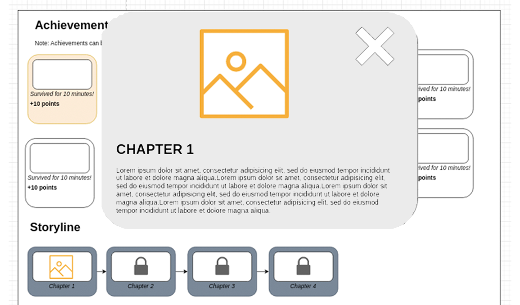
Appreciated parts: Version three is a good solution to the problems that existed in version two, and the combination of achievements and unlocked progress is easy for players to associate with the relationships that exist, allowing them to better understand the mechanics of the game.
-
Needs to be improved: The main problem of version three is the design of the background, should add elements related to the game, on the one hand, make the interface more full, but also will not let players feel abrupt.
User design idea:
- First of all, I will design a separate module, and will not let the interface appear directly in the game. Second, the module will be filled with elements from the game. If possible, I would also like to design fireworks-like effects on both sides of the interface when players open the module and if they unlock new progress, to remind players and make the game look more polished.
User3:
Version preference:
- Version 3.
For version 1:
- Appreciated parts: As far as this game story chapter is concerned, I think version one contains enough rich content.
- Needs to be improved: Version 1 needs to improve its appearance, for example, a design like a message alert box would be better, so as not to distract players in the game.
For version 2:
- Appreciated parts: Version two pops up the game story chapter way I like, rich design sense.
- Needs to be improved: Version 2 needs to increase the richness of its screen, I think it is possible to put the related content in this interface as well.
For version 3:
- Appreciated parts: In version three players can see the achievements they have earned, and the design of this achievement just makes up for the previous gap.
- Needs to be improved: The font of the game story chapters in version three I think can be enlarged appropriately for easy reading. And correspondingly simplify the content, too long length will make players lose interest in reading on.
User design idea:
- I will first design an achievement module, which contains two major categories, game story chapters and game achievements. Players can see the corresponding content by clicking on the for section. This kind of switching page design will increase players' interest in playing the game.
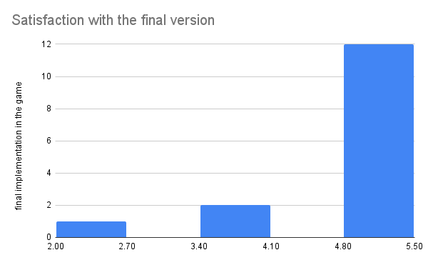
More users opted for version 3. Compared to version three, version one appears in a form that interferes with players' normal game play and ruins their gaming experience. While version two has too many vacancies in the game's interface and conveys too little information to the players. Version 3 is a good combination of achievements and story chapters, but the colorfulness and the text part of the story chapters need further improvement.
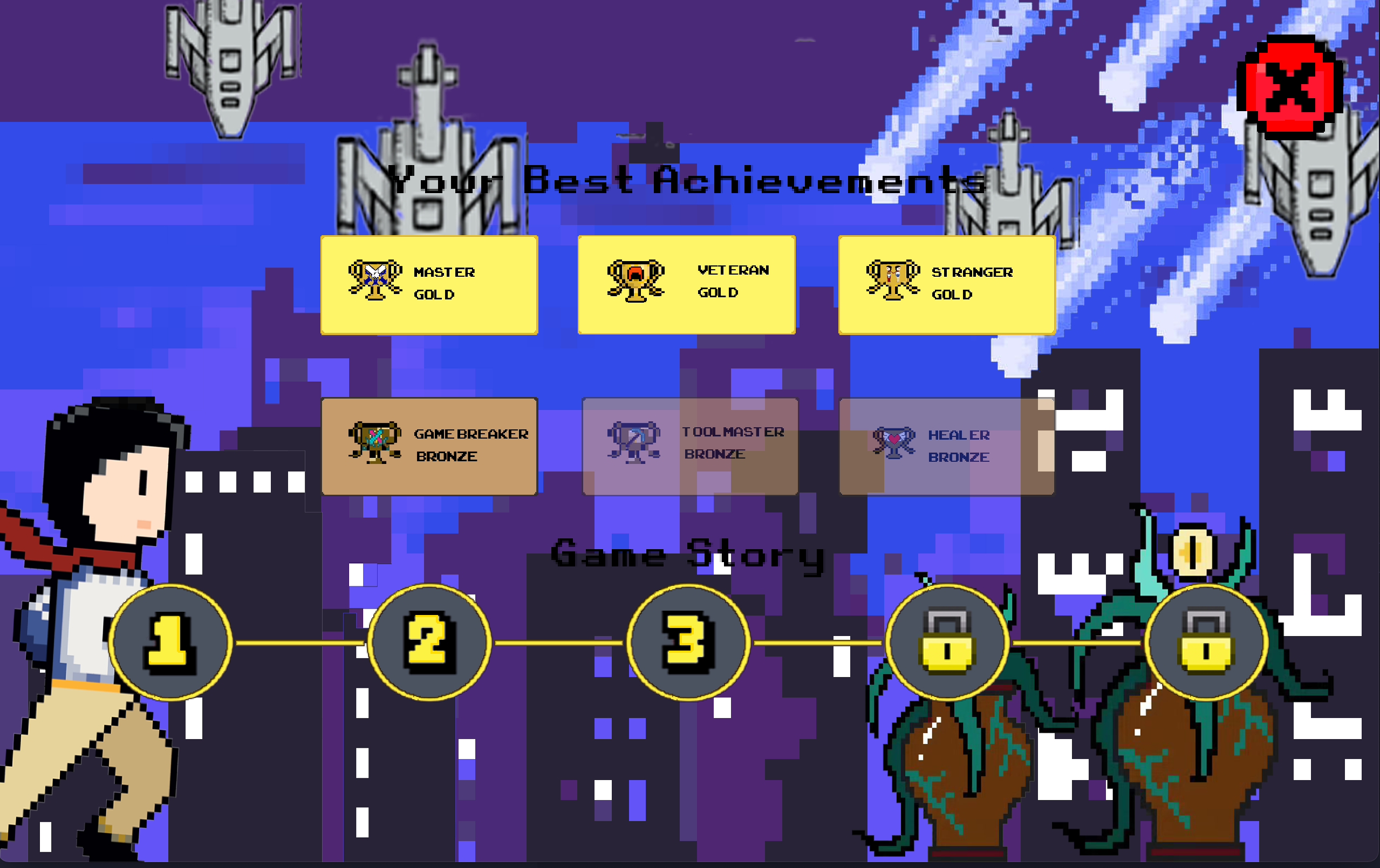
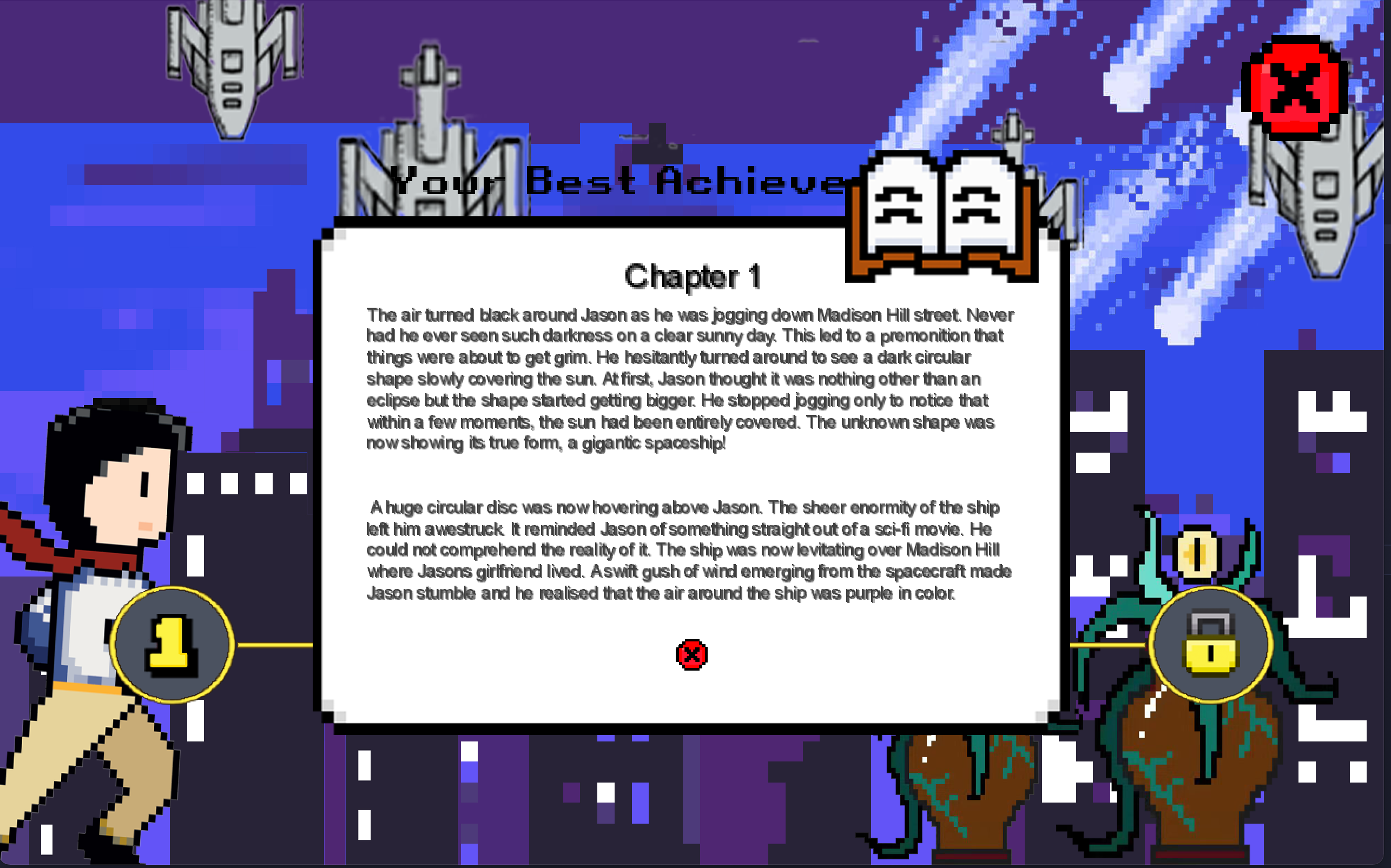
We show the final design results to users who have made suggestions before and ask for improvement suggestions. Interviews / questionnaires were used to collect suggestions of game story chapters final version.
| Achievements Screen 1 | Achievements Screen 2 |
|---|---|
The questionnaire is tested on students who have chosen the same class, and the questions in the questionnaire are in a single-choice format. The target number of people for the questionnaire survey was 20.
Since the online interviews involved questions about views on design, the interviewees were selected from the same class who were responsible for the design section. The number of interviewees was 3, and the interview was done through Zoom. The interview format was to ask users about their opinions on our design and record their views.
-
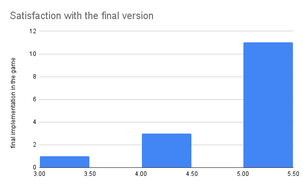
How much do you like the final version?
-
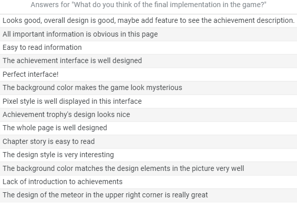
What do you think of the final implementation in the game?
-
From the design perspective, what do you think appeals to you about the implementation in the game section?
-
Do you think the design of the story chapter of the game is well integrated with the achievement screen?
-
Do you think there is anything that needs to be improved in this section?
User1:
Appreciated parts:
- I think the background of the game can catch my eyes, and the sense of this picture is very coordinated, I love it.
Degree of combination:
- I think so, first of all, the color combination of the two does not make people feel abrupt, and the achievement section is designed very conspicuously, it is easy to make people notice it.
Needs to be improved:
- I think the display box for achievements could use some added detail, the rest of it is great.
User2:
Appreciated parts:
- I think the design is very thoughtful, especially the semi-transparent design when displaying the unearned achievements, which is very innovative and has a sense of design.
Degree of combination:
- Yes, the combination of the two is perfect.
Needs to be improved:
- I think the font color of the title section could be changed or a border could be designed. I feel that the words are not very clear to see.
User3:
Appreciated parts:
- The story chapter part is very attractive to me, because the whole interface has a rich background color, so the use of white can very well catch the player's eye and highlight the focus.
Degree of combination:
- Yes, I feel that the two sections are clearly divided, and the information that I want to convey to the player is also very adequate.
Needs to be improved:
- I think the overall design is very good, maybe appropriate to increase the characteristics of the achievement description.
The majority of users gave this section a positive review, saying that the color scheme, the key information and some details are perfect. The downside is that the achievements and game story chapters are not displayed with enough features and the title section is not prominent enough.

