Responsive with Material ui - Tuong-Nguyen/JavaScript-Structure GitHub Wiki
-
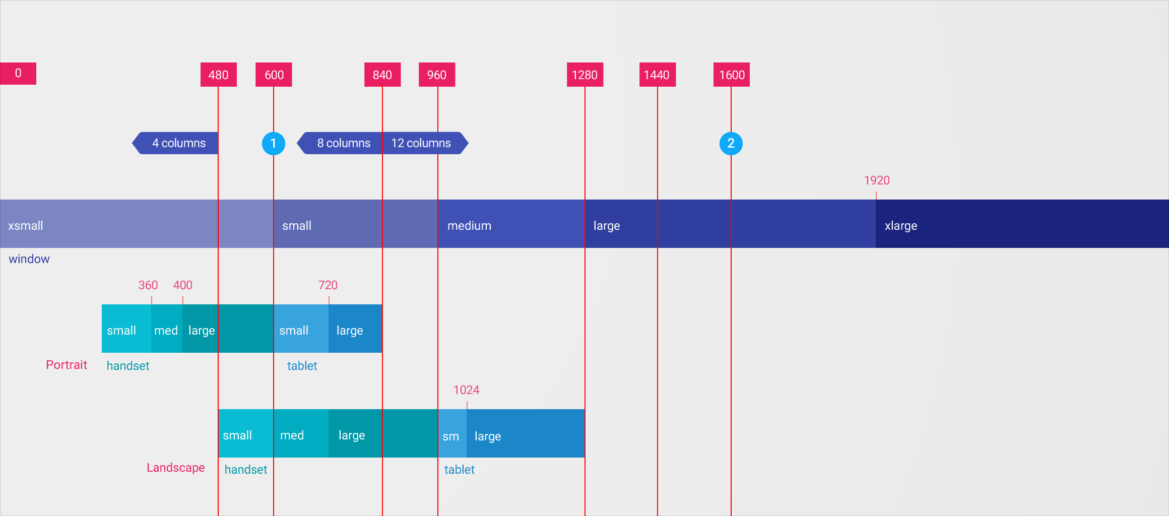
For optimal user experience, material design interfaces need to be able to adapt their layout at various breakpoints. Material-UI uses a simplified implementation of the orignal specification.
-
Each breakpoint matches with a fixed screen width:
xs, extra-small: 360dp
sm, small: 600dp
md, medium: 960dp
lg, large: 1280dp
xl, xlarge: 1920dp
- Material design’s responsive UI is based on a 12-column grid layout. This grid creates visual consistency between layouts while allowing flexibility across a wide variety of designs.
   <Grid container>
      <Grid item xs={12}>
        <div style={{backgroundColor: "#ff3a45"}} >
          <span>12</span>
        </div>
      </Grid>
      <Grid item xs={8}>
        <div style={{backgroundColor: "#86ffaf"}} >
          <span>8</span>
        </div>
      </Grid>
      <Grid item xs={4}>
        <div style={{backgroundColor: "#123fff"}} >
          <span>4</span>
        </div>
      </Grid>
</Grid>Specify by: container prop
With container grid you can add grid item as child, set display style, spacing between item components ...
-
spacingdefines the space between the type item component. Union:0, 8, 16, 24, 40and default value is 16.
<Grid container spacing={40}>
  {[0, 1, 2].map(value =>
     <Grid key={value} item>
       <Paper/>
     </Grid>,
  )}
</Grid>-
directiondefine the child items is diplay with row or column. Union:'row', 'row-reverse', 'column', 'column-reverse'. the default value is'row'
<Grid container direction='column' spacing={40}>
  {[0, 1, 2].map(value =>
     <Grid key={value} item>
       <Paper/>
     </Grid>,
  )}
</Grid>-
aligndefine the align of child items. Union:'flex-start', 'center', 'flex-end', 'stretch', 'baseline'. Default value isstretch - if direction is
roworrow-reversethealignwill align items by vertical and horizontal for direction iscolumnorcolumn-reverse.
<Grid container direction="row" align="center" spacing={40}>
  {[0, 1, 2].map(value =>
     <Grid key={value} item>
       <Paper/>
     </Grid>,
  )}
</Grid>-
justifydefine the align of child items. Union:'flex-start', 'center', 'flex-end', 'space-between', 'space-around'. Default value is 'flex-start'. *if direction isroworrow-reversethejustifywill align items by horizontal and vertical for direction iscolumnorcolumn-reverse.
<Grid container direction='column' justify={flex-start} spacing={40}>
  {[0, 1, 2].map(value =>
     <Grid key={value} item>
       <Paper/>
     </Grid>,
  )}
</Grid>- Material-Ui defined 2 style of grid item:
full-widthandcentered.
full-withgrid row is an grid which is defines with more then 1 breakpoint
     <Grid item xs={12} sm={6} lg={3}>
        <div style={{backgroundColor: "#ff3a45"}} >
          <span>12</span>
        </div>
      </Grid>
centeredgrid row is an grid which is defines with only 1 breakpoint
     <Grid item xs={12}>
        <div style={{backgroundColor: "#ff3a45"}} >
          <span>12</span>
        </div>
      </Grid>
Hidden
Hidden component will define an component which will be hidden or display at an breakpoint range.
- The hidden props is boolean params which is a plus of breakpoint key and "Up" or "Down" key (mdDown, mdUp)
Up: the component will be display at maximum of smaller breapoint range and hidden at minimum of breapoint range.
// md minimum breakpoint: 960dp
// component will be show at 959dp and hidden at 960dp.
<Hidden mdUp>
...
</Hidden>
Down: the component will be hidden at maximum of breapoint range and display at minimum of bigger breapoint range.
// md maximum breapoint:1279
// component will be hiden at 1279dp and show at 1280dp.
<Hidden mdUp>
...
</Hidden>