Current Assessment Visualization - Learning-Dashboard/LD-learning-dashboard GitHub Wiki
⏪ User Guide >> 1.1. Current Assessment Visualization
The assessment features allow the user to inspect the result of the current and past status of the project assessments. In order to include role-dependents views, the contextual menu includes six different data views: Strategic Indicators, Detailed Strategic Indicators, Factors, Detailed Factors, Metrics, and Quality Model. These views allow the user to inspect different level of abstraction that could be more adequate to their role.
![]() Project Assessment Video Tutorial
Project Assessment Video Tutorial
In addition, the contextual menu includes different view mode options in order to select how the data should be shown. The options allow graphical and textual visualization (two options on the left) of the current status or the historical data (two options on the right).
In order to inspect the current project status, the dashboard provide the “Current” mode in all the data views. There are two different visualizations, but in case of Detailed Strategic Indicators and Detailed Factors, and also Metrics we have an extra type of visulization:
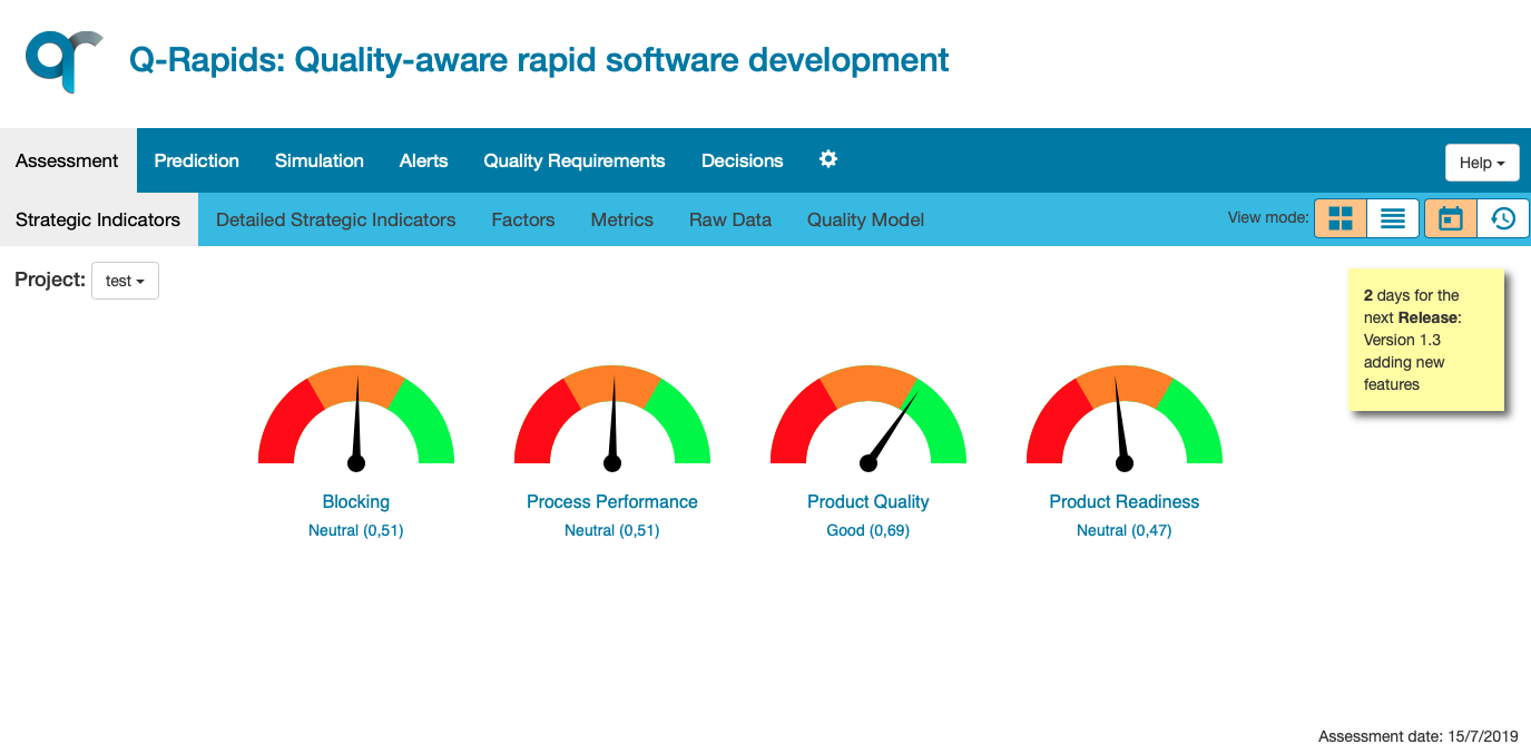
- Using gauge charts: showing the current value, when we only have one number to show. These charts are used in the Strategic Indicators Data View, Factors Data View and in the Metrics Data View.
- Using slider charts: showing the current value, when we only have one number to show. These charts are used only in the Metrics Data View.
- Using radar charts: showing the current value for all the elements used to calculate the assessed element. These charts are used in the Detailed Strategic Indicators Data View, showing the assessed value for the factors used to calculate the SI, and in the Detailed Factors Data View, showing the assessed value for the metrics used to calculate the factor. This charts also represent the categories of the system by colouring the axis with the corresponding colors for defined categories.
- Using stacked bar charts: showing the weighted value for all the elements used to calculate the assessed element. These charts are used in the Detailed Strategic Indicators Data View, showing the weighted value and the especific weight in percentage for the factors used to calculate the SI, and in the Detailed Factors Data View, showing the same information for the metrics used to calculate the factor.
- Using polar charts: showing how the weighted value of all the elements used to calculate contribute on the assessed element. These charts are used in the Detailed Strategic Indicators Data View, showing the weighted value and the specific weight in percentage for the factors used to calculate the SI, and in the Detailed Factors Data View, showing the same information for the metrics used to calculate the factor.
The dashboard informs if there has been some issue during the strategic indicator computation. A warning sign appear bellow the strategic indicator informing about the following situations:
-
When the strategic indicator is outdated: the assessment date (day when the SI was computed) is before yesterday.
-
When the factors assessment is outdated: the factors' assessment date is before the strategic indicators' assessment date.
-
When some factors were missing.
The warning reasons are shown when the user locate the mouse over the warning sign (tool-tip) and they are informed in the textual view.

|

|
The strategic indicators' assessment date is included at the bottom and right corner of the assessment area.


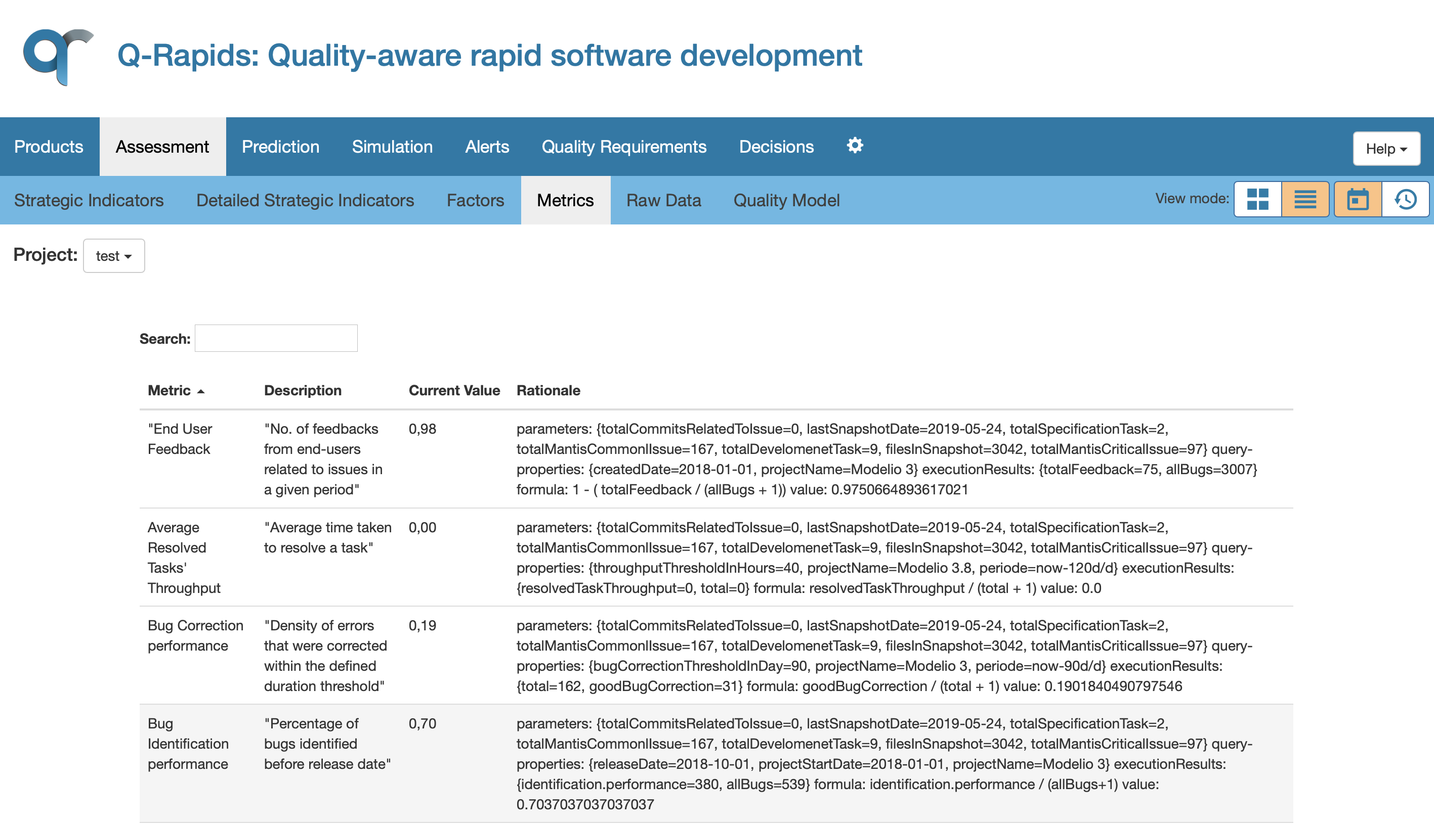
For the data views, the “Textual” option in the view mode menu allows the user to visualize the information in a textual way. The next image shows the textual mode view for Metrics Data View. In this version, this visualization includes some information to help the user understand the element (Description column) and the rationale behind the assessment value (Rationale column). As in every table in the dashboard, this view includes a search area where the user can write text in order to filter the rows, and every header of the table is a button that allows the user to order the rows by the content of the column.
The navigation through the elements helps the user to understand the assessed values, helping also to understand the meaning of the different elements. The user can navigate from high level elements (Strategic Indicators) to low level elements (Metrics) clicking on the element name. For example, if the user clicks in the name of strategic indicator named Process Performance in the Strategic Indicators Data View, the system will move to the Detailed Strategic Indicators Data View showing only the strategic indicator Process Performance. If the user clicks again in the indicator’s name, the system will move to the Quality Factors Data View showing only the factors related to this indicator (Process Performance). Finally, in the Quality Factors Data View the user can click in one of the factors to see the metric used to calculate this factor. Finally, if the metric is related with external website, the navigation can continue by making click on its name, so the system will open the web on a new tab.

When the user is navigating through the quality model elements, the name of the element is used for forward navigation (Strategic Indicator --> Detailed Strategic Indicators --> Quality Factors --> Metrics), and the system includes the path that the user followed at the top of the assessment area. The links in the navigation path can be used to navigate backwards to the origin elements. For example, the next image shows the metrics related to the Activities Completion quality factor, the user arrived to the Activities Completion inspecting the strategic indicator Product Readiness. At this point, the user could return to the Quality Factors Data View (viewing the Activities Completion metrics) or to the Strategic Indicators Data View.

In order to see an overview of all the assessed elements shown in the dashboard, the Quality Model View provides a graph which displays the names and the values of all the Strategic Indicators, Quality Factors and Metrics, as well as the relations between them that indicate what are the elements that compose each other. For the Strategic Indicators, the colour of the category in which the assessment fits is also shown. The relations between Metrics and Quality Factors inform about the ponderation of the Metrics in the calculation of each Quality Factor. And the relations between Quality Factors and Strategic Indicators inform about the ponderation of the Quality Factors in the calculation of each Strategic Indicator.

Another mode of visualization for Quality Model information is the zoomable sunburst chart. This chart has three levels representing Strategic Indicators, Quality Factors and Mertrics respectively from inner radius to external radius. Each piece of circle represents the contribution in upper level and tooltips show the real value of Strategic Indicators, Quality Factors or Mertrics and the percentage of contribution in case Quality Factors for Strategic Indicator and Mertrics for Quality Factor.
