Controller Reference - KSPSnark/IndicatorLights GitHub Wiki
What's this page?
This is a comprehensive listing of all controller and helper modules supported by IndicatorLights, intended for modders.
Please see Setting up a ModuleEmissiveController for an overview of how to use them.
Note that all controllers have controllerName and emissiveName properties (see discussion on the above-linked page), so those aren't listed here.
IScalar and IToggle
IndicatorLights declares two special types of interface that controller modules may implement:
IScalar: For modules that expose a single floating-point scalar value. For example, ModuleResourceLevelIndicator is an IScalar whose value is in the range [0,1] representing how full the resource is.IToggle: For modules that expose a single boolean status value. For example, ModuleToggleLED is an IToggle whose value is true when turned on, false when turned off.
Modules supporting IScalar and/or IToggle can be referenced using scalar syntax and/or toggle syntax, which is useful in certain types of color sources.
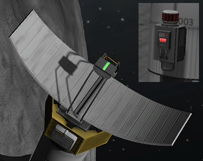
ModuleBiomeScannerIndicator
- What it does:
- Indicates whether the current biome can be scanned or not.
- Supports
IToggle(indicates whether or not a biome scan can be currently be done).
- Things that use it:
- Requirements:
- Must be on a part that has a ModuleBiomeScanner on it.
- Fields:
readyColor: Required. A ColorSource string specifying the color to display when it's ready to take a biome scan.inactiveColor: Optional. A ColorSource string specifying the color to display when it's inactive (either the current biome has already been scanned, or else the scanner is not in a usable situation, such as not being within range of the surface). If omitted, defaults to$Off.
- Example usage
- Source code
ModuleBooleanIndicator
- What it does:
- Displays one of two colors, depending on whether an arbitrary toggle control is true or false.
- Supports
IToggle(indicates the state of the source toggle). - Very useful and flexible when used with field@module syntax, since that allows you to base toggle control on any arbitrary boolean field of any PartModule, even if it's one that IndicatorLights doesn't know anything about. Here's an example.
- Things that use it:
- Nothing, currently. However, see below for link to sample config.
- Fields:
input: Required. A toggle string specifying the toggle that controls which color is displayed.activeColor: Optional. A ColorSource string specifying the color to display when the input toggle is true. If omitted, defaults to$ToggleLED.inactiveColor: Optional. A ColorSource string specifying the color to display when the input toggle is false. If omitted, defaults to$Off.
- Example usage
- Source code
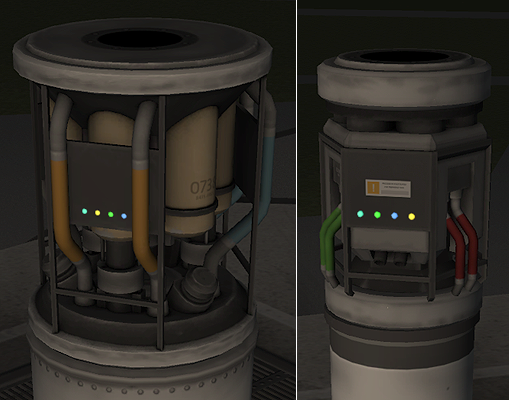
ModuleConverterIndicator
- What it does:
- Simple on/off indicator showing when a resource converter is active.
- Supports
IToggle(indicates whether converter is running).
- Things that use it:
- fuel cells
- ISRU
- Science lab
- Requirements:
- Must be on a part that has at least one BaseConverter (e.g. ModuleResourceConverter) on it.
- Fields:
converterName: Required. The converter which this module takes its control input from. Must exactly match theConverterNameproperty on the converter that it's tracking. (Needed because there may be more than one converter on the part, such as with the ISRU unit.)activeColor: Optional. A ColorSource string specifying the color to display when the converter is active. If omitted, defaults to$ToggleLED.inactiveColor: Optional. A ColorSource string specifying the color to display when the converter is inactive. If omitted, defaults to$Off.
- Example usage
- Source code
ModuleCrewIndicator
- What it does:
- On/off indicator showing when a crew slot is occupied.
- Color indicates profession of occupant.
- Supports
IToggle(showing whether crew slot is occupied).
- Things that use it:
- Requirements:
- Must be on a part that has crew capacity.
- Indicates a particular slot, so multi-crew parts need multiple indicators.
- Usage notes:
- Handy when used in conjunction with a ModuleCrewIndicatorToggle to activate/deactivate all indicators on the part at once.
- Off by default. Player config setting is available to make it on by default.
- Fields:
slot: Required. An integer indicating which crew slot the indicator is tracking, with 0 being the first slot.toggleName: Optional. A toggle string (e.g. a reference to a ModuleCrewIndicatorToggle) to control whether the crew indicator is on or off. If omitted, the indicator is always on.emptyColor: Optional. A ColorSource string specifying the color to display when the crew slot is unoccupied. If omitted, defaults to$Off.pilotColor: Optional. A ColorSource string specifying the color to display when a pilot occupies the slot. If omitted, defaults to$CrewPilot.engineerColor: Optional. A ColorSource string specifying the color to display when an engineer occupies the slot. If omitted, defaults to$CrewEngineer.scientistColor: Optional. A ColorSource string specifying the color to display when a scientist occupies the slot. If omitted, defaults to$CrewScientist.touristColor: Optional. A ColorSource string specifying the color to display when a tourist occupies the slot. If omitted, defaults to$CrewTourist.otherColor: Optional. A ColorSource string specifying the color to display when some other type of kerbal than the above (i.e. from a mod that adds new kerbal types) occupies the slot. If omitted, defaults to$Unknown.
- Defined static fields:
slot: Indicates the slot to which this module applies.
- Example usage
- Source code
ModuleCrewIndicatorToggle
- What it does:
- An input toggle with UI and action groups. UI is available in-flight and in the editor.
- Useful for toggling sets of crew indicators on/off at once.
- Supports
IToggle(shows whether the toggle is turned on or off).
- Things that use it:
- Usage notes:
- This is a "special" controller that can only be used as a control input to other controllers; it can't actually drive an emissive (it has no
emissiveNameproperty, unlike most controllers).
- This is a "special" controller that can only be used as a control input to other controllers; it can't actually drive an emissive (it has no
- Fields:
toggleName: Required. Identifies this toggle so that other controllers can reference it.status: Optional. Boolean that indicates the on/off status of the toggle. Defaults to false.uiToggle: Optional. A UI_Scene value that controls where the toggle's UI is visible. Allowed values: None, Editor, Flight, All. If omitted, defaults to All.
- Example usage
- Source code
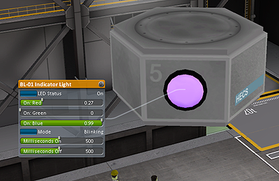
ModuleCustomBlink
- What it does:
- Blinking animation with UI and action groups.
- Editor UI allows player to select the blink timing.
- Blinking on/off toggle UI is available in-flight and in editor.
- Supports
IToggle(returns the current phase of the blink animation).
- Things that use it:
- Usage notes:
- If you want a blinking animation that does not have a UI for the player (i.e. behavior is fully specified in config), you don't need ModuleCustomBlink; you can just use a "blink" ColorSource.
- Fields:
onColor: Required. A ColorSource string specifying the color to display during the "on" phase of the blink cycle.offColor: Required. A ColorSource string specifying the color to display during the "off" phase of the blink cycle.onMillis: Optional. A float, specifying the length of the "on" phase of the blink cycle, in milliseconds. Defaults to 500.offMillis: Optional. A float, specifying the length of the "off" phase of the blink cycle, in milliseconds. Defaults to 500.phase: Optional. A float, in the range 0 to 1 (defaults to 0), specifying the "phase" of the blink cycle. Useful for making lights that blink in sequence rather than unison.blinkEnabled: Optional. Boolean specified whether the blinking is currently turned on or off. Defaults to false.uiToggle: Optional. A UI_Scene value that controls where the toggle's UI is visible. Allowed values: None, Editor, Flight, All. If omitted, defaults to All.
- Example usage
- Source code
ModuleCustomColoredEmissive
- What it does:
- A simple constant color, with editor UI that allows the player to pick the color via UI sliders.
- No in-flight UI; customization is in editor only.
- Things that use it:
- Usage notes:
- If you have multiple ModuleCustomColoredEmissives on a part, the
labelfield (see below) is a handy way to distinguish them in the UI so that the player can tell them apart.
- If you have multiple ModuleCustomColoredEmissives on a part, the
- Fields:
color: Optional. A ColorSource string specifying the physical or logical color that it initially has, before the player tinkers with the sliders. Defaults to$Off.label: Optional string. If provided, is used to "decorate" the labels on the sliders.
- Example usage
- Source code
ModuleDataTransmitterIndicator
- What it does:
- Shows whether an antenna is currently transmitting science.
- Supports
IToggle(true when transmission is taking place).
- Things that use it:
- Requirements:
- Must be on a part that has a ModuleDataTransmitter.
- Fields:
busyColor: Optional. A ColorSource string specifying the color to display when data transmission is taking place. If omitted, defaults torandom($ToggleLED,$Off,100,0.5).inactiveColor: Optional. A ColorSource string specifying the color to display when data transmission is taking place. If omitted, defaults to$Off.
- Defined static fields:
dataRate: Indicates the rate with which the antenna transmits data.
- Example usage
- Source code
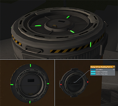
ModuleDockingCrossfeedIndicator
- What it does:
- A bi-state indicator that shows whether a docking port's fuel crossfeed is enabled or not.
- Supports
IToggle(indicates whether crossfeed is enabled).
- Things that use it:
- Requirements:
- Must be on a part that has a ModuleDockingNode.
- Fields:
crossfeedOnSource: Optional. A ColorSource string specifying the color to display when the docking port's fuel crossfeed is active. If omitted, defaults to$DockingCrossfeedOn.crossfeedOffSource: Optional. A ColorSource string specifying the color to display when the docking port's fuel crossfeed is disabled. If omitted, defaults to$DockingCrossfeedOff.
- Example usage
- Source code
ModuleDockingStateIndicator
- What it does:
- An indicator that shows when a docking port's docking field is engaged.
- It has three states: "ready", "acquire", and "disengage".
- Supports
IToggle(indicates when the docking is acquiring or disengaging).
- Things that use it:
- Requirements:
- Must be on a part that has a ModuleDockingNode.
- Fields:
readyColor: Required. A ColorSource string specifying the color to display when the docking port is either docked, or ready to dock (but no field engaged).acquireColor: Required. A ColorSource string specifying the color to display when the port's docking field has engaged.disengageColor: Required. A ColorSource string specifying the color to display when the port has undocked, but hasn't yet separated far enough to be dockable again.
- Example usage
- Source code
ModuleIndicatorToggle
- What it does:
- A general-purpose input toggle with UI and action groups, useful as a control input for other controllers.
- Names displayed in UI are customizable via fields.
- Supports
IToggle(exposes the toggle state).
- Things that use it:
- Nothing that ships with IndicatorLights.
- It's included as a general-purpose tool for modders. It's handy due to its UI being customizable via fields in the
.cfg.
- Usage notes:
- This is a "special" controller that can only be used as a control input to other controllers; it can't actually drive an emissive (it has no
emissiveNameproperty, unlike most controllers).
- This is a "special" controller that can only be used as a control input to other controllers; it can't actually drive an emissive (it has no
- Fields:
toggleName: Required. Identifies this toggle so that other controllers can reference it.status: Optional. Boolean that indicates the on/off status of the toggle. Defaults to false.guiActive: Optional. Indicates whether the UI is displayed in flight. Defaults to true.guiActiveEditor: Optional. Indicates whether the UI is displayed in the editor. Defaults to true.statusLabel: Optional. String to display in UI for current status of toggle. Defaults to "Status".statusOn: Optional. String to display when the toggle is turned on. Defaults to "On".statusOff: Optional. String to display when the toggle is turned off. Defaults to "Off".toggleAction: Optional. Name of the the "toggle" action group. Defaults to "Toggle".activateAction: Optional. Name of the "activate" action group. Defaults to "Activate".deactivateAction: Optional. Name of the "deactivate" action group. Defaults to "Deactivate".
- Example usage: None, but it's very similar to ModuleCrewIndicatorToggle; see example there.
- Source code
ModuleOrbitalSurveyorIndicator
- What it does:
- Shows the status of an orbital surveyor (e.g. can it take a scan or not).
- Includes a warning indicator if no antenna is available (required for taking a scan).
- Things that use it:
- Requirements:
- Must be pon a part that has a ModuleOrbitalSurveyor.
- Fields:
alreadyScannedColor: Required. A ColorSource string specifying the color to display when the current celestial body has already been scanned.potentialScanColor: Required. A ColorSource string specifying the color to display when there's a "potential" scan (i.e. we're in the SoI of a scannable body that hasn't been scanned yet, but we're not in a valid orbit around that body).readyScanColor: Required: A ColorSource string specifying the color to display when the scanner is "ready", i.e. can take a scan right now.unusableColor: Required. A ColorSource string specifying the color to display when the scanner is unusable (for example, because there is no antenna available).requireTerrain: Optional boolean. When set to true, the indicator will only light up when the body whose SoI it's in has terrain. (Examples of bodies that don't: the sun; gas giants such as Jool.) If omitted, defaults to true.
- Example usage
- Source code
ModuleReactionWheelIndicator
- What it does:
- Shows the status of a reaction wheel: its mode, whether it's turned on.
- Supports
IScalar(indicates torque authority, in the range [0,1]). - Supports
IToggle(true when the wheel is enabled).
- Things that use it:
- Requirements:
- Must be on a part that has a ModuleReactionWheel.
- Fields:
normalColor: Optional. A ColorSource string specifying the color to display when the reaction wheel is operating in normal mode. If omitted, defaults to$ReactionWheelNormal.pilotOnlyColor: Optional. A ColorSource string specifying the color to display when the reaction wheel is operating in pilot-only mode. If omitted, defaults to$ReactionWheelPilotOnly.sasOnlyColor: Optional. A ColorSource string specifying the color to display when the reaction wheel is operating in SAS-only mode. If omitted, defaults to$ReactionWheelSASOnly.problemColor: Optional. A ColorSource string specifying the color to display when the reaction wheel is broken. If omitted, defaults to$ReactionWheelProblem.
- Example usage
- Source code
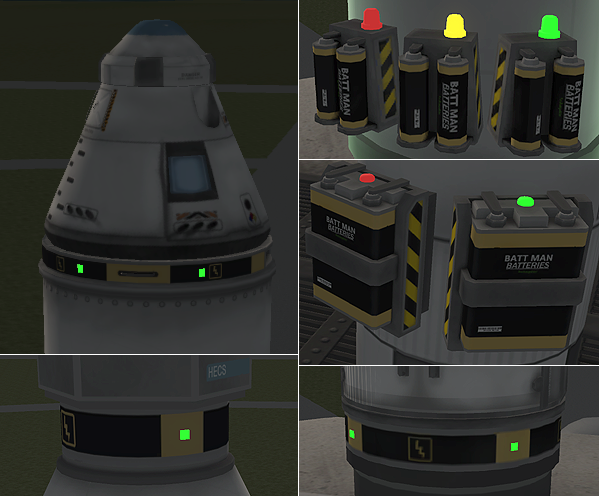
ModuleResourceEnabledIndicator
- What it does:
- A bi-state indicator that shows whether a resource container is enabled or not.
- Supports
IToggle(true when resource is enabled).
- Things that use it:
- Fields:
resourceName: Optional. A string that specifies which resource the indicator tracks. If omitted, will track the first resource on the part. (You only need to specify this in cases where more than one resource is present.)enabledColor: Optional. A ColorSource string specifying the color to display when the resource is enabled. If omitted, defaults to$ToggleLED.disabledColor: Optional. A ColorSource string specifying the color to display when the resource is disabled. If omitted, defaults to$Off.searchStrategy: Optional. Determines where (i.e. in which part) the module will look for resources. Valid values arehost(which will cause it to use the part where this module lives) orparent(which will cause it to use the parent of that part). If omitted, defaults tohost.
- Example usage 1
- Example usage 2 (demonstrates usage of
searchStrategy = parent) - Source code
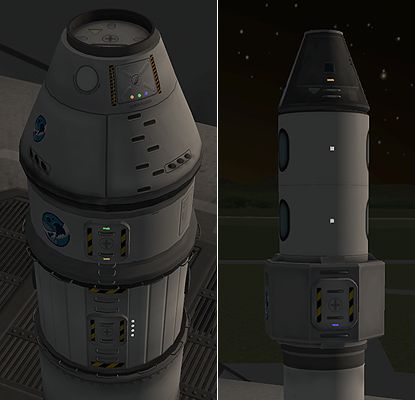
ModuleResourceLevelIndicator
- What it does:
- A color-coded indicator that shows how full a resource container is.
- Supports
IScalar(value is the fraction of resource present, in the range [0,1]). - Supports
IToggle(true when any amount of resource is present).
- Things that use it:
- Fields:
resourceName: Optional. A string that specifies which resource the indicator tracks. If omitted, will track the first resource on the part. (You only need to specify this in cases where more than one resource is present.)highColor: Optional. A ColorSource string specifying the color to display when the resource is nearly full. If omitted, defaults to$HighResource.mediumColor: Optional. A ColorSource string specifying the color to display when the resource is partially full (or, depending on your outlook on life, partially empty). If omitted, defaults to$MediumResource.lowColor: Optional. A ColorSource string specifying the color to display when the resource is mostly empty. If omitted, defaults to$LowResource.criticalColor: Optional. A ColorSource string specifying the color to display when the resource is almost completely empty. If omitted, defaults topulsate($LowResource, 1200, 0.6).highThreshold: Optional. A float in the range 0-1 that indicates the resource fraction above which the "full" color will be used. Defaults to 0.7.lowThreshold: Optional. A float in the range 0-1 that indicates the resource fraction below which the "resource low" color will be used. Defaults to 0.3.criticalThreshold: Optional. A float in the range 0-1 that indicates the resource fraction below which the "resource nearly empty" color will be used. Defaults to 0.03.emptyColor: Optional. A ColorSource string specifying the color to display when the resource is completely empty. If omitted, defaults to$Off.searchStrategy: Optional. Determines where (i.e. in which part) the module will look for resources. Valid values arehost(which will cause it to use the part where this module lives) orparent(which will cause it to use the parent of that part). If omitted, defaults tohost.
- Defined static fields:
highThreshold(see above)mediumThreshold(see above)criticalThreshold(see above)
- Example usage 1
- Example usage 2 (demonstrates usage of
searchStrategy = parent) - Source code
ModuleResourceScannerIndicator
- What it does:
- Indicates the relative degree of resource concentration found by the scanner: none, low, medium, high.
- Supports
IScalar(provides the resource abundance, or 0 when scanning isn't currently possible). - Supports
IToggle(true when scanning is possible and any resource is detectable).
- Things that use it:
- Requirements:
- Must be on a part that has a ModuleResourceScanner on it.
- Fields:
inactiveColor: Optional. A ColorSource string specifying the color to display when the scanner is inactive (i.e. can't scan right now). If omitted, defaults to$Off.unavailable: Optional. A ColorSource string specifying the color to display when resource content is zero (or nearly so). If omitted, defaults toinactiveColor, i.e. treat "unavailable" the same as "inactive".lowResourceColor: Optional. A ColorSource string specifying the color to display when resource content is "low". If omitted, defaults to$LowResource.mediumResourceColor: Optional. A ColorSource string specifying the color to display when resource content is "medium". If omitted, defaults to$MediumResource.highResourceColor: Optional. A ColorSource string specifying the color to display when resource content is "high". If omitted, defaults to$HighResource.unavailableResourceThreshold: Optional. A floating-point number specifying the resource abundance below which we treat it as zero. If omitted, defaults to 0.001 (i.e. 0.1% concentration).lowResourceThreshold: Optional. A floating-point number specifying the resource abundance threshold between "low" and "medium". If omitted, defaults to 0.025 (i.e. 2.5% abundance), which not coincidentally happens to be the threshold below which the small ore drill doesn't work.highResourceThreshold: Optional. A floating-point number specifying the resource abundance threshold between "medium" and "high". If omitted, defaults to 0.05 (i.e. 5% abundance).
- Defined static fields:
unavailableResourceThreshold(see above)lowResourceThreshold(see above)highResourceThreshold(see above)
- Example usage
- Source code
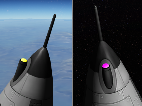
ModuleSasIndicator
- What it does:
- On/off state indicates whether SAS is active for the current vessel.
- When it's on, the indicator color shows which SAS mode is active.
- Supports
IToggle(indicates whether SAS is on or off).
- Things that use it:
- Fields:
stabilityAssistColor: Color to display when SAS is in "stability assist" mode. Defaults to white.progradeColor: Color to display when SAS is in "hold prograde" mode. Defaults to yellow.retrogradeColor: Color to display when SAS is in "hold retrograde" mode. Defaults to yellow.normalColor: Color to display when SAS is in "hold normal" mode. Defaults to magenta.antinormalColor: Color to display when SAS is in "hold anti-normal" mode. Defaults to magenta.radialInColor: Color to display when SAS is in "hold radial in" mode. Defaults to cyan.radialOutColor: Color to display when SAS is in "hold radial out" mode. Defaults to cyan.targetColor: Color to display when SAS is in "hold target" mode. Defaults to magenta.antitargetColor: Color to display when SAS is in "hold anti-target" mode. Defaults to magenta.maneuverColor: Color to display when SAS is in "hold maneuver" mode. Defaults to blue.inactiveColor: Color to display when SAS is inactive. Defaults to$Off.
- Example usage
- Source code
ModuleScalarIndicator
- What it does:
- Displays one of several colors, depending the value of an arbitrary scalar input is true or false.
- Supports
IScalar(indicates the value of the scalar input).
- Things that use it:
- Nothing, currently. However, see below for link to sample config.
- Fields:
input: Required. A scalar string specifying the scalar that controls which color is displayed.highColor: Optional. A ColorSource string specifying the color to display when the input value is "high". If omitted, defaults to$HighResource.mediumColor: Optional. A ColorSource string specifying the color to display when the input value is "medium". If omitted, defaults to$MediumResource.lowColor: Optional. A ColorSource string specifying the color to display when the input value is "low". If omitted, defaults to$LowResource.criticalColor: Optional. A ColorSource string specifying the color to display when the input value is "very low". If omitted, defaults tolowColor(meaning that "low is low" and there's no separate display for "very" low).absentColor: Optional. A ColorSource string specifying the color to display when the input value is effectively zero. If omitted, defaults to$Off.highThreshold: Optional. Specifies the input value above which the "high" color will be used. Defaults to 0.7.lowThreshold: Optional. Specifies the input value below which the "low" color will be used. Defaults to 0.3.criticalThreshold: Optional. Specifies the input value below which the "critical" color will be used. Defaults to 0.03.epsilon: Optional. Specifies the input value at or below which the "absent" color will be used. Defaults to 0.
- Defined static fields:
highThreshold(see above)lowThreshold(see above)criticalThreshold(see above)epsilon(see above)
- Example usage
- Source code
ModuleScienceAvailabilityIndicator
- What it does:
- Shows that science is available to acquire in the current location.
- Two different colors available to show the "value" of the available science (see below).
- Is
$Off(unlit) when there is no new science available, or if the vessel already has this science result stored somewhere. - Supports
IScalar(gets the value of obtainable science, in the range [0,1]). - Supports
IToggle(true if science is available).
- Things that use it:
- All science instruments.
- Requirements:
- Must be on a part that has a ModuleScienceExperiment.
- Fields:
experimentID: Optional. Specifies the experiment to which this indicator applies. If omitted, will just use the first ModuleScienceExperiment found on the part. (Specifying this field is usually not necessary, since most parts will only have one science experiment on them. However, if you have a single part that allows multiple science experiments, you can use this field to specify which one the indicator pertains to.)highValueColor: Optional. A ColorSource string specifying the color to display when "high value" (i.e. never-before-acquired) science is available and not already stored on the vessel somewhere.mediumValueColor: Optional. A ColorSource string specifying the color to display when "medium value" (i.e. previously transmitted, but not physically recovered) science is available and not already stored on the vessel somewhere.lowValueColor: Optional. A ColorSource string specifying the color to display when "low value" (i.e. close to zero, such as previously recovered) science is available and not already stored on the vessel somewhere.highScienceThreshold: Optional. Specifies the fractional value (in the range 0-1) above which science value should be considered "high". Defaults to 0.7 if not specified.lowScienceThreshold: Optional. Specifies the fractional value (in the range 0-1) below which science value should be considered "low". Defaults to 0.15 if not specified.
- Defined static fields:
highScienceThreshold(see above)lowScienceThreshold(see above)
- Example usage
- Source code
ModuleScienceContainerIndicator
- What it does:
- Works exactly the same and has exactly the same fields as ModuleScienceDataIndicator (see below), except for the following differences:
- Works with ModuleScienceContainer instead of ModuleScienceExperiment
- Has no
experimentIDfield (since it can contain multiple experiments and isn't associated with any one) - If it contains multiple experiments, shows the value of the most valuable one.
- Example usage
- Source code
ModuleScienceDataIndicator
- What it does:
- Uses color to display the data content of a science instrument.
- Four colors available for different states (see below).
- Supports
IScalar(gives the value of science contained, in the range [0,1]). - Supports
IToggle(true when any science is contained).
- Things that use it:
- All science instruments have a four-state LED on them.
- The Science Jr. materials bay has a two-state indicator to make the internal lights pulsate when data is present.
- Requirements:
- Must be on a part that has a ModuleScienceExperiment.
- Fields:
experimentID: Optional. Specifies the experiment to which this indicator applies. If omitted, will just use the first ModuleScienceExperiment found on the part. (Specifying this field is usually not necessary, since most parts will only have one science experiment on them. However, if you have a single part that allows multiple science experiments, you can use this field to specify which one the indicator pertains to.)dataColor: Optional. A ColorSource string specifying the color to display when the instrument contains science data. If omitted, defaults to$CrewScientist.emptyColor: Optional. A ColorSource string specifying the color to display when the instrument contains no science data. If omitted, defaults to$Off.partialDataColor: Optional. A ColorSource string specifying the color to display when the instrument contains "partial" science data: i.e. when you've previously transmitted this science result, but have never physically recovered the result before. If not specified, will usedataColorin this state.lowDataColor: Optional. A ColorSource string specifying the color to display when the instrument contains "nearly worthless" science data: i.e. when this result has been recovered before, so it's worth zero or close to zero. If not specified, will usedataColorin this state.highScienceThreshold: Optional. Specifies the fractional value (in the range 0-1) above which science value should be considered "high". Defaults to 0.7 if not specified.lowScienceThreshold: Optional. Specifies the fractional value (in the range 0-1) below which science value should be considered "low". Defaults to 0.15 if not specified.
- Defined static fields:
highScienceThreshold(see above)lowScienceThreshold(see above)
- Example usage
- Source code
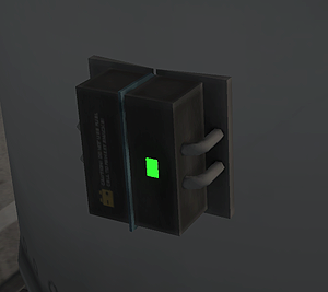
ModuleToggleLED
- What it does:
- An on/off toggle that the player can activate via right-click menu or action group.
- Supports
IToggle(exposes toggle status).
- Things that use it:
- Fields:
activeColor: Optional. A ColorSource string specifying the color to display when the toggle is turned on. If omitted, defaults to$ToggleLED.inactiveColor: Optional. A ColorSource string specifying the color to display when the toggle is turned off. If omitted, defaults to$Off.status: Optional. Boolean that indicates the on/off status of the toggle. Defaults to false.statusText: Optional. Sets the UI text to display for the toggle button. Defaults to "Toggle LED".
- Example usage
- Source code