Generating Output with Climate Explorer - wtblock/ClimateSuite GitHub Wiki
Generating Output with Climate Explorer
Render Properties
When generating output, there are several properties that control how the content is rendered:
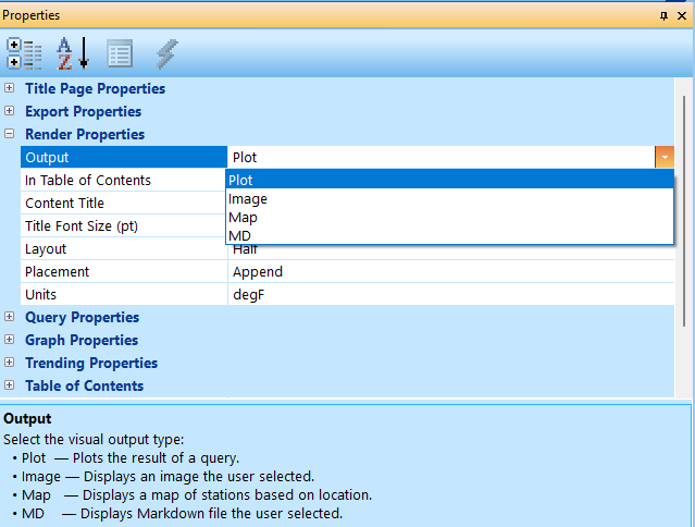
- Output — controls the type of output.
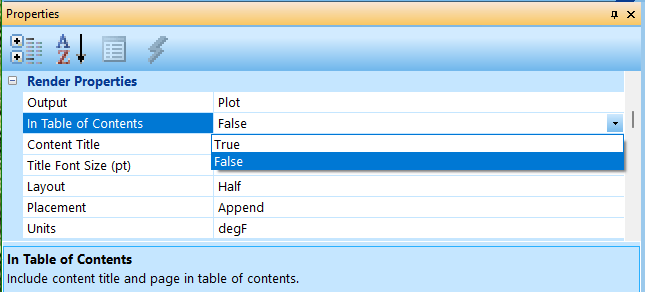
- In Table of Contents — enables listing in the table of contents.
- Content Title — the title of the output.
- Title Font Size (pt) — point size of text in plot titles.
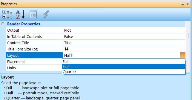
- Layout — defines how the output is laid out on the page.
- Placement — controls where the output is placed in the document.
- Units — specifies the temperature units for plots.

Output Types
Climate Explorer is designed to output four different types of information controlled by the Output property:
- Plot — plots the result of a database query.
- Image — displays an external image (JPEG, PNG, etc.).
- Map — displays a map associated with climate stations.
- MD — imports markdown files to allow for descriptions of the above.
In Table of Contents
This is a Boolean value that enables the output title to be displayed on the Table of Contents page.
Content Title
A text field for labeling the content in the table of contents.
Title Font Size (pt)
This property only affects the title on the top of graphs. The value is in points where 72 points is equivalent to one inch.
Layout
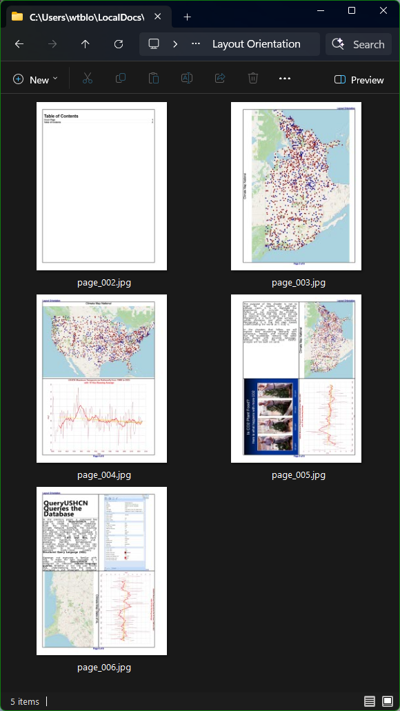
Climate Explorer is page oriented such that everything done is relative to a specific page which is different from a word processor where the document is a continuous stream and the pagination happens when the document is rendered. Climate Explorer is designed to create a letter sized (8 1/2" x 11") document specifically to the Kindle specification for a paperback book. The Layout property specifies how the page is divided:
- Full — the output fills the full page which has a portrait aspect ratio.
- Half — the output fills either the top or bottom half of the page and have a landscape aspect ratio.
- Quarter — the output fills one quadrant of the page which all have portrait aspect ratios.
The aspect ratio affects outputs differently.
- Plot and Maps — are always have a landscape aspect, so they will draw horizontally in Half layouts, and will rotate in the other layouts. The rotation depends on the page number. Odd pages (right side of book) force counterclockwise rotation to keep the base of the image on the outside border of the book. Even pages do the opposite.
- Images — the aspect of an image is unknown until it is rendered, and rotation happens when the result is to use the maximum space allotted to the layout. Direction of rotation follows the same rules as plots and maps.
- Markdown — is always rendered top to bottom regardless of the layout.
The Export icon on the toolbar will output pages as images in a book folder. Using that feature, here are some pages that illustrate the layouts and corresponding rotation effects as displayed in the File Explorer:
Output
Plot
The primary function of Climate Explorer is to generate output and as the name implies, plotting climate data is at the top of that list. Plot properties are controlled by three other sets of properties:
- Query Properties — the properties that generate the SQL query to pull data from the database.
- Graph Properties — the properties that control the formatting of the generated graph.
- Trending Properties — ability to enable up to three trend line graphs (least squares calculation) and to define their formatting.
The last two are obvious when using the application. Line styles, colors, font sizes, and axis labels do not require any explanation. When running the application and changing these setting and getting immediate feedback is the best teacher.
Query Properties are the heart of the application because they are how the user instructs the application what information to pull from the database to be plotted. If no properties are changed, the default is to generate a graph of the national maximum temperature from 1900 to 2025:

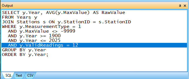
That generates the following SQL query:
SELECT y.Year, AVG(y.MaxValue) AS RawValue
FROM Years y
JOIN Stations s ON y.StationID = s.StationID
WHERE y.MeasurementType = 1
  AND y.MaxValue <> -9999
  AND y.Year >= 1900
  AND y.Year <= 2025
  AND y.ValidReadings = 12
GROUP BY y.Year
ORDER BY y.Year;
As seen in the SQL tab of the Output panel:
The Text tab of the output window displays the table of information retrieved from the database:
Year   Temperature
                   degF
---------------------------
1900        88.831
1901        91.384
1902        87.070
1903        86.019
1904        85.108
1905        86.701
1906        86.757
1907        86.423
1908        87.238
1909        87.816
1910        88.391
...
2024        87.926
2025        88.020

The Text can help you find specific values like what was spike in temperature in the 1930s. As you can see, the highest temperatures were recorded in 1936 also known as the "dust bowl."
The CSV tab contains the same information formatted as Comma Separated Value for easy import into other applications like Excel. Right clicking on these panels presents a context menu that allows the user to copy the contents of the panel out. In the case of the SQL panel, if you hold down the shift key while copying the data, it will copy the data as a single line of text that can easily be used with the QueryUSHCN command line application:

Query Properties
These properties are an interactive method of creating SQL queries without the need to understand SQL.
Pure
The Pure property defaults to true and its effect is the highlighted line in the SQL image above:
AND y.ValidReadings = 12
The query engine automatically discards all quality control flagged data and data marked as estimated. The Pure property also adds that the only data used is when all of the months of the year are read. If the Pure is set to false, that line of SQL is removed.
Scope
The Scope of the query can be one of the following:
- National — all of the active climate stations in the continental United States.
- State — individual states are plotted.
- Location — a specific station is plotted.
When the Scope is set to State, a State property is exposed:
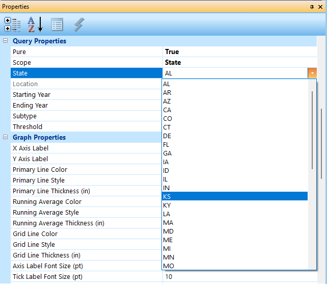
With the Scope set to State and the State set to KS (Kansas), executing the query (pressing the execute button on the toolbar), generates the following graph:

The plot looks very similar to the national plot, and the SQL had a single line added:

When the Scope is set to Location, all of the locations in the selected state will be in the Location dropdown control:
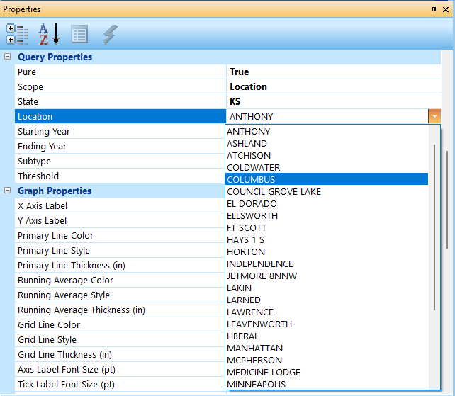
Executing the query with the Columbus Location selected generates the following graph:

Again, the plot looks similar to both the National and State scopes. The change to the SQL is highlighted below:

Starting and Ending Year
These properties do not need any explanation; they just limit the range of years to be included in the graph.
Subtype
The Subtype property provides choice of the measurement type of information being graphed:
- Maximum — monthly mean maximum temperature.
- Minimum — monthly mean minimum temperature
- Average — average monthly temperature (tmax + tmin)/2
- Threshold — percent of readings above a threshold temperature
- Stations — active stations over time
All of the previous graphs were done with Maximum Subtype, so with the Scope set back to National and the Subtype set to Minimum the plot looks like this:

The colors have changed from red to blue by default but can be changed in the Graph Properties if desired. Notice the green trend line showing a steep drop in temperatures over the last 25 years. The SQL changed to this:
SELECT y.Year, AVG(y.MinValue) AS RawValue
FROM Years y
JOIN Stations s ON y.StationID = s.StationID
WHERE y.MeasurementType = 2
  AND y.MinValue <> -9999
  AND y.Year >= 1900
  AND y.Year <= 2025
  AND y.ValidReadings = 12
GROUP BY y.Year
ORDER BY y.Year;
where MeasurementType changed from 1 (maximum) to 2 (minimum) and testing MinValue instead of MaxValue.
Doing the same thing with the Subtype set to Average results in the following graph:

The color scheme has changed to purple by default, but again the user can override this in the Graph Properties. The SQL changed to this:
SELECT y.Year, AVG(y.AvgValue) AS RawValue
FROM Years y
JOIN Stations s ON y.StationID = s.StationID
WHERE y.MeasurementType = 3
  AND y.AvgValue <> -9999
  AND y.Year >= 1900
  AND y.Year <= 2025
  AND y.ValidReadings = 12
GROUP BY y.Year
ORDER BY y.Year;
Where MeasurementType has changed to 3 (average) the test for missing data (-9999) is done against AvgValue instead of MaxValue.
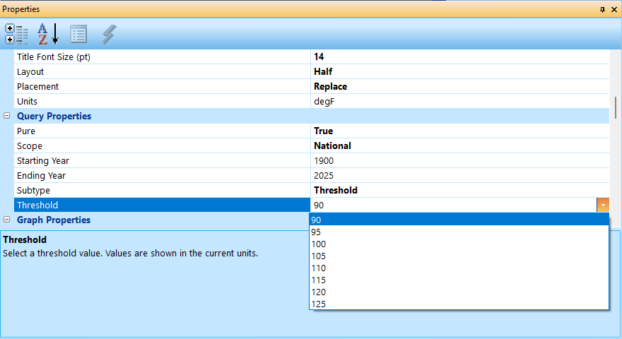
When the Subtype is set to Threshold, the Threshold dropdown is populated with choices (based in the Units Render Property):
The plot looks similar to the Maximum Scope plot:

The SQL is a little more complex and is the first one that uses the Months table instead of the Years table:
SELECT m.Year,
       100.0 * SUM(CASE WHEN m.CentigradeRaw >= 3222 THEN 1 ELSE 0 END)
             / SUM(CASE WHEN m.CentigradeRaw > -9000 THEN 1 ELSE 0 END) AS Percent
FROM Months m
JOIN Stations s ON m.StationID = s.StationID
WHERE m.MeasurementType = 1
  AND m.CentigradeRaw > -9000
  AND m.Year >= 1900
  AND m.Year <= 2025
AND m.DMFLAG != 'E'
AND m.QCFLAG = ' '
GROUP BY m.Year
ORDER BY m.Year;
The query returns one row per year. For each year, it computes the percentage of all valid station‑month temperature records that meet or exceed the threshold (e.g., 90°F).
-
m.Year— Groups results by year. -
Numerator: Counts how many station‑month records in that year meet or exceed the threshold (3222 = 32.22°C = 90°F).
SUM(CASE WHEN m.CentigradeRaw >= 3222 THEN 1 ELSE 0 END)
-
Denominator: Counts all valid station‑month temperature records for that year.
SUM(CASE WHEN m.CentigradeRaw > -9000 THEN 1 ELSE 0 END)
-
Percentage: 100.0 * (Numerator / Denominator)
This produces a time series showing, for each year, the fraction of all valid station‑month temperature measurements that were at or above the chosen threshold.
Finally, the Stations subtype simply plots the active stations over time:
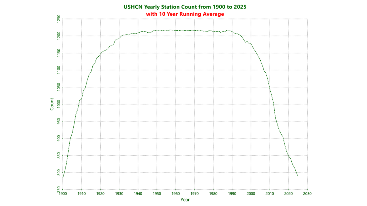
This graph shows how the number of stations grew to a maximum of 1218 stations (1957) and continues to decline to this day. Here is the SQL:
SELECT m.Year,
       COUNT(DISTINCT m.StationID) AS ActiveStations
FROM Months m
WHERE m.CentigradeRaw > -9000
  AND m.Year >= 1900
  AND m.Year <= 2025
GROUP BY m.Year
ORDER BY m.Year;
When you scroll the Output Text tab, you can see the one and only year where the number of stations was 1218:

Map Output
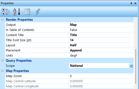
When you switch the Output from Plot to Map, the number of properties in the property panel are greatly reduced. There is only one Query Property which is the Scope because the only thing maps need from the database are GPS coordinates:
National Map
With the Scope set to National, after clicking the Execute button on the toolbar, a national map is generated:
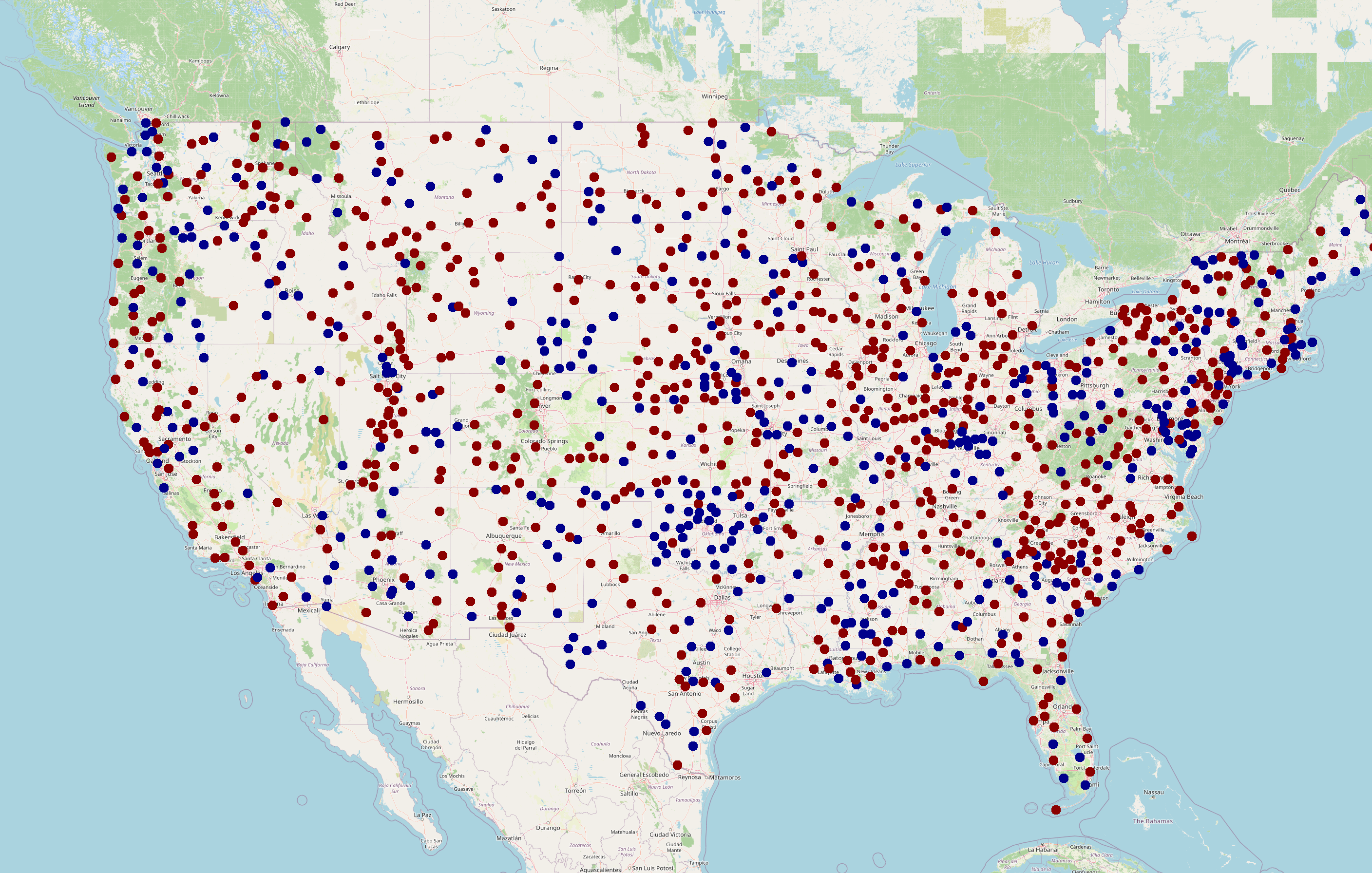
The generation of a map requires an internet connection because the information for the maps is coming from https://www.openstreetmap.org/. For this reason, there may be time delays for the map to be rendered. After the map renders, the map properties are updated to the center of the map:

The stations are color coded:
- Red — active stations (hot)
- Blue — inactive stations (cold)
The GPS coordinates are for the center of all the stations on the map. The Map Zoom property of zero means the renderer used the default for a national map (6). If I click on the map to select it, change the Map Zoom to 10, the Placement to Replace, and Execute, the map will be rendered at the new zoom level:

At that zoom level, the city of Tulsa, OK is visible towards the bottom of the map.
Ideally the map will be rendered best when it is rendered with the Map Zoom set to zero.
State Map
Changing the Scope to State, Placement to Append, picking a state postal code in the State dropdown control, and executing will generate a state map. In the following, I chose KS (Kansas):

The stations located towards the upper right are near Kansas City.
Location Map
Changing the Scope to Location enables the Location property which will dropdown to reveal all of the stations in Kansas. An alternative approach is to move the mouse arrow over a station and click on it. In the following image, I clicked on the active station at the bottom right which is Columbus, KS:

Map Context Menu
Selecting a map and right clicking on it will display a context menu:
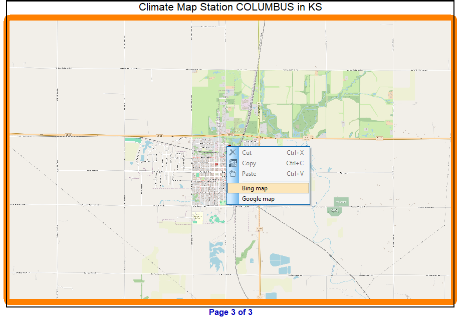
As you can see, there are two options enabled:
- Bing Map
- Google Map
If the user selects the Bing Map entry, a web page is launched centered on the same map:

If the user selects the Google Map entry, a web page is launched centered on the same map:

Image Output
With Output set to Image, a new Render Properties property called Select an Image shows up. There are three dots on the right side of the property and when the user clicks on them, an Open dialog is displayed to allow the user to select an image. There is an Images folder in the Climate workspace and all images used in the document should be hosted in that folder.
Using images is somewhat outdated because MD (markdown) Output has the ability to contain images and text to document the image.
MD (Markdown) Output
Markdown is a lightweight markup language that lets you format text using simple, readable symbols. It’s designed so that plain text looks clean on its own, while also converting into structured HTML for websites, documentation, and wikis. You can add headings, lists, links, code blocks, and emphasis without needing complex tags.
Climate Explorer uses a subset of the syntax with more functionality coming in the future. It works like Image output except instead of a Select an Image property, there is a Select a Markdown property. There is also a Markdown folder in the Climate workspace where markdown files should be kept. The extension for markdown files is MD.
The following are some simple examples:
Example 1 Markdown Unformatted
# Heading Level 1
This is a paragraph under an H1 heading. It should have extra spacing above and below.

## Heading Level 2
This is a paragraph under an H2 heading. It should be slightly smaller and spaced correctly.

### Heading Level 3
Paragraph under H3. This heading should be smaller than H2.

#### Heading Level 4
Paragraph under H4. Smaller still.

##### Heading Level 5
Paragraph under H5.

###### Heading Level 6
Paragraph under H6.

---

###### Paragraph and Line Wrapping Test
This paragraph contains enough text to force line wrapping inside the renderer. The goal is to verify that wrapped lines align correctly, maintain indentation, and do not overlap vertically.

---

###### Inline Formatting Test
Normal text with **bold**, *italic*, and **_bold italic_** formatting.

Inline code test: `int x = 42;`

Unicode test: café naïve résumé coöperate — and some extended characters: α β γ δ Ω π 漢字.

---
Example 1 Rendered by Climate Explorer
Here is the page Climate Explorer rendered of the above example:

Example 2 Markdown Unformatted
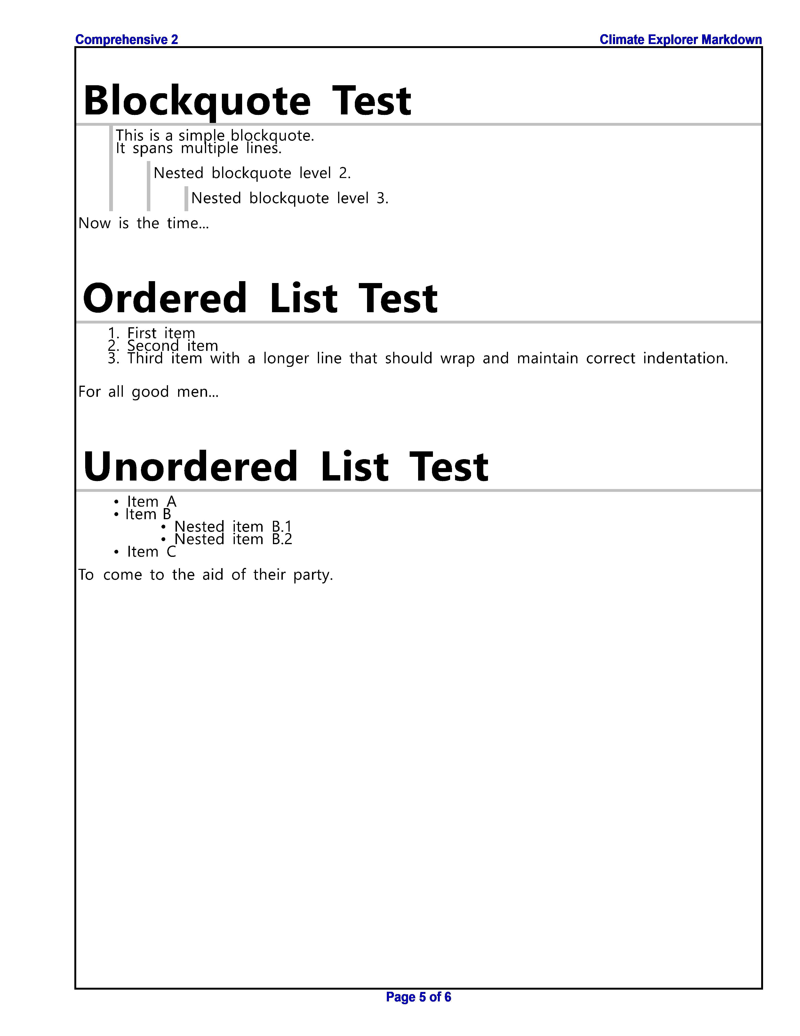
# Blockquote Test
> This is a simple blockquote.
> It spans multiple lines.
>
> > Nested blockquote level 2.
> >
> > > Nested blockquote level 3.

Now is the time...

# Ordered List Test
1. First item
2. Second item
3. Third item with a longer line that should wrap and maintain correct indentation.

For all good men...

# Unordered List Test
- Item A
- Item B
  - Nested item B.1
  - Nested item B.2
- Item C

To come to the aid of their party.
Example 2 Rendered by Climate Explorer
Example 3 Markdown Unformatted
##### CO₂ and Global Greening
Satellite observations over the past several decades show a remarkable trend: the Earth has become greener. Vegetation has expanded across multiple continents. Leaf area has increased. Growing seasons have lengthened in some regions. This phenomenon, known as global greening, is largely attributed to increased CO₂ levels.
Higher CO₂ improves plant water efficiency, allowing vegetation to thrive in areas that were previously too dry. This greening effect is one of the most direct, measurable consequences of rising CO₂ — and it is beneficial.

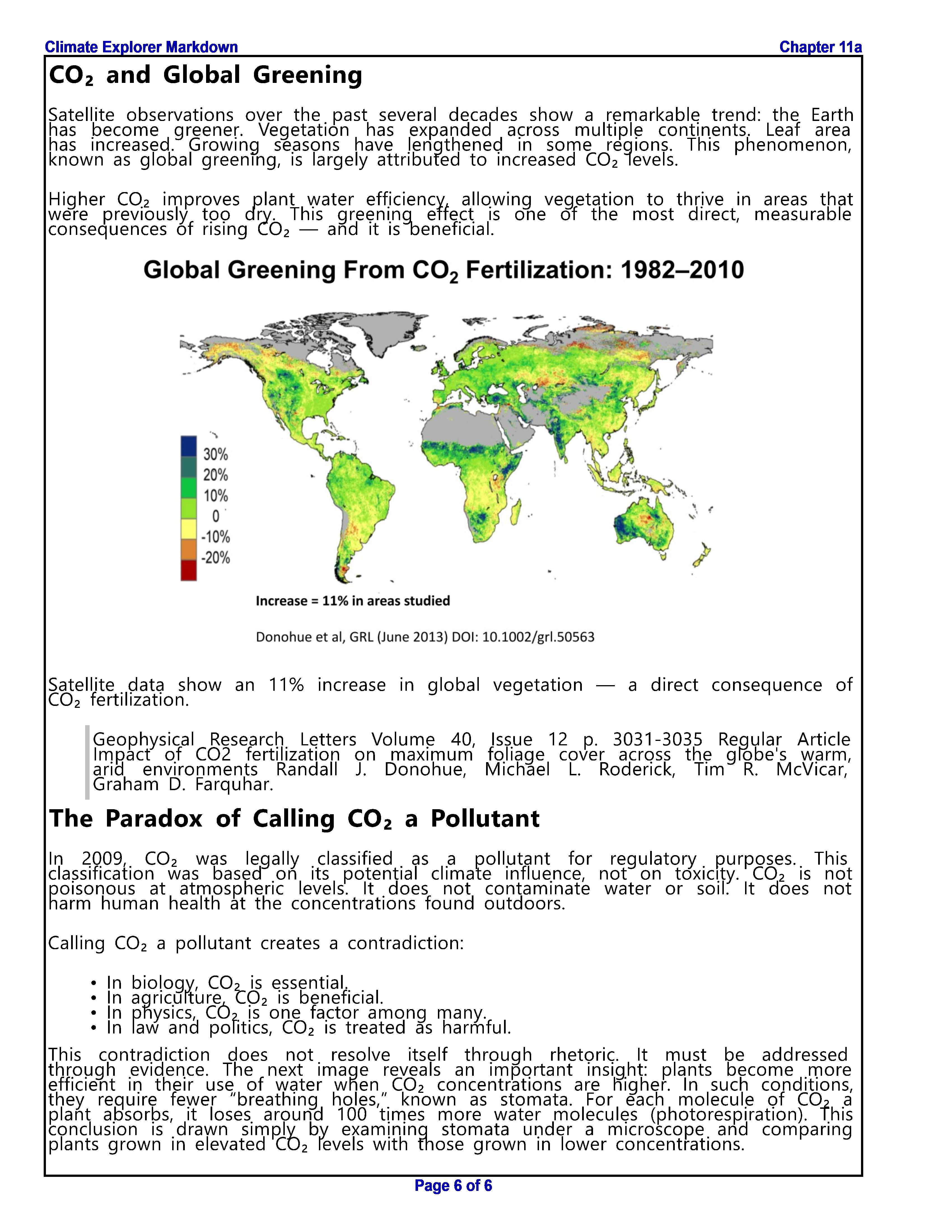
Satellite data show an 11% increase in global vegetation — a direct consequence of CO₂ fertilization.
> Geophysical Research Letters Volume 40, Issue 12 p. 3031-3035 Regular Article Impact of CO2 fertilization on maximum foliage cover across the globe's warm, arid environments Randall J. Donohue, Michael L. Roderick, Tim R. McVicar, Graham D. Farquhar.
##### The Paradox of Calling CO₂ a Pollutant
In 2009, CO₂ was legally classified as a pollutant for regulatory purposes. This classification was based on its potential climate influence, not on toxicity. CO₂ is not poisonous at atmospheric levels. It does not contaminate water or soil. It does not harm human health at the concentrations found outdoors.
Calling CO₂ a pollutant creates a contradiction:
- In biology, CO₂ is essential.
- In agriculture, CO₂ is beneficial.
- In physics, CO₂ is one factor among many.
- In law and politics, CO₂ is treated as harmful.
This contradiction does not resolve itself through rhetoric. It must be addressed through evidence. The next image reveals an important insight: plants become more efficient in their use of water when CO₂ concentrations are higher. In such conditions, they require fewer “breathing holes,” known as stomata. For each molecule of CO₂ a plant absorbs, it loses around 100 times more water molecules (photorespiration). This conclusion is drawn simply by examining stomata under a microscope and comparing plants grown in elevated CO₂ levels with those grown in lower concentrations.
Example 3 Rendered by Climate Explorer
Output Summary
Climate Explorer supports four output modes, each controlling how a page is rendered in the final document:
- Plot — Runs a SQL query and generates a graph (maximum, minimum, average, thresholds, stations, etc.) using the plotting engine.
- Image — Inserts a user‑selected bitmap (PNG/JPG) directly into the document at the chosen layout size.
- Map — Renders a geographic station map using the mapping subsystem, supporting full, half, or quarter‑page layouts.
- MD — Renders a Markdown file as a styled document page, allowing narrative text, headings, and mixed content.
These four modes define how each page in a Climate Explorer document is produced and displayed.
Video Demonstration
Here is a short video that illustrates some of the above information: