2. Exploratory data analysis - upalr/Python-camp GitHub Wiki
1 Visual exploratory data analysis
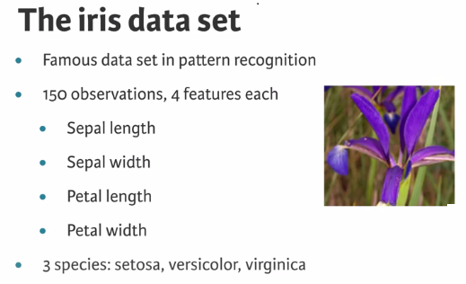
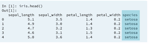
1.1 The iris data set
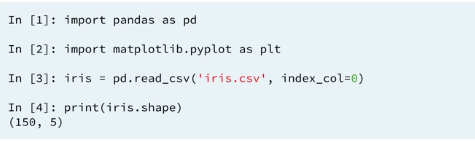
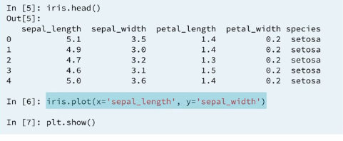
1.2 data import
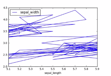
1.3 Line plot
For this unordered four dimentional data set a line doesn't make a lot of sense.
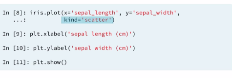
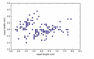
1.4 scatter plot
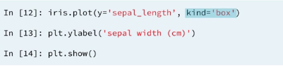
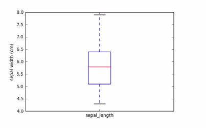
1.5 Box plot
Individual variable distributions are likely more informative than plotting two variables against each other for instance specifying kind=box makes a Box plot.
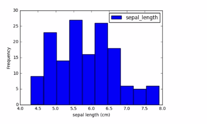
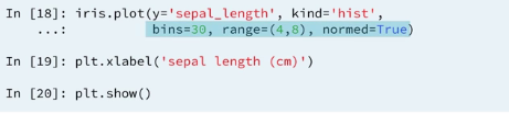
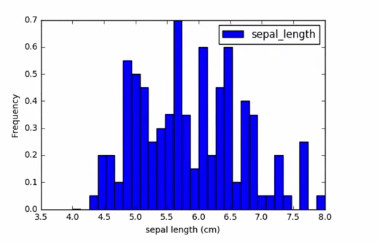
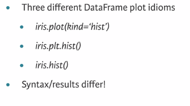
1.6 Histogram
1.6.1 Histogram options
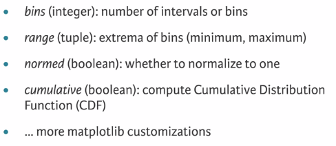
1.6.2 Customizing Histogram
1.7 Cumulative distribution
Another useful plot is the Cumulative distribution function (CDF) computed by adding up the areas of the rectangles under a normalized histogram. CDF's are used to computing the probability of observing a value in a given range. For instance, a simple width between 2 and 4 centimeters.
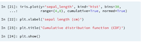
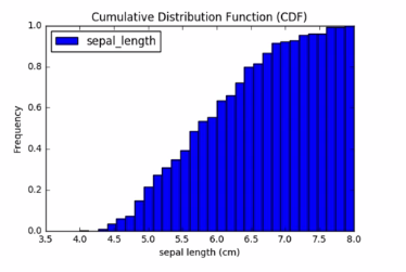
Intuitively, The CDF evaluated at say sepl_length 5 centimeters returns the probability of observing a flower with sepl_length up to 5 centimeters. A CDF is often a some what sooth curve increasing from 0 to 1.
1.8 Word warning
2 Statistical exploratory data analysis
Plots are useful, but it is also useful to have quantitative results.
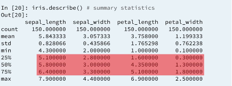
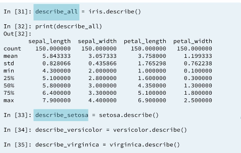
2.1 Summarizing with describe()
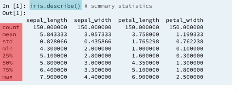
2.2 describe
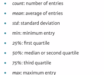
2.2.1 Counts
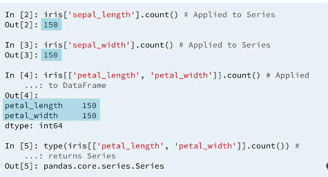
The count method returns the number of non null entries in a given numerical column.
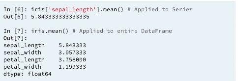
2.2.2 Averages
The mean method computes an average of a series and the average of data-frames column wise, ignoring null entries. All serise in dataframe statistical methods ignore null entries.
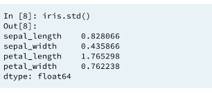
2.2.3 Standard deviations
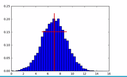
2.2.4 Mean and standard deviation on a bell curve
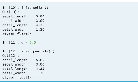
2.2.5 Medians
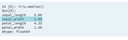
2.2.6 Medians ans 0.5 quantiles
A median is a special example of a quantiles. If q is a number between 0 and 1. The qth quantiles of a Data set is a numerical value that splits the data into two sets, one with the fractions q of smaller observations and the other with the larger observations. Colloquially quantiles are called percentiles using percentagew between 0 and 100 rather then fractions between 0 and 1. The median then is the 0.5 quantile or 50th percentile of a data set.
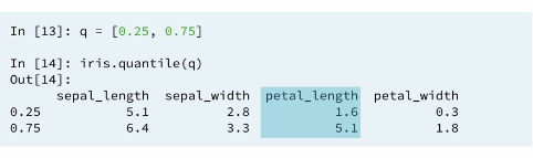
2.2.7 Inter quarterly range (IQR)
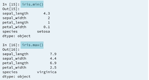
2.2.8 Ranges
2.3 BOX Plots
Actually Box plots are the representation of describe.
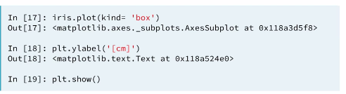
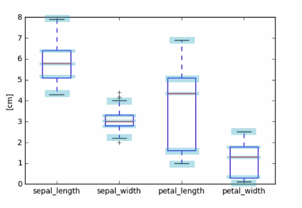
Percentiles as quantiles
The Box plot uses the exactly the same data as reported by describe. Notice the quartiles are reported as percentiles by describe.
3 Separating populations with Boolean indexing
Up to now our exploratory data analysis has used all rows of the irsih dataframe. We have ignored the non-numerical species column entirely.
3.1 Describe species column
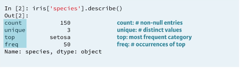
3.2 Unique & factors
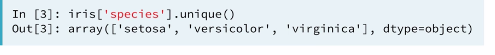
Knowing that there are three different factors, it make seance to carry out EDA separately on each factor.
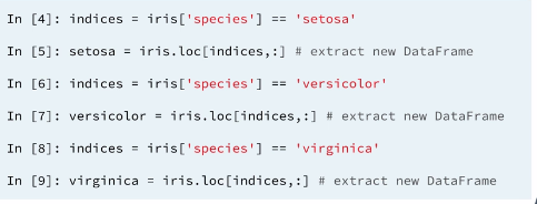
3.3 Filtering by species
We can extract rows corresponding to each species by filtering.
3.4 Checking species

The species column can be deleted from each.
3.5 Checking indexes
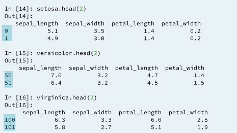
Actually the original observation is sorted by species in the dataframe irish. So we could split by species without filtering. we see this because the indexes setosa (0-49), vercicolot (50-99) and virginica (100-149).
In a later Pandas course you can learn better tools for performing group by operations to extract factors.
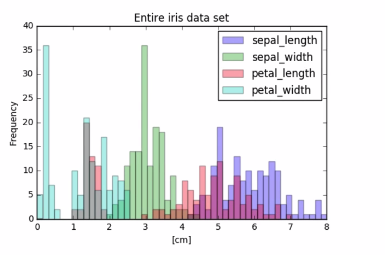
3.6 Visual EDA: all data
3.6.1 Visual EDA: individual factors
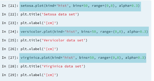
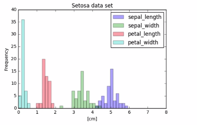
3.6.2 Visual EDA: Setosa data
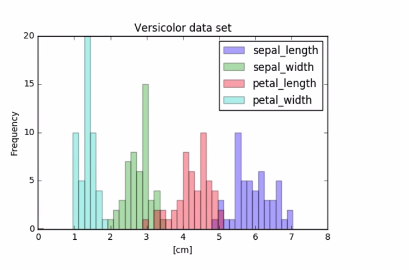
3.6.3 Visual EDA: Versicolor data
3.6.4 Visual EDA: Veirginica data
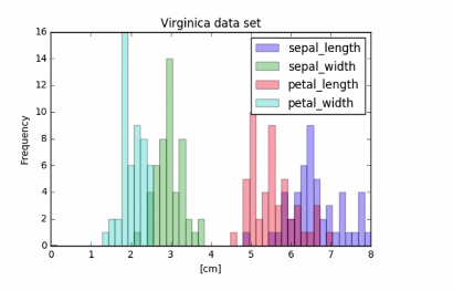
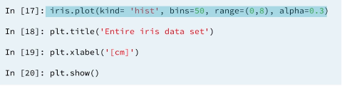
Where the collected data had significantly overlapping histograms with many confusing pics. The separated factors revel clear trance for each measurement.
3.7 Statistical EDA: describe()
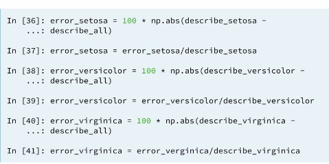
3.8 Computing errors
We can compute the percentage error in all the statistics in his case. This is the absolute difference of the correct statistic computed in his own group from the statistic computed with the whole population divided by the correct statistic.
3.9 Viewing errors
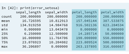
In looking at the percentage errors the petal_length and petal_width show the greatest errors in using non separated groups. This is suggested also by the histogram we saw earlier. This values give a sense, how misleading the statistics were when computed over the whole population rather than by factor.
3.10 Example : Separate and summarize
If you do not understand the above example please go through example. Separate and summarize
Let's use population filtering to determine how the automobiles in the US differ from the global average and standard deviation. How the distribution of fuel efficiency (MPG) for the US differ from the global average and standard deviation?
In this exercise, you'll compute the means and standard deviations of all columns in the full automobile dataset. Next, you'll compute the same quantities for just the US population and subtract the global values from the US values.
All necessary modules have been imported and the DataFrame has been pre-loaded as df.
Instructions
- Compute the global mean and global standard deviations of
dfusing the.mean()and.std()methods. Assign the results toglobal_meanandglobal_std. - Filter the
'US'population from the'origin'column and assign the result tous. - Compute the US mean and US standard deviations of
ususing the.mean()and.std()methods. Assign the results tous_meanandus_std. - Print the differences between
us_meanandglobal_meanandus_stdandglobal_std. This has already been done for you.
# Compute the global mean and global standard deviation: global_mean, global_std
global_mean = df.mean()
global_std = df.std()

# Filter the US population from the origin column: us
us = df.loc[df.origin == 'US', :]

# Compute the US mean and US standard deviation: us_mean, us_std
us_mean = us.mean()
us_std = us.std()

# Print the differences
print(us_mean - global_mean)
print(us_std - global_std)
3.12 Example : Separate and plot
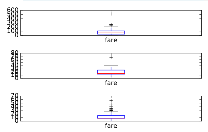
Population filtering can be used alongside plotting to quickly determine differences in distributions between the sub-populations. You'll work with the Titanic dataset.
There were three passenger classes on the Titanic, and passengers in each class paid a different fare price. In this exercise, you'll investigate the differences in these fare prices.
Your job is to use Boolean filtering and generate box plots of the fare prices for each of the three passenger classes. The fare prices are contained in the 'fare' column and passenger class information is contained in the 'pclass' column.
When you're done, notice the portions of the box plots that differ and those that are similar.
The DataFrame has been pre-loaded for you as titanic.
Instructions
- Inside plt.subplots(), specify the nrows and ncols parameters so that there are 3 rows and 1 column.
- Filter the rows where the 'pclass' column has the values 1 and generate a box plot of the 'fare' column.
- Filter the rows where the 'pclass' column has the values 2 and generate a box plot of the 'fare' column.
- Filter the rows where the 'pclass' column has the values 3 and generate a box plot of the 'fare' column.
# Display the box plots on 3 separate rows and 1 column
fig, axes = plt.subplots(nrows =3, ncols=1)

# Generate a box plot of the fare prices for the First passenger class
titanic.loc[titanic['pclass'] == 1].plot(ax=axes[0], y='fare', kind='box')

# Generate a box plot of the fare prices for the Second passenger class
titanic.loc[titanic['pclass'] == 2].plot(ax=axes[1], y='fare', kind='box')

# Generate a box plot of the fare prices for the Third passenger class
titanic.loc[titanic['pclass'] == 3].plot(ax=axes[2], y='fare', kind='box')

# Display the plot
plt.show()
Plot