1. Exploring your data - upalr/Python-camp GitHub Wiki
1 Diagnose data for cleaning
1.1 Common data problems
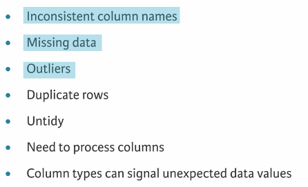
1.2 unclean data
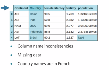
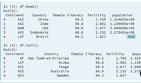
Visually inspect
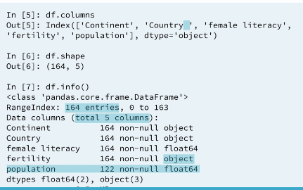
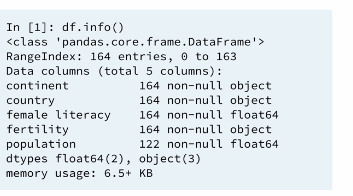
The .info() method provides important information about a DataFrame, such as the number of rows, number of columns, number of non-missing values in each column, and the data type stored in each column. This is the kind of information that will allow you to confirm whether the columns are numeric or strings. From the results, you'll also be able to see whether or not all columns have complete data in them.
2 Exploratory data analysis
2.1 Data type of each column
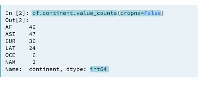
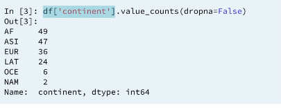
2.2 Frequency counts: continent
INFO 1: If the column name doesn't contain any special characters, spaces and not a name of a python function, we can select the column directly by it's name using .(dot) notation. It works the same way as sub-setting using bracket notation.
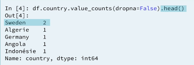
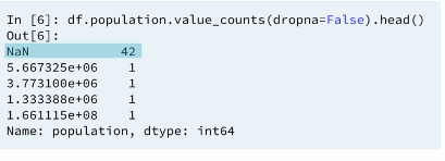
2.3 Frequency counts: country
As you've seen, .describe() can only be used on numeric columns. So how can you diagnose data issues when you have categorical data? One way is by using the .value_counts() method, which returns the frequency counts for each unique value in a column!
ANALYSIS 1: SWEDEN 2 time?? WHY 👎
!
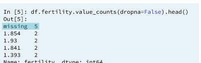
2.4 Frequency counts: fertility
ANALYSIS 2: The Fertility column is the column we expected to be numeric but stored as a string. This is because we have a string name
messingin the column. This is why the Fertility column has the wrongDtype. it also alerts us we need to re code themessingstring.
ANALYSIS 3: If your column has missing values they will also be counted provided you pass
dropen=False
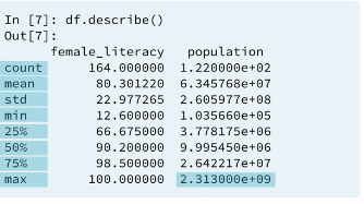
2.5 Summary statistics (only for numeric data)
We can quickly calculate summary statistics on our data by using the describe method. Only the columns that have numerical type will be returned.
2.5 Summary statistics: Numeric data (only for numeric data)
More exploratory data analysis
3 Visual exploratory data analysis
3.1 Data visualization
3.2 Bar plots and histograms
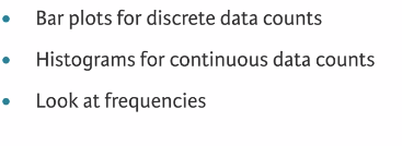
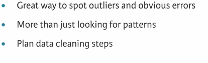
ANALYSIS 4: These plots will give us the ability to look at frequencies of our data which can be used to look for potentials errors.
3.2.1 Histogram
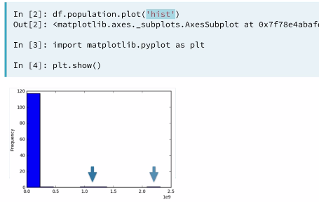
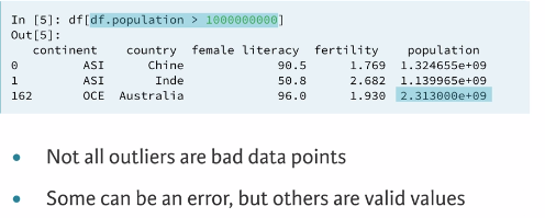
3.2.2 Identifying the error
Lets see how this data set looks like in other visualization
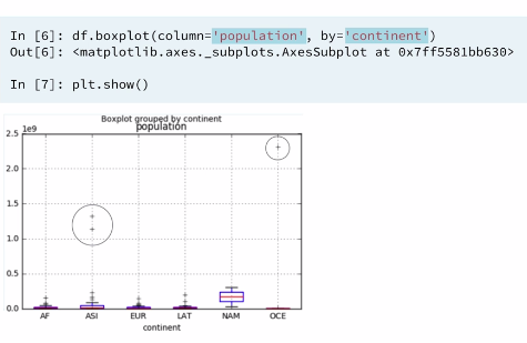
3.3 Box plots
Histograms are great ways of visualizing single variables. To visualize multiple variables, boxplots are useful, especially when one of the variables is categorical.
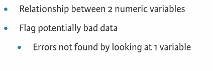
3.4 Scatter plots
Boxplots are great when you have a numeric column that you want to compare across different categories. When you want to visualize two numeric columns, scatter plots are ideal.
3.4.1 Example 1
Boxplots are great when you have a numeric column that you want to compare across different categories. When you want to visualize two numeric columns, scatter plots are ideal.
In this exercise, your job is to make a scatter plot with 'initial_cost' on the x-axis and the 'total_est_fee' on the y-axis. You can do this by using the DataFrame .plot() method with kind='scatter'. You'll notice right away that there are 2 major outliers shown in the plots.
Since these outliers dominate the plot, an additional DataFrame, df_subset, has been provided, in which some of the extreme values have been removed. After making a scatter plot using this, you'll find some interesting patterns here that would not have been seen by looking at summary statistics or 1 variable plots.
# Import necessary modules
import pandas as pd
import matplotlib.pyplot as plt

# Create and display the first scatter plot
df.plot(kind='scatter', x='initial_cost', y='total_est_fee', rot=70)
plt.show()

# Create and display the second scatter plot
df_subset.plot(kind='scatter', x='initial_cost', y='total_est_fee', rot=70)
plt.show()
4 Conclusion
Excellent work! While visualizing your data is a great way to understand it, keep in mind that no one technique is better than another. As you saw here, you still needed to look at the summary statistics to help understand your data better.