Sunburst - unipept/unipept-visualizations GitHub Wiki
The sunburst visualization consists of a collection of concentric circles that are all further divided in categories. Each circle represents one level of the hierarchy of the input data and consists of multiple categories, one for each node at the current level. The innermost circle of the sunburst corresponds with the root node, while the hierarchy moves outward from the center.
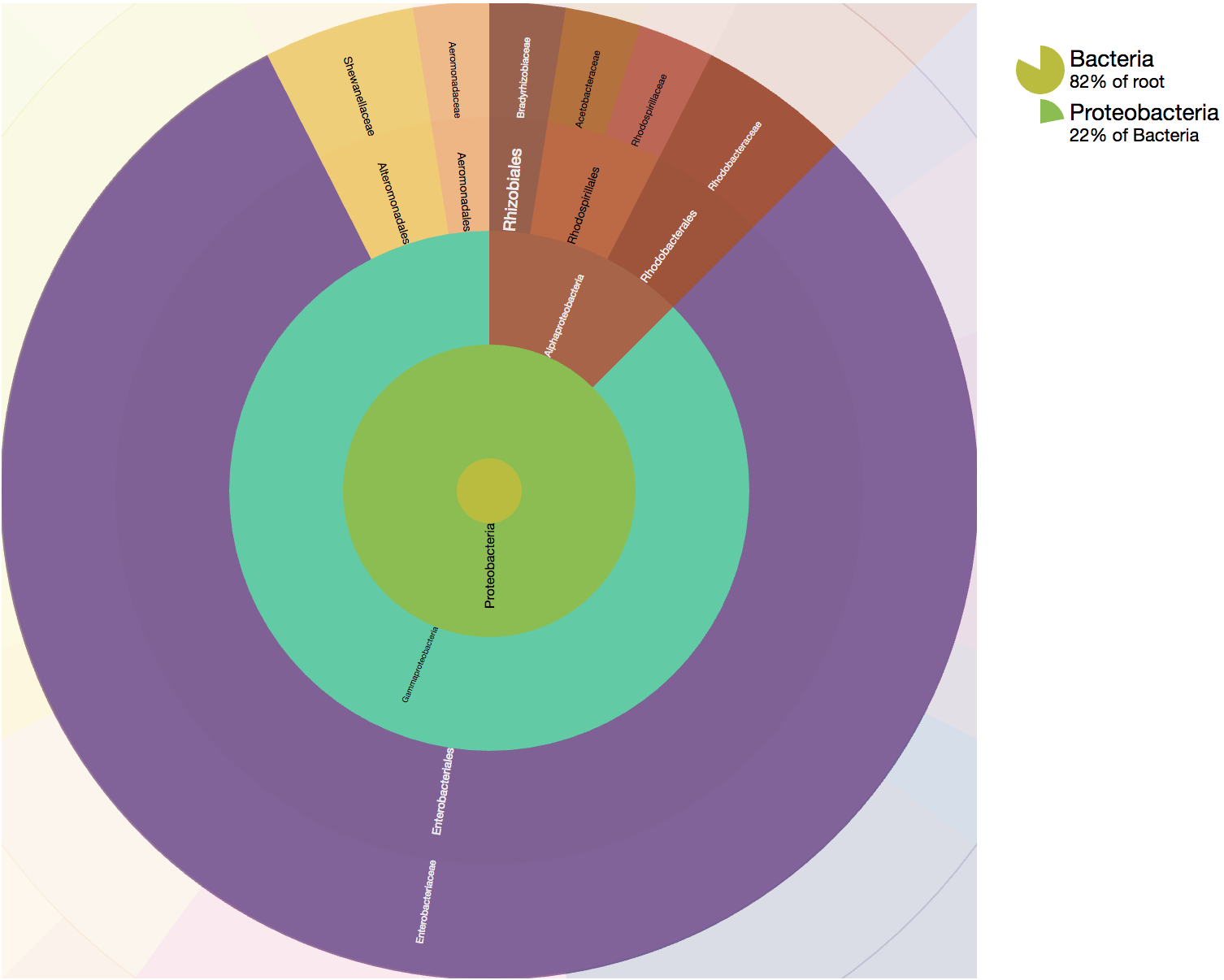 A live example of this visualization can be found on Observable.
Internals
The sunburst visualization works with an SVG under-the-hood. It can thus easily be exported as an SVG file. In order to speed up the rendering process, only nodes that are currently visible are rendered.
API
Sunburst
constructor
The constructor of the Sunburst class automatically starts rendering the sunburst upon invocation and has the following signature:
element: HTMLElement: TheHTMLElementin which the sunburst should be rendered.data: DataNodeLike: The root node of the hierarchical data that should be rendered by this sunburst. SeeDataNodefor how to construct these objects properly.options: SunburstSettings(optional): Can be used to configure the sunburst before rendering. See bellow for all the options that are currently supported.
reroot
Change the root of the visualization to the node with the given ID. The reroot is only carried out when a node with that ID exists; nothing happens when no node is found. This method takes the following arguments:
nodeId: number: ID of the node that should become the new root of the tree.triggerCallback: boolean = true: ShouldrerootCallbackbe called for this node?
reset
Return the visualization to its initial view, with the root of the tree at the centre again. Note that this goes
through the same path as a reroot to the root node, so rerootCallback is called.
SunburstSettings
Values
width: number(optional, default = 800): Maximum width of the visualization in pixels.height: number(optional, default = 800): Maximum height of the visualization in pixels.enableTooltips: boolean(optional, default = true): Are tooltips shown when hovering over a node in the sunburst?tooltipContainer: HTMLElement | string | null(optional, default = null): Element the tooltip is appended to, or a selector for it. The default is the body of the document that holds the visualization, and visualizations that share a container also share a single tooltip element. Browsers that support the popover API show the tooltip in the top layer, which is painted above a fullscreen element, so this only needs to be set for fullscreen support in browsers that do not: point it at the element that is made fullscreen and the tooltip goes fullscreen along with it.radius: number(optional, default = 300): Radius size of the sunburst in pixels.breadcrumbWidth: number(optional, default = 200): Amount of pixels that are reserved for the breadcrumb bar to the right of the visualization.className: string(optional, default = "sunburst"): Class name used internally for the rendered object.useFixedColors: boolean(optional, default = false): Should a fixed set of colors be used for the visualization? This means that nodes that return the samefixedColorHashwill be shown in the same color (always, even when creating multiple sunbursts).colorPalette: string[](optional, default = ColorPalette.DEFAULT_COLORS): Default color palette that should be used for the node colors. Use one of the predefined palettes from theColorPaletteclass if you lack inspiration.fixedColorPalette: string[](optional, default = ColorPalette.FIXED_COLORS): Color palette that should be used when theuseFixedColorsoption has been set. Use one of the predefined palettes from theColorPaletteclass if you lack inspiration.enableBreadcrumbs: boolean(optional, default = true): Should breadcrumbs be shown to the right of the sunburst visualization?levels: number(optional, default = 4): With how many levels at once can the user interact in the visualization?animationDuration: number(optional, default = 1000): How long should the animation between different states of the sunburst last? (This time is given in milliseconds).
Functions
rerootCallback(optional, default = identity function): Function that's called whenever the user clicks on a node. This function should not return anything and is called with 1 parameter:d: DataNode: The node that has been clicked by the user and which will become the new root of the visualization.
fixedColorHash(optional, default = function that returns a hash from the node's name). Returns the hashcode that should be used to determine which fixed color needs to be assigned to a node. The hash should be a number and should be the same for all nodes that require the same color. You can use thestringHashfunction provided by theStringUtilsclass to convert a string to a number. This function takes 1 parameter and returns a number:d: DataNode: The node for which the hashcode should be computed.
getTooltip(optional, default = generic tooltip function) Returns the html to use as tooltip for a node. Is called with a node that represents the current node that's being hovered by the user. The result of getTooltipTitle is used for the header and getTooltipText is used for the body of the tooltip by default. This function needs to return a string representing HTML-code that will be executed and receives 1 parameter:d: DataNode: Node for which the tooltip should be returned. NOTE: Be very cautious in passing user input directly as a result of this function. Please always sanitize the user's input before returning it, as this might lead to reflected XSS-attacks.
getTooltipTitle(optional, default = generic title function) Returns text that's being used for the title of a tooltip. This tooltip provides information to the user about the node that's currently hovered by the mouse cursor. This function needs to return a string representing HTML-code that will be executed and receives 1 parameter:d: DataNode: Node for which the title should be returned. NOTE: Be very cautious in passing user input directly as a result of this function. Please always sanitize the user's input before returning it, as this might lead to reflected XSS-attacks.
getTooltipText(optional, default = generic body function) Returns text that's being used for the body of a tooltip. This tooltip provides information to the user about the node that's currently hovered by the mouse cursor. This function needs to return a string representing HTML-code that will be executed and receives 1 parameter:d: DataNode: Node for which the tooltip body text should be returned. NOTE: Be very cautious in passing user input directly as a result of this function. Please always sanitize the user's input before returning it, as this might lead to reflected XSS-attacks.
getLabel(optional, default = function that returns the name of a node): Function that should return the label that needs to be associated to a node. This function is called with 1 parameter and should return a string:d: DataNode: Node for which the label should be returned.
getTitleText(optional, default = returns the label for a node): Function that should return the label or title text that's associated to a breadcrumb for a specific node. This function is called with 1 parameter and should return a string:d: DataNode: Node for which the label / title text should be returned.
mouseIn(optional, default = does nothing): Called when the user's pointer starts to move over an item in the sunburst. Returns nothing and takes 2 parameters:d: DataNode: The node that is being hovered.mousePosition: { x: number, y: number }: Pointer position.
mouseMove(optional, default = does nothing): Called when the user's pointer moves while already over an item. Takes the same 2 parameters asmouseIn.mouseOut(optional, default = does nothing): Called when the user's pointer moves out of an item it was previously over. Takes 1 parameter:d: DataNode: The node the pointer left.