40 布局消息通知开发 - udo-bit/naive_admin_pro GitHub Wiki

在layouts目录中创建一个notify的文件夹,然后再创建一个index.vue的文件。
然后我们先实现图标部分:
<script lang="ts" setup>
import { BellOutlined } from '@vicons/antd'
</script>

<template>
  <div class="flex">
    <n-icon class="cursor-pointer" size="18">
      <BellOutlined />
    </n-icon>
  </div>
</template>
然后在right-content.vue中使用组件
<script lang="ts" setup>
import Notify from '../notify/index.vue'
</script>

<template>
  <n-space align="center">
    <Notify />
  	...
  </n-space>
</template>
查看效果
接下来我们来实现一下小圆点部分,使用naive-ui的组件badge。
<script lang="ts" setup>
import { BellOutlined } from '@vicons/antd'
withDefaults(defineProps<{
  count?: number
  maxCount?: number
}>(), {
  maxCount: 99,
})
</script>

<template>
  <n-el class="flex cursor-pointer">
    <n-badge :value="count" :max="maxCount">
      <n-icon class="text-[var(--text-color-base)]" size="18">
        <BellOutlined />
      </n-icon>
    </n-badge>
  </n-el>
</template>
下面我们来实现点击出现下拉通知内容的部分。
当我们切换主题的时候会发现,当我们的主题为反色的时候,且使用顶部通栏的时候,以及使用混合布局的时候,也会变成黑色,所以我们需要处理一下这一部分:
<script lang="ts" setup>
withDefaults(defineProps<{
  inverted?:boolean
}>(), {
})
</script>

<template>
+  <n-icon :class="inverted ? 'text-white' : 'text-[var(--text-color-base)]'" size="18">
  	...
   </n-icon>
</template>
然后在right-content.vue中使用:
<script lang="ts" setup>
  const notifyInverted = computed(
  () =>
    (appStore.layout.layoutStyle === 'inverted' && appStore.layout.layout === 'top')
    || appStore.layout.layout === 'mix',
  )
</script>
<template>
<!--   ... -->
  <Notify :inverted="notifyInverted" />
<!--   ... -->
</template>
我们需要使用dropdown的render模式自定义渲染
<script lang="ts" setup>
import type { DropdownOption } from 'naive-ui'

const options = $ref<DropdownOption[]>([
  {
    type: 'render',
    key: 'render',
    render: () => h('div', 'render'),
  },
])
</script>

<template>
  <n-dropdown trigger="click" :options="options">
    ...
  </n-dropdown>
</template>
下面我们将下拉框内容作为一个独立的组件去实现,在notfiy下创建一个content.vue的文件,用于存放我们的内容部分。
<script lang="ts" setup>
</script>
<template>
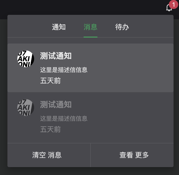
<n-tabs default-value="notify" justify-content="center" type="line">
<n-tab-pane name="notify" tab="通知">
<div class="w-336px">
通知
</div>
</n-tab-pane>
<n-tab-pane name="message" tab="消息">
<div class="w-336px">
消息
</div>
</n-tab-pane>
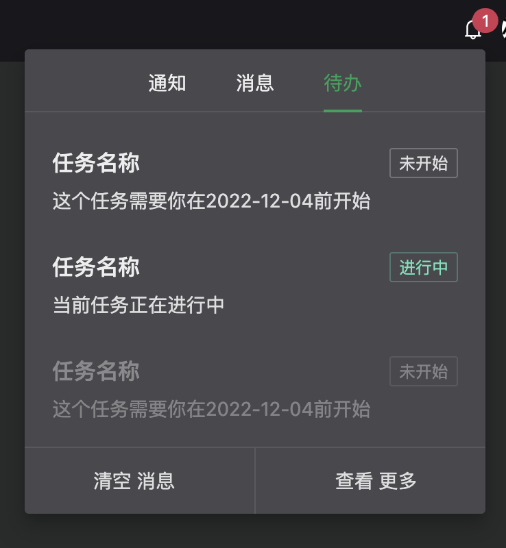
<n-tab-pane name="upcoming" tab="待办">
<div class="w-336px">
待办
</div>
</n-tab-pane>
</n-tabs>
</template>
我们优化一下这一部分的代码,我们将其划分为多个组件。分别为container.vue、notify-item.vue、message-item.vue以及upcoming-item.vue的组件文件。
container.vue
<script lang="ts" setup>

</script>

<template>
  <div class="w-336px px-20px">
    <n-list style="background: transparent">
      <slot />
    </n-list>
  </div>
</template>
notify-item.vue
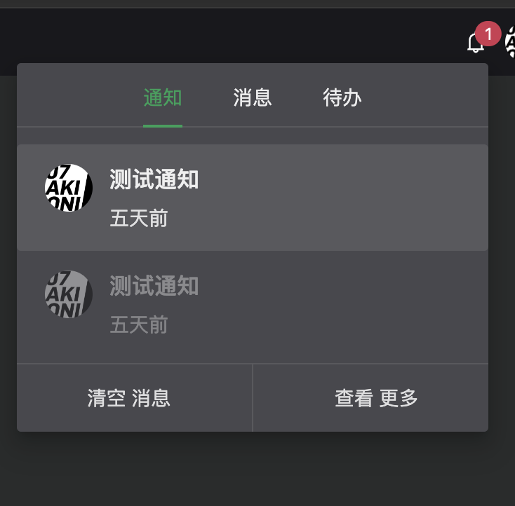
<script lang="ts" setup>

</script>

<template>
  <n-list-item>
    notify-item
  </n-list-item>
</template>
message-item和upcoming-item同上
接下来我们来分别实现一下通知组件的样式:
notify-item.vue
<script lang="ts" setup>
defineProps<{
  read?: boolean
  avatar?: string
  title?: string
  timer?: string
}>()
</script>

<template>
  <n-list-item :class="read ? 'op-40' : ''">
    <n-thing>
      <template v-if="avatar" #avatar>
        <n-avatar round :src="avatar" />
      </template>
      <template v-if="title" #header>
        <span class="text-16px">
          {{ title }}
        </span>
      </template>
      <template v-if="timer" #description>
        <span class="text-14px">
          {{ timer }}
        </span>
      </template>
    </n-thing>
  </n-list-item>
</template>

<style scoped>

</style>
我带领大家实现第一个,后面的我们留作作业,大家自己进行实现,实现完成后可以参考我们本节课的代码。