22 布局缩略图开发 - udo-bit/naive_admin_pro GitHub Wiki
实现布局的缩略图选择组件
完成了抽屉布局的开发后,接下来为了能让用户直接看到我们大概的布局样式,那么我们通过缩略图的方式来实现换一下我们的切换布局的效果。
我们在setting-drawer目录下创建一个checkbox-layout.vue的文件用于开发我们的选择布局的组件。
为了更直观的能看到效果我们在pages/index.vue中进行开发,开发完成后我们再迁移到我们的setting-drawer中去。如下:
<script lang="ts" setup>
import CheckBoxLayout from '~/layouts/setting-drawer/checkbox-layout.vue'
</script>

<template>
  <div>
    <CheckBoxLayout />
  </div>
</template>

<style scoped>

</style>
这里我们需要使用我们的n-el来兼容一下我们的naive UI的系统色
<script lang="ts" setup>

</script>

<template>
  <n-el
    tag="div"
    class="relative w-44px h-36px b-rd-2px overflow-hidden bg-[var(--pro-admin-layout-content-bg)] shadow-[var(--pro-admin-layout-box-shadow)]"
  >
    <div class="h-25% bg-[var(--base-color)] absolute top-0 w-100%" />
    <div class="w-30% bg-[var(--base-color)] absolute left-0 h-100%" />
  </n-el>
</template>接下来我们来完成我们的布局属性的配置,我们需要通过传入布局属性的方式来实现我们的各个布局。
withDefaults(defineProps<{
  layout?: 'mix' | 'side' | 'top'
}>(), {
  layout:"mix"
})
接下来我们实现一下各个布局的样式。 注: 当我们在unocss使用动态类名的时候,为了保证我们的类名百分百会存在我们需要在unocss.config.ts中的safelist中进行配置:
safelist: [
    'bg-[var(--base-color)]',
    'bg-[var(--inverted-color)]',
    'h-75%',
    'h-100%',
    'bottom-0',
],<script lang="ts" setup>
const props = withDefaults(defineProps<{
layout?: 'mix' | 'side' | 'top'
inverted?: boolean
}>(), {
inverted: false,
layout: 'top',
})
const headerClasss = computed(() => {
if (props.layout === 'mix' || props.layout === 'top') {
return [
'bg-[var(--inverted-color)]',
]
}
if (props.layout === 'side') {
return [
'bg-[var(--base-color)]',
]
}
})
const siderClasss = computed(() => {
if (props.layout === 'mix') {
return [
'h-75%',
'bg-white',
'bottom-0',
]
}
if (props.layout === 'side') {
return [
'h-100%',
`bg-[var(${props.inverted ? '--inverted-color' : '--base-color'})]`,
]
}
return []
})
</script>
<template>
<n-el
tag="div"
class="relative w-44px h-36px b-rd-4px overflow-hidden bg-[var(--pro-admin-layout-content-bg)] shadow-[var(--pro-admin-layout-box-shadow)]"
>
<div
:class="headerClasss"
class="h-25% absolute top-0 w-100%"
/>
<div
v-if="layout !== 'top'"
:class="siderClasss"
class="w-30% absolute left-0 h-100%"
/>
</n-el>
</template>
<style scoped>
</style>
接下来我们来实现checkbox
<script lang="ts" setup>
import { CheckOutlined } from '@vicons/antd'
const props = withDefaults(defineProps<{
layout?: 'mix' | 'side' | 'top'
inverted?: boolean
checked?: boolean
}>(), {
inverted: false,
layout: 'side',
})
</script>
<template>
<div v-if="checked" class="absolute bottom--3px right-3px">
<n-icon size="16">
<CheckOutlined />
</n-icon>
</div>
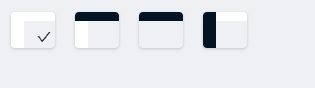
</template>最后我们把我们所有的布局模式罗列出来看一下效果:
<script lang="ts" setup>
import CheckBoxLayout from '~/layouts/setting-drawer/checkbox-layout.vue'
</script>

<template>
  <div class flex gap-5>
    <CheckBoxLayout checked />
    <CheckBoxLayout layout="mix" />
    <CheckBoxLayout layout="top" />
    <CheckBoxLayout layout="side" inverted />
  </div>
</template>