18 顶部通栏布局 - udo-bit/naive_admin_pro GitHub Wiki
完成顶部通栏布局模式的开发
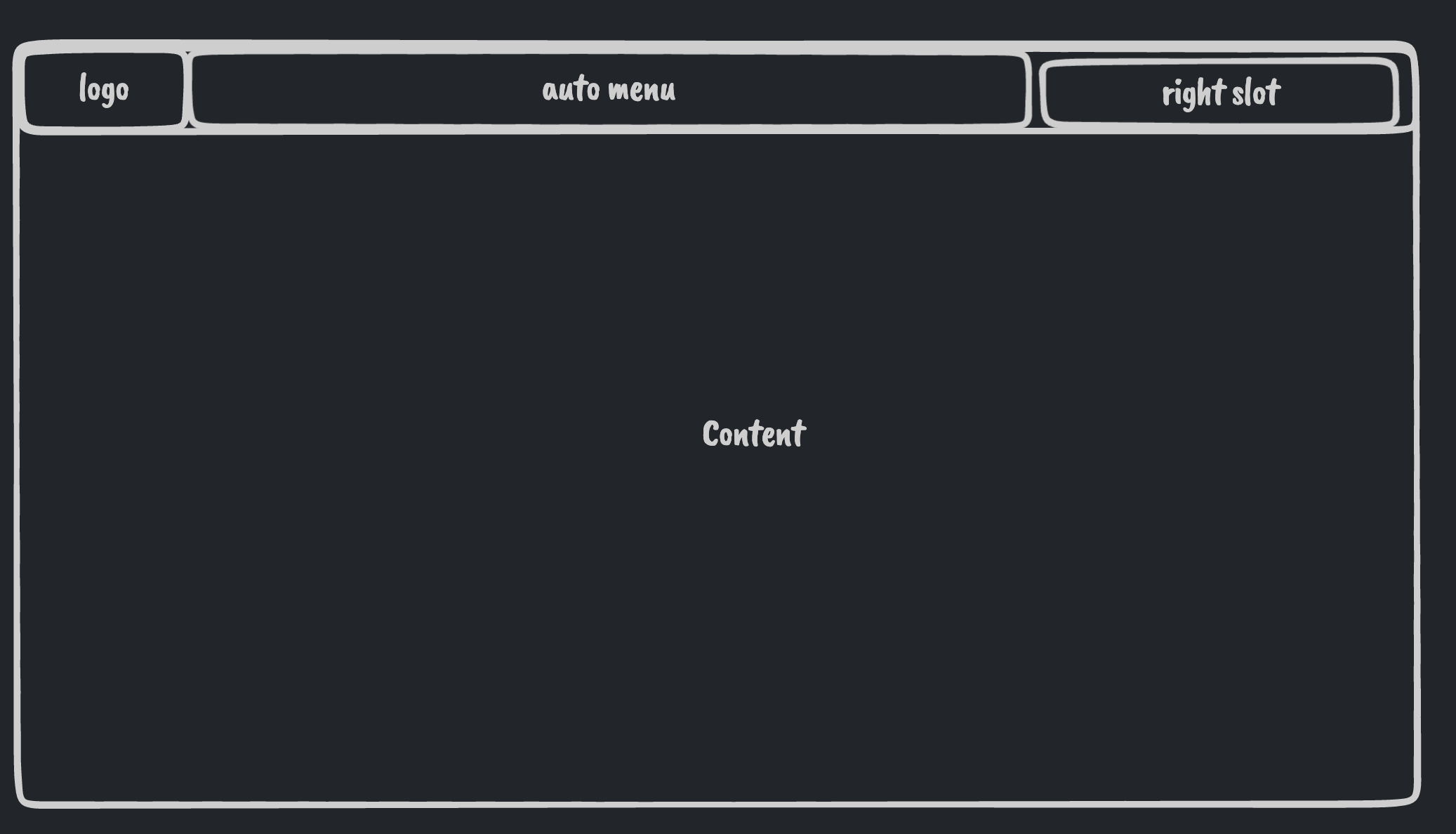
在layouts目录下创建一个top-layout布局文件夹然后创建一个index.vue的文件。 由于我们顶部通栏的布局模式和我们的混合布局的模式差不多,所以我们直接copy我们混合布局的样式进行改造。
<script lang="ts" setup>
import { LayoutContent, LayoutSider, Logo, Title } from '~/layouts/common'
const props = withDefaults(defineProps<{
  headerHeight?: number
  logo?: string
  title?: string
  siderWidth?: number
  siderCollapsedWidth?: number
  showSiderTrigger?: boolean | 'bar' | 'arrow-circle'
  collapsed?: boolean
}>(), {
  headerHeight: 48,
  collapsed: false,
})
defineEmits(['update:collapsed'])

const headerHeightVar = computed(() => `${props.headerHeight}px`)
const contentHeightVar = computed(() => `calc(100vh - ${props.headerHeight}px)`)
</script>

<template>
  <n-layout class="h-screen">
    <n-layout-header inverted class="pro-admin-mix-layout-header flex justify-between items-center px-4">
      <div class="flex items-center">
        <Logo :src="logo" />
        <Title :title="title" />
      </div>
      <slot name="headerRight">
        <div>
          右侧
        </div>
      </slot>
    </n-layout-header>
    <n-layout has-sider class="pro-admin-mix-layout-content">
      <LayoutSider
        :collapsed-width="siderCollapsedWidth"
        :width="siderWidth"
        :collapsed="collapsed"
        :show-trigger="showSiderTrigger"
        @update:collapsed="($event) => $emit('update:collapsed', $event)"
      >
        海淀桥
      </LayoutSider>
      <LayoutContent content-style="padding: 24px;">
        <slot />
      </LayoutContent>
    </n-layout>
  </n-layout>
</template>

<style scoped>
.pro-admin-mix-layout-header{
  height: v-bind(headerHeightVar);
}
.pro-admin-mix-layout-content{
  height: v-bind(contentHeightVar);
}
</style>
区别是我们顶部通栏是没有侧边栏的,所以我们把侧边栏布局的功能全部删掉调整一下我们内容区域存放内容的区域,我们不需要两个n-layout来实现了,所以我们把下面的内容移出来,然后删掉我们的下边的n-layout
<script lang="ts" setup>
import { LayoutContent, LayoutSider, Logo, Title } from '~/layouts/common'
const props = withDefaults(defineProps<{
  headerHeight?: number
  logo?: string
  title?: string
  siderWidth?: number
  siderCollapsedWidth?: number
  showSiderTrigger?: boolean | 'bar' | 'arrow-circle'
  collapsed?: boolean
}>(), {
  headerHeight: 48,
  collapsed: false,
})
defineEmits(['update:collapsed'])

const headerHeightVar = computed(() => `${props.headerHeight}px`)
const contentHeightVar = computed(() => `calc(100vh - ${props.headerHeight}px)`)
</script>

<template>
  <n-layout class="h-screen">
    <n-layout-header inverted class="pro-admin-mix-layout-header flex justify-between items-center px-4">
      <div class="flex items-center">
        <Logo :src="logo" />
        <Title :title="title" />
      </div>
      <slot name="headerRight">
        <div>
          右侧
        </div>
      </slot>
    </n-layout-header>
    <LayoutContent content-style="padding: 24px;">
      <slot />
    </LayoutContent>
  </n-layout>
</template>

<style scoped>
.pro-admin-mix-layout-header{
  height: v-bind(headerHeightVar);
}
.pro-admin-mix-layout-content{
  height: v-bind(contentHeightVar);
}
</style>
我们在base-layout中进行注册
<script lang="ts" setup>
import TopLayout from '../top-layout/index.vue'
</script>
<template>
  <TopLayout
    v-if="layout.layout === 'top'"
    v-model:collapsed="layout.collapsed"
    :logo="layout.logo"
    :title="layout.title"
    :show-sider-trigger="layout.showSiderTrigger"
    :sider-width="layout.siderWidth"
    :sider-collapsed-width="layout.siderCollapsedWidth"
  >
    <template #headerRight>
      <div>
        测试右侧插槽
      </div>
    </template>
    <router-view />
  </TopLayout>
</template>
全局配置改为top在config/layout-theme中,刷新页面。 发现依然是样式没有撑开,我们在side-layout中将layout布局样式代码直接复制过来使用。 简化一下没有用到的代码后:
<script lang="ts" setup>
import { LayoutContent, Logo, Title } from '~/layouts/common'
const props = withDefaults(defineProps<{
  headerHeight?: number
  logo?: string
  title?: string
  inverted?: boolean
}>(), {
  headerHeight: 48,
})

const headerHeightVar = computed(() => `${props.headerHeight}px`)
</script>

<template>
  <n-layout class="h-screen" style="--n-color:var(--pro-admin-layout-content-bg)">
    <n-layout-header
      :inverted="inverted"
      class="pro-admin-mix-layout-header flex justify-between items-center px-4"
    >
      <div class="flex items-center">
        <Logo :src="logo" />
        <Title :title="title" />
      </div>
      <slot name="headerRight">
        <div>
          右侧
        </div>
      </slot>
    </n-layout-header>
    <LayoutContent content-style="padding: 24px;">
      <slot />
    </LayoutContent>
  </n-layout>
</template>

<style scoped>
.pro-admin-mix-layout-header{
  height: v-bind(headerHeightVar);
}
</style>