Frontend - ttulka/technologies GitHub Wiki
- HTML5
- CCS3
- Web Components
- References
<nav>
    <a href="#intro">Intro</a>
</nav>
<section id="intro">
    <p>This is intro</p>
</section>Cascading style sheets = multiple rules can be applied to a single element.
Specificity is all about resolving conflicts that arise from multiple CSS rules which target the same element.
- in-line styles
- #ID selectors
- .class, :pseudo-class and [attribute] selectors
- and ::pseudo-element selectors
- appearance top-to-bottom
Allow you to combine two selectors in a dependent way.
h2 + p { /* p coming directly after h2 */
    color: red;
}<div>
<h2>Header</h2>
<p>**Red**</p>
<h2>Header</h2>
<div>Div</div>
<p>Regular</p>
<h2>Header</h2>
<p>**Red**</p>
</div>h2 ~ p { /* p coming somewhere after h2 */
color: red;
}<div>
<h2>Header</h2>
<p>**Red**</p>
<h2>Header</h2>
<div>Div</div>
<p>**Red**</p>
</div>div > p { /* p direct inside div */
color: red;
}<div>
<h2>Header</h2>
<p>**Red**</p>
<section>
<p>Regular</p>
</section>
<p>**Red**</p>
</div>div p { /* p anywhere inside div */
color: red;
}<div>
<p>**Red**</p>
<section>
<p>**Red**</p>
</section>
</div>[type] { }<input type="text">[type="email"] { }<input type="email">[lang~="en"] { }<p lang="en cs">[href^="#"] { }<a href="#index">link</a>[href$=".com"] { }<a href="http://example.com">link</a>[href*="example"] { }
[href*="example" i] { } /* case-insensitive */<a href="http://example.com">link</a>
<a href="http://EXAMPLE.com">link</a>box-sizing: content-box; /* width/height = content */
box-sizing: border-box; /* width/height = content + padding + border */+---------------------+
| margin |
| +---- border ----+ |
| | padding | |
| | +------------+ | |
| | | content | | |
| | +------------+ | |
| +----------------+ |
+---------------------+
-
pxpixels -
%percentages -
remroot em - relative to default font size -
emem -
vwviewport width - percentages always related to vieport -
vhviewport height - percentages always related to vieport
While em is relative to the font-size of its direct or nearest parent, rem is only relative to the html (root) font-size.
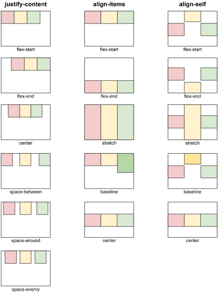
.flex-box {
    display: flex;
    height: 200px;
    flex-direction: row; /* x is main axis, default */
    /* flex-direction: column;  y is main axis */
    flex-wrap: wrap;
    align-items: center;     /* cross axis */
    justify-content: center; /* main axis */
    align-content: center; /* alignment for wrapping */
}
/* menu
+----------------------------------------------------+
| [menu1]        [menu2    [item]   [item]   [item]] |
+----------------------------------------------------+
*/
.menu {
    display: flex;
    align-items: center;
    justify-content: space-between;
}
.menu2 {
    display: flex;
    flex-basis: 80%;
    justify-content: space-around;
}[ el1 ]
[el4][ el2 ]
[ el5 ][el3]
<div class="grid">
    <div class="el1"></div>
    <div class="el2"></div>
    <div class="el3"></div>
    <div class="el4"></div>
    <div class="el5"></div>
</div>.grid {
display: grid;
grid-gap: 10px;
grid-template-columns: 1fr 20% 10rem;
grid-template-rows: repeat(3, 25%);
/* grid-auto-rows: minmax(5rm, auto); */
grid-template-areas: "header header header"
". main main"
"footer footer side";
}
.el1 {
grid-area: header;
}
.el2 {
grid-area: main;
}
.el3 {
grid-area: side;
}
.el4 {
}
.el5 {
grid-area: footer;
}<form class="form">
<label>First name:</label>
<input name="firstname">
<label>Last name:</label>
<input name="lastname">
<div class="form__checkbox">
<input type="checkbox" id="agree" required>
<label for="agree">Agree to <a href="">terms & conditions</a></label>
</div>
<button type="submit" class="button">Submit</button>
</form>.form { /* mobile first */
display: grid;
grid-auto-rows: 2rem;
grid-row-gap: 0.5rem;
align-items: end;
}
@media (min-width: 40rem) {
.form {
margin: auto;
width: 40rem;
grid-template-columns: 10rem auto;
grid-row-gap: 1rem;
grid-column-gap: 0.5rem;
}
.form__checkbox {
grid-column: span 2;
}
.form .button {
grid-column: 2;
}
}:not(p) { color: blue; }
a:not(.active) { color: blue; }
background-size: cover; /* automatically finds out the ratio */
background-size: contain; /* full picture in the container */
text-decoration: underline wavy red; /* for error highlights */
:nth-of-type(5) { }
p:nth-of-type(odd) { }
/** bottom-up arrow */
::after {
content: "";
border: 1rem solid transparent;
border-bottom-color: rgba(255, 255, 255, 0.5);
margin-left: 0.5em;
-webkit-transform: translateY(0.5em);
transform: translateY(0.5em);
}
/** all properties to initial */
.header{
all: initial;
color: blue;
}
/** text laid out horizontally or vertically */
.side {
writing-mode: vertical-rl;
}
/** background aligning to box model */
.bg {
background-clip: content-box;
}
/** prevent user from selecting text */
.notcopy {
user-select: none;
-webkit-user-select: none; /* Chrome & Safari all */
-moz-user-select: none; /* Firefox all */
-ms-user-select: none; /* IE 10+ */
}
/** image or gradiend border */
.frame {
border-image: url('diamonds.png') 30 / 19px round;
}input[type="checkbox"] {
border: 1px solid gray;
background: white;
width: 1rem;
height: 1rem;
-webkit-appearance: none;
-moz-appearance: none;
appearance: none;
}
input[type="checkbox"]:checked {
background: green;
}
input[type="checkbox"]:focus {
outline: none;
}button {
background: green;
color: white;
font: inherit;
border: 1.5px solid black;
padding: 0.5rem;
border-radius: 8px;
font-weight: bold;
cursor: pointer;
}
button:hover, button:active {
background: white;
color: green;
}
button:focus {
outline: none;
}
button[disabled] {
cursor: not-allowed;
border: gray;
background: silver;
color: gray;
}.card__badge {
position: absolute;
width: 12rem;
top: 0;
right: 0;
margin: 0;
color: white;
background-color: red;
padding: 0.5rem;
text-align: center;
transform: rotate(45deg) translate(3.5rem, -1rem);
transform-origin: center;
}const template = document.createElement('template');
template.innerHTML = `
<button type="button" class="buy">buy</button>
`;
customElements.define('buy-button', class extends HTMLElement {
constructor() { // no attributes allowed
super(); // mandatory
// create private state
this._id = Date.now();
this._buttonListener = e => this._buyAction();
}
connectedCallback() {
// create DOM
this.appendChild(template.content.cloneNode(true));
// initialize elements
this._button = this.querySelector('.buy');
// register listeners
this._button.addEventListener('click', this._buttonListener);
}
disconnectedCallback() {
// unregister listeners (clean up)
this._button.removeEventListener('click', this._buttonListener);
}
set text(text) {
// you can set the text like:
// document.querySelector('buy-button').text = 'get it!';
this._button.innerHTML = text;
}
// public & private methods
_buyAction() {
console.log('Buy button clicked');
this.dispatchEvent(new CustomEvent('buy:clicked',
{detail: {buttonId: this._id}, bubbles: true}));
}
});- Every HTML element in one post
- Reactive Frontend with Svelte
- Margin collapsing
- CSS Box Model
- Pseudo Classes on the MDN
- Dive deeper into Pseudo Elements
- CSS Filters
- Basic Concepts of Flexbox
- CSS Grid Layout
- Styling images
- Styling Form Elements
- Using media queries
- Modern CSS Solutions
- 3D Transforms
- CSS Transitions
- CSS Animations
- List of "transitionable" Properties
- Easing Functions Cheat Sheet
- CSS Counters
- Web Component in 33 Ways
- Autoprefixer CSS
- Free HTML Templates
- Free icons: 1, 2, 3
- CSS Vocabulary
- Why your designer won’t make the logo bigger
- Developing new Facebook
- Social images using SVG
- Canonical Tags
- A better way to structure React projects
- https://omatsuri.app/ - CSS generators
- https://kraken.io/web-interface
- https://random.css-pattern.com/ - Random CSS pattern
- https://caniuse.com
- https://favicon.io
- https://a.singlediv.com
- https://cssgradient.io
- https://cssmatic.com/box-shadow
- http://www.hemingwayapp.com
- https://semantic-ui.com
- Unicode character recognition
- Non-boring CSS gradients
- Ultimate web development resources
- Hand crafted icons
- Hyphen, en dash, em dash
- CSS Art: cabinet, 3D room, loaders, toggles, sticky nav, bear, coffee, add to cart, video platform, hover effect, glass card, light bulb, typing, sign up form, feedback smiles, poster zoom, paper plane, neuomorphic, navigation, check link, newspapers, parallax effect, isopleths