6.1.3.Explore visualization considerations - sj50179/Google-Data-Analytics-Professional-Certificate GitHub Wiki
- A line of words printed in large letters at the top of the visualization to communicate what data is being presented
- Supports the headline by adding more context and description
- Identifies the meaning of various elements in a data visualization

Headlines, subtitles, labels, and annotations help you turn your data visualizations into more meaningful displays. After all, you want to invite your audience into your presentation and keep them engaged. When you present a visualization, they should be able to process and understand the information you are trying to share in the first five seconds. This reading will teach you what you can do to engage your audience immediately.
If you already know what headlines, subtitles, labels and annotations do, go to the guidelines and style checks at the end of this reading. If you don’t, these next sections are for you.
A headline is a line of words printed in large letters at the top of a visualization to communicate what data is being presented. It is the attention grabber that makes your audience want to read more. Here are some examples:
- Which Generation Controls the Senate?: This headline immediately generates curiosity. Refer to the subreddit post in the dataisbeautiful community, r/dataisbeautiful, on January 21, 2021.
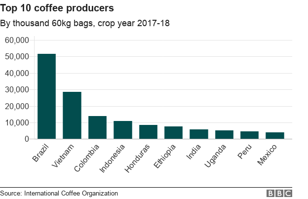
- Top 10 coffee producers: This headline immediately informs how many coffee producers are ranked. Read the full article: bbc.com/news/business-43742686.
Check out the chart below. Can you identify what type of data is being represented? Without a headline, it can be hard to figure out what data is being presented. A graph like the one below could be anything from average rents in the tri-city area, to sales of competing products, or daily absences at the local elementary, middle, and high schools.

Turns out, this illustration is showing average rents in the tri-city area. So, let’s add a headline to make that clear to the audience. Adding the headline, “Average Rents in the Tri-City Area” above the line chart instantly informs the audience what it is comparing.

A subtitle supports the headline by adding more context and description. Adding a subtitle will help the audience better understand the details associated with your chart. Typically, the text for subtitles has a smaller font size than the headline.
In the average rents chart, it is unclear from the headline “Average Rents in the Tri-City Area” ****which cities are being described. There are tri-cities near San Diego, California (Oceanside, Vista, and Carlsbad), tri-cities in the San Francisco Bay Area (Fremont, Newark, and Union City), tri-cities in North Carolina (Raleigh, Durham, and Chapel Hill), and tri-cities in the United Arab Emirates (Dubai, Ajman, and Sharjah).
We are actually reporting the data for the tri-city area near San Diego. So adding “Oceanside, Vista, and Carlsbad” becomes the subtitle in this case. This subtitle enables the audience to quickly identify which cities the data reflects.

A label in a visualization identifies data in relation to other data. Most commonly, labels in a chart identify what the x-axis and y-axis show. Always make sure you label your axes. We can add “Months (January - June 2020)” for the x-axis and “Average Monthly Rents ($)” for the y-axis in the average rents chart.

Data can also be labeled directly in a chart instead of through a chart legend. This makes it easier for the audience to understand data points without having to look up symbols or interpret the color coding in a legend.
We can add direct labels in the average rents chart. The audience can then identify the data for Oceanside in yellow, the data for Carlsbad in green, and the data for Vista in blue.

An annotation briefly explains data or helps focus the audience on a particular aspect of the data in a visualization.
Suppose in the average rents chart that we want the audience to pay attention to the rents at their highs. Annotating the data points representing the highest average rents will help people focus on those values for each city.

Refer to the following table for recommended guidelines and style checks for headlines, subtitles, labels, and annotations in your data visualizations. Think of these guidelines as guardrails. Sometimes data visualizations can become too crowded or busy. When this happens, the audience can get confused or distracted by elements that aren’t really necessary. The guidelines will help keep your data visualizations simple, and the style checks will help make your data visualizations more elegant.
| Visualzation components | Guidenlines | Style checks |
|---|---|---|
| Headlines | - Content: Briefly describe the data - Length: Usually the width of the data frame - Position: Above the data |
- Use brief language - Don’t use all caps - Don’t use italic - Don’t use acronyms - Don't use abbreviations - Don’t use humor or sarcasm |
| Subtitles | - Content: Clarify context for the data - Length: Same as or shorter than headline - Position: Directly below the headline |
- Use smaller font size than headline - Don’t use undefined words - Don’t use all caps, bold, or italic - Don’t use acronyms - Don't use abbreviations |
| Labels | - Content: Replace the need for legends - Length: Usually fewer than 30 characters - Position: Next to data or below or beside axes |
- Use a few words only - Use thoughtful color-coding - Use callouts to point to the data - Don’t use all caps, bold, or italic |
| Annotations | - Content: Draw attention to certain data - Length: Varies, limited by open space - Position: Immediately next to data annotated |
- Don’t use all caps, bold, or italic - Don't use rotated text - Don’t distract viewers from the data |
You want to be informative without getting too detailed. To meaningfully communicate the results of your data analysis, use the right visualization components with the right style. In other words, let simplicity and elegance work together to help your audience process the data you are sharing in five seconds or less.
- Labeling
- Text alternatives
- Text-based format
- Distinguishing
- Simplify
What is involved with designing with an accessibility mindset? Select all that apply.
- Think about your audience ahead of time
- Focus on simple, easy to understand visuals
- Create alternative ways for your audience to access and interact with your data
Rely solely on well-chosen color to convey information
Correct. Designing with an accessibility mindset involves thinking about your audience ahead of time; focusing on simple, easy to understand visuals; and creating alternative ways for your audience to access and interact with your data.
By now, you understand the principles of design and how to think like a designer. Among the many options of data visualization is creating a chart, which is a graphical representation of data.
Choosing to represent your data via a chart is usually the most simple and efficient method. Let’s go through the entire process of creating any type of chart in 60 minutes. The goal here is to develop a prototype or mock up of your chart that you can quickly present to an audience. This will also enable you to have a sense of whether or not the chart is communicating the information that you want.

Follow this high level 60-minute chart to guide your thinking whenever you begin working on a data visualization.
Prep (5 min): Create the mental and physical space necessary for an environment of comprehensive thinking. This means allowing yourself room to brainstorm how you want your data to appear while considering the amount and type of data that you have.
Talk and listen (15 min): Identify the object of your work by getting to the “ask behind the ask” and establishing expectations. Ask questions and really concentrate on feedback from stakeholders regarding your projects to help you hone how to lay out your data.
Sketch and design (20 min): Draft your approach to the problem. Define the timing and output of your work to get a clear and concise idea of what you are crafting.
Prototype and improve (20 min): Generate a visual solution and gauge its effectiveness at accurately communicating your data. Take your time and repeat the process until a final visual is produced. It is alright if you go through several visuals until you find the perfect fit.
This is a great overview you can use when you need to create a visualization in a short amount of time. As you become more experienced in data visualization, you will find yourself creating your own process. You will get a more detailed description of different visualization options in the next reading, including line charts, bar charts, scatter plots, and more. No matter what you choose, always remember to take the time to prep, identify your objective, take in feedback, design, and create.
Which of the following are necessary to consider while making an effective visualization? Select all that apply.
- The design thinking process
- The needs of your audience
The brand of visualization software you use- The type of data you are visualizing
Correct. In order to make an effective visualization, you must consider the type of data you’re visualizing, the needs of your audience, and the design thinking process. An effective visualization can be made in any visualization software. Going forward, you can use your knowledge of creating data visualizations in the chart editor to explore more types of data visualizations. This will help you better present your data and findings to peers and stakeholders.
In this activity, you used design thinking to create a data visualization and answer a business question. In the text box below, write 2-3 sentences (40-60 words) in response to each of the following questions:
- What insights did you gain about the two products you visualized? What trends did you notice?
- How did design thinking (Empathize, Define, Ideate, Prototype, Test) influence the process of making the data visualization?
- How can design thinking help make data visualizations more accessible and easier to understand?
- Answer: How design thinking should be at the heart of the visualization process because it allows analysts to create user-centric visualizations. Design thinking helps everyone stays focused on the audience, message, and goal. This helps anyone creates a data visualization that tells a meaningful story about the data that is useful to the audience. Design thinking also helps everyone plans for accessibility issues. By improving accessibility, anyone makes data visualizations that communicate more effectively.
TOTAL POINTS 4
What are the three basic visualization considerations? Select all that apply.
- Labels
- Headlines
- Subtitles
Text
Correct. The three basic visualization considerations are headlines, subtitles, and labels.
Directly labeling a data visualization helps viewers identify data more efficiently. Legends are often less effective because they are positioned away from the data.
- True
False
Correct. Directly labeling a data visualization helps viewers identify data quickly. Legends are often less effective because they are positioned away from the data.
Why do data analysts use alternative text to make their data visualizations more accessible?
To make the presentation of data clearer- To provide a textual alternative to non-text content
To make data visualizations easier to readTo add context to the data visualization
Correct. Alternative text provides a textual alternative to non-text context. Alternative text ensures that users who need to access your data visualizations in different ways, like with a screen-reader, will still absorb the information.
You are creating a data visualization and want to ensure it is accessible. What strategies do you use to simplify the visual? Select all that apply.
Do not include labels- Simplify your visualization
- Avoid overly complicated charts
- Focus on necessary information over long chunks of text
Correct. Simplifying your data visualizations can help your audience understand and focus on the important data. To do this, avoid overly complicated visuals or unnecessary information.