Enhancing Text with CSS Text Shadow Effects - sinonagar123/dev_to_articles GitHub Wiki
Enhancing Text with CSS Text Shadow Effects
The CSS text-shadow property is used to apply a shadow effect to text. It adds a shadow behind the text, creating a visual effect that can enhance the text's readability or aesthetics. It's a great way to enhance the visual appeal of your text and make it stand out. The text-shadow property accepts a comma-separated list of values that define the offset, blur radius, and color of the shadow. Here's the basic syntax:
selector {
  text-shadow: horizontal-offset vertical-offset blur-radius color;
}
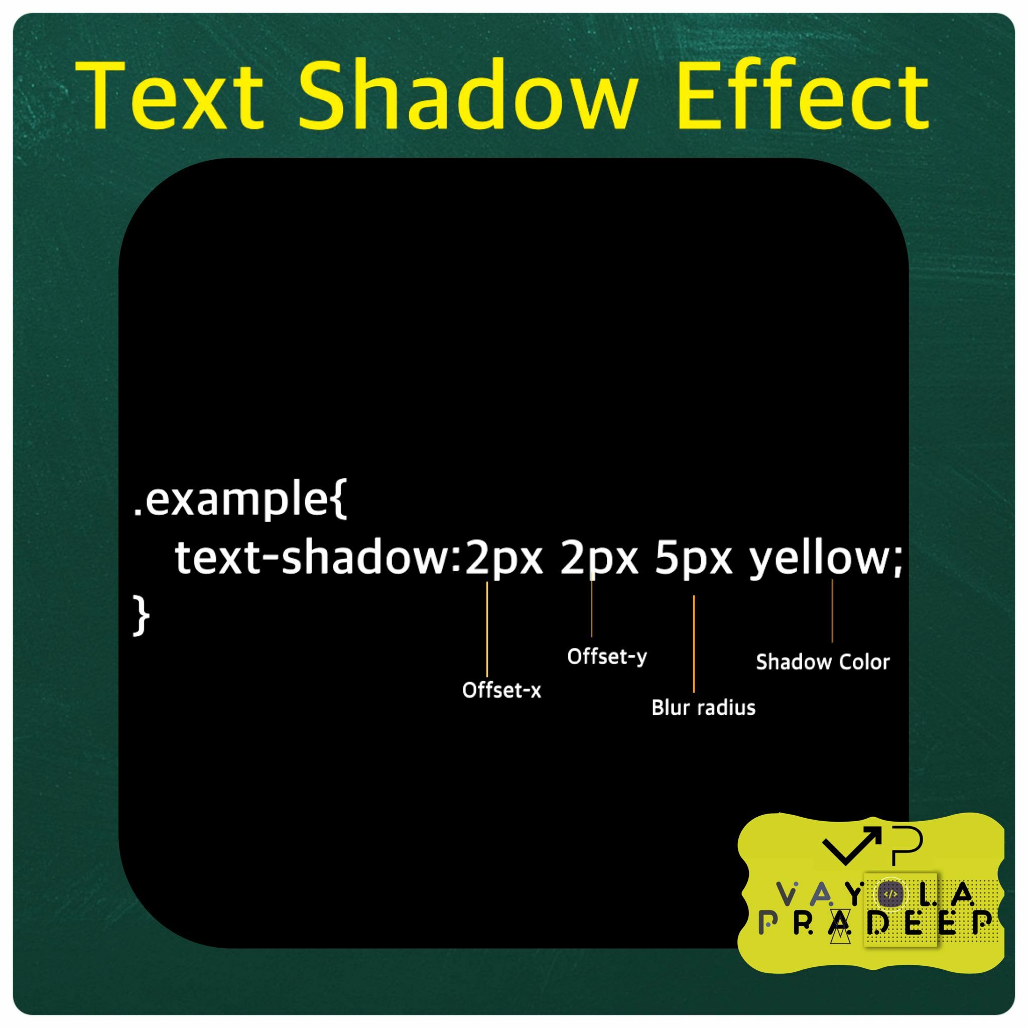
horizontal-offset: This value determines the horizontal distance of the shadow from the text. Positive values move the shadow to the right, while negative values move it to the left.
vertical-offset: This value determines the vertical distance of the shadow from the text. Positive values move the shadow downward, while negative values move it upward.
blur-radius: This value defines the amount of blurring applied to the shadow. A larger value results in a more spread out and softer shadow.
color: This value specifies the color of the shadow. You can use color names, hexadecimal codes, RGB values, or any other valid color representation.
Here are some examples
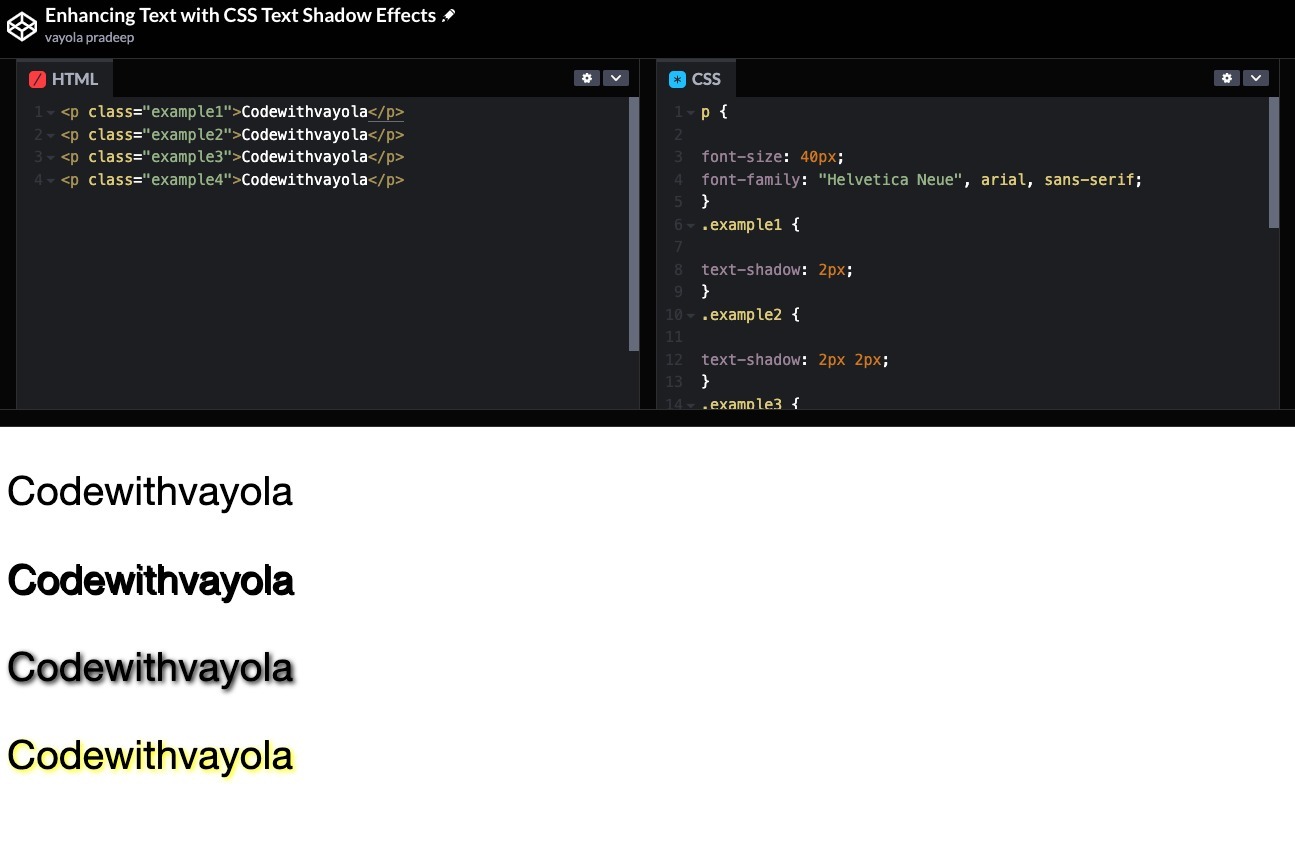
<p class="example1">Codewithvayola</p>
p {

font-size: 40px;
font-family: "Helvetica Neue", arial, sans-serif;
}
.example1 {

text-shadow: 2px;
}
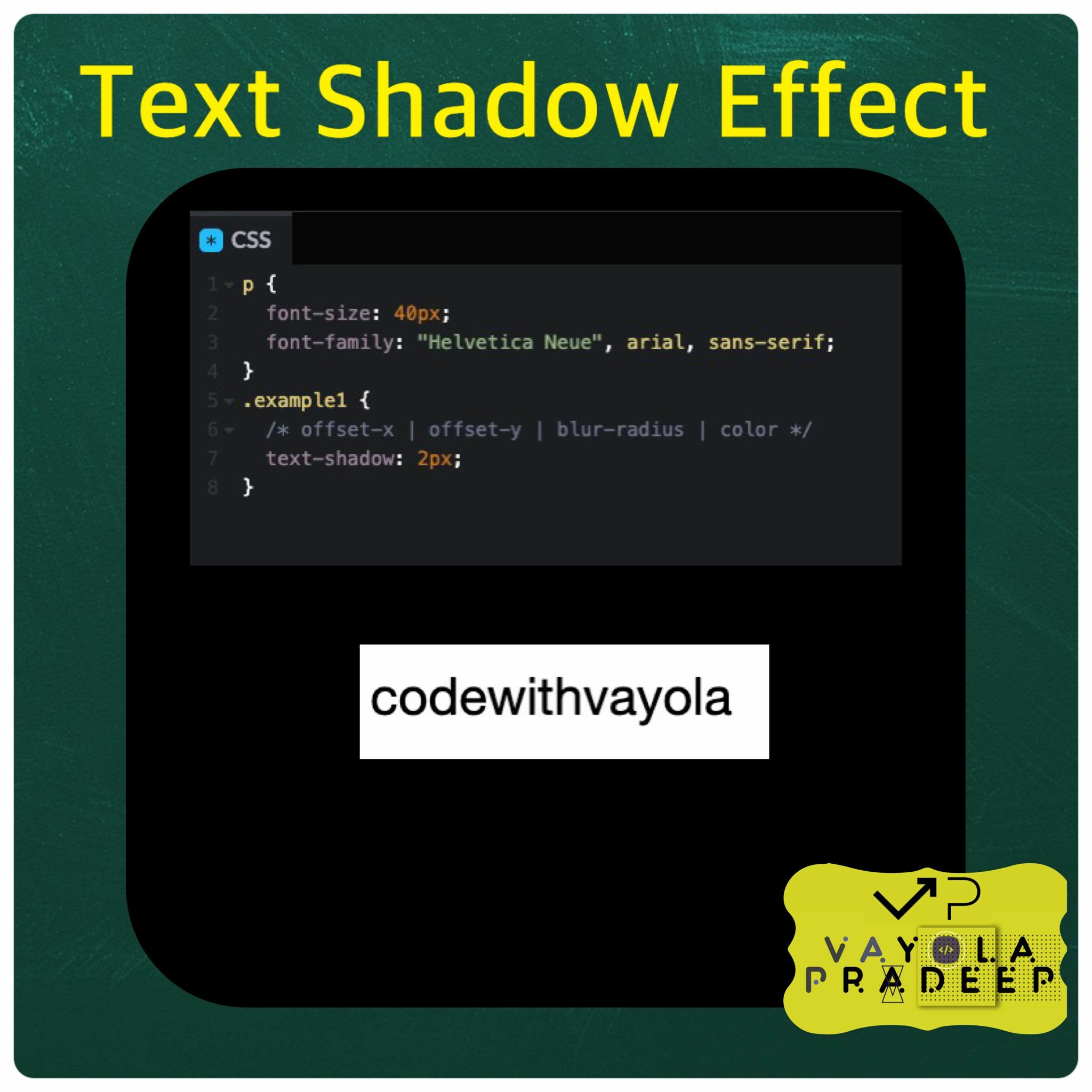
Here I gave only one value text-shadow: 2px; which is typically used to define the horizontal offset of the shadow.
<p class="example1">Codewithvayola</p>
p {

font-size: 40px;
font-family: "Helvetica Neue", arial, sans-serif;
}
.example1 {

text-shadow: 2px 2px;
}
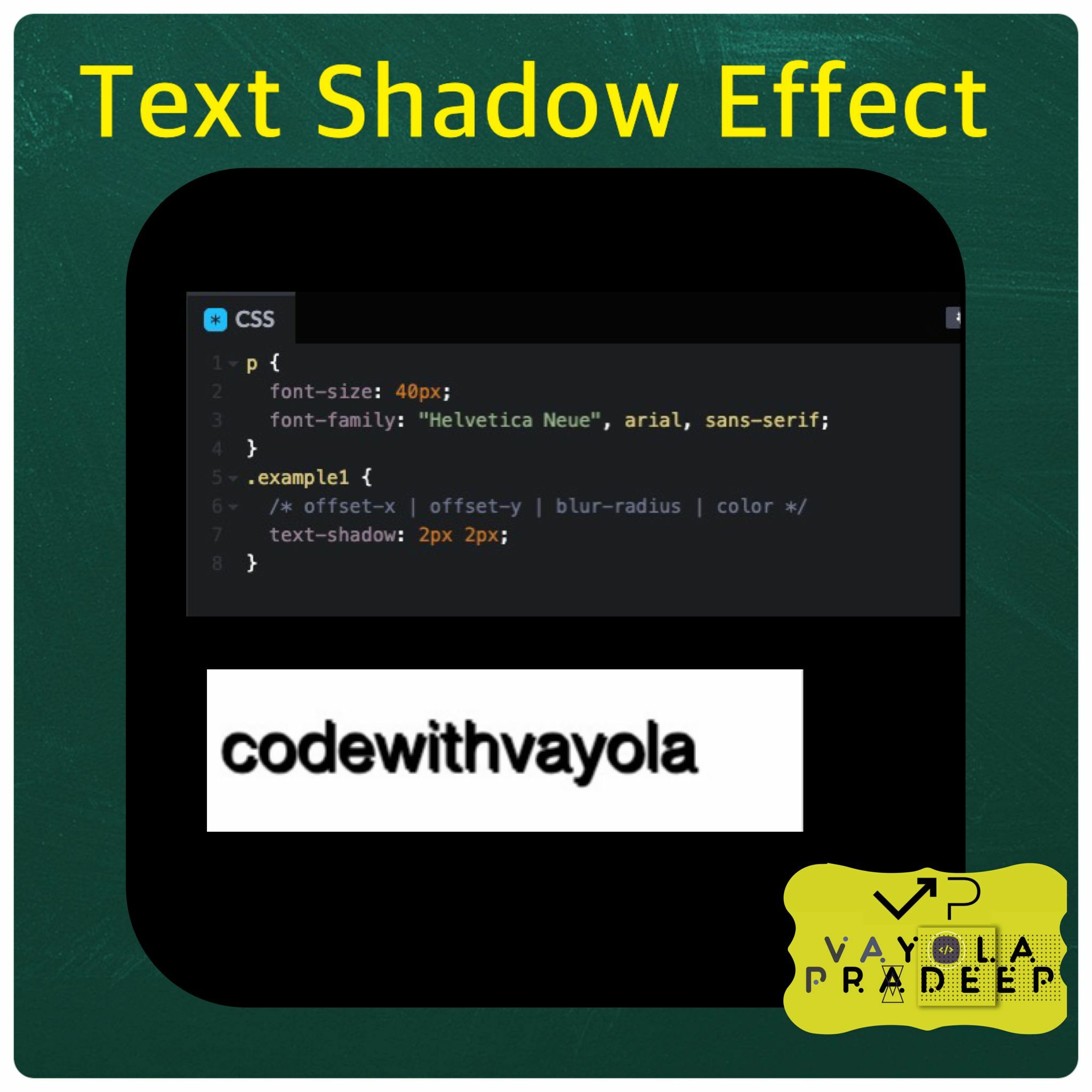
Here I gave two values text-shadow: 2px 2px; 2px for the horizontal offset and 2px for the vertical offset.
<p class="example1">Codewithvayola</p>
p {

font-size: 40px;
font-family: "Helvetica Neue", arial, sans-serif;
}
.example1 {

text-shadow: 2px 2px 5px;
}
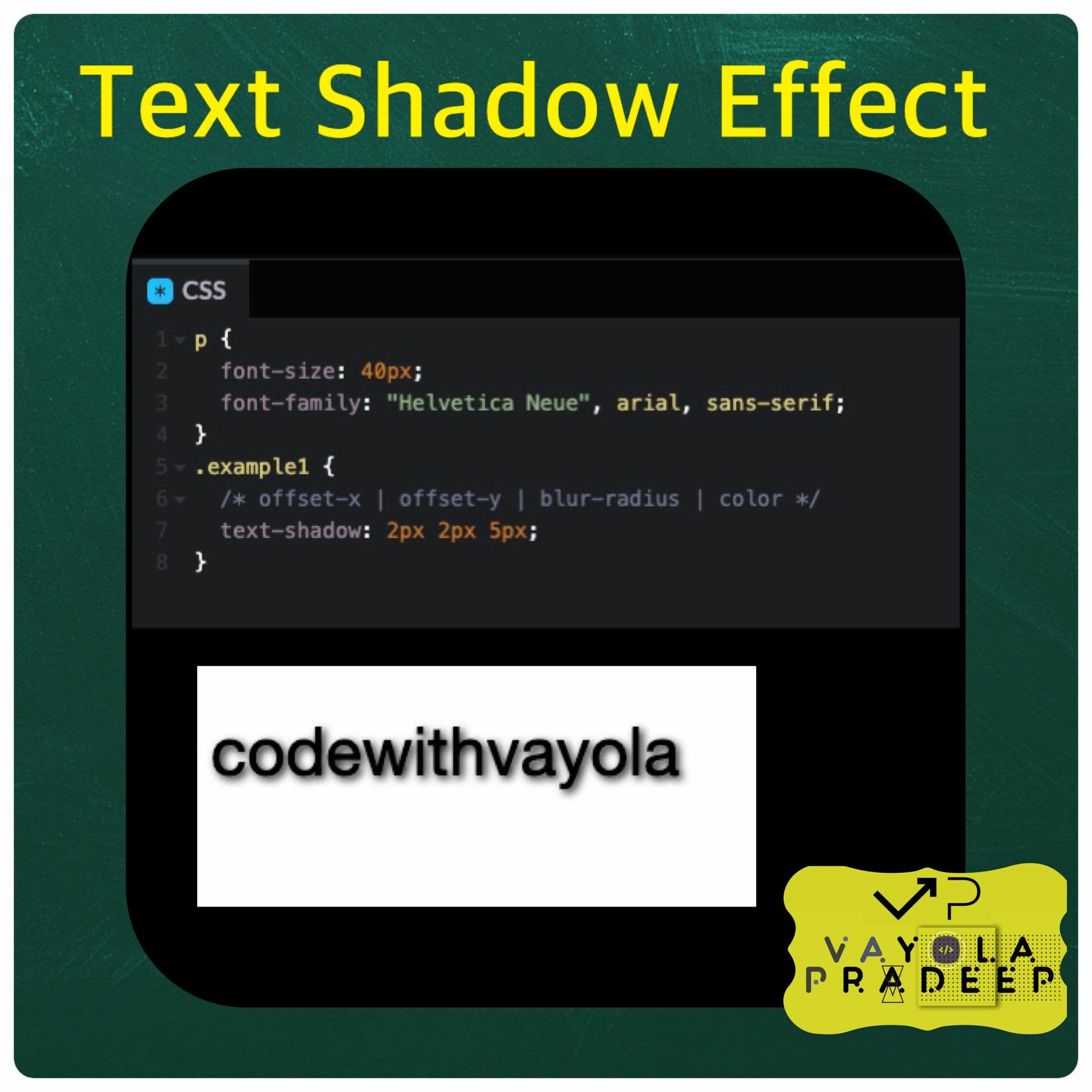
Will create a text shadow effect for the selected element with the following characteristics:
Horizontal offset: 2 pixels to the right. Vertical offset: 2 pixels down. Blur radius: 5 pixels. Shadow color: The default shadow color, which is typically black. This means that the text will appear with a shadow that is offset 2 pixels to the right and 2 pixels down from the original text position. The shadow will be blurred with a radius of 5 pixels, creating a softer and more spread-out shadow effect. The shadow color will be the default, usually black.
<p class="example1">Codewithvayola</p>
p {

font-size: 40px;
font-family: "Helvetica Neue", arial, sans-serif;
}
.example1 {

text-shadow: 2px 2px 5px yellow;
}
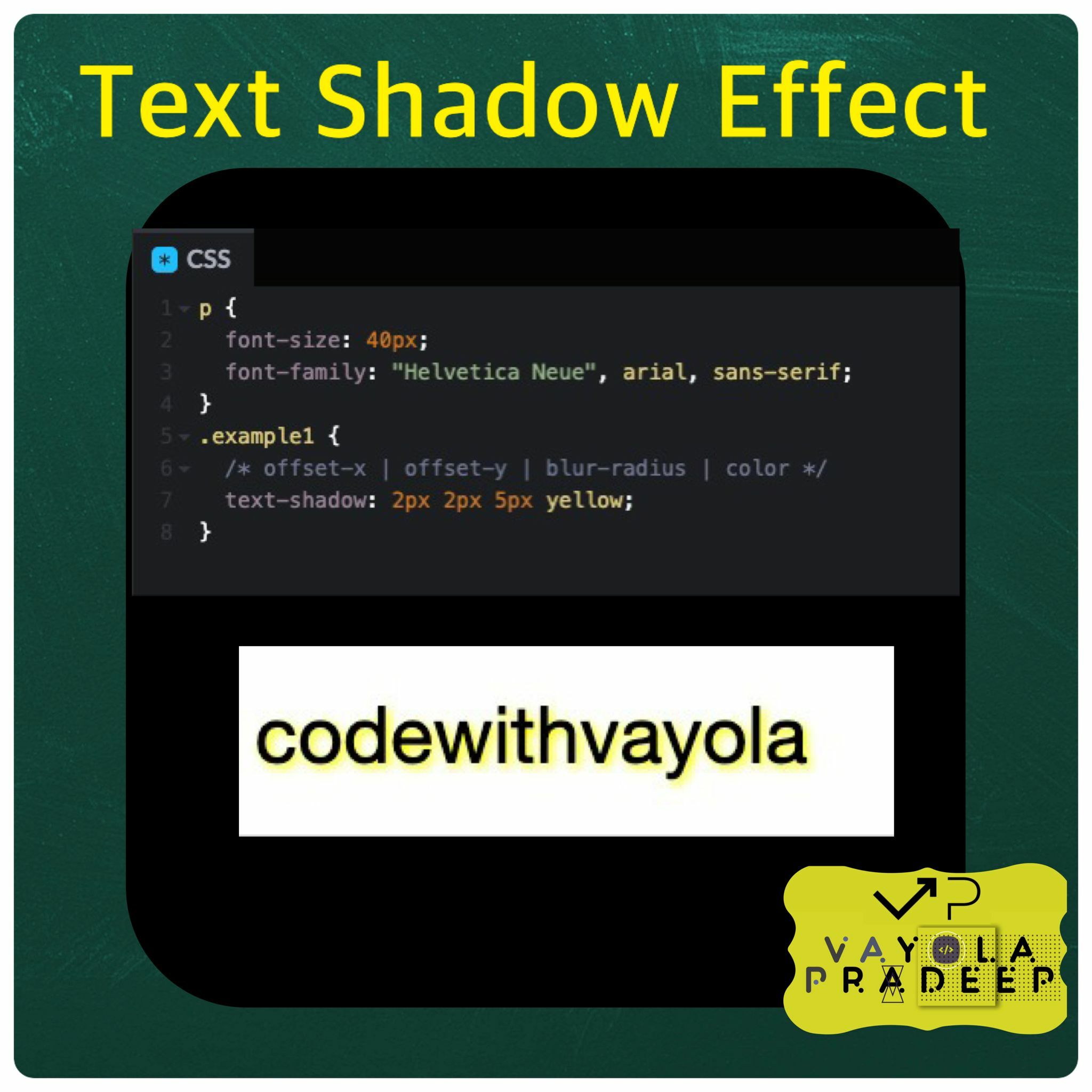
Will create a text shadow effect for the selected element with the following characteristics:
Horizontal offset: 2 pixels to the right. Vertical offset: 2 pixels down. Blur radius: 5 pixels. Shadow color: Yellow. This means that the text will appear with a shadow that is offset 2 pixels to the right and 2 pixels down from the original text position. The shadow will be blurred with a radius of 5 pixels, creating a softer and more spread-out shadow effect. The shadow color will be yellow.