Interface - shellywhen/measure-flow GitHub Wiki

Components
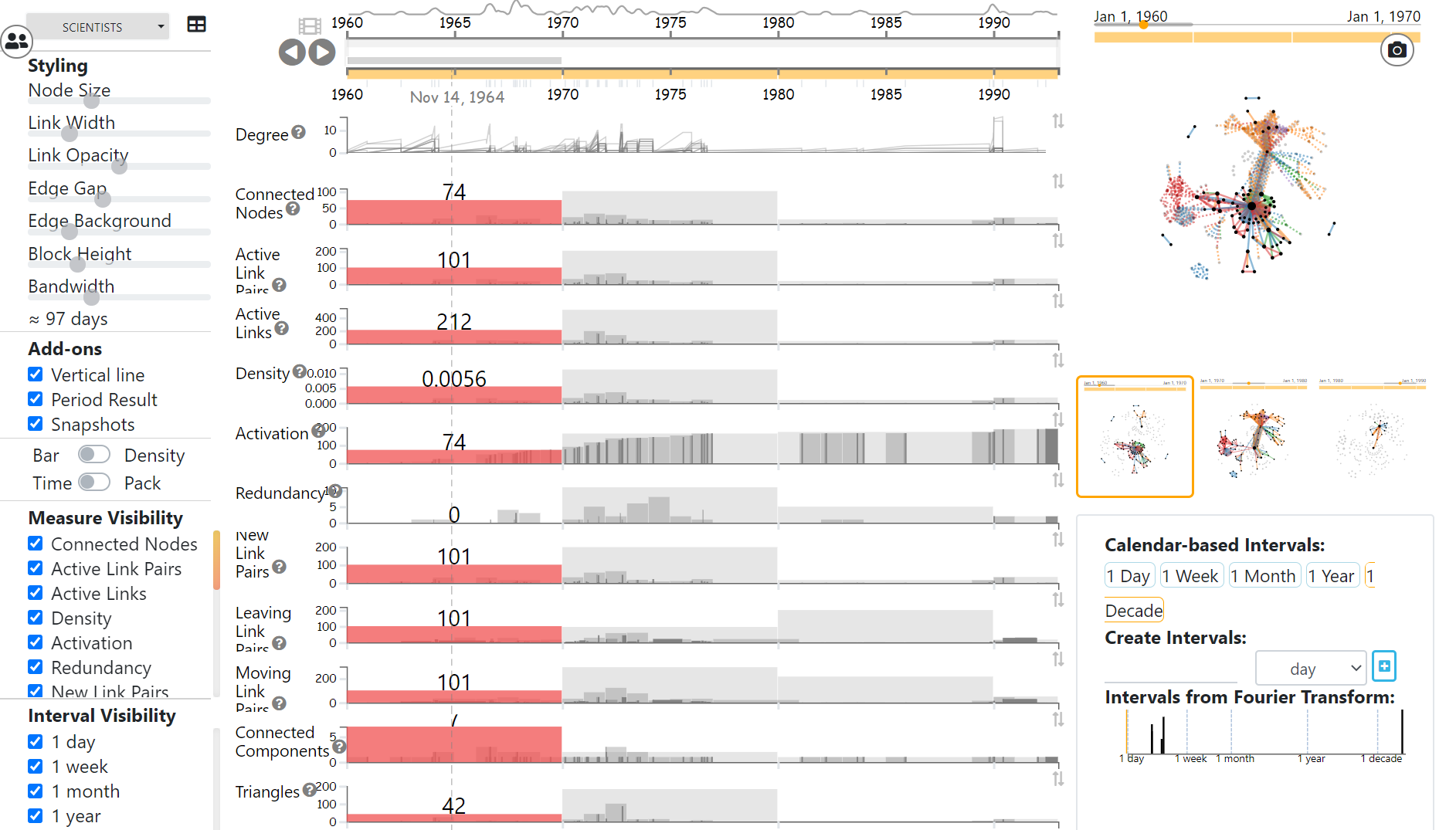
Generally, there is a major measure series view and a node-link diagram for data visualization, corresponding to the time range specified in the timeline. And there are two configuration bars. The one for visual appearance is in the left while the one for intervals is in the bottom right.
Interactions
Visual Encodings
Layout = connectivity: The node-link diagram uses the simple default force-directed layout, implemented in D3. Nodes with many common neighbors are drawn closer to each other, while nodes with few connections are drawn at the periphery of the layout.
Node size = number of connections: Larger nodes indicate nodes with more connections, smaller nodes have less connections (node degree)
Multiple lines = multiple relations: Multiple straight lines between two nodes indicate multiple links, e.g. different letters or different types of relationships.
Line thickness = relation weight*: lines of different thickness indicate relations of different strength (or weight).
Line color = relation type: Different colors mean different types of relations. A color legend is presented in the Browser (see below).