Text Placement and Balancing - saraoswald/lettering-tutorials GitHub Wiki
Outline:
- Text Placement and Balancing
- Placing Text
- Formatting Text
- Replacing Text
- Balancing Text
- Centering Text
- Asides
This guide will cover typesetting in InDesign only. I don't have much experience typesetting in Photoshop, and I wouldn't recommend it unless you're explicitly asked to typeset in Photoshop.
There are three steps to typesetting:
- Placing text frames
- Placing text into frames
- Formatting and balancing text

There's no correct order to this process, but I recommend doing each step in batches, by panels, pages, or even chapters. Here's what this process looks like if you do a whole page at a time:

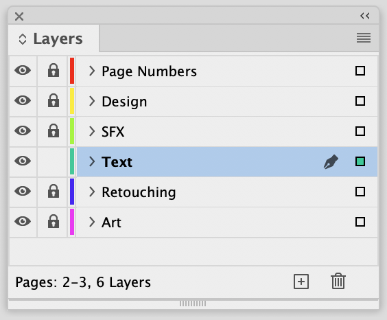
Text should be placed on its own layer, separate from the art and images. This makes it possible to lock the layers you're not using while you're typesetting so that you don't mess up your previous work.
Getting the text from the script into InDesign is a very important step, and everyone has a different method for getting it done.
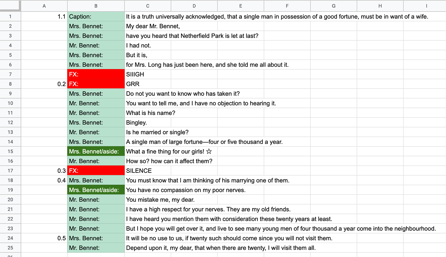
Every publisher has a different script format, but for the purposes of this guide I'll just be using this tab-delimited script:
1.1	Caption:	It is a truth universally acknowledged, that a single man in possession of a good fortune, must be in want of a wife.
	Mrs. Bennet: 	My dear Mr. Bennet,
	Mrs. Bennet:	have you heard that Netherfield Park is let at last?
	Mr. Bennet:	I had not.
	Mrs. Bennet: 	But it is,
	Mrs. Bennet:	for Mrs. Long has just been here, and she told me all about it.
	FX:		SIIIGH
.2	FX:		GRR
	Mrs. Bennet:	Do not you want to know who has taken it?
	Mr. Bennet:	You want to tell me, and I have no objection to hearing it.
	Mr. Bennet:	What is his name?
	Mrs. Bennet:	Bingley.
	Mr. Bennet:	Is he married or single?
	Mrs. Bennet: 	A single man of large fortune—four or five thousand a year.
	Mrs. Bennet/aside:	What a fine thing for our girls! ☆
	Mr. Bennet: 	How so? how can it affect them?
.3	FX:		SILENCE
.4	Mrs. Bennet: 	You must know that I am thinking of his marrying one of them.
	Mrs. Bennet/aside:	You have no compassion on my poor nerves.
	Mr. Bennet: 	You mistake me, my dear.
	Mr. Bennet:	I have a high respect for your nerves. They are my old friends.
	Mr. Bennet:	I have heard you mention them with consideration these twenty years at least.
	Mr. Bennet: 	But I hope you will get over it, and live to see many young men of four thousand a year come into the neighbourhood.
.5	Mrs. Bennet: 	It will be no use to us, if twenty such should come since you will not visit them.
	Mr. Bennet:	Depend upon it, my dear, that when there are twenty, I will visit them all.
This method is recommended if you don't want to bother with scripts and you want to avoid using your mouse. I'll demonstrate using Google Sheets since it's free, but feel free to use whatever spreadsheet software you want. This works best with tab-delimited scripts like shown above.
- Create a new spreadsheet.
- Open your script, and copy all of its text. Paste it into your spreadsheet.
- Format the spreadsheet as you'd like, adding colors and conditional formatting to draw your attention.
- In InDesign, use the Type Tool (
T) to draw a text frame over a balloon.- (optional) drawing all the frames on a page — or even a chapter — can help streamline your workflow
- Press
CMD + Tabto switch to your spreadsheet. - Use
Arrow Keys,Enter,Tabto navigate to the next cell with text you'd like to copy. - Press
CMD + Cto copy the text inside the cell. - Press
CMD + Tabto switch back to InDesign. - Double-click on the text frame you made in Step 1, and press
CMD + Vto paste the text.
- Install Letterer Buddy (See How to Install Scripts)
- (optional) Also install Go to Next Line and Go to Previous Line, and assign them to keyboard shortcuts. These will make it easier to navigate the script quickly.
- Save your script as a plain text file (.txt). In Word, this is one of the options in the
Save Asdialog. - Run Letterer Buddy (See How to Use Scripts)
- Click on
Load Scriptat the bottom of the panel, underActions. Choose the .txt file you created in Step 2. - Select
Settingsat the top of the panel, and set thePaste from Columnoption to whichever column the text is in.- For example, if your script looked like this, the
Paste from Columnwould be3:
- For example, if your script looked like this, the
| Page 1 | ||
| 1.1 | Caption: | It is a truth universally acknowledged, that a single man in possession of a good fortune, must be in want of a wife. |
| Mrs. Bennet: | My dear Mr. Bennet, | |
| Mrs. Bennet: | have you heard that Netherfield Park is let at last? |
- Click on
Scriptat the top of the panel to bring you back to the script. - If you already have text frames placed, simply click on a frame to insert the active line in the script. If not, you can draw a text frame, and then press
Escapeto insert the active line in the script.
A video of this process in action can be found here: https://twitter.com/salinsley/status/1347979426387132417
Using InDesign styles is useful not only for creating font samples, but also while typesetting. Instead of remembering which style you're using for flashbacks, you can make InDesign remember that for you.
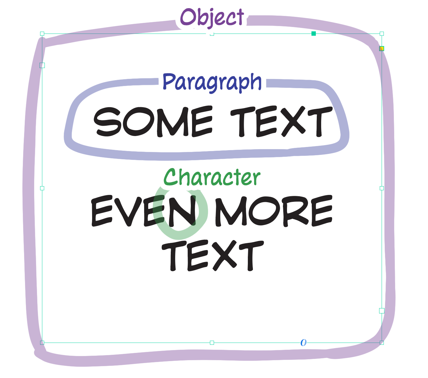
There are three style types that we'll be working with. They each have their own Panel that you can find under Window > Styles:
- Object Styles
- Paragraph Styles
- Character Styles
To create a new style, click the Create new style button in the bottom right corner, or go to the panel's options menu (hamburger icon) to select New Object Style....
To edit a style, right-click on its name and select Edit [Style Name]....
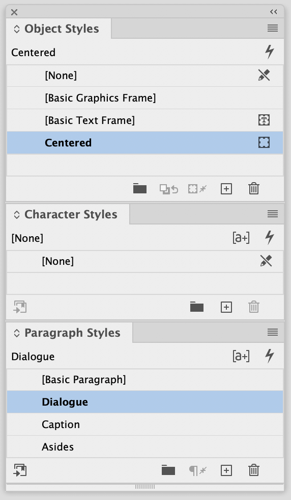
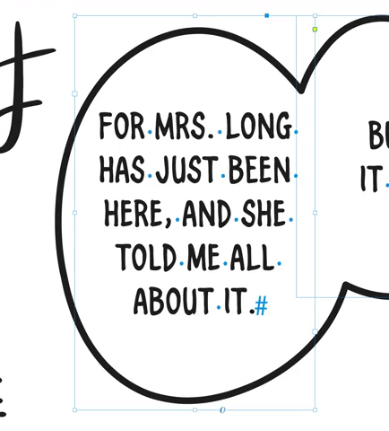
Whatever styles are selected will be used by the Text Tool (T) as the default. For example, in the case below, if I created a new text frame, it would have the Object Style "Centered" and the Paragraph Style "Dialogue"
Besides the ability to automatically center text, here are some extra useful tricks that Styles can do.
-
Faux Italics
- If your font doesn't have italics, you can use Skew to simulate it, and a Character Style to keep track of how much you used
-
Advanced Character Options>Skew
-
Special Glyphs
- If you're using a different font to bring up heart and star glyphs, you can keep track of which font you used by creating a Character Style
-
Leading Percentage
- Using the
(Auto)leading in InDesign makes it easier to scale text on the fly, as you don't have to change both the size and leading every time. - The
(Auto)leading is calculated from a given paragraph's Auto-Leading Percentage. Edit it underJustification>Auto-Leading.- e.g. if your font looks great at 7pt Font Size and 8pt Leading, the percentage would be 114%
8 / 7 * 100 ~= 114.2857
- e.g. if your font looks great at 7pt Font Size and 8pt Leading, the percentage would be 114%
- Using the
Your base "Dialogue" Paragraph Style should have a basic font size assigned to it (e.g. 7 pt)
- Set the Auto-Leading on your paragraph style proportionally.
- Set the Leading to
Autoin your paragraph style (Paragraph Style Options > Basic Character Formats > Leading). - Go to
Preferences > Units & Increments > Keyboard Increments. Adjust theSize/Leadingsetting to be0.5 pt(or whatever you want. I think the default is 2pt, which is really big). ClickOK. - With a text frame selected, use the keyboard shortcut
Shift + CMD + ,to decrease the font size andShift + CMD + .to increase font size. Repeat as necessary. The leading will change automatically with the text.
- Using the Character Panel (
Window > Type & Tables > Character), select a different font size, either by entering a new number or using the incremental arrows. - Edit the Leading setting proportionally.
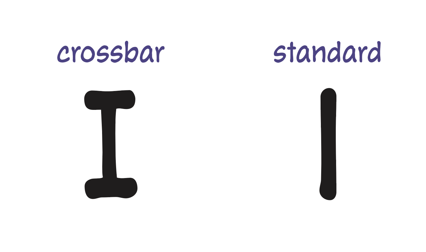
Consult your publisher's style guide for rules on when to use the crossbar-I glyph. If it's not specified, then I recommend using Blambot's guidance.
Depending on your font and the age of the file you have, the crossbar-I glyph may show up automatically, or it may be mapped to a different key. See the guide on using fonts for more information.
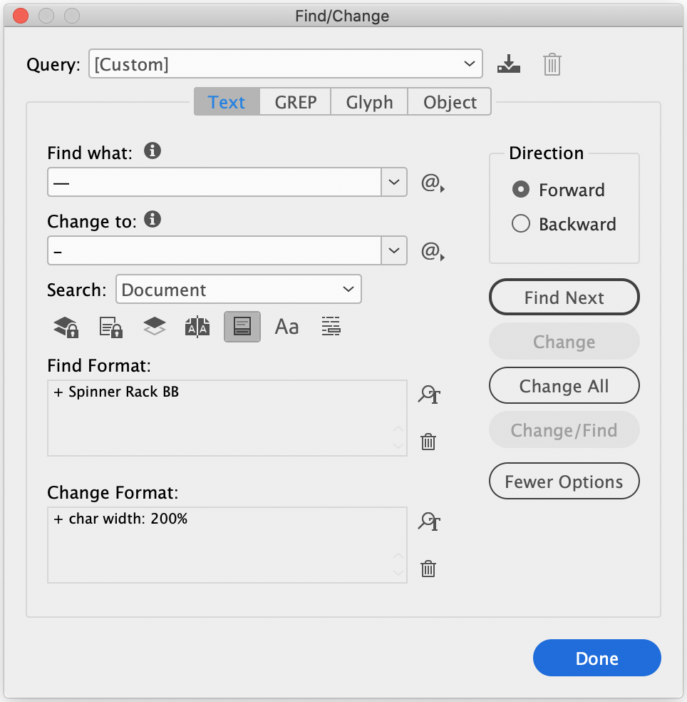
Like with the crossbar-I, consult your publisher's style guide for rules on how em dashes (—) should be formatted. If it's not specified, feel free to use the default behavior of the font you're using.
Some fonts use a double-dash (--) glyph for em and en dashes, and your publisher might ask you to change them to long dashes. I recommend:
- Changing the character to a hyphen
- Using a Character Style set to 200% Horizontal Width
You can do this either by running a script on each text frame, or by using InDesign's Find/Replace feature while finishing a book. Here's an example query that you could use, substituting your specific font name:
There are a number of reasons why we would want to replace text programmatically as letterers. The script could be unedited and full of mistakes, there might be a common replacement you need to do (e.g., <3 -> ♡), a particular font may need a pipe symbol (|) to get crossbar-I's, etc. This guide will give you some guidance and show you some best practices.
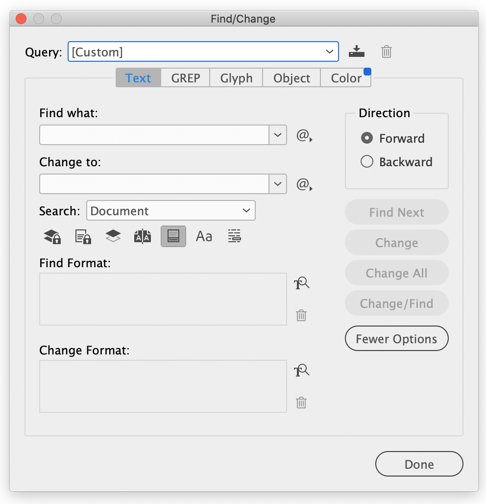
The Find/Replace window in InDesign is incredibly powerful, and we'll go over some of its most useful features. You can open this dialog by pressing CMD + F or navigating to Edit > Find/Replace in the top menu bar.
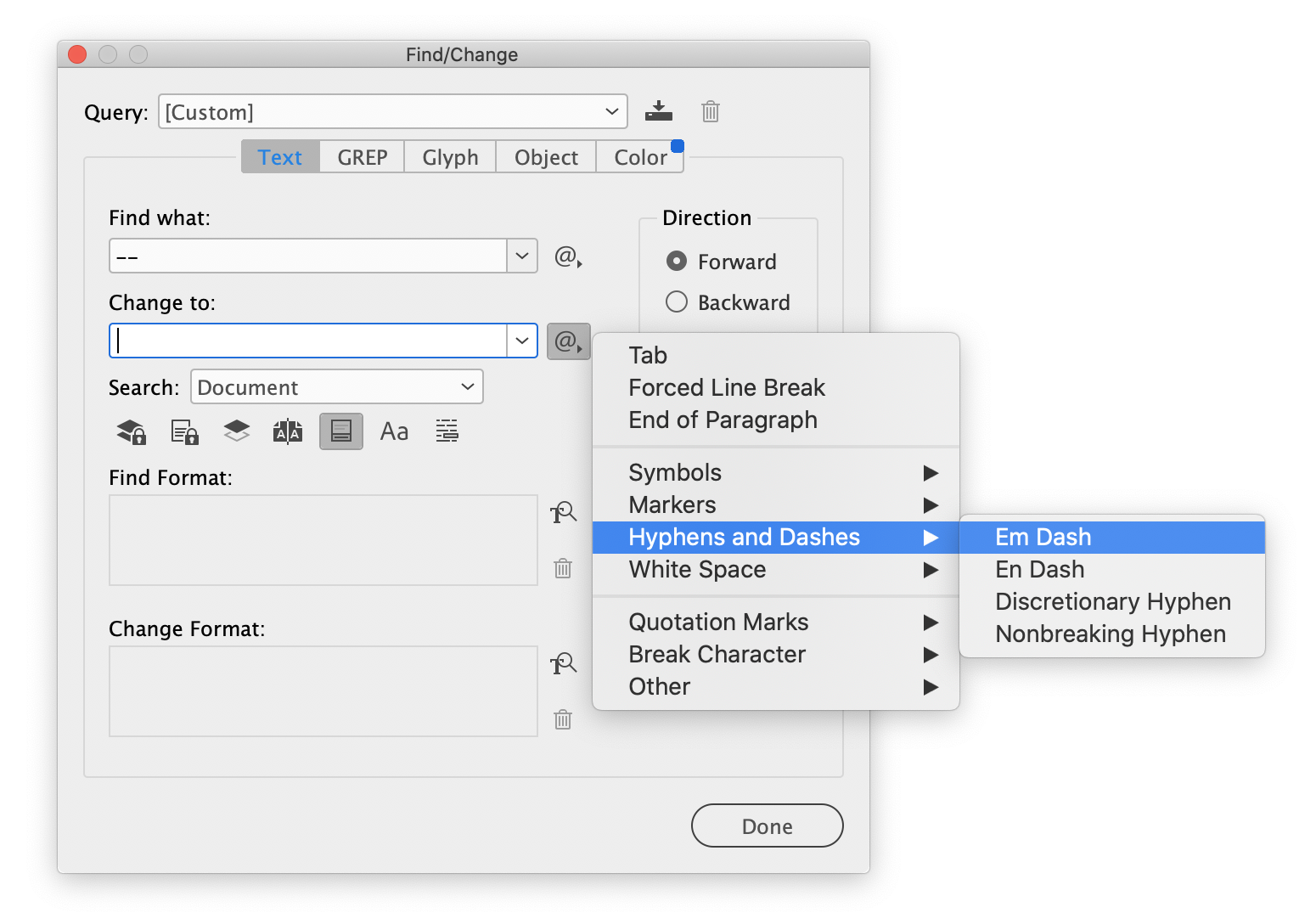
You can do basic text replacement in the Find what: and Change to: fields. Both of these fields have a handy menu for inserting special characters. For example, if you wanted to change all instances of two hyphens to be an em dash, you can use the @ menu to select the em dash character, instead of remembering what the combination is on your keyboard. Selecting Hyphens and Dashes > Em Dash will insert the special character that InDesign recognizes as an em dash (^_):
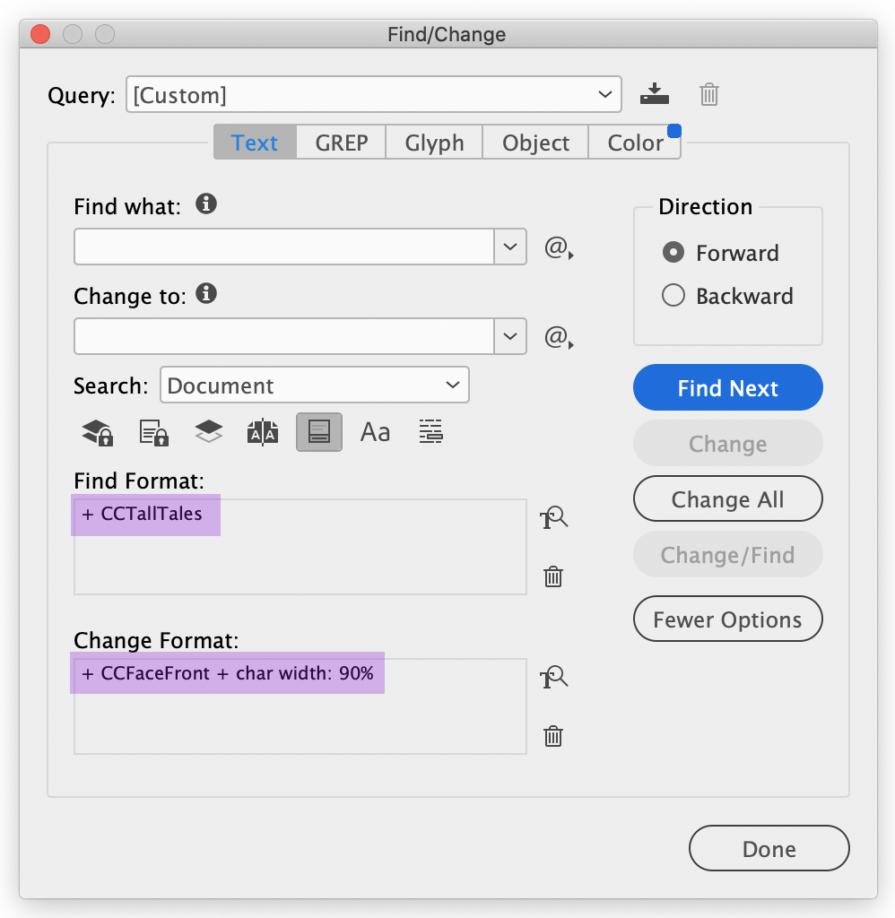
In addition to searching for basic text, you can also search by text styles. If you click inside the Find Format: or Change Format: fields, you will have access to a dialog where you can specify Fonts, Tracking, Character Styles, Paragraph Styles, Font Weights, Colors, etc.
Here is an example of how you can replace one font with another, perhaps because you got feedback in revisions to replace it:
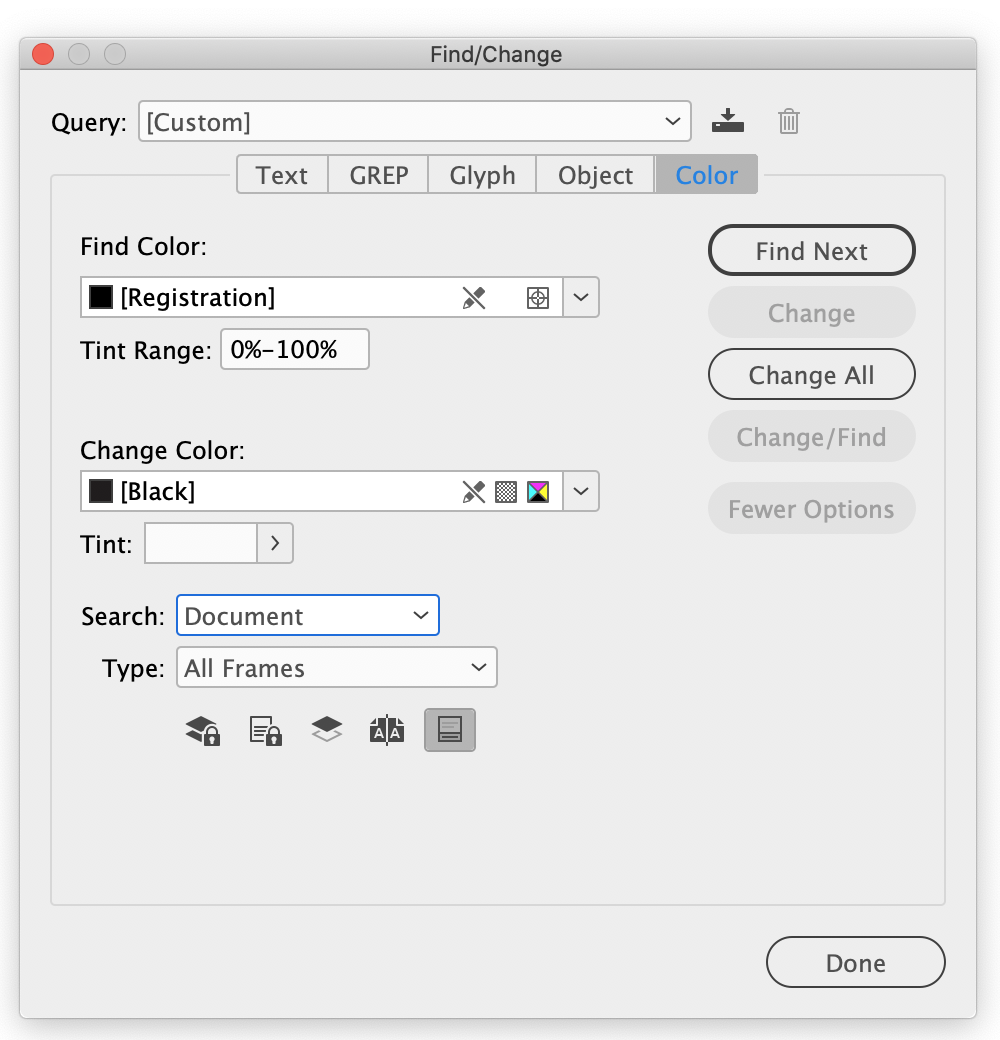
If you navigate to the Color tab in the Find/Replace dialog, you'll be able to replace colors as well. You could use this to consolidate colors, or to replace Registration Black with true Black:
If you're comfortable with regular expressions, you'll be able to do more comprehensive text replacement in InDesign. If not, check out the examples below and consider poking around with writing one yourself.
Here are some common patterns I've used in the past. Copy the Find what: value into the Find what: field in the Find/Replace dialog, and likewise for the Change to: value.
| Description | Find what: | Change to: |
|---|---|---|
| Replace two hyphens with an em-dash | -- | ^_ |
| Straight double quote to typographer's quote* | ^" | " |
| Straight single quote to typographer's quote* | ^' | ' |
| Convert an ellipsis into three periods on three lines | (?<!.)(~e|...)(?!.) | .\n.\n. |
| Add a line break after an honorific | (-)((san)|(sama)|(kun)|(chan)|(senpai)|(sempai)) | $1~b$2 |
| Make capital I's at the beginning of a word lowercase | I(?=[\l\u-]) | i |
| Convert uppercase I's in the middle of a word to lowercase | (\l?)(I)(\l) | $1i$3 |
| Remove extra whitespace at the end of a text frame* | \s+$ |
(*) This is a default query included with InDesign, but I'm pasting it here both for perpetuity and because they're great.
If you don't know what one of these would be used for, don't ask. If you do know, you're a real one.
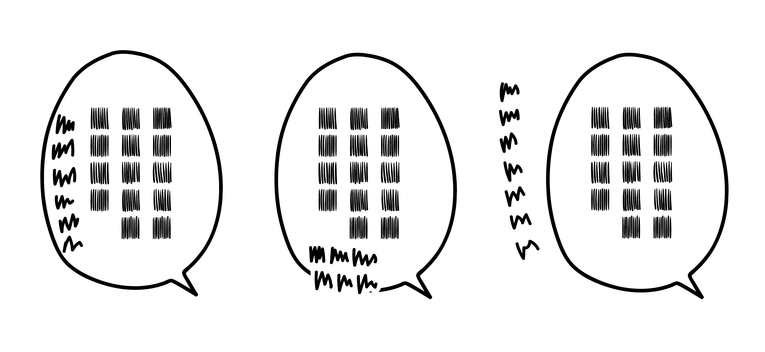
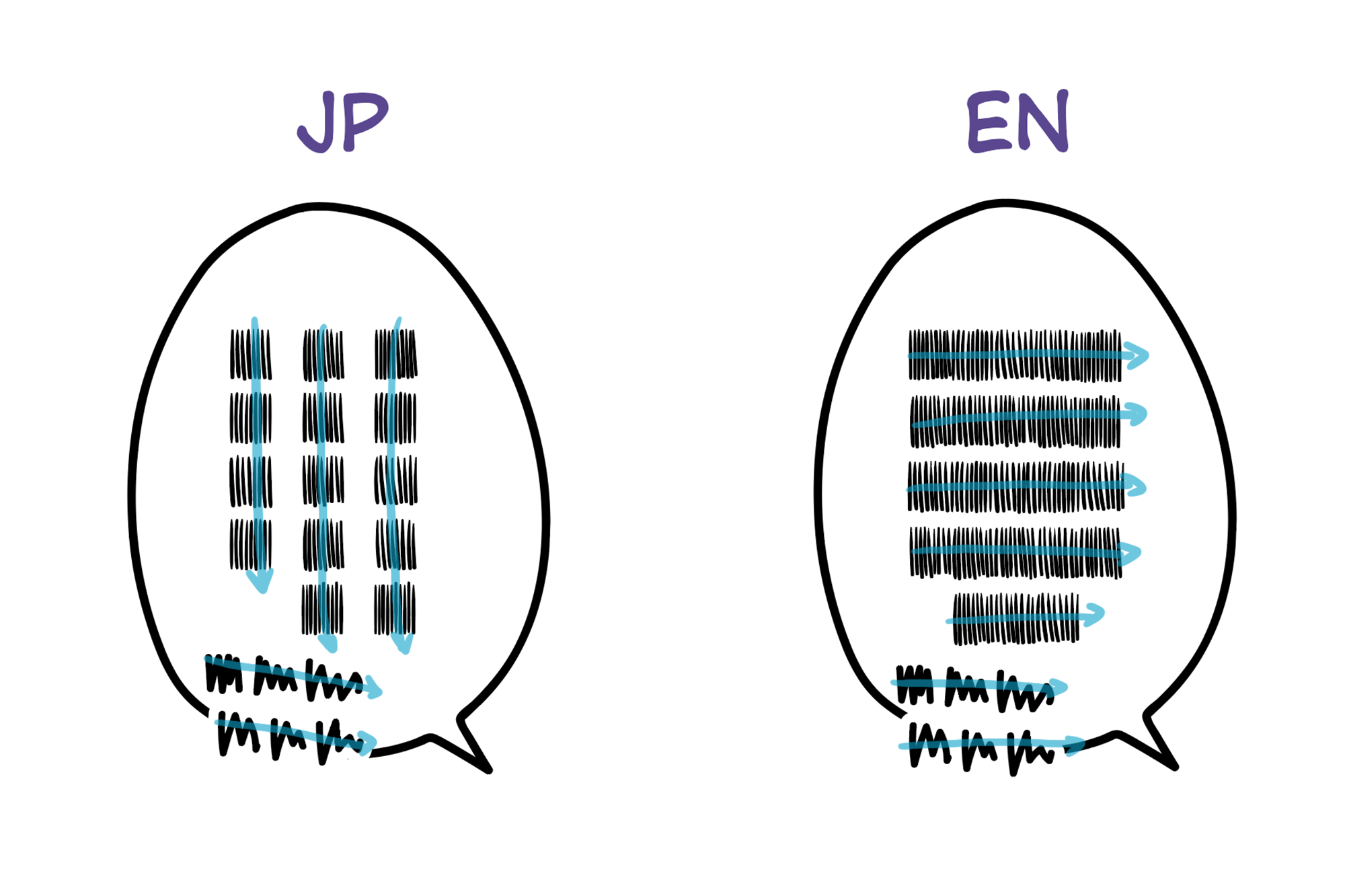
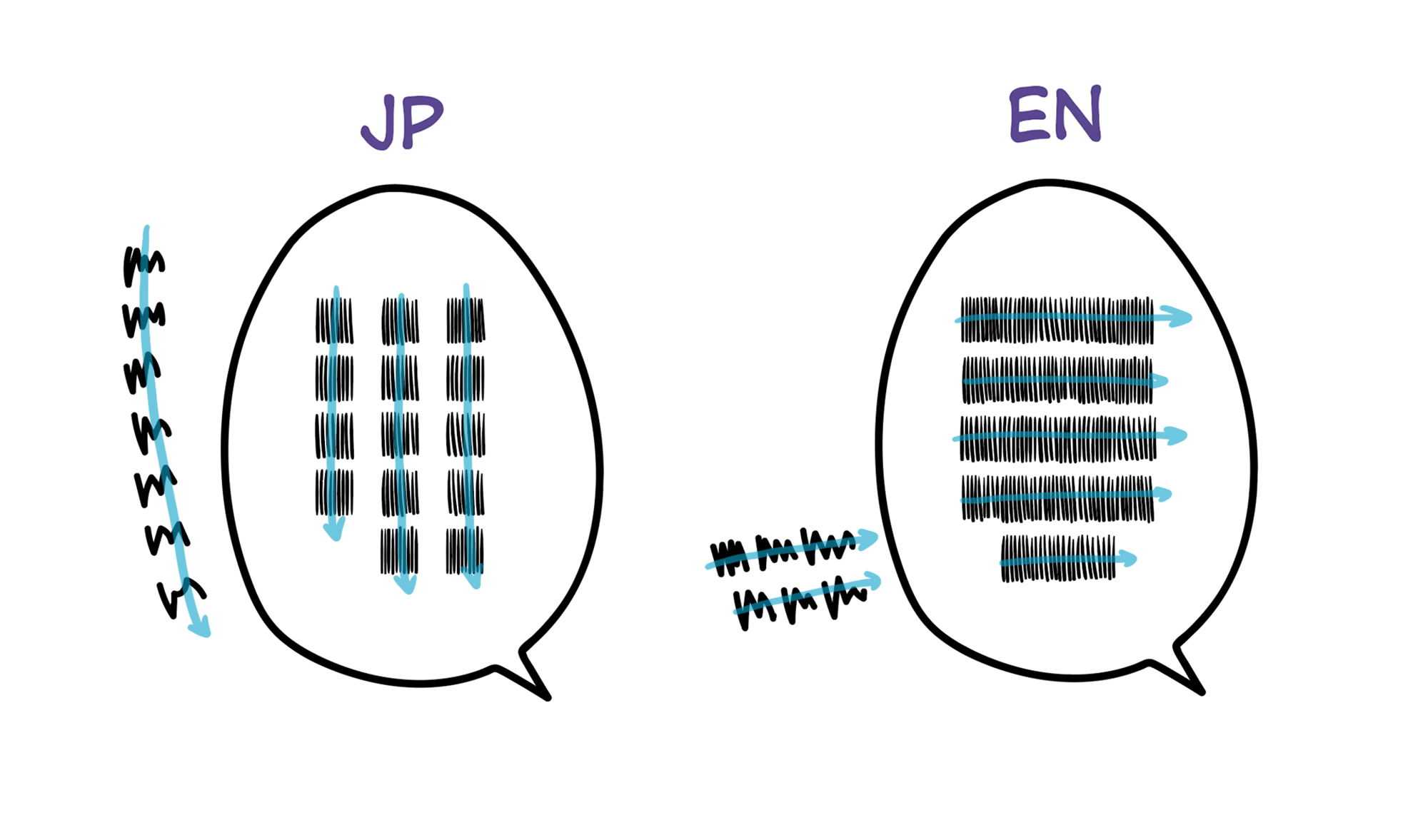
When letterers balance text, we're trying to get it to look as much like a "diamond" as possible. This is part of the Western comic book letterers' canon, and you can read more about it in Blambot's lettering tips.
Since manga letterers don't get to choose the shape of balloons, we have to make do with what we have.
Here are a couple different shapes of balloons, and the general shape you're trying to achieve with English text:
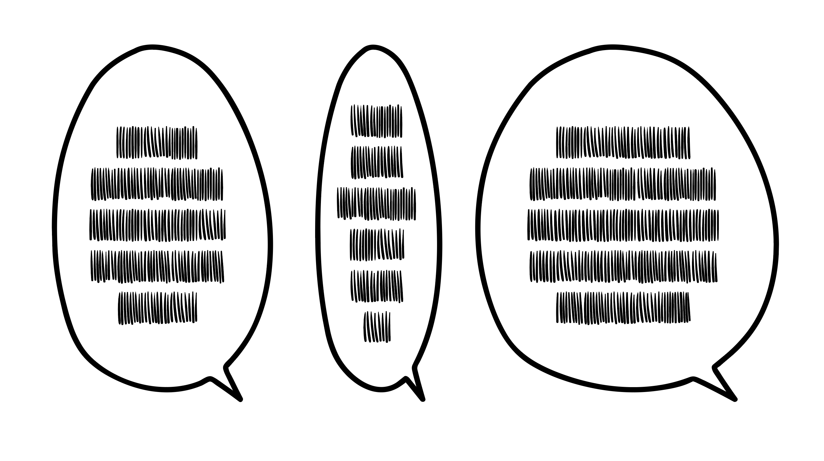
Some general guidelines:
- Shape the text so that it matches the shape of the balloon, with the top and bottom lines being shorter than the middle ones.
- Break words thoughtfully.
- Leave at least one letter's width between the text and the balloon's border.
- In compound balloons, leave plenty of space between the blocks of text, keeping them separate with negative space.
- You can decrease the horizontal width of a line to get it to fit, but more than a 6% decrease will look too noticeable.
- If a piece of text just absolutely won't fit in a balloon, it's okay to ask your editor for an alternate translation. Don't sacrifice readability for the sake of squeezing a long translation into a balloon. Words look different on a script than on the page.
When you're balancing text, readability is always paramount. Try not to break too many words, but if you have to, here are some of the easiest targets:
- Compound words
- e.g. basket/ball, some/thing, lunch/time, news/paper
- Honorifics
- e.g. Natori-/san, Yamada-/kun, Mitsuki-/chan
Try your very best not to break:
- Proper nouns (names, places, etc)
- if you need to break a name, ask your editor how they'd prefer it to be broken, or if possible consult the kanji (e.g. Yama/shita)
- Non-English words
- e.g. wagashi, yakisoba
InDesign has its own dictionary to break words, but feel free to search for the word name + "definition" to get a dictionary breakdown of a given word (e.g. em·bar·rass·ing)
Balancing text can involve repetitive mouse-wagging, so, if you like using the keyboard to save your wrist from RSI, I recommend using scripts. It takes a little bit of setup, but it saves a ton of time long-term.
- Save these four scripts (see How to Save Scripts for directions on where to save them):
-
Set the scripts from Step 1 to keyboard shortcuts.
- The shortcuts I use, for example:
-
Squeeze Frame - Horizontal - In.js=Opt + A -
Squeeze Frame - Horizontal - Out.js=Opt + D -
Squeeze Frame - Vertical - In.js=Opt + S -
Squeeze Frame - Vertical - Out.js=Opt + W
-
- The shortcuts I use, for example:
- Set Add Break to Bottom.js and Add Break to Top.js to keyboard shortcuts as in Step 2.
- The shortcuts I use:
-
Add Break to Bottom.js=alt + 0 -
Add Break to Top.js=alt + 1
-
- The shortcuts I use:
- Set Add Break to Second to Bottom.js and Add Break to Second to Top.js to keyboard shortcuts as in Step 2.
- The shortcuts I use:
-
Add Break to Second to Bottom.js=alt + 9 -
Add Break to Second to Top.js=alt + 2
-
- The shortcuts I use:
- Select a frame with text already placed, where the text is centered vertically and horizontally.
- Nudge the horizontal bounds in and out with the shortcuts you created in Step 3 of the setup above.
- (optional) Add breaks at the top and bottom of the balloon with the shortcuts you created in Steps 4 and 5 of the setup above.
- (optional) Continue to add breaks manually using
Shift + Enteron your keyboard. Note: usingShift + Enter(line break) is different fromEnter(Paragraph Break)- If you use
Shift + Enter, you can use the script Remove Breaks to clear out all your manual breaks to start over.- I have
Remove Breaks.jsset toCMD + Enter
- I have
- If you use
- Repeat Steps 2-4 as necessary.
The process should look something like this, completely without a mouse:
- Select a frame with text already placed, where the text is centered vertically and horizontally.
- Using the Selection Tool (
Escape,V) and holdingalt, drag the horizontal bounds until the text looks close to the shape you want. - Add breaks manually inside the text frame to balance.
- Repeat Steps 2-3 as necessary.
-
Note: While editing text, you can use
Escapeto return to the Selection Tool
-
Note: While editing text, you can use
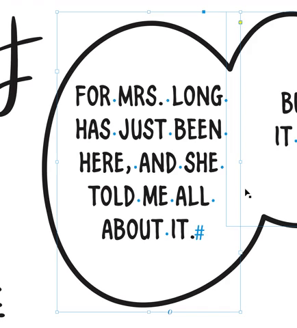
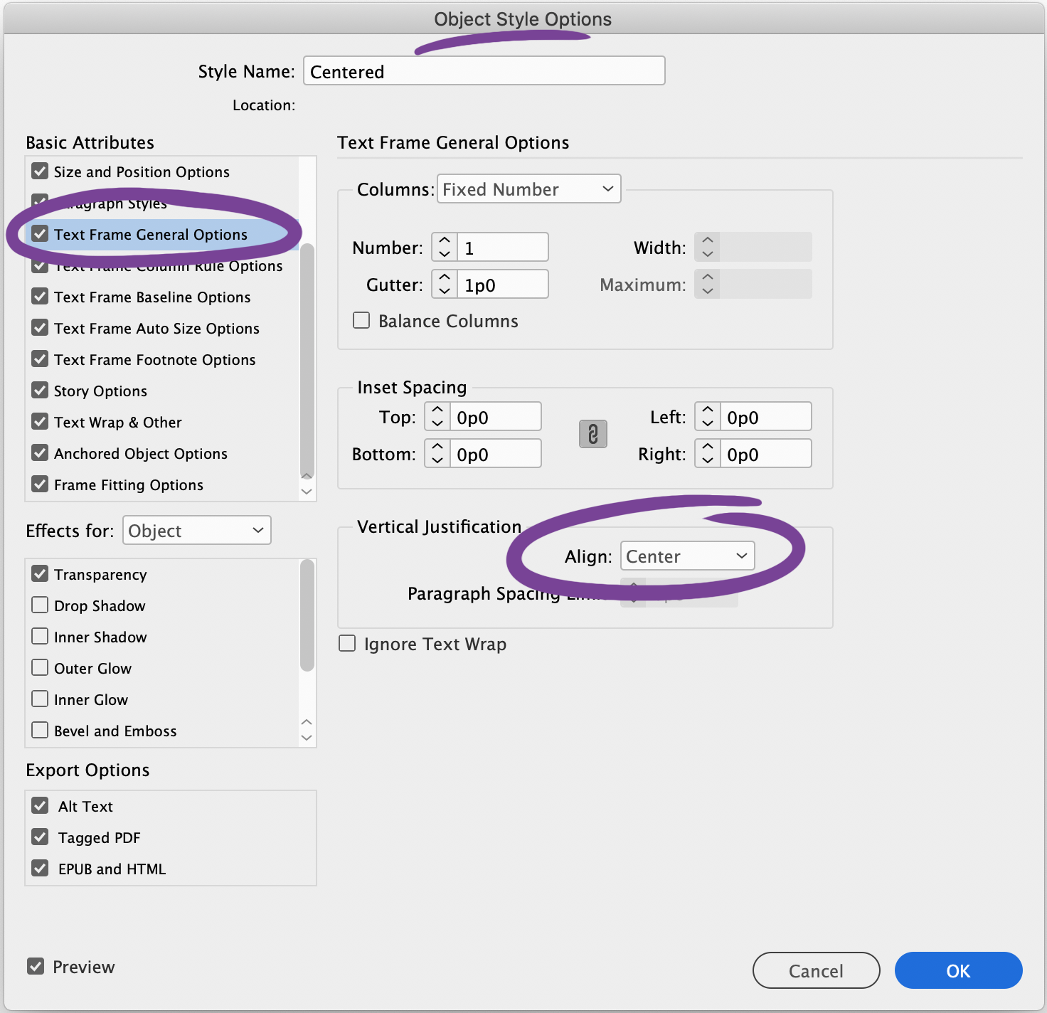
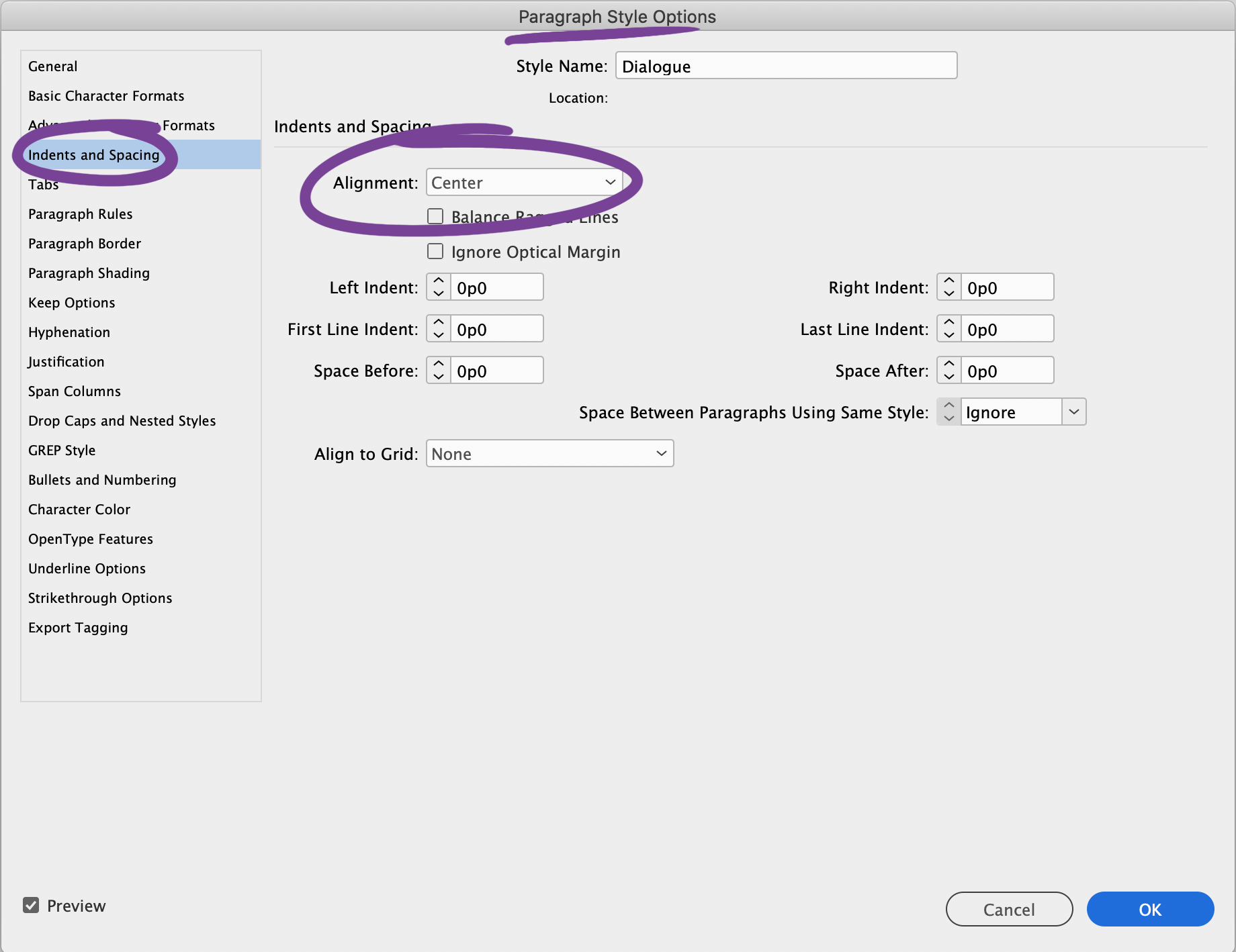
InDesign will take a lot of the guesswork out of alignment for you. Use styles to center text vertically and horizontally with:
-
Object Style Options:
Text Frame General Options>Vertical Alignment>Align>Center -
Paragraph Style Options:
Indents and Spacing>Indents and Spacing>Alignment>Center
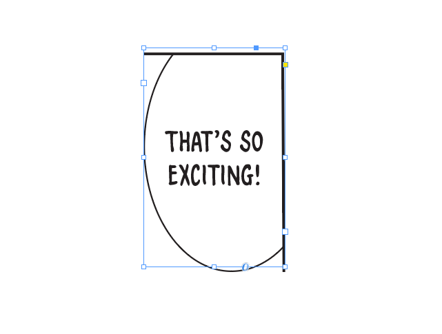
This is the most common shape. After setting up centering with InDesign, use the Selection Tool (V, Escape) to move the frame handles to the top and bottom of the balloon.

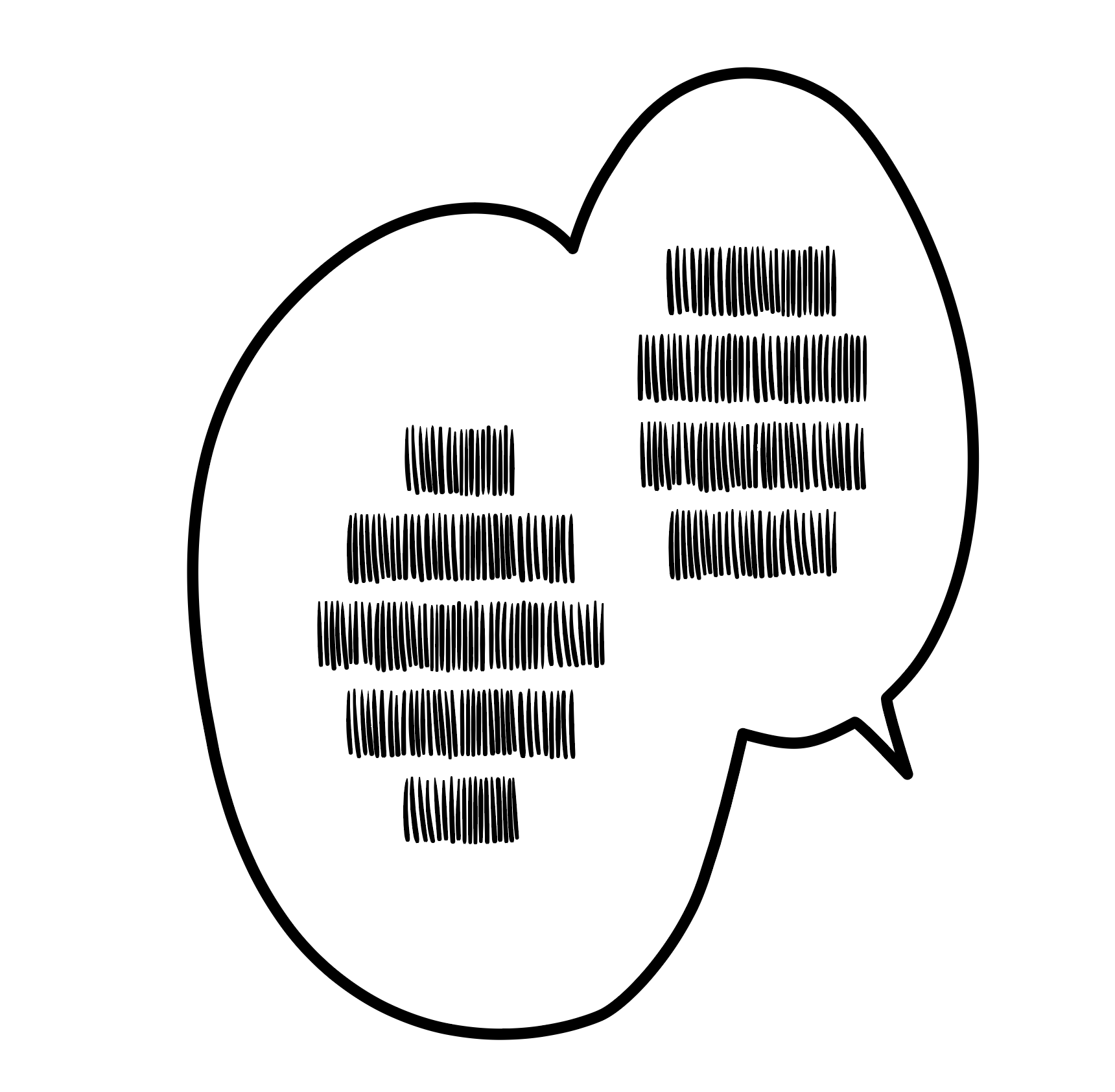
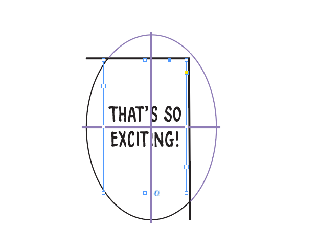
If the balloon is an irregular shape, you should align it to the center of gravity to compensate for the extra whitespace. Notice how, when compared to the perfect oval, the vertical alignment is slightly lower.

For balloons that are cut off by the panel border (a.k.a. butting), refer to your publisher's style guide.
Some publishers ask that you align it based on the visible whitespace. In other words, align it to the "center of gravity". In this case, the horizontal alignment is slightly nudged up to compensate for the extra whitespace.
Some publishers ask that you align it to the inferred shape of the balloon. Imagine where the balloon would be, and then align it as close to that center while leaving at least a character's space between the text and the frame edge.
An aside is dialogue that's spoken outside of a balloon, usually to illustrate casual or offhand speech. They're usually drawn by hand and therefore flattened into the artwork, and you will have to retouch/redraw the art beneath it.
Here are some common positions for asides to be in:
As demonstrated in the first example, placement of asides in speech balloons can be tight, since Japanese can be written vertically. It can be tempting to try to place an aside exactly where the Japanese was, but remember that readability always comes first.
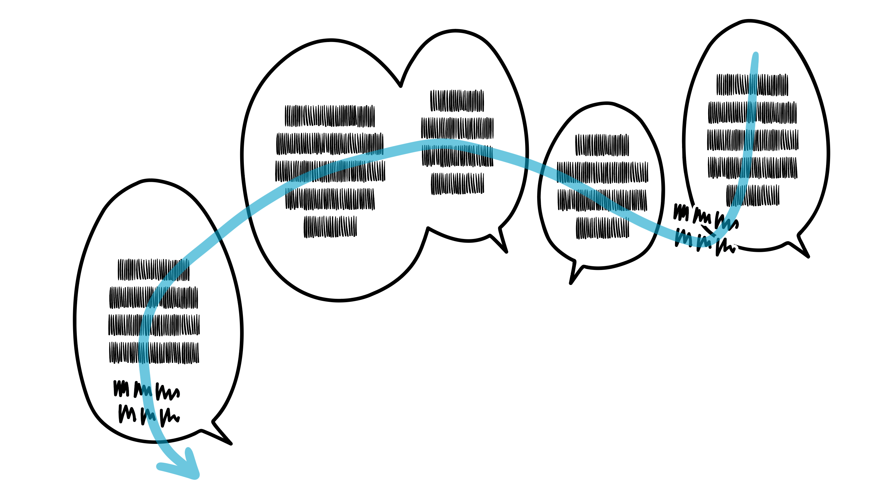
Like all text placement, asides are subjective and vary widely. Before placing an aside, try to "read" the text first to get an idea of the flow of the panel. As a letterer, it's your responsibility to guide a reader's eyes across the page.
Place asides so that they complement the reading order of dialogue text. Here are some examples of localized placement, with the reading order highlighted.
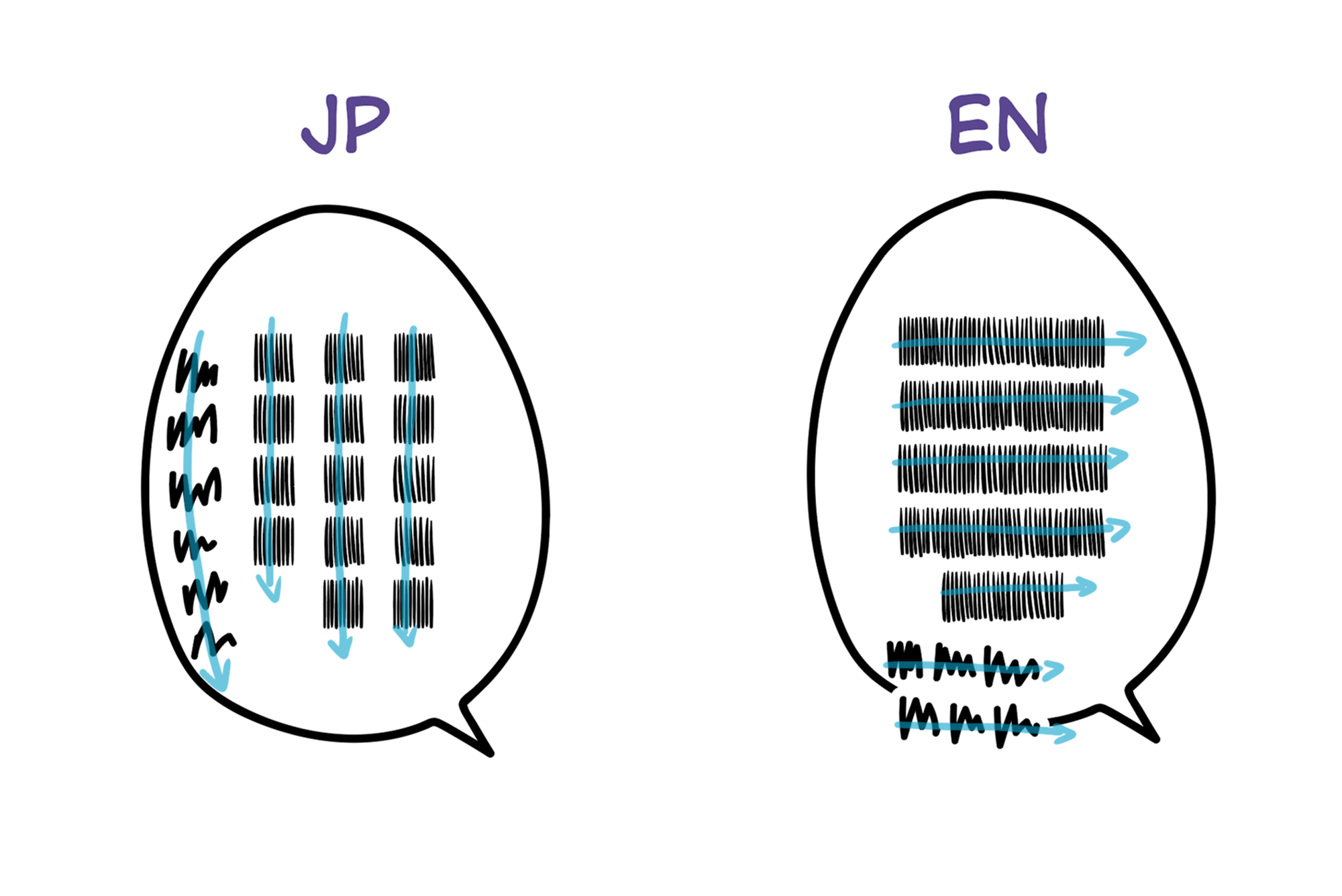
Every panel is different, and this is just to illustrate the importance of good placement. Guide the reader's eyes across the panel.
Asides often have hand-drawn hearts, stars, music notes, faces, etc. Unless you're very lucky, they won't be placed in a convenient spot for the English translation. Feel free to move them or replace them with a pretty font's glyph. (Tutorial coming soon...)