User Feedback - ride-tandem/Tandem GitHub Wiki
Scenarios
Milestone 2
Scenario 1: Group Creation/ Joining
A new user signs up for an account and wants to create a new group to share with their friends. They also want to look for a group that organizes rides to Tofino.
Preparation
Create a public group with a name "Tofino Surfing" that the user can find in the public group search.
Scenario 2: Creating a new Ride
The user now wants to create a ride from their home to Tofino on March 15th, leaving their house at 2pm. They own a Toyota Corolla (5 seats) and are driving their friends.
Preparation
None
Scenario 3: Joining a ride/ chat
The user now wants to join a ride created by a friend. The friend has sent them a link to a group that contains a ride for the Langford bowling alley. They are joining as a passenger, but they want to communicate they are making sandwiches for the trip. They want to ask the group if anybody has any specific allergies so they can plan their sandwich making.
Preparation
Create a group with a ride to Langford bowling alley. Generate a share-link for the group and give it to the user. Text the user back on the app when they ask for allergies.
Results
Cobey Feedback
-
Didn't figure out how to select point from current location
-
Would like to be able to move their point in case they misclick
-
It isn't clear what "private group means" (fixed)
-
It isn't clear how you return to the group list page from the group page. Breadcrumbs aren't obviously clickable
-
Confirm button should go blue when it's clickable when creating a car (fixed)
-
Not sure why they cannot delete rides they aren't part of. Mostly a marketing issue of not understanding groups.
-
Chat should auto-scroll when a new message is sent.
-
Didn't know that chat existed
Jae Feedback
- When you create a ride as a driver, it isn't clear that you have to add a car first. Maybe display a message letting the user know that they have to do that in order to create a ride? (fixed)
- Current chat/user list button is not clear that it is a chat button. Maybe a different Icon? (fixed)
- Drag and drop for destination felt a bit awkward since you have to zoom out/zoom in a lot if you're going outside of the city. It would be nice to have search bar like google maps
Sam's Feedback
- Not clear on what is a banner vs. a profile picture. Wording not clear
- Can't tell is a picture was uploaded or not.
- Share, setting and chat icons really not clear to what they are. Share could be as obvious as having the link visible on the page. The chat function needs a different icon and could be separated from the members list.
- Going back to group list not clear. Different wording and an arrow or other identifier that it is clickable.
- Description character limit a bit short
- Registration was clear and intuitive.
- Group list page was fun and clear.
- Group profile pic was fun, but maybe have an option to choose an icon rather than or in addition to adding a photo.
- Tell the user that the number of seats in a car includes the driver
- Map wasn't clear to be how you select start and end points. Changing the icon and the colour of the points would be helpful. Adding a title to the map to say this is where you select points.
- Would like to be able to have multiple cars per ride. (Discussed for a future milestone as having events with ride groupings)
- Link was good and easy to copy but using the link to join was not intuitive.
- Add a message to the share link, like zoom, with some instructions on how to join the group and who is sending the invitation.
- Would like to be able to see the list of all the pick ups and detours.
- Start date on ride not clear. Is it when the ride arrives, is when the driver leaves, is it when the passenger is picked up. Needs to be clarified.
Doug's Feedback
- One user was very excited about adding a feature to manage multiple vehicles and coordinate which passengers were in which cars, for example with sports teams. (Added to roadmap)
- Another user suggested that if multiple-car-rides were added, they would like to be able to specify a meetup point for all cars once all pickups were made.
- Appreciated the gas calculator but would like more clarity on how it was calculated.
- User asked if it was possible to create an identical reverse copy of a route, or set it to round trip for fuel calculations.
- All users found the interface was intuitive for completing the scenarios.
- It was not clear on the map which icons were pickups, having them numbered by pickup order would be good.
- One user asked about printable or saveable offline directions.
Milestone 3
Take our survey: [https://forms.gle/ULCVvD3MbBeUnY6z8]
User Testing and Survey Feedback
User Testing
Survey Results
Our first question asked users how often they carpool currently. This question was meant to get a baseline of how familiar people are with the idea of carpooling.

The second question provided more context by asking if the user owns a car. The feature requests will probably be different for drivers and passengers so it's important to know what side they are on.

The third question was the main focus of the survey. After users tried the app, it asked them to choose which feature would give the best experience improvement. 5 choices were given to the users who assigned them a ranking from favourite to least favourite.

A total "score" was calculated for each feature by giving 5 points for every first place vote, 4 points for every second place vote, and so on until 1 point is assigned for least favourite feature. A graph was generated for each feature's total score.

Multi-car rides received the highest score so that will be our next major feature.
Our next question asked users to suggest their own feature they would like to see in the app. Since these are one-off ideas we are not going to implement these immediately, but it gives a direction for possible inquiry in the future. Some ideas include the following:
- Have the map show my route and the cost of fuel, while I edit the start and end locations
- Rating drivers and passengers.
- Allow drivers to approve pickup points and say where they are not willing to drive.
- Public calendar for people to post their trip dates that others can see
- shotgun feature (call the front seat).
- Would like to see a Refuse ride to someone I don’t know feature
- I think being able to send out regular reminders would be useful, something that could be preset by the group creator so that people getting picked up could be reminded on a regular basis to be ready to go for that time.
- Friends list
- A homepage button. (this was implemented)
Next we wanted to determine what parts of Tandem are working well and what needs to be improved. We asked the users what they liked about Tandem and what they found challenging to use. What do you like about Tandem?
- Clear layout & fun to use!
- It is really simple and straight forward. Being able to chat is also a huge plus because most restrict that so you don't just arrange a ride out of the app 3.Free small group planning 4.Simple to use because app users don't need to download the app. 5.The ability to connect with people for activities. 6.Interesting idea, pretty website 7.Fairly intuitive creation flow. Gas calculation is very handy!
- the interactive map!
- simple, unique
- Dark mode is a nice touch
- E.g. for a sports team, would encourage carpooling and make it easy for people who are less inclined to carpool.
- Fun and fresh perspective to look at car pooling
- Clean interface, gas breakdown estimate
- I love the dark mode. I think the layout and visual aspects of the app are all appealing, and the mapping system for plotting route and adding new pickups works well.
- Nice interface; seamless and logical all of the way. I like that the fuel cost is calculated per person and shown on the app. Dark mode is great.
- Website loads pretty fast
- simplicity of the website
What challenges did you have while using Tandem?
- no bike option as a solo or group 'vehicle'
- Creating a ride got stuck when entering a time. Unable to test creating a group (fixed)
- It would be better to see how other drivers or passengers get rated so that users can safely share a rider with strangers.
- The complete ride button in the ride viewer is slightly confusing. (fixed)
- "Many text explanations were unclear;
- What does start time indicate?" (fixed)
- Navigating between features (starting new ride, chat, etc) was a little confusing and I ended up back in the create ride flow (fixed)
- There are some confusing parts about the menus, such as knowing whether or not you are actively typing in a text field and some of the fading of the buttons make it seem like an option is not available rather than being the selected option.
- Some scrolling interfaces weren't intuitive because of the minimalism. Auto-suggestions of locations doesn't always work when I tried inputting the name of a location (e.g., the Roost Bakery in Sidney) instead of the location's street address, but the street address worked.
- I think instead of choosing car type and associating that with the seating and fuel usage, it would be better to have some common car manufacturers(nissan, ,mazda, toyota etc) as well as models to select from, and the seat information comes from that. Maybe i'm just dumb, but I have no idea if my car is subcompact or mid-size. As well, I have absolutely no clue what the fuel usage is like for my car, I just know it's good. I think fuel usage could also be attached to the car type if they can just select make and model from the start. Lastly, after creating a group, I wish the group name button and the create group button were distinctly different, as of right now they are the same size and font which is off putting.
- Selecting a time for scheduling a ride was janky, and 12h/24h selection difference would be appreciated. Dark mode doesn't work on the active rides interface. (fixed time and dark theme issues).
- little confusing to use. Although the web is simple, it was missing some basic features such as a main menu or a home page that has all the basic options such as settings. Some more pictures would be also appreciated on the website to make the website more vibrant when the user is on the website. (added more pictures, added home button, better settings page).
Next we asked people how much they would be willing to pay for the app. We figure that the app has more value if more people use it (since there are more people to participate in rides), so we wanted to confirm that our business model should not be a subscription model where everybody needs to pay equally.

The results confirm our hypothesis, so we will continue pursuing a model where people pay what they can.
Our last section asked for some demographic data from the users such as Name, Age, and City they live in. Our privacy agreement prevents us from sharing this data directly, but we can show generalized results. This section was used to determine if our surveyed users were in the target demographic for this application.
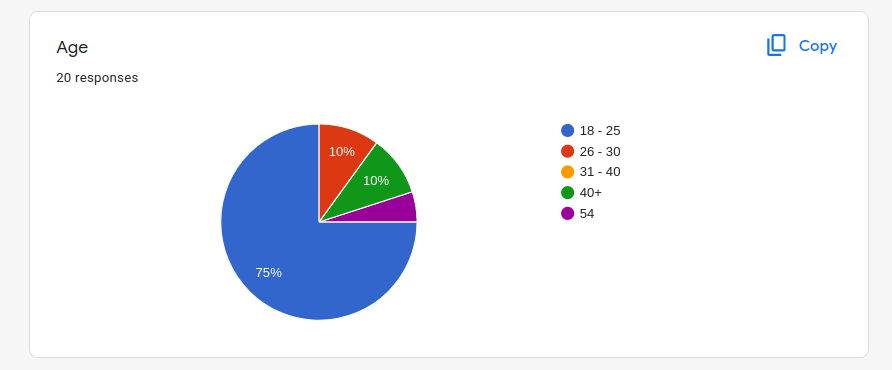
All surveyed users were in Western BC, but we will not share exact cities or their names.