Testing - nschonni/wet-boew GitHub Wiki
Research question(s):
- Where should the link to sign-in/sign-out of an application displayed?
- Should the link be displayed as text or as a button?
- Types of applications:
- Standalone (w/ and w/o it's own domain or sub-domain)
- Integrated
- How are people getting to a Web application?
- Are they accessing it through a domain or sub-domain?
- Are they clicking on a standalone link?
- Are they clicking on a link integrated into the content of a page?
- On which type of pages would sign-in links be displayed?
- Home pages.
- Content pages (w/ and w/o left navigation bar, w/ and w/o right column or floating box).
- On which type of pages would sign-out links be displayed?
- Application content pages.
- What happens when a user clicks on a link that would take them away from the application while signed-in to an application (e.g., the canada.gc.ca link)?
- Accessibility.
- Above the H1
- But the Skip to Content link sends the user to the H1, which would skip the sign-in/sign-out link.
- Below the H1
- What happens if there is no H1 (visible or at all)?
- What happens if the is content in the right column below the H1 (e.g., related links)?
- To the right of the breadcrumb
- What happens if there is no breadcrumb?
- In the footer
- Under what heading? In which order under that heading?
- What if the footer is empty?
- In the GC navigation bar
- Before or after the language toggle?
- In the site navigation bar
- Following other menu items or to the right?
- In a left navigation bar
- Under what heading? In which order under that heading?
- In the content
- Testing of two positions for the sign-in/sign-out, to the right of the breadcrumb and in the Government of Canada navigation bar.
- Testing of how the sign-in/sign-out would integrate with the breadcrumb when the breadcrumb is long.
- Testing of the workflow from sign-in to sign-out.
| Name | Description | Assigned to | Status |
|---|---|---|---|
| Test plan | Develop test plan. | Not started |
Materials:
Mockups:
- Sign-out option when user is signed in: http://fullahead.org/work/wet-boew/3.0/sign-out_v1b.png
- Sign-out option when user is signed in (with long breadcrumb path): http://fullahead.org/work/wet-boew/3.0/sign-out-long-crumb_v1b.png
- When logged in, with link to change user preference settings: http://fullahead.org/work/wet-boew/3.0/sign-out_v2.png
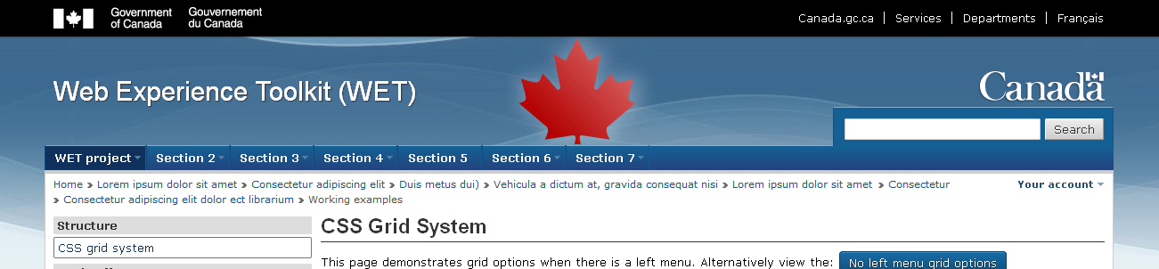
- An option with long breadcrumbs and multiple account options: http://fullahead.org/work/wet-boew/3.0/your-account_v1.png
- When viewed on smaller screen (eg. Mobile device/smart phone): http://fullahead.org/work/wet-boew/3.0/sign-out-mobile_v1.png
Test results: Application sign-in/sign-out test results
Scope: Determine whether people understand that the images are links.
Related issues:
Tasks:| Name | Description | Assigned to | Status |
|---|---|---|---|
| Test plan | Develop test plan. | Not started |
Materials: N/A.
Test plan: Tabbed interface style-4 test plan
Test results: Tabbed interface style-4 test results
Research question(s):
- Should the calendar change to the selected Go To month of year as it's selected or only when the Go button is clicked?
- Do users realise that they need to click the button for their selection to take effect?
- Accessibility.
Scope:
Related issues:
Tasks:| Name | Description | Assigned to | Status |
|---|---|---|---|
| Test plan | Develop test plan. | Not started |
Materials:
Mockups:
Test plan: Date picker Go To test plan
Test results: Date picker Go To test results