Product biography - norakramer1/bubble-machine GitHub Wiki
Product biography
About this project
For the meesterproef I chose the Bubble Machine because the subject is something that really interests me. Besides the subject I also found the challenges in this project really educational. I had never worked on a data visualisation before and never really tried to build a dashboard about a subject I do not completely understand.
About the Bubble Machine
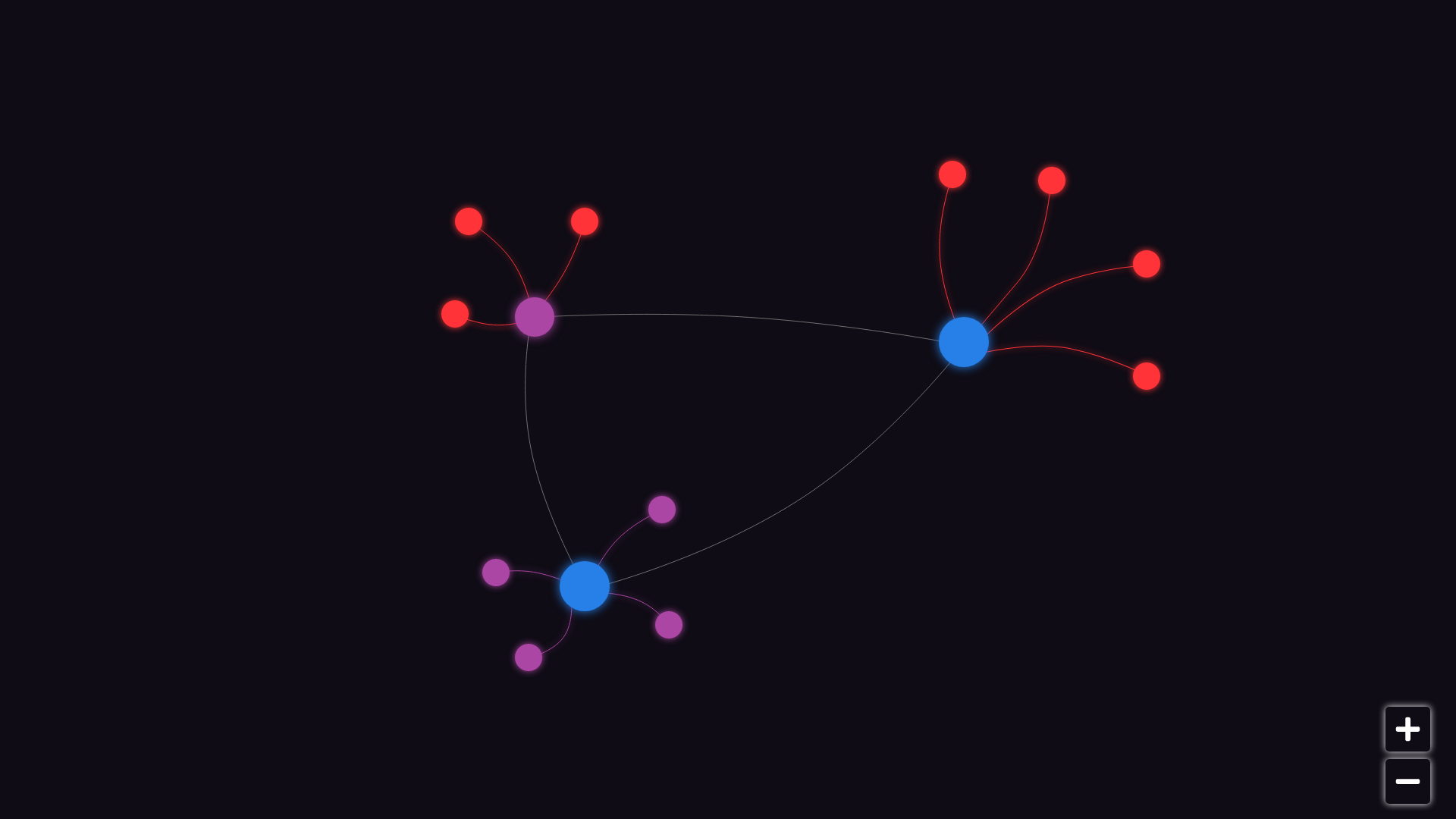
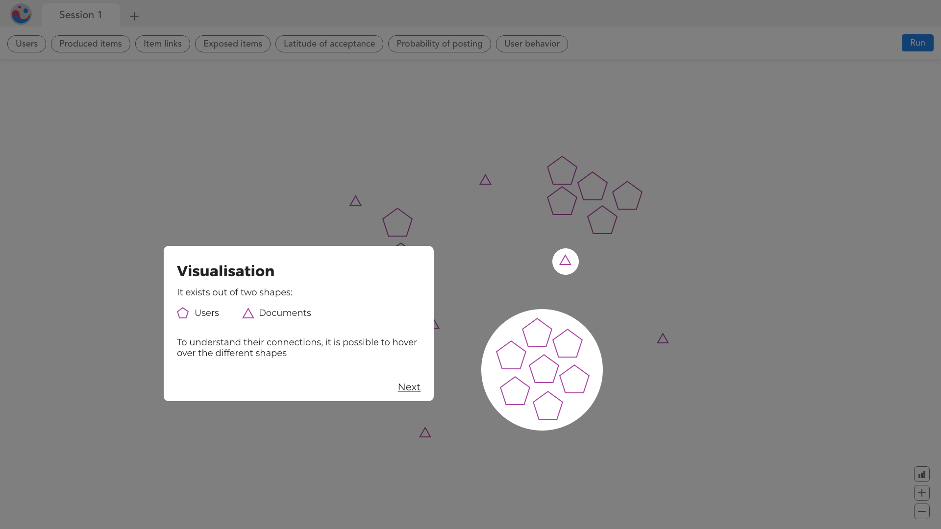
The Bubble Machine is an online simulator that show a graph of people, documents (like news articles, social media posts) and their links between them. The idea is to simulate how these documents have an effect on the creation of filter bubbles. The users in the simulation can choose to incorporate a certain document inside of them, how they "choose" certain documents is based on probability. Our job was to make this Bubble Machine usable and understandable for journalists and researchers to understand, besides this we needed to think about the data visualisations and how to make one that was more efficient. The current graph was readable in the beginning of the simulation but the more links and documents it got the more the graph started to become unreadable and overcrowded.
## First week In the first week we started by reading about the AI model Marcio Fuckner (the developer and researcher) made. After this we had a meeting with him and the product owner Yuri to further explain the model to us. In the beginning I had a hard time understanding how this model worked in the beginning but the meeting cleared it up.
After this I started on making a connection to the API. I started on fetching the API server side. This worked but it was not my best idea, we needed to use D3.js in the end to render the datapoints in a data visualisation and this can only be achieved client side. After realising this I tried to fetch the API with client-side Javascript. This did not work in the beginning. I kept getting errors in the console about CORS headers. Eventually Tim found a temporary fix by installing a Chrome Extension cabled ‘Moesif CORS Changer’ so the errors would be fixed. The issue was that the API did not provide a CORS header when someone tried to access the data. After this was fixed I was able to relieve the data client-side as well.
//API
 const api_url = "https://bubble-machine-api-dummy.herokuapp.com/rest/session/1";

 async function getapi(url) {
  const response = await fetch(url);

    // Storing data in form of JSON
    var data = await response.json();
    console.log(data);
}
//Calling that async function
getapi(api_url);
const data = await fetchDataFromAPI('GET', https://bubble-machine-api-dummy.herokuapp.com/rest/session/${sessionID});
console.log(await data)
updateGraph(await data)
## Second week I started the week off by setting up the file structure for the project. I made sure to add all necessary dependencies, folders and files, package.json, rendered the pages in EJS and divided the HTML in views and partials, added .env files and a gitIgnore file.
Design
At the end of the first week the UX design students presented their first design to us, which looked like this. They also provided some ideas for the navigation. I decided to start styling the first iteration of the project. With the data that Tim, Joeri and Remco visualised it looked like this. I started on making a small caption that explained what are items, users and links. Then I started on styling the buttons for the zoom function. I spent some time creating the slide in menu and dropdown using Javascript. In this dropdown the parameters would be visible. Because i and 11 parameters in a single dropdown menu I had some issues fitting everything in. At the end of the day it just did not work. I did not think it looked that good or that it was understandable for the user that parameters could be changed like this.
Local storage
Nora started on capturing the data points' X and Y axis and storing them in local storage to be able to take a step "back" in the simulation, since this is not incorporated in the API itself since this is not it's purpose. Third week In the third week I wanted to learn about D3.js. My goal was to make something that resembled a heat map graph. As a team we wanted to learn about D3.js and thought it would be a good idea to each try a different way to visualise the data and see how it goes. Because one of the main focuses of simulation is seeing filter bubbles appear I wanted to create something that showed where these bubbles clustered together.
Third week
In the third week I wanted to learn about D3.js. My goal was to make something that resembled a heat map graph. As a team we wanted to learn about D3.js and thought it would be a good idea to each try a different way to visualise the data and see how it goes. Because one of the main focuses of simulation is seeing filter bubbles appear I wanted to create something that showed where these bubbles clustered together.
I first started to research what a heat map is and what kind of data it represents. It seemed to me that it is useful for establishing values in a grid format. where you need to know the placement of values that are higher and represent that visually, sometimes even in layers. I found that the sort of data we used could possibly work for this because in the places the filter bubbles would appear you would see multiple different users close together or even partially covering each other. I made a sketch of what i wanted it to look like: I had a couple of issues regrading the data in the graph. This shows areas that are less ‘busy’ as well but looking at the API response there are not really large areas that are less busy, in those areas the users are spread out. It would be a challenge to form them together in one whole area like the green here. You would have to know which datapoints are on the outskirts and almost draw lines between them and fill the area. Besides that I had a challenge with making the more ‘crowded’ areas display colour based on how many layers of users the area had.

Fourth week
I made my own d3 experiment folder and used my own code to fetch the API, by this point Remco had figured out how to render the users and items in d3 himself but I wanted to learn how to do this myself. I started by looking at examples and introductory tutorials. Something I realised pretty quickly is that a lot of these tutorials are too old to be used. every version of d3 is different which makes tutorials about older version virtually useless.
https://www.smashingmagazine.com/2015/05/why-the-svg-filter-is-awesome/Fourth week https://www.jasondavies.com/maps/bounds/
Density plots
I started looking at some inspiration and used these sources: https://d3-graph-gallery.com/heatmap https://d3-graph-gallery.com/density2d.html https://plotly.com/javascript/2d-density-plots/ https://medium.com/d3-js-angular-gallery/density-2d-chart-angular-d3-js-66f5fc63162b
They are mostly resources to make your own heat map with d3. I did not end up using them because they were written for frameworks or languages like Python and R. I just started with the dot graph and experimented with trying to connect them. Joeri mentioned he saw a tutorial for a “gooey effect” for d3.js. Using this I made a graph that resembled more shapes that blended together. https://www.visualcinnamon.com/2015/05/gooey-effect/
After this I started on blending these users together to use see where they would overlap and change color. I tried out and experimented with a lot of different filters and eventually ended up using “mix-blend-mode: color-burn”” . I wanted to experiment further but have not had the time to continue. I wanted to use opacity to show different layers and make the bubbles bigger. This was also mentioned in a few design reviews.
https://developer.mozilla.org/en-US/docs/Web/CSS/filter https://www.smashingmagazine.com/2015/05/why-the-svg-filter-is-awesome/ https://css-tricks.com/almanac/properties/f/filter/
https://developer.mozilla.org/en-US/docs/Web/CSS/mix-blend-mode
Onboarding
I started on onboarding, these were the designs I had to replicate. I did not necessarily agree with the design or layout so I started on the functionality first. It took a lot of time to get the Javascript right for onboarding. I struggled with the application being able to remember the article that was active. I kept being able to change the class on click but only to two of the screens. I eventually added a class on click to the next article by setting a variable with a number and updating that in the nth-of-type() selector so the class would move down every click. When you get to the third screen you could click on the plus to be re routed to the home page. I did this using a form with a post method. When the route saw that a post request was made it re routed to the home page. I made the plus icon by changing the button URL of the arrows to a plus with an ::after in CSS.
At the end of the week it looked like I was finally done, but the UX students showed us their final iteration and once again scrapped everything. These were the new screens they showed us and that would mean that I could start over. I realised I did not have the time to do this. We only had a couple of days left. I decided to change the styling and add animations but not start over.


Fifth week
I made animations to show more information about the users and the documents. These were a few sentences maximum. I wanted to focus on explaining the relation between the users and the documents because that is what makes the filter bubbles emerge. As a last step I made a button at the beginning to skip the onboarding. Joeri helped with getting the routes correct so that when you entered home you got redirected to the onboarding route.
Wednesday afternoon and Thursday I finished writing documentation about the project, the design and code reviews. I finished the product bio and wrote the reflection for every course.