How Tooltips help make applications better - newired/Blog GitHub Wiki
Written by Frank Schroeder
We all know, people love to use applications. The more, the better. They understand them all intuitively and know immediately how to navigate. They discover all the different use cases and options that complex applications offer to make the user more efficient and productive. Yes I´m kidding 🙂
To bring reality closer to the “dream” above, Tooltips are a weapon for UX Designers and developers to make their applications better and improve their usability.
What is a tooltip?
The tooltip or infotip or a hint is a common graphical user interface element. It is used in conjunction with a cursor, usually a pointer. (Wikipedia: https://en.wikipedia.org/wiki/Tooltip)
Google’s Material Design guidelines goes a bit deeper:
A tooltip is displayed upon tapping and holding a screen element or component (on mobile) or hovering over it (desktop). Tooltips provide text labels that help explain the function of a button or other user interface actions.
Tooltips display informative text when users hover over, focus on, or tap an element Flutter. (https://material.io/search.html?q=Tooltips)
Why are Tooltips important?
Tooltips are important for UX designers to guide users through the useful and important features to ensure they get the most out of the applications they use.
Tooltips provide:
- Context sensitive help and explanation right on the spot
- Information readily when it is relevant for you – no overload of the UI
- Customer support via FAQ´s – frequent questions, as tooltips can reduce customer support significantly.
How to make good Tooltips
To efficiently guide the user through applications, a good UX designer should consider the following guidelines when they make and implement tooltips:
1. Clear & Short
Add clear and short additional information – no long explanations
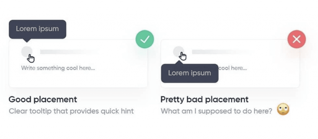
2. Place
Show the tooltip in a free area – don´t overwrite UI content and text
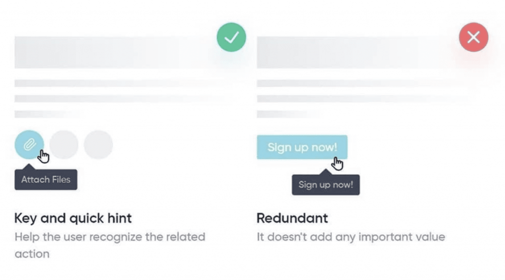
3. Value
Add additional value to the UI-topic – don’t provide redundant information
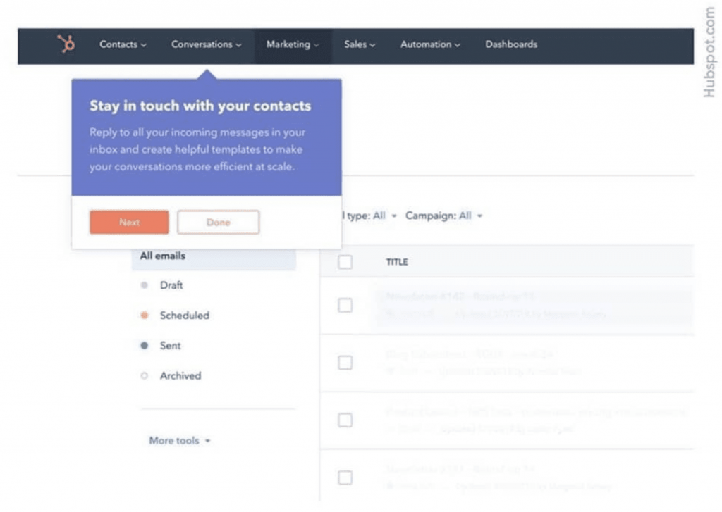
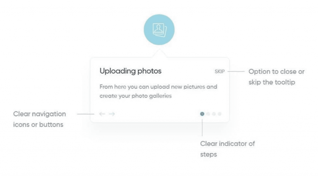
4. Focus
Provide information and tooltips for onboarding step-by-step focusing on one topic – Don’t show multiple tooltips at the same time.
5. Specific
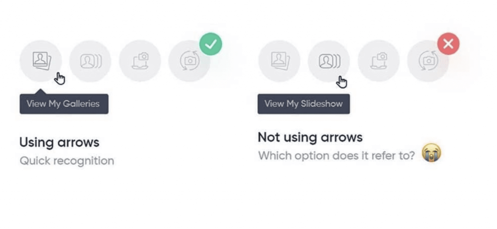
When you have several action options, use arrows and relate the tooltip to the specific action – don’t show tooltips with clear mapping.
6. Consistent
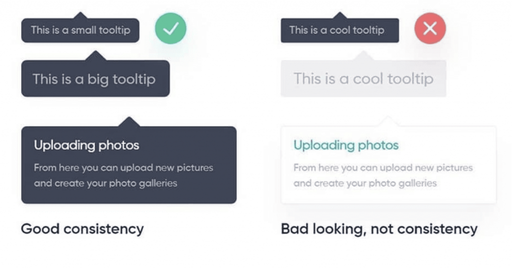
Use a consistent style, so your tooltips can be recognized fast and easily by the users.
Conclusion
Tooltips can provide users with important guidance and details to understand an application’s feature. Using tooltips the way described in this article is not “rocket science” and can help provide a unique user experience on an application, and with this, significantly reduce the support effort.
At Newired, we offer tooltips
At Newired we deliver 100% no-code tools which allow the delivery of quick usability fixes. Speed up onboarding on any web application and put users first! Try it now