Assignment#3 - nataruiz/Computer-Application GitHub Wiki
Abstract
This project is up to make use of Excel charts, i.e., Spark line, Columns, pie chart. Generating a visual chart display using multiple tabs.
Introduction
Create a spreadsheet excel to generate a visual chats display using multiple tabs as Spark line, Columns, pie chart.
Details of all items used
I used excel to create the spreadsheet and Github.
Problem statement
To look for a data expressing in different kind of graphics. Payments, survey, and Average grade.
Methodology
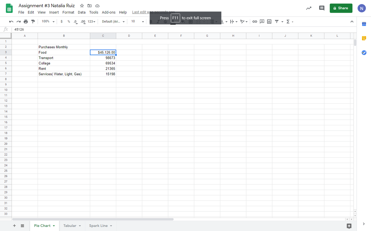
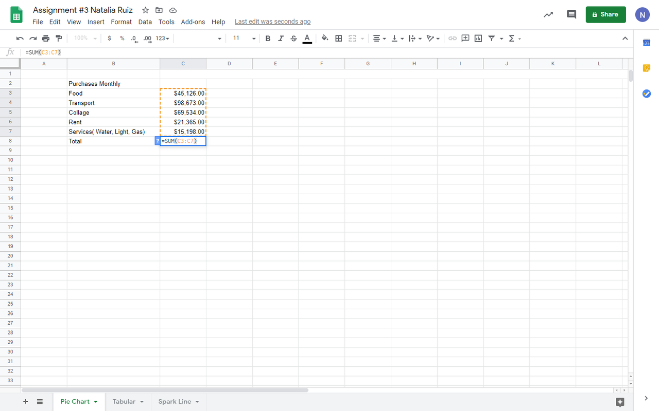
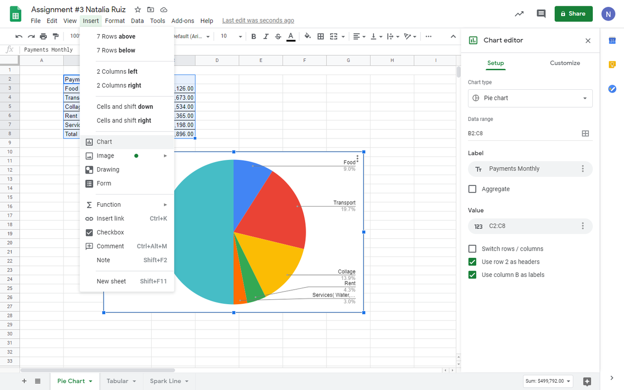
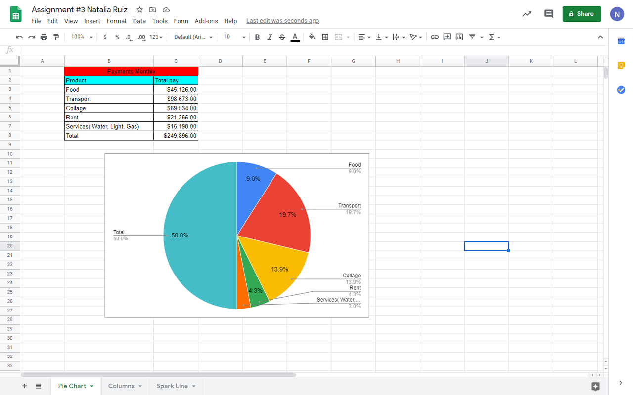
Firts of all, I put payments monthly as Food, Transport, Collage, Rent, Services (Water, Light, and Gas).
After that I put this formula (=SUM(C3:C7))to figure out the total payments monthly.
Then I selected all data to insert a chart. Looking for the percentages. To see a pie chart.
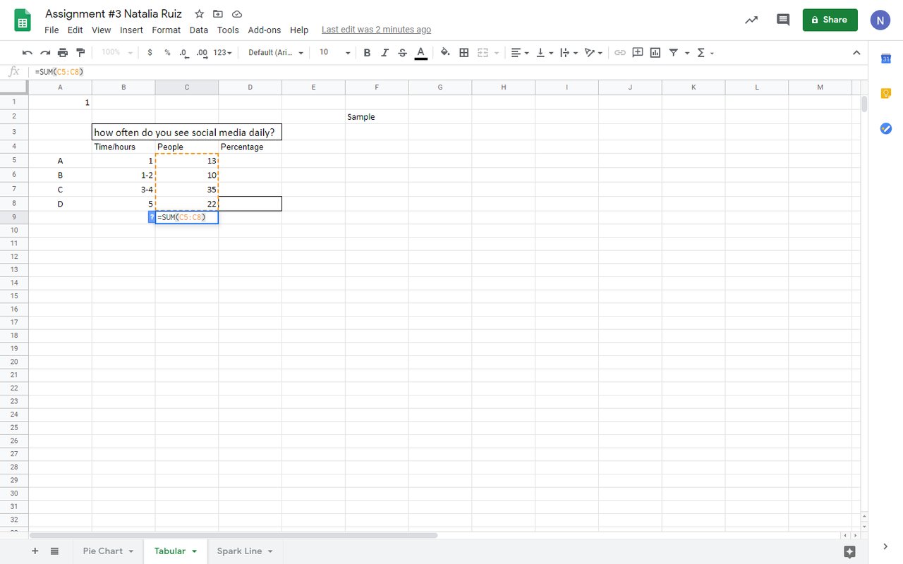
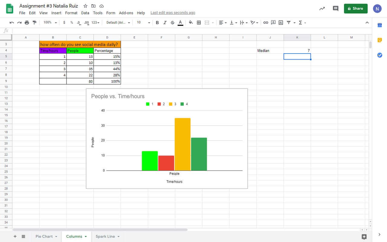
For the next chart, I select the total of the people who answered the survey, using this formula (=SUM(C5:C8)).
After that I looked for percentages. (=SUM(D5:D8))
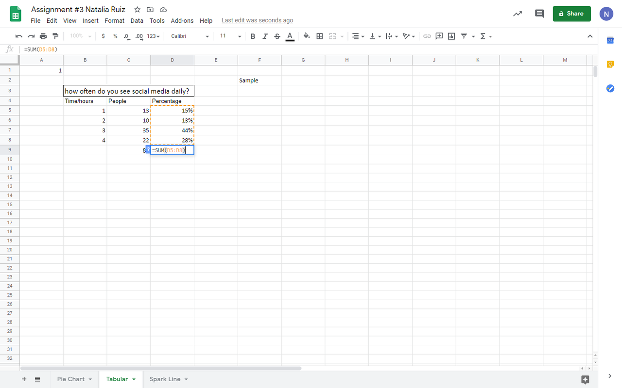
Then I looked for percentages. (=SUM(D5:D8))
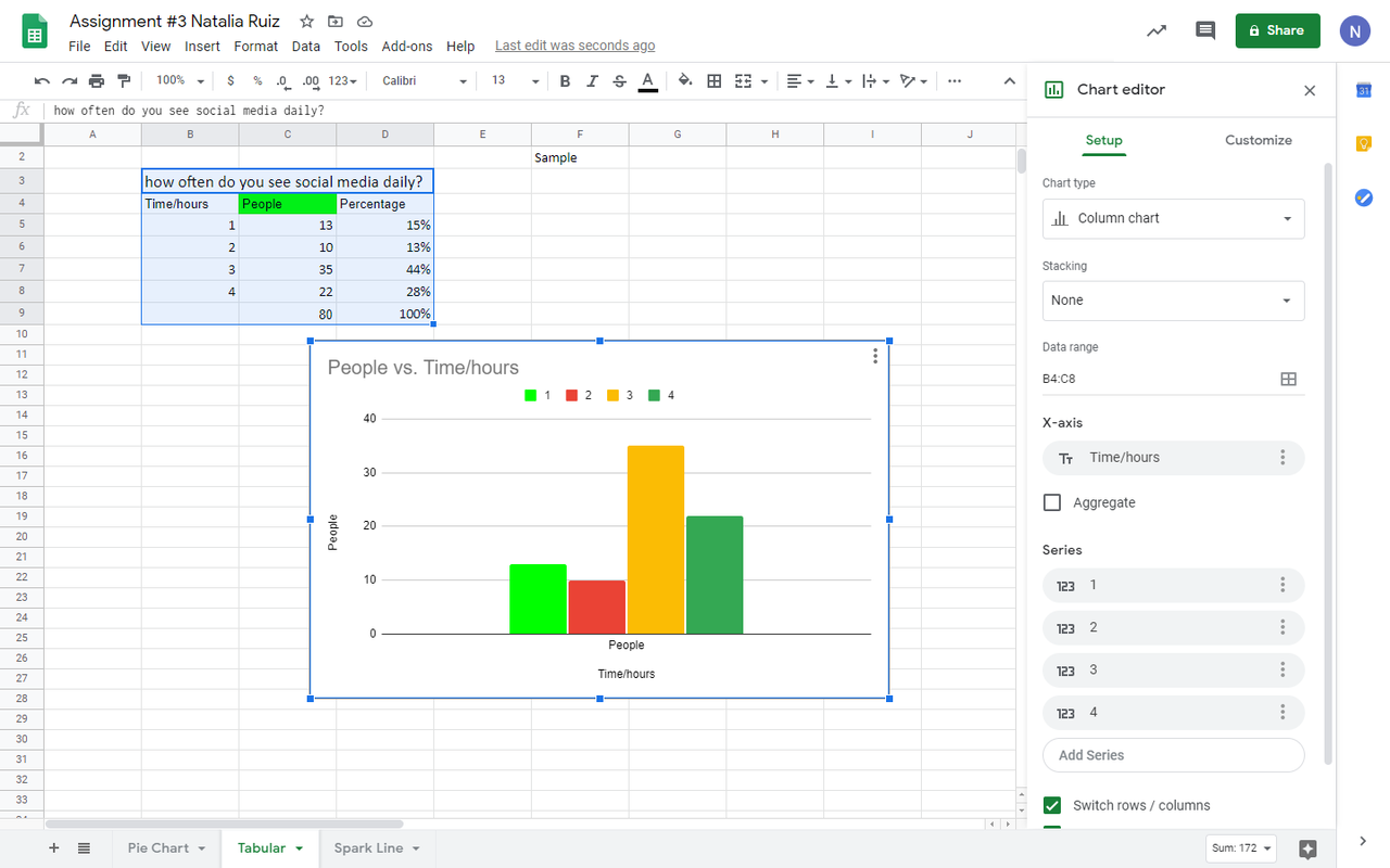
I selected time and people to make a column chart to see visually the results.
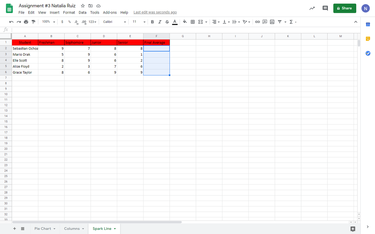
I added data student’s years grades in their collage.
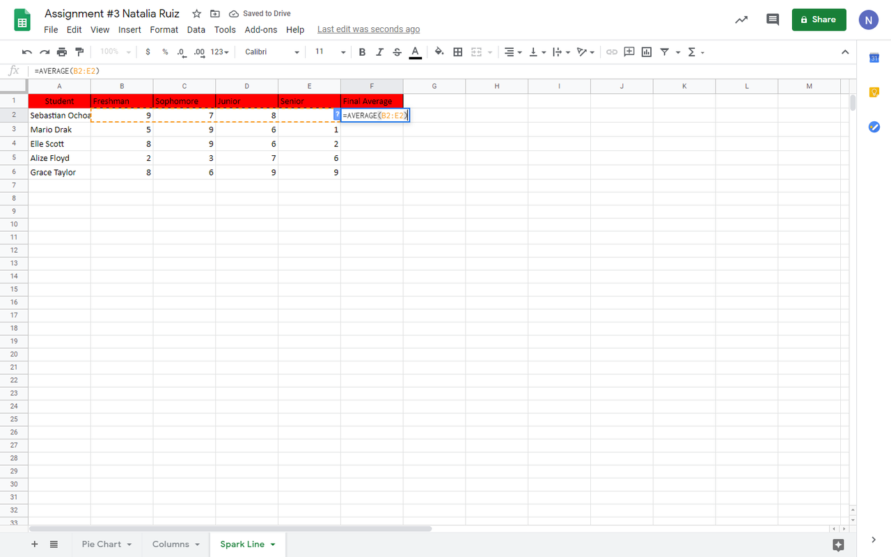
Then I looked for the average with this formula (=AVERAGE(B2:E2)).
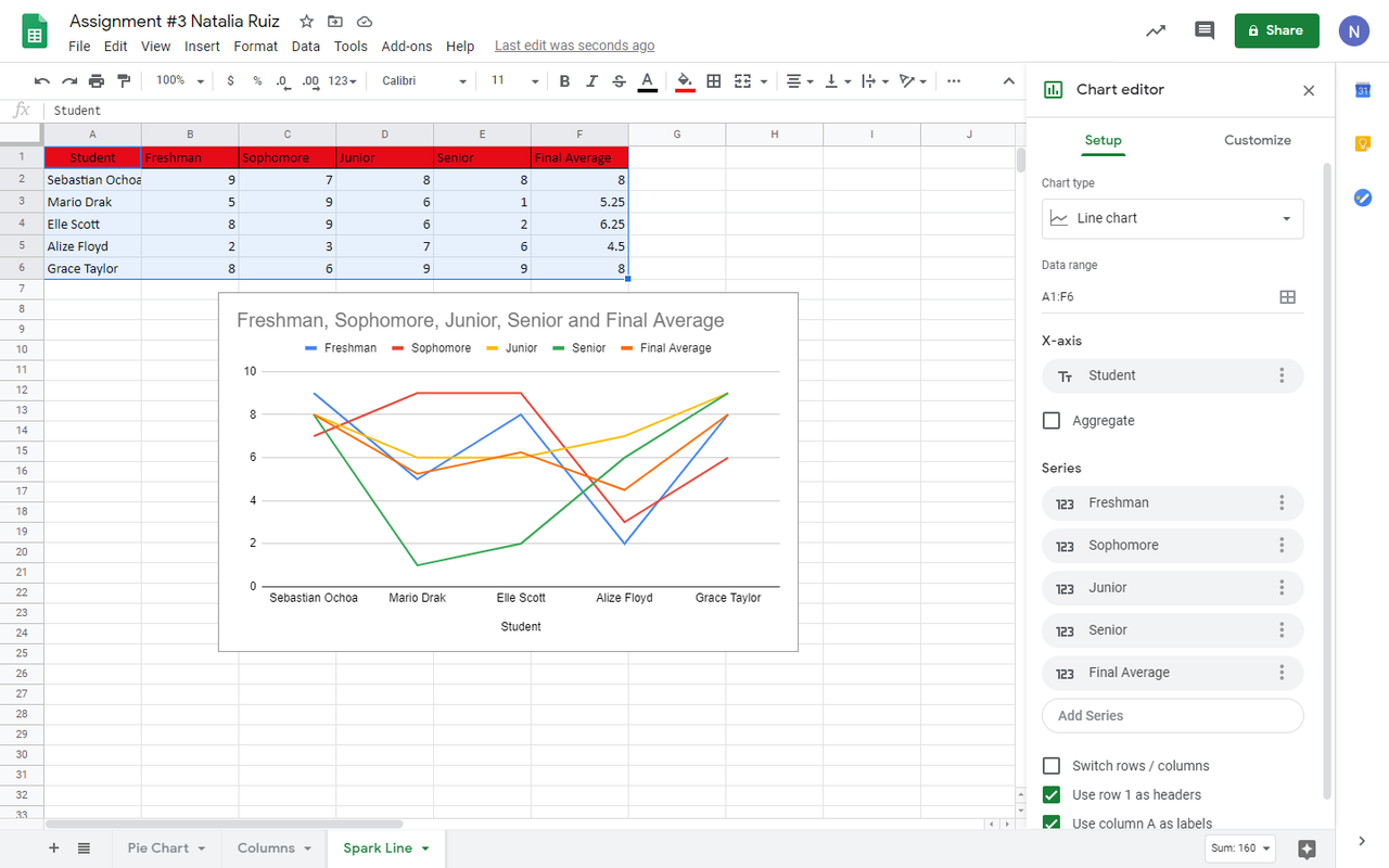
I selected all data and looked for the best chart to see the results.
Finals charts
Future work
Showing in a visual way all the results from the data
Results
Selecting all the data showing in a charts
Conclusion#
There is a different kind of charts depending on the data.
References
Github Excel