Module f7 - mymagic/open_hub GitHub Wiki
F7 is a google form inspired module with aim to allow admin quickly create form without any coding needed. MaGIC is using it for programs like Bootcamp, YouthColab and other small and straightforward programs, with an aim to replace ATAS for accelerator program in near future.
Forms can be group into intake in F7, allowing multiple forms for different process of a same program can display in one interface.
Related database tables:
formform_submissionform2intaketag2intakeimpact2intakeindustry2intakepersona2intakesdg2intakestartup_stage2intake
Intake
Intake is the way to group multiple forms under 1 event into a logical structure. For example, throughout the entire 'MaGIC Accelerator Program 2016', multiple forms involve:
- Application Form (default)
- Pre-arrival Form
- Claim Form
- Giving Back Form
- Post-Program Feedback Form
Hence, you will like to create an intake called 'MaGIC Accelerator Program 2016' and link all the others individual forms to it.
To reuse a form for other intakes, simply duplicate it.
Submission data is linked to the specific form. Since form is not a template, you will need to duplicate to reuse it.
Form & Submission
Both form structure and submission data in F7 Form is stored as JSON format inside database table cell. This design allow flexiblity in creating all kind of form without hard code into a database table structure, trading off with the simplicity of SQL query.
Form Structure
Here is a Sample F7 Form Structure that demo all the supported form components.
It's not suggested to change the form structure after it is published and had collected user submissions.
Section Component
Section serve as a visual container and has 2 modes: default or accordion.
Default Section
{
    "tag": "section",
    "prop": {
        "name": "section-1",
        "css": "",
        "class": "",
        "text": "Normal Section"
    },

    "members":[
        {
            "tag": "html",
            "prop":{
                "value": "This is a section by default"
            }

        }
    ]
}
Accordion Section
Use "accordionOpen": "in" to expand this accordion section by default.
{
    "tag": "section",
    "prop": {
        "name": "accordion-1",
        "css": "",
        "class": "",
        "text": "Accordion Section 1",
        "mode": "accordion",
        "accordionOpen": "in"
    },
    "members":[
        {
            "tag": "html",
            "prop":{
                "value": "This is a section with accordion mode and expand by default"
            }

        }
    ]
},
Nested Section
Nested section is possible.
{
    "tag": "section",
    "prop": {
        "name": "accordion-3",
        "css": "",
        "class": "",
        "text": "Nested Accordion Section 3",
        "mode": "accordion"
    },
    "members": [{
        "tag": "section",
        "prop": {
            "name": "accordion-4",
            "css": "",
            "class": "",
            "text": "Nested Accordion Section 4",
            "mode": "accordion"
        },
        "members": [{
            "tag": "html",
            "prop": {
                "value": "This is a nested accordion"
            }

        }]
    }]
}
Group Component
Group component is use to group multiple form field components into a logical grouping. Normally, group consists of a label and form field component. It is also especially useful for condition control a group of multiple fields.
 {
    "tag": "group",
    "members": [
        {
            "tag": "label",
            "prop": {
                "required": 1,
                "for": "startup",
                "value": "Startup Name"
            }
        },
        {
            "tag": "textbox",
            "prop": {
                "required": 1,
                "csv_label": "Startup Name",
                "hint": "",
                "value": "",
                "name": "startup",
                "error": "startup name is required."
            }
        },
        {
            "tag": "break"
        },
        {
            "tag": "label",
            "prop": {
                "required": 1,
                "for": "totalCustomer",
                "value": "Total Customer"
            }
        },
        {
            "tag": "number",
            "prop": {
                "required": 1,
                "csv_label": "Total Customer",
                "hint": "",
                "value": "",
                "name": "totalCustomer",
                "error": "Total Customer is required."
            }
        }
    ]
 }
Headline Component
{
    "tag": "headline",
    "prop": {
        "css": "",
        "style": "font-size: x-large",
        "text": "Sub Header Title"
    }
},
Break Component
This add a vertical padding of about 2em.
{
    "tag": "break",
}
Divider Component
This add a horizontal line to the form, useful to visually separate form content.
{
    "tag": "divider",
    "prop": {
        "style": "",
    }
}
Label Component
Label is a common component to use along with the rest of form field input components.
The required set here only has visual effect, it doesn't dictate the validation.
{
    "tag": "label",
    "prop": {
        "required": 0,
        "for": "startup",
        "value": "Startup Team / Company / Project name:"
    }
}
Button Component
 {
 	"tag": "button",
 	"prop": {
 		"name": "Submit",
 		"items": [{
 				"name": "save",
 				"value": "Draft",
 				"text": "Save Draft",
 				"css": "btn-white"
 			},
 			{
 				"name": "save",
 				"value": "submit",
 				"text": "Submit",
 				"css": "btn-primary"
 			}
 		]
 	}
 }
Textbox Component
Textbox is the most common field component you will be using, good to take in short free text answer like a person name, which is equivalent to <input type="text"> in HTML.
{
	"tag": "textbox",
	"prop": {
		"required": 1,
		"showinbackendlist": "1",
		"csv_label": "Participant Name",
		"hint": "",
		"value": "",
		"name": "fullname",
		"error": "Participant full name is required."
	}
}
Number Component
Number is similar to textbox field component except it only take in number value (integer and floating point too), which is equivalent to <input type="number" step="any"> in HTML.
{
	"tag": "number",
	"prop": {
		"required": 1,
		"showinbackendlist": "1",
		"csv_label": "Total Customer",
		"hint": "This is a custom number only input",
		"value": "",
		"name": "totalCustomer",
		"error": ""
	}
}
URL Component
{
	"tag": "url",
	"prop": {
		"required": 1,
		"csv_label": "Youtube",
		"hint": "This video should be less than 2 min on introduction about your project and each team members. Upload the video to youtube and set it public/unlisted, then paste the link here.",
		"value": "",
		"name": "urlYoutube",
		"error": ""
	}
}
Email Component
{
	"tag": "email",
	"prop": {
		"required": 0,
		"showinbackendlist": "0",
		"csv_label": "Participant Email",
		"hint": "",
		"value": "",
		"name": "email",
		"error": "Participant email address is required."
	}
}
Phone Component
{
	"tag": "phone",
	"prop": {
		"required": 1,
		"showinbackendlist": "0",
		"csv_label": "Participant Contact",
		"hint": "Please insert not less than 7 digit number only",
		"value": "",
		"name": "f1phone",
		"error": "Participant contact number is required."
	}
}
Textarea Component
{
	"tag": "textarea",
	"prop": {
		"required": 1,
		"showinbackendlist": "1",
		"csv_label": "Short Description",
		"hint": "",
		"value": "",
		"name": "shortDescription",
		"error": "Short Description is required."
	}
}
Boolean Button Component
{
	"tag": "booleanButton",
	"prop": {
		"required": 0,
		"showinbackendlist": "0",
		"csv_label": "Yes Or No",
		"hint": "",
		"value": "",
		"name": "yesOrNo",
		"error": ""
	}
}
List Component
{
	"tag": "list",
	"prop": {
		"required": 1,
		"showinbackendlist": "1",
		"csv_label": "Category",
		"hint": "This is a custom list",
		"value": "",
		"name": "category",
		"error": "Please specify the category you are interested in.",
		"text": "Select",
		"items": [{
				"text": "Social Track"
			},
			{
				"text": "Technology Track"
			}
		]
	}
}
Checkbox Component
Inline
{
	"tag": "checkbox",
	"prop": {
		"required": 1,
		"isGroup": 1,
		"isInlineItems": 1,
		"showinbackendlist": "0",
		"csv_label": "Regions",
		"hint": "",
		"name": "regions",
		"error": "",
		"items": [{
				"text": "North Peninsula"
			},
			{
				"text": "Central Peninsula"
			},
			{
				"text": "South Peninsula"
			},
			{
				"text": "Eastcoast Peninsula"
			},
			{
				"text": "Sarawak"
			},
			{
				"text": "Sabah"
			}
		]
	}
}
List
{
	"tag": "checkbox",
	"prop": {
		"required": 1,
		"isGroup": 1,
		"isInlineItems": 0,
		"showinbackendlist": "0",
		"csv_label": "Regions",
		"hint": "",
		"name": "regions",
		"error": "",
		"items": [{
				"text": "North Peninsula"
			},
			{
				"text": "Central Peninsula"
			},
			{
				"text": "South Peninsula"
			},
			{
				"text": "Eastcoast Peninsula"
			},
			{
				"text": "Sarawak"
			},
			{
				"text": "Sabah"
			}
		]
	}
}
Radio Button Component
{
	"tag": "radio",
	"prop": {
		"required": 1,
		"showinbackendlist": "1",
		"csv_label": "Your Hobby",
		"hint": "Please elect either one",
		"value": "",
		"css": "inline",
		"name": "radio1",
		"error": "",
		"text": "Select",
		"items": [{
				"text": "Food Lover"
			},
			{
				"text": "Movie Lover"
			}
		]
	}
}
Google Place Component
This component has bug as it is hardcoded to appear only once per form. It's now at drawback mode displaying just text input box.
 {
 	"tag": "googleplace",
 	"prop": {
 		"required": 1,
 		"showinbackendlist": "1",
 		"csv_label": "HQ Location",
 		"hint": "This is a google map input",
 		"value": "",
 		"name": "location",
 		"error": ""
 	}
 }
Upload Component
prop>acceptis an acceptable file format. for other format please refer Media Typesprop>cssis the class to check file size upon the file selection
 {
 	"tag": "upload",
 	"prop": {
 		"required": 1,
 		"csv_label": "Pitch Deck",
 		"hint": "Only PDF format and the file size must be less than 10Mb.",
 		"value": "",
 		"name": "uploadPitchdeck",
 		"error": "",
                "accept": ".pdf,application/pdf",
                "max-file-size": "10485760",
                "css": "checkUploadSize"
 	}
 }
Rating Component
prop name must be prefix with
voted-due to historical design reason. If it doesn't, system will auto prepand it
"1": {
    "tag": "group",
    "prop": {
        "css": ""
    },
    "members": [
        {
            "tag": "label",
            "prop": {
                "required": 1,
                "for": "voted-satisfaction",
                "value": "Rate the satisfaction of customer support"
            }
        },
        {
            "tag": "rating",
            "prop": {
                "required": 1,
                "showinbackendlist": "1",
                "csv_label": "Satisfaction Rating",
                "hint": "",
                "value": "",
                "name": "satisfaction",
                "label_low": "Strongly Disagree",
                "label_high": "Strongly Agree",
                "error": ""
            }
        }
    ]
},
When render, a hidden field will be generated <input type="hidden" id="voted-satisfaction" name="voted-satisfaction" value=""> to store the data.
Tabular Component
Tabular is a group of supported inputs display in table form.
- It must has a predefined headers(columns) and rows.
- It only support the following components:
- Label
- Url
- Phone
- Textbox
- Number
- Textarea
- List
- BooleanButton
{
	"1": {
		"tag": "group",
		"prop": {
			"css": ""
		},
		"members": [{
			"tag": "label",
			"prop": {
				"required": 1,
				"csv_label": "",
				"for": "shareholders",
				"hint": "",
				"value": "List all equity ownership by shareholders name"
			}
		}, {
			"tag": "tabular",
			"prop": {
				"showinbackendlist": "0",
				"csv_label": "Shareholders",
				"hint": "Insert all your shareholders here. Must insert minimum 1.",
				"value": "",
				"name": "shareholders",
				"error": "Shareholders detail is required",
				"headers": [{
					"text": "#",
					"css": "text-center"
				}, {
					"required": 1,
					"text": "Name",
					"css": "text-center"
				}, {
					"required": 1,
					"text": "Percentage of Share",
					"hint": "in percentage %",
					"css": "text-center"
				}, {
					"required": 1,
					"text": "Amount invested\/Capital",
					"hint": "in USD",
					"css": "text-center"
				}, {
					"text": "Note",
					"hint": "Optional",
					"css": "text-center"
				}],
				"members": [{
					"tag": "row",
					"members": [{
						"tag": "label",
						"prop": {
							"required": 1,
							"value": "1",
							"css": "text-center"
						}
					}, {
						"tag": "textbox",
						"prop": {
							"required": 1,
							"csv_label": "Shareholder Name #1",
							"hint": "",
							"value": "",
							"name": "shareholders1-name",
							"error": ""
						}
					}, {
						"tag": "number",
						"prop": {
							"required": 1,
							"csv_label": "Share Percentage #1",
							"hint": "",
							"value": "",
							"name": "shareholders1-sharePercentage",
							"error": ""
						}
					}, {
						"tag": "number",
						"prop": {
							"required": 1,
							"csv_label": "Amount Invested #1",
							"hint": "",
							"value": "",
							"name": "shareholders1-amountInvested",
							"error": ""
						}
					}, {
						"tag": "textarea",
						"prop": {
							"required": 0,
							"csv_label": "Note #1",
							"hint": "",
							"value": "",
							"name": "shareholders1-note",
							"rows": 2,
							"error": ""
						}
					}]
				}, {
					"tag": "row",
					"members": [{
						"tag": "label",
						"prop": {
							"value": "2",
							"css": "text-center"
						}
					}, {
						"tag": "textbox",
						"prop": {
							"csv_label": "Shareholder Name #2",
							"hint": "",
							"value": "",
							"name": "shareholders2-name",
							"error": ""
						}
					}, {
						"tag": "number",
						"prop": {
							"csv_label": "Share Percentage #2",
							"hint": "",
							"value": "",
							"name": "shareholders2-sharePercentage",
							"error": ""
						}
					}, {
						"tag": "number",
						"prop": {
							"csv_label": "Amount Invested #2",
							"hint": "",
							"value": "",
							"name": "shareholders2-amountInvested",
							"error": ""
						}
					}, {
						"tag": "textarea",
						"prop": {
							"required": 0,
							"csv_label": "Note #2",
							"hint": "",
							"value": "",
							"name": "shareholders2-note",
							"rows": 2,
							"error": ""
						}
					}]
				}]
			}
		}]
	},
	"99": {
		"tag": "button",
		"prop": {
			"name": "Submit",
			"items": [{
				"name": "save",
				"value": "Draft",
				"text": "Save Draft",
				"css": "btn-white"
			}, {
				"name": "save",
				"value": "submit",
				"text": "Submit",
				"css": "btn-primary"
			}]
		}
	}
}
Dynamic Row
Dynamic row allows applicant to create entry dynamically without constraint to the predefined row.
- use
limitTabularDynamicRowto set the maximum row for this tabular table - use
"tag": "drow"to identify it is a dynamic row tabular field - F7 will replace all %%N%% to row number
- Validation rules are not apply to dynamic row
{
    "1": {
        "tag": "group",
        "prop": {
            "css": ""
        },
        "members": [
            {
                "tag": "label",
                "prop": {
                    "required": 1,
                    "csv_label": "",
                    "for": "shareholders",
                    "hint": "",
                    "value": "List all equity ownership by shareholders name"
                }
            },
            {
                "tag": "tabular",
                "prop": {
                    "limitTabularDynamicRow": 5,
                    "showinbackendlist": "0",
                    "csv_label": "Shareholders",
                    "hint": "Insert all your shareholders here. Must insert minimum 1.",
                    "value": "",
                    "name": "shareholders",
                    "error": "Shareholders detail is required",
                    "headers": [
                        {
                            "text": "#",
                            "css": "text-center"
                        },
                        {
                            "required": 1,
                            "text": "Name",
                            "css": "text-center"
                        },
                        {
                            "required": 1,
                            "text": "Percentage of Share",
                            "hint": "in percentage %",
                            "css": "text-center"
                        },
                        {
                            "required": 1,
                            "text": "Amount invested/Capital",
                            "hint": "in USD",
                            "css": "text-center"
                        },
                        {
                            "text": "Note",
                            "hint": "Optional",
                            "css": "text-center"
                        }
                    ],
                    "members": [
                        {
                            "tag": "drow",
                            "members": [
                                {
                                    "tag": "label",
                                    "prop": {
                                        "required": 1,
                                        "value": "%%N%%",
                                        "css": "text-center"
                                    }
                                },
                                {
                                    "tag": "textbox",
                                    "prop": {
                                        "required": 1,
                                        "csv_label": "Shareholder Name #N>",
                                        "hint": "",
                                        "value": "",
                                        "name": "shareholders%%N%%-name",
                                        "error": ""
                                    }
                                },
                                {
                                    "tag": "number",
                                    "prop": {
                                        "required": 1,
                                        "csv_label": "Share Percentage #%%N%%",
                                        "hint": "",
                                        "value": "",
                                        "name": "shareholders%%N%%-sharePercentage",
                                        "error": ""
                                    }
                                },
                                {
                                    "tag": "number",
                                    "prop": {
                                        "required": 1,
                                        "csv_label": "Amount Invested #%%N%%",
                                        "hint": "",
                                        "value": "",
                                        "name": "shareholders%%N%%-amountInvested",
                                        "error": ""
                                    }
                                },
                                {
                                    "tag": "textarea",
                                    "prop": {
                                        "required": 0,
                                        "csv_label": "Note #%%N%%",
                                        "hint": "",
                                        "value": "",
                                        "name": "shareholders%%N%%-note",
                                        "rows": 2,
                                        "error": ""
                                    }
                                }
                            ]
                        }
                    ]
                }
            }
        ]
    },
    "99": {
        "tag": "button",
        "prop": {
            "name": "Submit",
            "items": [
                {
                    "name": "save",
                    "value": "Draft",
                    "text": "Save Draft",
                    "css": "btn-white"
                },
                {
                    "name": "save",
                    "value": "submit",
                    "text": "Submit",
                    "css": "btn-primary"
                }
            ]
        }
    }
}
Mapped Component
Organization
This model mapping allow form applicant to select from list of organization profile he has access to. This help save his time to re-insert the same organization information over and over again across different forms, and also helps system admin to keep organization profile consistent in database.
If the participant do not have a organization profile to start with, he can create new one by clicking on or, create a new one here:
{
    "tag": "group",
    "members": [{
        "tag": "label",
        "prop": {
            "required": 0,
            "csv_label": "",
            "for": "startup",
            "hint": "",
            "value": "Startup Team \/ Company \/ Project name:"
        }
    }, {
        "tag": "list",
        "prop": {
            "required": 0,
            "showinbackendlist": "0",
            "csv_label": "Startup Name",
            "hint": "A working name for your team \/ project is also acceptable.",
            "value": "",
            "name": "startup",
            "error": "Startup Name field is required",
            "text": "choose your team \/ company \/ project",
            "items": "",
            "model_mapping": {
                "startup": "Organization",
                "modifier": {
                    "title": {
                        "label": "Organisation",
                        "placeholder": "Insert company name here"
                    },
                    "url_website": {
                        "label": "Website URL",
                        "placeholder": "http://"
                    },
                    "text_oneliner": {
                        "label": "One liner",
                        "placeholder": "Insert one liner description here"
                    },
                    "hideCreateNew": 0
                }
            }
        }
    }]
}
Persona
{
    "tag": "group",
    "members": [{
        "tag": "label",
        "prop": {
            "required": 1,
            "for": "myPersona",
            "value": "Persona"
        }
    }, {
        "tag": "list",
        "prop": {
            "required": 1,
            "showinbackendlist": "1",
            "csv_label": "Persona",
            "hint": "",
            "value": "",
            "name": "myPersona",
            "error": "How should we clasify you",
            "text": "Select",
            "items": "",
            "model_mapping": {
                "myPersona": "persona"
            }
        }
    }]
}
Startup Stages
{
    "tag": "group",
    "members": [{
        "tag": "label",
        "prop": {
            "required": 1,
            "for": "theStartupStage",
            "value": "Your Startup Stages"
        }
    }, {
        "tag": "list",
        "prop": {
            "required": 1,
            "csv_label": "Startup Stage",
            "hint": "At which stages your startup current is",
            "value": "",
            "name": "theStartupStage",
            "text": "Select",
            "error": "",
            "model_mapping": {
                "theStartupStage": "startupStage"
            }
        }
    }]
}
Industry
{
    "tag": "group",
    "members": [{
        "tag": "label",
        "prop": {
            "required": 1,
            "for": "primaryIndustry",
            "value": "Industry"
        }
    }, {
        "tag": "list",
        "prop": {
            "required": 1,
            "csv_label": "Industry",
            "hint": "Select one primary Industry",
            "name": "primaryIndustry",
            "text": "Select",
            "error": "",
            "model_mapping": {
                "primaryIndustry": "industry"
            }
        }
    }]
}
SDG
{
    "tag": "group",
    "members": [{
        "tag": "label",
        "prop": {
            "required": 1,
            "for": "primarySdg",
            "value": "SDG"
        }
    }, {
        "tag": "list",
        "prop": {
            "required": 1,
            "csv_label": "SDG",
            "hint": "Select one primary SDG",
            "name": "primarySdg",
            "text": "Select",
            "error": "",
            "model_mapping": {
                "primarySdg": "sdg"
            }
        }
    }]
}
Stage Pipeline
F7 form comes with simple process pipeline. It is linear and new application start with the first stage, e.g. Application in example below.
All form must have a defined stages pipeline to function properly
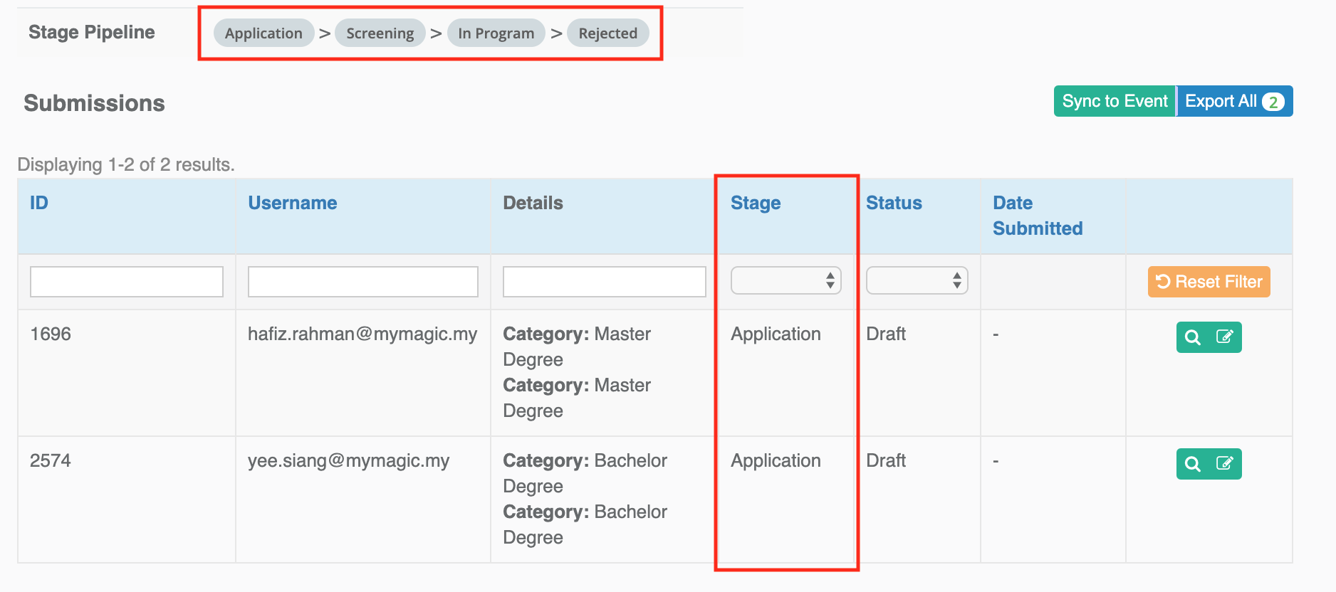
[
    {
        "key": "application",
        "title": "Application"
    },
    {
        "key": "screening",
        "title": "Screening"
    },
    {
        "key": "inprogram",
        "title": "In Program"
    },
    {
        "key": "rejected",
        "title": "Rejected"
    }
]
Sync to Event
One of the benefit of using F7 form is it has built in ability to sync form submissions to event. Both Organization and Individual registration information can be extract from a F7 Form and sync to Event as 'Company Participants' (event_organization) & 'Registrations' (event_registration) when admin click the "Sync to Event" menu item in form view.
First, Event Mapping Instruction in the form must be set. This will tell the system on how to map data between a F7 form and event.
{
    "event_id": 63652,
    "is_sync_draft": true,
    "is_sync_organization": true,
    "organizations": [
        {
            "name": "Participated Startup",
            "map2modal": "startup",
            "workflows": {
                "application": "participant",
                "screening": "participant",
                "inprogram": "selectedParticipant",
                "rejected": "rejectedParticipant"
            }
        }
    ],
    "is_sync_event_registration": true,
    "event_registrations": [
        {
            "name": "Founder 1",
            "attendance_map_workflow": [
                "inprogram"
            ],
            "mappings": {
                "full_name": "f7.f1name",
                "email": "f7.f1email",
                "phone": "f7.f1phone",
                "gender": "f7.f1gender",
                "organization": "f7.startup",
                "nationality": "MY"
            }
        }
    ]
}
Please note that on each execution, system will automatically clear all target data with the same form and vendor code f7.
Extra Settings
Extra setting can be set at Extra field in form. It allow admin / developer to tweak F7 default behaviour.
Sample:
{
	"hooks": [{
		"code": "onNotifyAfterSubmitForm",
		"call": "HubSim::hookNotifyAfterSubmitForm"
	}, {
		"code": "onNotifyAfterChangedSubmit2Draft",
		"call": "HubSim::hookNotifyAfterChangedSubmit2Draft"
	}, {
		"code":"onCopyDataFromDependantForm",
		"call":"HubAtas::hookCopyDataFromDependantForm"
	}, {
        	"code": "onNotifyAfterUpdateSubmission",
       		"scenario": [{
                	"status": "draft",
                	"stage": "processing",
               		"note": "show",
               		"code": "onNotifyAfterProcess",
                	"call": "HubEpik::hookNotifyAfterProcess"
                },
                {
                	"status": "submit",
                	"stage": "accepted",
                	"code": "onNotifyAfterValidated",
                	"call": "HubEpik::hookNotifyAfterValidated"
                },
                {
                	"status": "submit",
                	"stage": "rejected",
                	"note": "show",
                	"code": "onNotifyAfterRejected",
                	"call": "HubEpik::hookNotifyAfterRejected"
                }]
        }],
	"viewControls": {
		"hideMySubmissions": true,
		"hideAvailableFormForIntake": true,
		"publishViewOkButton": {
			"url": "\/sea\/frontend\/manage",
			"urlParams": [{
				"key": "id",
				"map": "startup_id"
			}]
		}
	},
	"is_integrated_form": true
}
Hooks - hooks
Example of 4 types of hooks which are:
- onNotifyAfterSubmitForm - will trigger the function after user
Submitthe form (notification) - onNotifyAfterChangedSubmit2Draft - will trigger the funtion after user decide to
Editafter has submitted the form (notification) - onCopyDataFromDependantForm - will trigger for custom build form to copy data from previous form
- onNotifyAfterUpdateSubmission - will trigger the function after admin update the stage for the submission
For hooks with scenario, some program's owner might one to send custom email after update to certain stage. This will allow custom function to be called if fulfill the given scenario (combination of the status & stage). For some case, program's owner might also want to send a note to the user, so note will be the attribute to be added into the structure.


View Controls - viewControls
Hide user previous submissions
F7 automatically display the user previous submissions section like this:
There are circumstances where you like to hide this section, e.g. you had create an interface in module and just like to use F7 for a form submission tool as it is. Set hideMySubmissions to true to achieve this.
Hide other forms of the same intake
When you added multiple F7 forms to intake, they will display at the side like this:
There are circumstances where you like to hide this section, e.g. you had create an interface in module and just like to use F7 for a form submission tool as it is. Set hideAvailableFormForIntake to true to achieve this.
Override OK button in view submission page
publishViewOkButton
Integrated Form - is_integrated_form
Some form might be custom build for a program and have a preset value. Use is_integrated_form to skip it being listed in Activity Feed to avoid any bugs or issue as user might use a call to action from the Activity Feed to access their form. The only entry point is from the module view where it was integrated.
Others
Preset value from URL
Prefill value from Selected Information
F7 support bind value (prefill) to the dependent fields once we have selected/keyed in the value.
    "101": {
        "tag": "group",
        "prop": {
            "css": ""
        },
        "members": [{
                "tag": "label",
                "prop": {
                    "required": 1,
                    "csv_label": "",
                    "for": "startup",
                    "hint": "",
                    "value": "Select Organization",
                    "value-ms": "Nama organisasi"
                }
            },
            {
                "tag": "list",
                "prop": {
                    "required": 1,
                    "showinbackendlist": "1",
                    "csv_label": "Organization Name",
                    "hint": "",
                    "hint-ms": "",
                    "value": "",
                    "name": "startup",
                    "error": "Organization name is required",
                    "error-ms": "Name organisasi diperlukan",
                    "text": "choose your organization",
                    "text-ms": "pilih organisasi",
                    "items": "",
                    "model_mapping": {
                        "startup": "Organization",
                        "modifier": {
                            "hideCreateNew": 1
                        }
                    },
                    "bind": {
                        "event": "change", // in this case we use event change to trigger it
                        "data": {

                            // "fieldNameWithinSameForm": "fieldDerivedFromToApiFunction"

                            // CASE 1: getting value from same object
                            // field type: textbox
                            "compRegNo": "companyNumber",

                            // CASE 2: getting value from ONE-TO-MANY relation
                            // field type: list
                            // since it is Primary, so we choose first industry to prefill it
                            // industries is a relation name
                            "primaryIndustry": "industries.0.title",

                            // since record will return many individual record, if first individual not a founder
                            // then it will find and return first individual with role as founder
                            "businessOwnerName": "individualOrganizations.0.individual.fullName",

                            // CASE 3: getting value using function
                            // field type: checkbox
                            "statusOrganization": {
                                "Registered with MaGIC": { // value of the checkbox
                                    "class": "HubSea",
                                    "method": "getRegisteredSeStatus"
                                }
                            },
                            // field type: radio (booleanButton)
                            "registeredWithMagic": {
                                "class": "HubSea",
                                "method": "getRegisteredSeStatus"
                            }
                        }
                    }
                }
            }
        ]
    },
    "102": {
        "tag": "group",
        "prop": {
            "css": ""
        },
        "members": [
            {
                "tag": "label",
                "prop": {
                    "required": 1,
                    "for": "compRegNo",
                    "value": "Company Registration No",
                    "value-ms": "No Pendaftaran Syarikat"
                }
            },
            {
                "tag": "textbox",
                "prop": {
                    "required": 1,
                    "showinbackendlist": 1,
                    "csv_label": "Company Registration No",
                    "hint": "",
                    "name": "compRegNo",
                    "error": "Company registration no is required",
                    "error-ms": "No pendaftaran syarikat diperlukan"
                }
            }
        ]
    },
    "103":{
        "tag": "group",
        "prop": {
            "css": ""
        },
        "members": [{
                "tag": "label",
                "prop": {
                    "required": 1,
                    "for": "primaryIndustry",
                    "value": "The industry your startup is in?",
                    "value-ms": "Apakah industri syarikat anda?"
                }
            },
            {
                "tag": "list",
                "prop": {
                    "required": 1,
                    "csv_label": "Industry",
                    "hint": "",
                    "name": "primaryIndustry",
                    "text": "Select",
                    "text-ms": "Pilih",
                    "error": "Industry is required",
                    "error-ms": "Industri diperlukan",
                    "model_mapping": {
                        "primaryIndustry": "industry"
                    }
                }
            }
        ]
    },
    "104": {
        "tag": "group",
        "prop": {
            "css": ""
        },
        "members": [
            {
                "tag": "label",
                "prop": {
                    "required": 1,
                    "for": "statusOrganization",
                    "value": "Status of Your Organisation"
                }
            },
            {
                "tag": "checkbox",
                "prop": {
                    "required": 1,
                    "isGroup": 1,
                    "isInlineItems": 0,
                    "showinbackendlist": "0",
                    "csv_label": "Status Organization",
                    "hint": "",
                    "name": "statusOrganization",
                    "error": "Please select the status of your organization",
                    "items": [
                        {
                            "text": "Registered with MaGIC"
                        }
                    ]
                }
            }
        ]
    },
    "105": {
        "tag": "group",
        "prop": {
            "css": ""
        },
        "members": [
            {
                "tag": "label",
                "prop": {
                    "required": 1,
                    "for": "registeredWithMagic",
                    "value": "Registered with MaGIC"
                }
            },
            {
                "tag": "booleanButton",
                "prop": {
                    "required": 1,
                    "isGroup": 1,
                    "isInlineItems": 0,
                    "showinbackendlist": "0",
                    "csv_label": "Registered with MaGIC",
                    "hint": "",
                    "name": "registeredWithMagic",
                    "error": "Please select Registered with MaGIC"
                }
            }
        ]
    }
Conditional form
F7 support conditional
Radio
So there is this option selection where user can select between 'Food Lover' or 'Movie Lover'
"71": {
    "tag": "group",
    "prop": {
        "css": "inline"
    },
    "members": [
        {
            "tag": "label",
            "prop": {
                "required": 1,
                "for": "condition1",
                "value": "Select an option"
            }
        },
        {
            "tag": "radio",
            "prop": {
                "required": 1,
                "showinbackendlist": "1",
                "csv_label": "Your Hobby",
                "hint": "This is a condition",
                "value": "",
                "css": "inline",
                "name": "condition1",
                "error": "",
                "text": "Select",
                "items": [
                    {
                        "text": "Food Lover"
                    },
                    {
                        "text": "Movie Lover"
                    }
                ]
            }
        }
    ]
}
If 'Food Lover is selected', the following section will be shown.
"72": {
    "tag": "group",
    "prop": {
        "name": "choice-A",
        "css": "",
        "size": 3,
        "text": "Food Lover"
    },
    "members": [
        {
            "tag": "label",
            "prop": {
                "required": 0,
                "for": "favRestaurant",
                "value": "Favorite Restaurant:"
            }
        },
        {
            "tag": "textbox",
            "prop": {
                "required": 0,
                "showinbackendlist": "0",
                "csv_label": "Favorite Restaurant",
                "hint": "",
                "value": "",
                "name": "favRestaurant",
                "error": ""
            }
        },
        {
            "tag": "label",
            "prop": {
                "required": 0,
                "for": "favFruit",
                "value": "Favorite Fruit:"
            }
        },
        {
            "tag": "textbox",
            "prop": {
                "required": 0,
                "showinbackendlist": "0",
                "csv_label": "Favorite Fruit",
                "hint": "",
                "value": "",
                "name": "favFruit",
                "error": ""
            }
        }
    ]
}
Else if movie lover is selected, the following section will be shown.
"73": {
    "tag": "group",
    "prop": {
        "name": "choice-B",
        "css": "",
        "size": 3,
        "text": "Movie Lover"
    },
    "members": [
        {
            "tag": "label",
            "prop": {
                "required": 0,
                "for": "favCinema",
                "value": "Favorite Cinema:"
            }
        },
        {
            "tag": "textbox",
            "prop": {
                "required": 0,
                "showinbackendlist": "0",
                "csv_label": "Favorite Cinema",
                "hint": "",
                "value": "",
                "name": "favCinema",
                "error": ""
            }
        },
        {
            "tag": "label",
            "prop": {
                "required": 0,
                "for": "favMovie",
                "value": "Favorite Movie:"
            }
        },
        {
            "tag": "textbox",
            "prop": {
                "required": 0,
                "showinbackendlist": "0",
                "csv_label": "Favorite Movie",
                "hint": "",
                "value": "",
                "name": "favMovie",
                "error": ""
            }
        }
    ]
}
It's all made possible with this chunk of code of javascript.
"jscripts":
[
    {
        "caller": "condition1",
        "action": "show",
        "items": [
            "favFruit",
            "favRestaurant"
        ],
        "condition": {
            "check": "Food Lover"
        }
    },
    {
        "caller": "condition1",
        "action": "show",
        "items": [
            "favMovie",
            "favCinema"
        ],
        "condition": {
            "check": "Movie Lover"
        }
    }
]
List
So there is this option selection when user select 'Registered with MaGIC', user need to fill up another field
{
    "tag": "group",
    "prop": {
        "css": ""
    },
    "members": [
        {
            "tag": "label",
            "prop": {
                "required": 1,
                "for": "statusOrganization1",
                "value": "Status of Your Organisation"
            }
        },
        {
            "tag": "list",
            "prop": {
                "required": 1,
                "showinbackendlist": "0",
                "csv_label": "Status Organization",
                "hint": "",
                "name": "statusOrganization1",
                "text": "select",
                "text-ms": "pilih",
                "error": "Please select the status of your organization (Dropdown)",
                "items": [
                    {
                        "text": "Accredited by Ministry"
                    },
                    {
                        "text": "Registered with MaGIC"
                    }
                ]
            }
        }
    ]
},
{
    "tag": "group",
    "prop": {
        "css": "cls-descAssessment1"
    },
    "members": [
        {
            "tag": "label",
            "prop": {
                "required": 1,
                "for": "descAssessment1",
                "value": "Please describe the assessment you take",
                "value-ms": ""
            }
        },
        {
            "tag": "textarea",
            "prop": {
                "required": 1,
                "csv_label": "",
                "hint": "This field will appear when selected option is Registered with MaGIC",
                "value": "",
                "rows": 2,
                "name": "descAssessment1",
                "error": "",
                "error-ms": ""
            }
        }
    ]
}
This is the code for the javascript hide/show the field
"jscripts": [
    {
        "caller": "statusOrganization1",
        "action": "show",
        "items": [
            "descAssessment1",
            "cls-descAssessment1"
        ],
        "condition": {
            "select": "Registered with MaGIC"
        }
    }
]
This is the code for the javascript to check if the field is required
"jscripts": [
    {
        "caller": "statusOrganization1",
        "action": "enable",
        "items": [
            "descAssessment1"
        ],
        "condition": {
            "select": "Registered with MaGIC"
        }
    }
]
This is the complete code for the javascript to make the dependent field with required tag functioning properly
"jscripts": [
    {
        "caller": "statusOrganization1",
        "action": "show",
        "items": [
            "descAssessment1",
            "cls-descAssessment1"
        ],
        "condition": {
            "select": "Registered with MaGIC"
        }
    },
    {
        "caller": "statusOrganization1",
        "action": "enable",
        "items": [
            "descAssessment1"
        ],
        "condition": {
            "select": "Registered with MaGIC"
        }
    }
]
Checkbox
So there is this option checkbox when user tick 'Registered with MaGIC', user need to fill up another field
{
    "tag": "group",
    "prop": {
        "css": ""
    },
    "members": [
        {
            "tag": "label",
            "prop": {
                "required": 1,
                "for": "statusOrganization",
                "value": "Status of Your Organisation"
            }
        },
        {
            "tag": "checkbox",
            "prop": {
                "required": 1,
                "isGroup": 1,
                "isInlineItems": 0,
                "showinbackendlist": "0",
                "csv_label": "Status Organization",
                "hint": "",
                "name": "statusOrganization",
                "error": "Please select the status of your organization",
                "items": [
                    {
                        "text": "Accredited by Ministry"
                    },
                    {
                        "text": "Registered with MaGIC"
                    }
                ]
            }
        }
    ]
},
{
    "tag": "group",
    "prop": {
        "css": "cls-descAssessment"
    },
    "members": [
        {
            "tag": "label",
            "prop": {
                "required": 1,
                "for": "descAssessment",
                "value": "Please describe the assessment you take",
                "value-ms": ""
            }
        },
        {
            "tag": "textarea",
            "prop": {
                "required": 1,
                "csv_label": "",
                "hint": "This field will appear if one the the checked checkbox is Registered with MaGIC",
                "value": "",
                "rows": 2,
                "name": "descAssessment",
                "error": "",
                "error-ms": ""
            }
        }
    ]
}
This is the code for the javascript
"jscripts": [
    {
        "caller": "statusOrganization",
        "action": "show",
        "items": [
            "descAssessment",
            "cls-descAssessment"
        ],
        "condition": {
            "check": "Registered with MaGIC"
        }
    }
]
This is the code for the javascript to check if the field is required
"jscripts": [
    {
        "caller": "statusOrganization1",
        "action": "enable",
        "items": [
            "descAssessment"
        ],
        "condition": {
            "check": "Registered with MaGIC"
        }
    }
]
This is the complete code for the javascript to make the dependent field with required tag functioning properly
"jscripts": [
    {
        "caller": "statusOrganization1",
        "action": "show",
        "items": [
            "descAssessment",
            "cls-descAssessment"
        ],
        "condition": {
            "check": "Registered with MaGIC"
        }
    },
    {
        "caller": "statusOrganization1",
        "action": "enable",
        "items": [
            "descAssessment"
        ],
        "condition": {
            "check": "Registered with MaGIC"
        }
    }
]
Override layout design
Known Issues
This module was heavily hard coded by a developer and lots of refactor and rework needed to set it right. Here are few issues to take notes:
- File upload is hardcoded to 10MB only and involved session
- Survey is hardcoded to the database table
- views generated are buggy