Kata01 Theming - mitchwongho/GDS-Material-Kata GitHub Wiki
Android Material design elements are provided as:
- New themes
- Widgets for complex views
- APIs for custom shadows, animations and layouts
The material theme defines styling attributes that control:
- System widgets that let you set their colour palette
- default animations for touch feedback
- activity transitions
The goal of this kata is to customise the colour palette and Status Bar. [Source reference]
Start by applying the Theme.AppCompat.Light.NoActionBar theme in styles.xml and defining a style for TextViews
...
<style name="AppTheme" parent="Theme.AppCompat.Light.NoActionBar">
<!-- Main theme colors -->
<!-- appcompat theme attributes aren't prepended with 'android:' -->
<!-- your app branding colour for the app bar -->
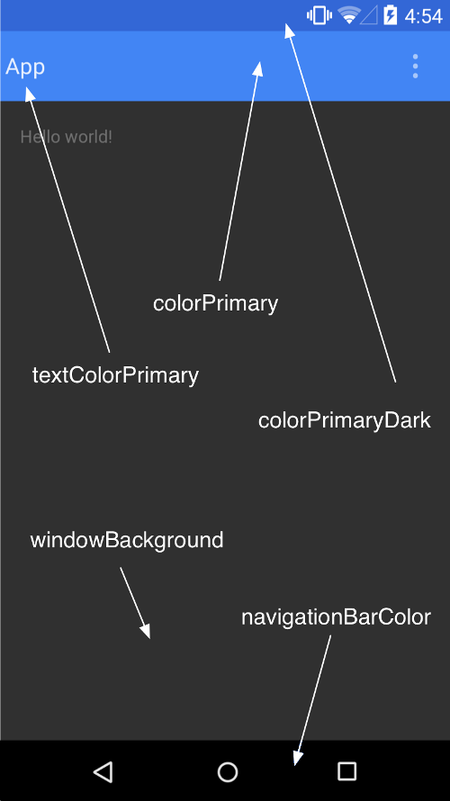
<item name="colorPrimary">@color/primary</item>
<!-- darker variant for the status bar and contextual app bars -->
<item name="colorPrimaryDark">@color/primary_dark</item>
<!-- theme UI controls like checkboxes and text fields -->
<item name="colorAccent">@color/accent</item>
</style>
...
<style name="AppTheme.TextAppearance.Medium" parent="TextAppearance.AppCompat.Medium">
<item name="android:textStyle">bold|italic</item>
<item name="android:fontFamily">sans-serif-thin</item> <!-- Roboto typeface -->
</style>
...
Apply the style to the hello_world TextView in layout/activity_main.xml:
...
<TextView
    android:layout_width="wrap_content"
    android:layout_height="wrap_content"
    android:text="@string/hello_world"
    style="@style/AppTheme.TextAppearance.Medium"/>
...