Adaptive Cards - microsoft-campus-community/workshop-shopping-list-bot GitHub Wiki
Adaptive cards allow presenting little bites of information and actions in a user interface agnostic manner. Platforms that implement adaptive cards have full control over how a card is displayed. As the creator of adaptive cards, you can control the layout of information and the information itself. The layout of an adaptive card is defined by the payload of the card in JSON format. You can use variables in your adaptive card to replace during runtime of your app with data. This allows you to reuse a layout with different data. Adaptive cards are not limited to bots. However, adaptive cards and bots can go hand in hand. They allow your bot to send richer messages than only plain text. Also, for some cases, it might be easier for the chat participant to interact with a small user interface piece than writing an entire message. When getting the items for a shopping list, the bot could send them as an adaptive card. The adaptive card could contain an action to allow to check or uncheck which items should be marked as completed through checkboxes.
So, let's enrich the bot with adaptive cards.
Creating an Adaptive Card
A good place to learn more about adaptive cards is adaptivecards.io.
- Go to the adaptive cards designer where you will design the adaptive card for the bot right in your browser.
- In the top right corner, select
1.1as the target version from the dropdown.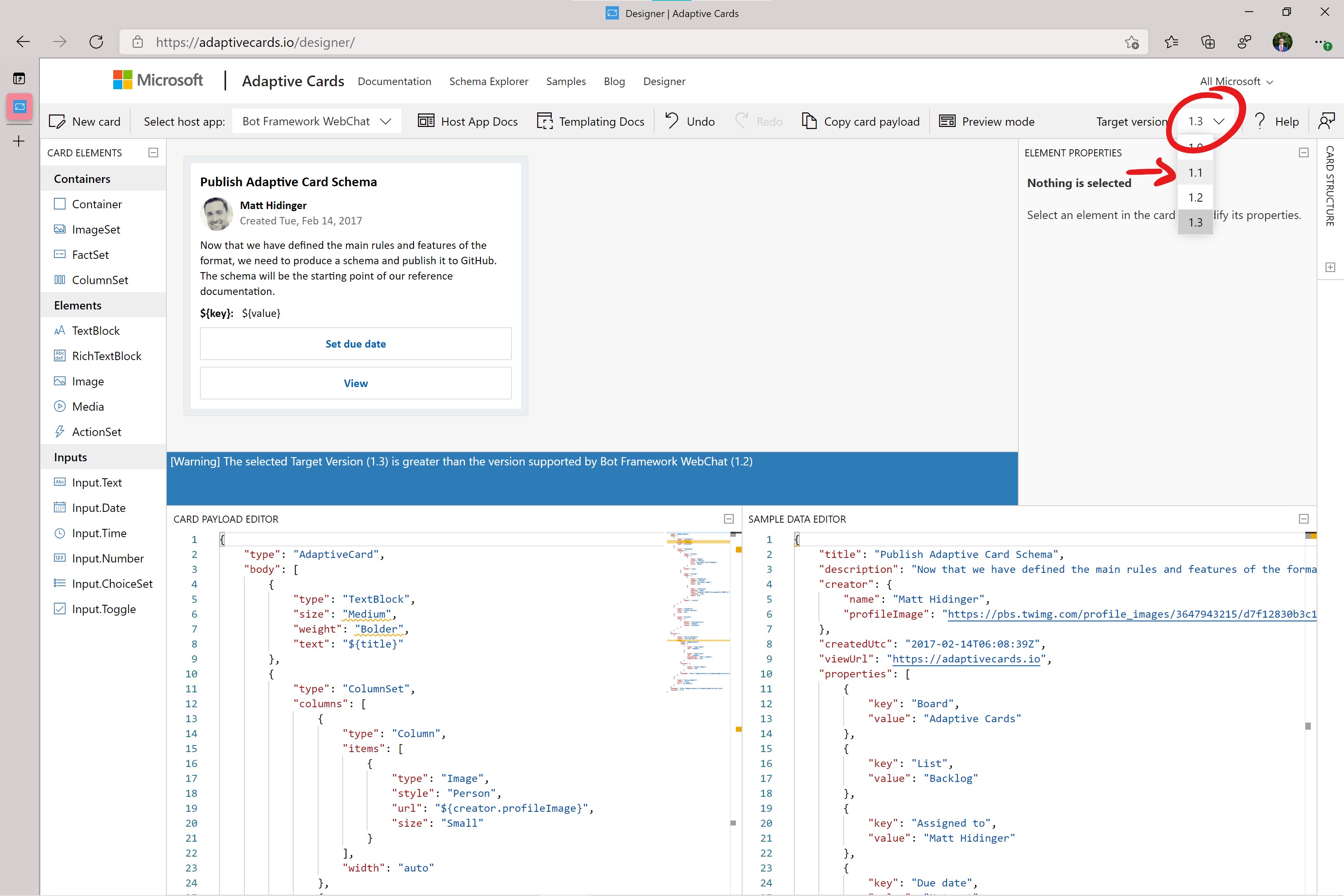
- Bevor you start creating the adaptive cards, make yourself familiar with the designer's layout.
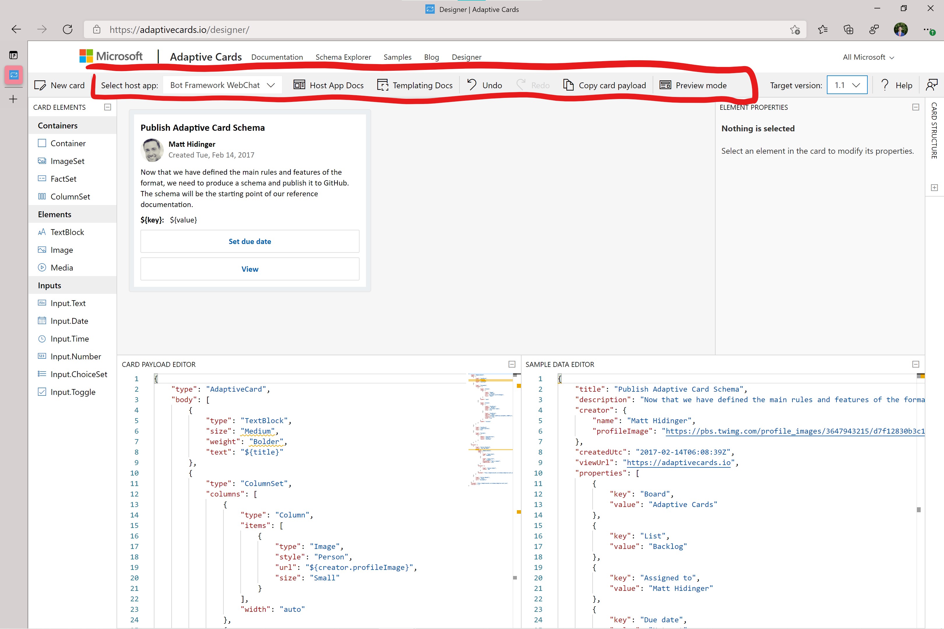
- The top row, which also contains the target version, allows you to switch between different platforms that implement adaptive cards. Note that it will look natural to the specific platform without you having to change the adaptive card. It is platform agnostic. When you click on the 'Preview mode' button, it will show you the actual adaptive card with the payload data inserted.
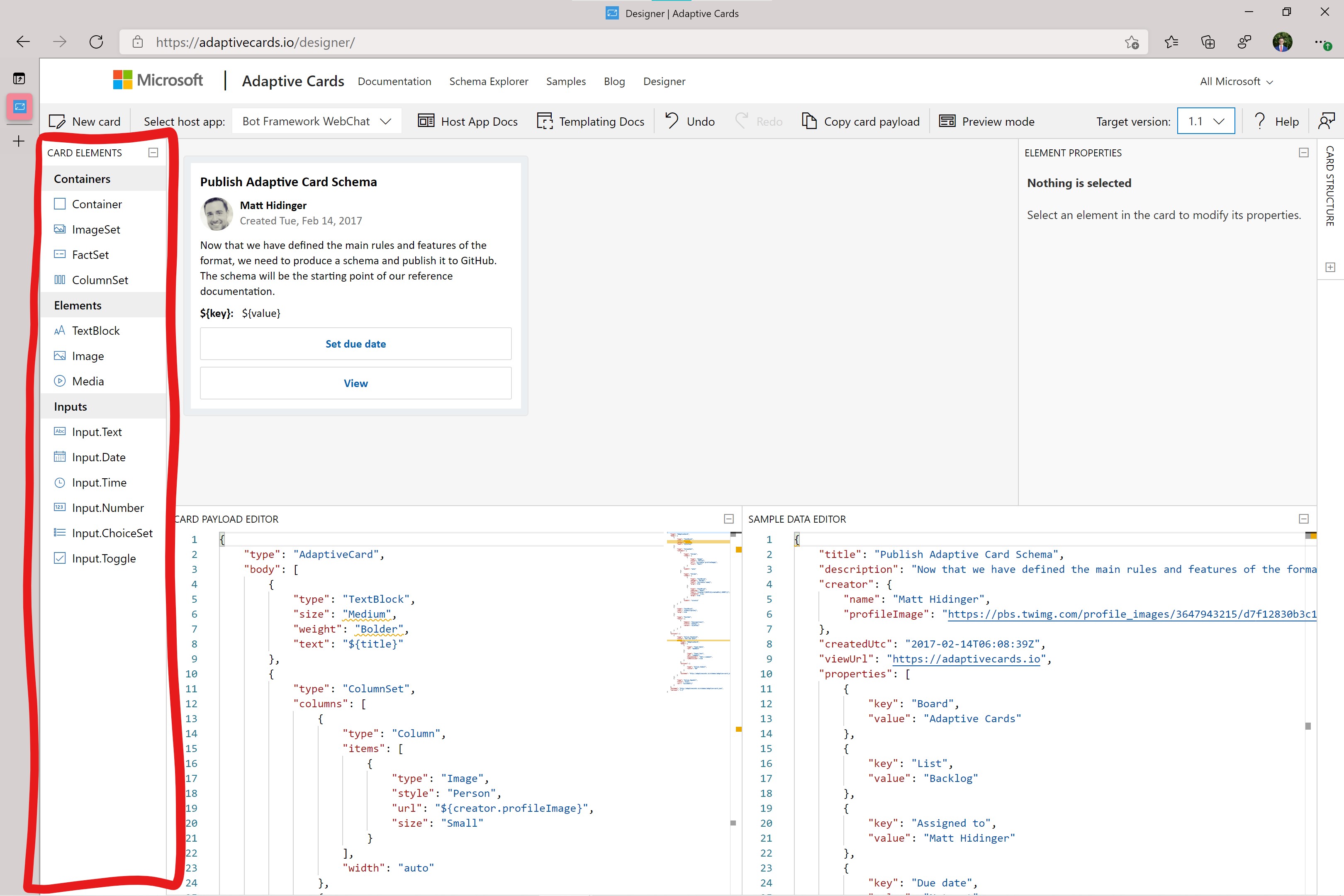
- On the left side is a handy list of all the elements you can use with the selected target version. You can drag them into the canvas.
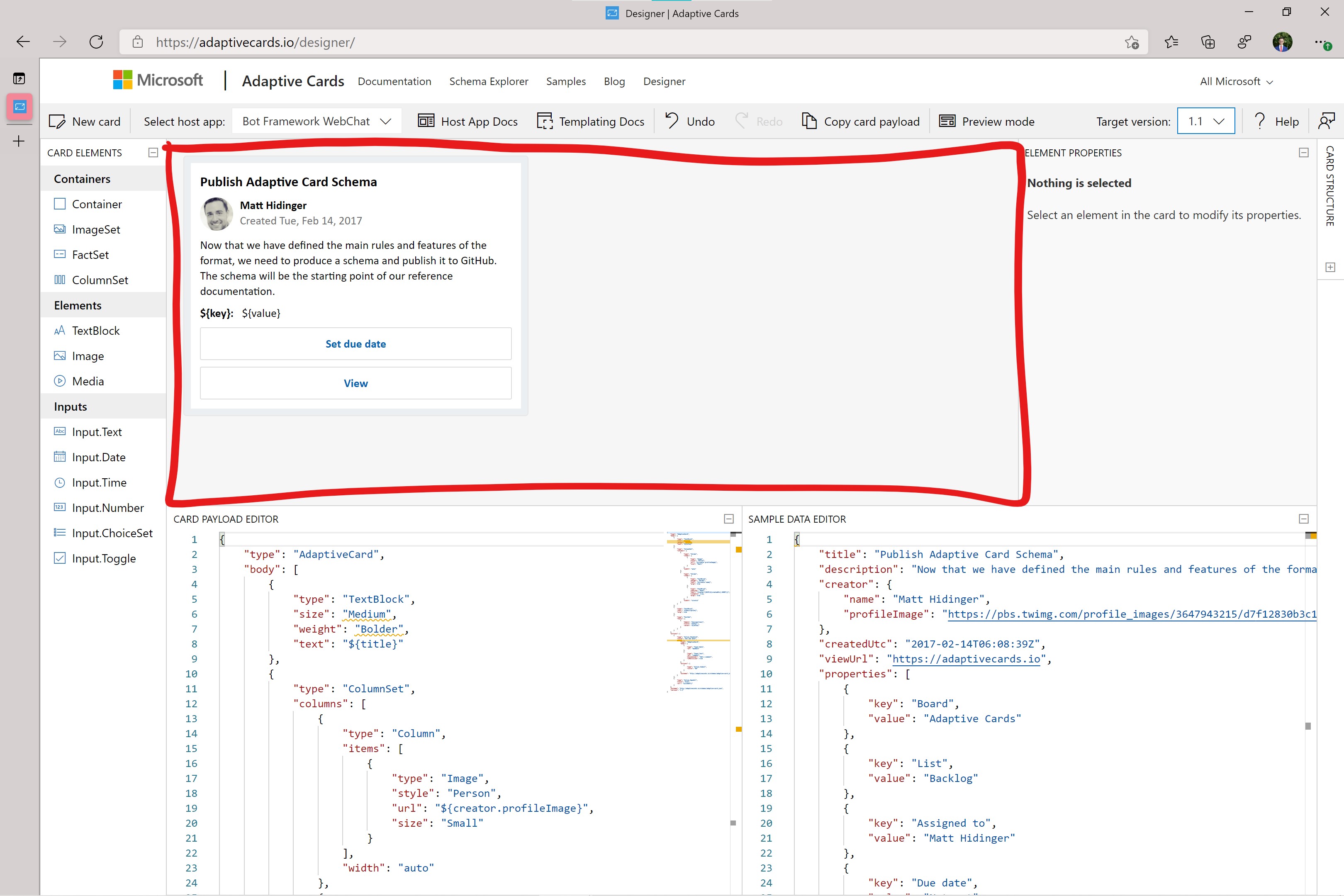
- The canvas is in the center. It allows you to view your adaptive card, add new elements, delete, and move around elements.
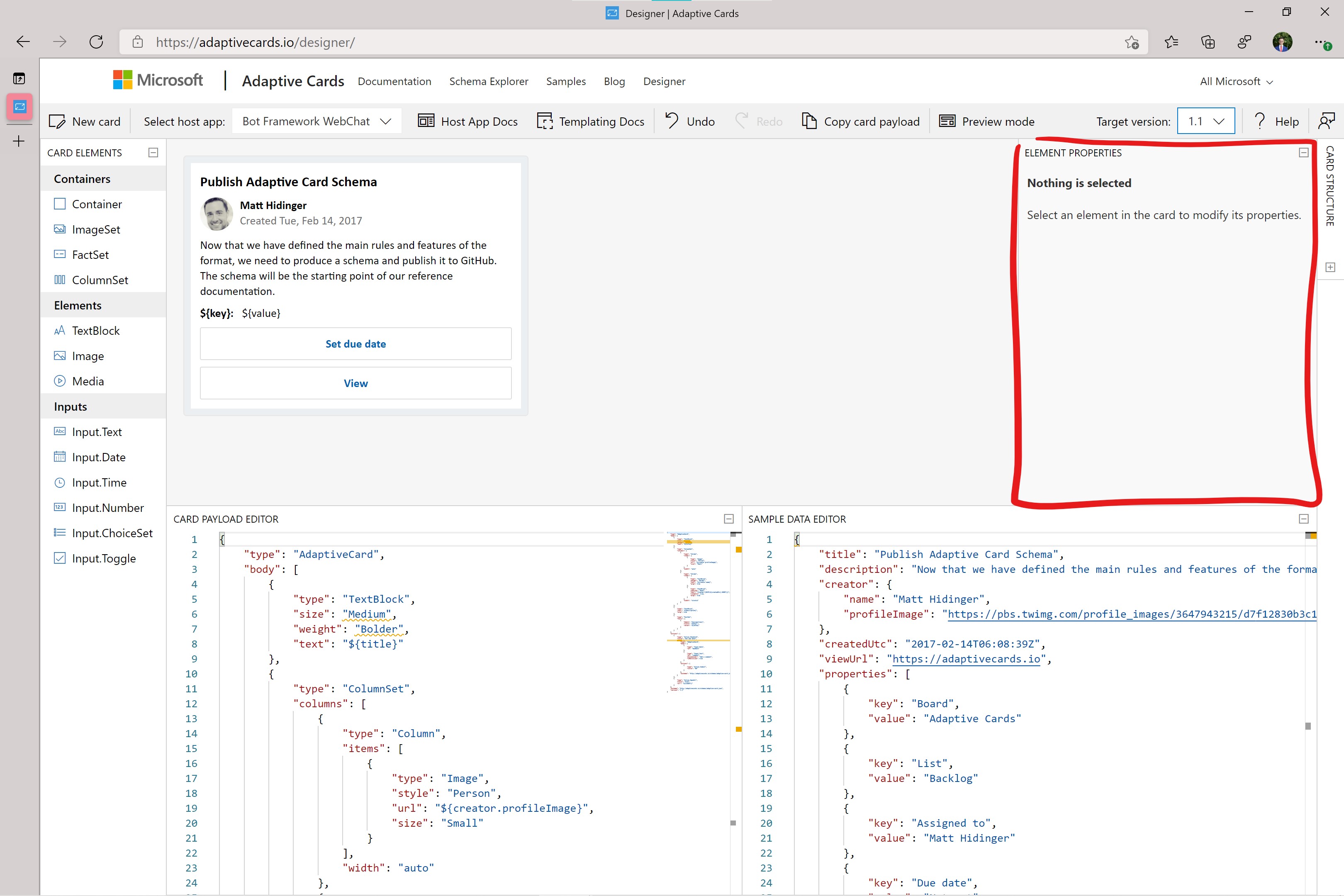
 * To the right side of the canvas, you have the 'Element Properties' panel. If you select an element in the canvas, you can edit the element's properties, for example, the content of a text element.
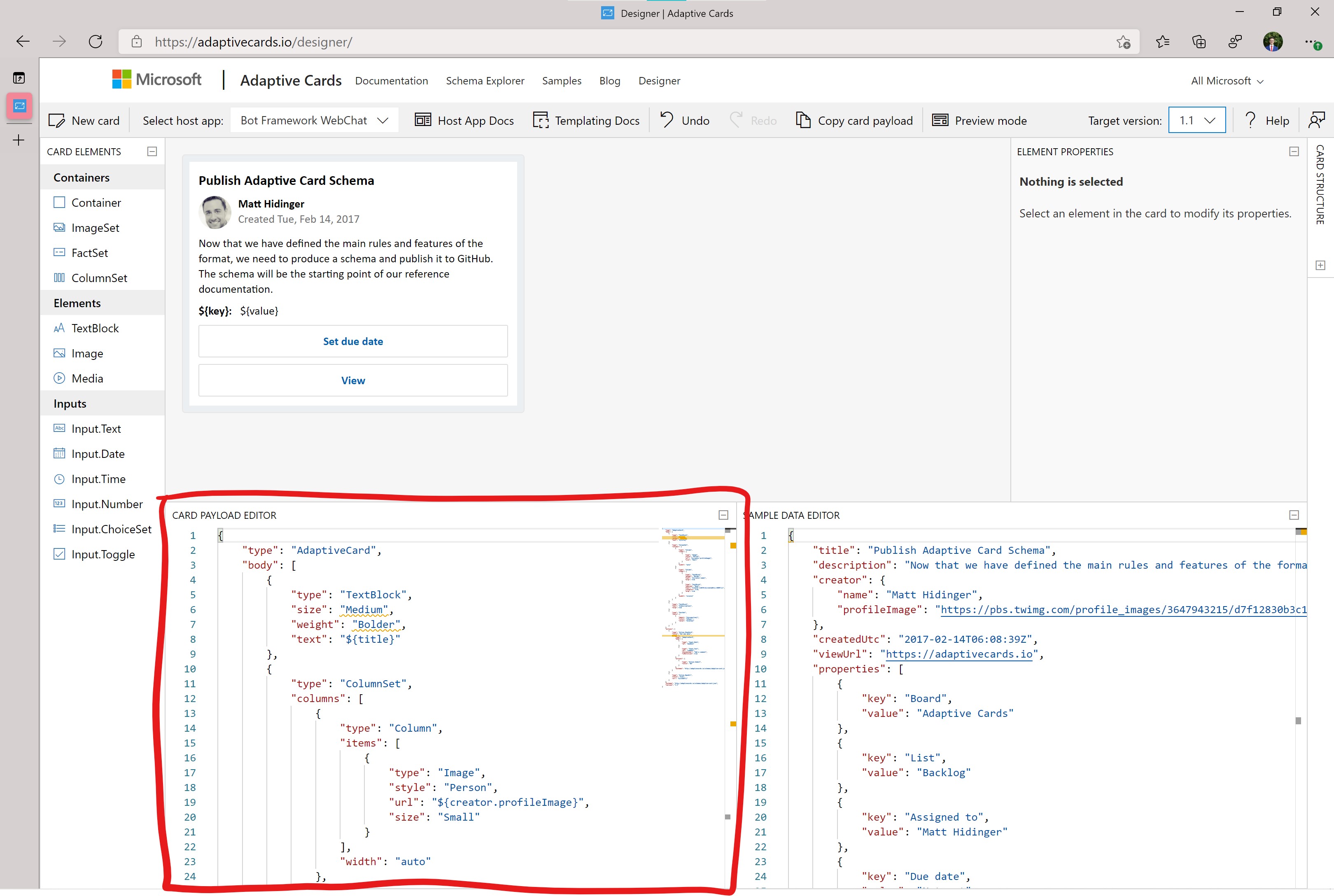
  * Left below the canvas is the 'Card Payload Editor'. This is the JSON you will copy and use in your application when sending an adaptive card. In the designer, changes in the payload will update the canvas and vice versa. So, there are effectively two ways to edit an adaptive card.
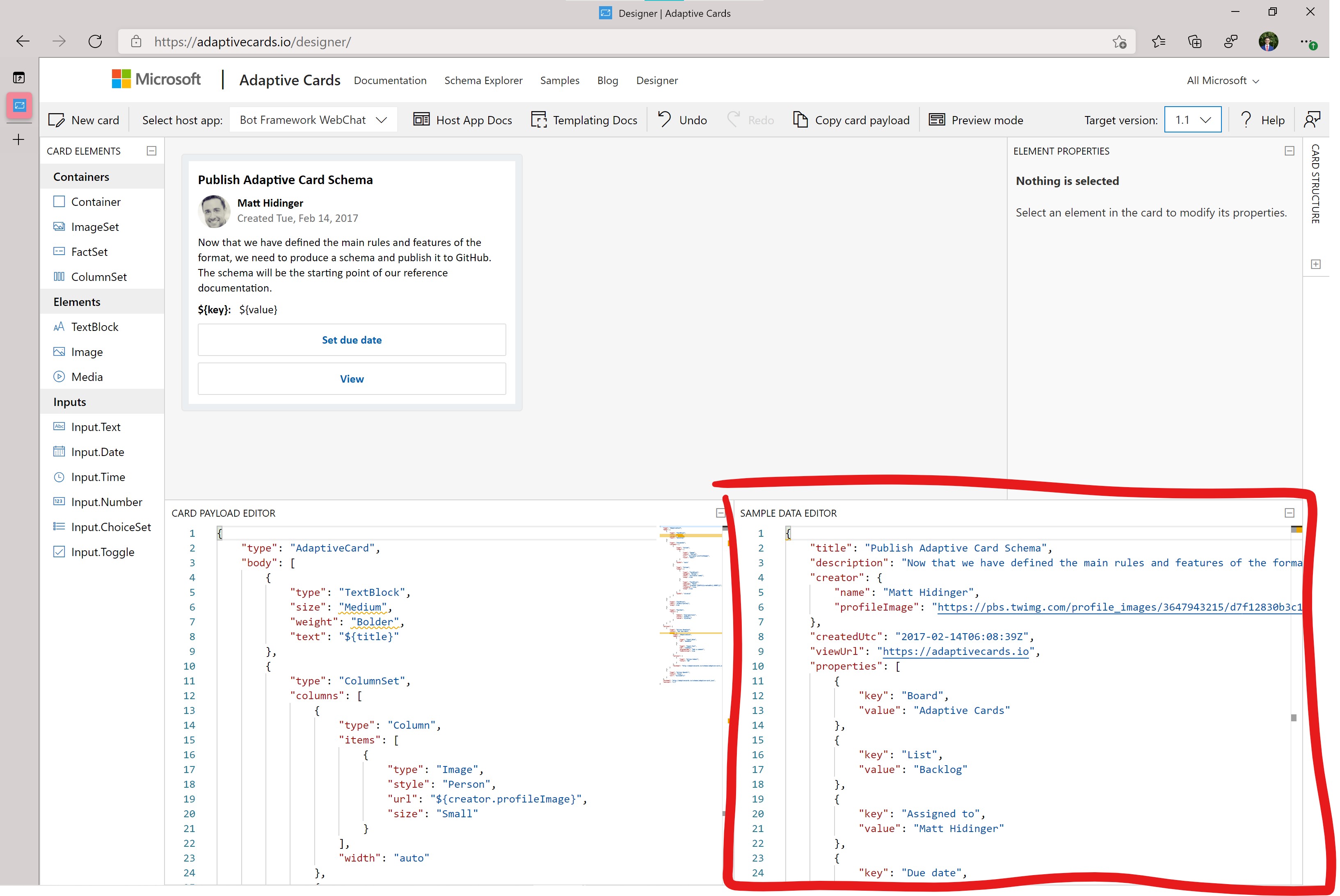
  * To the right of the 'Card Payload Editor' is the 'Sample Data Editor'. Here you can define a JSON structure if you use variables in your adaptive card, so you can also see the card rendered with the sample data when changing to the 'Preview mode'.
- The top row, which also contains the target version, allows you to switch between different platforms that implement adaptive cards. Note that it will look natural to the specific platform without you having to change the adaptive card. It is platform agnostic. When you click on the 'Preview mode' button, it will show you the actual adaptive card with the payload data inserted.
- The visual designer is awesome to get started with adaptive cards. For this workshop, you will make more use of the 'Card Payload Editor' and 'Sample Data Editor' because it is easier to instruct this way.
- Delete all the JSON in the 'Card Payload Editor' and 'Sample Data Editor' to empty.
- Type the following JSON into the 'Card Payload Editor'. This is the general structure of an empty adaptive card: some metadata, a body containing the elements and actions.
{
    "type": "AdaptiveCard",
    "body": [

    ],
    "actions": [

    ],
    "$schema": "http://adaptivecards.io/schemas/adaptive-card.json",
    "version": "1.1"
}
- The first element in the body array will be a headline where the bot could insert different values for the title.
{
            "type": "TextBlock",
            "size": "Medium",
            "weight": "Bolder",
            "text": "${title}"
}
- In the previous step, you inserted a text element. Note that the content of the text property is
${title}. The $ sign and squiggly brackets denote a variable. To fill the variable with data, you can paste the following JSON in the 'Sample Data Editor'. Note that there is no magic happening. We defined a variabletitlein the payload editor, so we must also provide some data for this variable.
{
    "title": "Shopping List"
}
- The next element you should insert in the body array after the
TextBlockelement involves a bit more magic. It defines a list of checkboxes, like a ToDo list. However, only one element in the payload is needed to define a list of variable length. No for-loops here. How about you type the element into the body array first and learn how it works in the next step?
,
{
  "$data": "${items}",
  "id": "${id}",
  "type": "Input.Toggle",
  "title": "${if(unit.value, unit.value, '')} ${if(unit.value && unit.unitName, unit.unitName, '')} ${itemName}",
  "value": "${marked}"
}
- Now, how does the list work?
- All elements in the list have an
idwhich uniquely identifies each list entry and is a variable you also namedid. This will become important in a bit. - Each element in the list is of type
Input.Toggle. In other words, this is a list of checkboxes. - Each checkbox has two parts.
- First, the title is simply the text next to the actual checkmark. At first, the value for the title might look scary. However, it shows that building adaptive cards is quite powerful. Forget about the list for a second. With the shopping list bot, it is optional to have a unit for an item. If this information is available for the item, we want to display it in the list, which is what the first to if statements are for. The first if statement says that if
unit.valueis defined for this item, then insert it; otherwise, we place an empty string. Do you know what the second if statement does? Ifunit.valueandunit.unitNameare defined for the item, then theunitNameis inserted and otherwise an empty string. Hence the syntax for if statements is${if(condition , TRUE_PART, ELSE_PART)}. TheitemNameis always defined for an item, so we append it at the end of the title. Know the title's possibilities look likenoodles,2 applesand1 kg flour. - The second part of the checkbox is a simple
"true"or"false"value as a string to define if the checkbox is selected or not.
- First, the title is simply the text next to the actual checkmark. At first, the value for the title might look scary. However, it shows that building adaptive cards is quite powerful. Forget about the list for a second. With the shopping list bot, it is optional to have a unit for an item. If this information is available for the item, we want to display it in the list, which is what the first to if statements are for. The first if statement says that if
- Now you know how each element in the list is constructed. But how is the list constructed? The
$dataproperty defines the array to construct the list. So, the$dataproperty, in this case, turns a single element into a list of elements if the value we provide for data is an array. Here no data is provided inline. Instead, the data is expected to come from a variable with the nameitems.
- Let's define example data for the list of items so you can better understand how the list comes to life. In the 'Sample Data Editor' append the following JSON.
,
    "items": [
        {
            "id": "noodles-id",
            "itemName": "noodles",
            "marked": "true"
        },
        {
            "id": "apples-id",
            "itemName": "apples",
            "marked": "false",
            "unit": {
                "value": 2
            }
        },
        {
            "id": "flour-id",
            "itemName": "flour",
            "marked": "false",
            "unit": {
                "value": 1,
                "unitName": "kg"
            }
        }
    ]
- Again, you are simply providing data for the variables you defined in the payload. An array called
itemsto create the list of elements in the card. Each entry in theitemsarray must have the importantid, anitemName, and whether it ismarked. An item can have an optional unit used in the template to construct a more detailed checkbox element. To see the rendered list, you should make sure that you have the 'Preview mode' selected. - Now, you have a complete body for an adaptive card to display a shopping list. Sadly, toggling the checkboxes does not really change anything. This is where actions come into play. In the 'Card Payload Editor', type in the following JSON into the empty
actionsarray.
{
            "type": "Action.Submit",
            "title": "Save"
}
- This action adds a button with the
titleSave. There are different types of actions. TheAction.Submittype extracts all the inputs, for example, the checkboxes in the adaptive card, and sends it as an event to whoever authored the adaptive card. In the Bot Framework case, this event will be converted into an activity and sent to the bot. You will learn later how the bot can handle this activity. For now, it is important to know that the extracted data for theInput.Toggleelement is"$id": "true"if the toggle is checked or"$id": "false"if the toggle is unchecked. Therefore theidfor each item is important. It allows the bot to know which item in the adaptive card changed its marked value. You can try this out in the designer by clicking theSavebutton in the adaptive cards. Then your browser will display a message with what is sent through theSubmitevent.
Now you have an adaptive card to display and modify a shopping list. To use the adaptive card, you will need to keep the payload JSON, which should look like the following.
{
    "type": "AdaptiveCard",
    "body": [
        {
            "type": "TextBlock",
            "size": "Medium",
            "weight": "Bolder",
            "text": "${title}"
        },
        {
            "$data": "${items}",
            "id": "${id}",
            "type": "Input.Toggle",
            "title": "${if(unit.value, unit.value, '')} ${if(unit.value && unit.unitName, unit.unitName, '')}  ${itemName}",
            "value": "${marked}"
        }
    ],
    "actions": [
        {
            "type": "Action.Submit",
            "title": "Save"
        }
    ],
    "$schema": "http://adaptivecards.io/schemas/adaptive-card.json",
    "version": "1.1"
}