Creating a chart - methnen/m-chart GitHub Wiki
Here's a screenshot of the M Chart UI:
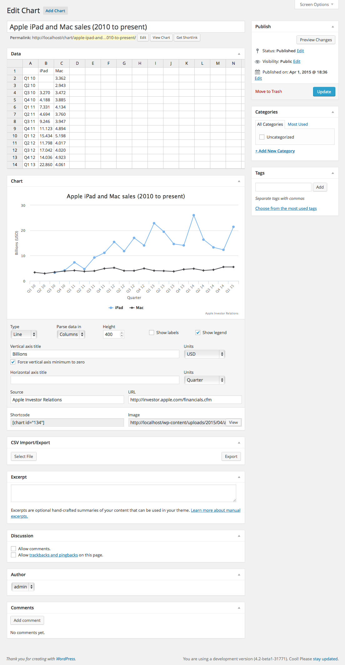
You'll see a spreadsheet interface at the top. This is where you'll input your data. It works similarly to Google Spreadsheet or Excel.
In the screenshot you'll see that the user has put two columns of sales data (iPad and iPhone) broken up by Quarter.
They could have also put two rows of sales data and simply flipped the Parse in setting to Rows instead of columns. Also note that the first two quarters there was no reported iPad sales data. It's fine to leave values like that blank. M Chart will set them as a null value in Highcharts and everything will still render fine.
Line, Spline, Area, Column and Bar Charts
Let's look at a relatively simple Spline chart:
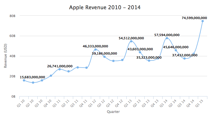
This one only has one set of Revenue data. So the spreadsheet for this one is a bit simpler:
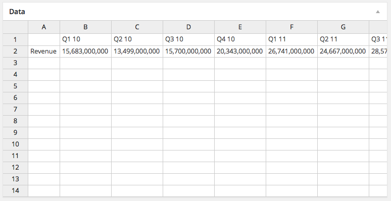
You'll see in this case they entered data in a row versus in a column. That's reflected in the settings panel for this chart:
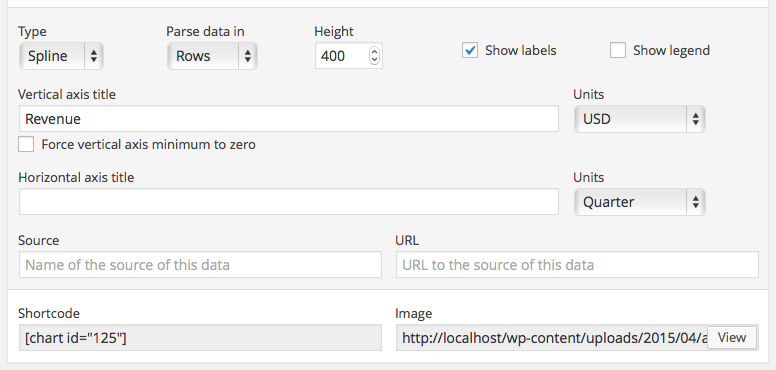
Line, Spline, Area, Column, and Bar charts all have roughly the same options available in the settings panel. One exception is the Force vertical axis minimum option which is only available on Line and Spline charts.
The charting libraries try to always give a little padding above and below the minimum values in a chart. Most of the time this is a good thing but it's occasionally troublesome.
Let's pretend that Apple's Q1 2010 sales were only 1 Billion (I know hard to imagine):
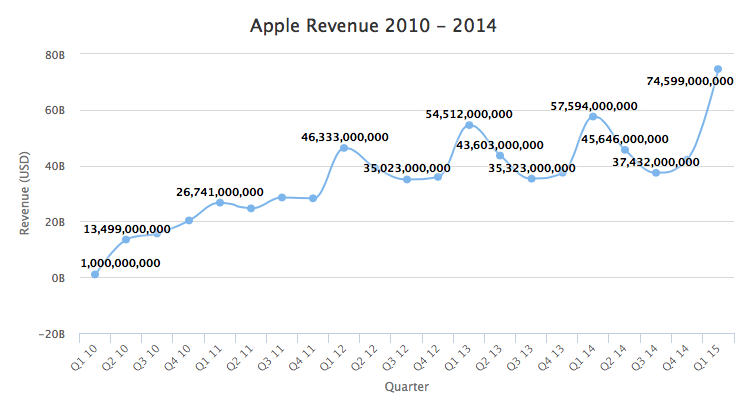
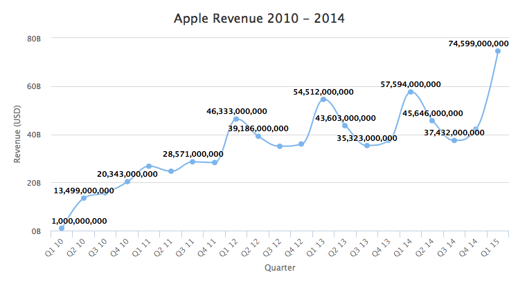
Highcharts pads the bottom of the graph and you end up with negative values in the Y Axis. This is ugly in this situation because we all know Apple could never have negative sales. If you check the Force vertical axis minimum to zero option you end up with a chart that looks like this:
Note: In M Chart version 1.4 and later the Force vertical axis minimum: option takes a user defineable value (i.e. -20). The charting library will round down from the defined value to the next displayable tick mark and set the vertical axis minimum to that value.
Pie and Polar Charts
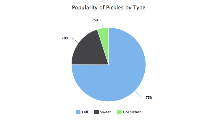
Pie and Polar charts are simpler since they can only ever have one set of data in them. Here's an example pie chart illustrating pickle popularity by type (according to my wild guess):
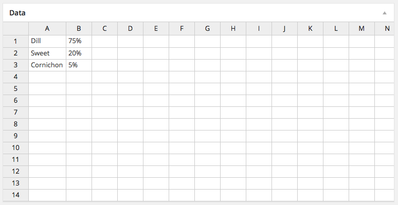
The spreadsheet for this data set is quite simple:
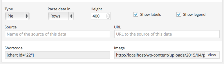
Pie charts also have simplified chart options:
Scatter, Bubble, Radar, and Radar Area Charts
See additional instructions for Scatter and Bubble Charts and Radar and Radar Area Charts.
Example Charts
If you'd like to play with some example charts you can download either the Chart.js Example Files Export or Highcharts Example Files Export and import them using the WordPress Importer plugin.