Working with Input Views - meswapnilwagh/android_guides GitHub Wiki
Android has support for many different input controls for accepting input from the user. The common input controls include:
- Buttons
- Text Fields
- Checkboxes
- Radio Buttons
- Spinners
- SeekBar
- RatingBar
- NumberPicker
- Switch
- Date and Time Pickers
Adding an input control to your UI is as simple as adding an XML element with attributes to your layout file:

The important part of input is deciding which input to use and how to properly configure the input view.
There are many input fields available, use the handy chart below to determine which inputs to use for different situations:
| Type | Inputs |
|---|---|
| Single Action | Button, ImageButton |
| Free Text | [[EditText |
| Integer | [[EditText |
| Boolean | [[Checkboxes |
| Single Choice | [[Spinner |
| Multiple Choice | [[Checkboxes |
| Dates, Times | [[DateTimePicker |
| Rating | RatingBar |
There are many third-party libraries available to improve input selection within apps. See this list of UI libraries and our Must Have Libraries guide for more information.
If you are using an EditText, you should always specify the hint and input type.
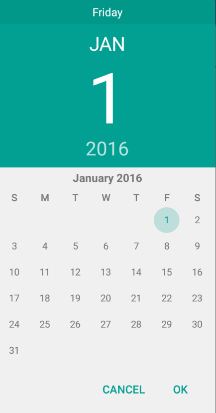
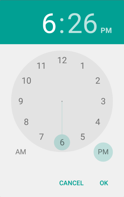
Often within an app you will need the user to select a time or date for an event or other object. There are native date and time pickers but they do not make for a polished user experience for pre Lollipop (API v21) devices. Consider the difference:
| Description | Pre-Android 5.0 (API 20 and lower) | Android 5.0 (API 21+) |
|---|---|---|
| Date Picker |  |
 |
| Time Picker | 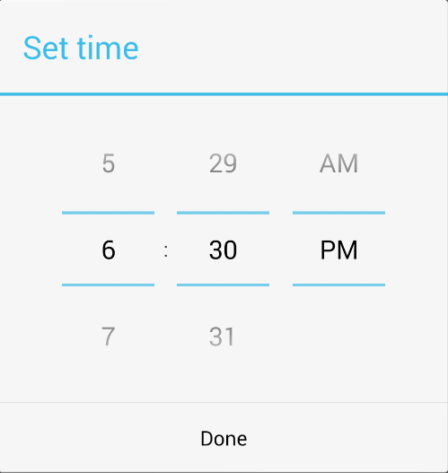 |
 |
If you intend to support older Android devices, the better options for date and time picking are below:
- BetterPickers - DialogFragments modeled after the AOSP Clock and Calendar apps to improve UX for picking time, date, numbers, and other things (supports Android 2.3+ devices)
- DateTimePicker - Contains the beautiful DatePicker and TimePicker that can be seen in the new Google Agenda app (supports Android 2.1+ devices)
- MaterialDateTimePicker - Material Design styled DatePicker and TimePicker (supports Android 4.0+ devices)
DateTimerPicker and MaterialDateTimePicker are both forks from the original Android open source datetime picker located here. MaterialDateTimePicker however does not use the Support Fragment Manager for reasons stated here, so if you need it in your project, you will need to download the original source, create a separate project, and modify the import statements.
Checkboxes allow the user to select one or more options from a set. Typically, you should present each checkbox option in a vertical list. Add them to the view:
<?xml version="1.0" encoding="utf-8"?>
<LinearLayout xmlns:android="http://schemas.android.com/apk/res/android"
    android:orientation="vertical"
    android:layout_width="match_parent"
    android:layout_height="match_parent">
    <CheckBox android:id="@+id/checkbox_meat"
        android:layout_width="wrap_content"
        android:layout_height="wrap_content"
        android:text="@string/meat"
        android:onClick="onCheckboxClicked"/>
    <CheckBox android:id="@+id/checkbox_cheese"
        android:layout_width="wrap_content"
        android:layout_height="wrap_content"
        android:text="@string/cheese"
        android:onClick="onCheckboxClicked"/>
</LinearLayout>
and then in the activity:
public void onCheckboxClicked(View view) {
    // Is the view now checked?
    boolean checked = ((CheckBox) view).isChecked();

    // Check which checkbox was clicked
    switch(view.getId()) {
        case R.id.checkbox_meat:
            if (checked)
                // Put some meat on the sandwich
            else
                // Remove the meat
            break;
        case R.id.checkbox_cheese:
            if (checked)
                // Cheese me
            else
                // I'm lactose intolerant
            break;
    }
}
Using this pattern you can manage the checkbox events and take the user input. Take a look at the Official Checkbox Guide for more details.
Radio buttons allow the user to select one option from a set. If it's not necessary to show all options side-by-side, use a spinner instead.
To create each radio button option, create a RadioButton in your layout. However, because radio buttons are mutually exclusive, you must group them together inside a RadioGroup. By grouping them together, the system ensures that only one radio button can be selected at a time.
<?xml version="1.0" encoding="utf-8"?>
<RadioGroup xmlns:android="http://schemas.android.com/apk/res/android"
    android:layout_width="match_parent"
    android:layout_height="wrap_content"
    android:orientation="vertical">
    <RadioButton android:id="@+id/radio_pirates"
        android:layout_width="wrap_content"
        android:layout_height="wrap_content"
        android:text="@string/pirates"
        android:onClick="onRadioButtonClicked"/>
    <RadioButton android:id="@+id/radio_ninjas"
        android:layout_width="wrap_content"
        android:layout_height="wrap_content"
        android:text="@string/ninjas"
        android:onClick="onRadioButtonClicked"/>
</RadioGroup>
and within the activity:
public void onRadioButtonClicked(View view) {
    // Is the button now checked?
    boolean checked = ((RadioButton) view).isChecked();

    // Check which radio button was clicked
    switch(view.getId()) {
        case R.id.radio_pirates:
            if (checked)
                // Pirates are the best
            break;
        case R.id.radio_ninjas:
            if (checked)
                // Ninjas rule
            break;
    }
}
Check out the official radio buttons guide for more details.
Spinners provide a quick way to select one value from a set of options. Create a spinner like any view and specify the android:entries attribute to specify the set of options:
<Spinner
    android:id="@+id/mySpinner"
    android:layout_width="wrap_content"
    android:entries="@array/planets_arrays"
    android:prompt="@string/planets_prompt"
    android:layout_height="wrap_content" />
and then specify the string array of options in res/values/planets_array.xml:
<?xml version="1.0" encoding="utf-8"?>
<resources>
	<string-array name="planets_array">
		<item>Mercury</item>
		<item>Venus</item>
		<item>Earth</item>
		<item>Mars</item>
	</string-array>
</resources>
Check out the Spinners guide for more details. Note that customizing a spinner's text requires using a custom array adapter and layout file.
Get the selected item out a spinner using:
String value = spinner.getSelectedItem().toString();Setting spinner item based on value (rather than item position):
public void setSpinnerToValue(Spinner spinner, String value) {
	int index = 0;
	SpinnerAdapter adapter = spinner.getAdapter();
	for (int i = 0; i < adapter.getCount(); i++) {
		if (adapter.getItem(i).equals(value)) {
			index = i;
			break; // terminate loop
		}
	}
	spinner.setSelection(index);
}You can also load a spinner using an adapter for a dynamic source of options using an Adapter:
Spinner spinner = (Spinner) findViewById(R.id.spinner);
// Create an ArrayAdapter using the string array and a default spinner layout
ArrayAdapter<CharSequence> adapter = ArrayAdapter.createFromResource(this,
        R.array.planets_array, android.R.layout.simple_spinner_item);
// Specify the layout to use when the list of choices appears
adapter.setDropDownViewResource(android.R.layout.simple_spinner_dropdown_item);
// Apply the adapter to the spinner
spinner.setAdapter(adapter);By default, the spinner only allows the user to select one option from the list. Check out the following resources surrounding multiple selection spinners:
- MultiSelectSpinner - Simple multi-select library
- MultiSelect Tutorial 1
- MultiSelect Tutorial 2
- Simple Multi Dialog
Note that we can also use a ListView in this case instead to avoid a spinner altogether.
This is a widget that enables the user to select a number from a predefined range. First, we put the NumberPicker within the layout XML:
 <NumberPicker
        android:id="@+id/np_total"
        android:layout_width="wrap_content"
        android:layout_height="wrap_content"
/>
Then we must define the desired range at runtime in the Activity:
public class DemoPickerActivity extends Activity {
    @Override
    public void onCreate(Bundle savedInstanceState) {
        super.onCreate(savedInstanceState);
        setContentView(R.layout.activity_demo_picker);
        NumberPicker numberPicker =
            (NumberPicker) findViewById(R.id.np_total);
        numberPicker.setMinValue(0);
        numberPicker.setMaxValue(100);
        numberPicker.setWrapSelectorWheel(true);
        numberPicker.setDescendantFocusability(NumberPicker.FOCUS_BLOCK_DESCENDANTS);
    }
}
Note we set the range with setMinValue and setMaxValue and made the selector wrap with setWrapSelectorWheel.
If you don't want the soft keyboard to popup and take focus on number picker click, you can set DescendantFocusability to be [NumberPicker.FOCUS_BLOCK_DESCENDANTS] (http://developer.android.com/reference/android/view/ViewGroup.html#setDescendantFocusability\(int\)).
If you want to listen as the value changes, we can use the OnValueChangeListener listener:
// within onCreate
numberPicker.setOnValueChangedListener(new NumberPicker.OnValueChangeListener() {
    @Override
    public void onValueChange(NumberPicker picker, int oldVal, int newVal) {
        Log.d("DEBUG", "Selected number in picker is " + newVal);
    }
});
You can also call getValue to retrieve the numeric value any time. See the NumberPicker docs for more details.