themes - mescon/Muximux GitHub Wiki
Themes
Muximux uses a CSS custom properties system for theming. You can choose from built-in themes, create your own through the Settings panel, or edit theme CSS files directly.
Configuration
The active theme is stored in your data/config.yaml:
theme:
  family: default              # Theme family: default, nord, dracula, etc.
  variant: system              # dark, light, system
This is the authoritative source of truth and syncs across all browsers and devices. The browser also caches the current theme in localStorage for instant application on page load (avoiding a flash of unstyled content), but the server config always takes precedence when loaded.
Built-in Themes
Muximux ships with multiple built-in theme families, each with dark and light variants:
- Default -- Deep charcoal (dark) or clean and bright (light) with teal accents. This is the default theme.
- Nord -- Arctic, blue-grey palette inspired by the Nord color scheme.
- Dracula -- Dark purple tones from the popular Dracula theme.
- Catppuccin -- Warm, pastel tones from the Catppuccin palette.
- Solarized -- Ethan Schoonover's precision-crafted color scheme.
- Tokyo Night -- Inspired by Tokyo city lights at night.
- Gruvbox -- Retro groove with warm, earthy colors.
- Cineplex -- Warm amber and gold tones inspired by media player interfaces.
- Rose Pine -- Soft, muted tones with a natural feel.
Built-in themes cannot be deleted.
Variant Modes
Each theme supports three variant modes:
- Dark -- Always use the dark variant of the selected theme.
- Light -- Always use the light variant of the selected theme.
- System -- Automatically follow your operating system's preference. This uses the
prefers-color-schememedia query, so switching your OS between light and dark mode will update Muximux in real time.
Changing Themes
- Open Settings (click the gear icon or press
S). - Go to the Appearance tab.
- Select a theme family and a variant mode.
Changes apply instantly and are saved to config.yaml when you click Save. No restart is needed. Switching theme from the command palette is a per-browser preview; the next Settings save persists it.
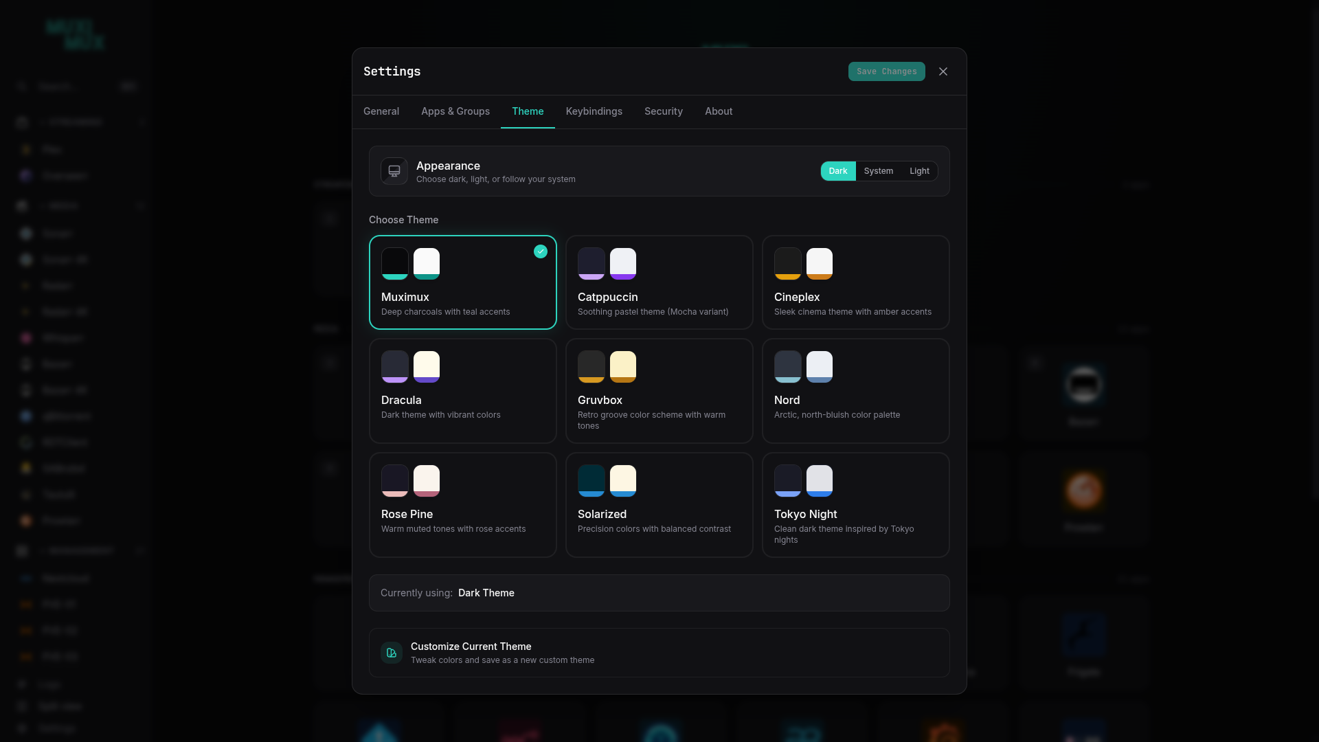
Here are a few examples of the available themes applied to the onboarding wizard:
| Muximux (Default) | Catppuccin | Dracula |
|---|---|---|
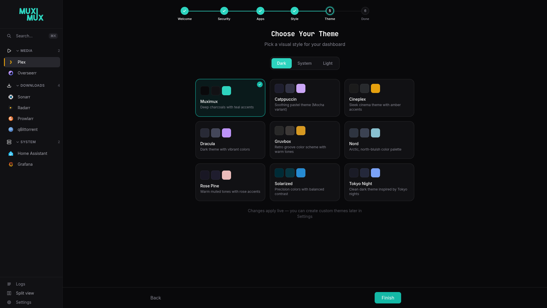 |
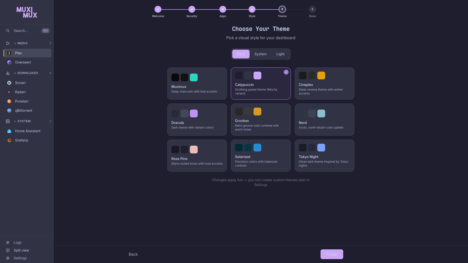 |
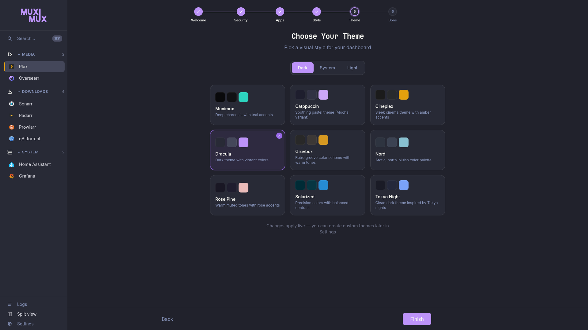 |
You can also select a theme during the onboarding wizard when setting up Muximux for the first time.
Custom Themes
You can create fully custom themes through the Settings panel:
- Open Settings > Appearance.
- Click "New Theme".
- Use the theme editor to customize colors, backgrounds, borders, and other visual properties.
- Save the theme.
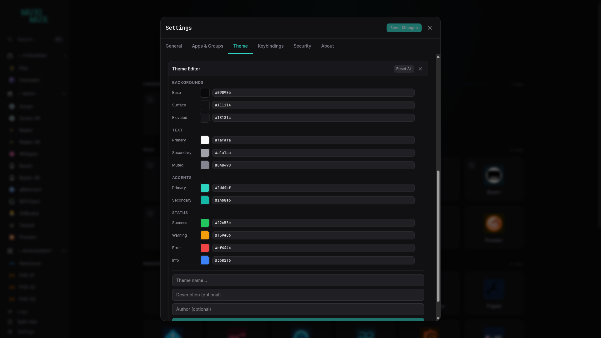
A custom theme name must not match a bundled theme's name; the save is refused.
Custom themes are stored as CSS files in the data/themes/ directory. When you create a theme, Muximux generates a CSS file that overrides the default CSS custom properties (variables) with your chosen values.
A theme file starts with a comment holding @theme-* metadata, followed by one rule scoped to the theme's ID. A file without any @theme-* line is not listed. A minimal hand-written light theme:
/**
 * @theme-name: Paper
 * @theme-is-dark: false
 */
[data-theme="paper"] {
  color-scheme: light;
  --bg-base: #fbfaf7;
  --text-primary: #1c1c1c;
  --accent-primary: #2563eb;
}
The ID in the selector is the file name without .css (data/themes/paper.css here). @theme-is-dark decides which way the derived status, accent and form-control colours go (see Status and accent tokens), so set it correctly for a light theme.
Theme CSS Variables
Themes control the visual appearance through CSS custom properties defined on :root. The key variable groups include:
- Background colors -- Page background, surface, elevated surface
- Text colors -- Primary, secondary, muted
- Accent/brand colors -- Used for highlights, active states, and interactive elements
- Border colors and radii -- Controls the look and roundness of UI elements
- Shadow definitions -- Drop shadows for depth and layering
- Navigation-specific colors -- Background, text, and active state colors for the navigation bar
You do not need to override every variable. Any variable you omit will fall back to the base theme's default.
Status and accent tokens
Status boxes, pills, inline messages, form control borders and the danger button read these variables. A theme may override any of them; omitted ones are derived from the theme's own --status-* and --accent-primary colours (see below).
| token | used for | derived when omitted |
|---|---|---|
--success-text, --success-bg, --success-border |
success notices and pills (text, translucent background, border) | --status-success mixed 40% / 12% (transparent) / 60% as described below |
--warning-text, --warning-bg, --warning-border |
warnings, "Unsaved changes", the discard prompt | the same recipe from --status-warning |
--danger-text, --danger-bg, --danger-border |
errors, failed saves, destructive hints | the same recipe from --status-error |
--info-text, --info-bg, --info-border |
informational pills | the same recipe from --status-info |
--danger-solid, --danger-solid-hover, --danger-on-solid |
the solid danger button fill, its hover fill and its text | --danger-border, that fill mixed 90% with the ink, #111111 on dark or #ffffff on light |
--accent-text |
the accent used as text: links, the active tab and the active navigation item | --accent-primary mixed 51% with the ink |
--accent-on-primary |
text on an accent-filled button | #ffffff or #000000, whichever reads better on --accent-primary (worked out at runtime, see below) |
--border-focus |
the keyboard focus outline on every control | --accent-primary |
--border-input |
the boundary of form controls: inputs, selects, textareas, checkboxes and the locale picker | the ink at 50% over transparent |
Every bundled theme defines the status and accent tokens with values that meet WCAG 2.1 AA on that theme's surfaces: 4.5:1 for text, 3:1 for borders and the focus outline. --border-input meets 3:1 on the base, surface, elevated and overlay backgrounds, so a form control stays visible wherever it sits. Card and divider borders (--border-subtle, --border-default, --border-strong) are unchanged.
A custom theme that omits the tokens gets values derived from its --status-* and --accent-primary colours. The "ink" is white on a dark theme and black on a light one: text uses 40% of the status colour mixed with the ink, borders use 60%, and backgrounds are a 12% tint of the status colour. These pass AA for every bundled palette. Which way to go comes from the theme's @theme-is-dark header, which the app turns into a data-color-scheme attribute on the root element; set @theme-is-dark: false for a light theme (a theme without the @theme-is-dark line counts as dark). If you set the tokens yourself, aim for the same ratios. The themeContrast test in web/src/lib/themeContrast.test.ts is strict (no list of known failures) and checks every bundled theme and the derived fallback; it is the reference implementation. web/src/lib/builtCss.test.ts guards the compiled CSS against light-dark(), which the build would turn into a form that ignores the theme's scheme.
For contrast, bundled themes were adjusted: muted and secondary text is slightly lighter on the dark themes and darker on the light ones (Solarized Light and Tokyo Night Light also darken their primary text), the elevated and overlay surfaces of Catppuccin, Cineplex Dark, Gruvbox, Nord and Solarized Dark are a step darker, buttons on most themes use dark text on the accent, and the focus outline of Cineplex Light, Gruvbox Light, Solarized Light and Tokyo Night Light uses the text-safe accent. Accent and status base colours are unchanged.
For --accent-on-primary, use #ffffff or #000000, whichever has the higher contrast on your accent (one of the two always reaches at least 4.5:1). When you save a custom theme, the theme editor works this out from your accent colour (a translucent accent is judged over --bg-base) and writes it for you. If a theme file omits --accent-on-primary, Muximux derives it at runtime from the theme's --accent-primary (over --bg-base when the accent is translucent) and picks white or black accordingly; a theme that defines the token is never overridden. The primary button and the floating navigation button keep their --accent-primary fill on hover and signal it with a glow and shadow (--shadow-glow) instead of switching to --accent-secondary.
The --color-brand-* palette is no longer used by the interface and is kept only for older theme files.
Focus, motion and screen readers
- Focus. Every focusable element shows the same outline in
--border-focuswhile it has keyboard focus. A field with an error keeps its danger border while focused. - Dialogs. Settings and every other dialog keep Tab and Shift+Tab inside them, make the page behind them inert, and return focus to the control that opened them; Escape closes the topmost dialog. See Keyboard Shortcuts > Keyboard navigation.
- Links and toasts. Links in running text are underlined, so they do not rely on colour. Toasts use the theme's surface and status tokens instead of always being dark.
- Reduced motion. When your operating system asks for reduced motion, transitions collapse, spinners slow down and pulses stop.
- Health indicator. Each status has its own shape (circle, diamond or ring) so it does not rely on colour alone. The indicator has an accessible name and a tooltip that opens with the keyboard. The "Check now" action in that tooltip is mouse-only for now.
- Screen readers. Errors are announced as alerts and confirmations as status messages. The onboarding wizard announces each step change, and the log level filters report whether they are on or off. Form controls and icon-only buttons have names, and per-row actions name their item or position.
Importing and Exporting Themes
Themes are plain CSS files, which makes sharing straightforward:
- Import: Copy a
.csstheme file into thedata/themes/directory. It will appear in Settings automatically on the next page load. - Export/Share: Copy a theme file from
data/themes/and share it with others or transfer it to another Muximux installation. - Manual editing: You can open any theme CSS file in a text editor for fine-grained control over individual variables.
Deleting Custom Themes
To delete a custom theme:
- Open Settings > Appearance.
- Find the custom theme card.
- Click the delete button on the theme card.
If the deleted theme was active, Muximux will revert to the default dark theme. Built-in themes cannot be deleted.