生成样本数据 - leftrk/dotfile GitHub Wiki
sklearn自带数据
load_bostion波士顿房价,回归load_irisiris,分类load_diabetes糖尿病,回归load_digits手写字符集,分类load_linnerud多元回归
波士顿房价数据,回归使用。样本数据集的特征默认是一个(506, 13)大小的矩阵,样本值是一个包含506个数值的向量。
from sklearn.datasets import load_boston
from sklearn import linear_model

boston = load_boston()
data = boston.data
target = boston.target

print(data.shape)
print(target.shape)
(506, 13)
(506,)
iris花卉数据,分类使用。样本数据集的特征默认是一个(150, 4)大小的矩阵,样本值是一个包含150个类标号的向量,包含三种分类标号。
from sklearn.datasets import load_iris
from sklearn import svm

iris = load_iris()
data = iris.data
target = iris.target

print(data.shape)
print(target.shape)

print('svm模型:\n', svm.SVC().fit(data, target))
(150, 4)
(150,)
svm模型:
 SVC(C=1.0, cache_size=200, class_weight=None, coef0=0.0,
  decision_function_shape='ovr', degree=3, gamma='auto_deprecated',
  kernel='rbf', max_iter=-1, probability=False, random_state=None,
  shrinking=True, tol=0.001, verbose=False)


C:\Users\GuanHua\Anaconda3\envs\jupyter36\lib\site-packages\sklearn\svm\base.py:196: FutureWarning: The default value of gamma will change from 'auto' to 'scale' in version 0.22 to account better for unscaled features. Set gamma explicitly to 'auto' or 'scale' to avoid this warning.
  "avoid this warning.", FutureWarning)
糖尿病数据集,回归使用。样本数据集的特征默认是一个(442, 10)大小的矩阵,样本值是一个包含442个数值的向量。
from sklearn.datasets import load_diabetes
from sklearn import linear_model

diabetes = load_diabetes()
data = diabetes.data
target = diabetes.target

print(data.shape)
print(target.shape)

print('系数矩阵:\n', linear_model.LinearRegression().fit(data, target).coef_)
(442, 10)
(442,)
系数矩阵:
 [ -10.01219782 -239.81908937  519.83978679  324.39042769 -792.18416163
  476.74583782  101.04457032  177.06417623  751.27932109   67.62538639]
手写体数据,分类使用。每个手写体数据使用8*8的矩阵存放。样本数据为(1797, 64)大小的数据集。
from sklearn.datasets import load_digits
import matplotlib.pyplot as plt

digits = load_digits()
data = digits.data
print(data.shape)
plt.matshow(digits.images[3])
plt.show()
(1797, 64)
linnerud数据集,多元回归使用。样本数据集的特征默认是一个(20, 3)大小的矩阵,样本值也是(20, 3)大小的矩阵。也就是3种特征,有3个输出结果,所以系数矩阵w为(3, 3)
from sklearn.datasets import load_linnerud
from sklearn import linear_model

linerud = load_linnerud()
data = linerud.data
target = linerud.target

print(data.shape)
print(target.shape)

print('系数矩阵:\n', linear_model.LinearRegression().fit(data, target).coef_)
(20, 3)
(20, 3)
系数矩阵:
 [[-0.47502636 -0.21771647  0.09308837]
 [-0.13687023 -0.04033662  0.0279736 ]
 [ 0.00107079  0.04202941 -0.02946117]]
加载样本图案
from sklearn.datasets import load_sample_image
import matplotlib.pyplot as plt        # 画图工具

# TODO
# img=load_sample_image('flower.jpg')    # 加载sk自带的花朵图案
plt.imshow(img)
plt.show()
生成自定义分类数据
import sklearn
sklearn.datasets.make_classification(
    n_samples=100,
    n_features=20,          # 特征个数= n_informative + n_redundant + n_repeated
    n_informative=2,        # 多信息特征的个数
    n_redundant=2,          # 冗余信息,informative特征的随机线性组合
    n_repeated=0,           # 重复信息,随机提取n_informative和n_redundant 特征
    n_classes=2,            # 分类类别
    n_clusters_per_class=2, # 某一个类别是由几个cluster构成的
    weights=None,
    flip_y=0.01,
    class_sep=1.0,
    hypercube=True,
    shift=0.0,
    scale=1.0,
    shuffle=True,
    random_state=None)
(array([[ 1.8461504 ,  0.03848572,  0.25433879, ..., -0.59014239,
         -0.40341559,  0.01772495],
        [-0.59626679,  0.83538253, -0.21912058, ..., -0.94875914,
          1.29788683, -1.11817539],
        [ 0.28195654, -0.76670458,  0.4885209 , ..., -1.05231624,
         -0.67534132,  0.43679042],
        ...,
        [ 0.82769899, -1.29624424, -0.49990061, ...,  0.93614529,
         -0.03219093, -1.25128875],
        [-0.56530543,  1.41014299, -0.94493333, ..., -0.02995261,
         -0.91282777, -0.12096302],
        [-0.53586744,  0.96594646, -0.8230071 , ..., -0.54264436,
          2.35359895,  0.46968258]]),
 array([1, 1, 0, 1, 0, 0, 0, 0, 1, 0, 0, 1, 0, 1, 0, 0, 1, 0, 1, 0, 1, 1,
        0, 1, 1, 1, 1, 1, 0, 0, 0, 1, 1, 0, 1, 1, 1, 0, 1, 1, 1, 0, 1, 0,
        1, 0, 0, 1, 1, 1, 0, 0, 0, 1, 0, 1, 0, 1, 0, 1, 0, 1, 1, 1, 0, 1,
        1, 1, 0, 1, 0, 0, 0, 0, 1, 1, 0, 0, 1, 0, 0, 0, 1, 0, 0, 1, 0, 0,
        0, 1, 0, 1, 1, 0, 1, 0, 0, 0, 1, 1]))
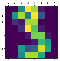
from sklearn import datasets
import matplotlib.pyplot as plt

data, target = datasets.make_classification(
    n_samples=100,
    n_features=2,
    n_informative=2,
    n_redundant=0,
    n_repeated=0,
    n_classes=2,
    n_clusters_per_class=1)

print(data.shape)
print(target.shape)

plt.scatter(data[:, 0], data[:, 1], c=target)
plt.show()
(100, 2)
(100,)
其他生成分类样本的函数
make_blobs函数会根据用户指定的特征数量、中心点数量、范围等来生成几类数据,这些数据可用于测试聚类算法的效果。
sklearn.datasets.make_blobs(
    n_samples=2,   # n_samples是待生成的样本的总数。
    n_features=2,    # n_features是每个样本的特征数。
    centers=None,    # centers表示类别数
    cluster_std=1.0, # cluster_std表示每个类别的方差,例如我们希望生成2类数据,其中一类比另一类具有更大的方差,可以将cluster_std设置为[1.0,3.0]
    center_box=(-10.0, 10.0),
    shuffle=True,
    random_state=None)
(array([[ 5.81423857, -7.92616015],
        [ 0.80072402,  9.44693509]]), array([0, 1]))
n_samples是待生成的样本的总数。n_features是每个样本的特征数。centers表示类别数。cluster_std表示每个类别的方差,例如我们希望生成2类数据,其中一类比另一类具有更大的方差,可以将cluster_std设置为$[1.0,3.0]$。
sklearn.datasets.make_gaussian_quantiles(
    mean=None,
    cov=1.0,
    n_samples=10,
    n_features=2,
    n_classes=3,
    shuffle=True,
    random_state=None)
(array([[-0.9458994 , -0.13019411],
        [-1.76713334,  0.67008263],
        [-2.29210678, -0.18234667],
        [-1.13228033,  0.46473215],
        [-0.74482651,  0.53492138],
        [ 0.22163954,  0.90450951],
        [ 1.94396304, -1.92662044],
        [-1.19356192, -0.53676911],
        [ 0.18841147, -0.71994545],
        [-0.42131631, -0.13509863]]), array([1, 2, 2, 1, 0, 1, 2, 2, 0, 0]))
make_gaussian_quantiles函数利用高斯分位点区分不同数据
sklearn.datasets.make_hastie_10_2(n_samples=2, random_state=None)
(array([[-7.54429587e-01,  5.91454448e-01, -1.53131929e-01,
          2.69649567e+00, -1.39215258e+00,  7.86168827e-01,
         -1.50339899e+00,  7.80839140e-01, -1.16048806e+00,
          1.99973464e-01],
        [ 7.96165141e-01,  1.11454999e-01,  2.00137127e-01,
          1.06070426e+00,  5.67945734e-04, -1.34371997e+00,
          4.13264922e-01, -2.13907337e+00, -2.73247852e-02,
          2.88027117e-01]]), array([ 1., -1.]))
make_hastie_10_2函数利用Hastie算法,生成2分类数据
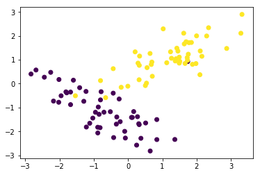
下面我们通过代码的比较一下这些样本数据的生成
import matplotlib.pyplot as plt
from sklearn.datasets import make_classification
from sklearn.datasets import make_blobs
from sklearn.datasets import make_gaussian_quantiles
from sklearn.datasets import make_hastie_10_2

plt.figure(figsize=(10, 10))
plt.subplots_adjust(bottom=.05, top=.9, left=.05, right=.95)

plt.subplot(421)
plt.title("One informative feature, one cluster per class", fontsize='small')
X1, Y1 = make_classification(
    n_samples=1000,
    n_features=2,
    n_redundant=0,
    n_informative=1,
    n_clusters_per_class=1)
plt.scatter(X1[:, 0], X1[:, 1], marker='o', c=Y1)

plt.subplot(422)
plt.title("Two informative features, one cluster per class", fontsize='small')
X1, Y1 = make_classification(
    n_samples=1000,
    n_features=2,
    n_redundant=0,
    n_informative=2,
    n_clusters_per_class=1)
plt.scatter(X1[:, 0], X1[:, 1], marker='o', c=Y1)

plt.subplot(423)
plt.title("Two informative features, two clusters per class", fontsize='small')
X2, Y2 = make_classification(
    n_samples=1000, n_features=2, n_redundant=0, n_informative=2)
plt.scatter(X2[:, 0], X2[:, 1], marker='o', c=Y2)

plt.subplot(424)
plt.title(
    "Multi-class, two informative features, one cluster", fontsize='small')
X1, Y1 = make_classification(
    n_samples=1000,
    n_features=2,
    n_redundant=0,
    n_informative=2,
    n_clusters_per_class=1,
    n_classes=3)
plt.scatter(X1[:, 0], X1[:, 1], marker='o', c=Y1)

plt.subplot(425)
plt.title("Three blobs", fontsize='small')
# 1000个样本,2个属性,3种类别,方差分别为1.0,3.0,2.0
X1, Y1 = make_blobs(
    n_samples=1000, n_features=2, centers=3, cluster_std=[1.0, 3.0, 2.0])
plt.scatter(X1[:, 0], X1[:, 1], marker='o', c=Y1)

plt.subplot(426)
plt.title("Gaussian divided into four quantiles", fontsize='small')
X1, Y1 = make_gaussian_quantiles(n_samples=1000, n_features=2, n_classes=4)
plt.scatter(X1[:, 0], X1[:, 1], marker='o', c=Y1)

plt.subplot(427)
plt.title("hastie data ", fontsize='small')
X1, Y1 = make_hastie_10_2(n_samples=1000)
plt.scatter(X1[:, 0], X1[:, 1], marker='o', c=Y1)
plt.show()
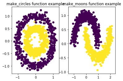
自定义生成圆形和月牙形分类数据
sklearn.datasets.make_circles(
    n_samples=2,
    shuffle=True,
    noise=None,
    random_state=None,
    factor=0.8)
(array([[0.8, 0. ],
        [1. , 0. ]]), array([1, 0], dtype=int64))
生成环形数据
factor :外圈与内圈的尺度因子<1
sklearn.datasets.make_moons(
    n_samples=2,
    shuffle=True,
    noise=None,
    random_state=None)
(array([[1. , 0. ],
        [0. , 0.5]]), array([0, 1], dtype=int64))
生成半环形图
from sklearn.datasets import make_circles
from sklearn.datasets import make_moons
import matplotlib.pyplot as plt

fig = plt.figure(1)
x1, y1 = make_circles(n_samples=1000, factor=0.5, noise=0.1)
plt.subplot(121)
plt.title('make_circles function example')
plt.scatter(x1[:, 0], x1[:, 1], marker='o', c=y1)

plt.subplot(122)
x1, y1 = make_moons(n_samples=1000, noise=0.1)
plt.title('make_moons function example')
plt.scatter(x1[:, 0], x1[:, 1], marker='o', c=y1)
plt.show()
自定义生成回归样本
from sklearn.datasets import make_regression