Strapi Component Elasticchart - kwantu/platformconfiguration GitHub Wiki
1. Elastic Charts
1.1 What are Elastic Charts?
An Elastic Chart component renders a chart from Betterdata. This component builds a query in elastic based on the users inputs to the fields. The component will then run that query in elastic to get the data required to populate the chart.
1.2 Setup in Betterdata
The benefit of the elastic chart is that we no longer need to create a report to pull the data from. This means the setup is simpler. There are currently 3 different types of charts Pie, Bar and Mix-line-bar. The structure of the widget changes depending which of these you pick.
1.2.1 Basic fields
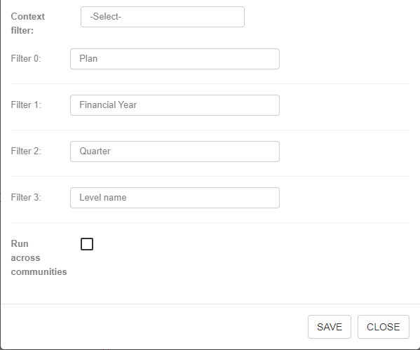
Regardless of what chart type you choose the following fields will be the same.
Chart Example 1

| Field | Description | Required? |
|---|---|---|
| Node ID | Unique Identifier for the node (randomly generated) | Yes |
| Box title | Title for the box the chart will be inside, this title only shows when you hover over the box with a mouse | Yes |
| Widget | All dashboard nodes require you to pick a widget. For this case select Elastic Chart | Yes |
| SDO | This is where you select your data object that will be used as the data source | Yes |
| Chart type | This is where you select the type of chart you want to render. The following fields will change depending on your choice. The current chart types available are: Pie, Bar and Mix-line-bar | yes |
| Context filter | This defines the context of the data. Currently this only works for Strapi. The case for this is where you want the chart to be filtered on a specific field. For example: filtering on a specific District. | No |
| filter | Here select which fields correspond to which filters you have defined | No |
| Run across communities | If the community this dashboard is on has child communities and you would like to pull data from all communities then tick this | No |
1.2.2.1 Pie Chart
This chart type renders a pie chart. There are 2 ways of using this chart.
Scenario 1
You can use this chart to use data from multiple fields or just one field. You may want to use multiple fields for example: Incoming and Outgoing. For this user story a client may want to see a pie chart that shows the total flow of cash incoming and outgoing across all of their businesses. To achieve this we can input the Field as "incoming,outgoing" and use the function Sum.
Scenario 2
For an example where there is just one field used then imagine a client wants to have a count of how many of his businesses he has in each province. To achieve this we can set the Group By to be province, the Field to businessName and finally the Function to Distinct Count.
Pie Chart Example 1

| Field | Description | Required? |
|---|---|---|
| Template | This is a textbox containing the code that will define the template of the chart you are using. It will default to a basic template but can be edited if you know what is required. | Yes |
| Group By | This is where you can define whether the query used in elastic will group the data by a certain field. Currently we are limited to 2 options. | No |
| Field | This defines which fields from the data source will be selected in the query. | Yes |
| Label | This defines what labels to use for the above fields. | Yes |
| Function | This defines what aggregate function will be applied to the above fields. Currently the choices are: Sum, Average, Count, Distinct Count | Yes |
| Chart Library | This defines which chart library you want to draw from. Older charts tend to use Vega charts but more recently we use eCharts | Yes |
1.2.2.2 Gaps in pie charts
- Can we provide labels that are not dynamically set by fields in elastic?
- Can we provide percentages upon mouse-over of a segment in the chart?
1.2.3.1 Bar charts
This chart type renders a bar.
Bar Chart Example 1

| Field | Description | Required? |
|---|---|---|
| Template | This is a textbox containing the code that will define the template of the chart you are using. It will default to a basic template but can be edited if you know what is required. | Yes |
| X axis | ... Not sure on purpose | Yes |
| Y axis | ... Not sure on purpose | Yes |
| Group By | This is where you can define whether the query used in elastic will group the data by a certain field. Currently we are limited to 2 options. | No |
| Field | This defines which fields from the data source will be selected in the query. | Yes |
| Label | This defines what labels to use for the above fields. | Yes |
| Function | This defines what aggregate function will be applied to the above fields. Currently the choices are: Sum, Average, Count, Distinct Count | Yes |
| Chart Library | This defines which chart library you want to draw from. Older charts tend to use Vega charts but more recently we use eCharts | Yes |
1.2.4.2 Gaps in bar charts
- What is the purpose of the X axis, Y axis, Field, Label
- Can we create stacked and grouped bar charts?
1.2.3.1 Mix-line-bar charts
This chart type renders a Mix-line-bar.
Line-Bar Chart Example 1
| Field | Description | Required? |
|---|---|---|
| Template | This is a textbox containing the code that will define the template of the chart you are using. It will default to a basic template but can be edited if you know what is required. | Yes |
| X axis | ... Not sure on purpose | Yes |
| Y axis | ... Not sure on purpose | Yes |
| Y1 axis | ... Not sure on purpose | Yes |
| Group By | This is where you can define whether the query used in elastic will group the data by a certain field. Currently we are limited to 2 options. | No |
| Field | This defines which fields from the data source will be selected in the query. | Yes |
| Label | This defines what labels to use for the above fields. | Yes |
| Function | This defines what aggregate function will be applied to the above fields. Currently the choices are: Sum, Average, Count, Distinct Count | Yes |
| Chart Library | This defines which chart library you want to draw from. Older charts tend to use Vega charts but more recently we use eCharts | Yes |
1.2.4.2 Gaps in Mix-line-bar charts
- What is the purpose of the X axis, Y axis, Y1 axis, Field, Label
1.3 Overall Gaps
- Does the context filter work in BetterData?
- Can we have a chart that is hard-coded to be pre-filtered. Similar to how the context filter works in strapi. For this we cannot use the filter option as we only want the filter to effect the specific chart and no other dashboard widgets.