Data Viz - konradmayer/knowledge-base GitHub Wiki
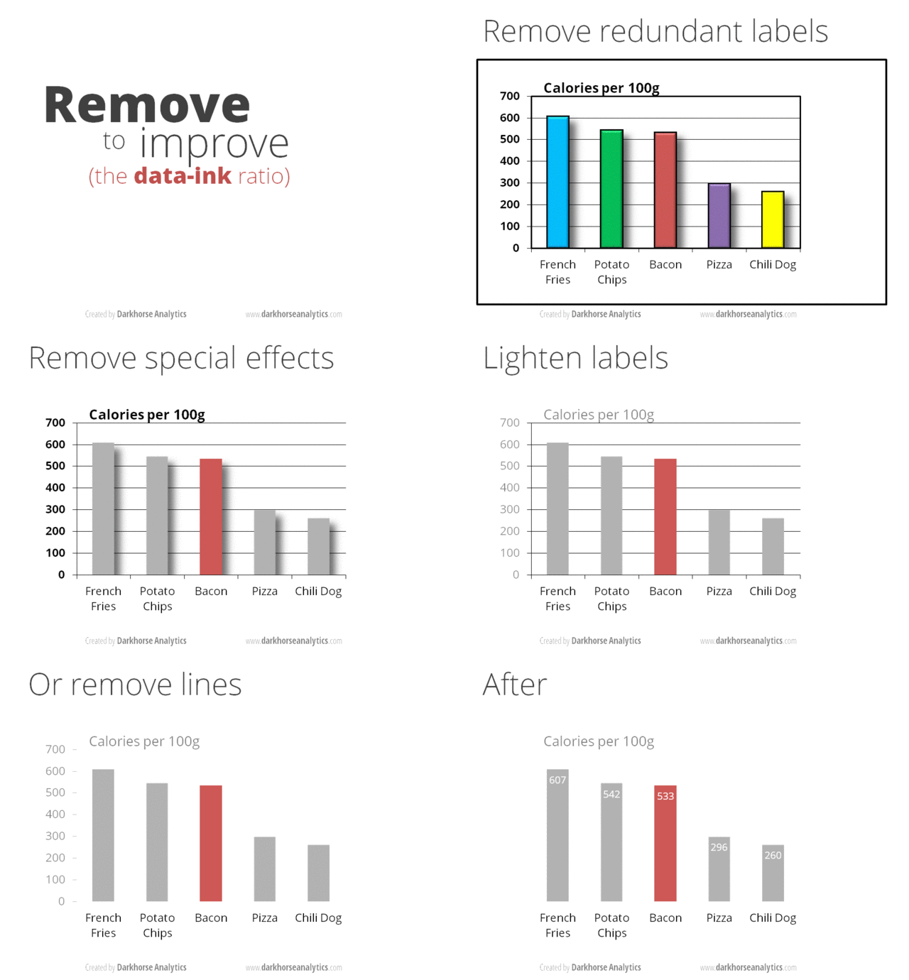
Data to ink ratio - less is more
Awesome animations from: https://www.darkhorseanalytics.com/blog/data-looks-better-naked


However, while "less is more" is generally a good advice, some wisely used visual enhancements can also have advantages over minimalist approaches: e.g. see this paper (http://dx.doi.org/10.1145/1753326.1753716)
Great ressources
Tools
Open source or free:
- R (base graphics, lattice and ggplot)
- https://www.datawrapper.de/ (they also offer a free plan)
- https://inkscape.org/ (open source equivalent to Adobe Illustrator)
- https://draw.io/
Proprietary:
- https://biorender.com/ (offer also a free plan - but you aren't allowed to publish in journals with it)
- https://chemix.org/ (offer also a free plan - but you aren't allowed to publish in journals with it)
- https://www.tableau.com/community/academic (free for students and teaching)