Journal Entry Week 11 20221107 - klmartinez/DSF GitHub Wiki
DSF Journal Club: Interactive data visualization based on conventional statistical findings for antihypertensive prescriptions using National Health Insurance claims data
DSF Weekly Challenge:
The challenge is the following: With the data visualization of your choosing, please write about each of the below items in your log for this week...
- Who is the intended and unintended audience?
This data visualization was posted on the subreddit "r/dataisbeautiful" which is intended for people who enjoy looking at data that "effectively convey information". Additionally, the platform Reddit generally attracts highly engaged users that trend toward the younger 18-35 demographic. - Who collected, processed, and visualized the data? Was this information easy to find?
The data was collected from the Centers for Disease Control and Prevention. The person who created this data visualization is listed under the Reddit username "jcceagle". By clicking on his Reddit profile page I found his linked Twitter account and then his LinkedIN page. It seems his name is James Eagle and he is an investment writer, among other professions. This information was relatively easy to find. - Why was the data collected, processed, and visualized? Was this information easy to find?\ They do not state why the data was collected, processed, and visualized. This figure is not given in the context of a journal article which would have hopefully provided this information.
- How was the data collected, processed, and visualized? Was this information easy to find?\ They only state that he used Javascript and Adobe After Effects, which was linked to an underlying json file. He doesn't provide further methodology.
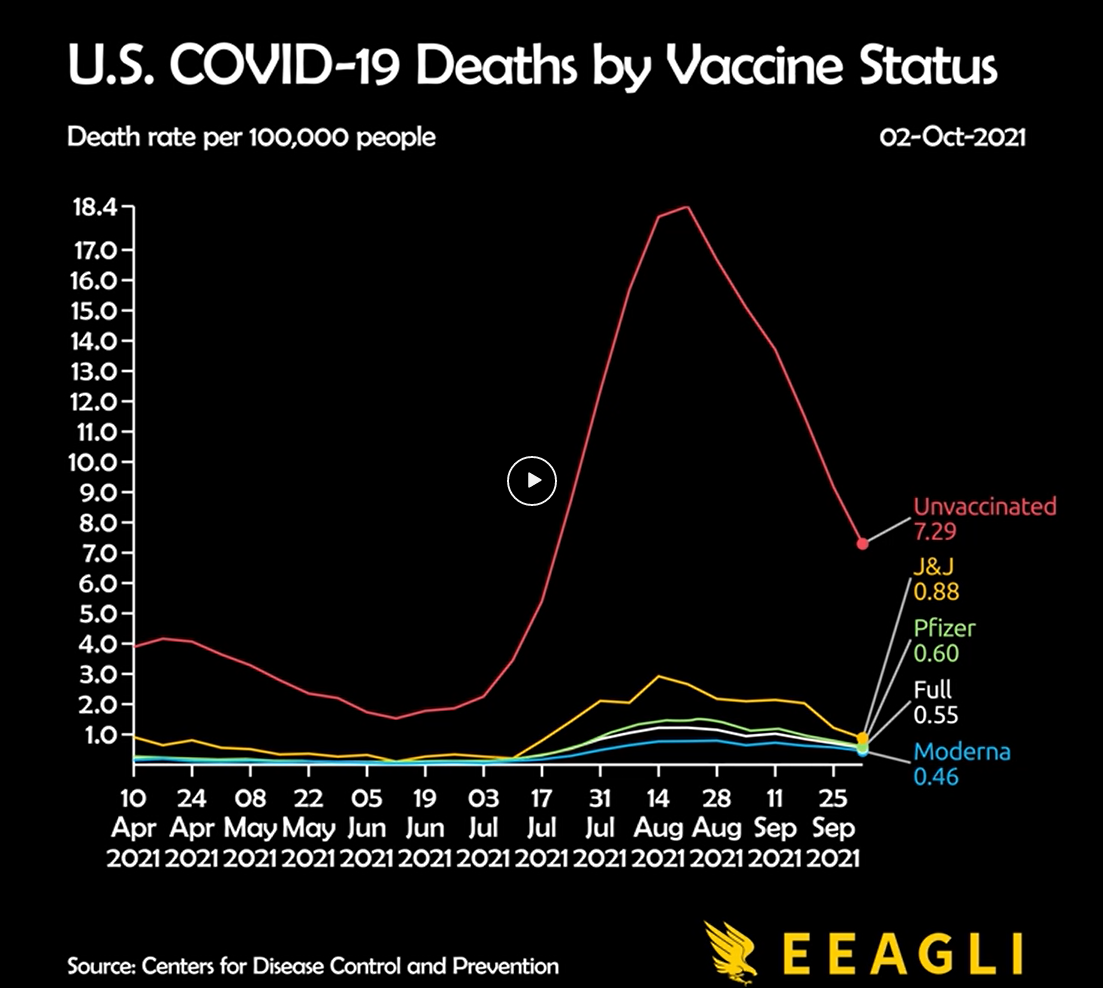
- What is the focus? What is being left out?\ The focus is the rate of U.S. COVID-19 deaths (death rate per 100,000 people) by vaccine status (unvaccinated, J&J vaccine, Pfizer vaccine, Moderna vaccine, and "full"). It is stated that the "full" variable represents those that are fully vaccinated meaning they were given two doses of either Pfizer or Moderna, or one dose from J&J. However, the data shown is only for the months April 2021 to September 2021.
- What assumptions are being made?\ This data only shows a small period of time so I wonder if others would assume these trends are also the same for other time periods or across a larger time period.
- What tone is being set by the aesthetics of this visualization?\ The red coloring for the "Unvaccinated" values gives a negative tone to this vaccine status.
- What established worldviews does this visualization support or challenge?\ The way this was animated and focused on a small period of time highlights the huge jump in COVID-19 death rates for unvaccinated people. This reinforces the idea that unvaccinated individuals are more susceptible to COVID-19. However, I don't think this figure is misleading because this idea has support by scientific evidence.
- What is the effect of using political/social borders (county, state, ethnicity, gender) to group the data?\ I think if this visualization had chosen to also incorporate another variable such as political party this would have told an additional story and would have also most likely become a political statement.
- Does the visualization empower the audience?\ I think this figure empowers those that have been vaccinated by providing them comfort in that by taking the vaccines they are more protected.
- Have all steps been taken to increase benefit and reduce harm in producing and publishing this visualization?\ I'm not sure... I think to meet this criteria the full methodology for how this figure was created would need to be communicated.
The is original link for the animated data visualization I have chosen can be found here:U.S. COVID-19 Deaths by Vaccine Status. Below is a screenshot of this plot:
Useful links: