Fly.Dialog Reference - kitkatzecat/fly GitHub Wiki
This page serves as a reference for use of the Fly.Dialog.php file, which adds the FLY.DIALOG include.
This file adds only JavaScript methods for runtime use.
IMPORTANT NOTE: When using this include, make sure that the FLY.WINDOW (Fly.Window.php or Fly.Window.Background.php) include is loaded first!
This file has the following Fly include dependencies:
- FLY.CORE
- FLY.WINDOW
Fly.Dialog adds the object dialog to the standard JavaScript Fly object (Fly.dialog). This object has the following methods and properties:
base (object)
The base custom dialog properties. Not intended to be changed in most cases, but can be edited to streamline an application's code. Dialogs opened with custom will cascade over this object.
Default contents:
modal: true,
title: "Information",
message: "Information",
content: "Something happened",
sound: "error",
input: false,
checkbox: false,
icon: "%FLY.RESOURCE.URL.ICONS%info.svg",
buttons: [
	{
		align: "right",
		image: "%FLY.RESOURCE.URL.ICONS%mark-o.svg",
		default: true,
		onclick: function() {},
		text: ""
	}
]
(See Fly Variables Reference for more information on what %-variables represent)
custom (method)
The custom dialog creator. This method takes an object and opens a dialog based on the object's specifications.
images/Fly.Dialog.custom_454.png
This method takes the following arguments:
attributes (object)
Attributes of the dialog to be opened. May contain these properties:
modal- true/false, whether or not the dialog should take focus of the parent windowtitle- string, title to be displayed in the dialog's title bar- Will display beside application name, so "Information" from the application "Fly Help" will display as "Fly Help - Information"
message- string, the heading to be displayed in the message boxcontent- string/HTML content, the content text to be displayed in the message box- If left blank, will not leave a space in the dialog
- May contain HTML content, but is not recommended (use at your own risk!)
sound- system sound string/false, the sound to play when the dialog is opened or not if false or not present- System sound options include:
error- used when information is being given to the user (not necessarily an error)question- used when information is expected from the useralert- used to get the user's attention (not usually used for dialog boxes, mostly when flashing windows)password- used when the user's password is expected
- System sound options include:
input- object/array/false, the properties of the input to be taken from the user or not if false- If false, will not leave a space in the dialog
- Otherwise, this property can be an object (for a single input) or an array of objects (for multiple inputs)
- If an array of multiple inputs is specified, inputs will be displayed in the order they appear in the array
- Object (standalone or as part of an array) contains the following properties (all optional):
type- input type string, the type of input to get from the user (acceptstext(default),date,time,password,number,select,checkbox, orlist)value- string/bool, the value for the input to have when opened (user editable) (must work withtypeto be displayed)- Not used for
selectorlisttypes - For
checkboxtype, determines if box is checked
- Not used for
placeholder- string, the value to be shown in the input when blank (disappears when user edits) (not compatible with sometypes)- Not used for
selectorlisttypes - For
checkboxtype, displays as text next to checkbox
- Not used for
heading- string, a heading to be displayed above the inputvalidate- string/regexp, the regular expression to validate the input against- Input will only be validated if the button being clicked has the
validateproperty set to true (includingdefaultbuttons) - Not used for
select,checkbox, orlisttypes
- Input will only be validated if the button being clicked has the
validateMessage- string, the message to be displayed below the input box along with an audio/visual cue if the input is invalid- Defaults to "Invalid input"
- Only used if the
validateproperty is set
options- array, options to be displayed if input type isselectorlist- Attributes for each option:
text- string (/HTML content only forlist), the text to be displayed to the user for the optionvalue- string, the value to be returned if this option is selectedicon(only forlist) - URL to icon/string, the icon to be displayed next to the option's textselected- true/false, whether or not this option is the default option- If no options have this property true, the first option will be selected
- If multiple options have this property true, the last one with the true value will be selected
disabled- true/false, whether or not this option is disabledheader(only forlist) - true/false, must be set to false for option to be a selectable option
- Only used for
selectorlisttype - Attributes for headers: (only for
list)header- true/false, this must be set to true for the option to be a headertext- string/HTML content, the content to be displayed to the user for the header
- Attributes for each option:
checkbox- object/false, the properties of a checkbox to be displayed at the bottom of the dialog or not if false- If false, nothing is changed in dialog
- If not false, a checkbox with a string of text next to it is displayed below the dialog content either beside or above the buttons (depending on space) and is and object with the following properties (all optional):
text- string, the text to be displayed next to the checkboxchecked- true/false, whether or not the checkbox is checked when the dialog is opened
icon- URL to icon/string, the icon to be displayed next to the heading in the dialog- If blank or not present, will not leave a space in the dialog
buttons- array, buttons to be displayed at the bottom of the dialog window- At least one button is necessary to allow your user to close the dialog, and at most 3 buttons will fit on a standard size dialog
- Each element of the array is an object with the following properties (all optional, but you probably shouldn't):
text- string, the text to be displayed on the button (Fly prefers icon-centric design, see next bullet)image- URL to icon/string, the image to be displayed on the button- Fly design is based on an icon-centric design for buttons, meaning that buttons' actions are represented as icons whenever possible; therefore, most buttons in dialogs will use only images
onclick- function, the function to be executed when the button is clicked- If an
inputis specified, the value of the input is passed as the first argument to this function- If multiple inputs are specified, this argument will be an array of all input values in the order the inputs were originally specified
- If a
checkboxis specified, the value (true/false) of the checkbox is passed as the second argument to this function - If one of these is specified and the other is not, unused
inputwill pass as an empty string and unusedcheckboxwill always pass as false
- If an
default- true/false, if this button is the one to be activated if the user uses an alternative method of closing the dialog (such as pressing the Enter key)- If more than one button is specified as
default, the last one specified asdefaultin thebuttonarray will be the default
- If more than one button is specified as
align- string "right" or "left", the side of the window to align the button to- This property is not currently used, and all buttons align to the right
validate- true/false, whether or not to validate the input before closing the dialog when this button is clicked- Only used if the
inputproperty and thevalidateproperty of theinputare set
- Only used if the
All properties are optional for attributes (but that would make a pretty generic dialog!) since it is cascaded into the base dialog object. Attributes specified in attributes will overwrite the defaults in base when cascading (for the current dialog).
Example call:
Fly.dialog.custom({
	title: "Hello World",
	message: "Hello World!",
	content: "Hello again, world!"
});
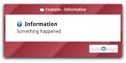
message (method)
A dialog template that creates a simple modal message dialog. This method takes an object (simpler than custom's) and creates a dialog.
images/Fly.Dialog.message_454.png
This method takes the following arguments:
properties (object)
The properties of the message dialog to be opened. A simplified version of Fly.dialog.custom's attributes object that assumes some values for ease of programming. May contain these properties:
title- string, title to be displayed in the dialog's title bar- Will display beside application name, so "Information" from the application "Fly Help" will display as "Fly Help - Information"
- Defaults to "Information"
message- string, the heading to be displayed in the message box- Defaults to "Information"
content- string/HTML content, the content text to be displayed in the message box- Defaults to "Something happened." (please don't show this to a user! that's the least helpful error ever)
icon- URL to icon/string, the icon to be displayed next to the heading in the dialog- Defaults to
%FLY.RESOURCE.URL.ICONS%info.svg
- Defaults to
callback- function, the function that is called when the user closes the dialog- Defaults to
function() {}
- Defaults to
What's assumed:
modalis truesoundis "error" (which is also used for general information popups)inputis falsebuttonshas one button showing the O symbol to close the dialog
attributes passed to custom:
modal: true,
title: properties.title,
message: properties.message,
content: properties.content,
sound: "error",
input: false,
icon: properties.icon,
buttons: [
	{
		align: "right",
		image: "%FLY.RESOURCE.URL.ICONS%mark-o.svg",
		default: true,
		onclick: properties.callback,
		text: ""
	}
]
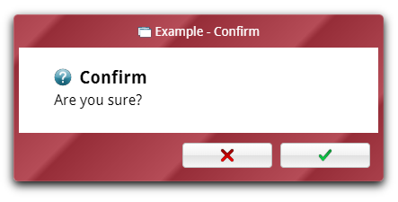
confirm (method)
A dialog template that creates a simple modal confirmation dialog. This method takes an object (simpler than custom's) and creates a dialog.
images/Fly.Dialog.confirm_454.png
This method takes the following arguments:
properties (object)
The properties of the message dialog to be opened. A simplified version of Fly.dialog.custom's attributes object that assumes some values for ease of programming. May contain these properties:
title- string, title to be displayed in the dialog's title bar- Will display beside application name, so "Information" from the application "Fly Help" will display as "Fly Help - Information"
- Defaults to "Confirm"
message- string, the heading to be displayed in the message box- Defaults to "Confirm"
content- string/HTML content, the content text to be displayed in the message box- Defaults to "Are you sure?"
icon- URL to icon/string, the icon to be displayed next to the heading in the dialog- Defaults to
%FLY.RESOURCE.URL.ICONS%question.svg
- Defaults to
callback- function, the function that is called when the user closes the dialog- When closed, the value of the user's choice (true or false) will be passed as the first argument
- Defaults to
function() {}
What's assumed:
modalis truesoundis "question"inputis falsebuttonshas two buttons: one showing the check symbol to close the dialog and confirm the question (passing true tocallback, and one showing the X symbol to close the dialog and deny the question (passing false tocallback)
attributes passed to custom:
modal: true,
title: properties.title,
message: properties.message,
content: properties.content,
sound: "question",
input: false,
icon: properties.icon,
buttons: [
	{
		align: "right",
		image: "%FLY.RESOURCE.URL.ICONS%mark-check.svg",
		default: true,
		onclick: function() {
			properties.callback(true);
		},
		text: ""
	},
	{
		align: "right",
		image: "%FLY.RESOURCE.URL.ICONS%mark-x.svg",
		onclick: function() {
			properties.callback(false);
		},
		text: ""
	}
]
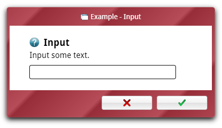
input (method)
A dialog template that creates a simple modal text input dialog. This method takes an object (simpler than custom's) and creates a dialog.
images/Fly.Dialog.input_454.png
This method takes the following arguments:
properties (object)
The properties of the message dialog to be opened. A simplified version of Fly.dialog.custom's attributes object that assumes some values for ease of programming. May contain these properties:
title- string, title to be displayed in the dialog's title bar- Will display beside application name, so "Information" from the application "Fly Help" will display as "Fly Help - Information"
- Defaults to "Input"
message- string, the heading to be displayed in the message box- Defaults to "Input"
content- string/HTML content, the content text to be displayed in the message box- Defaults to "Input some text."
icon- URL to icon/string, the icon to be displayed next to the heading in the dialog- Defaults to
%FLY.RESOURCE.URL.ICONS%question.svg
- Defaults to
callback- function, the function that is called when the user submits the input- Will not be called if user cancels input with X button (to make a more insistent dialog, see the
custommethod) - Defaults to
function() {} - When closed, the value of the input will be passed as the first argument to this function
- Will not be called if user cancels input with X button (to make a more insistent dialog, see the
placeholder- string, the value to be shown in the input when blank (disappears when user edits)value- string, the value for the input to have when opened (user editable)validate- string/regexp, the regular expression to validate the input againstvalidateMessage- string, the message to be displayed below the input box along with an audio/visual cue if the input is invalid- Defaults to "Invalid input"
- Only used if the
validateproperty is set
What's assumed:
modalis truesoundis "question" (which is used for general getting information from the user)inputis an object specifying thetypeas text andplaceholder,value,validate, andvalidateMessageto the values specified inpropertiesbuttonshas two buttons: one showing the check symbol to close the dialog and submit the input, and one showing the X symbol to close the dialog without submitting the input
attributes passed to custom:
modal: true,
title: properties.title,
message: properties.message,
content: properties.content,
sound: "question",
input: {
	type: "text",
	placeholder: properties.placeholder,
	value: properties.value
},
icon: properties.icon,
buttons: [
	{
		align: "right",
		image: "%FLY.RESOURCE.URL.ICONS%mark-check.svg",
		default: true,
		onclick: function(i) {
			properties.callback(i);
		}
	},
	{
		align: "right",
		image: "%FLY.RESOURCE.URL.ICONS%mark-x.svg"
	}
]
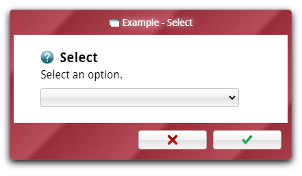
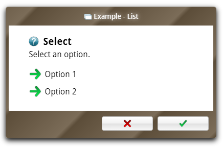
select (method)
A dialog template that creates a simple modal option select dialog. This method takes an object (simpler than custom's) and creates a dialog.
images/Fly.Dialog.select_466.png
This method takes the following arguments:
properties (object)
The properties of the message dialog to be opened. A simplified version of Fly.dialog.custom's attributes object that assumes some values for ease of programming. May contain these properties:
title- string, title to be displayed in the dialog's title bar- Will display beside application name, so "Information" from the application "Fly Help" will display as "Fly Help - Information"
- Defaults to "Select"
message- string, the heading to be displayed in the message box- Defaults to "Select"
content- string/HTML content, the content text to be displayed in the message box- Defaults to "Select an option."
icon- URL to icon/string, the icon to be displayed next to the heading in the dialog- Defaults to
%FLY.RESOURCE.URL.ICONS%question.svg
- Defaults to
callback- function, the function that is called when the user submits the input- Will not be called if user cancels input with X button (to make a more insistent dialog, see the
custommethod) - Defaults to
function() {} - When closed, the value of the input will be passed as the first argument to this function
- Will not be called if user cancels input with X button (to make a more insistent dialog, see the
options- array, options to be displayed- Attributes for each option:
text- string, the text to be displayed to the user for the optionvalue- string, the value to be returned if this option is selectedselected- true/false, whether or not this option is the default option- If no options have this property true, the first option will be selected
- If multiple options have this property true, the last one with the true value will be selected
disabled- true/false, whether or not this option is disabled
- Attributes for each option:
What's assumed:
modalis truesoundis "question" (which is used for general getting information from the user)inputis an object specifying thetypeas select andoptionsto the values specified inpropertiesbuttonshas two buttons: one showing the check symbol to close the dialog and submit the choice, and one showing the X symbol to close the dialog without submitting the input
attributes passed to custom:
modal: true,
title: properties.title,
message: properties.message,
content: properties.content,
sound: "question",
input: {
	type: "select",
	options: properties.options
},
icon: properties.icon,
buttons: [
	{
		align: "right",
		image: "%FLY.RESOURCE.URL.ICONS%mark-check.svg",
		default: true,
		onclick: function(i) {
			properties.callback(i);
		}
	},
	{
		align: "right",
		image: "%FLY.RESOURCE.URL.ICONS%mark-x.svg"
	}
]
list (method)
A dialog template that creates a rich modal option list selection dialog. The list dialog is similar to select, but with a richer view. This method takes an object (simpler than custom's) and creates a dialog.
images/Fly.Dialog.list_482.png
This method takes the following arguments:
properties (object)
The properties of the message dialog to be opened. A simplified version of Fly.dialog.custom's attributes object that assumes some values for ease of programming. May contain these properties:
title- string, title to be displayed in the dialog's title bar- Will display beside application name, so "Information" from the application "Fly Help" will display as "Fly Help - Information"
- Defaults to "List"
message- string, the heading to be displayed in the message box- Defaults to "Select"
content- string/HTML content, the content text to be displayed in the message box- Defaults to "Select an option."
icon- URL to icon/string, the icon to be displayed next to the heading in the dialog- Defaults to
%FLY.RESOURCE.URL.ICONS%question.svg
- Defaults to
callback- function, the function that is called when the user submits the input- Will not be called if user cancels input with X button (to make a more insistent dialog, see the
custommethod) - Defaults to
function() {} - When closed, the value of the input will be passed as the first argument to this function
- Will not be called if user cancels input with X button (to make a more insistent dialog, see the
options- array, options to be displayed- For a list dialog, there are two types of options that can be in this list: options and headers. Options are an option that is selectable by the user to allow the prompt to continue, and a header is used to group options together.
- Attributes for options:
text- string/HTML content, the content to be displayed to the user for the optionvalue- string, the value to be returned if this option is selectedicon- URL to icon/string, the icon to be displayed next to the option's textselected- true/false, whether or not this option is the default option- If no options have this property true, the first option will be selected
- If multiple options have this property true, the last one with the true value will be selected
disabled- true/false, whether or not this option is disabledheader- true/false, this must be set to false for the option to be a selectable option
- Attributes for headers:
header- true/false, this must be set to true for the option to be a headertext- string/HTML content, the content to be displayed to the user for the header
What's assumed:
modalis truesoundis "question" (which is used for general getting information from the user)inputis an object specifying thetypeas list andoptionsto the values specified inpropertiesbuttonshas two buttons: one showing the check symbol to close the dialog and submit the choice, and one showing the X symbol to close the dialog without submitting the input
attributes passed to custom:
modal: true,
title: properties.title,
message: properties.message,
content: properties.content,
sound: "question",
input: {
	type: "list",
	options: properties.options
},
icon: properties.icon,
buttons: [
	{
		align: "right",
		image: "%FLY.RESOURCE.URL.ICONS%mark-check.svg",
		default: true,
		validate: true,
		onclick: function(i) {
			properties.callback(i);
		}
	},
	{
		align: "right",
		validate: false,
		image: "%FLY.RESOURCE.URL.ICONS%mark-x.svg"
	}
]
For dialogs more versatile than the presets of message, confirm, input, select, or list, see the custom method.
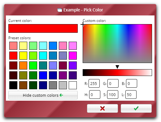
color (method)
A dialog type that asks the user for a color, returning the chosen color in RGB and HSL format. color uses a different style dialog than the other dialogs, so it is less customizable.
images/Fly.Dialog.color_454.png
This method takes the following arguments:
properties (object)
The properties of the color picker to be opened. May contain these properties:
title- string, title to be displayed in the dialog's title bar- Will display beside application name, so "Information" from the application "Fly Help" will display as "Fly Help - Information"
- Defaults to "Pick Color"
value- array[r,g,b](red, green, blue), the RGB color value the color picker has selected when opened (user editable)- Defaults to
[255,0,0](red)
- Defaults to
custom- true/false, whether or not to have custom color selection visible when dialog opens- Defaults to
false
- Defaults to
callback- function, the function that is called when the user closes the dialog- When closed, the value of the user's color choice will be passed as two arguments:
- argument 1: array(3)
[r,g,b](red, green, blue), - argument 2: array(3)
[h,s,l](hue, saturation, lightness),
- argument 1: array(3)
- or, if the user cancels,
falsewill be passed - Defaults to
function() {}
- When closed, the value of the user's color choice will be passed as two arguments:
Appearance
Color picker dialogs are always modal, have two buttons (confirm and cancel), and play no sound.