Fly Styling Conventions - kitkatzecat/fly GitHub Wiki
This article intends to serve as a reference for styling of text, applications, and more to be used when developing for Fly. These guidelines are designed to create a cohesive and consistent experience for the user while navigating through Fly.
This article is divided into sections relating to the following areas of Fly design:
Dialogs
A dialog box is a secondary box that is displayed to either get information from or give information to the user. Dialog boxes come in many different types (covered in the Fly.Dialog Reference), but all share common features for styling.
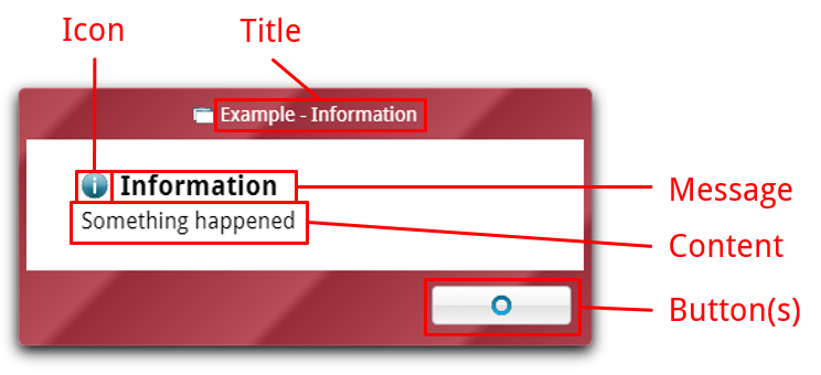
All dialog boxes consist of at least these main elements:
Title
The title of the window. In most cases, this is displayed in the dialog window's title bar and is alongside the application's name (e.g. Example - Dialog). The icon of the application that opened the dialog is shown next to the title.
- The title should use title case (e.g.
Get FileThis is The Title of the Dialog Box). - Punctuation should not be used in the title unless it is part of a user-specified string, such as a file name.
Message
The main message or question that the dialog box is delivering to the user. Ideally uses as few words as possible and is limited to one line; generally the first thing the user sees in the dialog.
- The message should use sentence case (e.g.
This is informationAre you sure?). - Punctuation should not be used in the message unless it is a question, in which case it should end with a question mark.
Icon
(Optional) An icon that gives the user a visual hint (and a bit of color among all the text) of what the dialog is about. Generally relates to the purpose of the message/content, not the application opening the dialog; that's what the icon in the title bar is for.
- Custom icons may be used, but for general use, the following are recommended:
- Information - images/icons/info.png
info.svg- Used with a general information dialog informing the user of something that does not affect their experience in any negative way.
- Warning - images/icons/warning.png
warning.svg- Usually used to warn the user about something that may impact their experience, but the application can continue to run anyway.
- Examples include an image being too large and causing an application to run slowly, but all functions still work; or the user viewing files that are critical to system operation and should only be modified by experienced users.
- Error - images/icons/error.png
error.svg- Used to tell the user of an error that has occurred that prevents the application from running or continuing as expected.
- Examples include an application not starting because another instance is already running; or an application unable to perform a task due to a resource being unavailable.
- Question - images/icons/question.png
question.svg- Generally used when the dialog requires any input from the user at all other than acknowledgement.
- Examples include any dialog in which the user has to enter text, make a choice, etc.
- Also generally used alongside
questionsystem sound (vserrorfor other dialogs).
- Information - images/icons/info.png
Content
The main content of the dialog box. Typically text that further explains or informs the user about what the message is saying, but can also include content such as images or other HTML content if it is relevant to the dialog.
- The content should use sentence case, including punctuation, as normal.
- Be concise! Unnecessary words fill the screen and waste the user's time.
- Generally, the first sentence of the content should get the point of the dialog across.
- For example, the first sentence of the content of a confirmation dialog to delete a file might read
Are you sure you want to delete the file "abc.xyz"?- This is concise. In most cases, we should stop here before we overwhelm the user with information.
- For example, the first sentence of the content of a confirmation dialog to delete a file might read
- If a dialog's content is more than one sentence, and the sentences after the first sentence provide more context, the subsequent sentences should be separated by a line break and a blank line.
- Although this information, being separated from the main information/question of the dialog, is less likely to overwhelm the user, it should also be at most 1-2 sentences.
- Using the same example:
Are you sure you want to delete the file "abc.xyz"?

This will permanently delete the file, making it unrecoverable.
- Additionally, in most cases, no text styling (bold, italics, underline, ALL CAPS, etc.) should be used in the content.
- This rule may be broken when a dialog box is of extreme importance or other similar purposes.
Buttons
The final place that the user interacts with the dialog box. May be just one button to acknowledge (such as a message box) or as many as three (for a "save changes before exiting" box).
- The button should never contain any text, only an icon, unless it is not possible to convey what the button does with an icon, or if the text being shown on the button is user-generated.
- If the button does use text, it should use title case and be limited to one or two words.
- Custom icons may be used for buttons, but for general functions (such as yes, no, cancel, etc.), using the standard Fly icons is strongly recommended.
- The following is a table of button icons that are recommended to be used for buttons that do the specified action:
| Action | Icon | Filename |
|---|---|---|
| Yes | images/icons/mark-check.png | mark-check.svg |
| No | images/icons/mark-x.png | mark-x.svg |
| OK | images/icons/mark-o.png | mark-o.svg |
| Cancel | images/icons/mark-x.png | mark-x.svg |
| Save | images/icons/save.png | save.svg |
| Delete/Discard | images/icons/trash.png | trash.svg |
...more to come...