WinForms and WPF - jyotiprasadpal/useful-resources GitHub Wiki
What should every WPF developer know?
Entry Level
- Explain dependency properties?
- What's a style?
- What's a template?
- Data Binding
- What are the different types of views in WPF?
- Differences between base classes: Visual, UIElement, FrameworkElement, Control
- Visual vs Logical tree?
- Property Change Notification (INotifyPropertyChanged and ObservableCollection)
- ResourceDictionary - Added by a7an
- UserControls - Added by a7an
- difference between bubble and tunnel routing strategies - added by Carlo
- Why did Microsoft introduce yet another markup language?
- XAML vs XML
- Lifecycle of WPF application
Mid-level
- Routed Events & Commands
- Converters - Added by Artur Carvalho
- Explain WPF's 2-pass layout engine?
- How to implement a panel?
- Interoperability (WPF/WinForms)
- Blend / Cider - Added by a7an
- Animations and Storyboarding
- ClickOnce Deployment
- Skinning/Themeing
- Custom Controls
- How can worker threads update the UI?
- DataTemplate vs HierarchicalDataTemplate
- ItemsControl vs ItemsPresenter vs ContentControl vs ContentPresenter
- Different types of Triggers
- How to do Animations through StoryBoards
Senior
- Example of attached behavior?
- What is PRISM,CAL & CAG?
- How can worker threads update the UI?
- WPF 3D - Added by a7an
- Differences between Silverlight 2 and WPF
- MVVM/MVP - Added by a7an
- WPF Performance tuning
- Pixel Shaders
- Purpose of Freezables
- What are routed events?
- What are Value Converters?
- What is the difference between X:name and x:key?
- What is layout?
- How does layout work?
- What is a panel?
- Explain WPF's 2-Pass layout engine?
- What is WPF?
- What are the core WPF assemblies?
- Explain Logical- and Visual Tree with example.
- Why do we need two different kinds of trees?
- How to programmatically find an Ancestor in the Visual Tree?
- Control class of WPF is derived from which class?
- The core classes for User Interface are located in which namespace?
- Compare WPF vs. Windows Forms
- What is the need of WPF when we had GDI, GDI+ and DirectX?
- How does hardware acceleration work with WPF?
- Does that mean WPF has replaced DirectX?
- So can we define WPF in a precise way?
- Can you explain the overall architecture of WPF?
- Can explain the different elements involved in WPF application practically?
- What is SilverLight?
- Can SilverLight run in other platforms other than window?
- Come on, even WPF runs under browser why SilverLight?
- What is the relationship between Silver Light, WPF and XAML?
- Can you explain SilverLight architecture?
- What are the various basic steps to make a simple Silver Light application?
-
What is XAML?
-
How to XML is different from XAML?
-
How to define a button USING XAML?
-
What is the use of "System.Windows.Markup" namespace in WPF?
-
What are XBAP'S?
-
Are XAML file compiled or built on runtime?
-
Can you explain how we can separate code and XAML?
-
What is XAML?
-
So, is XAML meant only for WPF?
-
How should I create an ItemsControl (and derived classes) ControlTemplate?
-
Explain the relationship between ItemsControl, ItemsPanel and ItemsPresenter.
-
What is the difference between CollectionView and CollectionViewSource?
-
What is the difference between ContentPresenter and ContentControl?
-
What are the 3 Ways to build an ImageButton?
- What is a dependency property?
- How is DP different from CLR property?
- When do you implement a property as DP?
- When Should You Implement a Dependency Property?
- Can we override DP in derived classes?
- What are the different functionalties provided by DP?
- Give an overview of dependency properties in WPF.
- Give an example of the DP value resolution process being used, to gain a clearer understanding of how it works.
- What is an Attached Property?
- What is the most elegant way to implement drag and drop?
- How do you explain meaning of attached property in simple terms?
- Why Use Attached Properties?
- When to create an Attached Property?
- How to create an attached property?
- What happens if you omit the attached property's get accessor?
- How attached property is different from dependency property and normal .NET property? Give an overview of attached property in WPF.
What are routed events?
Routed events are events which navigate up or down the visual tree according to their RoutingStrategy. The routing strategy can be bubble, tunnel or direct. You can hook up event handlers on the element that raises the event or also on other elements above or below it by using the attached event syntax: Button.Click="Button_Click". Routed events normally appear as pair. The first is a tunneling event called PreviewMouseDown and the second is the bubbling called MouseDown. They don't stop routing if the reach an event handler. To stop routing then you have to set e.Handled = true;
Tunneling The event is raised on the root element and navigates down to the visual tree until it reaches the source element or until the tunneling is stopped by marking the event as handeld. By naming convention it is called Preview... and appears before corresponding bubbling event.
Bubbling The event is raised on the source element and navigates up to the visual tree until it reaches the root element or until the bubbling is stopped by marking the event as handled. The bubbling event is raised after the tunneling event.
Direct The event is raised on the source element and must be handled on the source element itself. This behavior is the same as normal .NET events.
What are Value Converters?
A value converter converts one type to another. Converters are frequently used in data binding scenarios where the target type and the source type are not the same. Value converters are used heavily in WPF because XAML attributes are strings, but these strings often need to be converted into objects. For instance, thestring value of red for a background in XAML needs to be converted to a Color object representing red.
If you want to databind two properties that have incompatible types, you need a piece of code in between, that converts the value from source to target type and back. This piece of code is called ValueConverter. A value converter is a class, that implements the simple interface IValueConverter with the two methods object Convert(object value) andobject ConvertBack(object value).
What is the difference between X:name and x:key?
X:name idetifies a UIElment in XAML Tree
X:Key identifies objects in resources section, can be accessed by resourceDictionary
What is layout?
In WPF, the term "layout" refers to the sizing and positioning of visual elements within the user interface.
How does layout work?
In some cases, an element may know exactly what size it should be (because it's Width and Height properties have been explicitly set). But very often, the size of an element is determined by its content. To enable this "size to content" feature, the WPF layout engine uses a 2-pass layout cycle to size and position visual elements:
-
First a measure pass is used to determine the desired size of each element.
-
Then an arrange pass is used to explicitly size and position each element.
The measure pass involves a recursive drilldown into the UI's visual tree to measure each element. During this pass, an element is basically asked what size it wants to be. To determine an answer to this question, the element turns around and measures each of its own children by asking them what size they want to be. This recursion continues until all visual children in the subtree have been measured. At this point, each element can answer this question regarding its desired size.
The arrange pass involves another recursive drilldown into the visual tree to arrange each element. During this pass, the element is basically told what size it gets to be. In an ideal world, each element would get to be the size that it wants to be… but we all know life doesn't work that way! The parent Panel has ultimate control over how much real estate each child gets and where that real estate is located.
The Nitty Gritty of Measure (200 Level)
During the measure pass, the question of "What size do you want to be?" is posed to an element in the form of a method named MeasureOverride(), so named because you will override this method on a framework element whenever you wish to implement custom sizing logic for the element. The size parameter received within MeasureOverride() represents a constraint for the element. It is the parent's way of saying, "You have this much space to work with… with that in mind, what size do you want to be?"
Before answering this question, the element first asks its children what size they want to be by executing the Measure() method of each child. When you call Measure() on a child, this indirectly executes the MeasureOverride() of that child… hence the recursion for the measure pass.
After measuring its children, an element should be able to determine its desired size. The value returned from MeasureOverride() becomes the value of the element's DesiredSize property.
The Nitty Gritty of Arrange (200 Level)
The sequence is very much the same during the arrange pass. In this case, the "Here's what size you get to be" message is delivered in the form of a method named ArrangeOverride(). You will override this method on a framework element anytime you need to provide custom positioning logic for child elements. The size parameter received within ArrangeOverride() represents the real estate allotted for the element and its children.
Note that a position is not supplied to an element within ArrangeOverride(). This is because an element does not get to decide where it will be positioned. It can provide hints by setting some of its layout properties (HorizontalAlignment, VerticalAlignment, etc), but ultimately, the parent is responsible for respecting those properties and positioning the child.
Although the element cannot control its own position, it does get to control the position of each of its children, relative to itself. This process is called arranging the children and it happens when the element calls the Arrange() method on each child. The Arrange() method takes a Rect as a parameter. The position of the Rect represents the position of the child relative to the parent. The size of the Rect represents the size of the child within the coordinate space of the parent.
As with measuring, when you call Arrange() on a child, this indirectly executes the ArrangeOverride() of that child… hence the recursion for the arrange pass.
After arranging its children, an element should know its actual size. The value returned from ArrangeOverride() becomes the value of the element's RenderSize property (and consequently, the values of the ActualWidth and ActualHeight properties).
Dispatcher Priority for Layout and Rendering (200 Level)
The WPF threading model dictates that all code execution will occur within a succinct execution block. We call these blocks dispatcher operations. Each dispatcher operation is queued for execution at a specific priority. The queue is continuously processed by executing the highest priority operations first. The available dispatcher priorities are given by the following enum:
    public enum DispatcherPriority
    {
        Invalid          = -1,
        Inactive         = 0,
        SystemIdle       = 1,
        ApplicationIdle  = 2,
        ContextIdle      = 3,
        Background       = 4,
        Input            = 5,
        Loaded           = 6,
        Render           = 7,
        DataBind         = 8,
        Normal           = 9,
        Send             = 10
    }
Layout and rendering go hand in hand. After the 2-pass layout cycle, the element tree is rendered. As a result, you may hear the terms "render pass" and "layout pass" used interchangeably. And indeed, the layout cycle and UI rendering actually occur within the same dispatcher operation. This operation typically occurs at Render priority. The exception to this rule is that the initial layout cycle and rendering (when a Page or Window is first loaded) actually occur at Loaded priority.
When a render operation executes, the visual tree is first walked to size any elements that need to be measured (IsMeasureValid == false). The tree is then walked again to position any elements that need to be arranged (IsArrangeValid == false). Finally, the updated scene is rendered.
Keeping this in mind, if you ever change a property that affects layout and you want to delay some processing until after the layout has been updated, you can use BeginInvoke() to queue that additional work at Loaded priority. This will typically cause it to execute within the next dispatcher operation after the render pass.
What is a panel?
Typically, when we talk about layout in WPF, we tend to focus on a particular category of elements called panels (so named because they descend from an abstract Panel class). You may recall from our earlier look at different WPF content models that a panel is a special element whose visual children are UIElements.
The reason we tend to focus on panels so much when talking about layout is because layout is really all a panel does. Its sole purpose is to arrange its children at their proper sizes and positions.
Specifically, a panel does three things:
- It maintains a collection of child elements (UIElements)
- It sizes those elements
- It positions those elements
It is important to note that layout in WPF is certainly not restricted to panels. In fact, every framework element actively participates in the layout system. More specifically, every framework element has a MeasureOverride() implementation to measure itself and its children and an ArrangeOverride() implementation to arrange itself and its children.
Non-panel elements typically have no more than one child, and often they have no children at all. The non-panel elements that do have a child rarely do anything interesting with respect to the placement of that child. Typically, the child is simply arranged within the entire rectangular area of the parent.
Panels, on the other hand, almost always do something interesting with their children. A Canvas, for example, positions its children precisely where they want to be according to the Canvas-related attached properties on each child (Canvas.Top, Canvas.Left, etc).
A Grid positions its children within conceptual rows and columns according to the Grid-related attached properties on each child (Grid.Row, Grid.Column, Grid.RowSpan, Grid.ColumnSpan, etc).
A StackPanel stacks its children vertically or horizontally, based on the Orientation property of the StackPanel.
A WrapPanel stacks its children vertically or horizontally until it runs out of room and then it starts a new stack adjacent to or below the previous stack, again depending on the Orientation property of the WrapPanel.
A lot more time could be spent explaining how the native panels implement their respective layout algorithms, but before we get too far off track…
Explain WPF's 2-Pass layout engine?
In some cases, an element may know exactly what size it should be (because it's Width and Height properties have been explicitly set). But very often, the size of an element is determined by its content. To enable this "size to content" feature, the WPF layout engine uses a 2-pass layout cycle to size and position visual elements:
-
First a measure pass is used to determine the desired size of each element.
-
Then an arrange pass is used to explicitly size and position each element.
WPF basics
Microsoft has introduced WPF (Windows Presentation Foundation) API in .NET3.0 framework for the first time. WPF merged all the unrelated APIs into a single unified object model. So if you want to use 3D graphics or multimedia for your application you do not use to need use different APIs. WPF provides all the functionalities you need to develop richer GUI applications.
Using WPF we can develop GUI for both windows application and web application.
What are the core WPF assemblies?
The core WPF assemblies are,
WindowsBase.dll:- It defines the core types constituting the infrastructure of WPF API.
PresentationCore.dll:- Defines numerous types constituting foundation of WPF GUI layer.
PresentationFoundation.dll:- It defines WPF control types, animation & multimedia support, data binding suport and other WPF services.
Besides these three libraries WPF also uses an unmanaged binary called milcore.dll which acts as a bridge between WPF assemblies and DirectX runtime layer.
Explain Logical- and Visual Tree with example.

Elements of a WPF user interface are hierarchically related. This relation is called the _ LogicalTree . The template of one element consists of multiple visual elements. This tree is called the_ _ VisualTree _. WPF differs between those two trees, because for some problems you only need the logical elements and for other problems you want all elements.
<Window>
    <Grid>
        <Label Content="Label" />
        <Button Content="Button" />
    </Grid>
</Window>
A WPF control consists of multiple, more primitive controls. A button - for example - consists of a border, a rectangle and a content presenter. These controls are visual children of the button. When WPF renders the button, the element itself has no appearance, but it iterates through the visual tree and renders the visual children of it. This hierarchical relation can also be used to do hit-testing, layout etc. But sometimes you are not interested in the borders and rectangles of a controls' template. Particulary because the template can be replaced, and so you should not relate on the visual tree structure! Because of that you want a more robust tree that only contains the "real" controls - and not all the template parts. And that is the eligibility for the logical tree.
The logical tree describes the relations between elements of the user interface. The logical tree is responsible for:
- Inherit DependencyProperty values
- Resolving DynamicResources references
- Looking up element names for bindings
- Forwaring RoutedEvents
The visual tree contains all logical elements including all visual elements of the template of each element. The visual tree is responsible for:
- Rendering visual elements
- Propagate element opacity
- Propagate Layout- and RenderTransforms
- Propagate the IsEnabled property.
- Do Hit-Testing
- RelativeSource (FindAncestor)
If you are a child element of a user interface and you want to access data from a parent element, but you don't know how many levels up that elemens is, it's the best solution to navigate up the tree until it finds an element of the requested type.
This helper does excactly this. You can use almost the same code to navigate through the logical tree.
 public static class VisualTreeHelperExtensions
 {
    public static T FindAncestor<T>(DependencyObject dependencyObject)
        where T : class
    {
        DependencyObject target = dependencyObject;
        do
        {
            target = VisualTreeHelper.GetParent(target);
        }
        while (target != null && !(target is T));
        return target as T;
    }
 }
The following example shows how to use the helper. It starts at this and navigates up the visual tree until it finds an element of type Grid. If the helper reaches the root element of the tree, it returns null.
var grid = VisualTreeHelperExtensions.FindAncestor<Grid>( this );
Select from following answers:
- Shape
- ContentControl
-
FrameworkElement

- Window
Select from following answers:
-
System.Windows.Shapes
- System.Windows.Controls
- System.Windows.Automation
- System.Windows.Media
Compare WPF vs. Windows Forms
During my WPF presentation at the NYC .NET Developer Group, someone asked me a simple yet difficult question. Allow me to paraphrase: "I work for a bank's IT department. We build Windows Forms applications which basically just show large tables of numbers, allow the user to sort them, edit them, etc. There is some simple business validation in place, and a few other standard LOB-application things you'd expect. We have no need for UI candy, animations, 3D, etc. Why should we use WPF and what can I say to management to convince them that we should use WPF in upcoming projects?"
When he asked that question, I did not have an answer for him. Ever since that night I have been thinking about it, and even had the chance to discuss it with Tim Sneath; who had some excellent perspectives on the question. Here is my much delayed answer for the fellow who asked that question. Please note that the answer I'm about to give does not necessarily reflect Tim Sneath's opinion of this topic, nor am I claiming that he supports the view I'm about to express.
WPF is not intended to replace Windows Forms. I used to think it was intended to be a replacement for WinForms, but it is not. WinForms is still alive and well, and will continue to be enhanced and supported by Microsoft for years to come. WPF is simply another tool for Windows desktop application developers to use, when appropriate. If the type of applications you develop would not benefit from the features found in the WPF platform, then perhaps WPF is not the correct platform for you to use.
So, when should one use WPF instead of WinForms, and vice versa?
- First off, WPF is not just for applications which simply require "eye candy." That is the most common and frustrating misperception about WPF which I've encountered. Sure, WPF has a lot of support for flashy visuals and animations. But that's not all it's good for. If you've worked with WPF for any substantial period of time you are probably well aware of this fact, so I won't keep harping on the issue.
- WPF is an especially great platform to use if your applications involve various media types. For example, if you need to incorporate video, or documents, or 3D content, or animated transitions between a sequence of images, or a combination of any of the above. WPF is also great if you need to create a skinned user interface, or if you need to bind to XML data, or dynamically load portions of a user interface from a Web service, or want to create a desktop application with a Web-like navigation style.
- Another great reason to use WPF is if you have a team of developers who are bored with WinForms and are itching to get into something new and cool. Of course this is not as powerful and compelling a reason from a business perspective, but nothing promotes employee retention better than keeping the employees interested in their jobs.
- WinForms definitely still has a role to play, despite the fact that WPF has hit the scene. If you are building applications with no need for the extensive modern functionality in WPF, then there is no compelling reason to leave behind a time-tested developer-approved platform. WinForms certainly has more 3rd party controls available, online resources, developer communities, etc. than WPF currently does. It's much easier to find WinForms developers than WPF developers. Also, WinForms currently has a much better design-time experience in Visual Studio than WPF. That fact alone is a very compelling reason to stick with WinForms for a while.
- Lastly, don't forget that it is possible to use WPF controls in a WinForms app, and WinForms controls in a WPF app. If you have a substantial investment in a WinForms code-base, but want to use some aspect(s) of WPF, you can leverage the interop support to make that possible. Just be sure to read up on the limitations involved with WinForms-WPF interop before getting too far down that path. See http://joshsmithonwpf.wordpress.com/2007/09/05/wpf-vs-windows-forms/

First let's try to understand how display technology has evolved in Microsoft technology.
User32:- This provides the windows look and feel for buttons and textboxes and other UI elements. User32 lacked drawing capabilities.
GDI (Graphics device interface):- Microsoft introduced GDI to provide drawing capabilities. GDI not only provided drawing capabilities but also provided a high level of abstraction on the hardware display. In other words it encapsulates all complexities of hardware in the GDI API.
GDI+:- GDI+ was introduced which basically extends GDI and provides extra functionalities like JPG and PNG support, gradient shading and anti-aliasing. The biggest issue with GDI API was it did not use hardware acceleration and did not have animation and 3D support.
Note: - Hardware acceleration is a process in which we use hardware to perform some functions rather than performing those functions using the software which is running in the CPU.
DirectX: - One of the biggest issues with GDI and its extension GDI+ was hardware acceleration and animation support. This came as a biggest disadvantage for game developers. To answer and server game developers Microsoft developed DirectX. DirectX exploited hardware acceleration, had support for 3D, full color graphics , media streaming facility and lot more. This API no matured when it comes to gaming industry.
WPF** : - Microsoft almost had 3 to 4 API's for display technologies , so why a need for one more display technology. DirectX had this excellent feature of using hardware acceleration. Microsoft wanted to develop UI elements like textboxes,button,grids etc using the DirectX technology by which they can exploit the hardware acceleration feature. As WPF stands on the top of directX you can not only build simple UI elements but also go one step further and develop special UI elements like Grid, FlowDocument, and Ellipse. Oh yes you can go one more step further and build animations. WPF**is not meant for game development. DirectX still will lead in that scenario. In case you are looking for light animation ( not game programming )WPF will be a choice. You can also express WPF using XML which is also called as XAML.In other words WPF is a wrapper which is built over DirectX. So let's define WPF.

WPF is a collection of classes that simplify building dynamic user interfaces. Those classes include a new set of controls, some of which mimic old UI elements (such as Label, TextBox, Button), and some that are new (such as Grid, FlowDocument and Ellipse).
Hardware acceleration is a process in which we use hardware to perform some functions rather than performing those functions using the software which is running in the CPU.
WPF exploits hardware acceleration in a two tier manner.

WPF API first detects the level of hardware acceleration using parameters like RAM of video card , per pixel value etc. Depending on that it either uses Tier 0, Tier 1 or Tier 2 rendering mode.
Tier 0:- If the video card does not support hardware acceleration then WPF uses Tier 0 rendering mode. In other words it uses software acceleration. This corresponds to working of DirectX version less than 7.0.
Tier 1:- If the video card supports partial hardware acceleration then WPF uses Tier 1 rendering mode. This corresponds to working of DirectX version between 7.0 and 9.0.
Tier 2:- If the video card supports hardware acceleration then WPF uses Tier 2 rendering mode. This corresponds to working of DirectX version equal or greater than 9.0.
No, WPF does not replace DirectX. DirectX will still be still needed to make cutting edge games. The video performance of directX is still many times higher than WPF API. So when it comes to game development the preference will be always DirectX and not WPF. WPF is not a optimum solution to make games, oh yes you can make a TIC TAC TOE game but not high action animation games.
Windows Presentation Framework is the new presentation API. WPF is a two and three dimensional graphics engine. It has the following capabilities:- • Has all equivalent common user controls like buttons, check boxes sliders etc. • Fixed and flow format documents • Has all of the capabilities of HTML and Flash • 2D and 3D vector graphics • Animation • Multimedia • Data binding
Which namespace provide classes for integration with WPF and Win32?
The "System.Windows.Interop" namespace provides classes for integration of WPF with Win32.

Above figure shows the overall architecture of WPF. It has three major sections presentation core, presentation framework and milcore. In the same diagram we have shown how other section like direct and operating system interact with the system. So let's go section by section to understand how every section works. User32:- It decides which goes where on the screen.
DirectX: - As said previously WPF uses directX internally. DirectX talks with drivers and renders the content.
Milcore: - Mil stands for media integration library. This section is a unmanaged code because it acts like a bridge between WPF managed and DirectX / User32 unmanaged API.
Presentation core ;- This is a low level API exposed by WPF providing features for 2D , 3D , geometry etc.
Presentation framework:- This section has high level features like application controls , layouts . Content etc which helps you to build up your application.
Which are the different namespaces and classes in WPF?

There are ten important namespaces / classes in WPF.
System.Threading.DispatcherObject All WPF objects derive from the DispatcherObject. WPF works on STA model i.e. Single Threading Apartment Model. The main duty of this object is to handle concurrency and threading. When any message like mouse clicks, button clicks etc are initiated they are sent to the DispatcherObject who verifies whether code is running on the correct thread. In the coming section we will look in to detail how WPF threading works.
System.Windows.DependencyObject
When WPF was designed property based architecture was considered. In other words rather than using methods, functions and events object behavior will interact using properties. For now we will only restrict ourselves to this definition. In the coming section we have dedicated question for the same.
System.Windows.Media.Visual Visual class is a drawing object which abstracts drawing instructions, how drawing should be drawn like clipping, opacity and other functionalities. Visual class also acts like a bridge between unmanaged MilCore.dll and WPF managed classes. When any class derived from visual it can be displayed on windows. If you want to create your own customized user interface then you can program using visual objects.

System.Windows.UIElement UIElement handled three important aspects layout, input and events. System.Windows.FrameworkElement FrameWorkElement uses the foundation set by UIElement. It adds key properties like HorizontalAlignment , VerticalAlignment , margins etc.
System.Windows.Shapes.Shape This class helps us to create basic shapes such as Rectangle, Polygon, Ellipse, Line, and Path.
System.Windows.Controls.Control This class has controls like TextBox,Button,ListBox etc. It adds some extra properties like font,foreground and background colors.
System.Windows.Controls.ContentControl It holds a single piece of content. This can start from a simple label and go down to a unit level of string in a layout panel using shapes. System.Windows.Controls.ItemsControl This is the base class for all controls that show a collection of items, such as the ListBox and TreeView.
System.Windows.Controls.Panel This class is used for all layout containers—elements that can contain one or more children and arrange them as per specific layout rules. These containers are the foundation of the WPF layout system, and using them is the key to arranging your content in the most attractive, flexible way possible.
In order to understand the different elements of WPF , we will do a small 'hello world' sample and in that process we will understand the different elements of WPF.
Note: - For this sample we have VS 2008 express edition.
So start VS 2008 express and from the templates select the WPF application as show in the below figure below.

Once we have created the WPF application project you will see two file types one the XAML file and the other is the behind code i.e. XAML.cs. XAML files are nothing but XML files which has all the elements needed to display the windows UI. Every of the XAML elements maps to come class. For instance the 'Window' element maps to ' Wpf Application1.Window1' class , 'Button' elements in XAML file maps to 'System.Windows.Control.Button' class and 'Grid' XAML element is mapped to 'System.Windows.Control.Grid'.

The 'App.XAML' and 'App.XAML.CS' are the entry point files. If we see the code for 'App.XAML.CS' you will see the reference to XAML file which needs to be loaded. So the first code which runs in the application is 'void main ()' method from 'App.XAML.CS' which in turn loads the 'Window1.XAML' file for rendering.

We can now connect the behind code method and function to events in XAML file elements.

You can see from the above code snippet how the button element has the click event linked to the 'MyButton_Click' function. 'MyButton_Click' is the method which is in the XAML.CS behind code. So now if you run the code you can see the button and if you click on it you can see the message box for the same.

Silver light is a web browser plug-in by which we can enable animations, graphics and audio video. You can compare silver light with flash. We can view animations with flash and it's installed as a plug-in in the browser.
Yes, animations made in SilverLight can run in other platforms other than window. In whatever platform you want run you just need the SilverLight plug-in.
Yes there is something called as WPF browser application which can run WPF in browser. For WPF browser application you need .Net framework to be installed in the client location while for silver light you need only the plug-in. So in other words WPF browser applications are OS dependent while SilverLight is not. SilverLight plug-in can run in other OS other than windows while we all know .NET framework only runs in windows.
As explained previously XAML is a XML file which defines the UI elements. This XML file can be read by WPF framework or Silver light framework for rendering. Microsoft first developed WPF and they used XAML files to describe the UI elements to the WPF framework. Microsoft then extended WPF and made WPF /e which helped to render the UI in the browser. WPF /e was the code name for Silver Light. Later Microsoft launched Silver Light officially. So the XAML just defines the XML structure to represent the UI elements. Both the frameworks i.e. WPF and Silverlight then reads the UI elements and renders the UI elements in the respective platform.

Before we talk about silver light architecture let's discuss what is silver light is really made of technically. Silver light has borrowed lot of things from existing Microsoft technologies. We can think silver light plug-in as a combination of some technologies from core .NET framework, vector animations, media and JavaScript.

So we can visualize the silver light architecture as combination of some functionalities from core .NET framework , Ajax and some functionalities like animation , media etc provided by core silver light framework. We can think silver light architecture as a combination of four important blocks:- • Some .NET framework components: - Silver light uses some components from .NET framework. One of the main components is WPF. Many of the UI components (check box , buttons , text boxes etc) , XAML parsing etc are taken from the core WPF system. It also has taken components like WCF to simplify data access. It also have CLR for memory management, safety checking and garbage collection. The base class libraries of Net are used for string manipulations, algorithms, expressions, collections and globalization. • Presentation core: - The core presentation framework has functionalities to display vector 2d animations, images, media, DRM and handle inputs like mouse and keyboard. • Other technologies: - Silver light interacts with other technologies like Ajax and javascript. So it also borrows some functionalities from there technologies. • Hosting: - Silver light animations finally run under the browser environment. So it has a the hosting functionality which helps to host the application the browser , expose a DOM by which JavaScript can manipulate the silver light components and it also has a installer functionality which helps to install silver light application and plug-in in the browser environment. One of the things which you can notice from the architecture diagram is that the presentation core reads from the XAML file for rendering. The XAML is a component which is a part of the .NET framework and the rendering part is done by the presentation core.

The application is a typical HTML which runs under the browser. There are markups which instantiates the silver light plug-in. Now when user interacts with the silver light application it sends event to JavaScript system or the .NET system. This depends on which programming language you are using. The program code which is either in JavaScript of .NET can make calls to the silver light run-time and achieve the necessary functionalities. XAML will be read and parsed by the silver light runtime and then rendered accordingly to the browser.

What are the various basic steps to make a simple Silver Light application?
This sample we are making using VS 2008 web express edition and .NET 3.5. It's a 6 step procedure to run our first silver light application. So let's go through it step by step.
Step1:- The first thing we need to do is install silverlight SDK kit from http://www.microsoft.com/downloads/details.aspx?familyid=FB7900DB-4380-4B0F-BB95-0BAEC714EE17&displaylang=en
Step 2:- Once you install the silver light SDK you should be able to use the silver light template. So when you go to create a new project you will see a 'SilverLight application' template as shown in the below figure.

Step 3 :- Once you click ok you will see a dialog box as shown below which has three options.

Add a ASP.NET web project to the solution to host silver light: - This option is the default option, and it will create a new Web application project that is configured to host and run your Silverlight application. If you are creating a new silver light application then this is the option to go.
Automatically generate Test Page To Host Silverlight at build time: - This option will create a new page at run time every time you try to debug and test your application. If you want to only concentrate on your silver light application then this option is worth looking at.
Link This Silverlight Control Into An Existing Web Site :- If you have a existing silver light application then this option helps to link the silver light application with the existing web application project. You will not see this option enabled to new projects , you need to have an existing web application.
For this example we have selected the first option. Once you click ok you should see the full IDE environment for silver light.

So let's run through some basic points regarding the IDE view what we see. You will see there are two projects one is your web application and the other is the silver light application. In the silver light application we two XAML files one is App.XAML and the other is Page.XAML. App.XAML has the global level information.
Step 4:- Now for simplicity sake we just use the TextBlock tag to display a text. You can see as we type in the Page.XAML its displayed in the viewer.

Step 5 :- Now we need to consume the silver light application in a ASPX page. So in the HTML / ASPX page we need to first refer the silver light name space using the 'Register' attribute.
<%@Register Assembly="System.Web.Silverlight" Namespace="System.Web.UI.SilverlightControls"
TagPrefix="asp"%>
We also need to refer the script manager from the silver light name space. The script manager control is functionality from AJAX. The main purpose of this control is to manage the download and referencing of JavaScript libraries.
<asp:ScriptManager ID="ScriptManager1" runat="server"></asp:ScriptManager>
Finally we need to refer the silver light application. You can see that in the source we have referred to the XAP file. XAP file is nothing but a compiled silver light application which is compressed and ZIP. It basically has all the files that's needed for the application in a compressed format. If you rename the file to ZIP extension you can open the same using WINZIP.
<asp:Silverlight ID="Xaml1" runat="server" Source="~/ClientBin/MyFirstSilverLightApplication.xap"
MinimumVersion="2.0.31005.0" Width="100%" Height="100%" />
So your final ASPX / HTML code consuming the silver light application looks something as shown below.
<%@ Page Language="C#" AutoEventWireup="true"%>
<%@ Register Assembly="System.Web.Silverlight" Namespace="System.Web.UI.SilverlightControls"
TagPrefix="asp"%>
<!DOCTYPEhtmlPUBLIC"-//W3C//DTDXHTML1.0Transitional//EN"
"http://www.w3.org/TR/xhtml1/DTD/xhtml1-transitional.dtd"\>
<htmlxmlns="http://www.w3.org/1999/xhtml"style="height:100%;"\>
<headrunat="server">
<title>MyFirstSilverLightApplication</title>
</head>
<bodystyle="height:100%;margin:0;">
<formid="form1"runat="server"style="height:100%;">
<asp:ScriptManagerID="ScriptManager1"runat="server"></asp:ScriptManager>
<divstyle="height:100%;">
<asp:SilverlightID="Xaml1"runat="server"Source="~/ClientBin/MyFirstSilverLightApplication.xap"
MinimumVersion="2.0.31005.0"Width="100%"Height="100%"/>
</div>
</form>
</body>
</html>
Step 6 :- So finally set the web application as start up and also set this page as start up and run it. You should be pleased to see your first silver light application running.

XAML
What is XAML?
XAML (pronounced as Zammel) is a declarative XML-based language by which you can define object and properties in XML. XAML document is loaded by a XAML parser. XAML parser instantiates objects and set there properties. XAML describes objects, properties and there relation in between them. Using XAML you can create any kind of objects that means graphical or non-graphical. WPF parses the XAML document and instantiates the objects and creates the relation as defined by XAML.
How to XML is different from XAML?
- XAML is application markup language used mainly in Microsoft WPF technology. That is, it is language construct while XML is a format, mainly used for format independent communication.
- XAML stands for Extensible Application Markup Language while XML stands for Extensible Markup Language.
- XAML is based on XML, so it uses XML for its markup. If you look at a XAML document, it is also a valid XML document. But any XML document is not XAML. In other words, XAML is a declarative XML-based language that defines objects and their properties in XML.
How to define a button USING XAML?
To define a button in WPD using XAML use the following syntax,
<Button Name="btnName">btnCaption</Button>
Example:-
<Button Name="btnClick">Click Me</Button>
Here the <Button> element specifies the use of the Button class.
What is the use of "System.Windows.Markup" namespace in WPF?
The System.Windows.Markup namespace provides some helper classes for XAML code.
What are XBAP'S?
XBAP Xml Browser Applications:
They are basically WPF applications which run with .xbap extension in the browser.Their main features are: 1)They provide a page based navigation model .Root tag is Page. In page based navigation, we can navigate from one .Xaml file to another by using the standard techniques like HyperLinks, NavigationService, and we are provided with back and forward buttons in the toolbar that appears in the output to visit the pages that have been opened using HyperlInk, NavigationService.
2)They have restrictive permissions: example: we cannot do database connectivity, file handling or alter registries using XBAP's
3)We can do animations, drawings, transforms apply brushes on XBPAP files.
<Button Height="100" Width="100" Foreground="Yellow" Content="click here" Background="Yellow"/>
Select from following answers:
1.Pink
2.Blue
3.Yellow
4.None of these
XAML files are usually compiled rather than parsing on runtime. But it also supports parsing during runtime. When we build a XAML based project, you will see it creates g.cs extension in obi\Debug folder. Therefore, for every XAMl file you will find a g.cs file. For instance, a Shiv.XAML will have Shiv.g.cs file in obi\Debug folder. In short, in runtime you actually do not see the XAML file. But if you want to do runtime, parsing of XAML file it also allows that to be done.
This is one of the most important features of WPF , separating the XAML from the code to be handled. So designers can independently work on the presentation of the application and developers can actually write the code logic independent of how the presentation is.

Figure 16.1:- XAML and behind code in action
Above is the code snippet, which shows a XAML file and the code completely detached from the XAML presentation. In order to associate a class with XAML file you need to specify the x: Class attribute. Any event specified on the XAML object can be connected by defining a method with sender and event values. You can see from the above code snippet we have linked the MyClickEvent to an event in the behind code.
Note: - You can get a simple sample in WindowsSimpleXAML folder. Feel free to experiment with the code… experimenting will teach you much more than reading something theoretical.
How can we access XAML objects in behind code?
To access XAML objects in behind code you just need to define them with the same name as given in the XAML document. For instance in the below code snippet we named the object as objtext and the object is defined with the same name in the behind code.

Figure 16.2 Accessing XAML object
Note: - You can get the source code in WindowsAccessXAML folder.
XAML (pronounced as Zammel) is a declarative XML-based language by which you can define object and properties in XML. XAML document is loaded by a XAML parser. XAML parser instantiates objects and set their properties. XAML describes objects, properties and there relation in between them. Using XAML, you can create any kind of objects that means graphical or non-graphical. WPF parses the XAML document and instantiates the objects and creates the relation as defined by XAML. So XAML is a XML document which defines objects and properties and WPF loads this document in actual memory.
No, XAML is not meant only for WPF.XAML is a XML-based language and it had various variants. WPF XAML is used to describe WPF content, such as WPF objects, controls and documents. In WPF XAML we also have XPS XAML which defines an XML representation of electronic documents. Silverlight XAML is a subset of WPF XAML meant for Silverlight applications. Silverlight is a cross-platform browser plug-in which helps us to create rich web content with 2-dimensional graphics, animation, and audio and video. WWF XAML helps us to describe Windows Workflow Foundation content. WWF engine then uses this XAML and invokes workflow accordingly.
Controls
What are content controls?
Content controls are a category of controls that can hold a single nested element, which represents its content. Since the nested element can be anything, controls that derive from ContentControl can store a variety of different types of content.
Content controls have a Content property, which points to the single element that they contain. The element is often a UIElement , but can be any .NET object.
Here's an example, with CheckBox using a DatePicker as its content.
<CheckBox Height="31" HorizontalAlignment="Center" Name="checkBox1" VerticalAlignment="Center">
<DatePicker Name="datePicker1"/>
</CheckBox>

Note that because the Window class is a content control, a Window may have only one child element. Your window might have a single simple child control, like a Button.
<Window>
<Button Content="Big Daddy Button"/>
</Window>

Since having a single control in your application is not very useful, it's more common that the single child control of a Window is a container control like StackPanel , which in turn can contain multiple child elements.
<Window>
<StackPanel>
<Label Content="You can enter your name here:"/>
<TextBox />
<Button Content="Push to Continue"/>
</StackPanel>
</Window>

You can effectively include a collection of controls in a content control by including as its content a single container object that in turn contains other elements. (E.g. A Button could contain a StackPanel, which would then contain other elements).
How should I create an ItemsControl (and derived classes) ControlTemplate?
(Items Control: ControlTemplate vs. ItemsPresenter vs. IsItemsHost)
The key to building an ItemsControl ControlTemplate (and the derived classes: Selector, ListView, ComboBox, ListBox, etc.) is to make sure to include an ItemsPresenter object somewhere in the ControlTemplate.
An ItemsPresenter will be the placeholder for the panel to display the ItemsControl items.
An alternative is to include directly in the ControlTemplate a Panel with the property IsItemsHost set to true, in which case, that Panel is going to be used to display the ItemsControl's items.
The latter solution however is not as elegant as the first one since it "ignores" the ItemsPanel property of the ItemsControl.
Explain the relationship between ItemsControl, ItemsPanel and ItemsPresenter.
ItemsControl is conceptually a control that houses items. Try to simply think of this control as a holder for zero or more objects.
ItemsPresenter is a bit tougher to explain, but this is part of the ItemsControl template that will define where the items are placed within it. Your ItemsControl's template can be anything you like, say a Grid with some pretty pictures around it, inside this template, you would place the ItemsPresenter where ever you want your items to be, say right in the middle of your grid. (this example is taken from msdn and simplified for ease of reading)
<StyleTargetType="HeaderedItemsControl"> <Setter Property="Template"> <Setter.Value> <ControlTemplate TargetType="{x:Type HeaderedItemsControl}"> <Grid> <Rectangle Stroke="Black" Fill="Red"/> <ItemsPresenter Margin="2,0,0,0"/> </Grid> </ControlTemplate> </Setter.Value> </Setter> </Style>
The ItemsPanel is the panel (or container) that controls the layout of the items in your ItemsControl. So if you want your items that you have added to your ItemsControl to display in a horizotal way, then yor items panel could simply be a StackPanel with its Orientation property set to Horizontal.
The ControlTemplate will define the look of your ItemsControl as it is a template for a control. Inside the ControlTemplate is where you place the ItemsPresenter this is a place holder control that will insert (or "replace at runtime") the ItemsPanel which maybe a StackPanel, Grid (or whatever) that holds your items. The thing to remember about SL is that it's built to be "lookless" which basically means that its all about behavior and not a locked down look and feel.
What is the difference between CollectionView and CollectionViewSource?
The short answer is that CollectionView is a view and CollectionViewSource is not.
Every time you bind an ItemsControl directly to a collection, we create a view on top of that collection and bind to the view instead. You can think of a view as a list of pointers to the source collection. Views make it possible to perform four operations on bound collections: sorting, filtering, grouping and tracking the current item. Creating an intermediate object to handle these operations may seem like unnecessary overhead, but it's important to guarantee that the original data remains intact. Imagine the problems that could occur without view objects if two different parts of the UI were bound to the same collection but with different sorting and filtering.
So, what is the type of that view object? At the very minimum, it needs to implement ICollectionView. CollectionView is the base implementation we provide for this interface, and it's also the view type we create when the source collection implements IEnumerable and nothing else. CollectionView is the base class for two other interesting view classes: BindingListCollectionView, which we create when the source collection implements IBindingList, and ListCollectionView, which is created when the source collection implements IList. I talked about views in a bit more detail in an earlier post.
CollectionViewSource is *not* a view. We designed this class for three reasons:
-
We wanted to allow users to create a custom view and be able to tell us to use that view without the use of code (all in markup). I may show how this can be done in a future post (is this a topic of interest?).
-
We wanted to allow users to do simple sorting and grouping without using code. You can see a sample with this scenario in this earlier post. We wanted to have a container for all methods and properties related to view operations. I'm not sure where they lived before we had this class possibly in BindingOperations but I do remember realizing that users had a hard time finding them.
CollectionViewSource has a Source property that should be set to the source collection and a read-only View property that returns a handle to the view we create over that collection. If we set the Source property of a Binding to a CollectionViewSource, the binding engine is smart enough to understand that most of the time we really want to bind to the view, so it binds to its View property instead. (If this is not what you want, you can set the BindsDirectlyToSource property of Binding to true.) I believe this is the reason why people tend to think that CollectionViewSource is a view. Also, the name is probably a bit misleading.
In summary, you can think of CollectionViewSource as an intermediate class that has a pointer to the source collection and another one to the corresponding view, and that offers the advantages I mentioned above. A CollectionView is simply the base class for all view types we ship in WPF.
http://www.beacosta.com/blog/?m=200611
What is the difference between ContentPresenter and ContentControl?
If you look at these two classes in reflector, you will notice the main difference between them: ContentControl derives from Control, and ContentPresenter doesn't.
ContentControl is a control that knows how to display content. If you've been reading my blog, you're probably familiar with ItemsControl by now, which is a control that knows how to display a collection of data. ContentControl is the equivalent to ItemsControl, but it is used to display non-collections instead. Some classic examples of controls that derive from ContentControl are Button and Label. Its most important property is the Content DependencyProperty, of type object.
ContentPresenter is an element that is useful inside the template of a ContentControl, and is used to specify where you want its content to be placed. For example, in the markup above I placed a ContentPresenter inside the Border because I want the Content of the Button ("Hello") to appear inside the Border. If you remove the ContentPresenter, you will notice that "Hello" is no longer displayed. If you add elements before or after, you will notice that "Hello" will show up in the location where the ContentPresenter is placed in the layout pass.
The ContentPresenter tag in the markup above is equivalent to the following:
<ContentPresenter Content="{TemplateBinding Content}" ContentTemplate="{TemplateBinding ContentTemplate}" ContentTemplateSelector="{TemplateBinding ContentTemplateSelector}" Margin="10"/>
A long time ago, you had to be explicit about where the Content, ContentTemplate and ContentTemplateSelector properties came from. We decided to make this implicit because we realized this is what people want most of the time. If, for some reason, you don't want to use the Content of your ContentControl in its template, and want to use some other data instead, you can set the Content property of the ContentPresenter explicitly. For example, try replacing the ContentPresenter in the markup above with the following:
<ContentPresenter Content="{TemplateBinding Background}" Margin="10"/>
You will notice that the Button will display "#FF4682B4″ instead of "Hello", even though we set its Content property to "Hello".
In summary: ContentControl is a control that uses a template to display a single piece of content, and ContentPresenter is used to specify where the content should go in the ContentControl's template.
http://www.beacosta.com/blog/?m=200611
What is the difference between the WPF TextBlock element and Label control?
I always thought it was odd that WPF has both TextBlock and Label. They both are responsible for displaying a small amount of text. Every piece of documentation about Label I have read justifies its existence by mentioning that it allows for access keys (a.k.a. mnemonics). Access keys allow you to hit Alt + SomeKey to quickly interact with a control in the UI, such as hitting Alt + O to click an "OK" button. My thought has been, "Why not just add support for access keys to TextBlock and get rid of Label?"
Recently I discovered some reasons why it makes sense for Label to exist. The rest of this blog post sheds some light on that obscure topic. Throughout this blog post we will refer to a demo application which looks like this when you first run it:

The "Username:" text is a TextBlock and the "Password:" text is a Label.
_ TextBlock is not a control _
_Even though TextBlock lives in the System.Windows.Controls namespace, it is not a control. It derives directly from FrameworkElement. Label, on the other hand, derives from ContentControl. _ This means that Label can:
- Be given a custom control template (via the Template property).
- Display data other than just a string (via the Content property).
- Apply a DataTemplate to its content (via the ContentTemplate property).
- Do whatever else a ContentControl can do that a FrameworkElement cannot.
Below is a fragment of the class inheritance hierarchy containing Label and TextBlock?

_ Label text is grayed out when disabled _
When a Label's IsEnabled property returns false its text is "grayed out." TextBlock does not have this behavior by default. Here is what the demo app looks like when the input area is disabled. Keep in mind that the "Username:" text is a TextBlock and the "Password:" text is a Label:

The reason Label text turns gray when it is disabled is due to the fact that Label's default control template has a Trigger which explicitly sets the Foreground property when IsEnabled is false. Here is that Trigger from Label's default control template:

If we really wanted TextBlocks to appear grayed out when disabled, we could repurpose that XAML seen above into a Style which is applied to TextBlocks (as seen in the demo project available at the end of this post).
_ Label supports access keys _
This is the standard explanation of why Label exists. You can associate a Label with another control, such as a PasswordBox, and allow the user to type an access key defined by the Label to set focus to the other control. The access key is represented in the UI by drawing a line under the appropriate character. If the user presses the Alt key and then the designated "access character" the target control will be given focus.
Here is what the demo application looks like after the user presses the Alt key:

Notice how every piece of text in the UI has an access key indicator, except for the "Username" TextBlock. The "Password" Label and its target (a PasswordBox) were declared like this:

_ Label is much heavier than TextBlock _
So far we have examined why Label can be considered better than TextBlock, but now its time to discuss the benefits of using a TextBlock instead. Label has a higher runtime overhead than TextBlock. Not only does Label inherit from two classes further down the inheritance hierarchy than TextBlock, but its visual tree is much more involved.
I snooped the visual tree of the demo app to see what was really going on when you create a Label with an access key defined. Below is a screenshot of Snoop displaying the visual trees of both the "Username" TextBlock and the "Password" Label (with an access key defined):

The "Username" TextBlock's visual tree contains no child elements. The Label, however, is much more involved. It has a Border, which contains a ContentPresenter, which hosts an AccessText element, which finally uses a TextBlock to display the text. So it turns out that using a Label is really just an elaborate and customizable way of using a TextBlock.
What are the 3 Ways to build an ImageButton?
1st Way: Use Buttons Content Property directly:
And it was easy: Thanks to the concept of ContentControls I easily assigned the Button.Content property (in the sample below left out because it's the default property) a Stackpanel arranging the Image and the Text next to each other.
... <Button VerticalAlignment="Top" HorizontalAlignment="Left" Click="Button_Click" Background="Blue">
<StackPanel Orientation="Horizontal" Margin="10">
<Image Source="calendar.png" Width="16" Height="16" Margin="0,0,10,0"/>
<TextBlock>Calendar</TextBlock>
</StackPanel>
</Button> ...
Bravely I showed them these simple 6 lines - I really enjoyed it! - They didn't :-(
"We don't wanna use this 6 lines everywhere just to get an image button!", they complained.. So I showed them how to refactor a custom control out of this. First of all I tried inheriting from Button (which is the hard way for this case):
2nd Way: Create an inherited control:
I created a new control, inherited it from Button and created the visual tree for the content property out of C# code in the constructor:
publicclassImageButton : Button
{
Image _image = null;
TextBlock _textBlock = null;
public ImageButton()
{
StackPanel panel = newStackPanel();
panel.Orientation = Orientation.Horizontal;
panel.Margin = new System.Windows.Thickness(10);
_image = newImage();
_image.Margin = new System.Windows.Thickness(0, 0, 10, 0);
panel.Children.Add(_image);
_textBlock = newTextBlock();
panel.Children.Add(_textBlock);
this.Content = panel;
}
// Properties
}
This does exactly the same like the 1st sample, but encapsulates everything in an own class. I also added properties, to set the _textBlock.Text and _image.Source for the button.
The advantage is you can now use the ImageButton directly out of XAML in one line:
Specify a custom Xml-Namespace prefix:
<Window ... xmlns:my="clr-namespace:ImageButtonDemo">
and use the button in your XAML
<my:ImageButton Image="calendar.png" Text="Calendar" />
This is quite simple to use, but the creation of the Content via C# is more complex than it needed to be.
So I decided to do a 3rd - mixed way of the first ones:
3rd Way: Create a UserControl:
In contrary to inherited controls, UserControls are composite controls, which can consist of many subcontrols. UserControl inherits like Button or Window from ContentControl, so you can think of it as an embeddable window area. As with window, UserControl consists of both, a XAML file as well as a code behind file.
So what I did is placing a single button into the UserControl and set its content as before:
<UserControl Name** ="UC"**...>
<Grid>
<Button>
<StackPanel Orientation="Horizontal">
<Image .../>
<TextBlock .../>
</StackPanel>
</Button>
</Grid>
</UserControl>
For setting the image's and the textblock's values I could again have used simple properties, but this time I decided to use databinding:
I made up dependency properties, to externally access the imagebutton's properties:
publicstring Text { get { return (string)GetValue(TextProperty); } set { SetValue(TextProperty, value); } }
publicstaticreadonlyDependencyProperty TextProperty = DependencyProperty.Register("Text", typeof(string), typeof(ImageButton2), newUIPropertyMetadata(""));
publicImageSource Image { get { return (ImageSource)GetValue(ImageProperty); } set { SetValue(ImageProperty, value); } }
publicstaticreadonlyDependencyProperty ImageProperty = DependencyProperty.Register("Image", typeof(ImageSource), typeof(ImageButton2), newUIPropertyMetadata(null));
A tipp: Dependency Properties as shown above can be easily created with a code snippet by typing propd <tab><tab> in Visual Studio.
What I did then, is bind these dependency properties to the XAML object's properties:
<Image Source="{Binding ElementName=UC, Path=Image}"/>
<TextBlock Text="{Binding ElementName=UC, Path=Text}" />
That's it!
In my opinion the last method is a good combination: Everything encapsulated in an own object, but having the benefits of XAML as well.
And here is the ImageButton:

For the entire code download the attached project!
4** th **** Way: Use an attached property:**

Basically, the work to get there consists of two parts:
- Declare an attached property that gets an image source.
- Create a style (or multiple styles) that makes use of the attached property in order to display the image.
There's nothing special here - I just declared an attached property named Image, which is of type ImageSource.
using System.Windows;
using System.Windows.Media;
namespace Hardcodet.Wpf.Util
{
publicclass EyeCandy
{
#region Image dependency property
/// <summary>
/// An attached dependency property which provides an
/// <see cref="ImageSource" /> for arbitrary WPF elements.
/// </summary>
publicstaticreadonly DependencyProperty ImageProperty;
/// <summary>
/// Gets the <see cref="ImageProperty"/> for a given
/// <see cref="DependencyObject"/>, which provides an
/// <see cref="ImageSource" /> for arbitrary WPF elements.
/// </summary>
publicstatic ImageSource GetImage(DependencyObject obj)
{
return (ImageSource) obj.GetValue(ImageProperty);
}
/// <summary>
/// Sets the attached <see cref="ImageProperty"/> for a given
/// <see cref="DependencyObject"/>, which provides an
/// <see cref="ImageSource" /> for arbitrary WPF elements.
/// </summary>
publicstaticvoid SetImage(DependencyObject obj, ImageSource value)
{
obj.SetValue(ImageProperty, value);
}
#endregion
static EyeCandy()
{
//register attached dependency property
var metadata = new FrameworkPropertyMetadata((ImageSource) null);
ImageProperty = DependencyProperty.RegisterAttached("Image",
typeof (ImageSource),
typeof (EyeCandy), metadata);
}
}
}
Once this is done, you can attach the property to arbitrary items. I want to enhance a standard WPF button, so my XAML looks like this:
<Window
x:Class="Hardcodet.Wpf.Util.Window1"
xmlns="http://schemas.microsoft.com/winfx/2006/xaml/presentation"
xmlns:x="http://schemas.microsoft.com/winfx/2006/xaml"
xmlns:local="clr-namespace:Hardcodet.Wpf.Util">
<Grid>
<!-- declare a button with an attached image -->
<Button
Content="OK"
local:EyeCandy.Image="Ok.png"/>
</Grid>
</Window>
However, just setting the attached property doesn't change anything at all. This is no surprise: After all, the button does not know what to do with the attached image. Yet 
This is where styles come into play. Here's the button style I used for this sample:
<!-- A button style that displays an attached image -->
<Style x:Key="ImageButton" TargetType="{x:Type Button}">
<Setter Property="HorizontalContentAlignment" Value="Stretch"/>
<Setter Property="ContentTemplate">
<Setter.Value>
<DataTemplate>
<Grid>
<Image
Source="{Binding Path=(local:EyeCandy.Image),
RelativeSource={RelativeSource FindAncestor,
AncestorType={x:Type Button}}}"
HorizontalAlignment="Left"
Margin="8,0,0,0"
Height="16"
Width="16"/>
<TextBlock Text="{TemplateBinding Content}" HorizontalAlignment="Center"/>
</Grid>
</DataTemplate>
</Setter.Value>
</Setter>
</Style>
As I explicitly named the style, the last step is to assign the style to the button:
<!-- declare a button with an attached image -->
<Button Content="OK" local:EyeCandy.Image="Ok.png" Style** ="{DynamicResource ImageButton}"/>**
Note that you are not limited to the standard WPF button class. Once the attached property is declared, you can attach an image to whatever control you like. All you have to do is just writing another style. You gotta love WPF
Blend fully supports attached properties. However, it might take one or two restarts.

User Controls are great, especially if want to create composite controls and provide multiple binding points. However, for simple customization, I still prefer the attached property approach over writing custom controls:
- Apart from the property declaration, everything else is pure XAML.
- I can style whatever control I like: Commercial 3rd party controls, tab headers, borders etc. without having to create new controls or even write code. All I have to do is create a new style.
- Its fully up to the designer how to style controls one the properties have been declared. And I can even write multiple styles for the same control type in order to provide a different look and feel for a given control.
See http://www.hardcodet.net/2009/01/create-wpf-image-button-through-attached-properties
Dependency property
What is a dependency property?
Windows Presentation Foundation (WPF) provides a set of services that can be used to extend the functionality of a common language runtime (CLR) property. Collectively, these services are typically referred to as the WPF property system. A property that is backed by the WPF property system is known as a dependency property.
Dependency properties and the WPF property system extend property functionality by providing a type that backs a property, as an alternative implementation to the standard pattern of backing the property with a private field. The name of this type is DependencyProperty. The other important type that defines the WPF property system is DependencyObject. DependencyObject defines the base class that can register and own a dependency property.
The following example defines the IsSpinning dependency property, and shows the relationship of the DependencyProperty identifier to the property that it backs.
publicstaticreadonly DependencyProperty IsSpinningProperty =
DependencyProperty.Register(
"IsSpinning", typeof(Boolean),
...
);
publicbool IsSpinning
{
get { return (bool)GetValue(IsSpinningProperty); }
set { SetValue(IsSpinningProperty, value); }
}
The naming convention of the property and its backing DependencyProperty field is important. The name of the field is always the name of the property, with the suffix Property appended.
How is DP different from CLR property?
A dependency property provides functionality that extends the functionality of a property as opposed to a property that is backed by a field.
When do you implement a property as DP?
There are a number of properties defined on WPF elements that are not dependency properties. By and large, properties were implemented as dependency properties only when there were needs to support at least one of the scenarios enabled by the property system: data binding, styling, animation, default value support, inheritance, attached properties, or invalidation.
When Should You Implement a Dependency Property?
When you implement a property on a class, so long as your class derives from DependencyObject, you have the option to back your property with a DependencyProperty identifier and thus to make it a dependency property. Having your property be a dependency property is not always necessary or appropriate, and will depend on your scenario needs. Sometimes, the typical technique of backing your property with a private field is adequate. However, you should implement your property as a dependency property whenever you want your property to support one or more of the following WPF capabilities:
- You want your property to be settable in a style. For more information, see Styling and Templating.
- You want your property to support data binding. For more information about data binding dependency properties, see How to: Bind the Properties of Two Controls.
- You want your property to be settable with a dynamic resource reference. For more information, see Resources Overview.
- You want to inherit a property value automatically from a parent element in the element tree. In this case, register with the RegisterAttached method, even if you also create a property wrapper for CLR access. For more information, see Property Value Inheritance.
- You want your property to be animatable. For more information, see Animation Overview.
- You want the property system to report when the previous value of the property has been changed by actions taken by the property system, the environment, or the user, or by reading and using styles. By using property metadata, your property can specify a callback method that will be invoked each time the property system determines that your property value was definitively changed. A related concept is property value coercion. For more information, see Dependency Property Callbacks and Validation.
- You want to use established metadata conventions that are also used by WPF processes, such as reporting whether changing a property value should require the layout system to recompose the visuals for an element. Or you want to be able to use metadata overrides so that derived classes can change metadata-based characteristics such as the default value.
- You want properties of a custom control to receive Visual Studio 2008 WPF Designer support, such as Properties window editing. For more information, see Control Authoring Overview.
Can we override DP in derived classes?
Derived classes can also change some specific characteristics of an existing property by overriding dependency property metadata, rather than overriding the actual implementation of existing properties or creating new properties.
What are the different functionalties provided by DP?
A dependency property provides functionality that extends the functionality of a property as opposed to a property that is backed by a field. Often, each such functionality represents or supports a specific feature of the overall WPF set of features:
- Resources
- Data binding
- Styles
- Animations
- Metadata overrides
- Property value inheritance
- WPF Designer integration
A dependency property value can be set by referencing a resource. Resources are typically specified as the Resources property value of a page root element, or of the application (these locations enable the most convenient access to the resource). The following example shows how to define a SolidColorBrush resource.
<DockPanel.Resources>
<SolidColorBrushx:Key="MyBrush" Color="Gold"/>
</DockPanel.Resources>
Once the resource is defined, you can reference the resource and use it to provide a property value:
<ButtonBackground="{DynamicResource MyBrush}" Content="I am gold" />
This particular resource is referenced as a DynamicResource Markup Extension (in WPF XAML, you can use either a static or dynamic resource reference). To use a dynamic resource reference, you must be setting to a dependency property, so it is specifically the dynamic resource reference usage that is enabled by the WPF property system. For more information, see Resources Overview.
 Note Note
|
|---|
| Resources are treated as a local value, which means that if you set another local value, you will eliminate the resource reference. For more information, see Dependency Property Value Precedence. |
A dependency property can reference a value through data binding. Data binding works through a specific markup extension syntax in XAML, or the Binding object in code. With data binding, the final property value determination is deferred until run time, at which time the value is obtained from a data source.
The following example sets the Content property for a Button, using a binding declared in XAML. The binding uses an inherited data context and an XmlDataProvider data source (not shown). The binding itself specifies the desired source property by XPath within the data source.
<ButtonContent="{Binding XPath=Team/@TeamName}"/>
|
Note
|
|---|
| Bindings are treated as a local value, which means that if you set another local value, you will eliminate the binding. For details, see Dependency Property Value Precedence. |
Dependency properties, or the DependencyObject class, do not natively support INotifyPropertyChanged for purposes of producing notifications of changes in DependencyObject source property value for data binding operations. For more information on how to create properties for use in data binding that can report changes to a data binding target, see Data Binding Overview.
Styles and templates are two of the chief motivating scenarios for using dependency properties. Styles are particularly useful for setting properties that define application user interface (UI). Styles are typically defined as resources in XAML. Styles interact with the property system because they typically contain "setters" for particular properties, as well as "triggers" that change a property value based on the real-time value for another property.
The following example creates a very simple style (which would be defined inside a Resources dictionary, not shown), then applies that style directly to the Style property for a Button. The setter within the style sets the Background property for a styled Button to green.
<Stylex:Key="GreenButtonStyle">
<SetterProperty="Control.Background" Value="Green"/>
</Style>
<ButtonStyle="{StaticResource GreenButtonStyle}">I am green!</Button>
For more information, see Styling and Templating.
Dependency properties can be animated. When an animation is applied and is running, the animated value operates at a higher precedence than any value (such as a local value) that the property otherwise has.
The following example animates the Background on a Button property (technically, the Background is animated by using property element syntax to specify a blank SolidColorBrush as the Background, then the Color property of that SolidColorBrush is the property that is directly animated).
<Button>I am animated
<Button.Background>
<SolidColorBrushx:Name="AnimBrush"/>
</Button.Background>
<Button.Triggers>
<EventTriggerRoutedEvent="Button.Loaded">
<BeginStoryboard>
<Storyboard>
<ColorAnimation
Storyboard.TargetName="AnimBrush"
Storyboard.TargetProperty="(SolidColorBrush.Color)"
From="Red" To="Green" Duration="0:0:5"
AutoReverse="True" RepeatBehavior="Forever" />
</Storyboard>
</BeginStoryboard>
</EventTrigger>
</Button.Triggers>
</Button>
For more information on animating properties, see Animation Overview and Storyboards Overview.
You can change certain behaviors of a dependency property by overriding the metadata for that property when you derive from the class that originally registers the dependency property. Overriding metadata relies on the DependencyProperty identifier. Overriding metadata does not require re-implementing the property. The metadata change is handled natively by the property system; each class potentially holds individual metadata for all properties that are inherited from base classes, on a per-type basis.
The following example overrides metadata for a dependency property DefaultStyleKey. Overriding this particular dependency property metadata is part of an implementation pattern that creates controls that can use default styles from themes.
publicclass SpinnerControl : ItemsControl
{
static SpinnerControl()
{
DefaultStyleKeyProperty.OverrideMetadata(
typeof(SpinnerControl),
new FrameworkPropertyMetadata(typeof(SpinnerControl))
);
}
}
For more information about overriding or obtaining property metadata, see Dependency Property Metadata.
An element can inherit the value of a dependency property from its parent in the object tree.
|
Note
|
|---|
| Property value inheritance behavior is not globally enabled for all dependency properties, because the calculation time for inheritance does have some performance impact. Property value inheritance is typically only enabled for properties where a particular scenario suggests that property value inheritance is appropriate. You can determine whether a dependency property inherits by looking at the Dependency Property Information section for that dependency property in the SDK reference. |
The following example shows a binding, and sets the DataContext property that specifies the source of the binding, which was not shown in the earlier binding example. Any subsequent bindings in child objects do not need to specify the source, they can use the inherited value from DataContext in the parent StackPanel object. (Alternatively, a child object could instead choose to directly specify its own DataContext or a Source in the Binding, and to deliberately not use the inherited value for data context of its bindings.)
<StackPanelCanvas.Top="50" DataContext="{Binding Source={StaticResource XmlTeamsSource}}">
<ButtonContent="{Binding XPath=Team/@TeamName}"/>
</StackPanel>
For more information, see Property Value Inheritance.
A custom control with properties that are implemented as dependency properties will receive appropriate WPF Designer for Visual Studio support. One example is the ability to edit direct and attached dependency properties with the Properties window. For more information, see Control Authoring Overview.
Why don't ever anything but the GetValue and SetValue calls inside the property wrapper?
This is because you never know if someone will set the property through the wrapper, or straight through a SetValue call - so you don't want to put any extra logic in the property wrapper. For example, when you set the value of a dependency property in XAML, it will not use the property wrapper - it will hit the SetValue call directly, bypassing anything that you happened to put in the property wrapper.
In my previous blog entry we examined the routed event system used by WPF. Similar to how routed events augment the standard .NET event-driven programming model, dependency properties take standard .NET properties to another level. In this entry we will discuss what dependency properties are and what advantages they bring to WPF development.
WPF leverages a property system which allows for much more sophisticated and intelligent usage of properties than was possible before. In addition to using regular CLR properties, the Windows Presentation Foundation also uses dependency properties. Dependency properties are used when the resolution of a property's value is based on other properties or runtime settings (such as operating system settings).
Here are some important features of dependency properties:
- Value resolution – DPs are used to form a system which can determine the actual property value based on various runtime information. The resolution process has an order of precedence it assigns to various environmental contexts in which the property might exist. For example, if the DP is being modified by an animation then the value supplied by the animation is the resolved value, but if it is not animated, then the value is derived from elsewhere.
- Self-contained validation – DPs can have custom callback methods execute when the property value has changed. These callbacks can validate the new value or coerce the new property value into something acceptable, according to the semantics of the property.
- Default values – DPs provide a consistent mechanism for associating a default value with a property. A DP's default value has the lowest precedence in the value resolution process, meaning that if there is no other way to determine the property value, then the default value will be used.
- Property metadata – The property system knows how a DP should behave based on metadata supplied at the time the property is registered with the system. Subclasses can tweak a DP by overriding the property's metadata, instead of completely re-implementing the property itself. It is interesting to note that this metadata is not stored in attributes, partly because the performance impact associated with using reflection to manipulate the metadata was unacceptable.
- XAML friendly – Just like normal properties, DPs can be set in XAML.
- Value inheritance – Any DP can be given the ability to inherit its value from the property setting on an ancestor element, in the logical tree. This provides similar functionality to the ambient properties used in Windows Forms. Value inheritance is useful in many situations, such as propogating a data source down the element tree, font settings, flow direction (right-to-left) settings, etc.
- Attached properties – A form of dependency property which allows a child element to store a value associated with a property defined on an ancestor element.
Dependency properties are used to support many features in WPF, and also many features can only be used in conjunction with dependency properties. For example, the data binding system in WPF is rooted in the FrameworkElement.DataContext dependency property. The value of that property is inherited by all descendant elements, meaning that all elements in a logical tree can implicitly share the same data source. On the other hand, only dependency properties on a framework element can be bound to the data source. WPF data binding utilizes and requires dependency properties. To learn more about data binding in WPF, read this article.
Using dependency properties is typically very straightforward because it is conventional for them to be wrapped by a normal CLR property. It is also possible to get and set the value of a DP via the DependencyObject.GetValue and DependencyObject.SetValue instance methods, respectively, but that is rarely necessary in most development scenarios.
It is also worth noting that a dependency property can only be created on a class which derives, directly or indirectly, from the System.Windows.DependencyObject class. That class is very high up in the WPF class hierarchy, which allows the majority of classes in WPF to leverage dependency properties.
What is property value inheritance? Give examples of property value inheritance in WPF.
It is the ability of any DP to inherit its value from the property setting on an ancestor element, in the logical tree.
_ DataContext: _ Unless told otherwise, all bindings implicitly bind against an element's DataContext property. An element's DataContext references its data source, so to speak. There is something special to be aware of regarding how DataContext works. Once you understand this subtle aspect of DataContext, it vastly simplifies the design of complex data-bound user interfaces.
An element's DataContext property does not have to be set in order to reference a data source object. If the DataContext of an ancestor element in the element tree (technically, the logical tree) is given a value for its DataContext, the value will automatically be inherited by every descendant element in the user interface. In other words, if a window's DataContext is set to reference a Foo object, by default the DataContext of every element in the window will reference that same Foo object. You can easily give any element in the window a different DataContext value, which causes all of that element's descendant elements to inherit that new DataContext value. This is similar to an ambient property in Windows Forms.
In the previous section, I examined how to use DataTemplates to create visualizations of data objects. Elements created by the template in Figure 2 have their properties bound to properties of a FullName object. Those elements are implicitly binding to their DataContext. The DataContext of elements created by a DataTemplate reference the data object for which the template is used, such as a FullName object.
There is no magic involved in the value inheritance of the DataContext property. It is leveraging the support for inherited dependency properties that is built-in to WPF. Any dependency property can be an inherited property, simply by specifying a flag in the metadata provided when registering that property with the dependency property system of WPF.
_ FontSize: _ Another example of an inherited dependency property is FontSize, which all elements have. If you set the FontSize dependency property on a window, by default all elements in that window will display their text at that size. The same infrastructure used to propagate the FontSize value down the element tree is what propagates the DataContext.
How property value inheritance in WPF differs from inheritance in OOP?
This usage of the term "inheritance" is different from its meaning in the object-oriented sense, where a subclass inherits the members of its parent class. Property value inheritance refers only to the propagation of values down the element tree at run time. Naturally, a class can inherit a dependency property that happens to support value inheritance, in the object-oriented sense.
How the value of dependency property is resolved?
_ The value of a dependency property is resolved. _
Normal CLR properties (i.e. not dependency properties) typically provide a getter and/or setter with which the value of a private field can be retrieved and/or modified. When you set a normal CLR property, you might usually think of it as assigning a value to a field. Usually whatever value you set a property to is the value which is returned when you access its getter. Of course, properties can contain other logic which executes before and after the field is modified or returned. That's a major reason why they exist.
Dependency properties are a different animal altogether. They never represent a private field in your class. You can assign a DP a specific value, but that is not necessarily the value which will be returned when you access its getter. Even if your DP has no validation or value coercion logic, you still might not get back the same value you put in.
There is a well-defined set of rules which is used internally by WPF to figure out what the real value of a DP is. Here is a brief summary of the rules of precedence used when resolving the value of a DP (read more about it here):
- Property system coercion
- Active animations, or animations with a Hold behavior
- Local value
- TemplatedParent template
- Style triggers
- Template triggers
- Style setters
- Theme style
- Inheritance
- Default value from dependency property metadata
As that list suggests, there is a lot more going on when the value of a DP is determined than simply using the value of a field. When you explicitly set a DP to a value (ex. this.Height = 123;), you are assigning it a "local value." As you can see above, a DP's local value is the third place the system will look when resolving the property's value.
If the DP was registered with a callback to coerce the value to which it is set, the value returned by the callback is returned the next time you access the property. If the DP is being animated, or was animated by an Animation which "holds" its value after it completes, the Animation's value is returned. If neither of those conditions is met, the DP will resolve to the value which you assigned to the property (the local value). Failing that, the DP resolution keeps walking down that list looking for an applicable value to use. If it reaches the end of the list and discovers that the DP was not registered with a default value, then the property's getter returns null or zero (which are the default values for a reference type or value type, respectively).
On a side note, this explains how a trigger is able to "magically" revert the value of a DP back to the original value, once the trigger is no longer active. Since the value applied by a trigger is part of the value resolution algorithm, as soon as a trigger stops applying a value to a DP, the DP's value is taken from somewhere further down the list. The DP's value is never actually reverted, because it does not have a value in the first place!
Remember, a DP never really "has" a value…its value depends on various external factors. That's why they are called dependency properties.
Give an example of the DP value resolution process being used, to gain a clearer understanding of how it works.
In my previous blog post we examined how a dependency property can be given a value by multiple entities, but its actual value is resolved by the WPF property system based on a set of well-defined rules. In this post we will dig deeper into how this works, by examining how a dependency property in a simple demo application gets its value. Understanding how this value resolution process works is critical for those of us who want to do serious WPF programming, so I think it's important to study this topic in great depth.
The demo application, which is available to download at the end of this post, contains a TextBlock whose Text property is set in various ways. We can experiment with how the Text dependency property's value is determined by checking/unchecking some CheckBoxs and putting the mouse cursor over the TextBlock (which activates a Trigger).
This is what the demo app looks like when you first start it:

The TextBlock whose Text property we are interested in is green. In the screenshot above, it is displaying the string which was assigned to its Text property in the code-behind.
If you uncheck the upper CheckBox, the following method is executed:

The UI now looks like this:

Here is the Style which provides the TextBlock's Text property with its new value:

If you were to now put the mouse cursor over the TextBlock, the Style's sole trigger would be activated. At that point the Setter in the Style's Trigger would provide the property's effective value. The UI would look like this:

If you were to then uncheck the bottom CheckBox, the Text property's default value (an empty string) would be used. At that point the TextBlock is not displayed because a TextBlock naturally wants to only be big enough to display its text. In this situation the UI looks like this:

This demonstrates how a dependency property's value is contingent on the values provided to it by external entities, such as a Style or default value. In this example, when the Text property has a local value assigned to it, that value trumps those provided by the Style and the property's default value. When the Style's trigger is active, its value takes precedence over the Style's Setter and the property's default value.
You can download the demo project here. Be sure to change the file's extension from .DOC to .ZIP and then decompress it.
Attached Properties
What is an Attached Property?
Let's first have a look at the definition from MSDN website:
"An attached property is a concept defined by Extensible Application Markup Language (XAML). An attached property is intended to be used as a type of global property that is settable on any object."
Hmmm… What does that mean ? Actually, if you already played with WPF, you already encountered a lot of attached properties. For example if you add an Image in a DockPanel, you might write something like
<Image DockPanel.Dock="Top" …/>
Have you ever thought about the DockPanel.Dock part ? It is funny because Image objects don't have a DockPanel property. Actually all UI element that you can dock (Image, TextBlock, anything) doesn't have a DockPanel property, so how it is possible to write that ? It is possible because the DockPanel control defines an attached property. See http://www.japf.fr/2008/08/thinking-in-wpf-attached-properties/
What is the most elegant way to implement drag and drop?
Imagine you need to display a list of person (that's very original isn't it?). Each person has a name, a first name, and let's say an address. Because you want to display a list of data, you're probably going to use a ListView.You also would like to let the user sort this list of data in the order he wants, simply by dragging and dropping items in the control.
This is a feature that is possible to implement for a ListView (by handling common Drag'n'Drop events such as DragEnter, DragOver, PreviewDrop… Basically, you can think of two ways to implement this behavior:
-
- handle all Drag'n'Drop events in the code behind (C# file)
-
- inherit ListView and add new features
Well, in my opinion, none of those two options are very elegant:
- The first one pollutes the code behind file with "functional" code. I prefer trying to keep the code behind file as clean as possible. Moreover, this solution doesn't allow ANY reuse.
- The second one is maybe the first one we can think about, but… It forces to change all the ListView control to our NewListView control (which inherit ListView). I don't like that solution that much.
The good news is that WPF allows you to implement this by using an alternative, an Attached property.
Attached properties as an extensibility mechanism: the Attached Behavior pattern
As the name suggests, an attached property can be attached to arbitrary object. In the previous example (with DockPanel.Dock) we use an attached property to add an attribute to an object (we add the information "I want to dock this image on the top"). What is important, is that we can also use attached properties to provide extensibility without the need for traditional inheritance.
A very nice definition of the Attached Behavior can be found on the blog of John Gossman:
"The Attached Behavior pattern encapsulates "behavior" (usually user interactivity) into a class outside the visual heirarchy and allows it to be applied to a visual element by setting an attached property and hooking various events on the visual element."
How does that work? Basically what we can do is the following:
- Declare a boolean attached property in a new class, for example DragDropHelper.cs
- When the value of this attached property, it is possible to hook the interesting events (OnDrag, OnDrop…) and implement Drag'n'Drop operation in them
I suggest you to have a look at this excellent post from Beatriz Costa which implement Drag'n'Drop using attached properties.
The benefits of this technique are the following:
- No need to change all your ListView control to a subclass that you would create by using standard inheritance principle
- It becomes possible (as in Beatriz Costa post) to implement the Drag'n'Drop behaviour on the mode generic ItemsControl class
There are plenty of things that can be achieved using attached properties. In this post, I talked about implementing Drag'n'Drop using an attached property, but a lot of things that could be done using inheritance can be done using attached properties.
How do you explain meaning of attached property in simple terms?
The simplest way to explain an attached property is that it allows the place where the property is defined and the place where it is stored to be completely different classes that know nothing about each other. The only restriction is that the property value can only be stored on DependencyObject object (which happens to be the base class for most Avalon/WPF things).
Why Use Attached Properties?
One purpose of an attached property is to allow different child elements to specify unique values for a property that is actually defined in a parent element. A specific application of this scenario is having child elements inform the parent element of how they are to be presented in the user interface (UI). In XAML, you set attached properties by using the syntax AttachedPropertyProvider.PropertyName
<DockPanel>
<CheckBoxDockPanel.Dock="Top">Hello</CheckBox>
</DockPanel>
When to create an Attached Property?
You might create an attached property:
- When there is a reason to have a property setting mechanism available for classes other than the defining class. The most common scenario for this is layout. Examples of existing layout properties are DockPanel.Dock, Panel.ZIndex, and Canvas.Top. The scenario enabled here is that elements that exist as child elements to layout-controlling elements are able to express layout requirements to their layout parent elements individually, each setting a property value that the parent defined as an attached property.
- When your class represents a service, and you want classes to be able to integrate the service more transparently.
- To receive Visual Studio 2008 WPF Designer support, such as Properties window editing. For more information, see Control Authoring Overview.
As mentioned before, you should register as an attached property if you want to use property value inheritance.
How to create an attached property?
If your class is defining the attached property strictly for use on other types, then the class does not have to derive from DependencyObject. But you do need to derive from DependencyObject if you follow the overall WPF model of having your attached property also be a dependency property.
Define your attached property as a dependency property by declaring a publicstaticreadonly field of type DependencyProperty. You define this field by using the return value of the RegisterAttached method. The field name must match the attached property name, appended with the string Property, to follow the established WPF pattern of naming the identifying fields versus the properties that they represent. The attached property provider must also provide static Get_PropertyName_ and Set_PropertyName_ methods as accessors for the attached property; failing to do this will result in the property system being unable to use your attached property.
|
Note
|
|---|
| If you omit the attached property's get accessor, data binding on the property will not work in design tools, such as Visual Studio and Expression Blend. |
The signature for the Get_PropertyName_ accessor must be:
public static object GetPropertyName(object target)
- The target object can be specified as a more specific type in your implementation. For example, the DockPanel.GetDock method types the parameter as UIElement, because the attached property is only intended to be set on UIElement instances.
- The return value can be specified as a more specific type in your implementation. For example, the GetDock method types it as Dock, because the value can only be set to that enumeration.
The signature for the Set_PropertyName_ accessor must be:
public static void SetPropertyName(object target, object value)
- The target object can be specified as a more specific type in your implementation. For example, the SetDock method types it as UIElement, because the attached property is only intended to be set on UIElement instances.
- The value object can be specified as a more specific type in your implementation. For example, the SetDock method types it as Dock, because the value can only be set to that enumeration. Remember that the value for this method is the input coming from the XAML loader when it encounters your attached property in an attached property usage in markup. That input is the value specified as a XAML attribute value in markup. Therefore there must be type conversion, value serializer, or markup extension support for the type you use, such that the appropriate type can be created from the attribute value (which is ultimately just a string).
The following example shows the dependency property registration (using the RegisterAttached method), as well as the Get_PropertyName_ and Set_PropertyName_ accessors. In the example, the attached property name is IsBubbleSource. Therefore, the accessors must be named GetIsBubbleSource and SetIsBubbleSource.
publicstaticreadonly DependencyProperty IsBubbleSourceProperty = DependencyProperty.RegisterAttached(
"IsBubbleSource",
typeof(Boolean),
typeof(AquariumObject),
new FrameworkPropertyMetadata(false, FrameworkPropertyMetadataOptions.AffectsRender)
);
publicstaticvoid SetIsBubbleSource(UIElement element, Boolean value)
{
element.SetValue(IsBubbleSourceProperty, value);
}
publicstatic Boolean GetIsBubbleSource(UIElement element)
{
return (Boolean)element.GetValue(IsBubbleSourceProperty);
}
Here is some explanation about the code:
- We make the DependencyProperty public because other people need to reference it.
- It is static because this object is only really describing the property, not storing it per instance.
- We make it read only, because we don't want people to overwrite it.
- We define the type of the value stored (Boolean) and the type of the owner (AquariumObject).
- The metadata tells WPF what the default value is, and it also says that changing the value of this property will invalidate rendering of the object that the value is set on. This is very handy, because we don't need to write a handler for when the property changes.
What happens if you omit the attached property's get accessor?
If you omit the attached property's get accessor, data binding on the property will not work in design tools, such as Visual Studio and Expression Blend.
How attached property is different from dependency property and normal .NET property?
Give an overview of attached property in WPF.
From blog post http://joshsmithonwpf.wordpress.com/2007/06/22/overview-of-attached-properties-in-wpf/
My previous blog entry focused on dependency properties. In that entry I briefly mentioned a type of dependency property called the attached property. This entry explores attached properties in detail.
Attached properties are a special form of dependency property. They exist so that a child element can store a value associated with a property defined on an ancestor element. This is commonly used in the interaction between elements and the WPF layout infrastructure, such as an element informing a DockPanel that it should be docked to a particular side of the panel. The value which an element has for an attached property is stored by that element, not by the element which exposes the attached property. This is in stark contrast with the extender provider model used in WinForms, where the "extended" property only appeared to exist on other controls, but the backing store actually existed on the object which defined the extended property.
Using attached properties in XAML is very intuitive. The following example shows how the DockPanel.Dock attached property can be set on any element (in this case, a Button) within a DockPanel.
<DockPanel> <Button x:Name="btn" DockPanel.Dock="Left"/> < /DockPanel>
The equivalent C# code for setting the attached Dock property on a Button is:
DockPanel.SetDock( btn, Dock.Left );
Both of the code snippets above express the same thing; the Button should be docked to the left side of the DockPanel in which it exists. What is not expressed in the code is that if the Button is not contained within a DockPanel then the setting has no effect. This is consistent with the semantics of attached properties in general: if the property setting has no meaning in a given context, it is ignored.
Attached properties differ from normal dependency properties in several ways:
- The most noticeable is that they are not wrapped in CLR properties (i.e. standard .NET properties). There is no class in which it would make sense to declare the CLR property for an attached property. If the CLR property were on the class which exposes the attached property, there would be no way to associate different values for different elements. On the other hand, the CLR property could not be defined on all possible classes which might use the attached property, simply for practical reasons.
The solution to the problem of how attached properties should be declared lies in a method naming convention. An attached property named Foo exposed by the Bar class would be exposed by two static methods in the Bar class definition, one called SetFoo and the other called GetFoo. The setter must have two parameters: the first is the element for which the value is being set (usually of type UIElement) and the second is the actual value of the attached property for that element. The getter simply takes the element for which the value is to be retrieved and returns the associated value. The WPF property system looks for methods which follow that naming convention when dealing with attached properties.
- Other differences between attached properties and normal dependency properties include the methods used to register them with the property system (DependencyProperty.RegisterAttached and .RegisterAttachedReadOnly instead of .Register and .RegisterReadOnly), and where the property values are stored (on the element which consumes the property instead of the element which declares the property).
To learn more about attached properties, read the Attached Properties Overview page in the Windows SDK.
Events
In a typical WPF application, it contains many elements. These elements exist in an element tree relationship with each other. A routed event is a type of event that can invoke handlers on multiple listeners in an element tree, rather than just on the object that raised the event.
Give an overview of routed events in WPF.
WPF introduces an augmentation to the standard .NET event-driven programming model. A new type of event, called the routed event, allows for much greater flexibility in event-driven programming scenarios. Subscribing to a routed event can be achieved with the same syntax as a "normal" event (referred to as a CLR event), because it is typical that routed events are exposed via CLR events.
Before discussing routed events any further, it is important to mention the concept of the visual tree. A WPF user interface is constructed in a layered approach, where one visual element can have zero or more child elements. The hierarchy of visible layers in a user interface constitutes what is known as its visual tree.
Routed events are a new infrastructure provided by WPF which allows events to tunnel down the visual tree to the target element, or bubble up to the root element. When an event is raised, it "travels" up or down the visual tree invoking handlers for that event on any element subscribed to that event it encounters en route. Note that this tree traversal does not cover the entire visual tree, only the ancestral element chain between the root element and the element which is the target of the event.

Figure 1 – Routed events in the visual tree (image borrowed from Routed Events Overview article in the SDK.)
It is common that one logical routed event is represented by two actual events, one tunneling and one bubbling. The naming convention for tunneling events is PreviewXYZ, where XYZ is the name of the bubbling event. For example, PreviewMouseLeftButtonDown and MouseLeftButtonDown is a pair of routed events used to notify elements in the visual tree that the user has depressed the left mouse button. Not all routed events have a tunneling event, and some events do not tunnel or bubble at all. Those are referred to as direct events, and they are essentially the same as standard CLR events.
What are the advantages of routed events?
The routed notification pattern has many benefits.
- One very important benefit of routed events is that a high-level visual element in a UI need not explicitly hook the same event on all of its descendants, such as MouseMove. Instead it can hook the event on itself, and when the mouse moves over one of its descendants, the high level element will be notified appropriately.
- Another important advantage of routed events is that elements at all levels of the visual tree can execute code in response to events of their descendants, without expecting the descendant to notify them when the event fires. An ancestor element which hooks a tunneling event can even prevent its descendants from ever receiving both the tunneling and bubbling events at all (although it is possible for an element to demand that it is notified of the event, regardless of it is handled or not).
For more information about routed events, including how to create custom routed events, read Routed Events Overview from the SDK.
Select from following answers:
- Bubbled
- Tunnelled
- Direct
- All of the Above
Yes, It's is possible for a control to define a handler for an event, that the control can't itself raise.
These incidents are called attached events.
For example, a button controls in a grid. The button class defines a click event, but the grid class does not. However, you can still define a handler for buttons in the grid by attaching the Click events of the button control.
What is the use of System.Windows.Media namespace?
It is the root namespace to several other media related namespaces. It provides different types to work with animations, 3D rendering, text rendering and other multimedia services.
What is the difference between User Settings and Application Settings in WPF?
The User Settings are Read/Write, they can be read or write even at runtime and can be saved.
The Application Settings are read-only, they can only be written at design time.
Select from following answers:
- Ellipse
- Polygon
-
Polypath
- Line
The System.Windows.Media.Medi3D namespace is used to work with 3D.
Data binding
Data binding is the process that establishes a connection between the application UI and business logic. If the binding has the correct settings and the data provides the proper notifications, then, when the data changes its value, the elements that are bound to the data reflect changes automatically. Data binding can also mean that if an outer representation of the data in an element changes, then the underlying data can be automatically updated to reflect the change. For example, if the user edits the value in a TextBox element, the underlying data value is automatically updated to reflect that change.
This section contains the following subsections.
Regardless of what element you are binding and the nature of your data source, each binding always follows the model illustrated by the following figure:

As illustrated by the above figure, data binding is essentially the bridge between your binding target and your binding source. The figure demonstrates the following fundamental WPF data binding concepts:
- Typically, each binding has these four components: a binding target object, a target property, a binding source, and a path to the value in the binding source to use. For example, if you want to bind the content of a TextBox to the Name property of an Employee object, your target object is the TextBox, the target property is the Text property, the value to use is Name, and the source object is the Employee object.
- The target property must be a dependency property. Most UIElement properties are dependency properties and most dependency properties, except read-only ones, support data binding by default. (Only DependencyObject types can define dependency properties and all UIElements derive from DependencyObject.)
- Although not specified in the figure, it should be noted that the binding source object is not restricted to being a custom CLR object. WPF data binding supports data in the form of CLR objects and XML. To provide some examples, your binding source may be a UIElement, any list object, a CLR object that is associated with ADO.NET data or Web Services, or an XmlNode that contains your XML data. For more information, see Binding Sources Overview.
As you read through other software development kit (SDK) topics, it is important to remember that when you are establishing a binding, you are binding a binding target to a binding source. For example, if you are displaying some underlying XML data in a ListBox using data binding, you are binding your ListBox to the XML data.
To establish a binding, you use the Binding object. The rest of this topic discusses many of the concepts associated with and some of the properties and usage of the Binding object.
As mentioned previously and as indicated by the arrow in the figure above, the data flow of a binding can go from the binding target to the binding source (for example, the source value changes when a user edits the value of a TextBox) and/or from the binding source to the binding target (for example, your TextBox content gets updated with changes in the binding source) if the binding source provides the proper notifications.
You may want your application to enable users to change the data and propagate it back to the source object. Or you may not want to enable users to update the source data. You can control this by setting the Mode property of your Binding object. The following figure illustrates the different types of data flow:

- OneWay binding causes changes to the source property to automatically update the target property, but changes to the target property are not propagated back to the source property. This type of binding is appropriate if the control being bound is implicitly read-only. For instance, you may bind to a source such as a stock ticker or perhaps your target property has no control interface provided for making changes, such as a data-bound background color of a table. If there is no need to monitor the changes of the target property, using the OneWay binding mode avoids the overhead of the TwoWay binding mode.
- TwoWay binding causes changes to either the source property or the target property to automatically update the other. This type of binding is appropriate for editable forms or other fully-interactive UI scenarios. Most properties default to OneWay binding, but some dependency properties (typically properties of user-editable controls such as the Text property of TextBox and the IsChecked property of CheckBox) default to TwoWay binding. A programmatic way to determine whether a dependency property binds one-way or two-way by default is to get the property metadata of the property using GetMetadata and then check the Boolean value of the BindsTwoWayByDefault property.
- OneWayToSource binding is the reverse of OneWay binding; it updates the source property when the target property changes. One example scenario is if you only need to re-evaluate the source value from the UI.
- Not illustrated in the figure is OneTime binding, which causes the source property to initialize the target property, but subsequent changes do not propagate. This means that if the data context undergoes a change or the object in the data context changes, then the change is not reflected in the target property. This type of binding is appropriate if you are using data where either a snapshot of the current state is appropriate to use or the data is truly static. This type of binding is also useful if you want to initialize your target property with some value from a source property and the data context is not known in advance. This is essentially a simpler form of OneWay binding that provides better performance in cases where the source value does not change.
Note that to detect source changes (applicable to OneWay and TwoWay bindings), the source must implement a suitable property change notification mechanism such as INotifyPropertyChanged. See How to: Implement Property Change Notification for an example of an INotifyPropertyChanged implementation.
The Mode property page provides more information about binding modes and an example of how to specify the direction of a binding.
Bindings that are TwoWay or OneWayToSource listen for changes in the target property and propagate them back to the source. This is known as updating the source. For example, you may edit the text of a TextBox to change the underlying source value. As described in the last section, the direction of the data flow is determined by the value of the Mode property of the binding.
However, does your source value get updated while you are editing the text or after you finish editing the text and point your mouse away from the TextBox? The UpdateSourceTrigger property of the binding determines what triggers the update of the source. The dots of the right arrows in the following figure illustrate the role of the UpdateSourceTrigger property:

If the UpdateSourceTrigger value is PropertyChanged, then the value pointed to by the right arrow of TwoWay or the OneWayToSource bindings gets updated as soon as the target property changes. However, if the UpdateSourceTrigger value is LostFocus, then that value only gets updated with the new value when the target property loses focus.
Similar to the Mode property, different dependency properties have different default UpdateSourceTrigger values. The default value for most dependency properties is PropertyChanged, while the Text property has a default value of LostFocus. This means that source updates usually happen whenever the target property changes, which is fine for CheckBoxes and other simple controls. However, for text fields, updating after every keystroke can diminish performance and it denies the user the usual opportunity to backspace and fix typing errors before committing to the new value. That is why the Text property has a default value of LostFocus instead of PropertyChanged.
See the UpdateSourceTrigger property page for information about how to find the default UpdateSourceTrigger value of a dependency property.
The following table provides an example scenario for each UpdateSourceTrigger value using the TextBox as an example:
| UpdateSourceTrigger value | When the Source Value Gets Updated | Example Scenario for TextBox |
|---|---|---|
| LostFocus (default for TextBox.Text) | When the TextBox control loses focus | A TextBox that is associated with validation logic (see Data Validation section) |
| PropertyChanged | As you type into the TextBox | TextBox controls in a chat room window |
| Explicit | When the application calls UpdateSource | TextBox controls in an editable form (updates the source values only when the user clicks the submit button) |
<ControlTemplateTargetType="{x:Type Button}">
<BorderBorderBrush="{TemplateBinding Property=Background}">
<ContentPresenter/>
</Border>
</ControlTemplate>
and
<ControlTemplateTargetType="{x:Type Button}">
<BorderBorderBrush="{Binding RelativeSource={RelativeSource TemplatedParent}, Path=Background}">
<ContentPresenter/>
</Border>
</ControlTemplate>
Binding provides much more flexibility than TemplateBinding, but it's more costly. TemplateBinding is limited to one scenario but very efficient in what it does.
Everytime you want to bind to a property of an element from within its template, you should consider using a TemplateBinding. For example, consider the following scenario:
<Window x:Class="CommonQuestions.Window1" xmlns="http://schemas.microsoft.com/winfx/2006/xaml/presentation" xmlns:x="http://schemas.microsoft.com/winfx/2006/xaml" Title="CommonQuestions" Height="300" Width="300">
<Window.Resources>
<ControlTemplate TargetType="{x:Type Button}" x:Key="buttonTemplate">
<Border BorderBrush="{TemplateBinding Property=Background}" BorderThickness="3" >
<ContentPresenter Margin="10"/>
</Border>
</ControlTemplate>
</Window.Resources>
<StackPanel Margin="20">
<Button Template="{StaticResource buttonTemplate}" HorizontalAlignment="Center" Background="SteelBlue">Hello</Button>
</StackPanel>
</Window>
In this case, I want the BorderBrush property of Border to be whatever color is specified in the Button's Background. This is exactly the scenario that TemplateBinding is optimized for. Instead of the TemplateBinding in this snippet, you could use the following Binding: {Binding RelativeSource={RelativeSource TemplatedParent}, Path=Background}. The resulting behavior would be the same, but this is not as efficient, and it's quite a bit more complex to write, so TemplateBinding is the preferred approach. TemplateBinding also allows you to specify a Converter and a ConverterParameter, which increases the scope of the supported scenarios quite a bit. However, a TemplateBinding can only transfer data in one direction: from the templated parent to the element with the TemplateBinding. If you need to transfer data in the opposite direction or both ways, a Binding with RelativeSource of TemplatedParent is your only option. For example, interaction with a TextBox or Slider within a template will only change a property on the templated parent if you use a two-way Binding.
In summary: if you want a one-way binding from within a template to a property of its templated parent, use TemplateBinding. For all other scenarios, or for extra flexibility in this last scenario, use Binding.
When you're doing a binding to a standard CLR property, you must add some kind of notification mechanisms in order to tell the binding when the value changes. In WPF, this is standardized by using the common INotifyPropertyChanged interface. This interface contains a single event which must be raised with the name of the property which has changed. Whenever this event is fired, the databinding engine is able to see the change and update the corresponding binding.
http://www.japf.fr/2011/04/wpf-databinding-trick-part-2/
public** partial **class MainWindow : Window
{
public MainWindow()
{
InitializeComponent();
this.DataContext=new DataObject(){ Data ="test "};
}
}
public** class** DataObject
{
private** string** data;
public** string** Data
{
get { return** this**.data;}
set { this.data= value;}
}
}
Here the DataObject class I use as DataContext does not implement INotifyPropertyChanged.Then I added some XAML in the MainWindow:
<Window x:Class="TestDataContext.MainWindow"
xmlns="http://schemas.microsoft.com/winfx/2006/xaml/presentation"
xmlns:x="http://schemas.microsoft.com/winfx/2006/xaml"
Title="MainWindow"Height="350"Width="525" >
<StackPanel>
<TextBox Text="{Binding Data}" />
<TextBox Text="{Binding Data}" />
<TextBox Text="{Binding Data}" />
</StackPanel>
</Window>
And the goal is to display 3 TextBoxes all databound to the same property. Now, we run the application, types some text in one of the TextBox and change the focus in order to update the binding. Most of us would expect to have the 2 other Textboxes with the old value: when the focus has been lost the new string value has been pushed into the Data property, but the other Textboxes have no way to detect this change.
Actually if you run this application, you'll see all the Textboxes being updated That's strange…
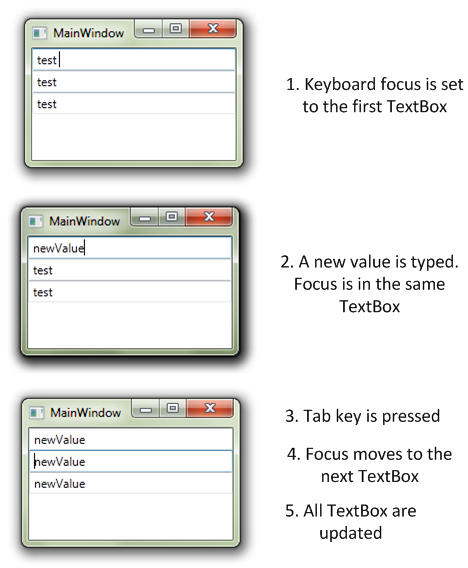
Ok, let's get into the dirty details. Here are what happens during initialization:
- XAML is parsed
- for the 3 TextBox
- the Binding is initialized
- a BindingExpression is created. The BindingExpression is a IWeakEventListener.
- its AttachOverride method is called
- if the UpdateOnLostFocus flag is set (which is the case because the default value of UpdateSourceTrigger is LostFocus), the static LostFocusEventManager type is used and the AddListener is called
- during the initialization of the binding, the PropertyPathWorker class is added and at some point the ReplaceItem method gets called
- then the following code gets execute
if (source is INotifyPropertyChanged)
{
PropertyChangedEventManager.AddListener(…);
}
else
{
PropertyDescriptor descriptor = GetDescriptor(source, path);
ValueChangedEventManager.AddListener(…);
}
Which means:
- if the source implements INotifyPropertyChanged, use that to track the changes to the property
- otherwise, use the ValueChanged event of the cached PropertyDescriptor instance to track the changes
What happens when one of the TextBox lost focus:
- the focus changes to another control, the previously focused TextBox gets is LostFocus event raised
- the LostFocusEventManager gets the notification
- the notification is transferred to the BindingExpression (which is a IWeakEventListener) by calling the IWeakEventListener.ReceiveWeakEvent method
- several method calls… ending in the PropertyPathWorker class where the PropertyDescriptor.SetValue methods is called (where the PropertyDescriptor is the one which has been cached during initialization)
- this method raises the ValueChanged event at the PropertyDescriptor level
- which is catched by the ValueChangedEventManager
- and the associated dependency property (Text) is updated
- and voila !
So there are no miracle behind the demo application I was talking about, just the fact the binding engine is smart enough to cache the PropertyDescriptor used for setting value to CLR property and using the ValueChanged event to get notifications if the source does not implement INotifyPropertyChanged.
http://10rem.net/blog/2010/12/17/puff-the-magic-poco-binding-and-inotifypropertychanged-in-wpf

Here's the Person Class

When you run this little application, and modify the value in the TextBox, the value in the ListBox is updated, seemingly by magic.

There it is. The value in the ListBox updated right when I tabbed off of the last name field. Magic code? Spirits? Too much alcohol? What is happening here?
The Person class has a PropertyDescriptor for each property. The PropertyDescriptor has the AddValueChanged method by which a listener can sign up to get the property change notifications from that descriptor. That's what the behind-the-scenes binding is doing- wiring up a value changed event for the property descriptor in play in the binding.
Note this only works when using binding. If you update the values from code, the change won't be notified.
What's happening is actually a perfectly valid (if not optimal) way to handle binding and change notification. What WPF is doing behind the scenes in this case is something you could explicitly put in your own code if you wish.
Implications
The PropertyDescriptor class is pretty heavy. In addition, WPF must request the full set of descriptors for the class, not just a single descriptor. If you have a class with a large number of properties, regardless of how many are actually involved in binding, the CPU and memory usage associated with that call can be both significant and measurable. In one instance, the memory used to get all the property descriptors for a large class was around 800K!
But doesn't WPF need that for binding anyway?
No. WPF uses the much lighter weight PropertyInfo class when binding. If you explicitly implement INotifyPropertyChanged, all WPF needs to do is call the PropertyInfo.GetValue method to get the latest value. That's quite a bit less work than getting all the descriptors. Descriptors end up costing in the order of 4x the memory of the property info classes.
Note also that if you have a reference from the POCO back in the UI (we don't do that, right…right?) you may be subject to the memory leak described in KB938416. That only applies to the PropertyDescriptor-based approach, which in this post, is POCO only.
So, here is the summary...
Implementing INotifyPropertyChanged can be a fair bit of tedious development work. However, you'll need to weigh that work against the runtime footprint (memory and CPU) of your WPF application. Implementing INPC yourself will save runtime CPU and memory.
What is the drawback of binding to a regular property of a regular .NET object (that doesn't implement INotifyPropertyChanged)?
Or As a general rule however, for anything other than Mode=OneTime bindings, the class you're binding to should implement INotifyPropertyChanged. Why is it so?
http://code.logos.com/blog/2008/10/detecting_bindings_that_should_be_onetime.html
In WPF, a Binding's source can be any .NET object; the target of the Binding will be updated when the specified property on that source changes. This works best when the source property is a DependencyProperty, or when the source object implements INotifyPropertyChanged; these objects have built-in support for property value changed notifications. In other cases, the ComponentModel infrastructure (as exposed by the PropertyDescriptor class) stores the source object in a global table in order to track clients who wish to be notified when a property value changes.
Binding to a regular property of a regular .NET object (that doesn't implement INotifyPropertyChanged) has two drawbacks:
- It may be needlessly inefficient. If, for example, the source object is not implementing INotifyPropertyChanged because it's immutable, creating and attaching value changed handlers is unnecessary overhead.
- It can cause a memory leak.
Both these problems can be eliminated by setting the Mode of the Binding to OneTime, but in a large application, determining all the bindings that could be OneTime is not an easy task. Some spelunking (with .NET Memory Profiler and .NET Reflector) showed that the (internal) ReflectTypeDescriptionProvider class has a static Hashtable containing all objects that have had value changed handlers added. A common reason for objects to end up in that Hashtable is their participation in a WPF binding, so enumerating this Hashtable at runtime can help track down bindings that may need to be changed. (And if an object is never removed from this hashtable that may be a sign of a memory leak).
Consider below code that Binding the Text property of a TextBlock to a collection of objects. This is something you're not supposed to do, but you'll see it actually works in an unexpected way. In the code-behind of our Window, we have the following C# code:
http://www.japf.fr/2011/03/wpf-databinding-trick-part-1/
public** partial **class MainWindow : Window
{
public MainWindow()
{
InitializeComponent();
Person person1 =new Person { Age =45};
Person person2 =new Person { Age =63};
Person person3 =new Person { Age =71};
this.DataContext=new List<Person>{ person1, person2, person3 };
}
}
public** class** Person
{
public** int** Age
{
get;
set;
}
}
The associated XAML looks like the following:
<Window x:Class="WpfApplicationDataContext.MainWindow"
xmlns="http://schemas.microsoft.com/winfx/2006/xaml/presentation"
xmlns:x="http://schemas.microsoft.com/winfx/2006/xaml"
Title="MainWindow"Height="350"Width="525" >
<StackPanel>
<TextBlock Margin="10"Text="{Binding Age}" />
</StackPanel>
</Window>
Here we're doing something not usual: we're binding the Text property of the TextBlock (which is of type string) to a collection of objects.
What do you think the Window will display? Or, why binding the Text property to a collection display the number of items in the collection?
The first time I saw this code, I thought the Window will remain empty. The DataContext is set to a List and we're trying to find an "Age" property on this collection: THAT CANNOT WORK.
Actually, it does…

What's happening behind the scene?
Let's take a deep breath a take a look at what's happening behind the scene to make this works.
1. A CollectionView is created
The first thing I was thinking while talking about the problem with my colleague was the use of a collection view. As you probably now, every time you create a binding to a collection property, the engine creates a collection view for you. This view will serve as an intermediate layer between your source and the target to manage selection, filtering and grouping. A good introduction to collection views is available here.
What is important to know is that collection views are shared along same objects instance. It means that when you use the CollectionViewSource.GetDefaultView() method, you're either creating a default view for the collection (if no one has requested one before) or getting the default view (if it has been created by calling the same method before you).
To make sure I was right about my hypothesis, I added the following code in the C#:
var collectionView = CollectionViewSource.GetDefaultView(this.DataContext);
collectionView.MoveCurrentToNext();
this.MouseDoubleClick += (s, e) => collectionView.MoveCurrentToNext();
And the Window is now displaying the second item of the list:
So we're definitively dealing with a collection view. The next question was, where the value comes from, I specified "Age" as binding path…
2. The CurrentItem property of ICollectionView
If you take a look at the documentation about ICollectionView, you'll find this property:

So it looks like the Text property of my TextBlock is databound to this CurrentItem property while I explicitly set to the Age property…
3. The magic of the PropertyPathWorker class
Using Reflector, I looked for potential types using the ICollectionView.CurrentItem property. I found an interesting class: PropertyPathWorker.In the source code of the .Net framework, this type is defines as "the workhorse for CLR binding".
In particular, take a look at this method:
private** void**ReplaceItem(int k, object newO, object parent)
{
// some code...
view = CollectionViewSource.GetDefaultCollectionView(parent, TreeContext);
// some more code...
newO = view.CurrentItem;
if (newO != null )
{
GetInfo(k, newO, ref svs);
svs.collectionView= view;
}
// and bam ! we're now using view.CurrentItem as source for our binding
}
So we've a special case when we're creating a binding with a collection view: the CurrentItem property is automatically used and merge with the specificied path. In our case, it's like creating a binding to CurrentItem.Age.
3. And voila !
Finally we've a lot going on within the engine to make this works. Of course the original binding was not something we would do in normal application but it was kind of cool doing the investigations to find out why it was working ! Hope you learn something cool about the databinding engine 
In One-way-to-Source binding when the target property changes, the source object gets updated.
System.Windows.Navigation namespace contains different classes for navigation between windows.
The System.Windows.Media namespace provide classes to work with images, sound, video, etc in WPF.
What is target and what is source?
In WPF, you typically use data binding to establish a connection between the properties of two objects. In this relationship, one object is referred to as the source and one object is referred to as the target. In the most typical scenario, your source object is the object that contains your data and your target object is a control that displays that data.
For instance, consider a Person class with a Name property. If you want to show the Name property value in the UI and have the UI automatically change when the Name property value changes at run-time, you can bind the TextBlock.Text property to the Name property of the Person object. In the following example, the Person class is declared in the BindingSample namespace. When you run this, your window shows "Joe".
<Window
xmlns="http://schemas.microsoft.com/winfx/2006/xaml/presentation"
xmlns:x="http://schemas.microsoft.com/winfx/2006/xaml"
xmlns:local="clr-namespace:BindingSample">
<Window.Resources>
<!-- Instantiates the Person class with the Name value "Joe"-->
<!-- Giving it an x:Key so it's available as a resource -->
\<local:Personx:Key="myDataSource"Name="Joe"/\>
</Window.Resources>
<!-- Binding the Text property to the Name property -->
<TextBlockText="{Binding Source={StaticResource myDataSource}, Path=Name}"/>
</Window>
So, in this example:
- The TextBlock is the target object.
- The Text property is the target property.
- The Person object is the source object.
- The Name property is the source property.
You bind a target _ to _ a source.
What's bindable?
A target property must be a dependency property. This means that your target object must be a DependencyObject. Fortunately, most UIElement properties are dependency properties and most dependency properties, except read-only ones, support data binding by default. To find out if a property is a dependency property, check to see if it has a corresponding field that ends with "Property". For example, the Text property is a dependency property and has a corresponding field named "TextProperty". Alternatively, if you are using the SDK documentation, see if the property page has a "Dependency Property Information" section. If it does, then it is a dependency property. For an example, check out the Background property page.
Your source can be any CLR object or XML data :
- You can bind to any CLR objects, including list objects. You can bind to the entire object or public properties, sub-properties, and indexers of the object. Fields are not supported. The binding engine uses CLR reflection to get the values of the properties. Alternatively, objects that implement ICustomTypeDescriptor or have a registered TypeDescriptionProvider also work with the binding engine.
- You can bind to ADO.NET objects such as DataTable.
- You can bind to an XmlNode, XmlDocument, or XmlElement, and run XPath queries on them.
When do I use Source and when do I use DataContext?
There are many ways to specify your binding source, that is, to specify where your data is coming from. The simplest way is to instantiate the source object as a resource in XAML and then the Source property of the Binding to that resource (as in the last example).
Using the Source property is simpler and more readable. However, if multiple properties bind to the same source, consider using the DataContext property. The DataContext property provides a convenient way to establish a data scope. Say you have many controls and you want all of them to bind to the same source.
<Window . . .>
<Window.Resources>
\<local:Personx:Key="myDataSource"Name="Joe"/\>
</Window.Resources>
<StackPanel>
<StackPanel.DataContext>
<BindingSource="{StaticResource myDataSource}"/>
</StackPanel.DataContext>
<TextBoxText="{Binding Path=Name}"/>
<TextBlockText="{Binding Path=Name}"/>
<!-- ...
Other controls that are also
interested in myDataSource.
...
-->
</StackPanel>
</Window>
In this case, you set the DataContext property of your StackPanel to that source so that all elements in that StackPanel inherit that common source. The TextBox and TextBlock in this example both inherit the binding source from the StackPanel. When you run this, you see a TextBox with "Joe" and a TextBlock with "Joe".
How do I make my data-bound TextBox update the source value as I type?
By default, TextBox.Text has an UpdateSourceTrigger value of LostFocus. This means if you have a data-bound TextBox, the default behavior is that the source does not get updated until the TextBox loses focus. If you want the source to update as you type into the TextBox, set the UpdateSourceTrigger property to PropertyChanged :
\<TextBoxText="{Binding Path=Name, UpdateSourceTrigger=PropertyChanged}"/\>
One thing that's really easy to miss is that the UpdateSourceTrigger default value varies for different properties. For most properties, the UpdateSourceTrigger property defaults to PropertyChanged. However, for TextBox.Text, it is LostFocus.
This table provides a summary of the UpdateSourceTrigger value for TextBox.Text. Again, remember that this is only true for the TextBox.Text property.
| UpdateSourceTrigger value | When the Source Value Gets Updated | Example Scenario for TextBox |
|---|---|---|
| LostFocus (default for TextBox. Text ) | When the TextBox control loses focus | A TextBox that is associated with validation logic |
| PropertyChanged | As you type into the TextBox | TextBox controls in a chat room window |
| Explicit | When the application calls UpdateSource | TextBox controls in an editable form (updates the source values only when the user clicks the submit button) |
What does OneWay or TwoWay binding mean?
These are binding Mode values. In the simplest terms, the OneWay mode is read-only (with respect to the source) and the TwoWay mode is read-write. For instance, in a stock ticker application, your controls are only "reading" and displaying the source values, so the controls only need to have OneWay bindings. The read-write scenario with TwoWay bindings is more applicable to a business application that allows users to both view and edit data.
Similar to UpdateSourceTrigger, the default value for the Mode property varies for each property. User-editable properties such as TextBox.Text, ComboBox.Text, MenuItem.IsChecked, etc, have TwoWay as their default Mode value. To figure out if the default is TwoWay, look at the Dependency Property Information section of the property. If it says BindsTwoWayByDefault is set to true, then the default Mode value of the property is TwoWay. To do it programmatically, get the property metadata of the property by calling GetMetadata and then check the boolean value of the BindsTwoWayByDefault property.
There's also OneWayToSource and OneTime. If you're interested, see the Mode page in the SDK.
My target binds to a property on my custom object but the binding does not refresh when the source value changes.
Your custom object needs to implement a mechanism to provide notifications when a property changes. The recommended way to do that is to implement INotifyPropertyChanged. Here's an example:
using System.ComponentModel;
namespace BindingSample
{
publicclassPerson : INotifyPropertyChanged
{
privatestring name;

// Declare the event

publiceventPropertyChangedEventHandler PropertyChanged;

public Person()

{

}

public Person(string value)

{

    this.name = value;

}

publicstring Name

{

  get { return name; }

  set

  {

   name = value;

    // Call OnPropertyChanged whenever the property is updated

   OnPropertyChanged("Name");

  }

}

// Create the OnPropertyChanged method to raise the event

protectedvoid OnPropertyChanged(string name)

{

  PropertyChangedEventHandler handler = PropertyChanged;

  if (handler != null)

  {

    handler(this, newPropertyChangedEventArgs(name));

  }

}
}
}
Also, remember that the properties you are binding to need to be public and you cannot bind to fields.
How do I create a binding in code?
One way is to call the SetBinding method on the target object:
Person myDataSource = newPerson("Joe");
Binding myBinding = newBinding("Name");
myBinding.Source = myDataSource;
// myText is an instance of TextBlock
myText.SetBinding(TextBlock.TextProperty, myBinding);
Only FrameworkElements and FrameworkContentElements have a SetBinding method. Their SetBinding method is actually calling the BindingOperations.SetBinding method. Therefore, you can always use the BindingOperations.SetBinding method, especially when your target object is not a FrameworkElement or a FrameworkContentElement.
How do I bind to an existing object instance?
In some cases the source object that you bind to can only be created at run-time, such as a DataSet object that's created in response to a database query. In those cases, you need to set the DataContext property of your target object to the instantiated object programmatically. Example:
  // myListBox is a ListBox control

  // myCustomBizObject is your custom business object

  myListBox.DataContext = myCustomBizObject;
There are two special cases. First, if you are binding to a property of another element in the same scope, then you use the ElementName property to specify the source. For example, you can bind the TextBlock.Text property to the content of the SelectedItem of a ComboBox:
  \<ComboBoxName="myComboBox"SelectedIndex="0"\>

    \<ComboBoxItem\>1\</ComboBoxItem\>

    \<ComboBoxItem\>2\</ComboBoxItem\>

    \<ComboBoxItem\>3\</ComboBoxItem\>

  \</ComboBox\>

  \<TextBlockText="{Binding ElementName=myComboBox, Path=SelectedItem.Content}"/\>
Second, if you are binding between properties of the same control, then you use the RelativeSource property. Specially, you set RelativeSource to Self: RelativeSource={x:Static RelativeSource.Self}.
How do I use WPF bindings with RelativeSource?
If you want to bind to another property on the object:
{BindingPath=PathToProperty, RelativeSource={RelativeSourceSelf}}
If you want to get a property on an ancestor:
{BindingPath=PathToProperty, RelativeSource={RelativeSourceAncestorType={x:Type typeOfAncestor}}}
If you want to get a property on the templated parent (so you can do 2 way bindings in a ControlTemplate)
{BindingPath=PathToProperty, RelativeSource={RelativeSourceTemplatedParent}}
or, shorter (this only works for OneWay bindings):
{TemplateBindingPath=PathToProperty}
Here's a more visual explanation in the context of a MVVM architecture: 
"**I have a DataTemplate that is bound to a List of strings in the ViewModel and this just shows the strings inside a StackPanel (easy stuff and it works... As I said, I'm just exploring here...). I want to have a button that fires a command and I don't want to have an event handler in the code behind of the XAML. Remember, this is MVVM so no (or at least very little) code behind! But when using the Prism way of binding a command, it doesn't trigger anything.
The thing is that if I put my button outside of the DataTemplate it triggers the command in the ViewModel, but not when it's inside the DataTemplate.
It seems like it doesn't really know of my command in the ViewModel while inside the DataTemplate." How can one bind commands in viewmodel from inside datatemplate?**
Your problem is a very common situation in MVVM. You can execute the Select command from the button using one of the following approaches:
Use relative source (as you propose):
<Button command:Click.Command="{Binding DataContext.SelectCommand, RelativeSource={RelativeSource FindAncestor, AncestorType={x:Type UserControl}}}" ...
Or set a name to your user control and use ElementName in the binding:
<UserControl x:Name = "MyUserControl"...>
... ...
<Button command:Click.Command="{Binding DataContext.SelectCommand, ElementName=MyUserControl}" ...
I have Menu in my app. I'm visualizing it using hierarchical data template:
<MenuItemHeader="Main menu"ItemsSource="{Binding ApplicationMenu}"> <MenuItem.ItemTemplate> <HierarchicalDataTemplateDataType="{x:Type tm:RMenuItem}" ItemsSource="{Binding Path=ChildrenItems}"> <MenuItemHeader="{Binding Name}"Command="{Binding RunOperationCommand}"/> </HierarchicalDataTemplate> </MenuItem.ItemTemplate> </MenuItem>
Menu looks like as it should, but Command for each menu item is not fired! Even more - it is not bounded, which could be seen in debugger: get accessor of ICommand Property has been never executed. Why it happens so?
Doing as usual works perfect:
<Menu> <MenuItemHeader="SomeHeader"Command="{Binding RunOperationCommand}"/> <Menu>
The difference between the first and the second example in your question is that in the second code snippet you are binding MenuItem.Command to the parent's data context, which has the RunOperationCommand defined. Whereas in the first example with the HierarchicalDataTemplate you are binding to the "local" DataContext, which is a menu item. It doesn't have the appropriate property, so the binding fails.
You have several options:
- one is to extend your menu items with the command property, like you did in your answer already;
- bind to the relative source up in the visual tree, which has the data context with the command, e.g. assuming that the command is in your window's DataContext:
<MenuItemHeader="Main menu"ItemsSource="{Binding ApplicationMenu}"> <MenuItem.ItemTemplate> <HierarchicalDataTemplateDataType="{x:Type tm:RMenuItem}" ItemsSource="{Binding Path=ChildrenItems}"> <MenuItemHeader="{Binding Name}" Command="{Binding RelativeSource={RelativeSource FindAncestor, AncestorType={x:Type Window}}, Path=DataContext.RunOperationCommand}" /> </HierarchicalDataTemplate> </MenuItem.ItemTemplate> </MenuItem>
How to display default text "--Select Team --" in combo box on pageload in WPF?
You can do this without any code behind by using an IValueConverter.
<Grid> <ComboBox x:Name="comboBox1" ItemsSource="{Binding MyItemSource}" /> <TextBlock Visibility="{Binding SelectedItem, ElementName=comboBox1, Converter={StaticResource NullToVisibilityConverter}}" IsHitTestVisible="False" Text="... Select Team ..."/> </Grid>
Here you have the converter class that you can re-use.
publicclassNullToVisibilityConverter : IValueConverter { #region Implementation of IValueConverter
publicobjectConvert(object value, Type targetType, object parameter, CultureInfo culture)
{
    return value == null ? Visibility.Visible : Visibility.Collapsed;
}

publicobjectConvertBack(object value, Type targetType, object parameter, CultureInfo culture)
{
    thrownewNotImplementedException();
}

#endregion
}
And finally, you need to declare your converter in a resource section.
<Converters:NullToVisibilityConverterx:Key="NullToVisibilityConverter"/>
Where Converters is the place you have placed the converter class. An example is:
xmlns:Converters="clr-namespace:MyProject.Resources.Converters"
The very nice thing about this approach is no repetition of code in your code behind.
Special symbols in WPF binding - what does "{Binding Path=.}" mean?
This is shorthand for binding to the current source. For more info see here.
Commands
What are commands?
Simply put in MSDN terms, Commands are a way to handle user interface (UI) actions. They are a loosely coupled way to bind the UI to the logic that performs the action.
Can anyone tell what are the advantages of using Commands over Events in WPF? What is the difference between commands and events?
Commands provide two main benefits over event handlers:
- Commands are not linked to the caller, so same command is not dependent and can be called from menu item, toolbar button, keyboard, etc.
- Commands provide support for enabling/disabling all related UI controls based on the status of command (can be executed or not)
What are routed commands?
This blog post explains what routed commands are, and why you should use them. My explanation does not cover all of the details, nor does it show all of the various uses of routed commands. For a more comprehensive review of commanding, but with a very different (and somewhat misleading) perspective on the issue, be sure to check out the official documentation here.
Many demonstrations of routed commands explain them in the context of text editing, which is just one of the many ways to use them. In fact, so many explanations about routed commands focus on how to use them in text editing scenarios that many people I have met assume routed commands have no practical use outside of text editing. That is an incorrect, yet understandable, interpretation of one of WPF's coolest features.
What is a routed command? Well, the answer to that question is too complicated to explain without first taking a step back and explaining some other things. To understand what a routed command is, we will examine what "routed" means, and then what "command" means. Once we have those two ideas defined, we can combine them and see what happens.
In WPF, the visual elements that constitute a user interface form a hierarchical tree structure. This "element tree" has many purposes, and is a core part of how WPF operates. The root node in the tree is a container, such as a Window or a Page. Everything seen within that top-level container is a descendant element in its element tree. There are two "views" of this element tree: the visual tree and logical tree. To learn more about that concept, I recommend you read this article.
In general, the term "route" refers to a path between two points in a network. Take that idea and apply it to the WPF element tree, and now you have a path between visual elements in a user interface. Now imagine an electric current quickly flowing through that route, zapping each element it passes through. When an element is zapped by the electric current, it has the opportunity to come to life and do whatever it wants (i.e. execute an event handler).
One could provide a more mundane definition of a routed event _ as a notification that travels a route between two elements in the WPF visual tree. _ They are not really events, in the standard sense of .NET events. People wrap routed events with standard .NET events, out of convention, just to make them more usable and ".NETish." But in reality, routed events are not events. They are a feature of the WPF framework, intimately tied to the WPF visual tree.
_ Routed commands use routed events _ , as do many other parts of WPF, so it is important to understand them thoroughly. If you are still hazy on the idea of routed events, check out the blog post I wrote about the topic here.
The Command pattern is nothing new. It means that you create an object that knows how to do some task, and then the entire application relies on that object to do that task. For example, if I am creating an image editing application, I could create a command object called "CreateNewImage" or something like that. When the user either clicks the "New" menu item, or clicks the "New" toolbar button, or hits Ctrl + N, etc., the same CreateNewImage command object would create a new image.
In WPF, we have the ICommand interface, which makes it easy to create command objects that WPF classes can use. When you implement ICommand, you place all the knowledge of what needs to be done to accomplish the task in the command. You can then assign that command to, say, a Button's Command property so that the command will execute when the user clicks the Button.
The ICommand interface has three members that all commands must define. It has two methods and one event. The CanExecute method determines if the state of the application currently supports the execution of the command. If CanExecute returns true, then the Execute method can be invoked, which is what actually performs the execution logic baked into the command. If CanExecute returns false, all controls whose Command references that command object are disabled so that the user cannot attempt to execute the command at that time. This is a very convenient feature, especially if multiple controls in the user interface all are bound to that command.
If the command determines that it's "can execute" status changes, it can raise the CanExecuteChanged event, defined by the ICommand interface. This lets WPF know that it should call the command's CanExecute method again, to query the new status.
So what happens when you mix routed events with commands? Well, you get a very powerful way to think about how an application represents and implements its features. You get routed commands.
_ A routed command is a command object that does not know how to accomplish the task it represents. It simply represents the task/feature. When asked if it can execute and when told to execute, it simply delegates that responsibility off to somewhere else. _

The answer is, confusingly enough, it does not know whom.
A routed command does not determine if it can execute and what to do when executed. Instead, some routed events travel through the element tree, giving any element in the UI a chance to do the command's work for it. It truly is just a semantic identifier: a named entity that represents a feature of a program.
When a routed command is asked if it can execute, the routed PreviewCanExecute and CanExecute events tunnel down and bubble up the element tree. These events give all elements between the root of the tree (such as a Window) and the source element that references the command a chance to determine if the command can execute. When the command is told to execute, the PreviewExecuted and Executed routed events travel the same event route, checking to see if anybody cares to react to the event. If so, they can run a handler for the event, if not, the event finishes zapping the elements and nothing happens.
You might be wondering why it is a good idea to use routed commands at all. Why bother? What's wrong with just hooking a Button's Click event and doing things the "normal" way?
Well, you do not have to use routed commands if you do not want to. You certainly can just hook a Button's Click event and go to town. By extension, why bother with a data layer and a business layer? Why not just stick your whole application into Window1.xaml.cs and be done with it? That would be much easier, right?

My point is, there are very real advantages to adhering to the loose coupling proffered by routed commands. Let's review them.
- First, all controls using the same RoutedCommand will automatically be disabled when the command cannot execute. If you have ever used a program where clicking on enabled buttons does not actually do anything, you will appreciate this.
- Second, there is less event handler code to write since most of the wiring is provided for you by the commanding system. You do not have to add event handlers for each UI element that executes the same command, whereas using events directly off of UI elements requires many handlers that all basically do the same thing.
- Third, if you use my implementation of Model-View-Controller or Structural Skinning, using routed commands is an absolute must. Learn more about MVC here and Structural Skinning here.
- Fourth, using routed commands makes it possible to decouple the Software Engineering team from the Visual Design team. The developers don't have to worry about what type of element is consuming application functionality, just as long as the UI executes the right commands all is well. This also frees the designers from having to worry about such details so that they can focus on creating a great user experience.
- Fifth, but certainly not last, using routed commands as part of your design process forces you to map functional requirements to commands up front. This process of taking a list of required features and translating them into RoutedCommand objects with meaningful names is invaluable to help the team as a whole understand the system they are about to build. It also creates a set of short terms that people can use to refer to features. See http://joshsmithonwpf.wordpress.com/2008/03/18/understanding-routed-commands/
What are the differences between routed event and routed command?
The difference between routed commands and routed events is in how the command gets routed from the command invoker to the command handler. Specifically, routed events are used under the covers to route messages between the command invokers and the command handlers (through the command binding that hooks it into the visual tree).
There could be a many-to-many relationship here, but only one command handler will actually be active at any given time. The active command handler is determined by a combination of where the command invoker and command handler are in the visual tree, and where the focus is in the UI. Routed events are used to call the active command handler to ask whether the command should be enabled, as well as to invoke the command handler's Executed method handler.
Usually, a command invoker looks for a command binding between its own location in the visual tree and the root of the visual tree. If it finds one, the bound command handler will determine whether the command is enabled and will be called when the command is invoked. If the command is hooked up to a control inside a toolbar or menu (or, more generally, a container that sets FocusManager.IsFocusScope = true), then some additional logic runs that also looks along the visual tree path from the root to the focus element for a command binding.
An important thing to understand about the routing of WPF routed commands is that once a single command handler is invoked, then no other handlers will be called. So if the user control handles the CanExecute method, the TextBox CanExecute implementation will no longer be called.
How to make Routed Command in Action?
To make this more concrete and to quickly see the benefits of routed commands, let's look at a simple example. In Figure you see a simple UI with two input textboxes and a toolbar button for performing a Cut action on the text in the textboxes.

Figure Simple App with Cut Command Toolbar Button
To get this hooked up using events, you would need to define a Click handler for the toolbar button, and that code would need references to the two textboxes. You would have to determine which textbox has the focus and call appropriate clipboard operations based on the text selection in the control. You would also have to worry about enabling and disabling the toolbar button at appropriate times based on where the focus is and whether anything was selected in the textbox. Ugly, messy, tightly coupled code.
It doesn't sound too bad for this simple form, but what if those textboxes are now down inside a user control or a custom control and your window codebehind doesn't have direct access to them? You would either have to expose an API at your user control boundary to make hooking things up from the container possible or expose the textboxes publicly—neither approach is ideal.
With commands, all you need to do is set the Command property on the toolbar button to the Cut command that is defined in WPF and you are done:
<ToolBar DockPanel.Dock="Top" Height="25"> <Button Command="ApplicationCommands.Cut"> <Image Source="cut.png"/> </Button> </ToolBar>
You could now run the app and see that the toolbar button is initially disabled. After you select some text in one of the textboxes, the toolbar button becomes enabled and, if you click it, the text is actually cut to the clipboard. And it would work for any textbox anywhere in your UI. Wow—pretty cool, huh?
What is happening here is that the TextBox class implementation has a built-in command binding for the Cut command and encapsulates the clipboard handling for that command (and Copy and Paste as well) for you. So how does the command only get invoked on the in-focus textbox, and how does the message get to the textbox to tell it to handle the command? That is where the routed part of routed commands comes into play.
What are the many commands provided by WPF?
Both the ApplicationCommands.Save and the ApplicationCommands.Cut commands are two of many commands provided by WPF. The five built-in command classes in WPF along with some examples of the commands they contain are shown in Figure.
Figure WPF Command Classes
| Command Class | Example Commands |
|---|---|
| ApplicationCommands | Close, Cut, Copy, Paste, Save, Print |
| --- | --- |
| NavigationCommands | BrowseForward, BrowseBack, Zoom, Search |
| EditingCommands | AlignXXX, MoveXXX, SelectXXX |
| MediaCommands | Play, Pause, NextTrack, IncreaseVolume, Record, Stop |
| ComponentCommands | MoveXXX, SelectXXX, ScrollXXX, ExtendSelectionXXX |
| | |
The XXX indicates a collection of operations such as MoveNext and MovePrevious. The commands in each class are defined as public static (Shared in Visual Basic®) properties so that you can easily hook them up. You can define your own custom commands easily by following the same approach. I'll show an example of this a little later.
You can also use these commands with a shorthand notation, like the following:
<Button Command="Save">Save</Button>
When you use this shortened version, a type converter in WPF will try to locate the named command against the collection of built-in commands. The net result in this case is exactly the same. I prefer to use the long-named versions to make the code more explicit and maintainable. Then there is no ambiguity as to where that command is defined. Even the built-in commands have some duplication between the EditingCommands and ComponentCommands classes.
What is the difference between a RoutedCommand and a RoutedUICommand?
RoutedUICommand derives from RoutedCommand and adds a text field used to provide a description of the command. This is useful when the command is bound to be accessed from the UI.
What are the limitations of routed commands? Or, why are WPF routed commands not used? WPF routed commands have a number of limitations. They are coupled to elements in the logical tree because they use routed events to deliver the command messages. This means you cannot directly connect a separate class, such as a presentation model, presenter, or controller, to be the direct command handler. The view would have to be the routed command handler, and it would have to forward the call to the presenter or controller through a method call or event. Additionally, the command handler that the routed event is delivered to is determined by the current focus in the UI. This works fine if the command handler is at the window level, because the window is always in the focus tree of the currently focused element, so it gets called for command messages. However, it does not work for child views who have their own command handlers unless they have the focus at the time.Finally, only one command handler is ever consulted with routed commands. After one command handler is invoked (for CanExecute or Execute ), no other handlers are consulted, even if they are in the focus tree of the focused element. For scenarios where multiple views (or their presenters) need to handle the command, there is no decoupled way to address it with routed commands.
Why and how do you create your own custom command?
As a result of the limitations of routed commands, a number of companies building complex UIs with WPF have started using custom ICommand implementations that allow them to provide their own routing mechanisms, particularly ones that are not tied to the visual tree and that can support multiple command handlers.
Creating a custom command implementation isn't hard. You implement the ICommand interface on a class, provide a way for command handlers to hook up, and then do the routing when the command is invoked. You also must decide what criteria you will use for determining when to raise the CanExecuteChanged event.
A good starting point for creating a custom command is to use delegates. A delegate already supports invocation of a target method, and it also supports multiple subscribers.
See delegate command and relay command implementation in MVVM.
Why CAL/Prism define their own commands?
Where would these Commands apply then practically, you think? – In composite applications we have design patterns such as Model-View-Presenter (MVP), Model-View-Controller (MVC), and Model-View-ViewModel (MVVM). Because these design patterns are normally used to separate the UI layout and code/logic. Taking example of WPF, the presenter or controller handles commands outside the WPF logical tree. To learn more about trees, visit this url http://msdn.microsoft.com/en-us/library/ms753391.aspx.
WPF routed commands deliver objects or messages within the tree and even require a command handler in the code behind to access them. But with Composite Application Library we get two commands that can be routed outside the WPF logical tree and do not require the handlers in code behind. These commands are DelegateCommand and CompositeCommand. These commands are custom implementations of ICommand interface defined by WPF and have their own routing mechanism to communicate with objects outside the logical tree.
DelegateCommand: it allows delegation of invoking a target handling method.
CompositeCommand: it has multiple child commands. Is better used in scenarios where you have a view with multiple rows having their own submit or delete button functionality and you would prefer running a selected event on the rows in one go.
I have just started to learn about MVVM Light. It's strong and MVVM - oriented but i got a problem with it. When i create a command CheckUser via RelayCommand on my ViewModel,i just found the RelayCommand<T> with only one parameter. I want something like CheckUser=new RelayCommand<string,string>((user,pass)=>....) How can I do this with RelayCommand multi param or some method to resolve my problem?
The fact that there is only one parameter in commands is not due to MVVM Light, but to the ICommand interface, which is defined by Microsoft. The Execute method defined by this interface has only one parameter (which may be null).
Typically when you need more than one parameter, there are other ways to go around this limitation. For instance, data bind some properties of your ViewModel to some elements of your view. Then, when the command is executed, you can read the value of these properties to configure your method call.
What are the differences between Prism and MVVM Light framework?
Prism contains a DelegateCommand which is similar to RelayCommand but based on John Gossman's original from Blend. RelayCommand in MVVM light is based on implementation from Josh Smith. A Messenger in MVVM Light is an implementation of the Event Aggregator of Prism.
The goal of the MVVM Light toolkit is to offer an alternative, directly targeted at MVVM (while Prism is targeted at composite applications, with some of the elements that can be used for MVVM), and in a form that works best with Expression Blend. This is a lighter framework than Prism, which should be easier to start with, and which integrates better in Blend for the design time experience.
What is Attached Behavior Pattern? Why do we need to use it?
The Attached Behavior pattern encapsulates "behavior" (usually user interactivity) into a class outside the visual heirarchy and allows it to be applied to a visual element by setting an attached property and hooking various events on the visual element.
One of the first behaviors we wrote in Blend was the ClickBehavior. The M-V-VM pattern uses Commands instead of events in many cases, but WPF controls don't trigger Commands in all the interesting cases. Button for example has a Command property, but it only fires when the Button is clicked, not double-clicked or right-clicked. ClickBehavior defines attached properties like DoubleClickCommand of type Command. When you set these properties the behavior registers for the MouseRightButtonUp event and in the handler for that event invokes the Command in the DoubleClickCommand behavior. Interestingly, this same behavior can be used to attach Commands to *any* UIElement, even a rectangle. This turns out to be useful for adding interactivity to parts of the UI without the extra cost of a full-blown Control.
You can do a lot with the Attached Behavior pattern. Drag and drop is an obvious candidate for a behavior. A single DragDropBehavior class can register for all the basic input events and invoke Commands like OnDrop and OnDrag, allowing you to make any visual a DropTarget or DropSource without sub-classing or adding substantial code to your page. As I mentioned in my previous post, Silverlight's Parts and States model does not work easily with the built-in desktop WPF controls because those controls do not trigger the state changes. An attached behavior can hook the right events and do the state transitions...the first prototype of the Silverlight model was written in desktop WPF as an attached behavior.
How do you create WatermarkText behaviour and then use it?
One of the coolest new features of Blend 3 is the inclusion of behaviors. This new feature formalizes the "attached behavior" model that has become so prevelant in WPF (and Silverlight) development. I won't go into details on the architecture - instead I'll refer you to a nice reference:
http://blogs.msdn.com/expression/archive/2009/05/19/link-round-up-behaviors-related-posts.aspx
To play with this new support, I built a WatermarkTextBehavior which places a watermark into a TextBox when it has no entered data. I've included this new behavior into the current build of my MVVM toolkit which I'll release soon, but for now, let's look at the behavior:
First, we derive from System.Windows.Interactivity.** Behavior<T> - the placeholder parameter is the Visual type you want the behavior to act on. This can be UIElement for anything WPF, or more restrictive if necessary based on the events you intend to hook up. For our purposes here, we will set the restricted type to TextBox**.
publicclassWatermarkTextBehavior : Behavior<TextBox>
Next, you override the OnAttached() and OnDetaching() methods to hook up your event behaviors you desire. Call the base implementation first, and then the AssociatedObject property will be the element you've been attached to (the TextBox in this case). In our case we want to hook the GotFocus and LostFocus events - this is where we trigger our behavior.
protectedoverridevoid OnAttached() { base.OnAttached(); AssociatedObject.GotFocus += OnGotFocus; AssociatedObject.LostFocus += OnLostFocus; ... }
protectedoverridevoid OnDetaching() { base.OnDetaching(); AssociatedObject.GotFocus -= OnGotFocus; AssociatedObject.LostFocus -= OnLostFocus; }
Finally, we can provide any properties necessary to drive our behavior. These should be done in the form of Dependency Properties so they are bindable and interact nicely with WPF. The base Behavior<T> derives from Freezable and inherits the DataContext automatically to enable this support. In our implementation we will have a Text property to indicate the watermark, and an attached property which we will place onto the TextBox so it can be styled when the watermark is being used.
publicstaticreadonlyDependencyProperty TextProperty = DependencyProperty.Register("Text", typeof (string), typeof (WatermarkTextBehavior), newFrameworkPropertyMetadata(string.Empty));
Next we can hook it up in Blend through the Asset panel - all known assets are shown here (either registered, in the Blend directory, or project references). Drag our WatermarkTextBehavior onto any TextBox and set the Text property and it will generate the following XAML:
<TextBox> <TextBox.Style> <Style TargetType="TextBox" BasedOn="{StaticResource {x:Type TextBox}}"> <Style.Triggers> <Trigger Property="julmar:WatermarkTextBehavior.IsWatermarked" Value="True"> <Setter Property="Foreground" Value="Gray" /> <Setter Property="FontStyle" Value="Italic" /> </Trigger> </Style.Triggers> </Style> </TextBox.Style> <i:Interaction.Behaviors> <julmar:WatermarkTextBehavior Text="Enter a name here" /> </i:Interaction.Behaviors> </TextBox>
Here is the complete source code to the behavior:
using System;
using System.Windows;
using System.Windows.Controls;
using System.Windows.Interactivity;
namespace JulMar.Windows.Interactivity
{
/// <summary>
/// This behavior associates a watermark onto a TextBox indicating what the user should
/// provide as input.
/// </summary>
publicclass WatermarkTextBehavior : Behavior<TextBox>
{
/// <summary>
/// The watermark text
/// </summary>
publicstaticreadonly DependencyProperty TextProperty =
DependencyProperty.Register("Text", typeof (string), typeof (WatermarkTextBehavior),
new FrameworkPropertyMetadata(string.Empty));
staticreadonly DependencyPropertyKey IsWatermarkedPropertyKey =
DependencyProperty.RegisterAttachedReadOnly("IsWatermarked", typeof(bool), typeof(WatermarkTextBehavior),
new FrameworkPropertyMetadata(false));
/// <summary>
/// This readonly property is applied to the TextBox and indicates whether the watermark
/// is currently being displayed. It allows a style to change the visual appearanve of the
/// TextBox.
/// </summary>
publicstaticreadonly DependencyProperty IsWatermarkedProperty = IsWatermarkedPropertyKey.DependencyProperty;
/// <summary>
/// Retrieves the current watermarked state of the TextBox.
/// </summary>
/// <param name="tb"></param>
/// <returns></returns>
publicstaticbool GetIsWatermarked(TextBox tb)
{
return (bool) tb.GetValue(IsWatermarkedProperty);
}
/// <summary>
/// Retrieves the current watermarked state of the TextBox.
/// </summary>
publicbool IsWatermarked
{
get { return GetIsWatermarked(AssociatedObject); }
private set { AssociatedObject.SetValue(IsWatermarkedPropertyKey, value);}
}
/// <summary>
/// The watermark text
/// </summary>
publicstring Text
{
get { return (string) base.GetValue(TextProperty); }
set { base.SetValue(TextProperty, value); }
}
/// <summary>
/// Called after the behavior is attached to an AssociatedObject.
/// </summary>
/// <remarks>
/// Override this to hook up functionality to the AssociatedObject.
/// </remarks>
protectedoverridevoid OnAttached()
{
base.OnAttached();
AssociatedObject.GotFocus += OnGotFocus;
AssociatedObject.LostFocus += OnLostFocus;
OnLostFocus(null, null);
}
/// <summary>
/// Called when the behavior is being detached from its AssociatedObject, but before it has actually occurred.
/// </summary>
/// <remarks>
/// Override this to unhook functionality from the AssociatedObject.
/// </remarks>
protectedoverridevoid OnDetaching()
{
base.OnDetaching();
AssociatedObject.GotFocus -= OnGotFocus;
AssociatedObject.LostFocus -= OnLostFocus;
}
/// <summary>
/// This method is called when the textbox gains focus. It removes the watermark.
/// </summary>
/// <param name="sender"></param>
/// <param name="e"></param>
privatevoid OnGotFocus(object sender, RoutedEventArgs e)
{
if (string.Compare(AssociatedObject.Text, this.Text, StringComparison.OrdinalIgnoreCase) == 0)
{
AssociatedObject.Text =string.Empty;
IsWatermarked =false;
}
}
/// <summary>
/// This method is called when focus is lost from the TextBox. It puts the watermark
/// into place if no text is in the textbox.
/// </summary>
/// <param name="sender"></param>
/// <param name="e"></param>
privatevoid OnLostFocus(object sender, RoutedEventArgs e)
{
if (string.IsNullOrEmpty(AssociatedObject.Text))
{
AssociatedObject.Text =this.Text;
IsWatermarked =true;
}
}
}
}
How do you create Silverlight Behaviors and Triggers: Making a True Behavior?
We have explored using dependency properties and attached properties to abstract behaviors and triggers. In my last article, TextBox Magic, I showed how to create a dependency property to enable a textbox filter that would prevent anything but digits. In this article, we'll take it a step further and turn it into a "true" behavior.
A "true" behavior inherits from Behavior. The first step is to add a reference to System.Windows.Interactivity. There are a number of nice things about using the behavior system that make them more flexible to use than basic dependency properties. First, the behaviors can integrate with Expression Blend. You can define a behavior, import it into the tool, and literally drag it onto a control to attach the behavior. Second, behaviors automatically provide overrides to tap into the attach/detatch events. Third, behaviors are typed to their target controls: you may have a generic behavior that targets FrameworkElement or a specific behavior that targets TextBox. Finally, we can decorate behaviors with attributes that are discovered by Intellisense and available when attaching the behavior.
We are going to create a filter behavior. The first step is to simply inherit from the base behavior class and then override the pertinent events:
| 01 | publicclassTextBoxFilterBehavior : Behavior<TextBox> |
|---|---|
| 02 | { |
|
| 03 | protectedoverridevoidOnAttached() |
|---|---|
| 04 | { |
|
| 05 | AssociatedObject.KeyDown += _TextBoxFilterBehaviorKeyDown; |
|---|---|
| 06 | } |
|
| 07 | | | | --- | --- | --- | | 08 | protectedoverridevoidOnDetaching() |
| 09 | { | | | --- | --- | --- | | 10 | AssociatedObject.KeyDown -= _TextBoxFilterBehaviorKeyDown; |
| 11 | } |
|---|---|
| 12 | } |
|
As you can see, we have a convenient place to hook into the KeyDown event and unhook at the end. We also have a nice, typed AssociatedObject to use and manipulate.
We'll extend our filter to handle alpha (alphanumeric and spaces), positive numeric digits, and regular numeric digits. For the regular numeric digits, we'll allow the subtract/minus sign only if it's the very first character in the text. The "helper" methods look like this:
| 01 | privatestaticreadonlyList<KEY> _controlKeys = newList<Key> |
|---|---|
| 02 | { |
|
| 03 | Key.Back, | | | --- | --- | --- | | 04 | Key.CapsLock, |
| 05 | Key.Ctrl, |
|---|---|
| 06 | Key.Down, |
| 07 | Key.End, | | | --- | --- | --- | | 08 | Key.Enter, |
| 09 | Key.Escape, |
|---|---|
| 10 | Key.Home, |
|
| 11 | Key.Insert, |
|---|---|
| 12 | Key.Left, |
|
| 13 | Key.PageDown, |
|---|---|
| 14 | Key.PageUp, |
|
| 15 | Key.Right, |
|---|---|
| 16 | Key.Shift, |
| 17 | Key.Tab, |
|---|---|
| 18 | Key.Up |
|
| 19 | }; |
|---|---|
| 20 |
|
| 21 | privatestaticbool_IsDigit(Key key) |
|---|---|
| 22 | { |
|
| 23 | boolshiftKey = (Keyboard.Modifiers & ModifierKeys.Shift) != 0; |
|---|---|
| 24 | boolretVal; |
|
| 25 | if(key >= Key.D0 && key <= Key.D9 && !shiftKey) |
|---|---|
| 26 | { |
|
| 27 | retVal = true; |
|---|---|
| 28 | } |
|
| 29 | else |
|---|---|
| 30 | { |
|
| 31 | retVal = key >= Key.NumPad0 && key <= Key.NumPad9; |
|---|---|
| 32 | } |
|
| 33 | returnretVal; |
|---|---|
| 34 | } |
|
| 35 | | | | --- | --- | --- | | 36 | staticbool_HandleNumeric(stringtext, Key key) |
| 37 | { | | | --- | --- | --- | | 38 | boolhandled = true; |
| 39 | | | | --- | --- | --- | | 40 | // if empty, allow minus - only can be first character |
| 41 | if(string.IsNullOrEmpty(text.Trim()) && key.Equals(Key.Subtract)) |
|---|---|
| 42 | { |
|
| 43 | handled = false; |
|---|---|
| 44 | } |
|
| 45 | elseif(_controlKeys.Contains(key) || _IsDigit(key)) | | --- | --- | | 46 | { | |
| 47 | handled = false; |
|---|---|
| 48 | } |
|
| 49 | | | | --- | --- | --- | | 50 | returnhandled; |
| 51 | } | | | --- | --- | --- | | 52 | |
| 53 | staticbool_HandlePositiveNumeric(Key key) |
|---|---|
| 54 | { |
|
| 55 | boolhandled = true; |
|---|---|
| 56 |
|
| 57 | if(_controlKeys.Contains(key) || _IsDigit(key)) | | --- | --- | | 58 | { | |
| 59 | handled = false; |
|---|---|
| 60 | } |
|
| 61 | | | | --- | --- | --- | | 62 | returnhandled; |
| 63 | } | | | --- | --- | --- | | 64 | |
| 65 | staticbool_HandleAlpha(Key key) |
|---|---|
| 66 | { |
|
| 67 | boolhandled = true; |
|---|---|
| 68 |
|
| 69 | if(_controlKeys.Contains(key) || _IsDigit(key) || key.Equals(Key.Space) || | | --- | --- | | 70 | (key >= Key.A && key <= Key.Z)) | |
| 71 | { | | | --- | --- | --- | | 72 | handled = false; |
| 73 | } |
|---|---|
| 74 |
|
| 75 | returnhandled; |
|---|---|
| 76 | } |
|
| 77 | | | | --- | --- | --- | | 78 | publicenumTextBoxFilterType |
| 79 | { | | | --- | --- | --- | | 80 | AlphaFilter, |
| 81 | PositiveNumericFilter, |
|---|---|
| 82 | NumericFilter |
|
| 83 | } | | | --- | --- | --- | | 84 | |
| 85 | publicTextBoxFilterType FilterType { get; set; } |
|---|
As you can see, the familiar list of "friendly" keys is carried over. There are some helper methods for our different types of filters, as well as an enumeration. The enumeration gives us the flexibility of determining which filter to use and then a property is exposed to set that enumeration.
The last step is to wire in the actual event:
| 01 | void_TextBoxFilterBehaviorKeyDown(objectsender, KeyEventArgs e) |
|---|---|
| 02 | { |
|
| 03 | switch(FilterType) |
|---|---|
| 04 | { |
|
| 05 | caseTextBoxFilterType.AlphaFilter: | | | --- | --- | --- | | 06 | e.Handled = _HandleAlpha(e.Key); |
| 07 | break; |
|---|---|
| 08 |
|
| 09 | caseTextBoxFilterType.NumericFilter: | | | --- | --- | --- | | 10 | e.Handled = _HandleNumeric(AssociatedObject.Text, e.Key); |
| 11 | break; |
|---|---|
| 12 |
|
| 13 | caseTextBoxFilterType.PositiveNumericFilter: | | | --- | --- | --- | | 14 | e.Handled = _HandlePositiveNumeric(e.Key); |
| 15 | break; |
|---|---|
| 16 | } |
|
| 17 | } |
|---|
As you can see, it's as simple as checking the enumeration, calling the helper function and modifying the handled property.
Now we can reference the project with our behavior and reference the System.Windows.Interactivity. In XAML, you attach the behavior like this:
| 1 | <TextBox> | | | --- | --- | --- | | 2 | <Interactivity:Interaction.Behaviors> |
| 3 | <Behaviors:TextBoxFilterBehaviorFilterType="AlphaFilter"/> |
|---|---|
| 4 | </Interactivity:Interaction.Behaviors> |
|
| 5 | </TextBox> |
|---|
As you can see, easy to add, easy to read quickly what the behavior does, and the added bonus is that you can manipulate these in Expression Blend.
Resources
Styling and templating
What is styling and templating in WPF?
Windows Presentation Foundation (WPF) styling and templating refer to a suite of features_(styles, templates, triggers, and storyboards)_ that allow developers and designers to create visually compelling effects and to create a consistent appearance for their product. Although developers and or designers can customize the appearance extensively on an application-by-application basis, a strong styling and templating model is necessary to allow maintenance and sharing of the appearance within and among applications. Windows Presentation Foundation (WPF) provides that model.
Another feature of the WPF styling model is the separation of presentation and logic. This means that designers can work on the appearance of an application by using only XAML at the same time that developers work on the programming logic by using C#.
What is a style? How do you create a style?
A Style is a convenient way to apply a set of property values to more than one element. For example, consider the following TextBlock elements and their default appearance:
<TextBlock>My Pictures</TextBlock>
<TextBlock>Check out my new pictures!</TextBlock>

You can change the default appearance by setting properties, such as FontSize and FontFamily, on each TextBlock element directly. However, if you want your TextBlock elements to share some properties, you can create a Style in the Resources section of your XAML file, as shown here:
<Window.Resources>
...
<!--A Style that affects all TextBlocks-->
<StyleTargetType="TextBlock">
<SetterProperty="HorizontalAlignment" Value="Center" />
<SetterProperty="FontFamily" Value="Comic Sans MS"/>
<SetterProperty="FontSize" Value="14"/>
</Style>
...
</Window.Resources>
When you set the TargetType of your style to the TextBlock type, the style is applied to all the TextBlock elements in the window.
Now the TextBlock elements appear as follows:

How do you extend styles? Or Explain inheritance in styles.
Like classes, styles can inherit from other styles. This way, you can create a base style, and have one or more derived styles. In these styles, you can add extra properties. When the derived style is applied on a control, both the properties from the base and from the derived style will be applied.
Perhaps you want your two TextBlock elements to share some property values, such as the FontFamily and the centered HorizontalAlignment, but you also want the text "My Pictures" to have some additional properties. You can do that by creating a new style that is based on the first style, as shown here:
<Window.Resources>
...
<!--A Style that extends the previous TextBlock Style-->
<!--This is a "named style" with an x:Key of TitleText-->
<StyleBasedOn="{StaticResource {x:Type TextBlock}}"
TargetType="TextBlock"
x:Key="TitleText">
<SetterProperty="FontSize" Value="26"/>
<SetterProperty="Foreground">
<Setter.Value>
<LinearGradientBrushStartPoint="0.5,0" EndPoint="0.5,1">
<LinearGradientBrush.GradientStops>
<GradientStopOffset="0.0" Color="#90DDDD" />
<GradientStopOffset="1.0" Color="#5BFFFF" />
</LinearGradientBrush.GradientStops>
</LinearGradientBrush>
</Setter.Value>
</Setter>
</Style>
...
</Window.Resources>
Notice that the previous style is given an x:Key. To apply the style, you set the Style property on your TextBlock to the x:Key value, as shown here:
<TextBlockStyle="{StaticResource TitleText}" Name="textblock1">My Pictures</TextBlock>
<TextBlock>Check out my new pictures!</TextBlock>
This TextBlock style now has a HorizontalAlignment value of Center, a FontFamily value of Comic Sans MS, a FontSize value of 26, and a Foreground value set to the LinearGradientBrush shown in the example. Notice that it overrides the FontSize value of the base style. If there is more than one Setter setting the same property in a Style, the Setter that is declared last takes precedence.
The following shows what the TextBlock elements now look like:

This TitleText style extends the style that has been created for the TextBlock type. You can also extend a style that has an x:Key by using the x:Key value. For an example, see the example provided for the BasedOn property.
Establish relationship of the TargetType Property and the x:Key Attribute.
As shown in the first example, setting the TargetType property to TextBlock without assigning the style an x:Key causes the style to be applied to all TextBlock elements. In this case, the x:Key is implicitly set to {x:Type TextBlock}. This means that if you explicitly set the x:Key value to anything other than {x:Type TextBlock}, the Style is not applied to all TextBlock elements automatically. Instead, you must apply the style (by using the x:Key value) to the TextBlock elements explicitly. If your style is in the resources section and you do not set the TargetType property on your style, then you must provide an x:Key.
In addition to providing a default value for the x:Key, the TargetType property specifies the type to which setter properties apply. If you do not specify a TargetType, you must qualify the properties in your Setter objects with a class name by using the syntax Property="ClassName.Property". For example, instead of setting Property="FontSize", you must set Property to "TextBlock.FontSize" or "Control.FontSize".
Also note that many WPF controls consist of a combination of other WPF controls. If you create a style that applies to all controls of a type, you might get unexpected results. For example, if you create a style that targets the TextBlock type in a Window, the style is applied to all TextBlock controls in the window, even if the TextBlock is part of another control, such as a ListBox.
How to override style properties?
When inheritance exists between styles, overriding is bound to exist too… And yes, it is included in XAML!
When applying a style, it's possible that for a particular control, one or more properties should not to follow the style. No problem, we can simply declare them as we would do without styles. The property declared on the control itself will take precedence over the declaration in the style.
In the next sample, we have a style and apply it to a control. Since that particular button should stand out from the rest, it should get another background color.
<Page.Resources>
<Style x:Key="ButtonPurpleStyle">
<Setter Property="Button.Background" Value="BlueViolet" />
<Setter Property="Button.FontSize" Value="20" />
<Setter Property="Button.Width" Value="200" />
<Setter Property="Button.Height" Value="30" />
</Style>
</Page.Resources>
...
<Button x:Name="GoButtonWithBaseStyle"
Style="{StaticResource ButtonBaseStyle}"
Background="LightGreen"
Content="Go with green!" >
</Button>
When using inheritance, we can also have a derived style override a property set in the base style. Simply declare it in the derived style, and only the property from the derived class will be used.
Where to declare your styles?
You can use a style on any element that derives from FrameworkElement or FrameworkContentElement. The most common way to declare a style is as a resource in the Resources section in a XAML file.
Based on where you want your style to be available, it can be defined on different locations in your code.
The largest scope is Application scope. When declaring the style as a part of the Application resources in your App.xaml file, every control in our entire application has access to the style. This can be handy when declaring default styles.
Your App.xaml file should look like the following:
<Application x:Class="WinFxBrowserApplication1.App"
xmlns="http://schemas.microsoft.com/winfx/2006/xaml/presentation"
xmlns:x="http://schemas.microsoft.com/winfx/2006/xaml"
StartupUri="Page1.xaml"
>
<Application.Resources>
<Style x:Key="ApplicationWideStyle">
<Setter Property="Button.Background" Value="BlueViolet" />
...
</Style>
</Application.Resources>
</Application>
If we want the style to be available only on a single page or window, we can add it to the resources of that page or window.
<Page>
<Page.Resources>
<Style x:Key="PageWideStyle">
<Setter Property="Button.Background" Value="BlueViolet" />
...
</Style>
</Page.Resources>
...
</Page>
Or, if our style should only be applied inside another element, say a StackPanel, we can add it to the resources of that element.
<StackPanel>
<StackPanel.Resources>
<Style x:Key="ButtonPurpleStyle">
<Setter Property="Button.Background" Value="BlueViolet" />
...
</Style>
</StackPanel.Resources>
...
</StackPanel>
Give example to use system resources.
<Stylex:Key="SystemResStyle" TargetType="{x:Type Button}">
<SetterProperty= "Background" Value=
"{DynamicResource {x:Static SystemColors.ControlLightBrushKey}}"/>
<SetterProperty= "Foreground" Value=
"{DynamicResource {x:Static SystemColors.ControlDarkBrushKey}}"/>
<SetterProperty= "FontSize" Value=
"{DynamicResource {x:Static SystemFonts.IconFontSizeKey}}"/>
<SetterProperty= "FontWeight" Value=
"{DynamicResource {x:Static SystemFonts.MessageFontWeightKey}}"/>
<SetterProperty= "FontFamily" Value=
"{DynamicResource {x:Static SystemFonts.CaptionFontFamilyKey}}"/>
</Style>
Give an example to a Value property that uses the Binding declaration.
<Stylex:Key="textBoxInError" TargetType="{x:Type TextBox}">
<Style.Triggers>
<TriggerProperty="Validation.HasError" Value="true">
<Setter Property="ToolTip"
Value="{Binding RelativeSource={x:Static RelativeSource.Self},
Path=(Validation.Errors)[0].ErrorContent}"/>
</Trigger>
</Style.Triggers>
</Style>
We can use the use of setters to set property value in a style. Can we specify event handlers in a style?
Yes. You can use EventSetter.
What is a trigger?
A trigger sets properties or starts actions, such as an animation, when a property value changes or when an event is raised.Style, ControlTemplate, and DataTemplate all have a Triggers property that can contain a set of triggers.
What are the different types of triggers?
There are various types of triggers.
A Trigger that sets property values or starts actions based on the value of a property is called a property trigger.
To demonstrate how to use property triggers, you can make each ListBoxItem partially transparent unless it is selected. The following style sets the Opacity value of a ListBoxItem to 0.5. When the IsSelected property is true, however, the Opacity is set to 1.0:
<StyleTargetType="ListBoxItem">
<SetterProperty="Opacity" Value="0.5" />
<SetterProperty="MaxHeight" Value="75" />
<Style.Triggers>
<TriggerProperty="IsSelected" Value="True">
<SetterProperty="Opacity" Value="1.0" />
</Trigger>
...
</Style.Triggers>
</Style>
This example uses a Trigger to set a property value, but note that the Trigger class also has the EnterActions and ExitActions properties that enable a trigger to perform actions.
Notice that the MaxHeight property of the ListBoxItem is set to 75. In the following illustration, the third item is the selected item:

Another type of trigger is the EventTrigger, which starts a set of actions based on the occurrence of an event. For example, the following EventTrigger objects specify that when the mouse pointer enters the ListBoxItem, the MaxHeight property animates to a value of 90 over a 0.2 second period. When the mouse moves away from the item, the property returns to the original value over a period of 1 second. Note how it is not necessary to specify a To value for the MouseLeave animation. This is because the animation is able to keep track of the original value.
<EventTriggerRoutedEvent="Mouse.MouseEnter">
<EventTrigger.Actions>
<BeginStoryboard>
<Storyboard>
<DoubleAnimation
Duration="0:0:0.2"
Storyboard.TargetProperty="MaxHeight"
To="90" />
</Storyboard>
</BeginStoryboard>
</EventTrigger.Actions>
</EventTrigger>
<EventTriggerRoutedEvent="Mouse.MouseLeave">
<EventTrigger.Actions>
<BeginStoryboard>
<Storyboard>
<DoubleAnimation
Duration="0:0:1"
Storyboard.TargetProperty="MaxHeight" />
</Storyboard>
</BeginStoryboard>
</EventTrigger.Actions>
</EventTrigger>
For more information, see the Storyboards Overview.
In the following illustration, the mouse is pointing to the third item:

What are the other types of trigger in addition to property and event trigger?
In addition to Trigger and EventTrigger, there are other types of triggers. MultiTrigger allows you to set property values based on multiple conditions. You use DataTrigger and MultiDataTrigger when the property of your condition is data-bound.
_ Datatemplate _
What is a datatemplate?
DataTemplate is about the presentation of data and is one of the many features provided by the WPF styling and templating model.
Why datatemplate is important?
Let's walk through a data binding example. In this example, we have a ListBox that is bound to a list of Task objects. Each Task object has a TaskName (string), a Description (string), a Priority (int), and a property of type TaskType, which is an Enum with values Home and Work.
<Windowx:Class="SDKSample.Window1"
xmlns="http://schemas.microsoft.com/winfx/2006/xaml/presentation"
xmlns:x="http://schemas.microsoft.com/winfx/2006/xaml"
xmlns:local="clr-namespace:SDKSample"
Title="Introduction to Data Templating Sample">
<Window.Resources>
<local:Tasksx:Key="myTodoList"/>
...
</Window.Resources>
<StackPanel>
<TextBlockName="blah" FontSize="20" Text="My Task List:"/>
<ListBoxWidth="400" Margin="10"
ItemsSource="{Binding Source={StaticResource myTodoList}}"/>
...
</StackPanel>
</Window>
Without a DataTemplate, our ListBox currently looks like this:

What's happening is that without any specific instructions, the ListBox by default calls ToString when trying to display the objects in the collection. Therefore, if the Task object overrides the ToString method, then the ListBox displays the string representation of each source object in the underlying collection.
For example, if the Task class overrides the ToString method this way, where name is the field for the TaskName property:
publicoverridestring ToString()
{
return name.ToString();
}
Then the ListBox looks like the following:

However, that is limiting and inflexible. Also, if you are binding to XML data, you wouldn't be able to override ToString.
How do you define a Simple DataTemplate?
The solution is to define a DataTemplate. One way to do that is to set the ItemTemplate property of the ListBox to a DataTemplate. What you specify in your DataTemplate becomes the visual structure of your data object. The following DataTemplate is fairly simple. We are giving instructions that each item appears as three TextBlock elements within a StackPanel. Each TextBlock element is bound to a property of the Task class.
<ListBoxWidth="400" Margin="10"
ItemsSource="{Binding Source={StaticResource myTodoList}}">
<ListBox.ItemTemplate>
<DataTemplate>
<StackPanel>
<TextBlockText="{Binding Path=TaskName}" />
<TextBlockText="{Binding Path=Description}"/>
<TextBlockText="{Binding Path=Priority}"/>
</StackPanel>
</DataTemplate>
</ListBox.ItemTemplate>
</ListBox>
The underlying data for the examples in this topic is a collection of CLR objects. If you are binding to XML data, the fundamental concepts are the same, but there is a slight syntactic difference. For example, instead of having Path=TaskName, you would set XPath to @TaskName (if TaskName is an attribute of your XML node).
Now our ListBox looks like the following:

In the above example, we defined the DataTemplate inline. It is more common to define it in the resources section so it can be a reusable object, as in the following example:
<Window.Resources>
...
<DataTemplatex:Key="myTaskTemplate">
<StackPanel>
<TextBlockText="{Binding Path=TaskName}" />
<TextBlockText="{Binding Path=Description}"/>
<TextBlockText="{Binding Path=Priority}"/>
</StackPanel>
</DataTemplate>
...
</Window.Resources>
Now you can use myTaskTemplate as a resource, as in the following example:
<ListBoxWidth="400" Margin="10"
ItemsSource="{Binding Source={StaticResource myTodoList}}"
ItemTemplate="{StaticResource myTaskTemplate}"/>
Because myTaskTemplate is a resource, you can now use it on other controls that have a property that takes a DataTemplate type. As shown above, for ItemsControl objects, such as the ListBox, it is the ItemTemplate property. For ContentControl objects, it is the ContentTemplate property.
Explain use of DataType property.
The DataTemplate class has a DataType property that is very similar to the TargetType property of the Style class. Therefore, instead of specifying an x:Key for the DataTemplate in the above example, you can do the following:
<DataTemplateDataType="{x:Type local:Task}">
<StackPanel>
<TextBlockText="{Binding Path=TaskName}" />
<TextBlockText="{Binding Path=Description}"/>
<TextBlockText="{Binding Path=Priority}"/>
</StackPanel>
</DataTemplate>
This DataTemplate gets applied automatically to all Task objects. Note that in this case the x:Key is set implicitly. Therefore, if you assign this DataTemplate an x:Key value, you are overriding the implicit x:Key and the DataTemplate would not be applied automatically.
If you are binding a ContentControl to a collection of Task objects, the ContentControl does not use the above DataTemplate automatically. This is because the binding on a ContentControl needs more information to distinguish whether you want to bind to an entire collection or the individual objects. If your ContentControl is tracking the selection of an ItemsControl type, you can set the Path property of the ContentControl binding to "/" to indicate that you are interested in the current item. For an example, see How to: Bind to a Collection and Display Information Based on Selection. Otherwise, you need to specify the DataTemplate explicitly by setting the ContentTemplate property.
The DataType property is particularly useful when you have a CompositeCollection of different types of data objects. For an example, see How to: Implement a CompositeCollection.
When it comes to customizing the look of controls, there are two concerns: _ styles _ and _ control templates _ . Knowing when to use one or the other can be confusing, as there is really a lot of overlap in what they each do. How do you contrast Control Templates & Styles in WPF?
http://devlicio.us/blogs/christopher_bennage/archive/2008/06/27/contrasting-control-templates-amp-styles-in-wpf.aspx
Styles are frequently compared to cascading styles sheets (css) in the html world. WPF styles are like css in that they can be used to globally define the looks of certain elements, they can be paired to specific element by way of a key, or they can even be declared inline directly on an element.
I've come to view styles as a way to set default values on the public properties of WPF elements. (Really, it's dependency properties, but most public properties on WPF controls are dependency properties anyway .) When you associate a style with an element you are essentially saying "here's the set of properties and corresponding values that I'd like to set." This distinction is important for two reasons:
- Styles can only affect the public dependency properties.
- Styles can affect non-visual properties.
This concept of setting properties is inherent in the syntax of styles:
- <Style>
- <Setter Property="X"Value="Y" />
- </Style>
<Style>
<Setter Property="X" Value="Y" />
</Style>
This also means that styles are limited in what they can do by the public API of the element that they are applied to.
Control templates are used for manipulating the composition of a control. They are a means of modifying the structure of a control.
First, you need to recognize that every control in WPF is composed out of other WPF elements. If you were to examine a Button control, you would discovered that internally it's composed of something like this:
- <ms:ClassicBorderDecorator x:Name="ContentContainer"
- SnapsToDevicePixels="True"
- Background="{TemplateBinding Background}"
- BorderBrush="{TemplateBinding BorderBrush}"
- BorderStyle="Raised"
- BorderThickness="3,3,3,3" >
- <ContentPresenter** />**
- </ms:ClassicBorderDecorator>
<ms:ClassicBorderDecorator x:Name="ContentContainer"
SnapsToDevicePixels="True"
Background="{TemplateBinding Background}"
BorderBrush="{TemplateBinding BorderBrush}"
BorderStyle="Raised"
BorderThickness="3,3,3,3">
<ContentPresenter />
</ms:ClassicBorderDecorator>
ClassicBorderDecorator is an element Microsoft built for emulating the look of the existing Windows UI (that's pre-WPF elements). It's very much like a Border, and tucked away in the theme-specific assembly PresentationFramework.Classic.dll. (Ok, maybe that's a lame example).
There are certain internal elements that the control looks for in its template. In the case of Button, it looks for a ContentPresenter, though it might be something else depending on the control.
Now, let's say you want a button that has rounded corners, with a black background, and gray outline. You can use a style to set the background and outline using the Background and BorderBrush properties, and you might hope for a CornerRadius property similar to that of a Border, but there isn't one. In short, you can't make a button have rounded corners using a style.
I'm sure someone out there is thinking that you can use a style and set Background to a DrawingBrush that looks like that, and well, yes, you could, but um, that's a different matter and I need a simple example at the moment.
We could achieve this with the following control template however:
- <Button>
- <Button.Template>
- <ControlTemplate TargetType="Button" >
- <Border CornerRadius="4"
- Background="Black"
- BorderBrush="Gray"
- BorderThickness="1"
- Padding="10 6" >
- <TextBlock Foreground="White"
- Text="Click Me" />
- </Border>
- </ControlTemplate>
- </Button.Template>
- </Button>
<Button>
<Button.Template>
<ControlTemplate TargetType="Button">
<Border CornerRadius="4"
Background="Black"
BorderBrush="Gray"
BorderThickness="1"
Padding="10 6">
<TextBlock Foreground="White"
Text="Click Me"/>
</Border>
</ControlTemplate>
</Button.Template>
</Button>
You are afforded much more liberty with control templates than you are with styles, but the control templates are also trickier to use. In the template above, we completely bypassed the Content property on the button, and we manually created the "content" in the template. That makes the template not so reusable and the above example is not a good template. Here's one that's a bit more generic:
- <Button Content="Click Me" >
- <Button.Template>
- <ControlTemplate TargetType="Button" >
- <Border CornerRadius="4"
- Background="Black"
- BorderBrush="Gray"
- BorderThickness="1"
- Padding="10 6" >
- <ContentPresenter TextBlock.Foreground="White" />
- </Border>
- </ControlTemplate>
- </Button.Template>
- </Button>
<Button Content="Click Me">
<Button.Template>
<ControlTemplate TargetType="Button">
<Border CornerRadius="4"
Background="Black"
BorderBrush="Gray"
BorderThickness="1"
Padding="10 6">
<ContentPresenter TextBlock.Foreground="White" />
</Border>
</ControlTemplate>
</Button.Template>
</Button>
We replaced the TextBlock with a ContentPresenter. We use an attached property to make any text inside the ContentPresenter white.
So we've redefined the look of a Button, and we didn't touch the style. Why do we need styles?
There are a few good reasons:
- Styles are easier to use. You don't need to be concerned about the internal composition of the control or making sure that you've included all the necessary pieces.
- Styles can affect properties on the control that don't have anything to due with the composition. That means they can affect things that control templates cannot.
- If you want to globally replace a template for a control in your application, you have to do it with a style.
- It's not uncommon to "break" your controls when you start creating custom templates. You don't need to worry about this so much with styles.
Separators are the little tiddly-bits that, um, _ separate _ items in a menu or tool bar. The intention is to divide the items on the menu or toolbar into logical groups. In one of your current projects includes an exhaustive custom styling of a WPF application. You are working on the top level menu as well as context menus and you want all of your separators to look the same. How do you do it?
http://devlicio.us/blogs/christopher_bennage/archive/2008/06/19/styling-separators-in-wpf.aspx
Separators are controls, but they don't have any real behavior.So I ignorantly created a style, the same way that I would for any other control. It looked something like this:
- <!-- Separator -->
- <Style TargetType="Separator" >
- <Setter Property="Height"Value="1" />
- <Setter Property="Template" >
- <Setter.Value>
- <ControlTemplate TargetType="{x:Type Separator}" >
- <Rectangle Height="{TemplateBinding Height}"
- Fill="{StaticResource NormalBorderBrush}" />
- </ControlTemplate>
- </Setter.Value>
- </Setter>
- </Style>
<!-- Separator -->
<Style TargetType="Separator">
<Setter Property="Height" Value="1" />
<Setter Property="Template">
<Setter.Value>
<ControlTemplate TargetType="{x:Type Separator}">
<Rectangle Height="{TemplateBinding Height}"
Fill="{StaticResource NormalBorderBrush}" />
</ControlTemplate>
</Setter.Value>
</Setter>
</Style>
In case you're not familiar with it, WPF allows to specify a default style for a control by setting the TargetType and omitting the x:Key.
But that doesn't work for separators.
The reason is that MenuItem and ToolBar both use separators, and thus creating global style for both wouldn't make sense. (At least, I'm guessing that's what the designers of WPF were thinking.) Instead, both of these MenuItem and ToolBar expose a static property, SeparatorStyleKey. This acts as the key for locating the corresponding separator style.
If you want to style the separators for all menu items, your need to set x:Key to this static property. The resulting style would look like this:
- <!-- Separator -->
- <Style x:Key="{x:Static MenuItem.SeparatorStyleKey}"
- TargetType="{x:Type Separator}" >
- <Setter Property="Height"Value="1" />
- <Setter Property="Template" >
- <Setter.Value>
- <ControlTemplate TargetType="{x:Type Separator}" >
- <Rectangle Height="{TemplateBinding Height}"
- Fill="{StaticResource NormalBorderBrush}" />
- </ControlTemplate>
- </Setter.Value>
- </Setter>
- </Style>
Threading model
Interoperability
What is the advantage of setting the DataContext in XAML instead of in code?
What is the difference between MVVM and MVP architectural UI patterns?
What is the advantage of MVVM over MVP?
In my opinion MVVM is a superb pattern, but there are limitations that it just does not do that well, for example how does one show a MessageBox (a modal dialog) from what is essentially a non UI class. Having worked out how to show a MessageBox from a ViewModel, how can we ensure that the code that relies on a "Yes" or "No" being picked for the ViewModel to traverse a certain code path is fully tested in the Unit tests applied to the ViewModel. This sort of thing is non trivial.
http://www.codeproject.com/KB/WPF/Cinch.aspx
One of the biggest points of friction for me when implementing the MVVM pattern happens when I need to bind commands to events. When using Prism, I get the Button.Click command binding out of the box, but every other event needs to be wired up individually. Doing this requires a LOT of boilerplate code that is very easy to get wrong. In my last post, I published some code to alleviate that pain. Still, it requires you to write a new behavior and attachment for every event that you want to bind an event to.
http://marlongrech.wordpress.com/2008/12/13/attachedcommandbehavior-v2-aka-acb/
How is MVVM different from MVP?
- Unlike the Presenter in MVP, a ViewModel does not need a reference to a view. The view binds to properties on a ViewModel, which, in turn, exposes data contained in model objects and other state specific to the view. The bindings between view and ViewModel are simple to construct because a ViewModel object is set as the DataContext of a view. If property values in the ViewModel change, those new values automatically propagate to the view via data binding. When the user clicks a button in the View, a command on the ViewModel executes to perform the requested action. The ViewModel, never the View, performs all modifications made to the model data.
- The view classes have no idea that the model classes exist, while the ViewModel and model are unaware of the view. In fact, the model is completely oblivious to the fact that the ViewModel and view exist. This is a very loosely coupled design, which pays dividends in many ways.
Why WPF developers love MVVM? Or what makes MVVM fit for WPF?
Once a developer becomes comfortable with WPF and MVVM, it can be difficult to differentiate the two. MVVM is the lingua franca of WPF developers because it is well suited to the WPF platform, and WPF was designed to make it easy to build applications using the MVVM pattern (amongst others). In fact, Microsoft was using MVVM internally to develop WPF applications, such as Microsoft Expression Blend, while the core WPF platform was under construction. Many aspects of WPF, such as the look-less control model and data templates, utilize the strong separation of display from state and behavior promoted by MVVM. Below are the features of WPF that make MVVM a great pattern:
- The single most important aspect of WPF that makes MVVM a great pattern to use is the data binding infrastructure. By binding properties of a view to a ViewModel, you get loose coupling between the two and entirely remove the need for writing code in a ViewModel that directly updates a view. The data binding system also supports input validation, which provides a standardized way of transmitting validation errors to a view.
- Two other features of WPF that make this pattern so usable are data templates and the resource system. Data templates apply Views to ViewModel objects shown in the user interface. You can declare templates in XAML and let the resource system automatically locate and apply those templates for you at run time. You can learn more about binding and data templates in my July 2008 article, "Data and WPF: Customize Data Display with Data Binding and WPF."
- If it were not for the support for commands in WPF, the MVVM pattern would be much less powerful. A ViewModel can expose commands to a View, thus allowing the view to consume its functionality. If you aren't familiar with commanding, I recommend that you read Brian Noyes's comprehensive article, "Advanced WPF: Understanding Routed Events and Commands in WPF," from the September 2008 issue.
- In addition to the WPF (and Silverlight 2) features that make MVVM a natural way to structure an application, the pattern is also popular because ViewModel classes are easy to unit test. When an application's interaction logic lives in a set of ViewModel classes, you can easily write code that tests it. In a sense, Views and unit tests are just two different types of ViewModel consumers. Having a suite of tests for an application's ViewModels provides free and fast regression testing, which helps reduce the cost of maintaining an application over time.
- In addition to promoting the creation of automated regression tests, the testability of ViewModel classes can assist in properly designing user interfaces that are easy to skin. When you are designing an application, you can often decide whether something should be in the view or the ViewModel by imagining that you want to write a unit test to consume the ViewModel. If you can write unit tests for the ViewModel without creating any UI objects, you can also completely skin the ViewModel because it has no dependencies on specific visual elements.
- Lastly, for developers who work with visual designers, using MVVM makes it much easier to create a smooth designer/developer workflow. Since a view is just an arbitrary consumer of a ViewModel, it is easy to just rip one view out and drop in a new view to render a ViewModel. This simple step allows for rapid prototyping and evaluation of user interfaces made by the designers.
The development team can focus on creating robust ViewModel classes, and the design team can focus on making user-friendly Views. Connecting the output of both teams can involve little more than ensuring that the correct bindings exist in a view's XAML file.
What are the advantages and disadvantages of M-V-VM?
_ Advantages: _ The obvious purpose is abstraction of the View, reducing the amount of business logic or glue code stuck in code-behind. All tasty goodness abstractly, but here's another concrete advantage: the ViewModel is easier to unit test than code-behind or event driven code. The ViewModel, though it sounds View-ish is really more Model-ish, and that means you can test it without awkward UI automation and interaction. If you've ever tried to unit test UI code, you know how hard that can be.
_ Disadvantages: _ For simple UI, M-V-VM can be overkill. In bigger cases, it can be hard to design the ViewModel up front in order to get the right amount of generality. Data-binding for all its wonders is declarative and harder to debug than nice imperative stuff where you just set breakpoints (though if you have lots of events running around, it may not be much different).
Data-binding performance is quite good, but it does tend to create a lot of general book-keeping data around. For awhile, we were adding a MultiBinding to every object we created. Loading a large file this meant 50,000 of them. In the WPF build we were using they were nearly 2K per...meaning the Bindings were heavier than the objects being bound. In this particular case I replaced the all the Bindings with a single static callback and saved nearly 100MB...! Normal UI won't create nearly so many bindings, but the perf is something to keep an eye on.
http://blogs.msdn.com/b/johngossman/archive/2006/03/04/543695.aspx
What relations should be in my application between model,viewmodel, view... One view-one viewmodel, or one model-one viewmodel? Or may be one viewmodel-many view?
- one or more models => one view model
- one view model => one view
ViewModelBase is not a UI element, so it has no inherent support for rendering itself. By default, in WPF a non-visual object is rendered by displaying the results of a call to its ToString method in a TextBlock. That clearly is not what you need, unless your users have a burning desire to see the type name of our ViewModel classes!
You can easily tell WPF how to render a ViewModel object by using typed DataTemplates. A typed DataTemplate does not have an x:Key value assigned to it, but it does have its DataType property set to an instance of the Type class. If WPF tries to render one of your ViewModel objects, it will check to see if the resource system has a typed DataTemplate in scope whose DataType is the same as (or a base class of) the type of your ViewModel object. If it finds one, it uses that template to render the ViewModel object referenced by the tab item's Content property. See http://msdn.microsoft.com/en-us/magazine/dd419663.aspx#id0090097
http://manuparasharcsharp.blogspot.com/2010/07/model-view-viewmodel-mvvm-design\_11.html
When you choose to use MVVM to construct your application, you have a number of design decisions that will alter the way you go about it.
- For each view, decide on which approach to view and view model construction you will use. For more information on this decision, see View and View Model Construction.
- For each view model, choose between exposing model objects directly, wrapping model properties, or exposing properties that don't exist in the model. For complex views, the view model may need to do a combination of all of these. For more information on the factors influencing the decision, see View Model to Model Relationship.
- Choose whether to use a value converter or to embed the conversion on the view model. A view model exists to provide the data to the view in the way it needs it to easily data bind and present the expected UI to the user. Value converters are an essential part of data binding when you are binding directly to model objects because the way the data is represented in the model often does not exactly match the way it needs to be displayed. But when you are using MVVM, the view model can take care of shaping or converting the data so it is suitable for direct data binding from the view, and the need for converters should be considerably less. For more information on value converters, see the IValueConverter Inteface. For an example of doing value conversion in your view model, see the NumericQuestionViewModel in the MVVM Quickstart.
- Decide whether Microsoft Expression Blend design-time data support is important to your team. If you will use Blend to design and maintain your user interface and want to see design time data, then you need to make sure that your view model does not construct and call model objects that will not work in the design time environment. For more information, see ???.
- Determine whether your model objects support validation for properties exposed to the view or whether the view model needs to wrap those properties to tie validation in to the UI. For properties that are not directly validated by setting a model property, for properties on the view model that wrap the model, or for properties on the view model that have no corresponding model property, the view model will need to do the validation, either embedding the validation logic in the view model or by calling out to the objects that define the validation logic. For examples of view model validation, see the MVVM Quickstart.
- Determine if your model objects implement INotifyPropertyChanged (INPC) for single valued properties and INotifyCollectionChanged (INCC) for collection properties. If not, the model properties should not be exposed directly by the view model because changes will not be reflected in the UI. In that case, the view model should wrap those properties and provide the INPC or INCC implementations as appropriate. See the MVVM RI for an example where the model implements INPC and is exposed directly. See the MVVM QuickStart for an example where the model does not implement INPC so the view model needs to wrap the model properties.
In an MVVM application there are two main ways (that I know of) to instantiate a new View/ViewModel pair:
- View-First in which you create a view and it creates its own ViewModel and sets it to its DataContext.
- ViewModel-First in which you create new view models and create new views in response to changes in ViewModel properties, usually with ItemsControls and/or DataTemplates.
In your experience what are the pros and cons of each method? What do they enable and what problems do you run into with each?
View First
-
Pros
- Easy to track which ViewModel is used by a View
-
Cons
- Doesn't allow a single View to be easily used with multiple ViewModels
- Tight coupling (view holds a reference to view model)
- Requires extra events to handle communication between Views and ViewModels
ViewModel First
-
Pros
- Allows more complete testing of logic to open new Views and ViewModels
- Tends to be DRYer as applications get larger
- View and ViewModel are more independent and can be worked on separately more easily
-
Cons
- More difficult to set up in Silverlight without DataTemplateSelector and typed DataTemplates.
By the VM instantiating the V (which is the way I do it) the view is independent and can be used independently of the VM (e.g. in a designer)
Personally, I am veering toward a MVVMC (model, View, ViewModel, Controller) where I have a controlling class which instantiates ViewModels and Views and 'joins them'. The C also then handles getting data (and caching it, etc.) and any communicating across VM and Vs (e.g if a V is instantiated, routes a command to its VM to perform some action, the VM will probably ask the C to perform the action on its behalf; the C can then raise appropriate events which other VMs can handle
If (whether using a controller or not) I need a VM to talk to another VM, it is harder to do so if the V instantiates a VM - because no I have to expose the VM in the V (or at least make some interface available so the 2nd VM can talk to the 1st).
I've been using MVVM for the past two years and it has certainly evolved for the better since that time. As I read though the hundreds of MVVM articles and stackoverflow questions, I've noticed that there appears to be more and more articles that describe the view/viewmodel relationship and creation as ViewModel first or View first. These articles usually use IoC or DI. I'd include some links but as a new SO user I'm only limited to 1.
My favorite technique has been the use of datatemplates to create the views, and structuring the application off the the viewmodels rather than the views. I rarely see articles anymore that use this pattern.
<DataTemplateDataType="{x:Type ViewModels:DummyViewModel}"> <Views:DummyUserControlDataContext="{Binding}"/> </DataTemplate>
Testability and decoupling seem to be the main focus of these 'non-datatemplate' V-VM creation/relationship designs and articles, and often they have to do with MEF or PRISM. Ultimately I would like to know the following:
- Is the DataTemplate view creation technique still used or recommended?
- What are the pros/cons of the view first design?
- What are the pros/cons of the viewmodel first design (with the view injected)
1 .Is the DataTemplate view creation technique still used or recommended?
This is my preferred method of operating in MVVM. I like this approach very much, for reasons I'll specify below. I use this in all of my development.
2. What are the pros/cons of the view first design?
The main pro here I've found is that it's a bit easier in the design time experience. The designer "knows" the data context in advance, and tends to be able to do an easier job of working.
The main con here, from my perspective, is that you're adding a tighter coupling between the View and the ViewModel. It's also more difficult to choose a specific model for passing around.
3_. What are the pros/cons of the viewmodel first design (with the view injected)_
I personally like this approach. This way, the "logical" side of your application is completely contained within your ViewModel layer. By using ContentPresenters, you can have the ViewModel easily generate other ViewModels, defining the "flow" of your application. The Views can be changed by a designer very easily.
The con here, though, is a slight decrease in design time usability, though- since the views don't really know anything about the VM at design time, you lose some designability.
One approach to use VM first is described on the WPF Application Framework (WAF) project page:
http://waf.codeplex.com/wikipage?title=Model-View-ViewModel%20Pattern&ProjectName=waf
Give an example to show how do you implement view first or view model first in order to associate V and VM in MVVM?
The two approaches are:
- View-First : The View has a relationship to its ViewModel (usually through data binding).
- ViewModel-First : The ViewModel creates the view (usually through an IOC container).
In View-First , it is usually is exemplified in XAML like so:
<UserControl x:Class="MVVM.Client.Views.CustomerView"
...
xmlns:data="clr-namespace:MVVM.Client.Data;assembly=MVVM.Client.Data">
<UserControl.Resources>
<data:CustomerViewModel x:Key="TheViewModel" />
</UserControl.Resources>
<Grid DataContext="{Binding Path=Games, Source={StaticResource TheViewModel}}">
...
</Grid>
</UserControl>
We can do the same thing in C # code:
publicpartialclass CustomerView: UserControl
{
public CustomerView()
{
InitializeComponent();
this.DataContext = new CustomerViewModel();
}
}
The view holds a direct reference to view model (the view knows the view model or the view is aware of view model). There are times when you'll want to have the View and the ViewModel types more loosely coupled. An example might be when you want to decide at run-time which View to display for a particular ViewModel based on, say, the user's role, chosen UI theme, screen size, or even the type of device that the user is using(!). So, while the approaches above are simple, they are relatively inflexible.
In ViewModel-First , it is usually implemented using an Inversion of Control container (e.g. Unity, Ninject, Spring, etc.). This way the ViewModel can request the interface (in the constructor) for the View it expects.
We'd probably define an IView interface; register an implementation of it with the container; define a constructor on the ViewModel that accepts an IView reference; then create an instance of the ViewModel using the container:
_container.RegisterType<ICustomerView, CustomerView>();
...
public CustomerViewModel( ICustomerView view )
{
((FrameworkElement)view).DataContext = this;
}
...
CustomerViewModel viewModel = _container.Resolve<CustomerViewModel>();
Again, a couple of problems with this approach:
- Again, we can't create a View declaratively using XAML – the container will create the View as a result of creating an instance of the ViewModel class – so we'd have to have a controller or event handler or some code somewhere to kick things off.
- We'd have a marker interface that we'd don't really need and that won't define any properties or methods – the ViewModel should not be programmatically calling into a View.
- The UI designer would have to implement an interface on the View each and every time they create one. It's not terribly complicated, but the UI designer should not be required to write any code except for advanced scenarios.
- The ViewModel-First approach is actually slightly worse that the View-First approach because of the nasty cast in the constructor. This is required in order to set the view's data context to the ViewModel.
In both of these methods it presents a sticky-ness of the view to the view-model. Also, both of these imply a one-to-one relationship which while the common case, is not the always case. There is a tight coupling but the couping is more in View-First approach. http://blogs.msdn.com/b/dphill/archive/2009/05/18/viewmodel-and-dependency-injection.aspx
What are the pros and cons of using datatemplate based associating view model to a view in MVVM?
What is the most common to map a ViewModel to a View in MVVM?
The most common approach to map a ViewModel to a View in MVVM is to use a DataTemplate:
<DataTemplateDataType="{x:Type vm:SomeViewModel}"> <v:SomeView/> </DataTemplate>
When you display a ViewModel instance in a ContentControl or ItemsControl, WPF will automatically instantiate the appropriate View for the ViewModel, and set the View's DataContext to the ViewModel instance.
That way, you don't have any reference to the View in the ViewModel, and the View only references the ViewModel through the DataContext property. In case you really need to access the ViewModel in the View's code-behind, you can always cast the DataContext (but this implies that the View knows about the ViewModel's actual type, which induces coupling). The primary metric is whether you should do it or not: can you test it?
The view absolutely needs a reference to the view model. How else would it get the information it needs to display itself? Usually just having the view model in the DataContext of the view is sufficient, but that still constitutes a dependency. Without the VM in the DataContext, the view would be useless.
Sometimes you need the view to call back to the VM. Normally I just do this in my code behind:
public MyViewModel ViewModel { get { return DataContext as MyViewModel; } }
private void _someEventHandler(object sender, EventArgs ) {
//Execute method or command ViewModel.SomeMethod(); }
Holding a reference to the view from the view model is where you need to be careful. If the VM depends on a particular view implementation, it is tightly coupled to the view and difficult to test as a result.
If the VM needs to interact in some fashion with the view, you can abstract the requirements into an interface and have the view implement that interface. Then, when the view loads, it can provide the VM with a reference to itself with which the VM can interact.
What types of objects should the ViewModel reference in the MVVM pattern?
Technically, the view-model should reference the model, but never the view. The view should bind to the view-model, and the view-model should expose convenient properties for binding using data from the model.
How can I tell my DataTemplate to bind to a property in the PARENT ViewModel?
What are the different ways to bind ItemsControl (Listbox, ComboBox) to commands in view model in MVVM?
You have a list box in your view, and you want your ViewModel to do something when an item in the ListBox is selected. You want to do this without any code-behind, using the MVVM pattern. There are three methods that I have come up with, and I will outline them here. In this post, I will be using a VERY simple data class in my ListBox called Person with a First and Last name. It is so simple, in fact that I have chosen not to include the source for this class.
This method sets up a SelectedPerson property in the view model and does something when the property is changed.
publicclass ViewModel : INotifyPropertyChanged
{
public ObservableCollection<Person> People { get; privateset; }
private Person _selectedPerson = null;
public Person SelectedPerson
{
get { return _selectedPerson; }
set
{
_selectedPerson = value;
OnPropertyChanged("SelectedPerson");
DoSomething(value);
}
}
// ... rest of ViewModel
}
<ListBox ItemsSource="{Binding People}" SelectedItem="{Binding SelectedPerson, Mode=TwoWay}"/>
Pros: This method is quick and simple to get going Cons: You are introducing side effects in your property code. If you are OK with this, then read no further. If this bothers you the way it does for me, then lets look at our next option.
There are plenty of commanding libraries out there to choose from. I will take advantage of the Prism commanding system (Microsoft.Practices.Composite.Presentation.Commands). They have implemented bindable commands for ButtonBase. The only problem: ListBox is not a ButtonBase. To get around this, replace the ItemTemplate with a Button that has a template of textblock.
publicclass ViewModel : INotifyPropertyChanged
{
public ViewModel()
{
PersonSelected = new DelegateCommand<Person>(DoSomething);
// ... rest of constructor
}
public ObservableCollection<Person> People { get; privateset; }
public ICommand PersonSelected { get; privateset; }
// ... rest of ViewModel
}
<ListBox ItemsSource="{Binding People}">
<ListBox.ItemTemplate>
<DataTemplate>
<Button Commands:Click.Command="{Binding PersonSelected, Source={StaticResource ViewModel}}" Commands:Click.CommandParameter="{Binding}">
<Button.Template>
<ControlTemplate>
<TextBlock Text="{Binding}"/>
</ControlTemplate>
</Button.Template>
</Button>
</DataTemplate>
</ListBox.ItemTemplate>
</ListBox>
Pros: The ViewModel is much more simple with no side effects. Cons: The XAML is ugly as sin. It also changes the behavior of the ListBox in a subtle way. Every time you select an item, the command fires, not just when it changes. This is my LEAST favorite approach. We can do better
The final mechanism is my favorite. Even though Prism doesn't give us the ability to bind commands to ListBoxes, we can extend their attached behavior infrastructure such that all ListBoxes and ComboBoxes (or anything that derives from Selector) can take advantage of it. The ViewModel doesn't change from "Method 2", but the XAML does:
<ListBox ItemsSource="{Binding People}" Commands:Selected.Command="{Binding PersonSelected}"/>
Pros: Best of both worlds. Simple ViewModel. Simple XAML Cons: You have to write some extensions to the Prism infrastructure. This code is boilerplate. I have written some generics that can reduce the boilerplate code somewhat, but not completely, due to the static properties.
I like "Method 3" the best. With a bit of some infrastructure code that you can tuck away, you get to bind the selected items to a command in any case. It plays well, and it is easy to follow.
But wait… you want the Prism extensions? Here they are:
publicclass SelectorSelectedCommandBehavior : CommandBehaviorBase<Selector>
{
public SelectorSelectedCommandBehavior(Selector selectableObject)
: base(selectableObject)
{
selectableObject.SelectionChanged += OnSelectionChanged;
}
void OnSelectionChanged(object sender, SelectionChangedEventArgs e)
{
CommandParameter = TargetObject.SelectedItem;
ExecuteCommand();
}
}
publicstaticclass Selected
{
privatestaticreadonly DependencyProperty SelectedCommandBehaviorProperty = DependencyProperty.RegisterAttached(
"SelectedCommandBehavior",
typeof(SelectorSelectedCommandBehavior),
typeof(Selected),
null);
publicstaticreadonly DependencyProperty CommandProperty = DependencyProperty.RegisterAttached(
"Command",
typeof(ICommand),
typeof(Selected),
new PropertyMetadata(OnSetCommandCallback));
[System.Diagnostics.CodeAnalysis.SuppressMessage("Microsoft.Design", "CA1011:ConsiderPassingBaseTypesAsParameters", Justification = "Only works for selector")]
publicstaticvoid SetCommand(Selector selector, ICommand command)
{
selector.SetValue(CommandProperty, command);
}
[System.Diagnostics.CodeAnalysis.SuppressMessage("Microsoft.Design", "CA1011:ConsiderPassingBaseTypesAsParameters", Justification = "Only works for selector")]
publicstatic ICommand GetCommand(Selector selector)
{
return selector.GetValue(CommandProperty) as ICommand;
}
privatestaticvoid OnSetCommandCallback(DependencyObject dependencyObject, DependencyPropertyChangedEventArgs e)
{
var selector = dependencyObject as Selector;
if (selector != null)
{
GetOrCreateBehavior(selector).Command = e.NewValue as ICommand;
}
}
privatestatic SelectorSelectedCommandBehavior GetOrCreateBehavior(Selector selector)
{
var behavior = selector.GetValue(SelectedCommandBehaviorProperty) as SelectorSelectedCommandBehavior;
if (behavior == null)
{
behavior = new SelectorSelectedCommandBehavior(selector);
selector.SetValue(SelectedCommandBehaviorProperty, behavior);
}
return behavior;
}
}
http://weblogs.asp.net/marianor/archive/2010/10/28/how-to-implement-property-changed-notification-in-wpf-with-a-base-viewmodel.aspx
Implement property changed notifications is tedious, there are some posts about how to implement it in a strongly-typed way. I decided combine that technique with a way to simplify the implementation of the setter.
The first what you need is a base class to inherit all your view models from, this class will have the necessary methods to raise the PropertyChanged event and to set the value of the property. Here is the base class that I use:
publicabstractclassObservableObject : INotifyPropertyChanged
{
protected ObservableObject()

{

}

publiceventPropertyChangedEventHandler PropertyChanged;

protectedvoid OnPropertyChanged\<T\>(Expression\<Func\<T\>\> propertyExpresion)

{

    var property = (MemberExpression)propertyExpresion.Body;

    VerifyPropertyExpression\<T\>(propertyExpresion, property);

    this.OnPropertyChanged(property.Member.Name);

}

protectedvoid OnPropertyChanged(string propertyName)

{

    if (this.PropertyChanged != null)

    {

        this.PropertyChanged(this, newPropertyChangedEventArgs(propertyName));

    }

}

protectedvoid SetValue\<T\>(ref T refValue, T newValue, Expression\<Func\<T\>\> propertyExpresion)

{

    if (!object.Equals(refValue, newValue))

    {

        refValue = newValue;

        this.OnPropertyChanged(propertyExpresion);

    }

}

protectedvoid SetValue\<T\>(ref T refValue, T newValue, Action valueChanged)

{

    if (!object.Equals(refValue, newValue))

    {

        refValue = newValue;

        valueChanged();

    }

}

[Conditional("DEBUG")]

privatevoid VerifyPropertyExpression\<T\>(

    Expression\<Func\<T\>\> propertyExpresion,

    MemberExpression property)

{

    if (property.Member.GetType().IsAssignableFrom(typeof(PropertyInfo)))

    {

        thrownewArgumentException(string.Format(

            CultureInfo.CurrentCulture,

            "Invalid Property Expression {0}",

            propertyExpresion));

    }

    var instance = property.Expression asConstantExpression;

    if (instance.Value != this)

    {

        thrownewArgumentException(string.Format(

            CultureInfo.CurrentCulture,

            "Invalid Property Expression {0}",

            propertyExpresion));

    }

}
}
Basically when you implement a property that need property changed notification, all you need to do is the following:
privatestring notificable;
publicstring Notificable
{
get { returnthis.notificable; }

set { this.SetValue(refthis.notificable, value, () =\> this.Notificable); }
}
As you can see the implementation of the setter is very simple. There are some other cases when you need execute some logic if the value of the property is changed, but you do not really need property changed notification, for that reason there is a second overload of the SetValue method:
privatestring notificable;
publicstring Notificable
{
get { returnthis.notificable; }

privateset { this.SetValue(refthis.notificable, value, this.OnNotificableChanged); }
}
privatevoid OnNotificableChanged()
{
// TODO seome logic here
}
As you can see is really easy to manage the notifications in this way.
http://joyfulwpf.blogspot.com/2009/05/mvvm-commandreference-and-keybinding.html
Recently when I was digging into MVVM sample in codeplex I came to notice one class named CommandReference.That class just contains a dependency property which is of ICommand.At first, I didn't get why they created that class.But after seeing it's application in the sample,I decided to add that in my MVVM.Core project because that was important when we come to a situation where we need to bind a command to non dependency properties.Eg :InputBinding.Command If you still didn't get the importance of CommandReference just try to Bind a command to a KeyBinding as follows.
<Window.InputBindings> <KeyBindingModifiers="Control" Key="N" Command="{Binding CreateCustomerCommand}"/> </Window.InputBindings>
The result will be an Exception
A 'Binding' cannot be set on the 'Command' property of type 'KeyBinding'. A 'Binding' can only be set on a DependencyProperty of a DependencyObject
Reason is simple the Command property is not DependencyProperty. To get rid of this we have to use the CommandReference.The usage is as follows.
<Window.Resources> <coreView:CommandReferencex:Key="newCust" Command="{Binding NewCustomerCommand}"/> </Window.Resources> <Window.InputBindings> <KeyBindingModifiers="Control" Key="N" Command="{StaticResource newCust}"/> </Window.InputBindings>
See the sample for more details. This is again a modified version of Josh Smith's MVVM sample.
http://kentb.blogspot.com/2009/03/view-models-pocos-versus.html
This post is part of a short series I am doing on MVVM infrastructure. In this series, I will share some thinking and code that has helped to produce cleaner, simpler MVVM code in my applications.
If you're leveraging the MVVM pattern in your WPF/Silverlight development, you will quickly be faced with a decision regarding the implementation of your view models: should they be DependencyObjects, or POCOs (Plain Old CLR Objects)? I've seen and worked with applications that use both of these options.
This post is intended to discuss these two options. It certainly won't touch on all issues and nuances of either option, but it will cover the main ones I have found to be problematic. I will order them from least significant to most.
Performance
I was hesitant to even mention this one because I haven't done any measuring and haven't found it to be a problem at all. There is a theoretical performance benefit to using DependencyObjects for view models for a couple of reasons:
- Lower memory usage.
- Faster binding performance.
The former assumes your view models have a lot of properties, and that those properties tend to take on their default values. WPF's dependency object system is optimised for this case. Your typical WPF control has dozens or even hundreds of properties, most of which are set to their default value. Extra memory is only used by properties if they take on a non-default value. If your view models follow a similar pattern then you might get some memory usage benefits from using DependencyObjects. But I'd also be questioning your view model design if that was the case.
The second point is more relevant, since the primary job of a view model is to provide properties to which the view can bind. WPF's binding system supposedly performs better when binding to DependencyObjects than to CLR properties. That may well be the case (again, I haven't measured), but the difference must be negligible because this has not proven to be a problem for me thus far.
Property Change Notification in a Related View Model
Suppose you have two view models that are related. For example, a ParentViewModel and ChildViewModel. Let's say that the ChildViewModel has a reference to a ParentViewModel. When the Savings property on the ParentViewModel changes, we want to update the Inheritance property on the ChildViewModel. Using DependencyObjects as view models, we can simply use data binding to achieve this:
//this code is in the ChildViewModel constructor
var binding = new Binding("Savings") { Source = parent};
BindingOperations.SetBinding(this, ChildViewModel.InheritanceProperty, binding);
Using POCOs we need to do a little more work. Typically your POCO view models will implement INotifyPropertyChanged, so the code would look more like this:
//this code is in the ChildViewModel constructor
parent.PropertyChanged += delegate(object sender, PropertyChangedEventArgs e)
{
if (e.PropertyName == "Savings")
{
Inheritance = parent.Savings;
}
};
Neither of these options is particularly appealing to me, but the binding approach with DependencyObjects is more flexible and less typing. Both suffer from magic strings ("Savings", in this case).
I recognised this as a problem with POCO view models a while back and have been busy working on a library that solves it. To whet your appetite, using my library would allow you to do this with any POCOs:
//this code is in the ChildViewModel constructor
var binding = new TypedBinding<ParentViewModel, ChildViewModel>(parent, x => x.Savings, this, x => x.Inheritance);
bindingManager.Bindings.Add(binding);
Note the strongly-typed binding using lambda expressions. Note also that I'm planning an even terser, fluent interface. Something like:
bindingManager.Bind(parent).Property(x => x.Savings).To(this).Property(x => x.Inheritance);
Serialization of View Models
Sometimes you will want to serialize your view model. For example, you might want to implement the IEditableObject interface so that changes to your view model can be rolled back. An easy way to do this is to serialize a snapshot of your view model and then roll back if necessary:
[Serializable]
publicclass MyViewModel : IEditableObject
{
[NonSerialized]
privateobject[] _copy;
public MyViewModel()
{
Name = string.Empty;
}
publicint Age { get; set; }
publicstring Name { get; set; }
publicvoid BeginEdit()
{
//take a copy of current state
var members = FormatterServices.GetSerializableMembers(GetType());
_copy = FormatterServices.GetObjectData(this, members);
}
publicvoid CancelEdit()
{
//roll back to copy
var members = FormatterServices.GetSerializableMembers(GetType());
FormatterServices.PopulateObjectMembers(this, members, _copy);
}
publicvoid EndEdit()
{
//discard copy
_copy = null;
}
}
This works fine for POCO view models, but not so for DependencyObjects. Recall that for an object to be serializable (and I'm talking strictly about IFormatter-based serialization here), it and all its subclasses must be marked with the Serializable attribute.
DependencyObject__s are not marked as serializable.
Incidentally, you might instead follow the pattern where you wrap your data inside a serializable struct and just serialize/restore that struct instead of the view model itself. That works great for POCOs, but – yet again – you will run into headaches if you use DependencyObjects.
And there are other reasons you might want to serialize your view model. Perhaps you want to clone it. Or perhaps you want to save certain view model objects over application restarts. DependencyObject-based view models will cause you grief when this need arises. Basically, your only option is to implement serialization surrogates, or use a non-IFormatter-based serialization mechanism.
Equality and Hashing
It is often useful to compare view models for equality, or stick them in a dictionary. For example, suppose you have a ReportsViewModel that is responsible for managing and exposing a set of ReportViewModels (note the plural versus singular in those names). Each ReportViewModel contains the name of the report, the parameters to the report, and the results of its execution:

Now suppose you'd like to cache report executions. If the user runs the same report with the same parameters, you'd like to just give them the existing results. To achieve this, you'd naturally attempt to override the Equals() and GetHashCode() methods in the ReportViewModel class (and implement IEquatable<ReportViewModel> if you're thorough). But if the ReportViewModel class inherits from DependencyObject, you'll find that you can't.
The DependencyObject class overrides and seals both the Equals() and GetHashCode() methods.
This inability to redefine equality in your view models is both annoying and limiting in certain scenarios. There may be ways around the problem. For example, you could implement a class that implements IEqualityComparer<ReportViewModel> and use it where appropriate. However, this can quickly lead to a mess and anti-DRY code base.
Of course, if your view model is a POCO, it won't suffer from this problem. You'd just provide the most appropriate implementation of equality inside your view model class.
Thread Affinity of View Models
One of the responsibilities your view models will typically take on is that of doing heavy work on a background thread. For example, suppose you have a refresh button in your UI that causes a heap of widget data to be loaded from the database and displayed in a list. You'd hardly want the UI to hang while the database access is taking place, so you decide to put the work in a background thread:
publicclass MyViewModel
{
//this gets called when the user clicks the refresh button - we'll worry about how that happens in a later post
publicvoid LoadWidgets()
{
//do the heavy lifting in a BG thread
ThreadPool.QueueUserWorkItem(delegate
{
var widgets = new List<Widget>();
//pretend I execute a database query here, would you kindly?
var dataReader = command.ExecuteReader();
while (dataReader.Read())
{
widgets.Add(new WidgetViewModel(dataReader["Name"]));
}
//now we have all our widgets read from the DB, so assign to the collection that the UI is bound to
Dispatcher.Invoke(delegate
{
Widgets.Clear();
Widgets.AddRange(widgets);
});
});
}
}
All we're doing here is doing as much work on a background thread as we can. Only at the last step do we switch to the UI thread to update the collection that the UI thread is bound to (and with the right infrastructure, even that would be optional).
Again, this is great for POCO view models, but falls flat on its face for DependencyObjects.
A DependencyObject has thread affinity - it can only be accessed on the thread on which it was created.
Since we're creating a bunch of WidgetViewModels on a background thread, those view models will only be accessible on that thread. Therefore, as soon as the UI thread tries to access them (via bindings) an exception will be thrown†.
The only option here is to construct and populate each view model on the UI thread. This is ugly, error-prone, and can negate much of the benefit of doing the work on a background thread in the first place. If we need to create many view models, suddenly the UI thread spends much of its time constructing and initialising those view models.
Code Readability
You'll notice that all of these problems can be worked around, and I don't dispute that. However, all those workarounds result in an incomprehensible mess of code. One of the most important qualities of code is its readability. Using DependencyObjects as view models causes an explosion of supporting code and workarounds that obscure the intent of the code. What's more, all these workarounds gain you . . . nothing.
To me, this is the final nail in the coffin for DependencyObjects as view models. I want my view models to be as readable and maintainable as the XAML I get from using MVVM in the first place. Rather than sweep The Ugly from the view to the view model, I'd much prefer to banish it entirely.
Conclusion
I think the advantages of POCO view models over DependencyObject view models are clear and convincing. Moreover, the disadvantages of using POCOs are practically zero. As such, I always use the POCO option in my projects. That said, all the problems I mentioned can be worked around, and you may have a convincing argument to do so (please let me know in the comments if you do). But, for the here and now, I will be sticking with POCOs for my view models.
In the next two or three posts, I will be sharing some infrastructure I have put together for MVVM applications, starting with a base ViewModel class.
† Note that WPF does do some auto-marshalling for us with simple properties. However, it cannot automatically marshal changes to collections, so you will inevitably end up wanting to create non-trivial DispatcherObjects on the UI thread.
How do you implement delegate command and relay command?
Below RelayCommand implementation is taken from MVVM Light ToolKit.
///<summary>
/// A generic command whose sole purpose is to relay its functionality to other
/// objects by invoking delegates. The default return value for the CanExecute
/// method is 'true'. This class allows you to accept command parameters in the
/// Execute and CanExecute callback methods.
///</summary>
///<typeparam name="T">The type of the command parameter.</typeparam>
//// [ClassInfo(typeof(RelayCommand)]
publicclassRelayCommand<T> : ICommand
{
privatereadonlyAction<T> _execute;
privatereadonlyPredicate<T> _canExecute;
///<summary>
/// Initializes a new instance of the RelayCommand class that
/// can always execute.
///</summary>
///<param name="execute">The execution logic.</param>
///<exception cref="ArgumentNullException">If the execute argument is null.</exception>
public RelayCommand(Action<T> execute)
: this(execute, null)
{
}
///<summary>
/// Initializes a new instance of the RelayCommand class.
///</summary>
///<param name="execute">The execution logic.</param>
///<param name="canExecute">The execution status logic.</param>
///<exception cref="ArgumentNullException">If the execute argument is null.</exception>
public RelayCommand(Action<T> execute, Predicate<T> canExecute)
{
if (execute == null)
{
thrownewArgumentNullException("execute");
}
_execute = execute;
_canExecute = canExecute;
}
///<summary>
/// Occurs when changes occur that affect whether the command should execute.
///</summary>
publiceventEventHandler CanExecuteChanged;
///<summary>
/// Raises the <see cref="CanExecuteChanged" /> event.
///</summary>
[SuppressMessage("Microsoft.Design", "CA1030:UseEventsWhereAppropriate",
Justification = "This cannot be an event")]
publicvoid RaiseCanExecuteChanged()
{
var handler = CanExecuteChanged;
if (handler != null)
{
handler(this, EventArgs.Empty);
}
}
///<summary>
/// Defines the method that determines whether the command can execute in its current state.
///</summary>
///<param name="parameter">Data used by the command. If the command does not require data
/// to be passed, this object can be set to a null reference</param>
///<returns>true if this command can be executed; otherwise, false.</returns>
publicbool CanExecute(object parameter)
{
return _canExecute == null ? true : _canExecute((T)parameter);
}
///<summary>
/// Defines the method to be called when the command is invoked.
///</summary>
///<param name="parameter">Data used by the command. If the command does not require data
/// to be passed, this object can be set to a null reference</param>
publicvoid Execute(object parameter)
{
_execute((T)parameter);
}
}
DelegateCommand implementation is taken from Prism.
///<summary>
/// An <see cref="ICommand"/> whose delegates can be attached for <see cref="Execute"/> and <see cref="CanExecute"/>.
/// It also implements the <see cref="IActiveAware"/> interface, which is
/// useful when registering this command in a <see cref="CompositeCommand"/>
/// that monitors command's activity.
///</summary>
///<typeparam name="T">Parameter type.</typeparam>
publicpartialclass DelegateCommand<T> : ICommand, IActiveAware
{
privatereadonly Action<T> executeMethod = null;
privatereadonly Func<T, bool> canExecuteMethod = null;
private List<WeakReference> _canExecuteChangedHandlers;
privatebool _isActive;
///<summary>
/// Initializes a new instance of <see cref="DelegateCommand{T}"/>.
///</summary>
///<param name="executeMethod">Delegate to execute when Execute is called on the command. This can be null to just hook up a CanExecute delegate.</param>
///<remarks><seealso cref="CanExecute"/> will always return true.</remarks>
public DelegateCommand(Action<T> executeMethod)
: this(executeMethod, null)
{
}
///<summary>
/// Initializes a new instance of <see cref="DelegateCommand{T}"/>.
///</summary>
///<param name="executeMethod">Delegate to execute when Execute is called on the command. This can be null to just hook up a CanExecute delegate.</param>
///<param name="canExecuteMethod">Delegate to execute when CanExecute is called on the command. This can be null.</param>
///<exception cref="ArgumentNullException">When both <paramref name="executeMethod"/> and <paramref name="canExecuteMethod"/> ar <see langword="null" />.</exception>
public DelegateCommand(Action<T> executeMethod, Func<T, bool> canExecuteMethod)
{
if (executeMethod == null && canExecuteMethod == null)
thrownew ArgumentNullException("executeMethod", Resources.DelegateCommandDelegatesCannotBeNull);
this.executeMethod = executeMethod;
this.canExecuteMethod = canExecuteMethod;
}
///<summary>
///Defines the method that determines whether the command can execute in its current state.
///</summary>
///<param name="parameter">Data used by the command. If the command does not require data to be passed, this object can be set to <see langword="null" />.</param>
///<returns>
///<see langword="true" /> if this command can be executed; otherwise, <see langword="false" />.
///</returns>
publicbool CanExecute(T parameter)
{
if (canExecuteMethod == null) returntrue;
return canExecuteMethod(parameter);
}
///<summary>
///Defines the method to be called when the command is invoked.
///</summary>
///<param name="parameter">Data used by the command. If the command does not require data to be passed, this object can be set to <see langword="null" />.</param>
publicvoid Execute(T parameter)
{
if (executeMethod == null) return;
executeMethod(parameter);
}
///<summary>
///Defines the method that determines whether the command can execute in its current state.
///</summary>
///<param name="parameter">Data used by the command. If the command does not require data to be passed, this object can be set to null.</param>
///<returns>
///true if this command can be executed; otherwise, false.
///</returns>
bool ICommand.CanExecute(object parameter)
{
return CanExecute((T)parameter);
}
///<summary>
///Occurs when changes occur that affect whether or not the command should execute.
///</summary>
publicevent EventHandler CanExecuteChanged
{
add
{
WeakEventHandlerManager.AddWeakReferenceHandler(ref _canExecuteChangedHandlers, value, 2);
}
remove
{
WeakEventHandlerManager.RemoveWeakReferenceHandler(_canExecuteChangedHandlers, value);
}
}
///<summary>
///Defines the method to be called when the command is invoked.
///</summary>
///<param name="parameter">Data used by the command. If the command does not require data to be passed, this object can be set to null.</param>
void ICommand.Execute(object parameter)
{
Execute((T)parameter);
}
///<summary>
/// Raises <see cref="ICommand.CanExecuteChanged"/> on the UI thread so every
/// command invoker can requery <see cref="ICommand.CanExecute"/> to check if the
///<see cref="CompositeCommand"/> can execute.
///</summary>
protectedvirtualvoid OnCanExecuteChanged()
{
WeakEventHandlerManager.CallWeakReferenceHandlers(this, _canExecuteChangedHandlers);
}
///<summary>
/// Raises <see cref="CanExecuteChanged"/> on the UI thread so every command invoker
/// can requery to check if the command can execute.
///<remarks>Note that this will trigger the execution of <see cref="CanExecute"/> once for each invoker.</remarks>
///</summary>
[System.Diagnostics.CodeAnalysis.SuppressMessage("Microsoft.Design", "CA1030:UseEventsWhereAppropriate")]
publicvoid RaiseCanExecuteChanged()
{
OnCanExecuteChanged();
}
#region IActiveAware members
///<summary>
/// Fired if the <see cref="IsActive"/> property changes.
///</summary>
publicevent EventHandler IsActiveChanged;
///<summary>
/// Gets or sets a value indicating whether the object is active.
///</summary>
///<value><see langword="true" /> if the object is active; otherwise <see langword="false" />.</value>
publicbool IsActive
{
get { return _isActive; }
set
{
if (_isActive != value)
{
_isActive = value;
OnIsActiveChanged();
}
}
}
///<summary>
/// This raises the <see cref="IsActiveChanged"/> event.
///</summary>
protectedvirtualvoid OnIsActiveChanged()
{
EventHandler isActiveChangedHandler = IsActiveChanged;
if (isActiveChangedHandler != null) isActiveChangedHandler(this, EventArgs.Empty);
}
#endregion
}
What is weak event pattern?
In applications, it is possible that handlers that are attached to event sources will not be destroyed in coordination with the listener object that attached the handler to the source. This situation can lead to memory leaks. Windows Presentation Foundation (WPF) introduces a design pattern that can be used to address this issue, by providing a dedicated manager class for particular events and implementing an interface on listeners for that event. This design pattern is known as the weak event pattern.
Why Implement the Weak Event Pattern?
Listening for events can lead to memory leaks. The typical technique for listening to an event is to use the language-specific syntax that attaches a handler to an event on a source. For example, in C#, that syntax is: source.SomeEvent += new SomeEventHandler(MyEventHandler).
This technique creates a strong reference from the event source to the event listener. Ordinarily, attaching an event handler for a listener causes the listener to have an object lifetime that is influenced by the object lifetime of the source (unless the event handler is explicitly removed). But in certain circumstances, you might want the object lifetime of the listener to be controlled by other factors, such as whether it currently belongs to the visual tree of the application, and not by the lifetime of the source. Whenever the source object lifetime extends beyond the object lifetime of the listener, the normal event pattern leads to a memory leak: the listener is kept alive longer than intended.
The weak event pattern is designed to solve this memory leak problem. The weak event pattern can be used whenever a listener needs to register for an event, but the listener does not explicitly know when to unregister. The weak event pattern can also be used whenever the object lifetime of the source exceeds the useful object lifetime of the listener. (In this case, useful is determined by you.) The weak event pattern allows the listener to register for and receive the event without affecting the object lifetime characteristics of the listener in any way. In effect, the implied reference from the source does not determine whether the listener is eligible for garbage collection. The reference is a weak reference, thus the naming of the weak event pattern and the related APIs. The listener can be garbage collected or otherwise destroyed, and the source can continue without retaining noncollectible handler references to a now destroyed object.
Who Should Implement the Weak Event Pattern?
Implementing the weak event pattern is interesting primarily for control authors. As a control author, you are largely responsible for the behavior and containment of your control and the impact it has on applications in which it is inserted. This includes the control object lifetime behavior, in particular the handling of the described memory leak problem.
Certain scenarios inherently lend themselves to the application of the weak event pattern. One such scenario is data binding. In data binding, it is common for the source object to be completely independent of the listener object, which is a target of a binding. Many aspects of WPF data binding already have the weak event pattern applied in how the events are implemented.
How to Implement the Weak Event Pattern?
Implementing the weak event pattern consists of the following three aspects:
- Derive a manager from the WeakEventManager class.
- Implement the IWeakEventListener interface on any class that wants to register listeners for the weak event without generating a strong reference to the source.
- When registering listeners, do not use the conventional add and remove accessors of the event where you want the listener to use the pattern. Instead, use the
AddListenerandRemoveListenerimplementations in the dedicated WeakEventManager for that event.
To implement the weak event pattern, you typically create a manager class with a 1:1 relationship to the event. For example, if you have an event named Spin, you would create a SpinEventManager class that is the dedicated weak event manager for the event. If the event exists in more than one class, behaves generally the same in each class, and shares the same event data type, the same manager can be used for each event.
When you derive from the WeakEventManager class, you override two virtual methods and expose several other members whose names are not specifically governed by a virtual template, but should exist nonetheless. The overrides are used to initiate or terminate event delivery mode by the WPF infrastructure. The other members provide functionality so that your own IWeakEventListener implementations can use the WeakEventManager to attach listeners to the event.
For more information about deriving from WeakEventManager, see the "Notes to Inheritors" section in the WeakEventManager reference topic.
The IWeakEventListener interface has a single interface method named ReceiveWeakEvent. The ReceiveWeakEvent implementation must be a centralized implementation that directs any event reference that exists on that class to the appropriate WeakEventManager.
For more information about implementing the IWeakEventListener interface, see the "Notes to Implementers" section in the ReceiveWeakEvent method reference topic.
Suppose that you have a ClockwiseSpin event (defined by a Spinner type) that is a conventional event. If you have a SpinListener listener class that wants to be a listener, the conventional technique (not using the weak event pattern) for attaching the handler would be to use the += operator:
spinnerInstance.ClockwiseSpin += new EventHandler(MyOnCWSpinHandler);
If you have a class that implements IWeakEventListener and accounts for the ClockwiseSpin event and its manager in the implementation, the syntax to use the weak event pattern is:
ClockwiseSpinEventManager.AddListener(spinnerInstance, this);
Your handling logic for that event is specified within one of the cases of the ReceiveWeakEvent implementation on your class, not as a conventional delegate-based handler.
One interesting aspect of the weak event pattern is that you can implement the pattern against an event that is not part of your code base. From the perspective of the source, the way that handlers are attached to its event does not differ, and is controlled by the WeakEventManager. You only need to define a WeakEventManager for that event, and then account for that event as part of the ReceiveWeakEvent logic on any prospective listener that wants to use the weak event pattern to listen to that event.
If you are using the ICommand approach, instead of routed commands, then you have to use the WeakEvent pattern in your canExecuteChanged event. Why is it so?
Or why do we need to implemented the WeakEvent Pattern for the DelegateCommand 's/ CompositeComand 's/ RelayCommand's CanExecuteChanged event?
This is because visual elements will hook that event, and since the command object might never be garbage collected until the app shuts down, there is a very real potential for a memory leak. Since the elements do not automatically unhook the CanExecuteChanged event on your command objects, they will continue to be referenced (and, hence, not eligible for garbage collection) until the app shuts down. This can be a nasty memory leak if your app creates many transient UI elements. See the implementation of delegate command in Prism.
Note: When subscribing to the CanExecuteChanged event using code (not when binding using XAML) will need to keep a hard reference to the event handler. This is to prevent garbage collection of the event handler because the command implements the Weak Event pattern so it does not have a hard reference to this handler. An example implementation can be seen in the CompositeCommand and CommandBehaviorBase classes. In most scenarios, there is no reason to sign up to the CanExecuteChanged event directly, but if you do, you are responsible for maintaining the reference. See http://msdn.microsoft.com/en-us/library/ff649547.aspx
How do you create a attached behaviour that helps to bind any event of framework elements to any command in view model?
EventToCommand attached behavior is used to bind an event to an Icommand (DelegateCommand/RelayCommand) directly in XAML. Below code is from MVVM Light ToolKit.
///<summary>
/// This <see cref="System.Windows.Interactivity.TriggerAction" /> can be
/// used to bind any event on any FrameworkElement to an <see cref="ICommand" />.
/// Typically, this element is used in XAML to connect the attached element
/// to a command located in a ViewModel. This trigger can only be attached
/// to a FrameworkElement or a class deriving from FrameworkElement.
///<para>To access the EventArgs of the fired event, use a
/// RelayCommand<EventArgs>
/// and leave the CommandParameter and CommandParameterValue empty!</para>
///</summary>
publicclassEventToCommand : TriggerAction<DependencyObject>
{
///<summary>
/// Identifies the <see cref="CommandParameter" /> dependency property
///</summary>
publicstaticreadonlyDependencyProperty CommandParameterProperty = DependencyProperty.Register(
"CommandParameter",
typeof(object),
typeof(EventToCommand),
newPropertyMetadata(
null,
(s, e) =>
{
var sender = s asEventToCommand;
if (sender == null)
{
return;
}
if (sender.AssociatedObject == null)
{
return;
}
sender.EnableDisableElement();
}));
///<summary>
/// Identifies the <see cref="Command" /> dependency property
///</summary>
publicstaticreadonlyDependencyProperty CommandProperty = DependencyProperty.Register(
"Command",
typeof(ICommand),
typeof(EventToCommand),
newPropertyMetadata(
null,
(s, e) => OnCommandChanged(s asEventToCommand, e)));
///<summary>
/// Identifies the <see cref="MustToggleIsEnabled" /> dependency property
///</summary>
publicstaticreadonlyDependencyProperty MustToggleIsEnabledProperty = DependencyProperty.Register(
"MustToggleIsEnabled",
typeof(bool),
typeof(EventToCommand),
newPropertyMetadata(
false,
(s, e) =>
{
var sender = s asEventToCommand;
if (sender == null)
{
return;
}
if (sender.AssociatedObject == null)
{
return;
}
sender.EnableDisableElement();
}));
privateobject _commandParameterValue;
privatebool? _mustToggleValue;
///<summary>
/// Gets or sets the ICommand that this trigger is bound to. This
/// is a DependencyProperty.
///</summary>
publicICommand Command
{
get
{
return (ICommand) GetValue(CommandProperty);
}
set
{
SetValue(CommandProperty, value);
}
}
///<summary>
/// Gets or sets an object that will be passed to the <see cref="Command" />
/// attached to this trigger. This is a DependencyProperty.
///</summary>
publicobject CommandParameter
{
get
{
returnthis.GetValue(CommandParameterProperty);
}
set
{
SetValue(CommandParameterProperty, value);
}
}
///<summary>
/// Gets or sets an object that will be passed to the <see cref="Command" />
/// attached to this trigger. This property is here for compatibility
/// with the Silverlight version. This is NOT a DependencyProperty.
/// For databinding, use the <see cref="CommandParameter" /> property.
///</summary>
publicobject CommandParameterValue
{
get
{
returnthis._commandParameterValue ?? this.CommandParameter;
}
set
{
_commandParameterValue = value;
EnableDisableElement();
}
}
///<summary>
/// Gets or sets a value indicating whether the attached element must be
/// disabled when the <see cref="Command" /> property's CanExecuteChanged
/// event fires. If this property is true, and the command's CanExecute
/// method returns false, the element will be disabled. If this property
/// is false, the element will not be disabled when the command's
/// CanExecute method changes. This is a DependencyProperty.
///</summary>
publicbool MustToggleIsEnabled
{
get
{
return (bool) this.GetValue(MustToggleIsEnabledProperty);
}
set
{
SetValue(MustToggleIsEnabledProperty, value);
}
}
///<summary>
/// Gets or sets a value indicating whether the attached element must be
/// disabled when the <see cref="Command" /> property's CanExecuteChanged
/// event fires. If this property is true, and the command's CanExecute
/// method returns false, the element will be disabled. This property is here for
/// compatibility with the Silverlight version. This is NOT a DependencyProperty.
/// For databinding, use the <see cref="MustToggleIsEnabled" /> property.
///</summary>
publicbool MustToggleIsEnabledValue
{
get
{
returnthis._mustToggleValue == null
? this.MustToggleIsEnabled
: this._mustToggleValue.Value;
}
set
{
_mustToggleValue = value;
EnableDisableElement();
}
}
///<summary>
/// Called when this trigger is attached to a FrameworkElement.
///</summary>
protectedoverridevoid OnAttached()
{
base.OnAttached();
EnableDisableElement();
}
#if SILVERLIGHT
private Control GetAssociatedObject()
{
return AssociatedObject as Control;
}
#else
///<summary>
/// This method is here for compatibility
/// with the Silverlight version.
///</summary>
///<returns>The FrameworkElement to which this trigger
/// is attached.</returns>
privateFrameworkElement GetAssociatedObject()
{
return AssociatedObject asFrameworkElement;
}
#endif
///<summary>
/// This method is here for compatibility
/// with the Silverlight 3 version.
///</summary>
///<returns>The command that must be executed when
/// this trigger is invoked.</returns>
privateICommand GetCommand()
{
return Command;
}
///<summary>
/// Specifies whether the EventArgs of the event that triggered this
/// action should be passed to the bound RelayCommand. If this is true,
/// the command should accept arguments of the corresponding
/// type (for example RelayCommand<MouseButtonEventArgs>).
///</summary>
publicbool PassEventArgsToCommand
{
get;
set;
}
///<summary>
/// Provides a simple way to invoke this trigger programatically
/// without any EventArgs.
///</summary>
publicvoid Invoke()
{
Invoke(null);
}
///<summary>
/// Executes the trigger.
///<para>To access the EventArgs of the fired event, use a RelayCommand<EventArgs>
/// and leave the CommandParameter and CommandParameterValue empty!</para>
///</summary>
///<param name="parameter">The EventArgs of the fired event.</param>
protectedoverridevoid Invoke(object parameter)
{
if (AssociatedElementIsDisabled())
{
return;
}
var command = GetCommand();
var commandParameter = CommandParameterValue;
if (commandParameter == null
&& PassEventArgsToCommand)
{
commandParameter = parameter;
}
if (command != null
&& command.CanExecute(commandParameter))
{
command.Execute(commandParameter);
}
}
privatestaticvoid OnCommandChanged(
EventToCommand element,
DependencyPropertyChangedEventArgs e)
{
if (element == null)
{
return;
}
if (e.OldValue != null)
{
((ICommand) e.OldValue).CanExecuteChanged -= element.OnCommandCanExecuteChanged;
}
var command = (ICommand) e.NewValue;
if (command != null)
{
command.CanExecuteChanged += element.OnCommandCanExecuteChanged;
}
element.EnableDisableElement();
}
privatebool AssociatedElementIsDisabled()
{
var element = GetAssociatedObject();
return AssociatedObject == null
|| (element != null
&& !element.IsEnabled);
}
privatevoid EnableDisableElement()
{
var element = GetAssociatedObject();
if (element == null)
{
return;
}
var command = this.GetCommand();
if (this.MustToggleIsEnabledValue
&& command != null)
{
element.IsEnabled = command.CanExecute(this.CommandParameterValue);
}
}
privatevoid OnCommandCanExecuteChanged(object sender, EventArgs e)
{
EnableDisableElement();
}
}
Using in code (example):
Add the EventToCommand to the desired element (in this example, a Rectangle) with the following XAML code. This presupposes that the DataContext of your page/window is set to a ViewModel containing the TestCommand command, as is usual in the MVVM pattern.
<Rectangle Fill="White"
Stroke="Black"
Width="200"
Height="100">
<i:Interaction.Triggers>
<i:EventTrigger EventName="MouseEnter">
<cmd:EventToCommand Command="{Binding TestCommand,
Mode=OneWay}"
CommandParameter="{Binding Text,
ElementName=MyTextBox,
Mode=OneWay}"
MustToggleIsEnabledValue="True" />
</i:EventTrigger>
</i:Interaction.Triggers>
</Rectangle>
Listening to events on other elements
Because EventToCommand derives from System.Windows.Interactivity.TriggerAction<T>, it has a property named SourceName. With this property, you can attach EventToCommand to an element, but listen to events on another element. I didn't explicitly forbid this in the code, but I would recommend against it. I think that it creates confusing code that can easily be broken. The best is probably to always listen to events on the attached element itself, and leave SourceName empty.
Small caveat
Because of limitations in the Silverlight framework (specifically, the fact that data bindings can only be applied to a FrameworkElement), I had to resort to a small trick to make CommandParameter and MustToggleIsEnabled bindable. You will see in the code that there are four properties:
-
CommandParameter :
- In Silverlight, used to data bind CommandParameter.
- In WPF, used either for data binding or for hard coded values.
-
CommandParameterValue:
- In Silverlight and in WPF, used for hard coded values only.
-
MustToggleIsEnabled:
- In Silverlight, used to data bind MustToggleIsEnabled.
- In WPF, used either for data binding or for hard coded values.
-
MustToggleIsEnabledValue:
- In Silverlight and in WPF, used for hard coded values only.
In short, if you don't care about Silverlight compatibility for your XAML code, you can always use CommandParameter or MustToggleIsEnabled in WPF, either for data binding or for hard coded values. If you want to share your XAML between a Silverlight and a WPF application, then you should respect the rules above, or else you will get exceptions in Silverlight when the XAML is being parsed.
What are the different ways to create attached behavior? Which one is the best to use and why?
What are the various layers found in a WPF Line of Business (LOB) or finance application?
http://karlshifflett.wordpress.com/2008/11/08/learning-wpf-m-v-vm/

Explain about MVMMC – MVVM grows a Controller?
Ray Booysen does it again! The first time I saw Ray do a talk was at NxtGen in Cambridge, when he gave me a timely introduction to MVVM just as I was starting to play with WPF. MVVM (Model-View-View Model) is an architectural pattern that improves on code behind, making it possible to unit test your UI code (View Model), a good thing. Over a year later and I'm just starting to play with Silverlight, Ray delivers another timely talk on Silverlight gotchas at the Edge UG in London, based on his real-world development experience (developing Financial applications). This time he introduces among other good things MVVMC (MVVM plus Controller). Here, the controller takes responsibility for communication between the Model and View Model, leaving the View Model with the single responsibility of providing data to the View. So, viewmodel observes and notifies the the controller.
http://www.trelford.com/blog/post/MVMMC-e28093-MVVM-grows-a-Controller.aspx

Elements of the MVVM pattern include:
Model: as in the classic MVC pattern, the model refers to either (a) an object model that represents the real state content (an object-oriented approach), or (b) the data access layer that represents that content (a data-centric approach).
View: as in the classic MVC pattern, the view refers to all elements displayed by the GUI such as buttons, windows, graphics, and other controls.
ViewModel: the ViewModel is a "Model of the View" meaning it is an abstraction of the View that also serves in data binding between the View and the Model. It could be seen as a specialized aspect of what would be a Controller (in the MVC pattern) that acts as a data binder/converter that changes Model information into View information and passes commands from the View into the Model. The ViewModel exposes public properties, commands, and abstractions. The ViewModel has been likened to a conceptual state of the data as opposed to the real state of the data in the Model.[7]
Controller: some references for MVVM also include a Controller layer or illustrate that the ViewModel is a specialized functional set in parallel with a Controller, while others do not. This difference is an ongoing area of discussion regarding the standardization of the MVVM pattern.
Compare MVVM + View Model Controller to MVP.
I've been thinking about this but I don't know of any references on the web that talk about how we've decided to use this pattern. Here's what I think though.
Before we had WPF and MVVM, we used a pattern called MVP (Model View Presenter). Hopefully you know this pattern … but the basic idea is that you separate the business logic from the view via a presenter class which knows the model and can interact with a view interface (IView). With an IView interface, you can mock the view and do automated unit testing. The pattern is basically represented below and is sometimes also called passive view.

MVVM really quite similar but has some slight differences. For one thing, there's data binding between the View and View Model. In this case, updates to the view happen because any change to the view model is being "observed" via databinding and therefore applied to the view. You can still do automated unit testing here because all you need to test is the View Model as it doesn't need or ever interact directly with the view (if you don't count databinding).

The problem that I have with this is that all of the interaction logic and business logic now gets combined in the View Model with a bunch of properties that essentially are just databinding properties for the view. I prefer to separate the two which is why we came up with MVVM-VMC (Model – View – ViewModel – ViewModelController). All this is really doing is breaking out the ViewModel into two parts: DataBinding Properties (View Model), interaction and business logic (View Model Controller). What you get is something that now looks a lot like MVP. See below:

To me, the View and ViewModel are very much tied together and really are just two parts to describe the view:
-
XAML (visual)
-
Properties (non visual attributes that are bound to the XAML) that the ViewModelController (aka Presenter) can manipulate.
Controllers in MVVM, How to get info from view model to its controller?
| | Could your ViewModel not take a dependency on an IController or some other interface, so they can talk back to it? I try to keep as much application logic out of the ViewModel as possible, as these classes can easily become bloated.MyViewModel(IController controller){this.controller = controller;}void Save(){this.controller.Save();}I do agree that the MVVM frameworks tend to be too simplistic with their samples. In particular, moving between views/screens in your application is something I would like to see more examples of. I create an IViewManager interface, to allow my ViewModels to request that we move to another view. | | --- | --- |
MVVMC (MVVM plus Controller). Here the controller takes responsibility for communication between the Model and View Model, leaving the View Model with the single responsibility of providing data to the View.
http://www.trelford.com/blog/post/MVMMC-e28093-MVVM-grows-a-Controller.aspx
How do I go about having two view models communicate with one another using MVVM Light. I know how to use the messenger class and register etc.. Here is my Scenario
**A Settings View ---> a Settings View Model . . .
A MainPage View ---> A MainPage ViewModel**
If something changes in the Settings View it will Message back to the Settings View Model. So, then I want the Settings View Model to communicate to the MainPage View Model about what changed. The MainPage ViewModel will then tell the MainPage View.
A common pattern for this style of problem is Mediator (a class that both view models reference and can be used to pass messages between the two).
The pattern I prefer is the Event Aggregator, an example can be found in the Prism framework. In this pattern different view models subscribe to events from the aggregator and others publish events.
The Event Aggregator is a nice and clean way of doing decoupled communication. The only thing I dislike about it is the need to place the event definitions in a common location, but that's just a minor quibble.
Another way is to use Mediator pattern V2 made by Josh Smith & Marlon Grech. Check out the Messenger class V2 in MVVM Foundation library, or directly on Marlon Grech blog.
Another alternative is to use Messenger class in MVVM Light framework.
What if your model classes do not implement the required interfaces like INotifyPropertyChanged, etc? Sometimes you will need to work with model objects that do not implement the INotifyPropertyChanged , INotifyCollectionChanged , IDataErrorInfo , or INotifyDataErrorInfo interfaces. In those cases, the view model may need to wrap the model objects and expose the required properties to the view. The values for these properties will be provided directly by the model objects. The view model will implement the required interfaces for the properties it exposes so that the view can easily data bind to them.
What is the Difference between the RoutedCommand/ DelegateCommand and RelayCommand ? When to use RoutedCommand and when to use RelayCommand in MVVM pattern ?
RoutedCommand is part of WPF, while RelayCommand was originally created by a WPF Disciple, Josh Smith.
Seriously, though, RS Conley described some of the differences. The key difference is that RoutedCommand is an ICommand implementation that uses a RoutedEvent to route through the tree until a CommandBinding for the command is found, while RelayCommand does no routing and instead directly executes some delegate. In a M-V-VM scenario a RelayCommand (DelegateCommand in Prism) is probably the better choice all around.
Why routed commands are not always a great fit for MVVM development?
- Typically the logic for your command execution belongs in the view model. For example, suppose you have a CustomersViewModel that maintains a list of CustomerViewModels, and you want to expose a command that deletes the selected customer. The logic for that command should reside in the CustomersViewModel, since it knows best what to do when a deletion is requested.
- If you were to use a RoutedCommand, you would then need a CommandBinding somewhere in the UI in order to connect a visual element to the DeleteCustomerCommand. In our example, we would likely stick a CommandBinding in the CustomersView and associate it with the deletion command and methods on the view model. Without the CommandBinding, the RoutedCommand won't find a handler for the command and the Delete button will be forever disabled.
- Using routed commands with MVVM ends up being messy, sub-optimal, and requires the view be more tightly coupled to the view model. And in some scenarios, it's not even possible (I'll discuss such a scenario in my next post). But the good news is, we don't have to use routed commands. All we need is an appropriate implementation of ICommand – one that is more conducive to MVVM development.
If you think about it, all we really want to do is have a command that – when executed – invokes a method in our view model. And when the command is queried for its executable status, it executes a different method in the view model.
Monolithic application Vs composite application
How do I execute my command when X happens? (X not being a button being clicked)?
Or
How to bind Command to TextChanged event of TextBox?
Approach 1:
You should use an EventTrigger in combination with InvokeCommandAction from the Windows.Interactivity namespace. Here is an example:
<ListBox ...> <i:Interaction.Triggers> <i:EventTrigger EventName="SelectionChanged"> <i:InvokeCommandAction Command="{Binding SelectedItemChangedCommand}"/> </i:EventTrigger> </i:Interaction.Triggers> </ListBox>
Approach 2:
I created the following attached behaviour using this snippet. I binding it to a button and moving in/out of it and it worked great.
publicstaticclass MouseOut
{
privatestaticreadonly DependencyProperty MouseOutCommandBehaviorProperty
= DependencyProperty.RegisterAttached(
"MouseOutCommandBehavior",
typeof(MouseOutCommandBehavior),
typeof(MouseOut),
null);
publicstaticreadonly DependencyProperty CommandProperty
= DependencyProperty.RegisterAttached(
"Command",
typeof(ICommand),
typeof(MouseOut),
new PropertyMetadata(OnSetCommandCallback));
publicstaticreadonly DependencyProperty CommandParameterProperty
= DependencyProperty.RegisterAttached(
"CommandParameter",
typeof(object),
typeof(MouseOut),
new PropertyMetadata(OnSetCommandParameterCallback));
publicstatic ICommand GetCommand(Control control)
{
return control.GetValue(CommandProperty) as ICommand;
}
publicstaticvoid SetCommand(Control control, ICommand command)
{
control.SetValue(CommandProperty, command);
}
publicstaticvoid SetCommandParameter(Control control, object parameter)
{
control.SetValue(CommandParameterProperty, parameter);
}
publicstaticobject GetCommandParameter(Control control)
{
return control.GetValue(CommandParameterProperty);
}
privatestaticvoid OnSetCommandCallback
(DependencyObject dependencyObject, DependencyPropertyChangedEventArgs e)
{
Control control = dependencyObject as Control;
if (control != null)
{
MouseOutCommandBehavior behavior = GetOrCreateBehavior(control);
behavior.Command = e.NewValue as ICommand;
}
}
privatestaticvoid OnSetCommandParameterCallback
(DependencyObject dependencyObject, DependencyPropertyChangedEventArgs e)
{
Control control = dependencyObject as Control;
if (control != null)
{
MouseOutCommandBehavior behavior = GetOrCreateBehavior(control);
behavior.CommandParameter = e.NewValue;
}
}
privatestatic MouseOutCommandBehavior GetOrCreateBehavior(Control control)
{
MouseOutCommandBehavior behavior =
control.GetValue(MouseOutCommandBehaviorProperty) as MouseOutCommandBehavior;
if (behavior == null)
{
behavior = new MouseOutCommandBehavior(control);
control.SetValue(MouseOutCommandBehaviorProperty, behavior);
}
return behavior;
}
}
publicclass MouseOutCommandBehavior : CommandBehaviorBase<Control>
{
public MouseOutCommandBehavior(Control control)
: base(control)
{
control.MouseLeave += OnMouseLeave;
}
privatevoid OnMouseLeave(object sender, RoutedEventArgs e)
{
ExecuteCommand();
}
}
Then in the XAML I used the following code to perform the binding (mou is the namespace where the class with attached behaviour is):
<Buttonmou:MouseOut.Command="{Binding Path=MouseOutCommand}"/>
publicclassMainWindowViewModel
{
publicDelegateCommand<object> MouseOutCommand { get; privateset; }
public MainWindowViewModel()
{
this.MouseOutCommand = newDelegateCommand<object>(OnMouseOut);
}
publicvoid OnMouseOut(Object o)
{
MessageBox.Show("Hi Jyoti");
}
}
http://stackoverflow.com/questions/1741504/silverlight-prism-creating-a-behavior
http://csharperimage.jeremylikness.com/2009/10/silverlight-behaviors-and-triggers\_09.html