dotplotGsea - junjunlab/GseaVis GitHub Wiki
function dotplotGsea can be used to make a dotplot for GSEA enrichment results from clusterProfiler package with a few new features.
# install.packages("devtools")
devtools::install_github("junjunlab/GseaVis")get GSEA enrichment results first:
library(clusterProfiler)
library(org.Hs.eg.db)

# loda genelist
data(geneList, package="DOSE")

# enrichment
ego3 <- gseGO(geneList     = geneList,
              OrgDb        = org.Hs.eg.db,
              ont          = "BP",
              minGSSize    = 100,
              maxGSSize    = 500,
              pvalueCutoff = 0.05,
              verbose      = FALSE)
show each top 10 terms:
# default plot
dotplotGsea(data = ego3,topn = 10)
# $df
# # A tibble: 20 × 14
# # Groups: type [2]
# ID Descr…¹ setSize enric…² NES pvalue p.adj…³ qvalue rank leadi…⁴ core_…⁵ type Count GeneR…⁶
# <chr> <fct> <int> <dbl> <dbl> <dbl> <dbl> <dbl> <dbl> <chr> <chr> <fct> <int> <dbl>
# 1 GO:0… "Rho p… 113 -0.435 -1.64 7.78e-4 4.19e-3 2.43e-3 2993 tags=4… 392/29… supp… 45 0.398
# 2 GO:0… "negat… 152 -0.359 -1.42 1.23e-2 3.72e-2 2.16e-2 3436 tags=4… 4038/2… supp… 62 0.408
# 3 GO:0… "embry… 230 -0.361 -1.50 2.07e-3 9.10e-3 5.29e-3 3316 tags=4… 10427/… supp… 94 0.409
# # … with abbreviated variable names ¹Description, ²enrichmentScore, ³p.adjust, ⁴leading_edge,
# # ⁵core_enrichment, ⁶GeneRatio
#
# $plot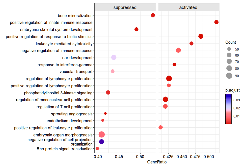
dotplotGsea returned a list which includes df
(data used for plot)and plot(plot).
use NES as X axis:
# use NES
dotplotGsea(data = ego3,topn = 10,
            order.by = 'NES')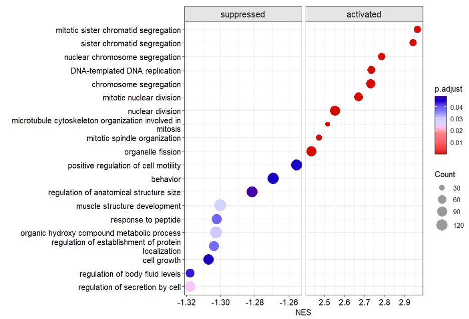
you can add segment line to make lollipop plot:
# add segment line
dotplotGsea(data = ego3,topn = 10,
            order.by = 'NES',
            add.seg = T)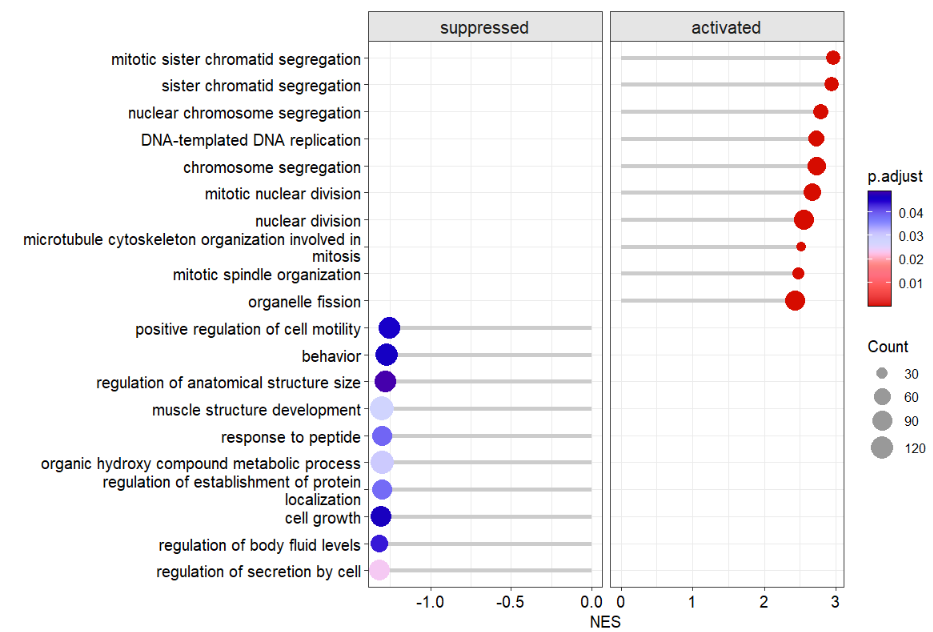
change line style:
# change line style
dotplotGsea(data = ego3,topn = 10,
            add.seg = T,
            line.col = 'orange',
            line.type = 'dashed')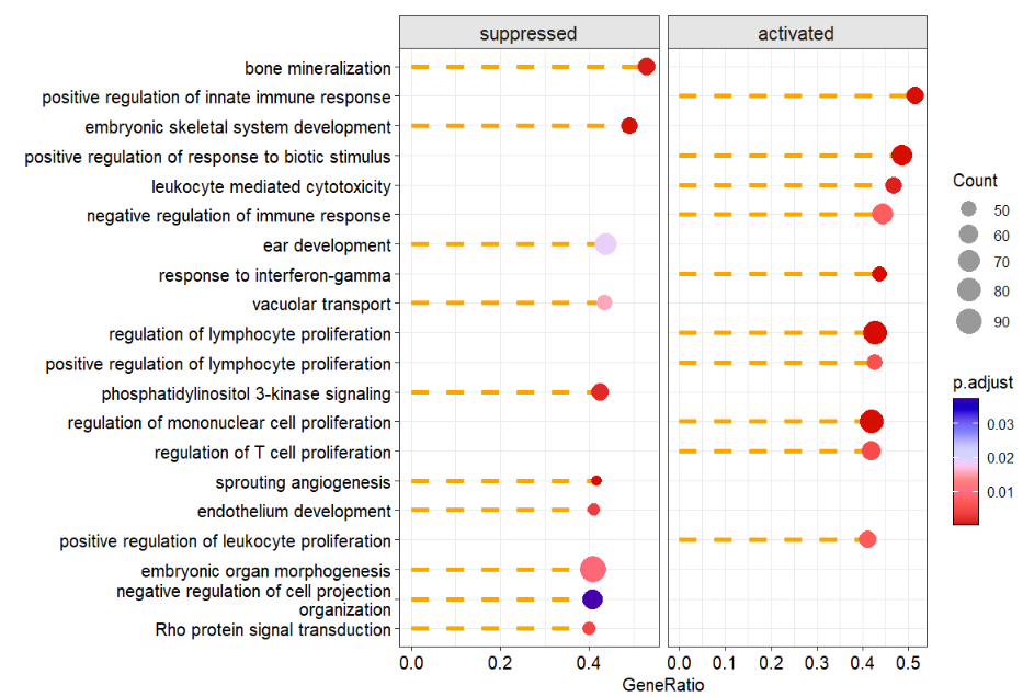
free scale:
# free scale
dotplotGsea(data = ego3,topn = 10,
            order.by = 'NES',
            add.seg = T,
            scales = 'free')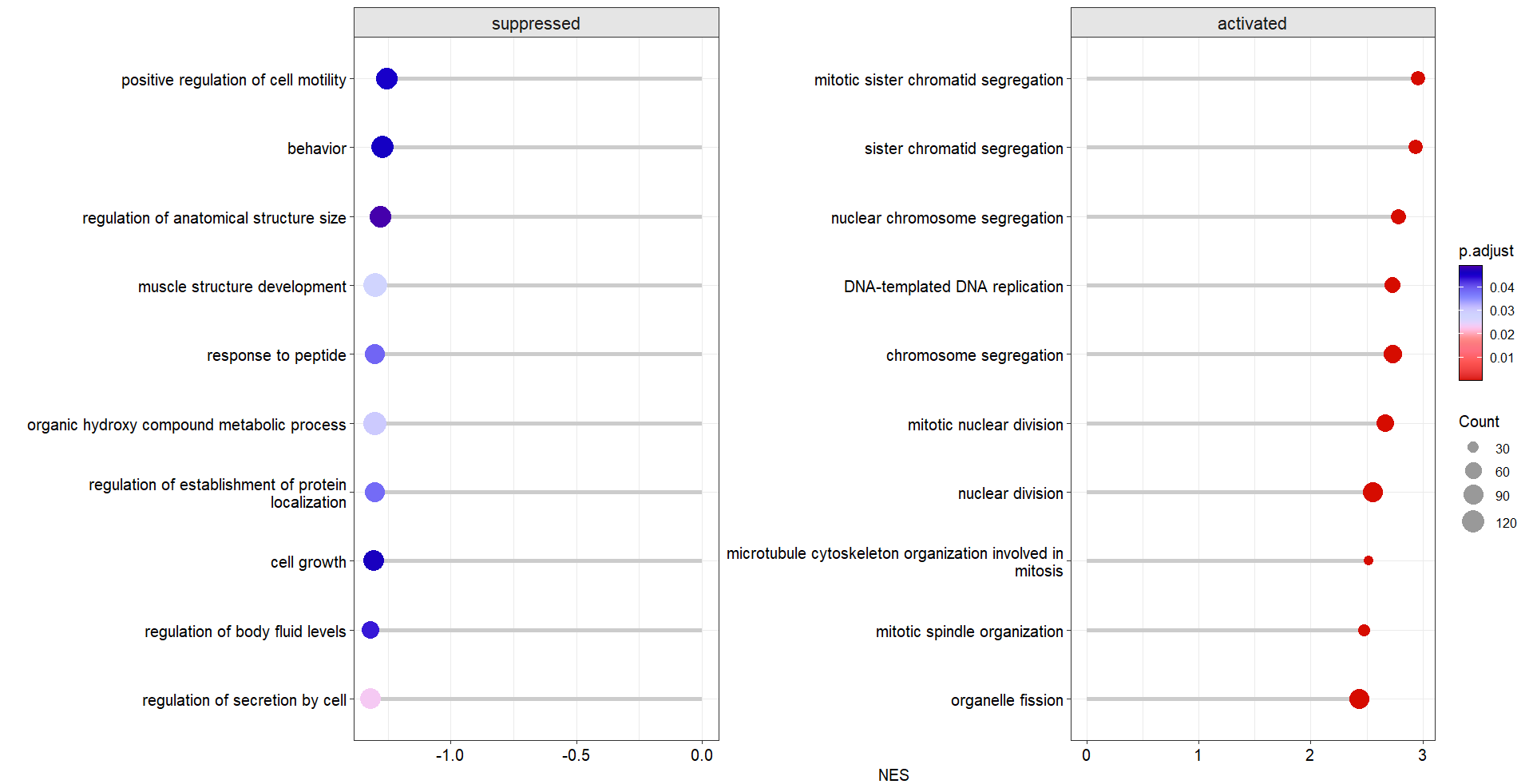
if there is no p.ajusted < 0.05 terms enriched, you can set the pajust cutoff or set pval cutoff to filter suitble terms to plot:
p1 <- dotplotGsea(data = ego3,topn = 5,
                  pajust = 0.1)$plot

p2 <- dotplotGsea(data = ego3,topn = 5,
                  pval = 0.05)$plot

# combine
cowplot::plot_grid(p1,p2,nrow = 2,align = 'hv')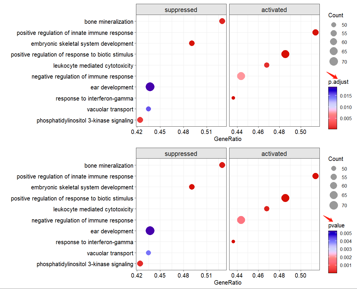
more arguments see:
?dotplotGsea