Module 3: Pyplot Formatting - josephalbaph/DataScience4 GitHub Wiki
Plotting Consecutive Plots
Learning Objectives
- Why Pyplot formatting?
- Plotting consecutive graphs
- Combining the 2 plots into 1
Pyplot Formatting
Tired of those plain, boring graphs? Want them to convey more information at once? This is the perfect module for you then!
We’ll be working on the same dataset i.e on the .
Plotting consecutive plots using Matplotlib
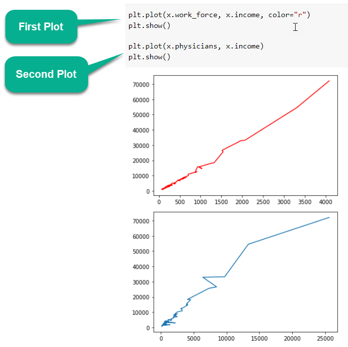
Plotting data on multiple consecutive figures can be done by calling the corresponding graphing functions and displaying each figure consecutively:
Combining the 2 plots into 1
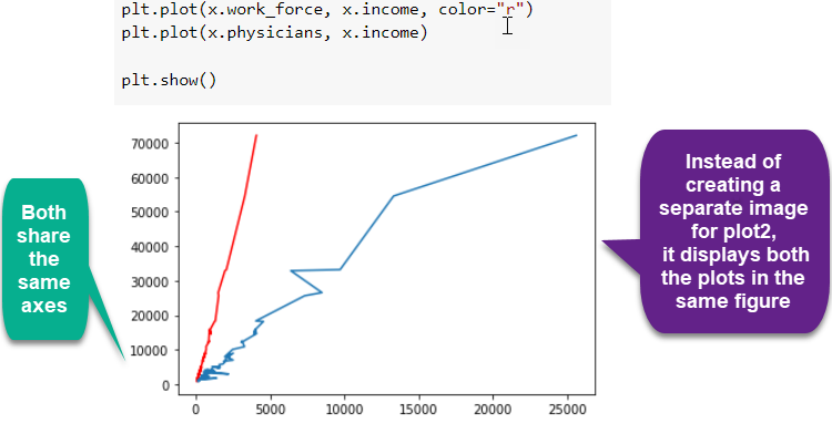
What happens if you don't use plt.show() after the first figure? Both variables will be plotted in the same figure:
Making The Plots Descriptive
Learning Objectives
- Why should we make plots descriptive?
- Adding a Title
- Adding Labels
- Adding a legend
Why should we make plots descriptive?
The plots that we created in the previous module do the job but do you think any person who looks at those will be able to understand what they represent?
It's a good practice to make all the plots descriptive and easy to understand using Title, Labels and Legends.
1. Adding a Title
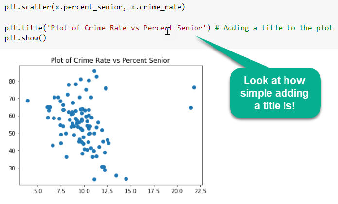
Your graph isn't complete without a title that summarizes what the graph itself depicts. The title is usually placed in the center, either above or below the graph. The proper form for a graph title is "y-axis variable vs. x-axis variable."
Adding title to a plot is very straightforward. It can be done with the title function as follows:
2. Adding Labels
Axis labels are the variable names or descriptions that represent a particular axis. The axis label usually appears below or to the left of the axis.
- To add a label to the X axis, xlabel function is used.
- Similarly, to add a label to the Y axis, ylabel function is used.
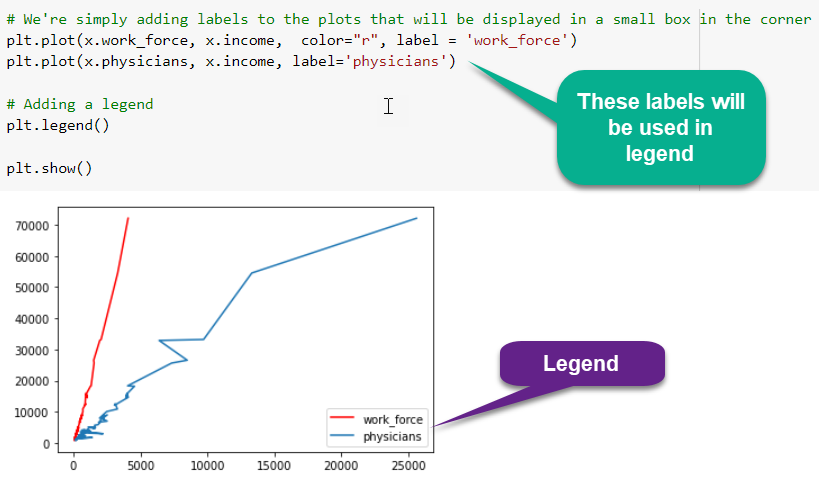
3. Adding a legend
Now that you've added what the graph, X and Y axis represent, you're already halfway through the process of making your graphs intuitive.
You plotted the income of both work_force and physicians on the same graph above. How would a layman know which plot represents the work_force and which physicians? That's the problem solved by legend.
A legend is an area describing the elements of the graph. In the matplotlib library, there’s a function called legend which is used to place a legend on the axes, as follows:
Formatting The Plots
Learning Objectives
- Changing Colors
- Changing line-styles
- Adding Markers
- Combining the 3 formatting option
Formatting Plots
-
The first adjustment you might wish to make to a plot is to control the line colors and styles.
-
Look at all the above graphs you’ve created till now. What is the color and style of the plots where it is not explicitly specified?
-
All blue solid lines. Blue solid line is thus the default formatting style.
-
The plt.plot() function takes additional arguments that can be used to specify the formatting.
-
You've already specified the colour of a few plots before using the 'color' argument. Colours can be provided in a number of ways apart from that.
1. Changing Colours
To adjust the color, you can use the color keyword, which accepts a string argument representing virtually any imaginable color. The color can be specified in a variety of ways:
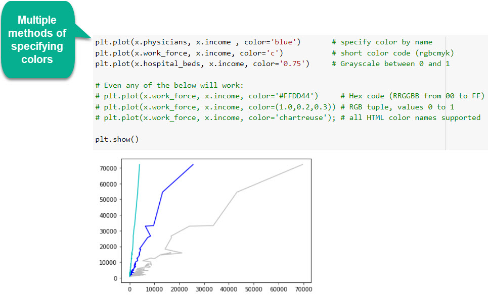
If no color is specified, Matplotlib will automatically cycle through a set of default colors for multiple lines.
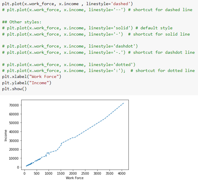
2. Changing Line Styles
Similarly, the line style can be adjusted using the linestyle keyword. You can make the lines dashed, dotted or a combination of both.
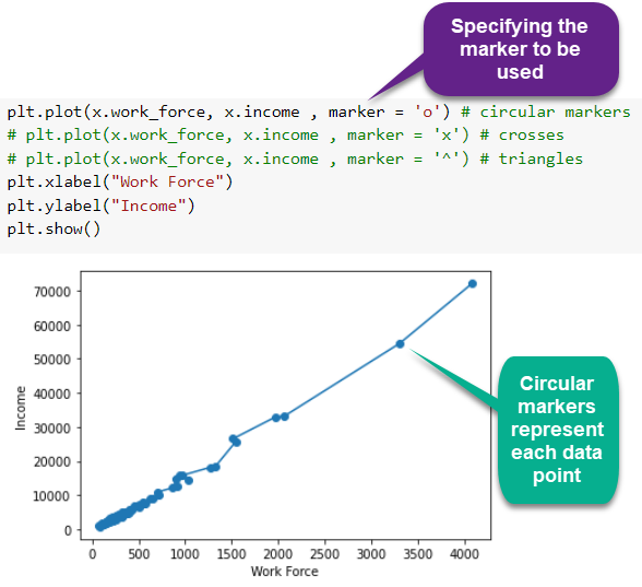
3. Adding Markers
So you've plotted lines that pass through the points in the dataset. But we can't really see those points in the lines above, can we?
Adding markers to a line plot can be a useful way to distinguish multiple lines or to highlight particular data points.
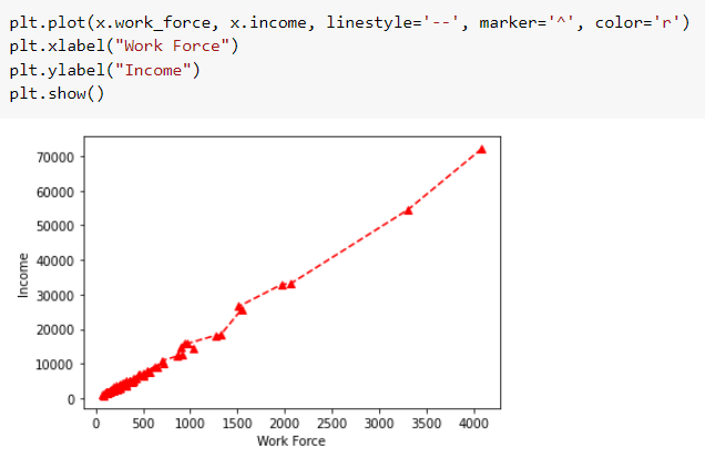
Combining the 3 formatting options
Let's plot a red dashed line with triangular markers!
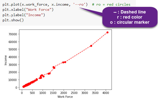
Shortcut for above
For every x, y pair of arguments, there is an optional third argument which is the format string that indicates the color and line type of the plot. The letters and symbols of the format string are from MATLAB, and you concatenate a color string with a line style string. The default format string is 'b-', which is a solid blue line.
These linestyle and color codes can be combined into a single non-keyword argument to the plt.plot() function:
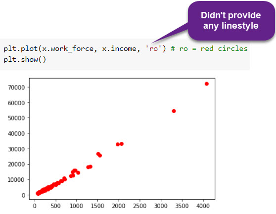
Scatter Plot with plot function
It turns out that the plot function can produce scatter plots as well. Just don't mention any linestyle.
More examples
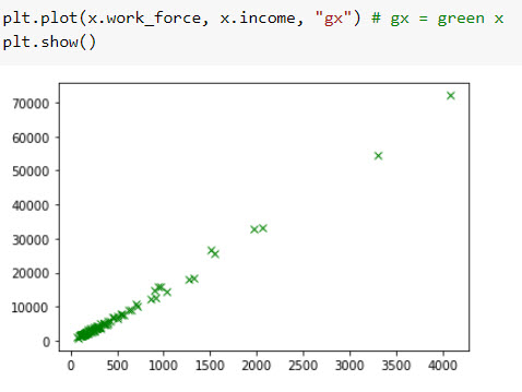
There are plenty of other options. You can try the following:
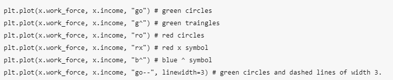
These single-character color codes reflect the standard abbreviations in the RGB (Red/Green/Blue) and CMYK (Cyan/Magenta/Yellow/blacK) color systems, commonly used for digital color graphics.
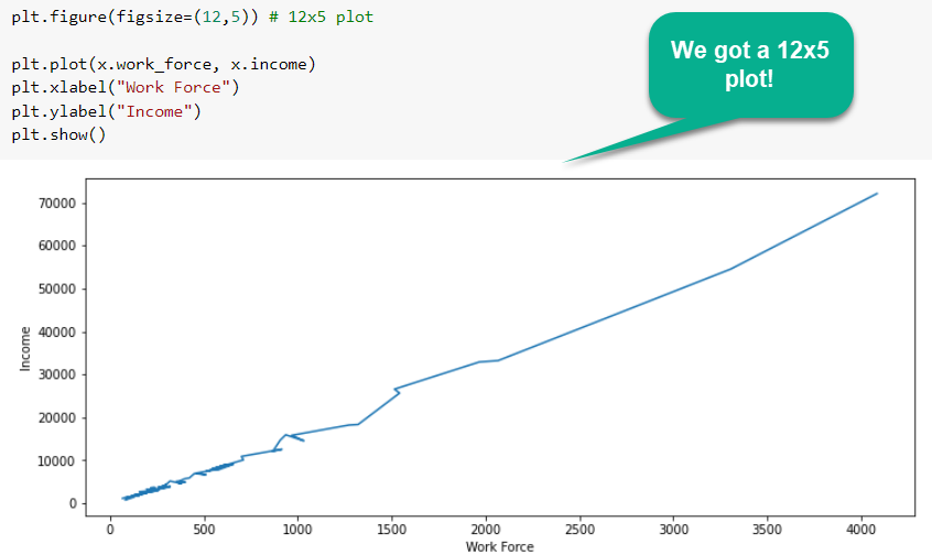
Changing Plot Size
-
You may feel that the output images are not of appropriate size and might prefer to enlarge or sometimes downsize them.
-
In such a case, the size of the figure that contains the graph can be changed with the figsize argument as follows:
plt.figure(figsize=(new_width_pixels, new_height_pixels))
Let's look at this example:
Multiple Plots
Multiple Plots in 1 Figure
-
We can make multiple graphics in one figure. This goes very well for comparing charts or for sharing data from several types of charts easily with a single image.
-
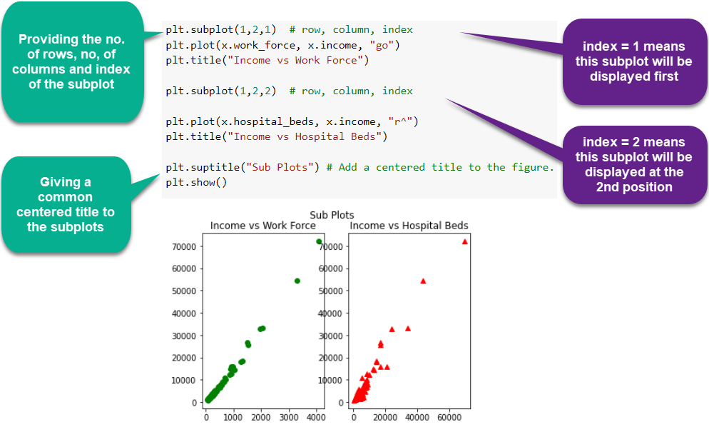
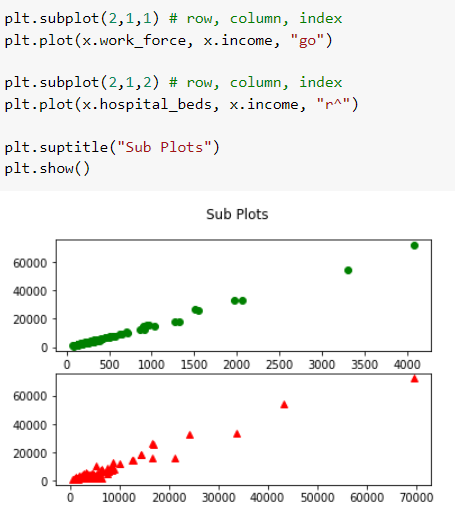
The .subplot() method is used to add multiple plots in one figure. It takes three arguments:
- nrows: number of rows in the figure
- ncols: number of columns in the figure
- index: index of the plot
-
Let's see how variables are plotted with different row and column configurations in the figures.
-
The function subplot creates a figure and a set of subplots. It is a wrapper function to make it convenient to create common layouts of subplots, including the enclosing figure object, in a single call.
-
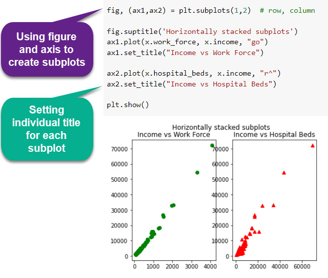
You can even give a Title to your subplots using the suptitle method! No, the 'p' is not a typing mistake.
-
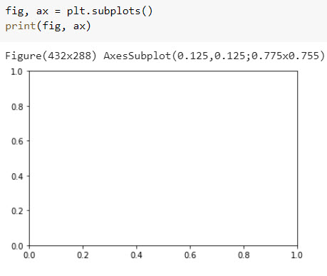
The subplot function returns a figure and an Axes object or an array of Axes objects.
Changing Plot Size
If we call the subplot function without any parameters - like we do in the following example - a Figure object and one Axes object will be returned:
1 row and 2 columns - Method 1##
1 row and 2 columns - Method 2##
Overlapping Values
-
PS. Aren't those overlapping axis values annoying? Matplotlib has a solution for that too.
-
Simply put sharey=True inside the subplot function. The two subplots will share the y axis values then.
-
Try it out!
2 rows and 1 column
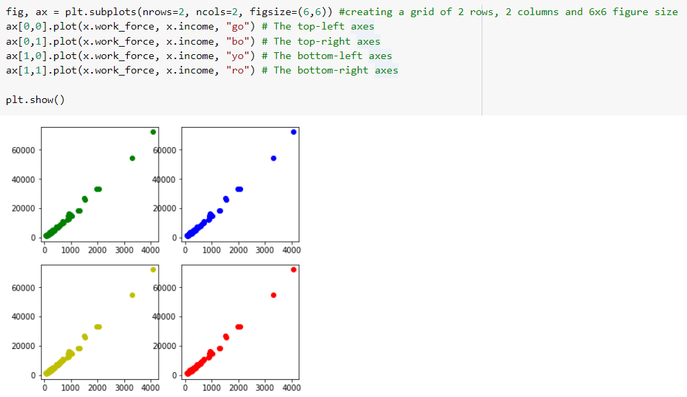
2 rows and 2 columns
Think of this as a 2X2 grid. You can access the different positions of the axis and plot your graphs there as follows: