Module 2: Matplotlib - josephalbaph/DataScience4 GitHub Wiki
Introduction
Learning Objectives
- Introduction to Matplotlib
- Advantages
- Installation
- Importing Matplotlib
- Matplotlib Chart
Introduction
- Matplotlib is the most popular Python plotting library.
- It is a comprehensive library for creating static, animated, and interactive visualizations in Python.
- It is useful for those working with Python and NumPy.
- It is a low-level library with a Matlab like interface which offers lots of freedom at the cost of having to write more code.
Advantages
- extremely powerful
- fast and efficient
- open source tool
- works well with many operating systems and graphic backends
- high-quality graphics and plots
- ability to print and view a range of graphs
- large community support and cross-platform support
- full control over graph or plot styles
Installation
- Before Matplotlib's plotting functions can be used, Matplotlib needs to be installed.
- The Anaconda distribution of Python as well as Google Colab come with Matplotlib pre-installed and no further installation steps are necessary.
- However, if you're not using any of those, you can install it by running a simple pip command in your terminal: pip install matplotlib
Pyplot
The most used module of Matplotib is Pyplot which is matplotlib's plotting framework.
Each pyplot function makes some change to a figure: e.g., creates a figure, creates a plotting area in a figure, plots some lines in a plotting area, decorates the plot with labels, etc.
Importing matplotlib
There are a lot of modules in Matplotlib but for plotting purposes, we only import pyplot.
Just as we use the np shorthand for NumPy and the pd shorthand for Pandas, we will use the standard shorthand plt for the Matplotlib import:
import matplotlib.pyplot as plt
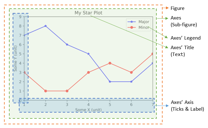
Matplotlib Chart
Matplotlib’s charts are made up of two main components:
- The axes: the lines that delimit the area of the chart
- The figure: where we draw the axes, titles and elements that come out of the area of the axes.
PS. Unlike the plural of axis, axes in Matplotlib is actually the whole rectangular box containing the axis lines, ticks and labels.
Setting Things Up
Learning Objectives
- Importing Libraries
- About the Dataset
- Loading the dataset
Importing libraries
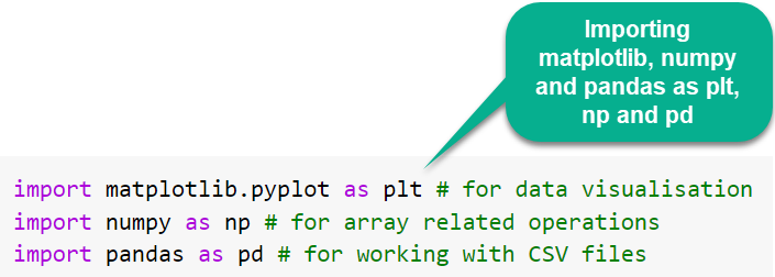
All Python capabilities are not loaded to our working environment by default (even they are already installed in your system). So, we import each and every library that we want to use.
We’ll import numpy, pandas and matplotlib with their respective aliases: np, pd and plt.
About the Dataset
Dataset Name: Standard Metropolitan Dataset
Dataset Description:
- It contains data of 99 standard metropolitan areas in the US i.e 99 row entries.
- The dataset provides information on 11 variables for each area for the period 1976-1977.
- The areas have been divided into 4 geographic regions: 1=North-East, 2=North-Central, 3=South, 4=West.
- The variables provided are listed in the table below:
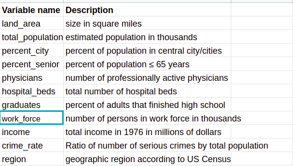
Objective
The problem objective is to find the crime rate of each area.
Loading the dataset
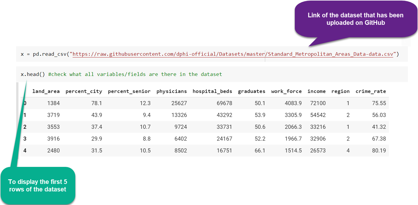
For loading the dataset, we’ll use the Pandas read_csv method.
Basic Plots
-
The terms Plot, Chart and Graph partly overlap, they are used somewhat loosely, and in that overlap there isn't really any significant difference that you need to know right now.
-
Therefore, there’s no need to be confused if you find Bar Plot, Bar Graph and Bar Chart being used interchangeably at places.
-
Let’s have a look at the commonly used plots in Matplotlib now.
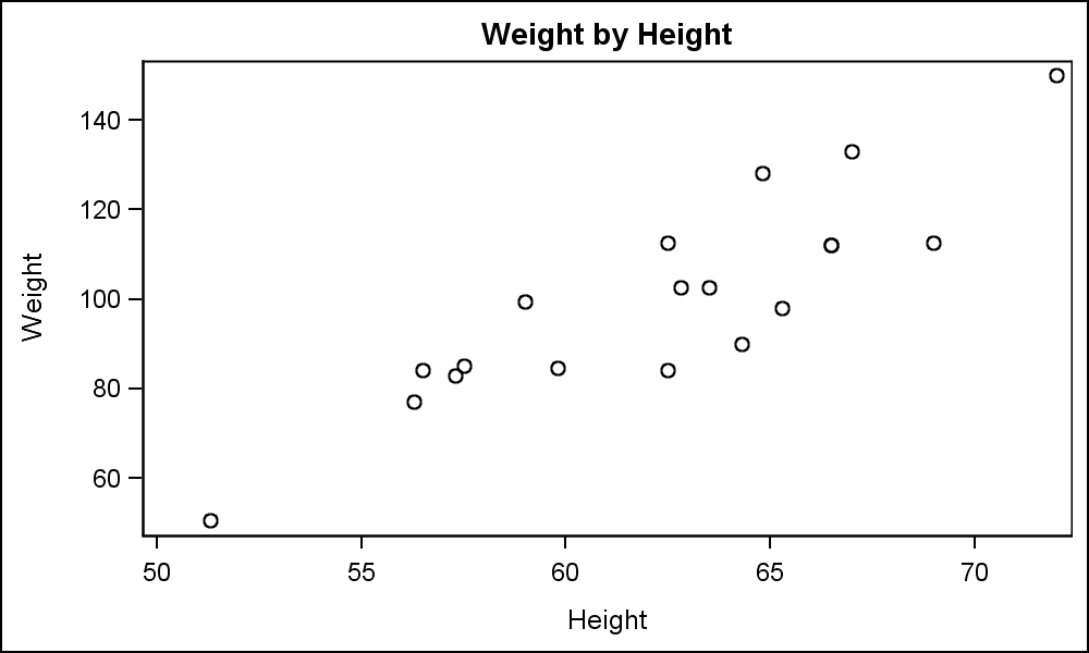
Scatter Plot
What is Scatter Plot?
- A scatter plot (aka scatter chart, scatter graph) uses dots to represent values for different numeric variables.
- The position of each dot on the horizontal and vertical axis indicates values for an individual data point.
- Scatter plots are used to observe relationships between variables.
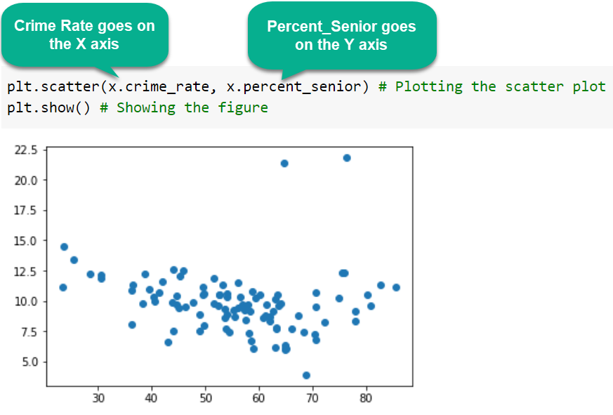
Creating a Scatter Plot
To create a scatter plot in Matplotlib we can use the .scatter() method:
Is plt.show( ) always required?
You might’ve observed the line plt.show( ) after the plt.scatter( ). Is it necessary to use?
- If Matplotlib is used in a terminal, scripts or specialized IDEs such as Spyder, Pycharm or VS Code, plt.show() is a must.
- If Matplotlib is used in a IPython shell or a notebook as Jupyter Notebook or Colab Notebook, plt.show() is usually unnecessary.
The plt.show() command does a lot under the hood, as it must interact with your system's interactive graphical backend. The details of this operation can vary greatly from system to system and even installation to installation, but matplotlib does its best to hide all these details from you.
In the following cell we are executing the same script as above, removing the plt.show() instruction:
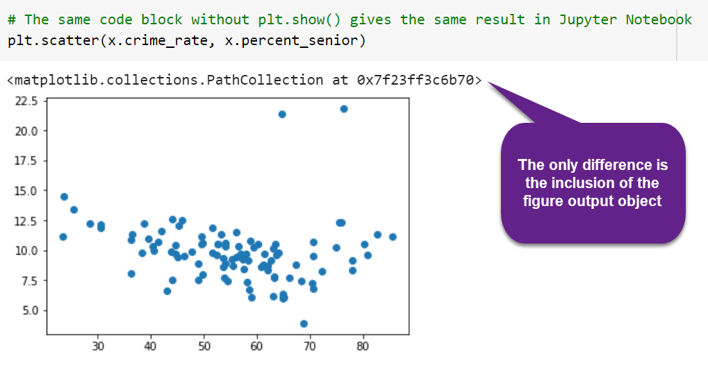
If you want to prevent this from being included as a cell output, use plt.show() at the end of each plotting instruction.
Applications of Scatter Plot
- A scatter plot can be useful for identifying other patterns in data.
- We can divide data points into groups based on how closely sets of points cluster together.
- Scatter plots can also show if there are any unexpected gaps in the data and if there are any outlier points. (Look at the 2 points away from rest of the data in the scatter plot. Those are outliers.)
- This can be useful if we want to segment the data into different parts, like categorising users into different groups.
Line Plot
What is Line Plot?
A line chart is used to represent data over a continuous time span. It is generally used to show trend of a variable over time. Data values are plotted as points that are connected using line segments.
Creating a Line Plot (with 2 arguments)
- In Matplotlib we can create a line chart by calling the plot method.
- plot() is a versatile command, and can take an arbitrary number of arguments.
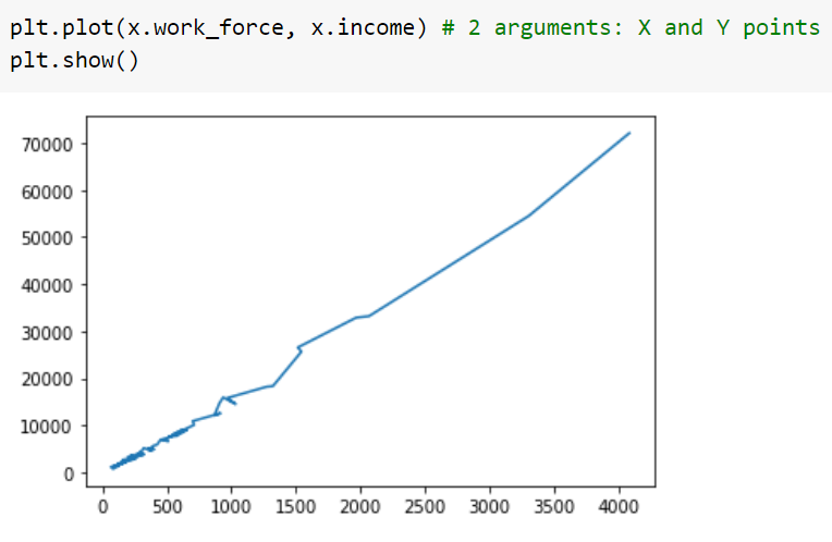
Because it is a line chart, matplotlib automatically draws a line to connect each pair of consecutive points that represent coordinates on the graph.
Creating a Line Plot (with a single argument)
-
We can make a graph with a simple line of code as mentioned in the image:
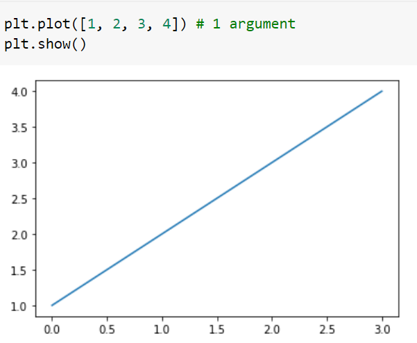
-
You may be wondering why the x-axis ranges from 0-3 and the y-axis from 1-4.
-
If you provide a list of n elements to the .plot() function, matplotlib will assume it is a sequence of y values, and automatically generates the x values for you as a range of n elements starting from 0.
-
Since python ranges start with 0, the default list x has the same length as y . Hence the x data will be [0,1,2,3]. (Length same as y( 4) but starts from 0 instead)
Applications of Line Plot
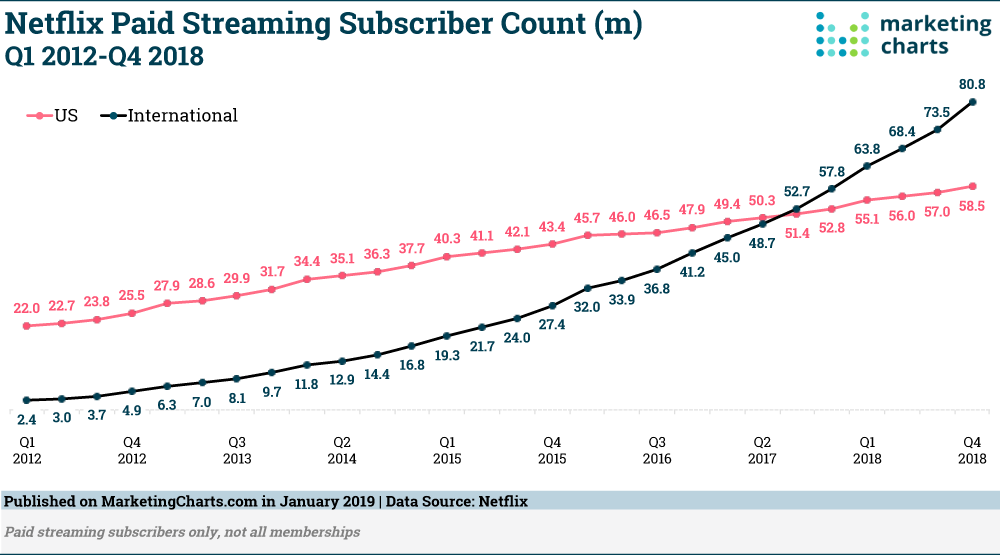
Using a line chart one can see the pattern of any dependent variable over time like share price, weather recordings (like temperature, precipitation or humidity), etc.
Let's look at an example of the graphical representation of Netflix Paid Subscriber Count growth from 2012 to 2018:
Histogram
What is Histogram?
A histogram is a graphical display of data using bars(rectangles) of different heights.
Parts of a Histogram:
- The title: The title describes the information included in the histogram.
- X-axis: The X-axis are intervals that show the scale of values which the measurements fall under. These intervals are also called bins.
- Y-axis: The Y-axis shows the number of times that the values occurred(frequency) for each interval on the X-axis.
- The bars: The height of the bar shows the number of times that the values occurred within the interval, while the width of the bar shows the interval that is covered.
Example: Height of Orange Trees
- You measure the height of every tree in the orchard in centimeters (cm)
- The heights vary from 100 cm to 340 cm
- You decide to put the results into groups of 50 cm:
- The 100 to just below 150 cm range,
- The 150 to just below 200 cm range, Etc…
- So a tree that is 260 cm tall is added to the "250-300" range.

- And here is the result:
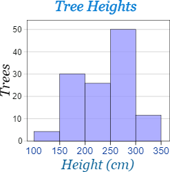
- You can see (for example) that there are 30 trees from 150 cm to just below 200 cm tall. You just created a histogram!
- Source: https://www.mathsisfun.com/data/histograms.html
Creating a Histogram
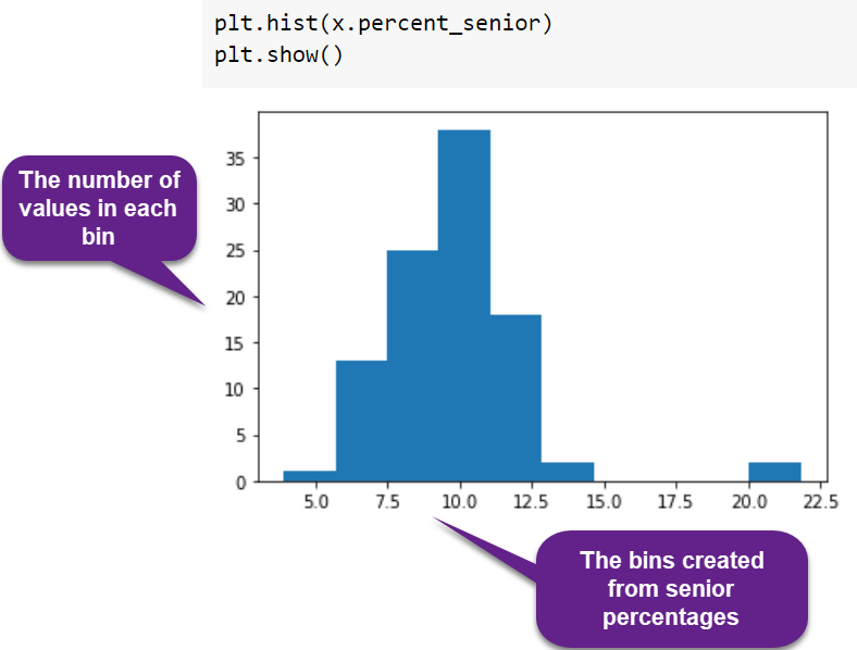
Matplotlib can be used to create histograms using the hist() method.
Parameters:
- x(n,) : this takes either a single array or a sequence of arrays which are not required to be of the same length.
- bins : intervals of any quantity
If the bins are:
[1, 2, 3, 4]
then the first bin is [1, 2) (including 1, but excluding 2) and the second [2, 3). The last bin, however, is [3, 4], which includes 4.
Applications of Histogram
- Histograms are a very common type of plots when we are looking at data like height and weight, stock prices, waiting time for a customer, etc -which are continuous in nature.
- Histograms are good for showing general distributional features of dataset variables. You can see roughly where the peaks of the distribution are, whether the distribution is skewed or symmetric, and if there are any outliers.
Bar Plot
What is Bar Plot?
Bar charts are one of the most common types of graphs and are used to show data associated with the categorical variables.
Let's see some ways to display a bar graph with matplotlib:
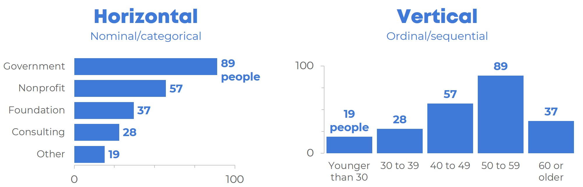
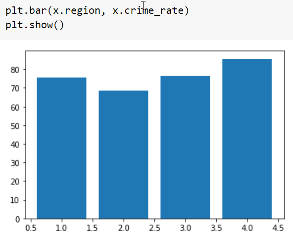
Creating a Vertical Bar Plot
Pyplot provides a bar() method to make bar graphs which take the following arguments: categorical variables, their values and color (if you want to specify any).
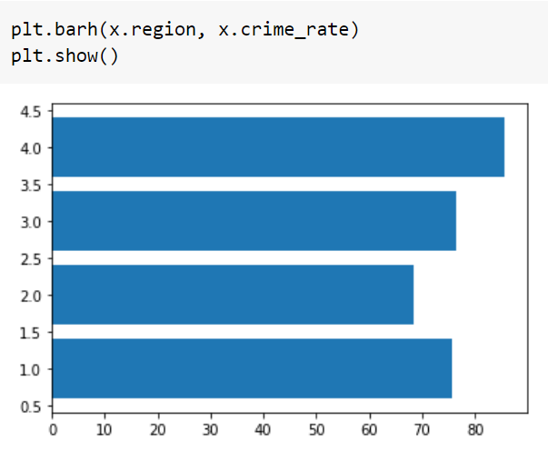
Creating a Horizontal Bar Plot
It’s also really simple to make a horizontal bar-chart using the plot.barh() method.
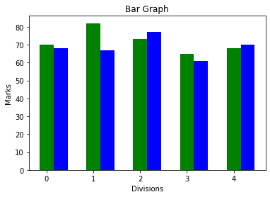
Bar Charts with multiple quantities
When comparing several quantities and when changing one variable, we might want a bar chart where we have bars of one color for one quantity value.
We can plot multiple bar charts by playing with the thickness and the positions of the bars.
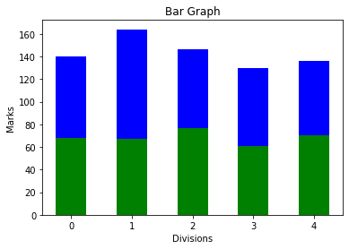
Stacked Bar Charts
The stacked bar chart stacks bars that represent different groups on top of each other. The height of the resulting bar shows the combined result of the groups.
Applications of Bar Charts
Bar graphs are used to match things between different groups or to trace changes over time. Look at the bar chart below representing the most in-demand tech skills for data engineers.
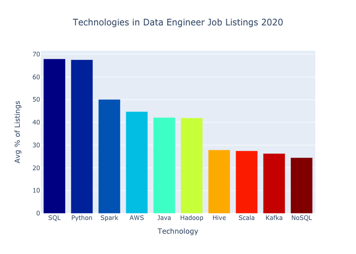
Source: https://www.experfy.com/blog/most-in-demand-tech-skills-for-data-engineers-58f4c1ca25ab/
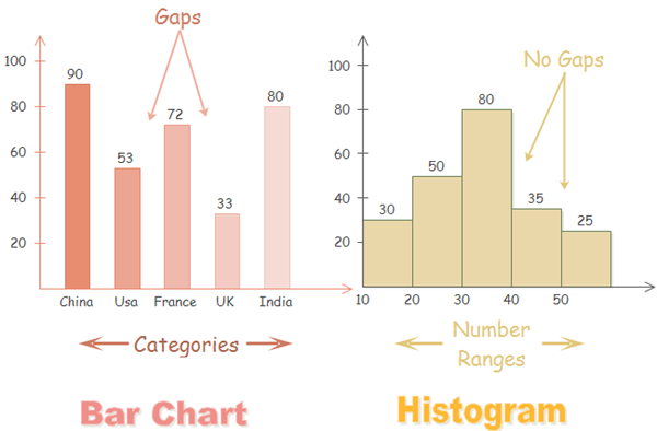
Bar Chart vs Histogram
Histograms are a great way to show results of continuous data, such as:
- weight
- height
- how much time etc.
But when the data is in categories (such as Country or Favorite Movie), we should use a Bar Chart. Have a look at the next part descripting the difference between histogram and bar chart:
Pie Chart
What is Pie Chart?
-
A pie chart (or a circle chart) is a circular statistical graphic, which is divided into slices(wedges) to illustrate numerical proportion.
-
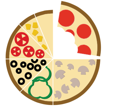
Imagine a pizza where different slices contain different toppings. Bigger the slice, larger the amount of that topping is present.
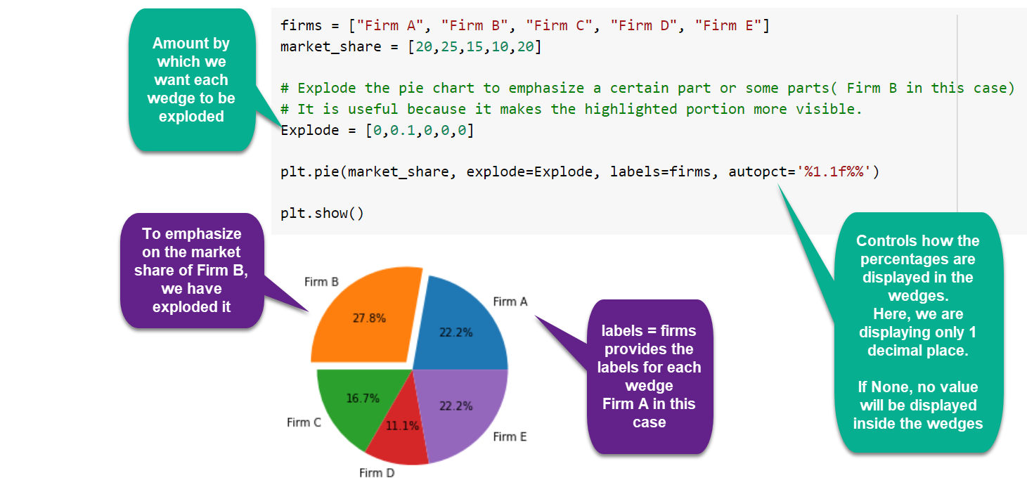
Parameters of a pie chart:
- x: The wedge sizes.
- labels: A sequence of strings providing the labels for each wedge.
- Colors: A sequence of colors through which the pie chart will cycle. If None, will use the colors in the currently active cycle.
- Autopct: string, used to label the wedges with their numeric value. The label will be placed inside the wedge. The format string will be fmt%pct.
We can also pass in arguments to customize our Pie chart to show shadow, explode a part of it, tilt it at an angle or do lot more exciting things!
Don’t get overwhelmed with the terms being used, it’ll be all clear in the below section.
Creating a Pie Chart
Pie chart can be made using the method pie().
Applications of Pie Charts
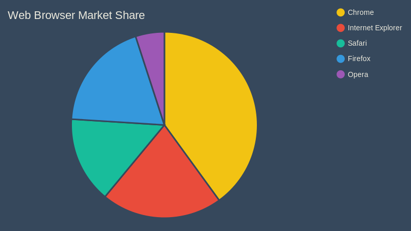
- A pie chart is best used when trying to work out the composition of something. If you have categorical data then using a pie chart would work really well as each slice can represent a different category. A good example of a pie chart can be seen below.
- Another good use for a pie chart would be to compare areas of growth within a business such as turnover, profit and exposure.
- Try creating a pie chart to see how much money you spend in different areas