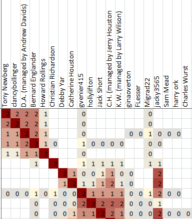
the saved cluster diagram - jonathanbrecher/sharedclustering GitHub Wiki
Shared Clustering saves its output in a .xlsx spreadsheet. Most of the spreadsheet is occupied by the clusters themselves. The headers of each row and column provide other information about the matches in each cluster.


Each cluster recognized by Shared Clustering is numbered, starting at 1 at the top of the file. The numbers are completely arbitrary; Cluster 1 isn't any more important than cluster 10 or cluster 100. These numbers simply provide a way to refer to the clusters, for example in the Correlated Clusters column.
When a row has no cluster number, that means that Shared Clustering didn't have a cluster to assign that person to. There's a minimum cluster size that gets specified in the advanced options when you create the diagram. The minimum cluster size defaults to 3, and there aren't many reasons to change the value. That means that anyone who is off by themselves in a cluster of one or two people are considered not to be in a cluster and they don't get numbered.
Sometimes it can be hard to tell where one cluster ends and another begins. This is especially true when the clusters overlap. Remember that the numbers are arbitrary. You should make your own interpretations.

This is the name of the match, as shown in the Ancestry DNA results.

The test ID is a way that Ancestry uses to identify each test uniquely. It's possible for two people to have the same names. It is not possible for two people to have the same guid. Even if one person takes the test twice, each test will have a different ID.
Shared Clustering can use the test IDs to produce custom reports showing a subset of the total matches.

The Link is a clickable hyperlink that will open the test results for that match in your default browser.

The shared centimorgans value is a standard measure of the strength of a match. Higher values indicate stronger matches. Most values tend to be fairly low.
The Ancestry DNA website only shows matches of at least 20 centimorgans in the shared match lists. Shared Clustering can include matches down to 6 centimorgans, which is the absolute lowest limit of the results returned by Ancestry.

While the Centimorgans value shows the total strength of each match, the Shared Segments value shows how many segments those centimorgans are split into. Weak matches tend to share only a single segment. Strong matches can share a dozen or more segments.

It can be helpful to know if each match has a tree linked to their DNA results. If you are trying to do research based on family names or locations and the match doesn't have any tree linked to their results at all, there's no point even opening the test results.
Possible tree types include:
- None
- Unlinked
- Private
- Public

Sometimes trees have only one or two people. That's hardly any more helpful than having no tree at all.
Unlinked trees always report a zero tree size.

Any matches marked as Starred on the Ancestry site will be shown with an asterisk.
This column will only be shown if at least one match is starred.

If a row is correlated with other clusters, the numbers of those clusters (from the first column in the spreadsheet) will be shown in this column.
Two clusters are correlated (or associated) when you can read horizontally from one cluster and vertically from another cluster and find some red squares in the intersection. Those red squares outside of the main clusters indicate matches that could be part of both clusters. Another way to say the same thing is that the shared match lists for those people include shared matches that are included in both clusters.
There are lots of reasons that one match might appear in several clusters, and many of the reasons are unhelpful to a genetic genealogist. If one or two members of a cluster are correlated with another cluster, that probably doesn't mean much. Correlated clusters become interesting when many matches are correlated between the same clusters. In the example shown here, cluster 3 appears as a correlated cluster for several matches. That is probably worth some time for a researcher to investigate.

If you used the "colored dots" groups feature on the Ancestry website to attach comments to your matches, the group colors will be repeated here for convenience. This can save a lot of time when interpreting the clusters, since you have easy access to the research you have already completed.
Each group is listed in a separate column, with the group name as the column header. The groups are listed in alphabetical order, using the same colors as on the Ancestry web site. The column widths are very narrow by default, to fit as much as possible on the screen, but can be widened in Excel if you want to read the headers.

If you used the note feature on the Ancestry website to attach comments to your matches, those notes will be repeated here for convenience. This can save a lot of time when interpreting the clusters, since you have easy access to the research you have already completed.

The main part of the spreadsheet shows the clusters themselves. The clusters are shown as red squares arranged on the diagonal. Each red square includes a group of matches that are more similar -- based on the shared matches of each match -- to each other than to any of the other matches.
More about the cluster output can be seen in the discussions of Interpreting clusters.