prototypes - joeriBouwman25/bubble-machine GitHub Wiki
A collection of different prototypes
Version 1.1
In the first version Joeri made a dashboard to test the API Marcio made, With this dashboard you could;
- get a collection of all Sessions,
- create a new session,
- delete a session,
- see at which step a session currently is
- get the sessions graph data.

Tim did make a scatterplot with the data from the API. With the data he managed to connect dots as friends and item links, the first version of this data visualisation looked like this:

We combined the dashboard made by Joeri with the graph made by Tim and presented that to Yuri in the first client meeting.
Version 2.1
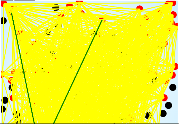
In the second version we removed the lines between the dots because (as you can see in the screenshot above) the graph wasn't readable at all when there were many items and the graph would start to look like a hairball. For now we removed the dashboard because Yuri, couldn't see a good purpose for it.
Remco did realized a scatterplot with D3, He replaced this graph with the version Tim had build earlier. We also changed the style to a dark mode because the UX students taught this would look better.
This Second prototype had an extendable menu for the buttons so the focus was completely on the data vizualisation.
Version 2.2
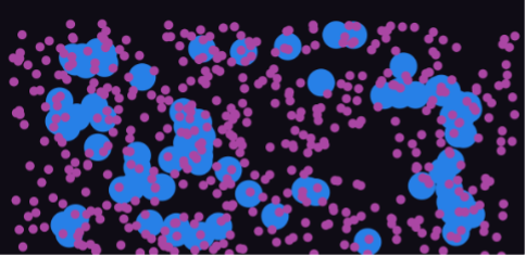
Joeri updated the second prototype to a more bubbly type. So instead of multiple circles and dots on the interface you now have gooey like blobs which represents the filter-bubbles. inside this blobs you see dots which represents news items. Nora made a new version of the extension menu with parameters. each parameter could be folded out as a harmonica.
Version 3.1
After a meetup with the UX students Remco and Nora made a redesign of the interface, The extendable menu is now added into a filter menu which folds out when you click on it. In this version it was also possible to run an autoplay of the simulation steps made by Remco and to save the Graph as an SVG made by Tim.
This Version also saw the return of the dashboard from version 1.1 but in a striped down version. Joeri made the tabs for multiple sessions in this prototype, this made it possible to add new sessions or delete sessions. it was also possible to compare sessions staged in differend steps.
Version 3.2
An alternate version of the third prototype was made by Joeri after he had a meeting with Justus on D3, Instead of a scatterplot this graph is a Force Directed Graph where every node is connected and the graph is draggable. This version was different and its purpose was to test if an other kind of graph would work. Unfortunately this graph type would't work because our data set didn't have an hierarchy in importance.
Version 4.1
In the fourth version of the Prototype it was possible to see connections between persons and items. Tim made this feature. When hovering over an item the connection lines will be visible. Remco redesigned the interface after a meeting with the UX students. The control panel is made less visible so that the user has focus on the data visualization.
Version 4.2
Joeri updated the control buttons, the next step button was no replaced by a run button which will automatic run the session. the session stops running after pressing the button again. Tim added labels to the person and items to see how many connection the highlighted node has. This label was reused from the 3.2 version.
Version 4.3
In the next update of the prototype Nora added an onboarding to explain the application to users. The onboarding will be seen the first time you open the application and can be skipped by the user if the user wants too.
Step 1
Step 2
Step 3
Final version
Eventually we came with the final prototype which you can check following the link down below: