Card separate reusable component - ita-social-projects/what-front GitHub Wiki
Optional:
-
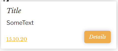
title:
string- card title. -
date:
string- card date. -
buttonName:
string- button name. Default: 'Details' -
iconName:
string- icon name(id). Default: 'Edit' -
className:
string- additional class that you can apply. -
children:
jsxorstring- content of button. -
onDetails:
func- click handler for details. -
onEdit:
func- click handler for Editing.
 <Card
      title="Title"
      date="15.15.15"
      onEdit={handleEdit}
      onDetails={handleShowDetails}
      buttonName="save"
      iconName="Edit"
    >
      <p>SomeText</p>
 </Card>
Card container:
- use @mixin card();
- Button "X": icon imported as Component;
Card content:
- color: #000000/ $neutral-colorN2 / map-get($colors, textMain-color);
- align: left(default);
- Title:
- use @mixin baskerville-italic() for styling;
- font-size: 20px;
- Description:
- use @mixin franklin-regular() for styling;
- font-size: 18px;
- Date:
- use @mixin baskerville-regular() for styling;
- font-size: 14px;
- text-decoratration: underline';
- color: #FFB800/ map-get($colors, textAccentN1-color);
Button “Details” Button separated reusable component
- use @mixin button() for styling;
- background-color: #FFB800 / $theme-colorN1 / map-get($colors, buttonCustom-color);
Functions:
- The button should reorder to the page with lesson's details;
Functions:
- the card should be clickable and when it happens there should be reordering to the page with lessons's details;
- :hover effect should scale the card to 1.5 size from it's default position;